
Studio Tumpić/Prenc is a design studio based in Rovinj, Croatia. Since the Studio was founded in 2017, we have had the opportunity to work on a wide range of diverse and engaging projects, ranging from developing marketing campaigns, through visual identities and packaging designs, to realizing interactive physical exhibitions.
Our work has been recognized by industry experts and the media alike. To date, we have been awarded with prestigious recognition such as Cannes Lions, Pentawards, Red Dot Best of the Best, Dieline, European Design Award Best on Show, D&AD, IIID Award, London International Award, Golden Drum, Cresta, Design Intelligence Award, Communication Arts, Art Directors Club, Grands Prix du Design, Epica, IdejaX, Somoborac, HDD Award, ZGDW Award, and the Zagreb Salon Award.
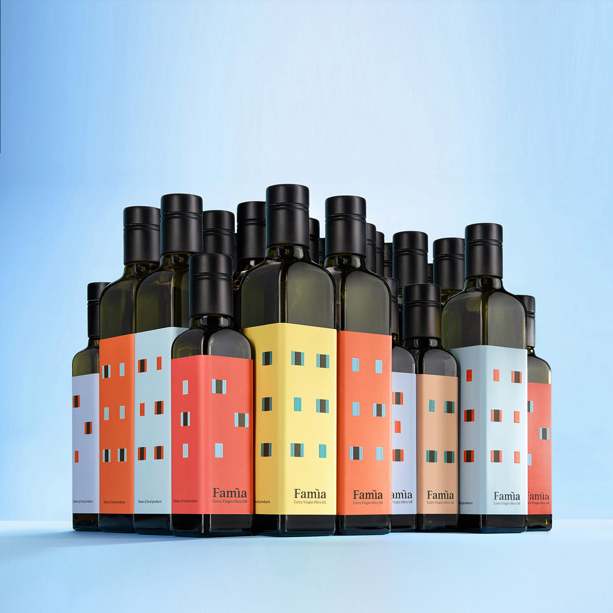
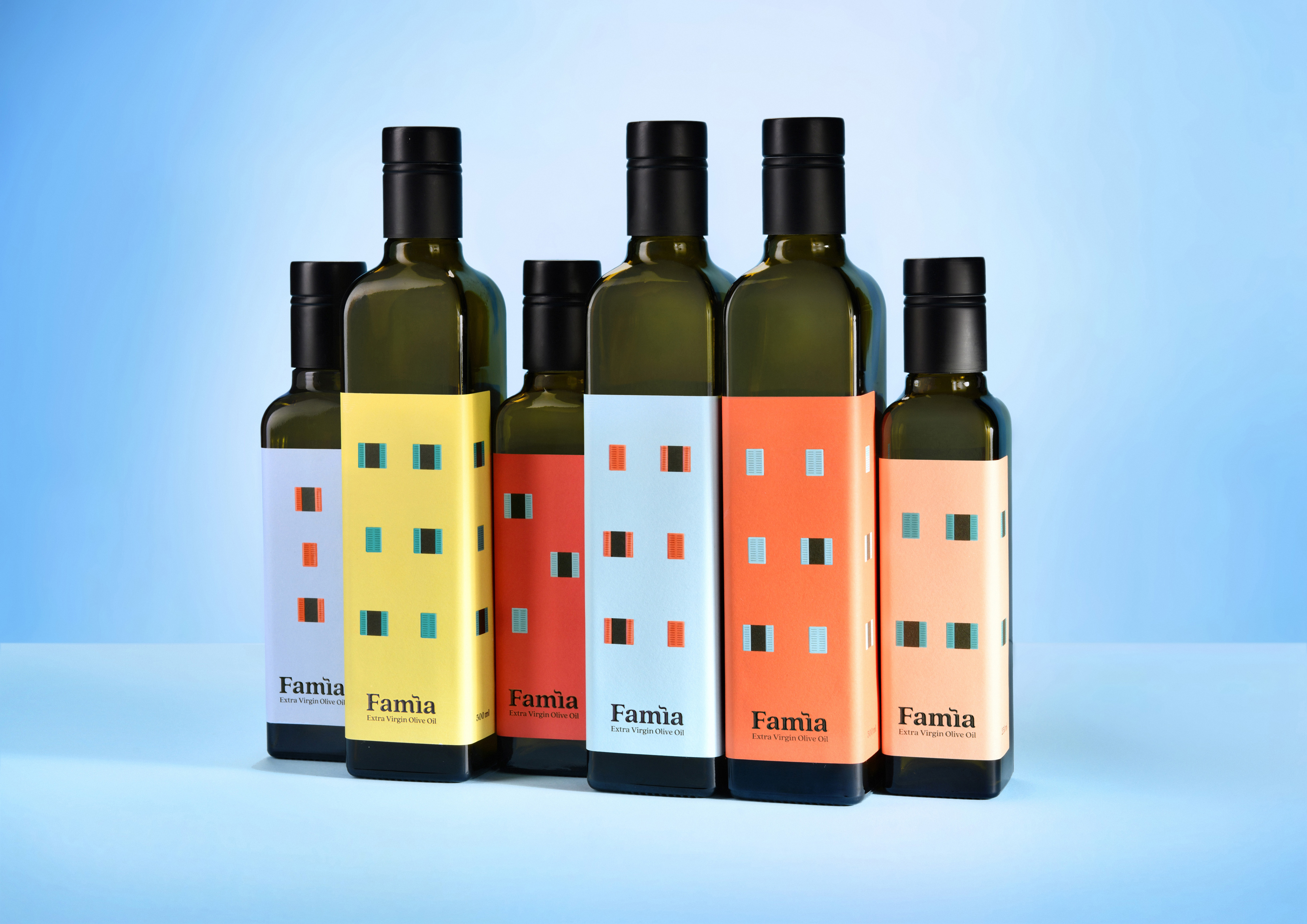
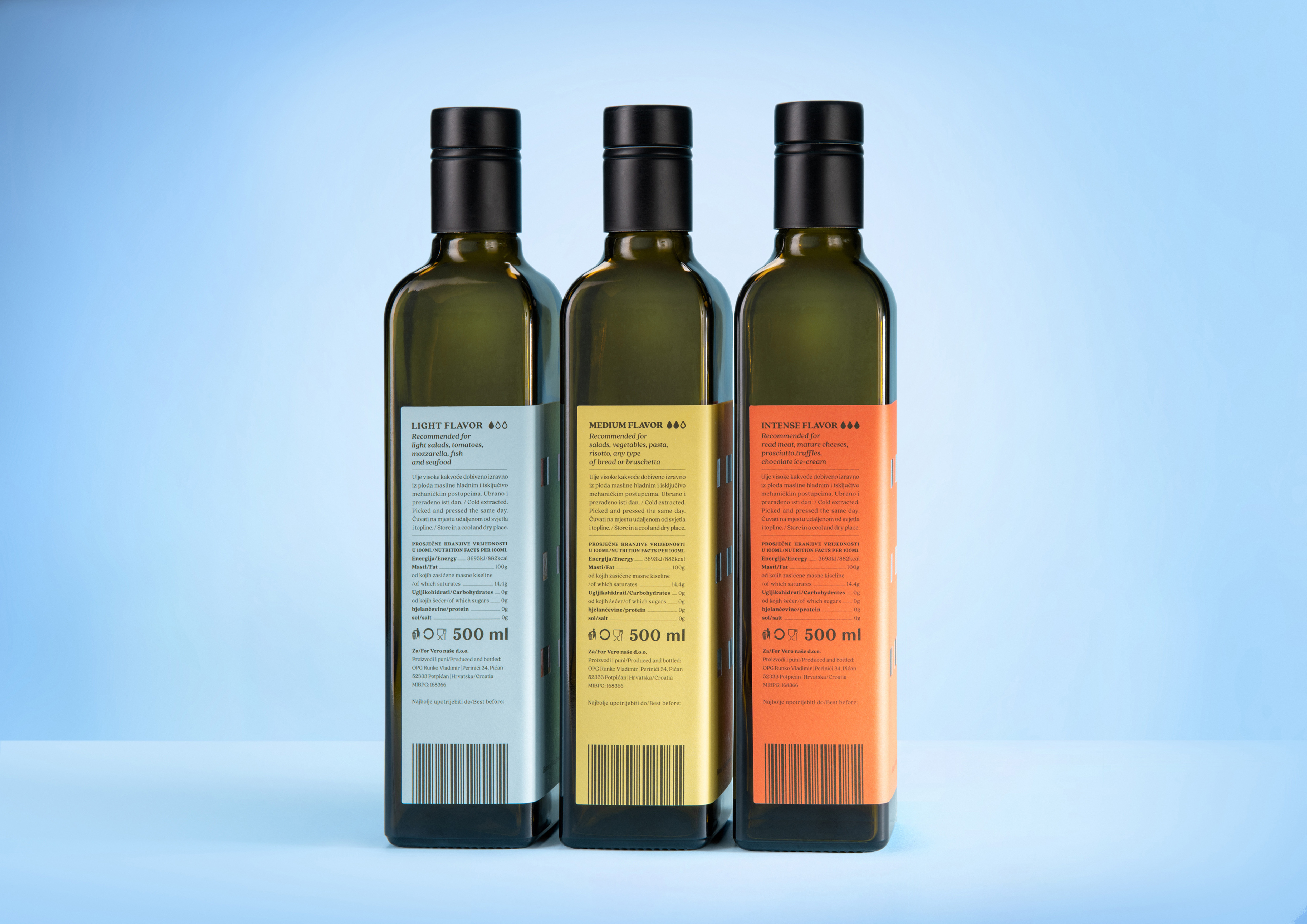
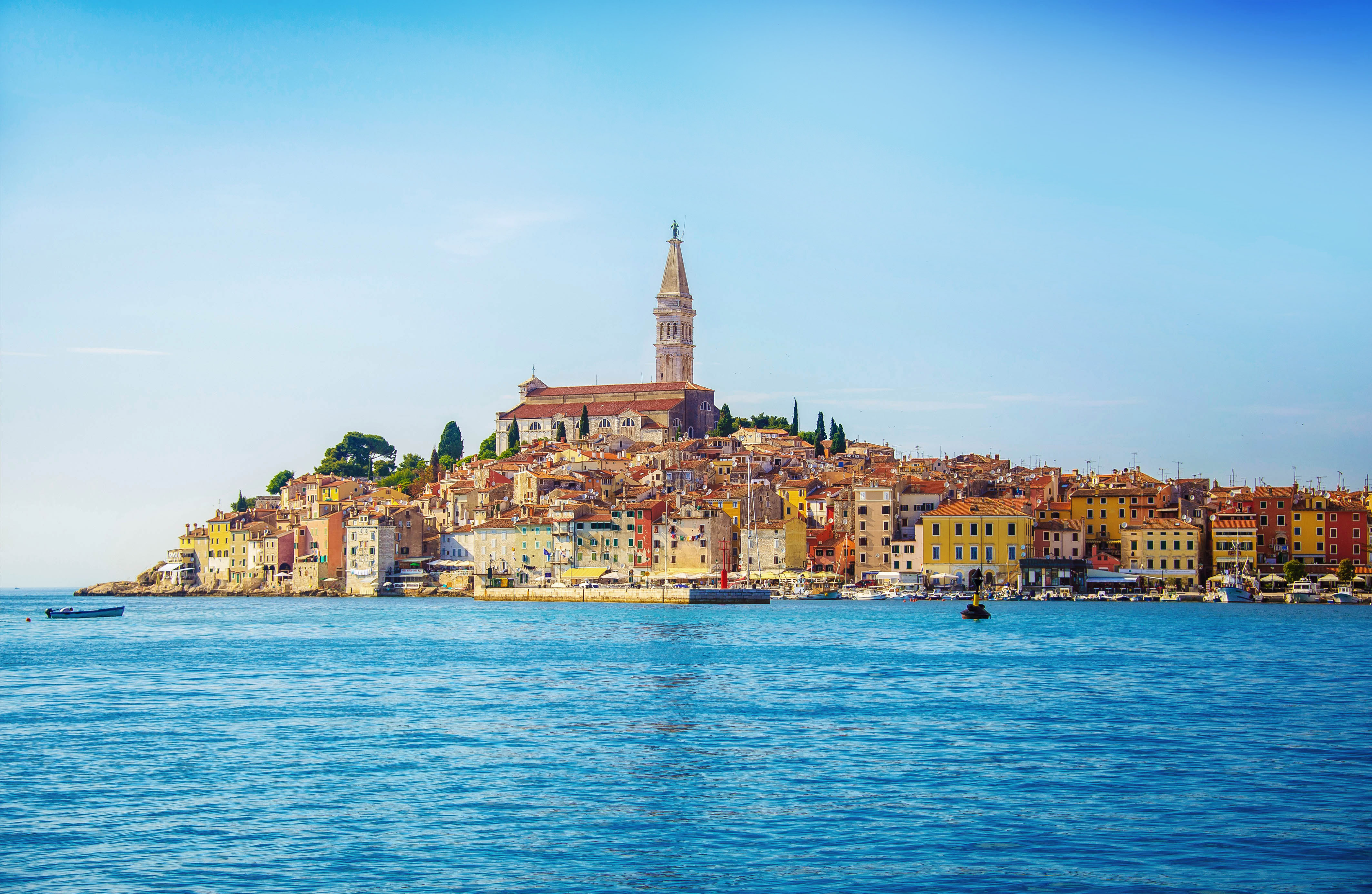
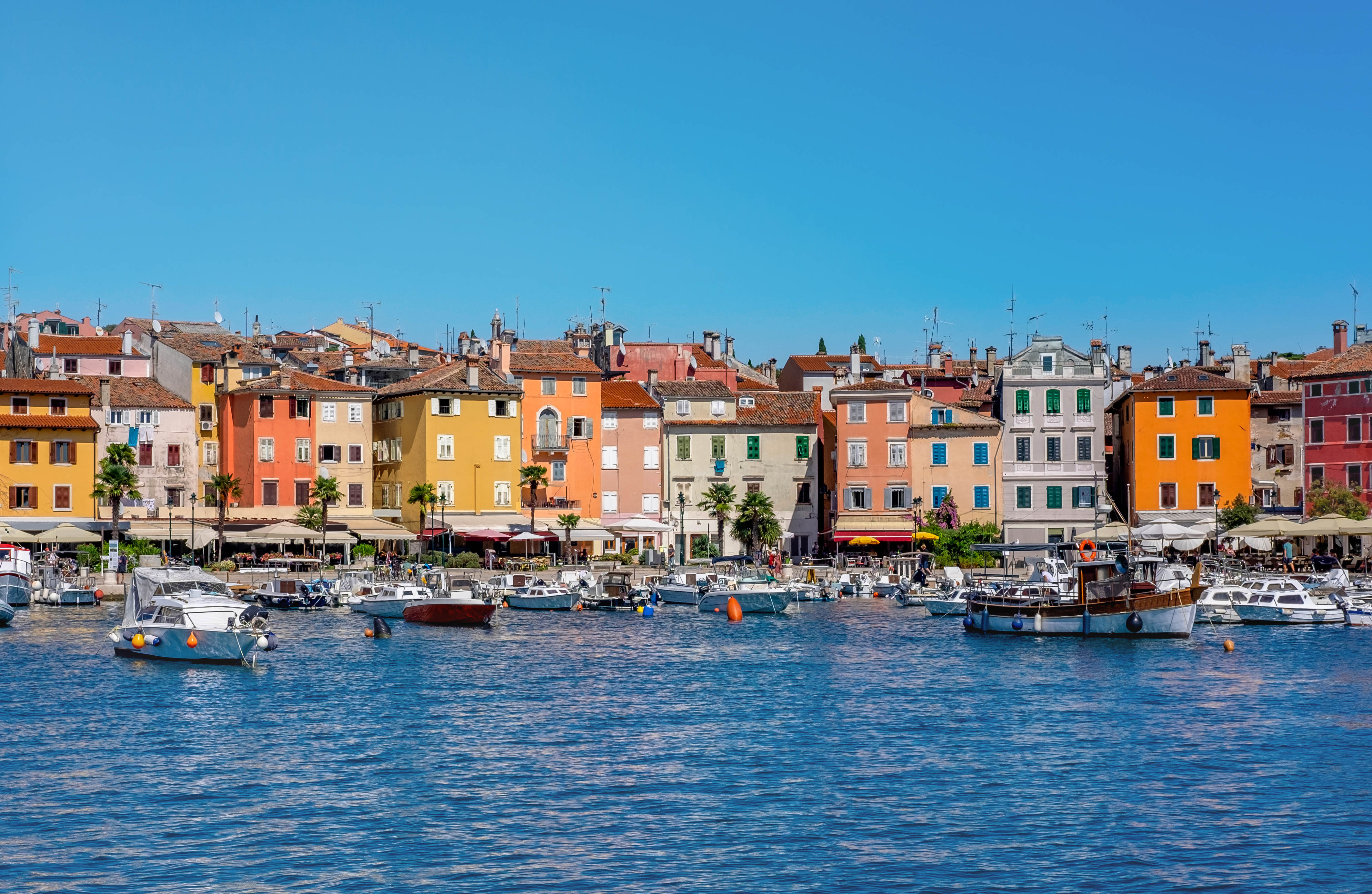
Famìa is an olive oil brand from Rovinj, a picturesque Istrian town, located in the northern part of the Croatian Adriatic. For centuries, Rovinj has thrived thanks to fishing and small-scale agriculture, including olive oil production – a key element of Mediterranean cuisine. Our task was to create a new name and packaging for the “House of Local Products” stores. In the past, every family in Rovinj had its own supply of olive oil, which inspired the name Famìa, derived from the Rovinj dialect word for “family.” The bottle design is inspired by Rovinj’s architecture, particularly its colorful seaside houses. The logo features the letter ì shaped like a chimney, symbolizing the warmth of home and the kitchen. The shapes and colors of the houses, with open or closed windows, reflect the vibrant spirit of the town as well as the diversity of its families. The label turns each bottle into a miniature home, while the colors indicate different oil intensities. By combining bottles of various sizes, a visually appealing display is created, evoking the charm of Rovinj and encouraging customers to collect all flavors, taking home a piece of the Mediterranean. This project has impressed national, European, and international juries, earning recognition at: Communication Arts, European Design Awards, Pentawards and Zagreb Design Week.

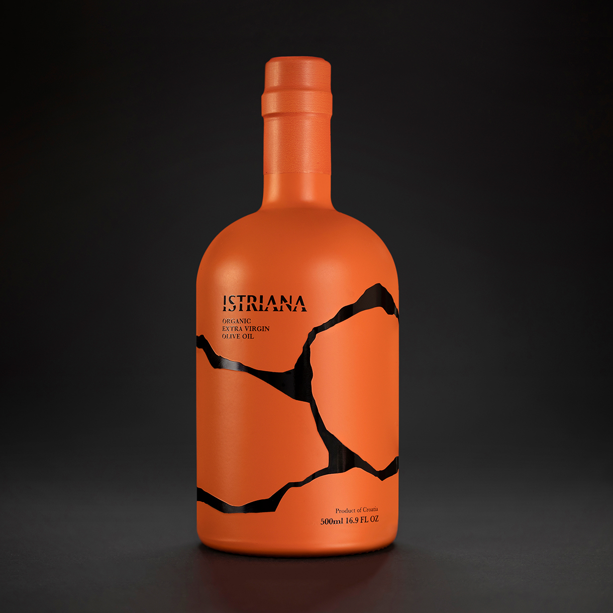
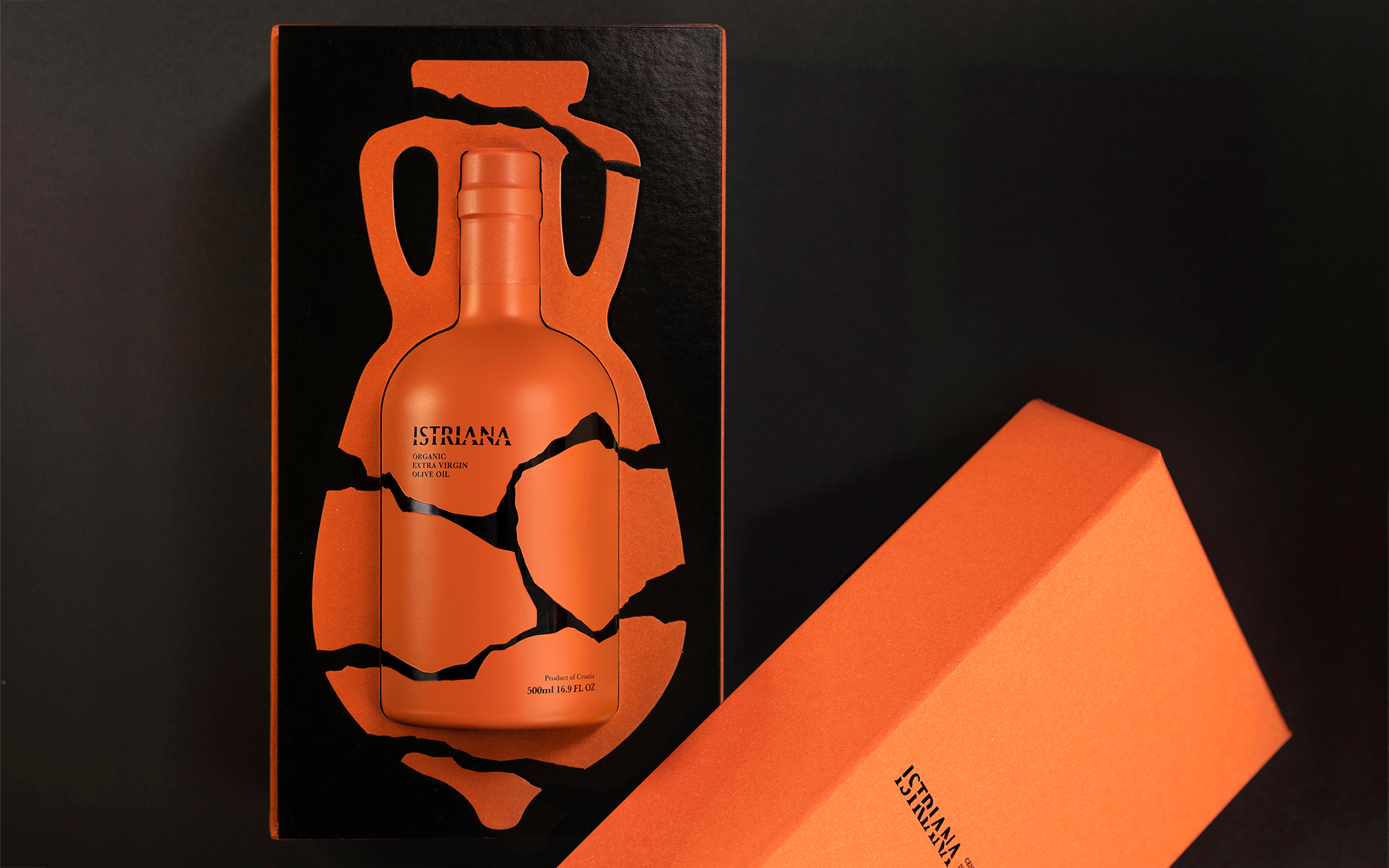
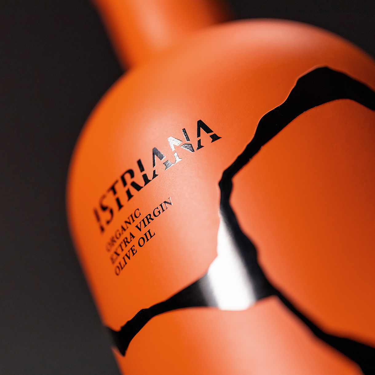
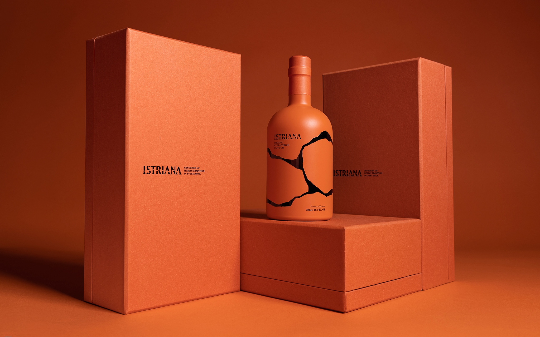
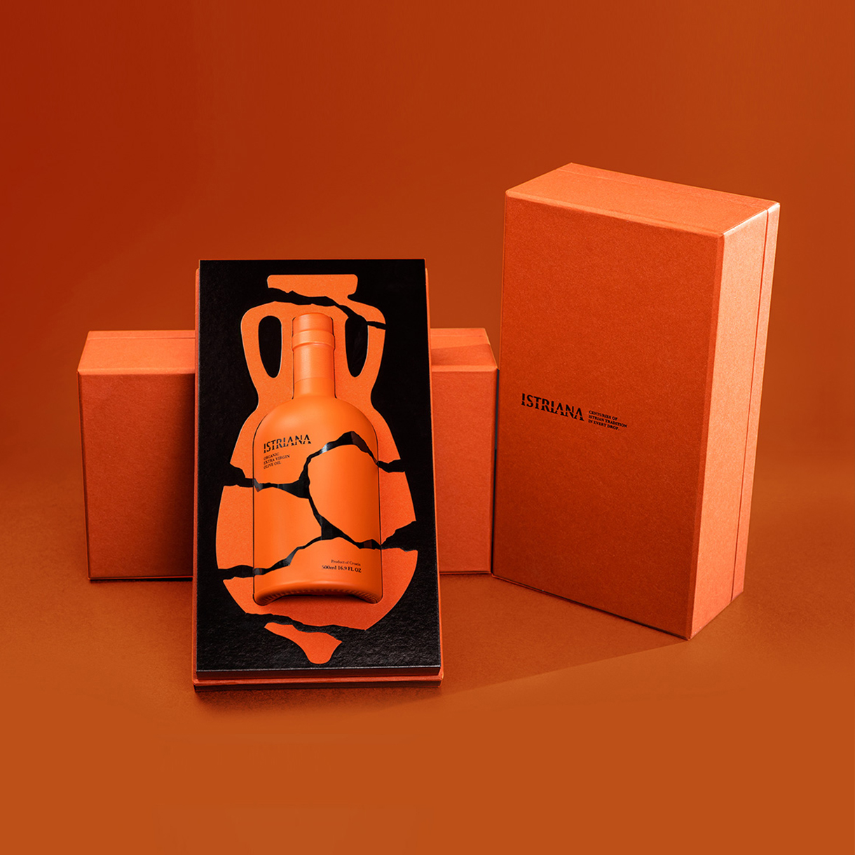
E Pluribus Unum produces brands that revive and nurture the tradition of olive oil production on Istrian soil. They are custodians of 3,000 organically grown olive trees, and their aim is to provide olive oil lovers with an authentic Istrian experience. Extra virgin olive oil “Istriana” is an organic blend made from a selection of Leccino and Pendolino olives. Our task was to find a conceptual solution and design the packaging of this special olive oil. The “Istriana” box emphasizes the connection with the past through the authentic shape of the Roman amphorae used on Istrian soil to store olive oil. Ever since the era of the Roman Empire, the Istrian olive oil has been mentioned as a synonym of quality. With the fall of the Empire, Istria no longer enjoyed the reputation it had during the Roman period. However, in the 90s, it gradually reaffirmed its status as one of the world’s best olive growing regions, by meeting all the requirements for creating top quality olive oil. Just like the excavated and then re-assembled fragments of the red amphorae, the olive growing tradition in Istria was given a new life. The bottle artwork represents meaningfully re-assembled ancient clay pieces, while the orange tone of terracotta on the packaging came from actual Istrian soil. It is worth mentioning that the project has already been recognised within the industry, as demonstrated by major previous awards such as the D&AD Pencil, Dieline, London International Awards, ADC Awards, and Fedrigoni Top Awards.
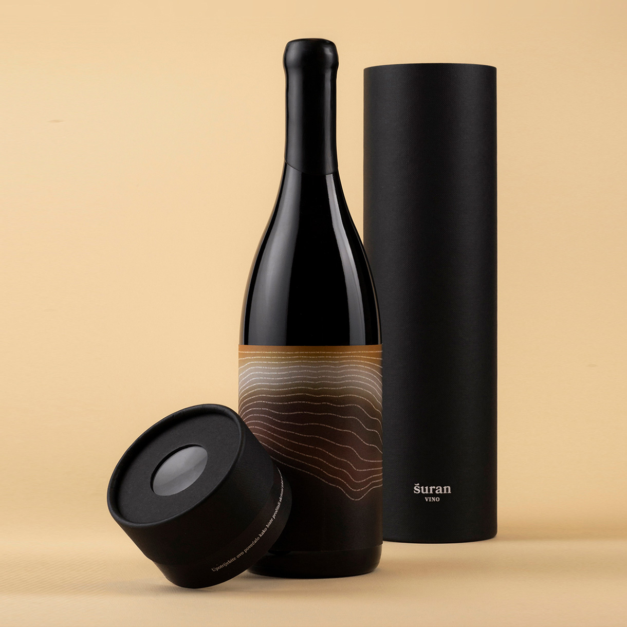
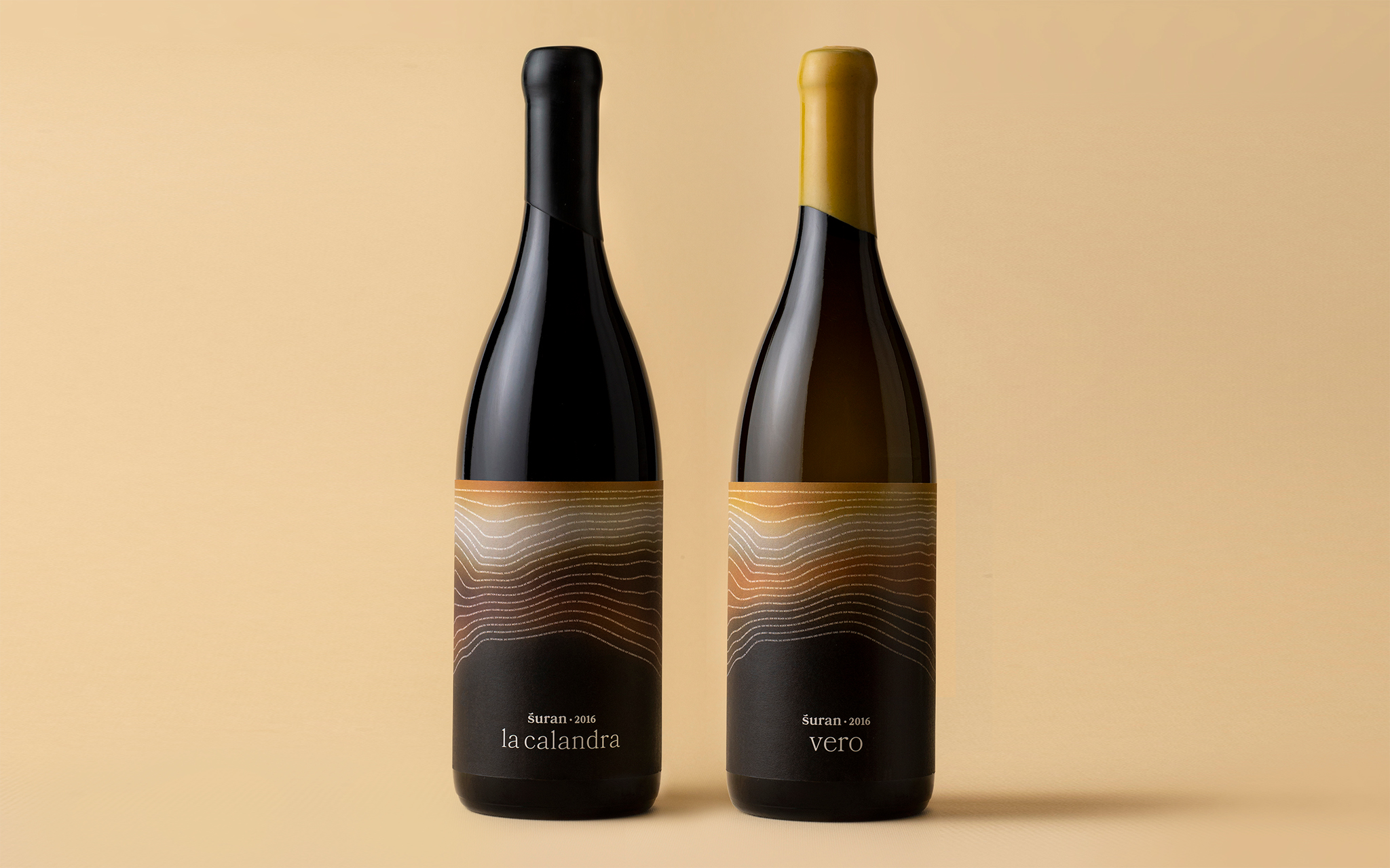
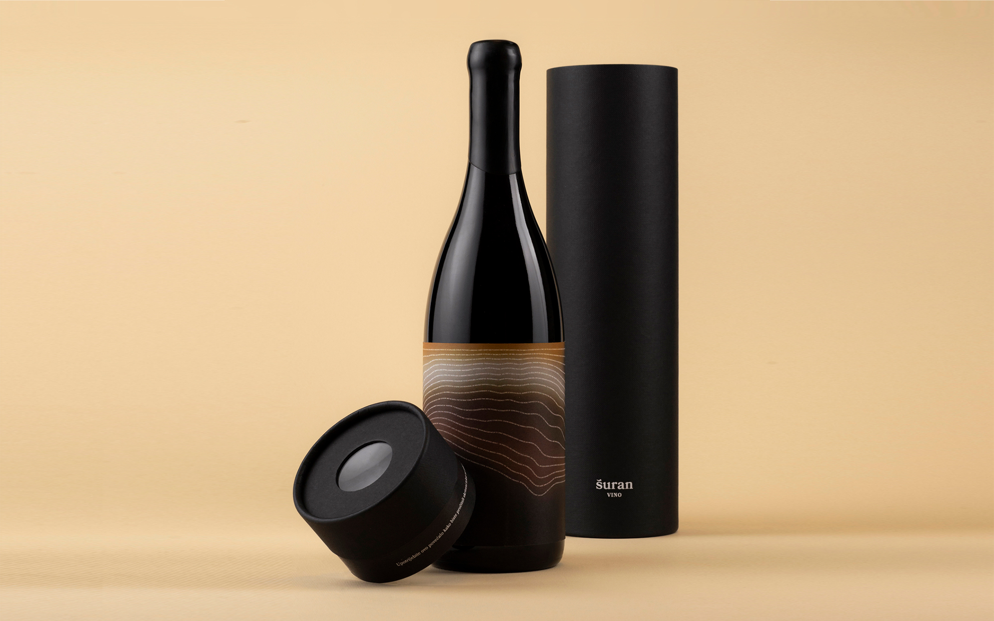
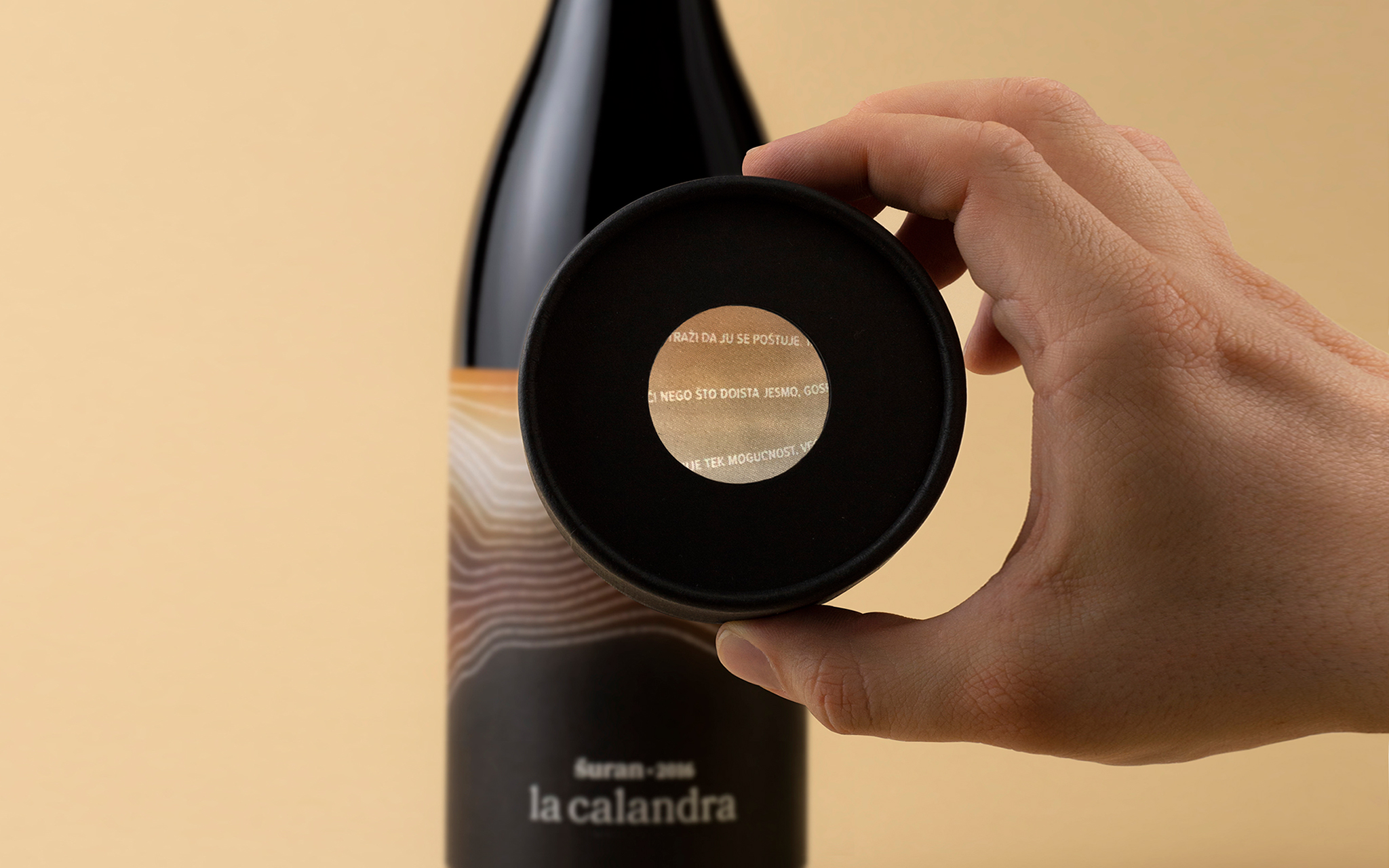
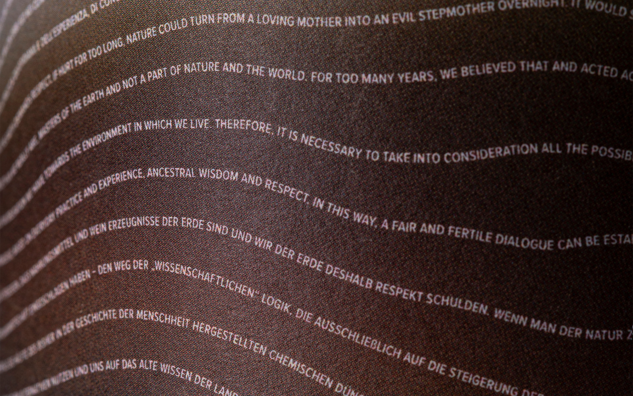
OPG Šuran has been producing and selling ecological wine and olive oil since the ‘90s. Later, they started bulk production and switched to biodynamic cultivation. Such an ecological approach entails creating a balanced ecosystem for self-sustainability. Consequently, biodynamic wines are produced from grapes not treated with chemicals, herbicides, or pesticides. Our task was to design a premium organic wine adapted to this specific production approach. The idea behind our label is based on a key characteristic of biodynamic agriculture – enriching the soil with natural preparations that increase its microbiological activity. For this reason, we represented this activity on the label with a cross-section of the soil. Microorganisms are illustrated with letters forming a text by Italian scientist and activist Carlo Petrini. In the quote, Petrini calls for environmental awareness and criticizes mass food production. To illustrate the invisible process, we reduced the text to a minimum, making it invisible to the naked eye. To highlight its significance, we included a magnifying glass in the specially designed packaging lid. This turns the lid into a simple tool inviting the consumer to interact, becoming a curious explorer discovering hidden truths and values of biodynamic farming. In addition to the Pentawards, the design has already been awarded at the European Design Awards, Red Dot, ADC Award, Dieline, and the IdejaX.
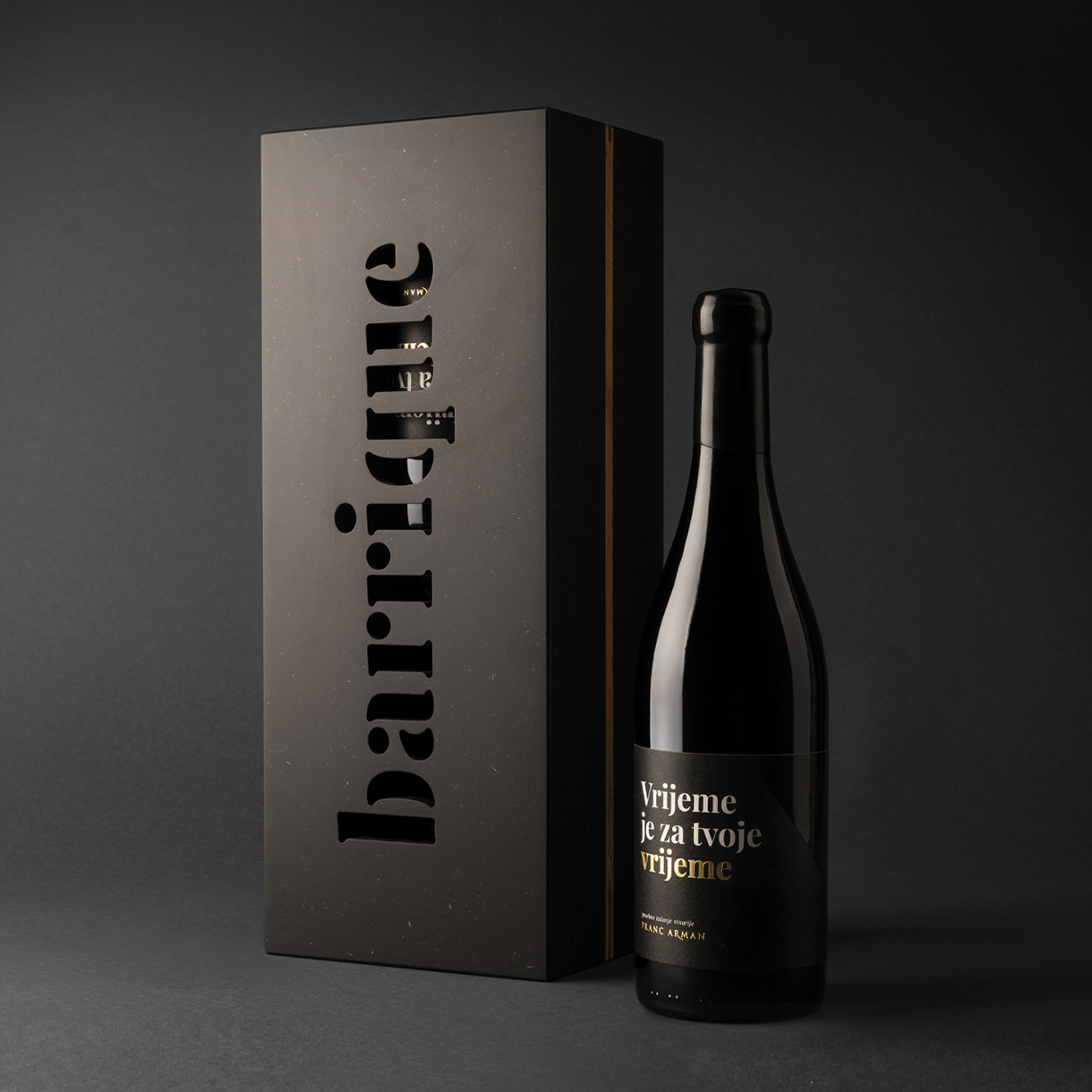
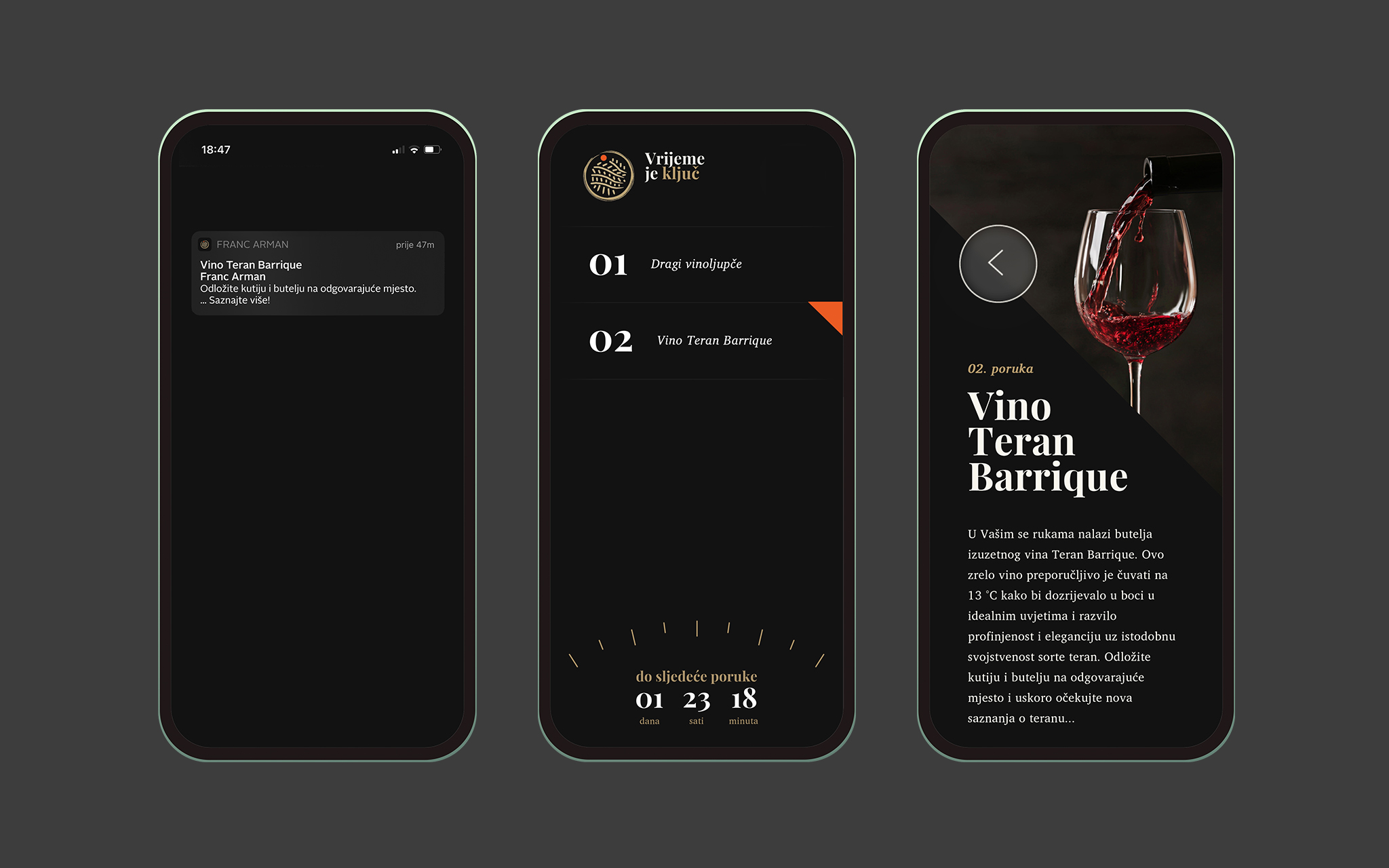
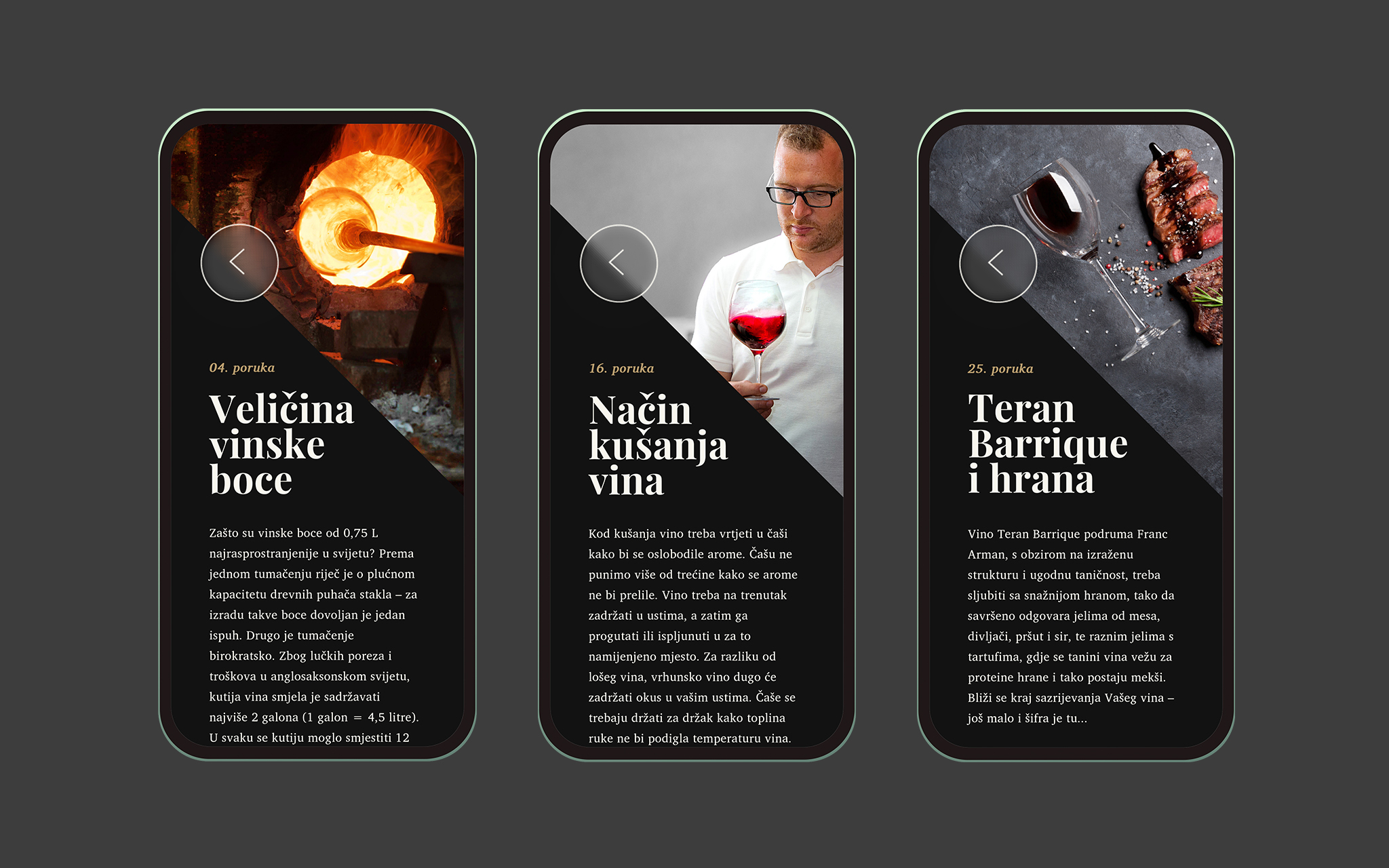
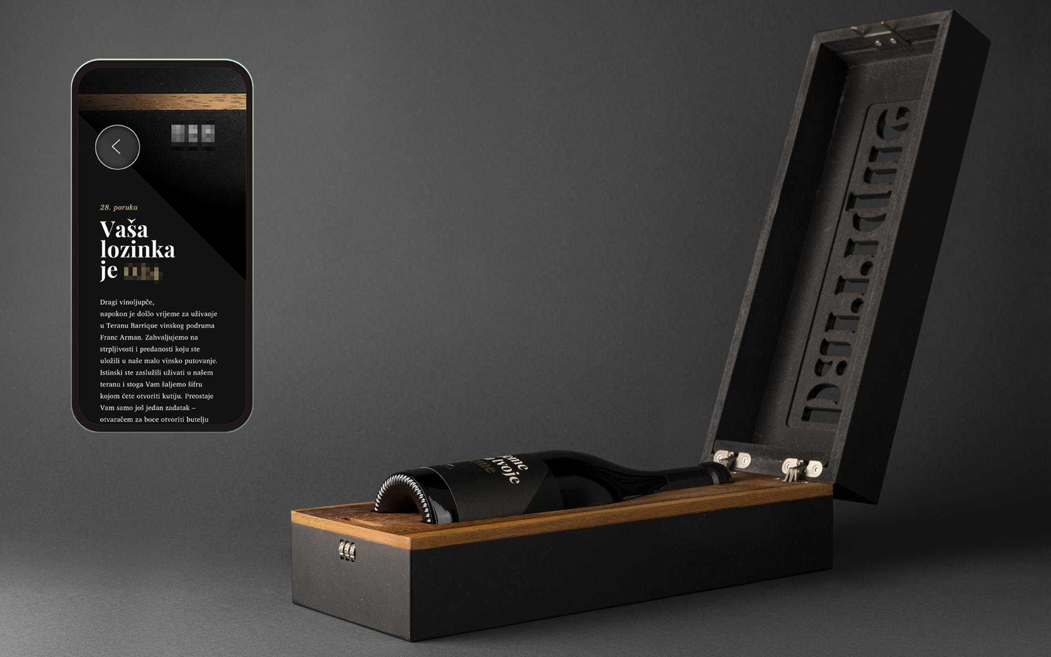
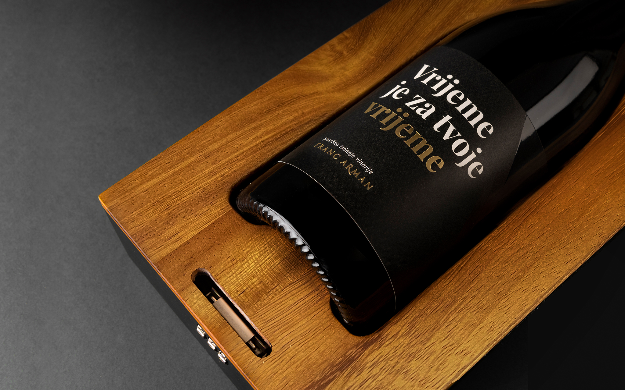
The history of the Franc Arman Winery dates back to 1850, when the Arman family ancestors began growing vines in the village of Narduči near Vižinada. Respecting centuries-old knowledge, winemakers Franc and Oliver continued to nurture this tradition with passion. Today, the winery produces top-quality wines, such as Teran Barrique, a limited-edition red made from hand-picked grapes. Our task was to find a conceptual solution and design the packaging for this special wine. Red wines like Teran age better with time. However, due to impatience or inexperience, many open their bottles too early. This special edition, defined by its traditional aging, requires patience. That’s why we locked the Teran Barrique bottle in a box, making it inaccessible. Only a cut-out inscription offers a glimpse of its contents. The wine ages while the owner learns. An app accessed via QR code sends weekly notifications about oenology and winemaking. When the time comes, the app provides a code to open the box. Upon opening, the wine enthusiast sees the words “It’s time for your time.” The initiative generated significant media attention, increasing brand awareness and driving sales up 31% over the year. “It’s Time for Your Time” has won the prestigious Cannes Lion, and awards at Cresta, Golden Drum, and BalCannes.
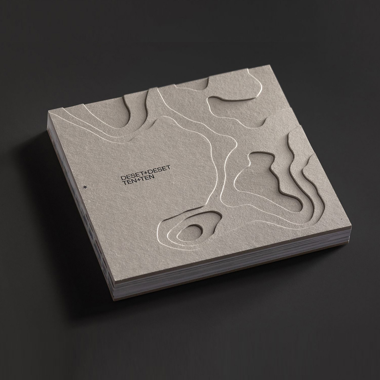
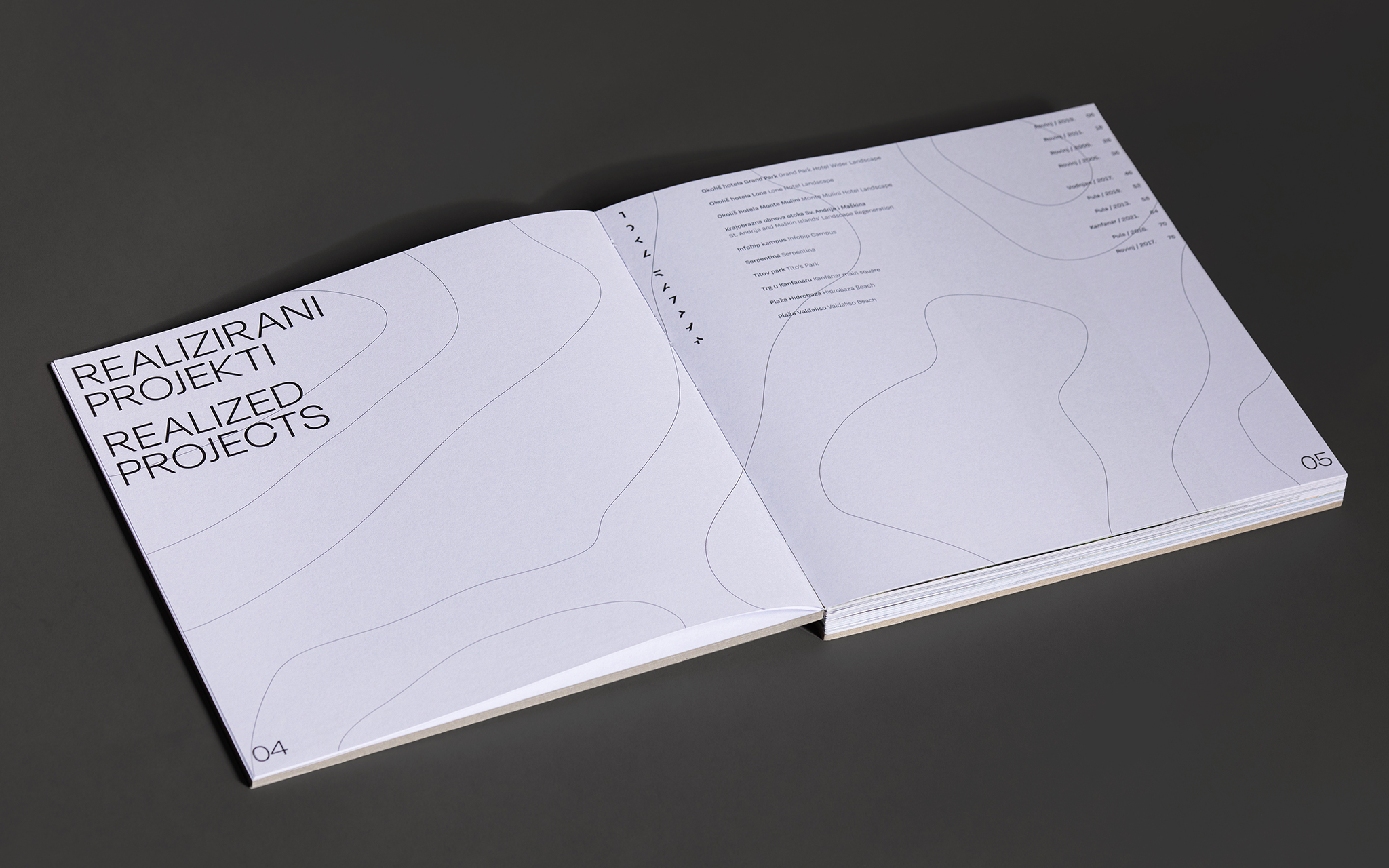
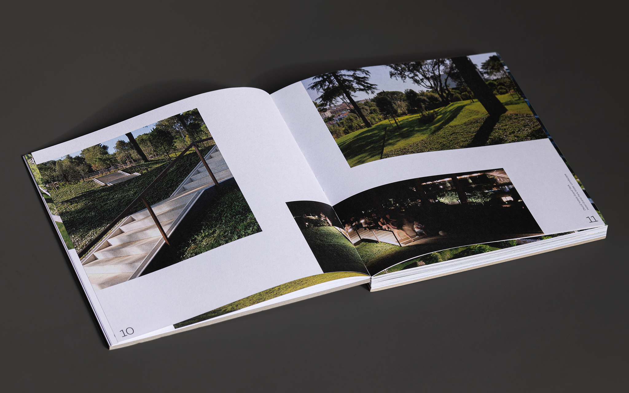
For 20 years, Rovinj's Studio Kappo has been offering innovative and creative solutions in the fields of landscape architecture, spatial and urban planning and environmental protection. In celebration of its 20th anniversary, we created a catalog presenting their 10 most significant realized, as well as 10 planned projects which reflect concern for the landscape, the environment, the needs of the local population, and respect for the local values. Our task was to visually design the catalog. Since the Studio deals exclusively with landscape architecture, we have chosen a cover that represents a relief of the region the Studio is from. According to the name of the anniversary, “10 plus 10”, the catalog itself has two covers. Once the reader reaches the middle, they are invited to turn the catalog over to start with a new category. On one side there are realized projects presented with a topographical three dimensional representation, and on the other side, there are planned projects presented only with a topographical plan. The numbering of the projects is so enlarged that it resembles paths or tracks, as in urban projects. The catalog, once read and put away, takes over the role of the topographic representation itself. The catalog impressed the jury of the European Design Awards.
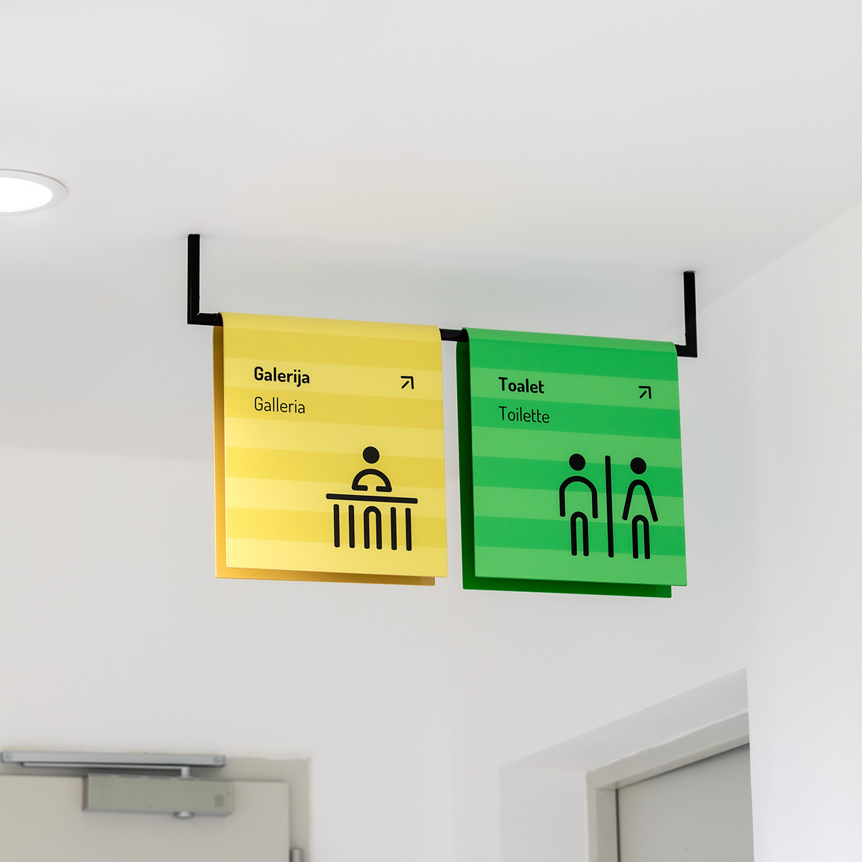
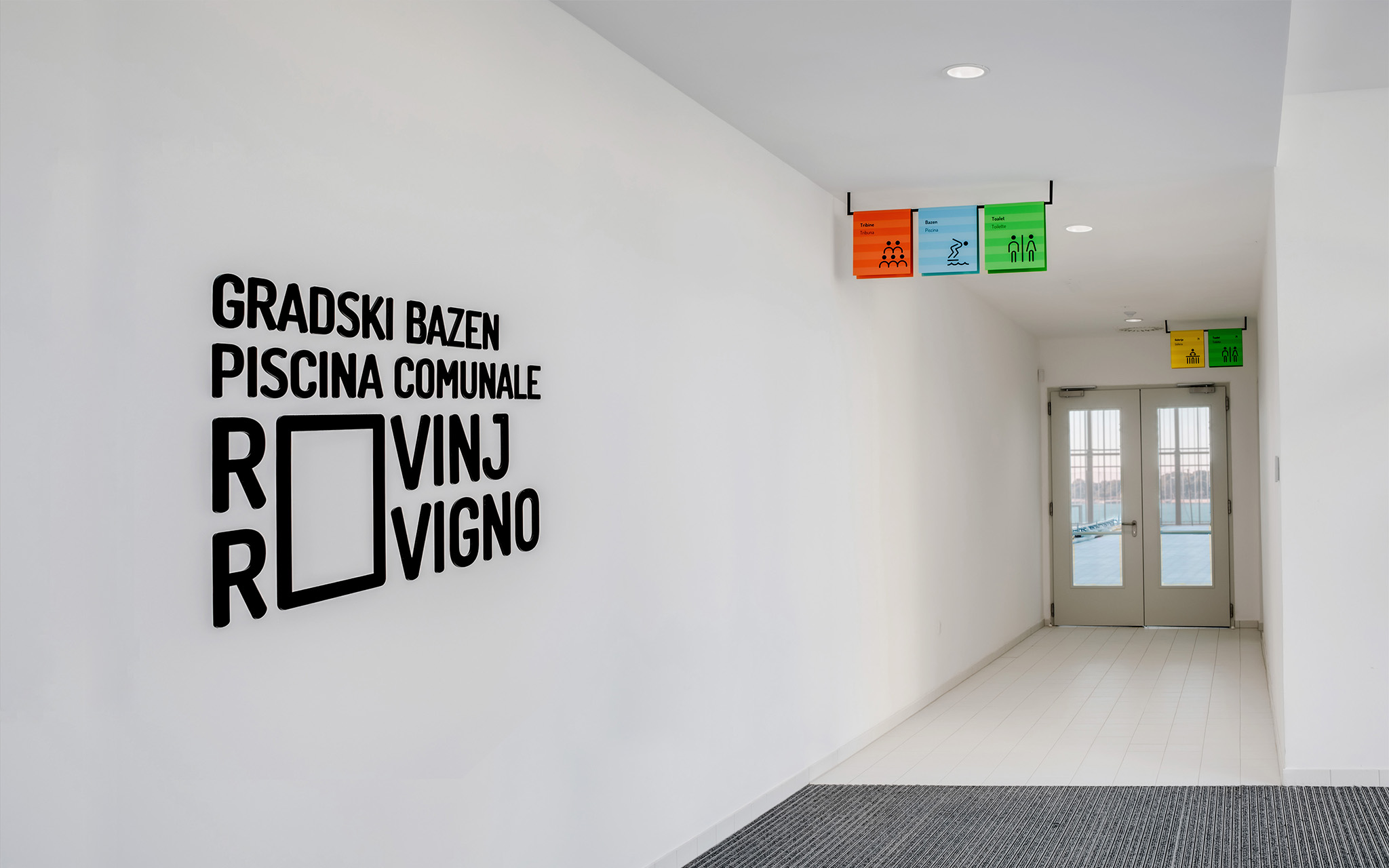
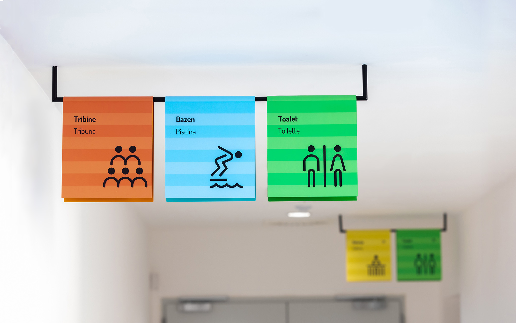
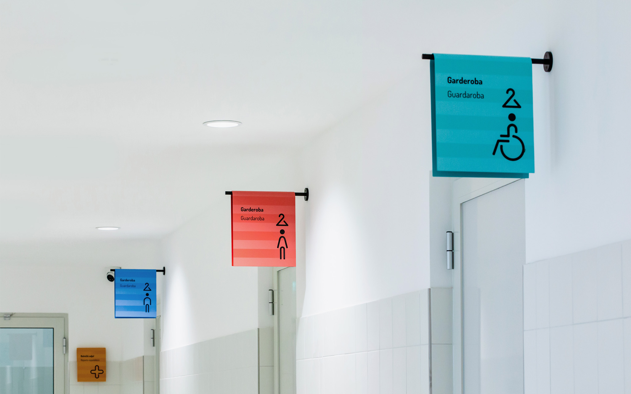
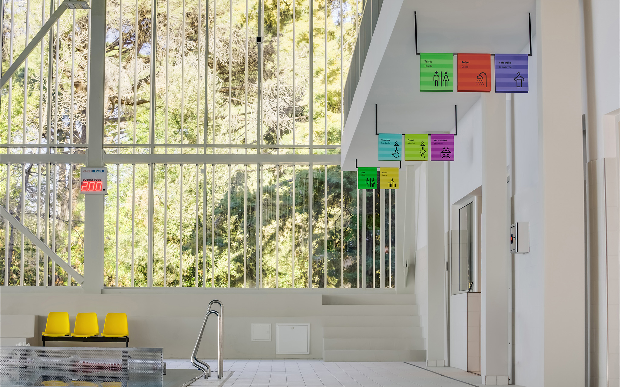
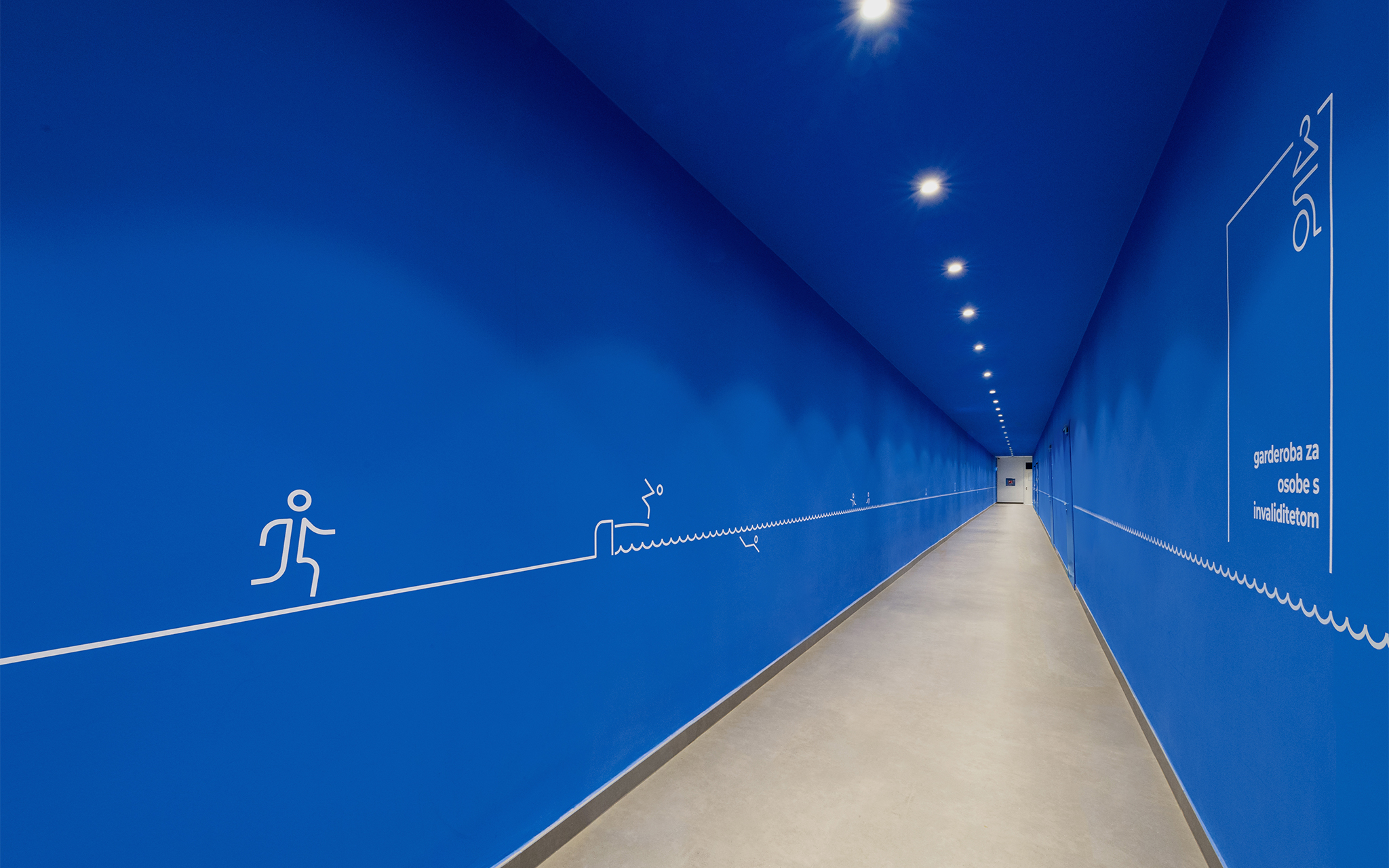
The Rovinj’s swimming pool complex is located right next to the sea, within the “Prim. Dr. Martin Horvat” Orthopaedic and Rehabilitation Hospital. It extends over 3,637 square meters and consists of a sports and spa area, making it the largest investment in sports infrastructure in the history of Rovinj. Our task was to design the visual identity and signaling of the newly opened swimming pool in this Istrian town known for its unique skyline. One of the characteristics of the pool is its large glass wall overlooking the sea, which is only a few meters away. In a certain way, this visually combines the experience of going to the sea or the pool. A towel is an important item, both on the beach and at the pool, so we used it as a leitmotif. Through stylization, it is present on all parts of the signaling by hanging from the ceiling, sideways, or from the tiles. Each icon has its own color, which brings variety and liveliness to the previously neutral space. This towel is classic, with horizontal lines, serving as a base for placing graphic elements. Our signaling celebrates its city by reminding of its iconic “tiramols” (place where laundry is dried - stretched between buildings). This work has been recognized by the International Institute for Information Design, the European Design Awards, and Zagreb Design Week.
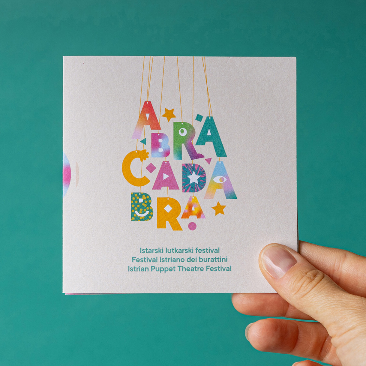
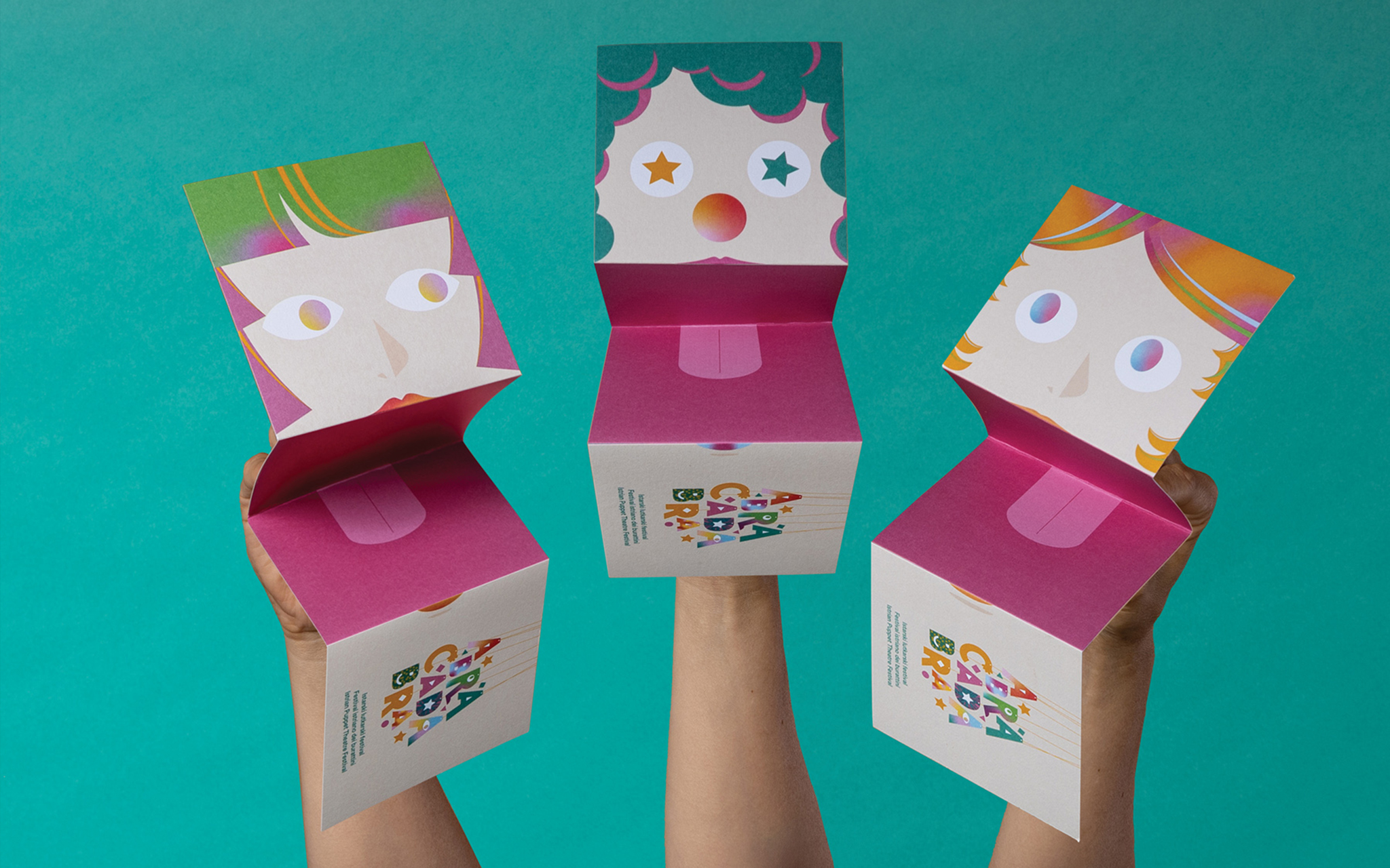
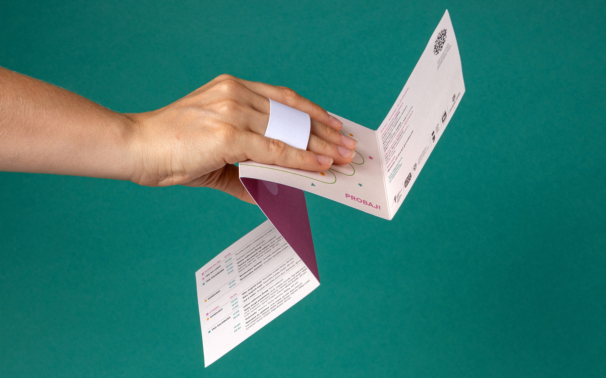
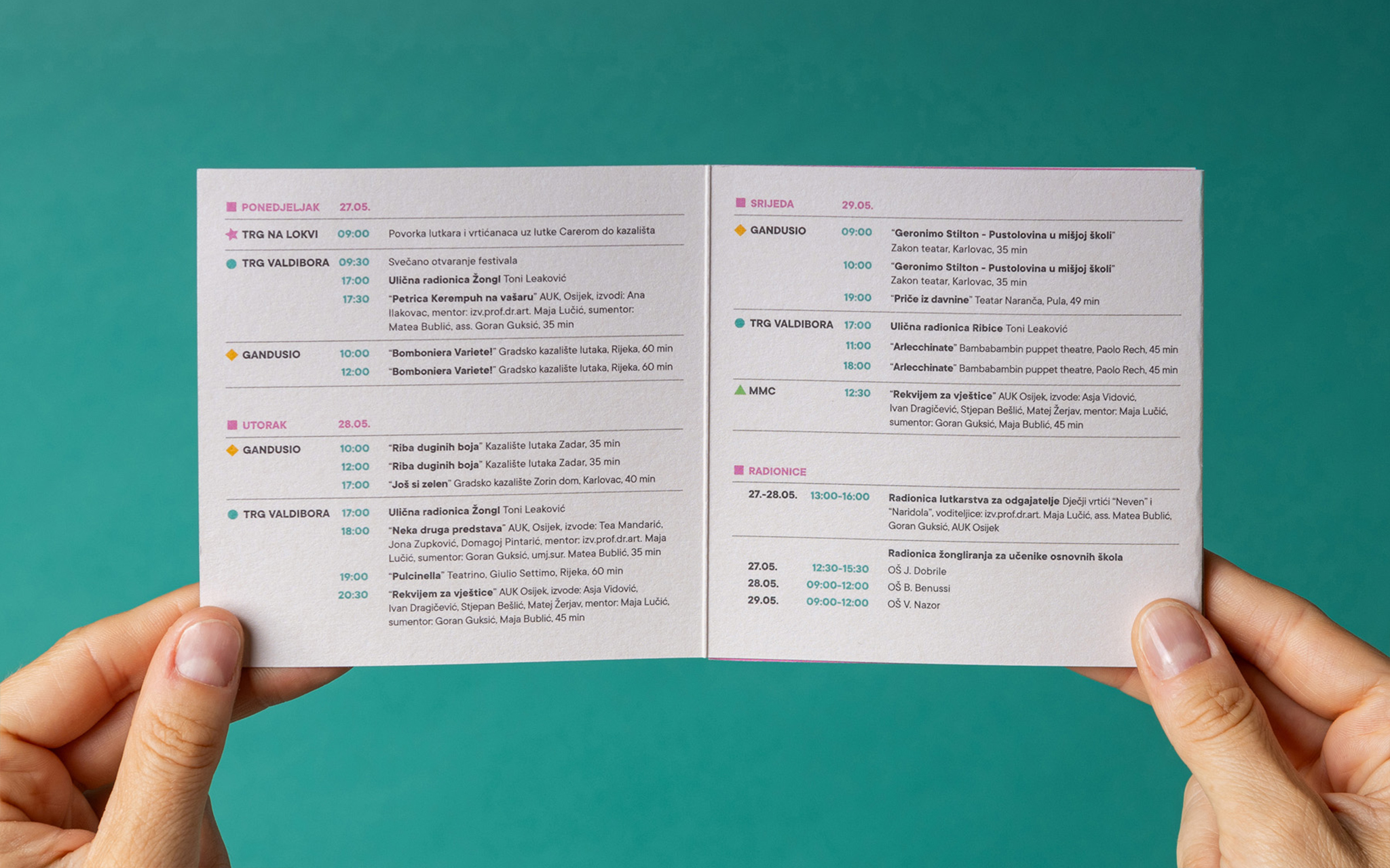
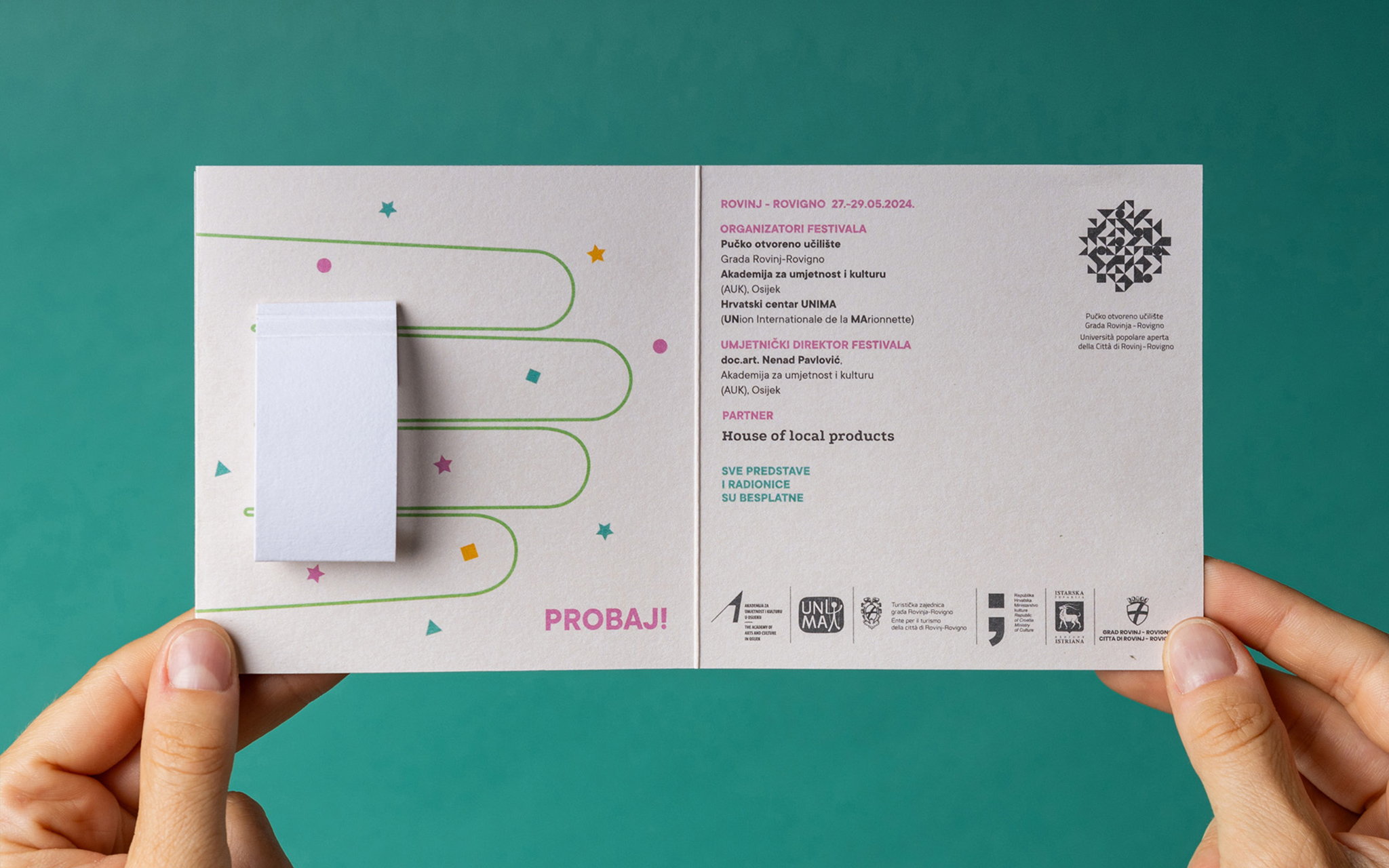
Abracadabra is a puppet festival dedicated to bringing the magic of puppet theater and the art of puppetry closer to audiences of all ages. The festival strives to engage the local community, especially schools and kindergartens, by introducing them to cultural content through puppetry as a unique theatrical form. Our task was to create attractive promotional material, focusing primarily on flyers. We wanted this seemingly simple promotional tool to stand out by being interactive and engaging on its own. To achieve this, we transformed the festival program flyer into a "talking puppet," allowing both children and adults to play and create their own puppet shows with minimal effort. Each flyer includes the festival program in one of three languages, Croatian, Italian, and English, with a unique character representing each language. Staying true to the festival’s magical essence, the word "Abracadabra", often associated with stage magic, perfectly captures the transformation of an ordinary flyer into an interactive puppet, combining simplicity with creativity. The project was a finalist at Zagreb Design Week and the European Design Awards.
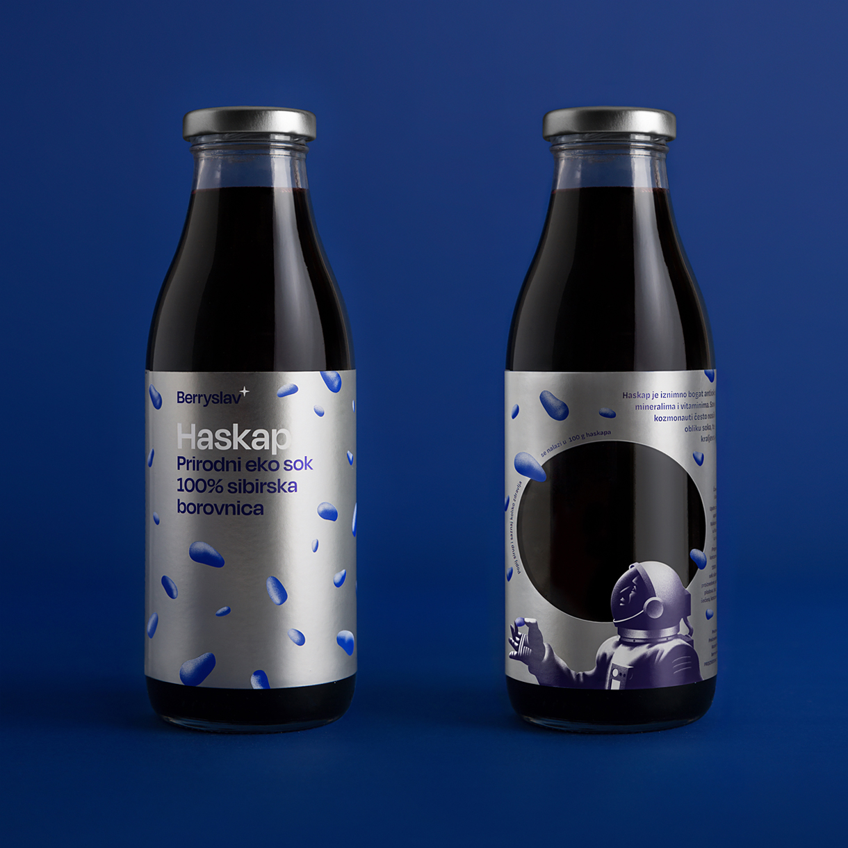
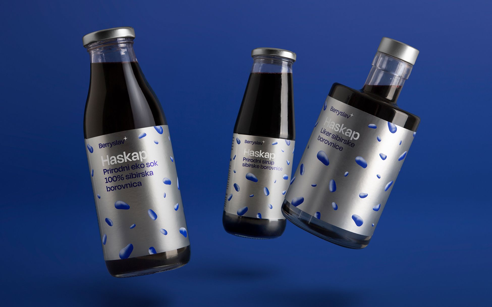
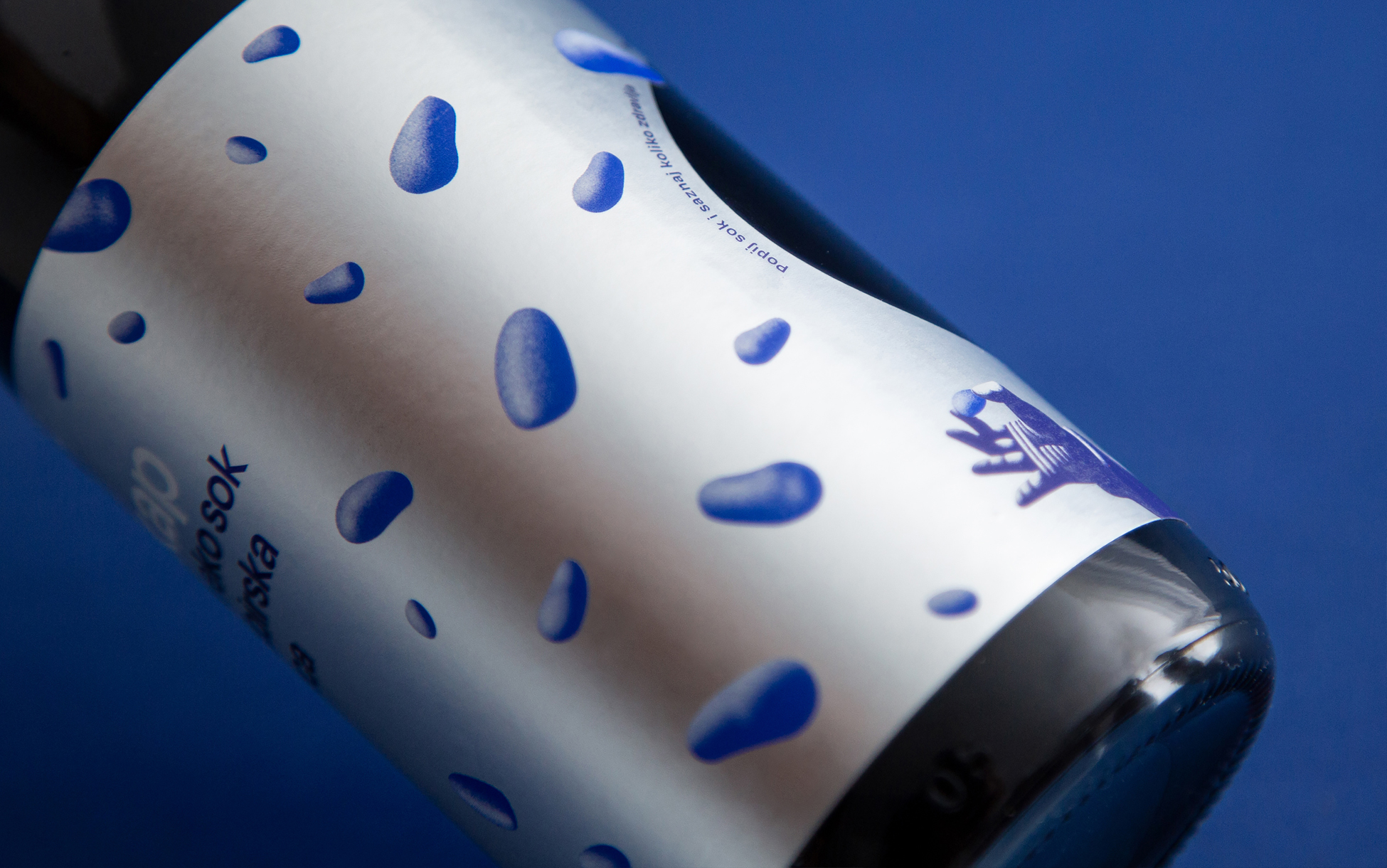
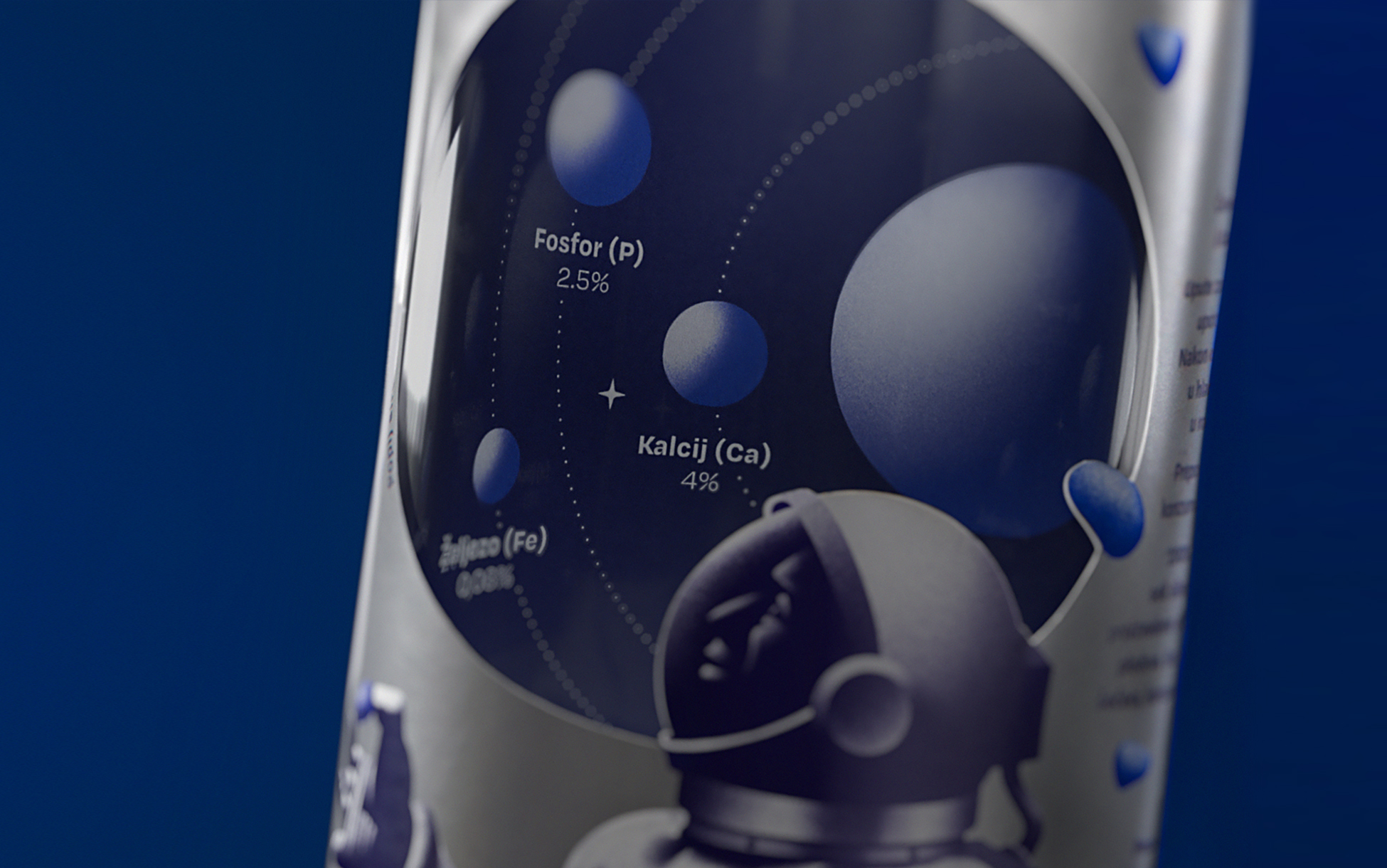
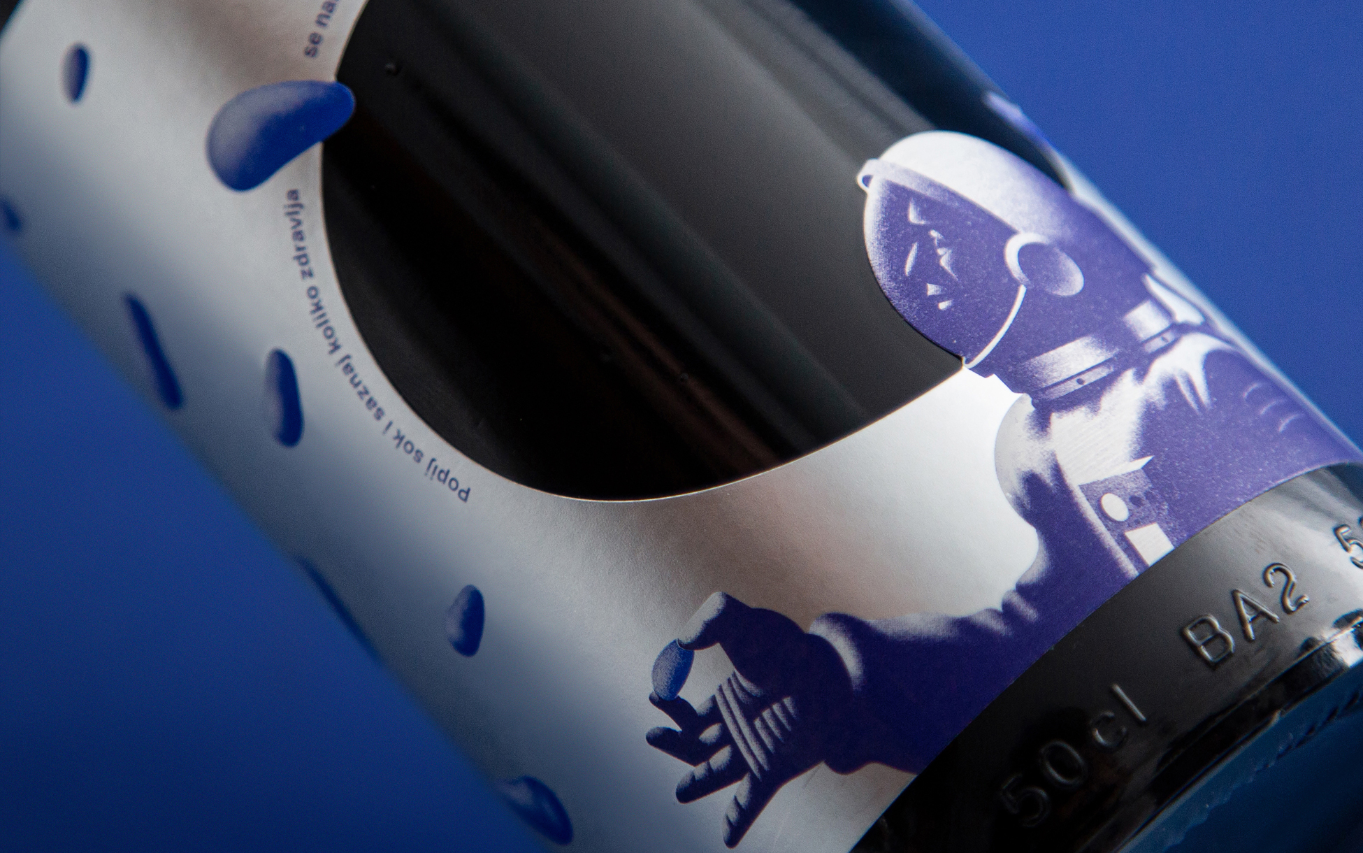
Haskap or honeyberry is a fruit incredibly rich in antioxidants, minerals, and vitamins. It contains up to 10 times more Vitamin C than blueberries, and its total antioxidant capacity is 30% higher than that of Aronia. Originally from Siberia, this superfood can withstand temperatures as low as -47 °C in the winter. Due to its special properties, Soviet astronauts carried haskap juice into space where it was soon pronounced a royal beverage. It was this fact that inspired us to showcase the astounding quality of the product through its use in an exquisite environment such as space. A pattern of stylized honeyberries decorates the entire area of the metallic label, which is visually reminiscent of space food packaging. Only when the bottle is turned around do we see the entirety of the idea - the pattern actually represents the fruit floating in a zero-gravity space capsule, along with an astronaut looking out into the darkness of space through a window on the label. Once the bottle is emptied, the inside of the label reveals planets of various sizes that visualize the percentage of minerals present in 100 grams of haskap. Through a combination of all these elements, the bottle is transformed into a three-dimensional representation of the product. The project has been awarded by the Croatian Designers Association, and was a finalist at Golden Drum, Fedrigoni Top Awards and IdejaX. Also, it has been included in the Packaging of the World archive.
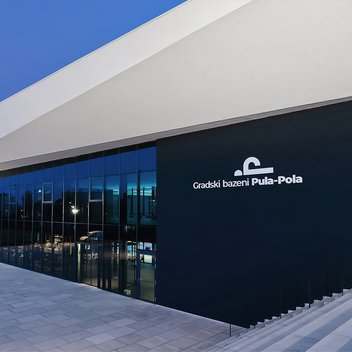
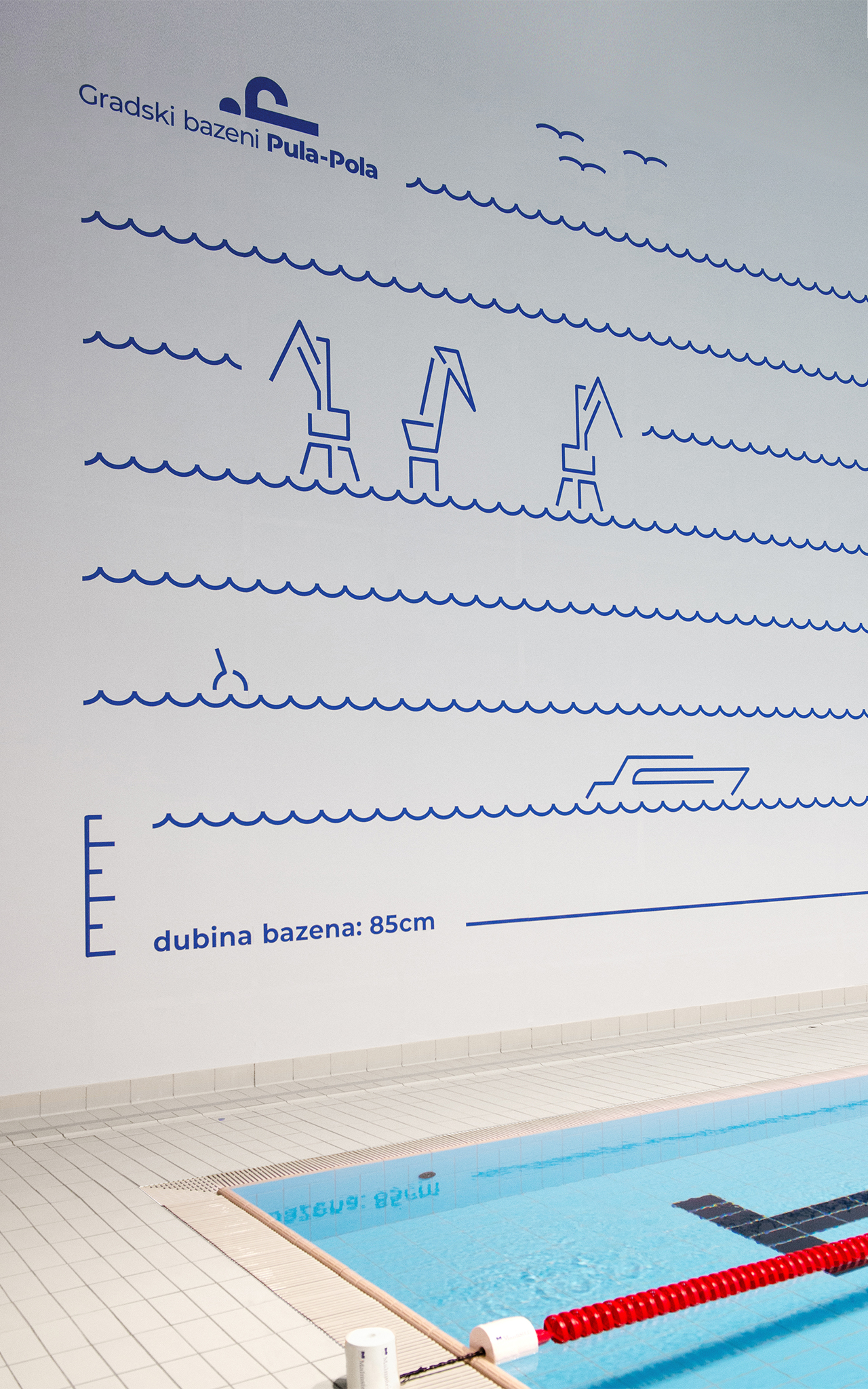
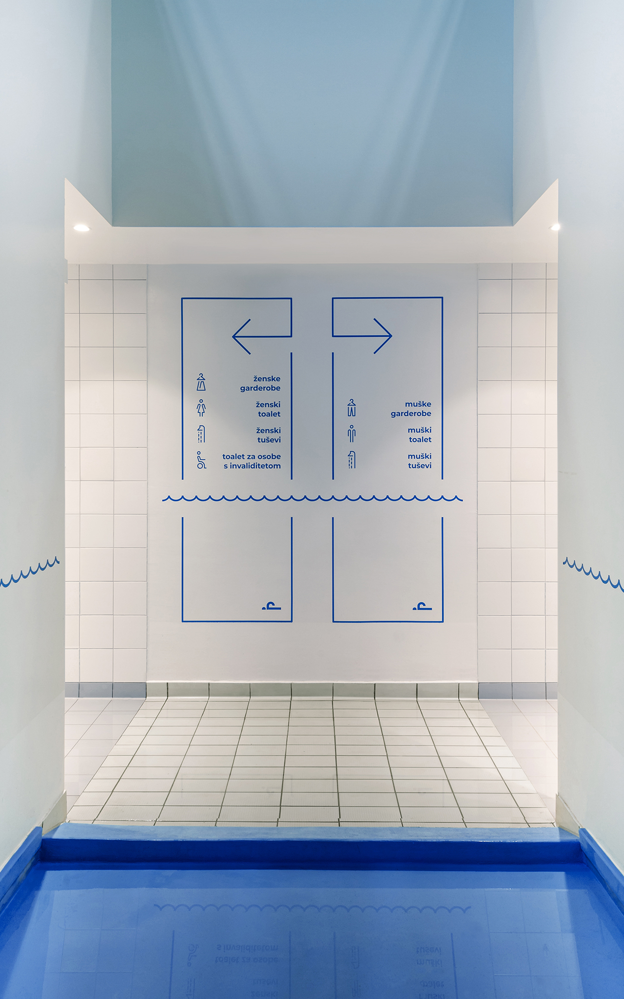
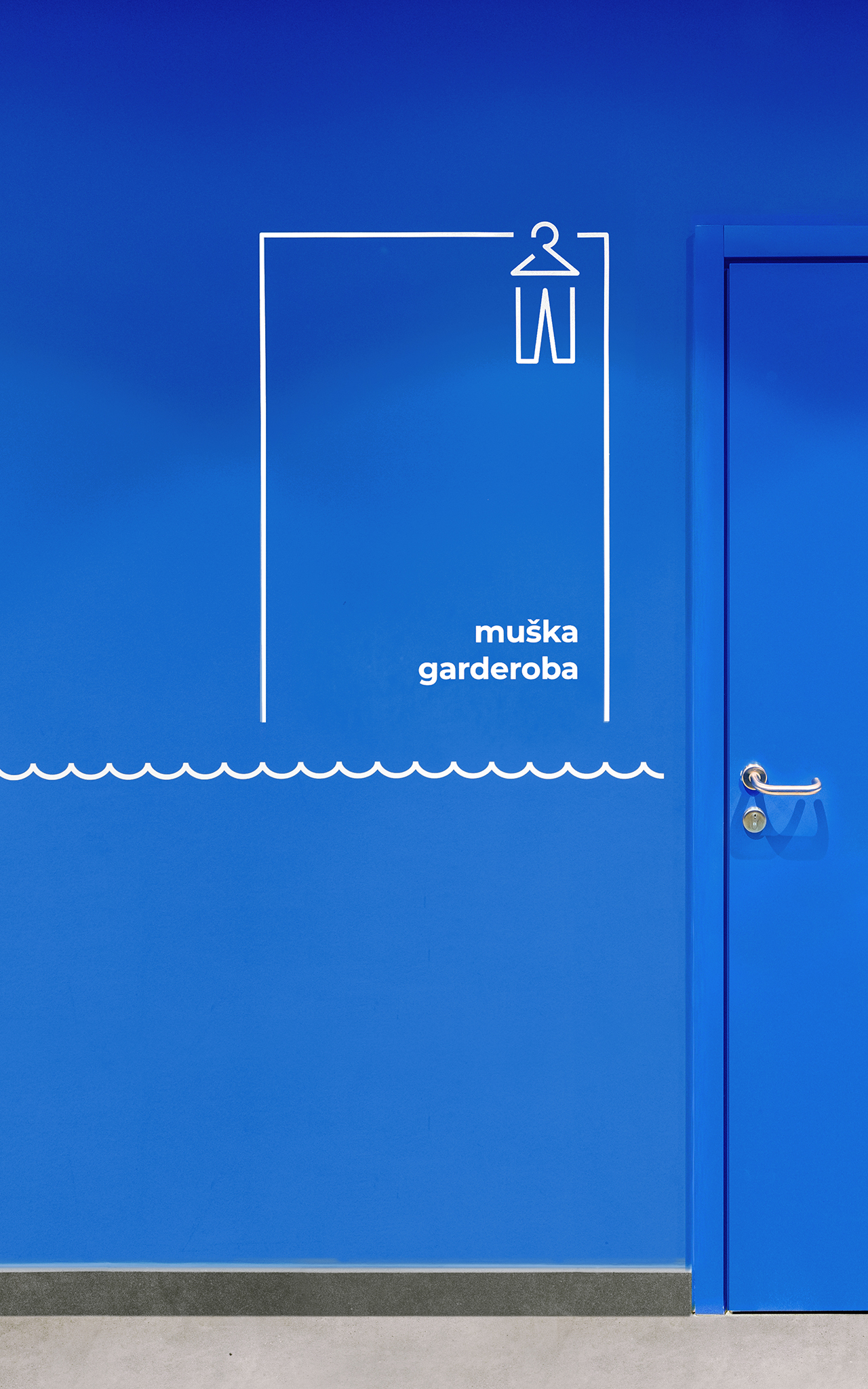
Pula City Pools are much-anticipated public swimming pools opened in 2018 for swimming and water-polo clubs, as well as the citizens of Pula. The 5,900 m² complex consists of a swimming pool for water-polo and swimming, multifunctional and children’s pools, fitness halls, a café, and a sports shop soon to open. Our task was to conceptualize and design the visual identity of the pool, as well as the indoor and outdoor signage. The identity concept is based on conversations with professional and recreational swimmers, which inspired the idea of a line. It became our guiding principle, like the line on the pool bottom guiding swimmers to the finish. Upon entering, visitors are guided by signage to the main hall connecting the lobby with other facilities. Along the hall, a stylized water-shaped line serves as the basis for animated illustrations derived from standard facility icons. Additionally, water depth information is integrated into a large illustration of Pula’s most prominent sites. As visitors pass through, they witness the evolution of signage – from purely functional to enlivening the space. The project was declared Best of Show by the European Design Awards, and has also won the IIID Award, Design Intelligence Award, and has been awarded by the Croatian Designers Association.
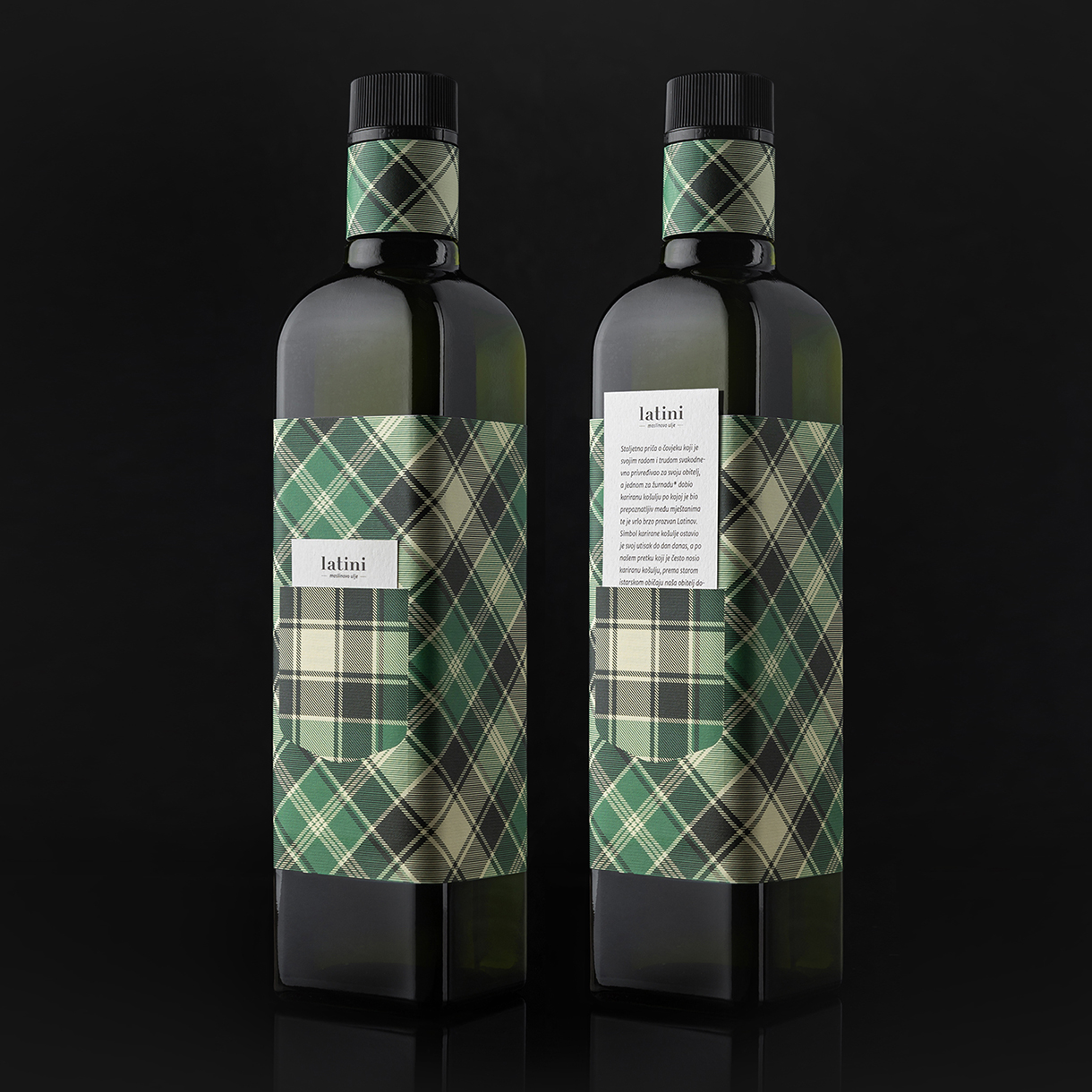
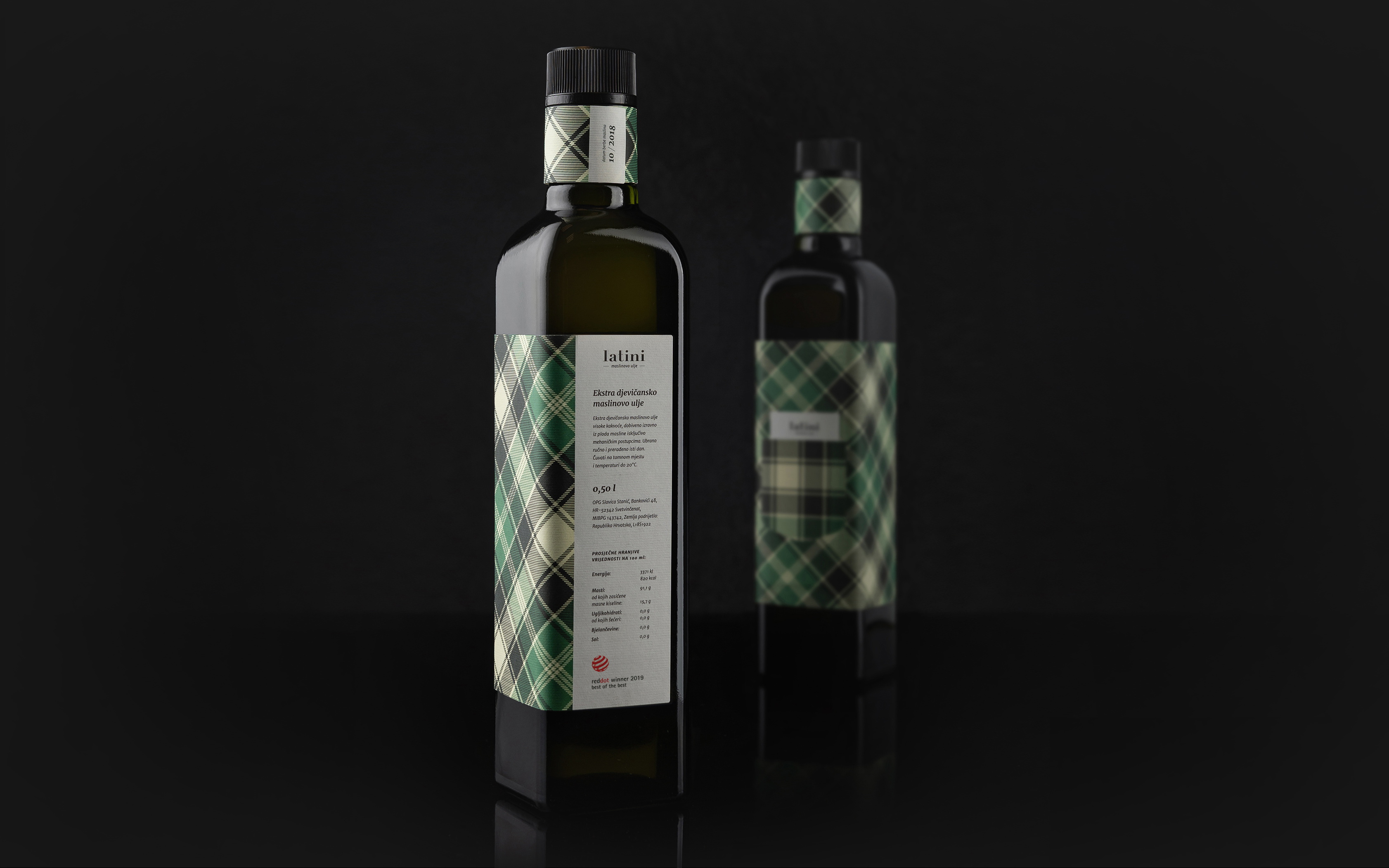
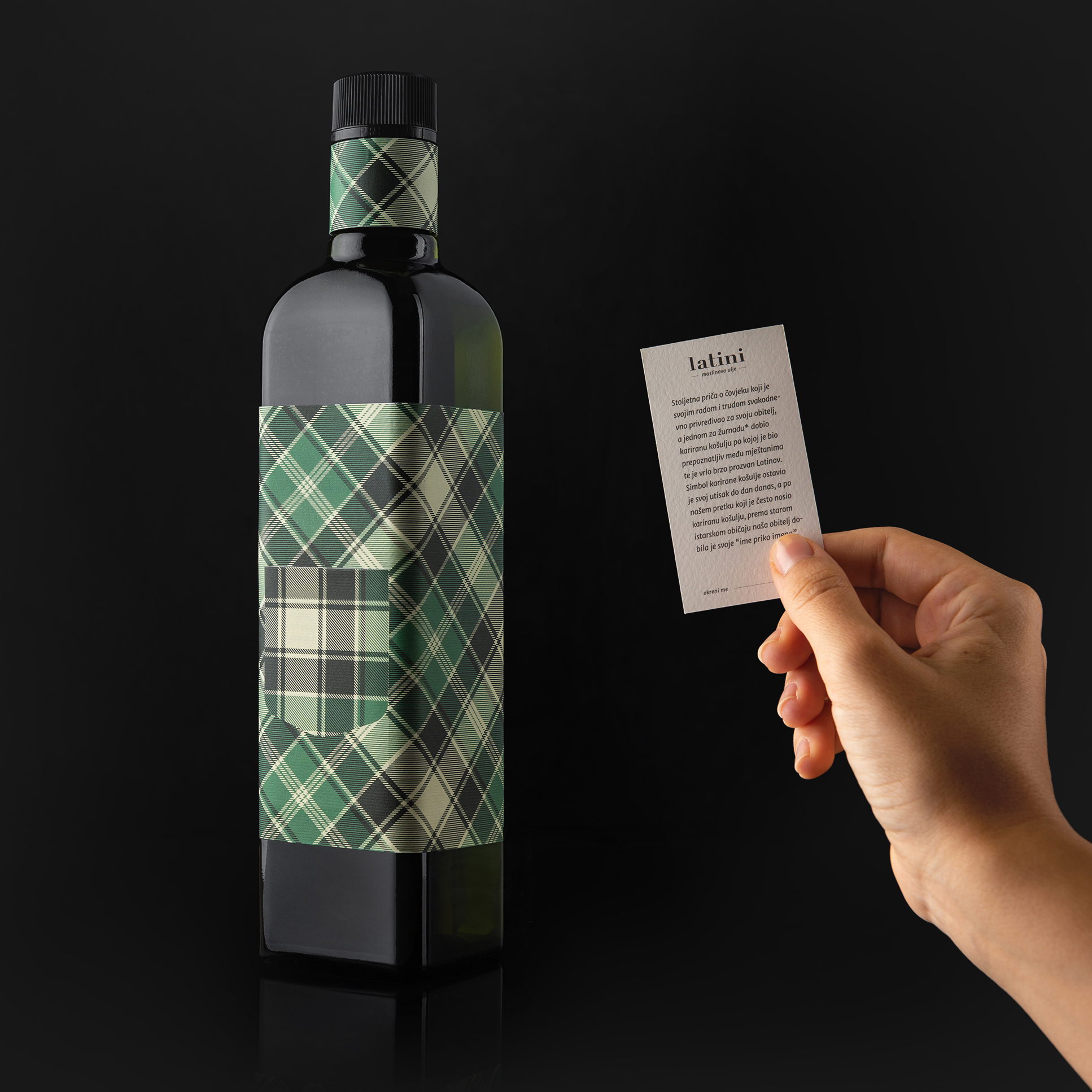
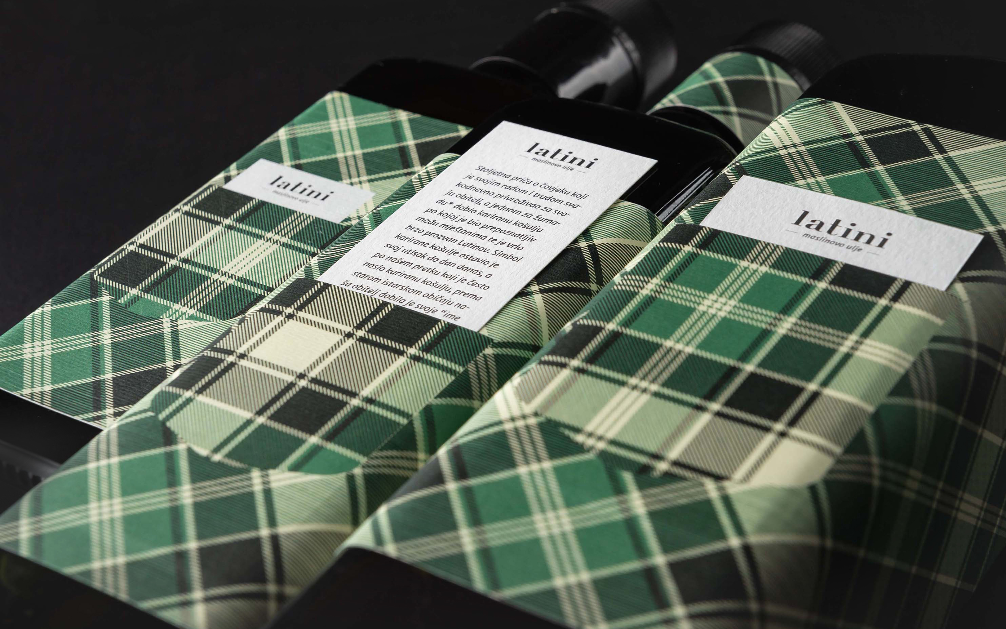
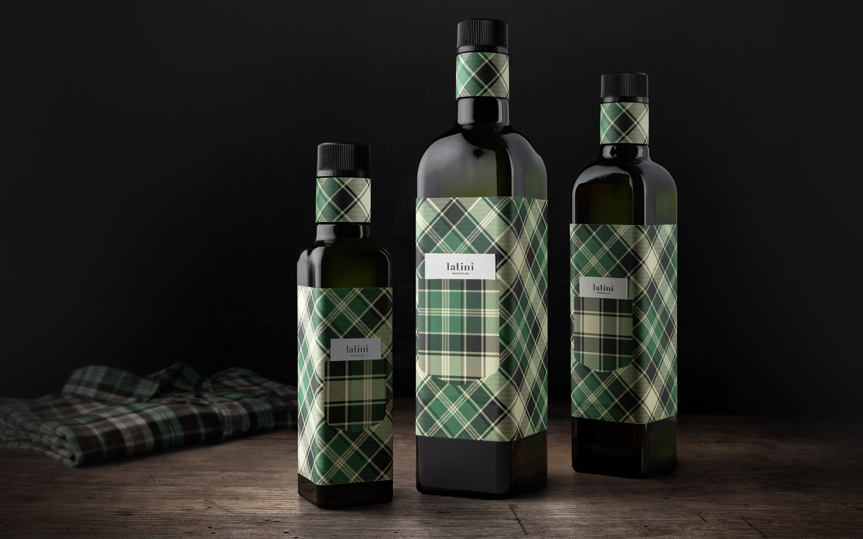
“Latini” are a local family farm in central Istria. They produce various agricultural products – from olive oil and vinegar to fruit-based products like marmalade and juice. Our task was to conceptualize and design the visual concept of this brand, as well as the bottle packaging for olive oil, the client’s most important product. To give “Latini” oil its historical context, we decided to use design to tell the century-old story of the farm, which started in 1880 when uncle Tone earned a living in the olive orchards of Istrian Italians, called Latins. One day he received a checked shirt, unusual for that time, as his daily wage, which is why locals started calling his family Latini. 140 years later, his successors, also olive orchard owners, named their indigenous olive oil Latini to honor their ancestor and the family nickname. That’s why we dressed the olive oil bottle in a green checked shirt, turning it into a portrait of the distant ancestor. The product’s originality is emphasized by a label tucked into the shirt pocket, containing the family story. The project won the prestigious Red Dot: Best of the Best, the European Design Awards, the 55th Zagreb Salon Award, and the Croatian IdejaX.
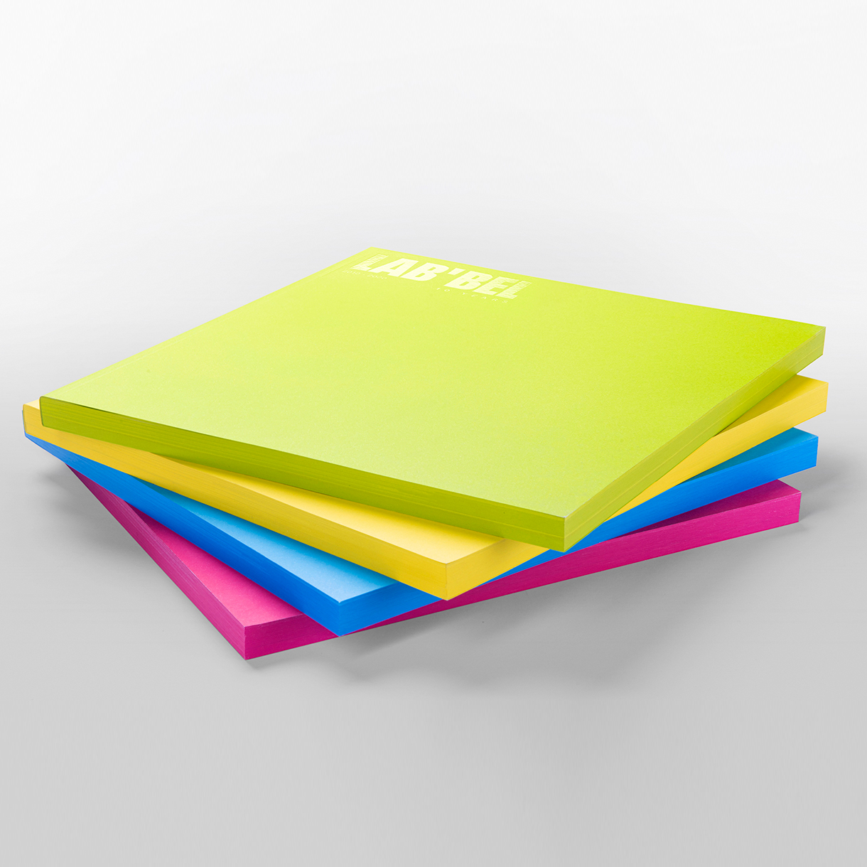
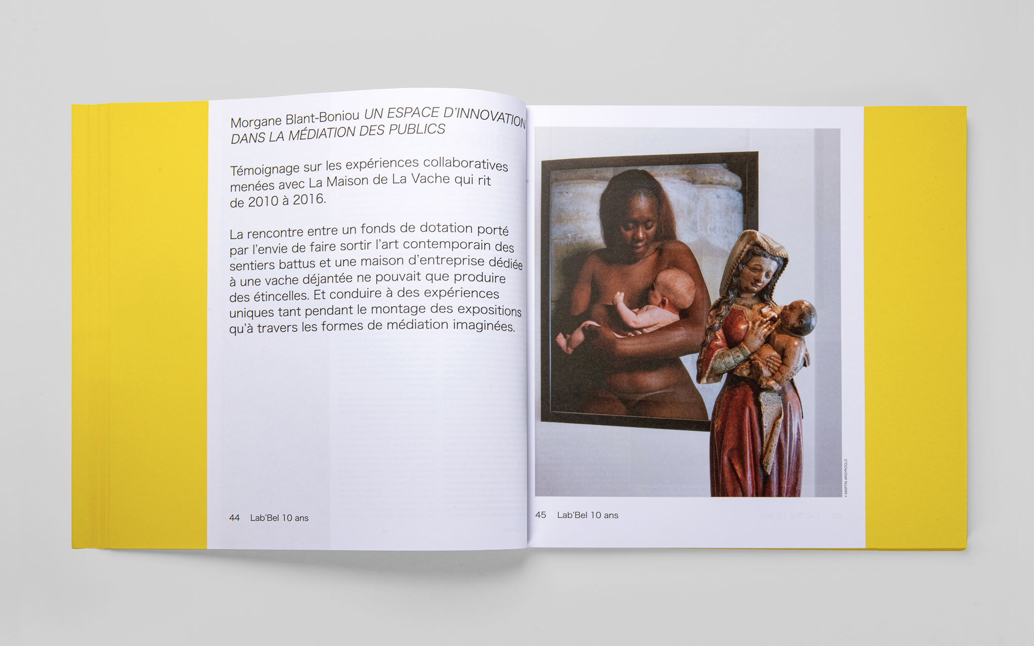
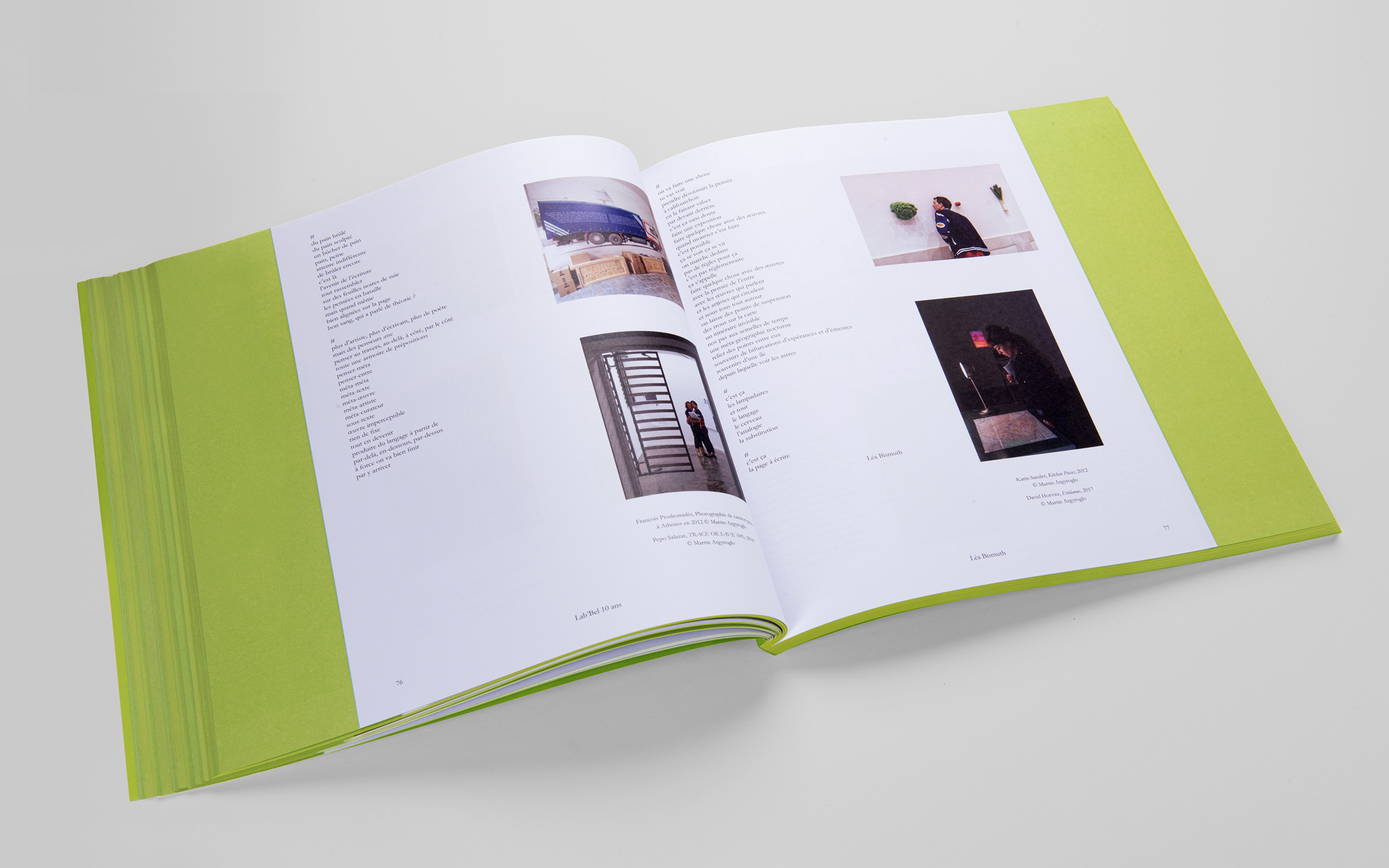
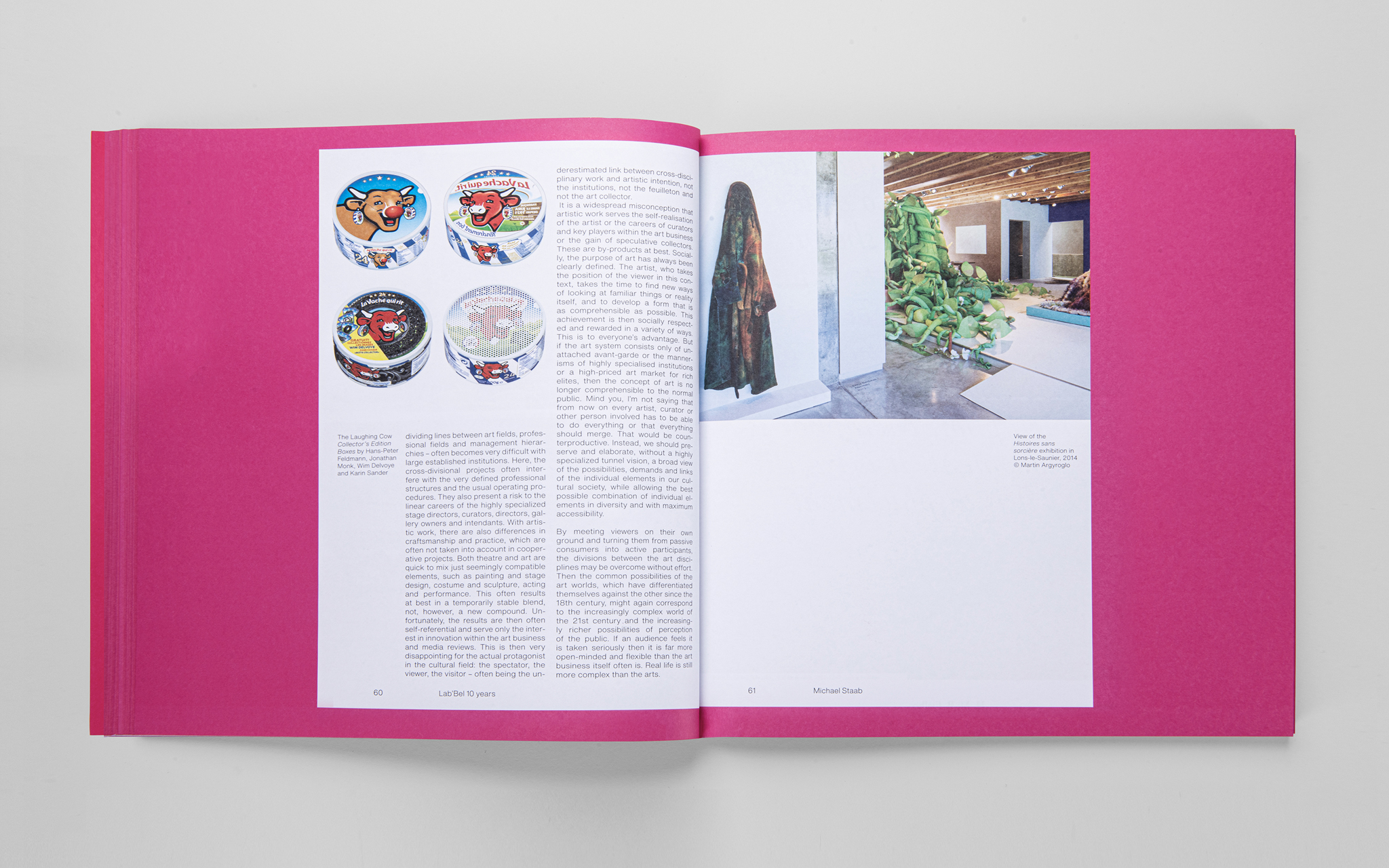
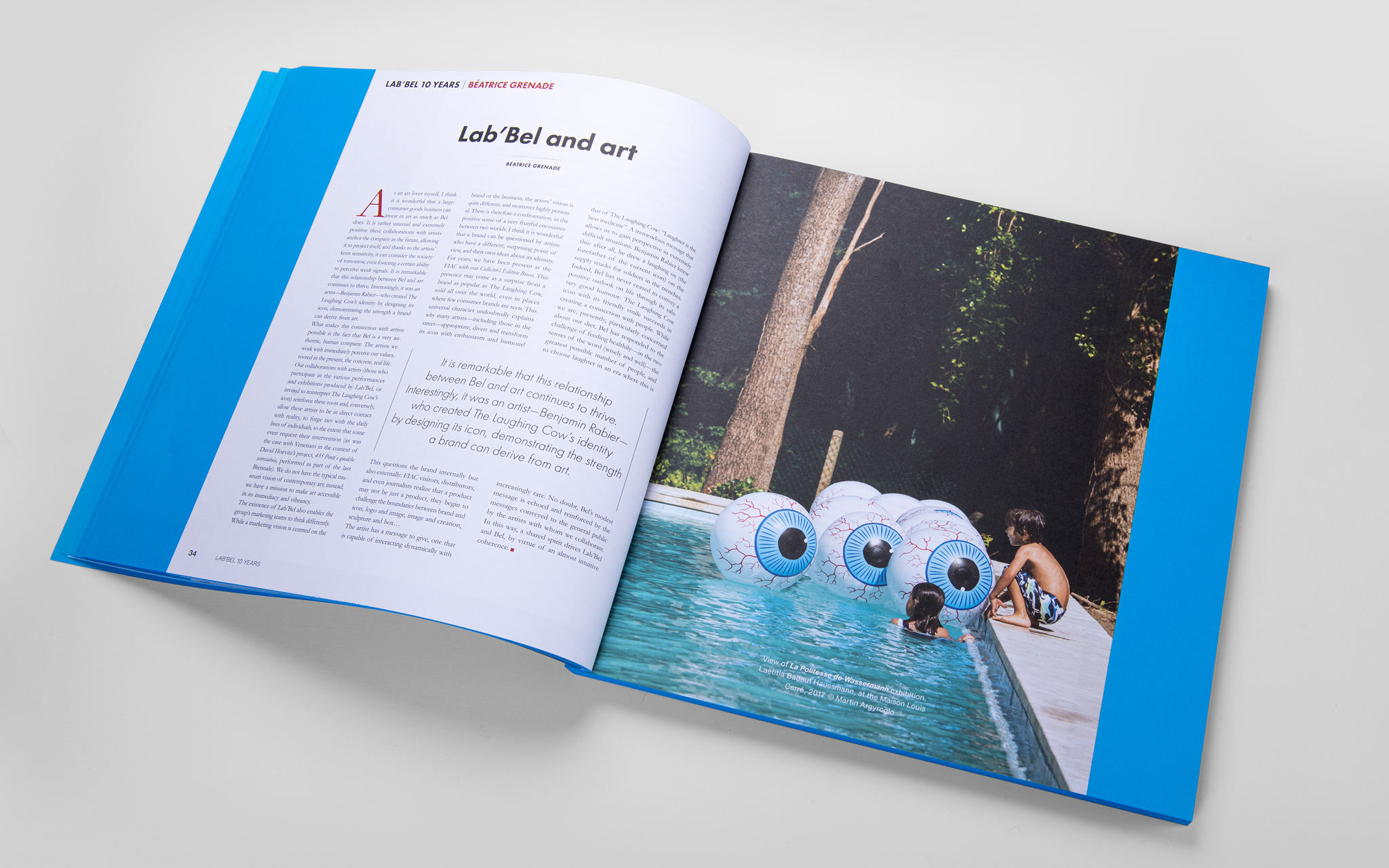
Lab’Bel is an artistic laboratory of the Bel Group from France whose goal is to develop a collection of modern art and generate art exhibitions and events in the country and in Europe, something it has been actively working on since 2010. It bases its identity on humor, eclecticism and extravagance. Our task was to conceptualize and design a book that consolidates their 10-year nomadic artistic activity.Each article of the book has been inspired by different international art, architecture and cinematography magazines, which requires a different graphic composition and format. We have arranged different formats on colored, unusually big pieces of paper that resemble an over-sized post-it pad. Thereby we have turned the 10-year anniversary into just another moment of success, just a note in a prospectively long and successful lifetime of the artistic laboratory. Each book color represents another language. During the book presentation and exhibition the visitors were able to pick a color they wanted and, bit by bit, take the exhibited books in the shape of an over-sized post-it. The catalog has at the same time become the object of modern art, following the steps of pop-art that creates a surreal dimension through object augmentation. The project was awarded by PRINT Awards as well as Zagreb Design Week.
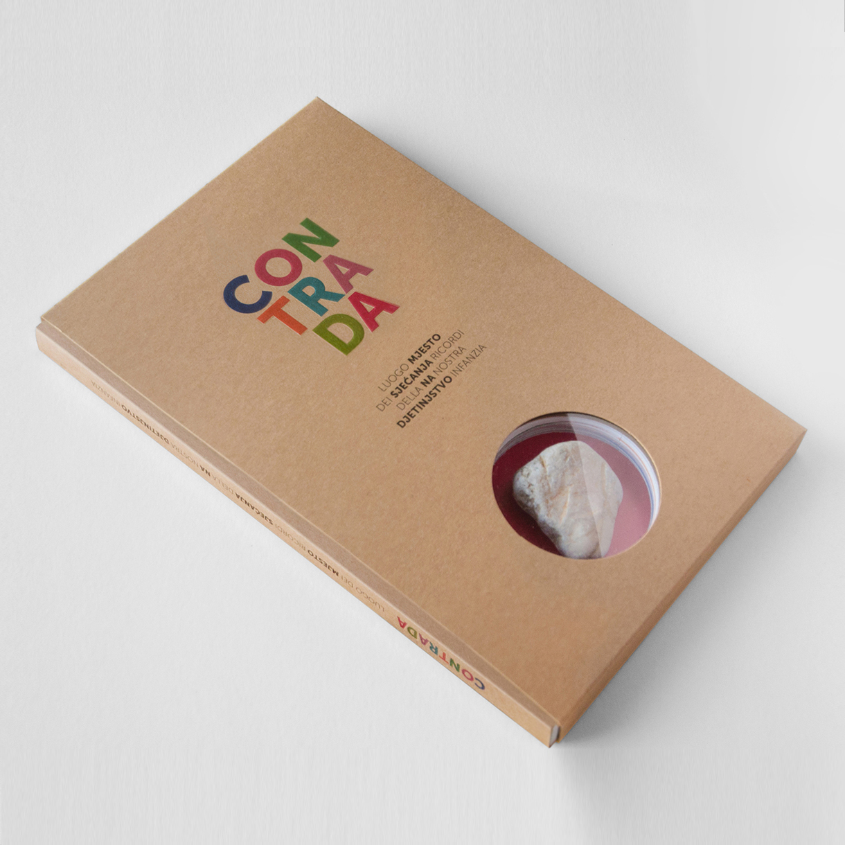
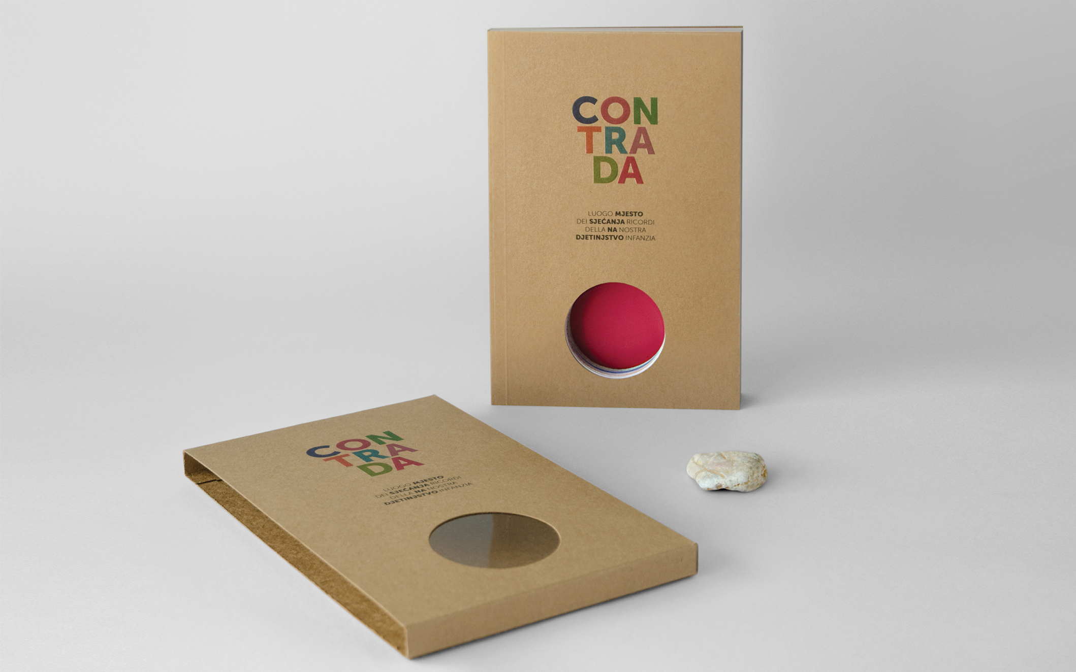
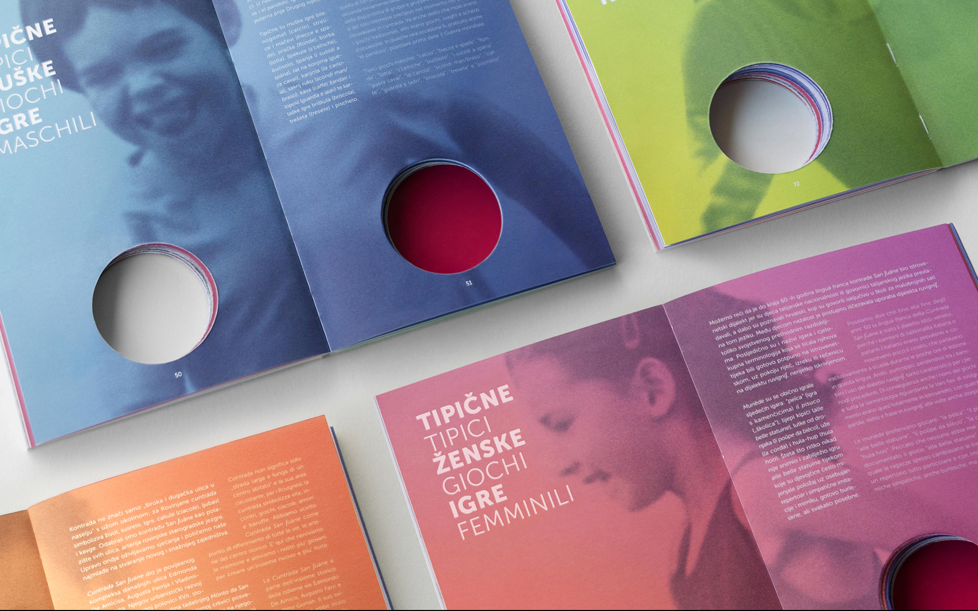
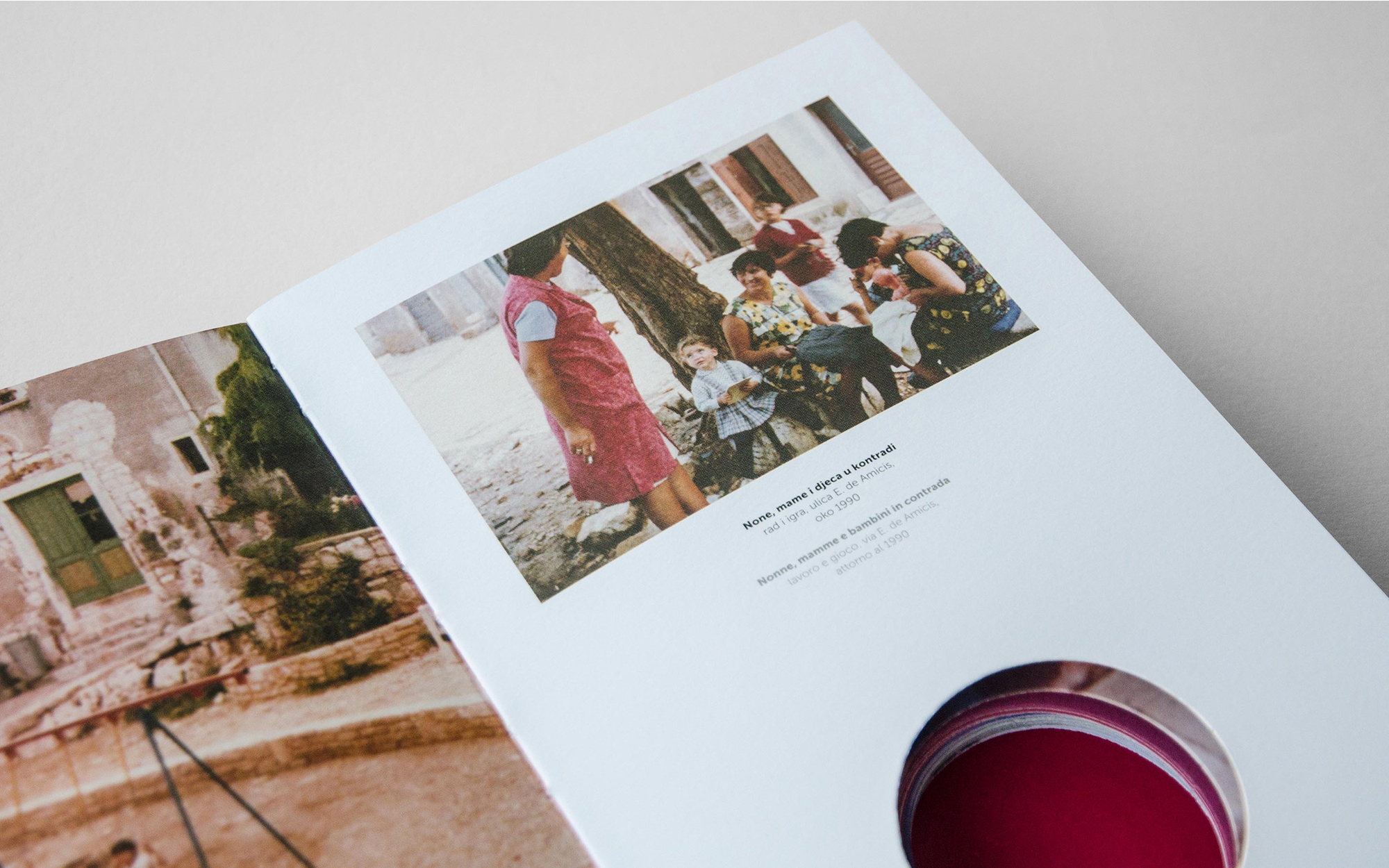
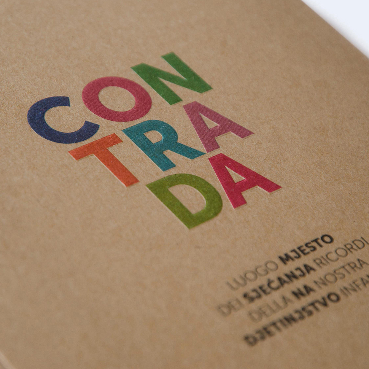
BATANA ecomuseum is an ecomuseum in Rovinj dedicated to a traditional wooden vessel called “batana”, as well as to the citizens of Rovinj who have picked it as their symbol. In 2015 Ecomuseum organized an exhibition called “Contrada – the place of childhood memories”, where the street of the same name was turned into an exhibition area where different workshops were held and traditional games from the city’s history were demonstrated. Our task was to design the catalogue by Tamara Nikolić Đerić with illustrations and descriptions of the games.The streets of Rovinj used to be a place where most of the everyday life went on – from socializing and playing to doing business. One of such streets was Cuntràda San suàne. “Contrada” catalog was created as a result of the need to present traditional games to the modern world and to try to prevent them from being forgotten in digital reality, and for the street games to continue even after the end of the exhibition. Besides descriptions of the games and their instructions, it also contains a seemingly unusual toy – a stone, which used to be the most common thing for playing street games. Treating a “regular” stone as a valuable present is a result of critical contemplation about changes in our society and the context of children playing then and now. This project was selected for exhibition at the 55th Zagreb Salon.