Supperstudio is a spanish branding and packaging boutique. Since it was founded in 2003 by Lourdes Morillas and Paco Adín, it has been working to find the best creative solutions for its clients. Its designs, in which narrative and simplicity stand out, have been recognised in the main packaging competitions. Its list of winners, with more than 120 awards, includes the Pentawards Best Agency received in 2016 and 2021. The signature of its creative director, Paco Adín, is regularly featured in the sector's main publications, as well as being on the jury of numerous international awards.
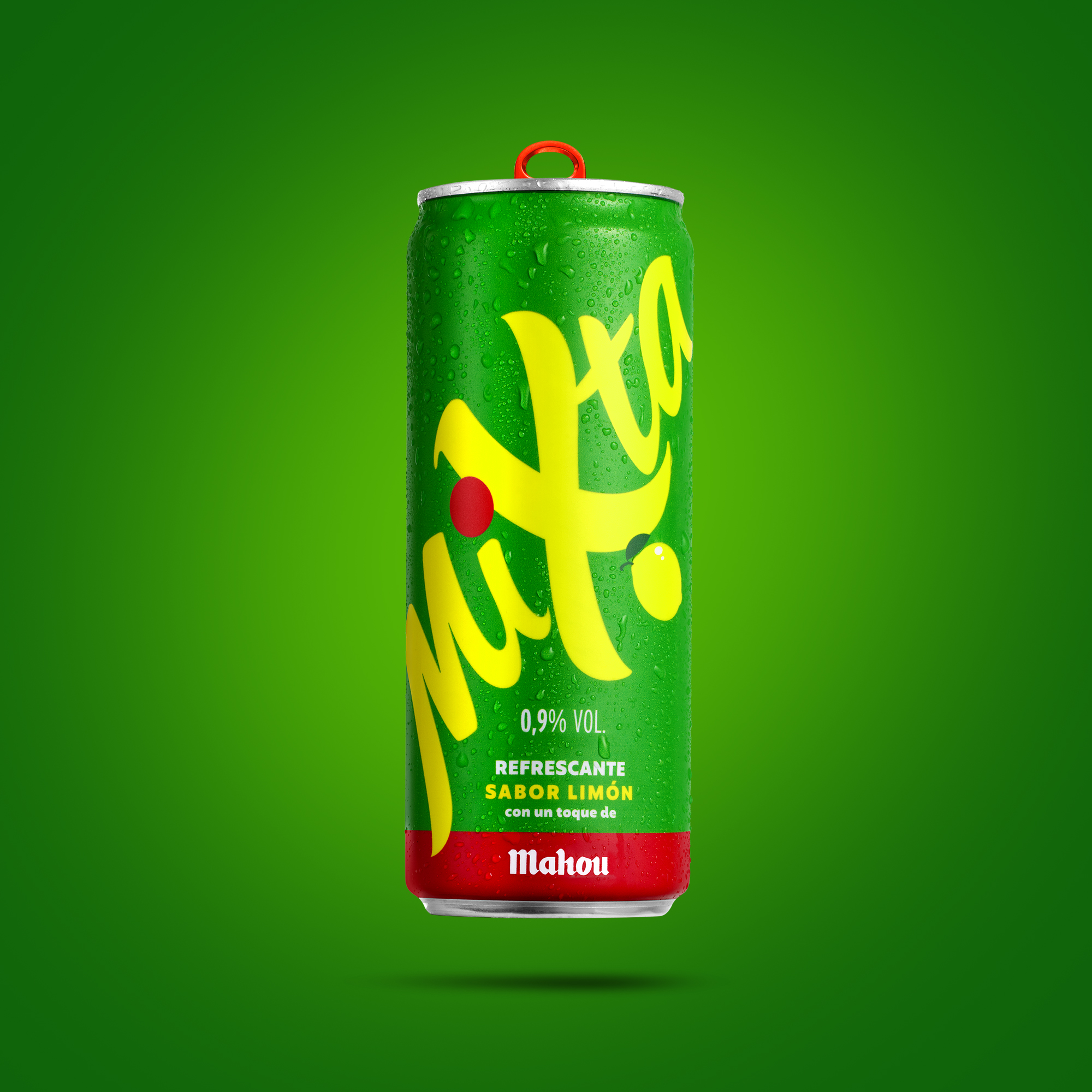
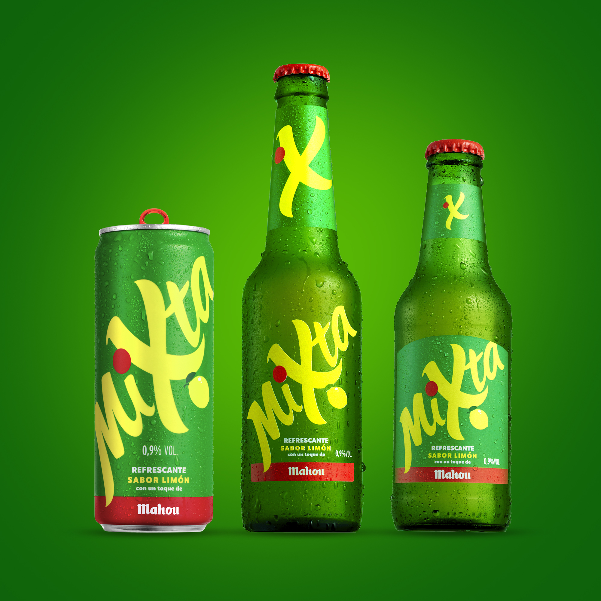
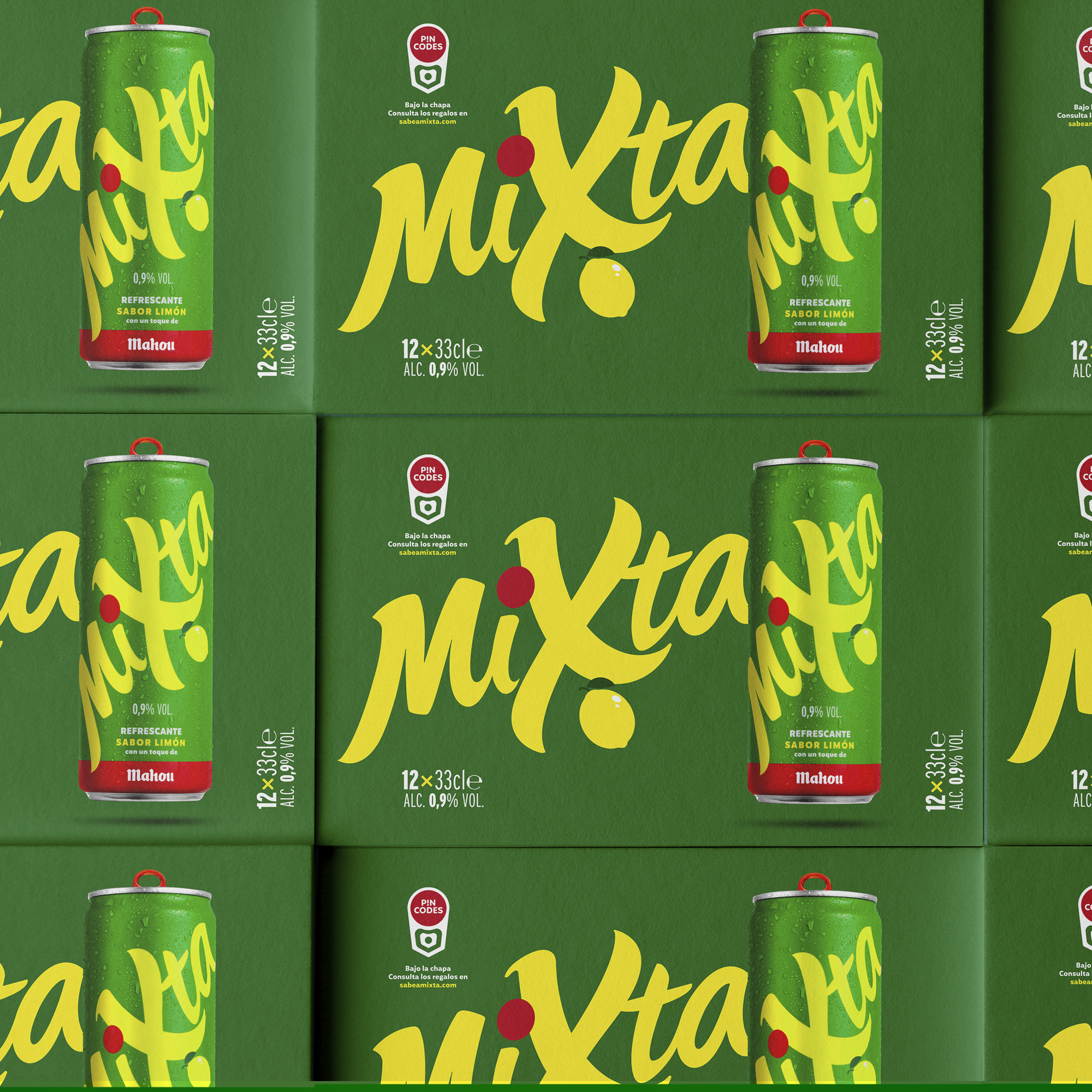
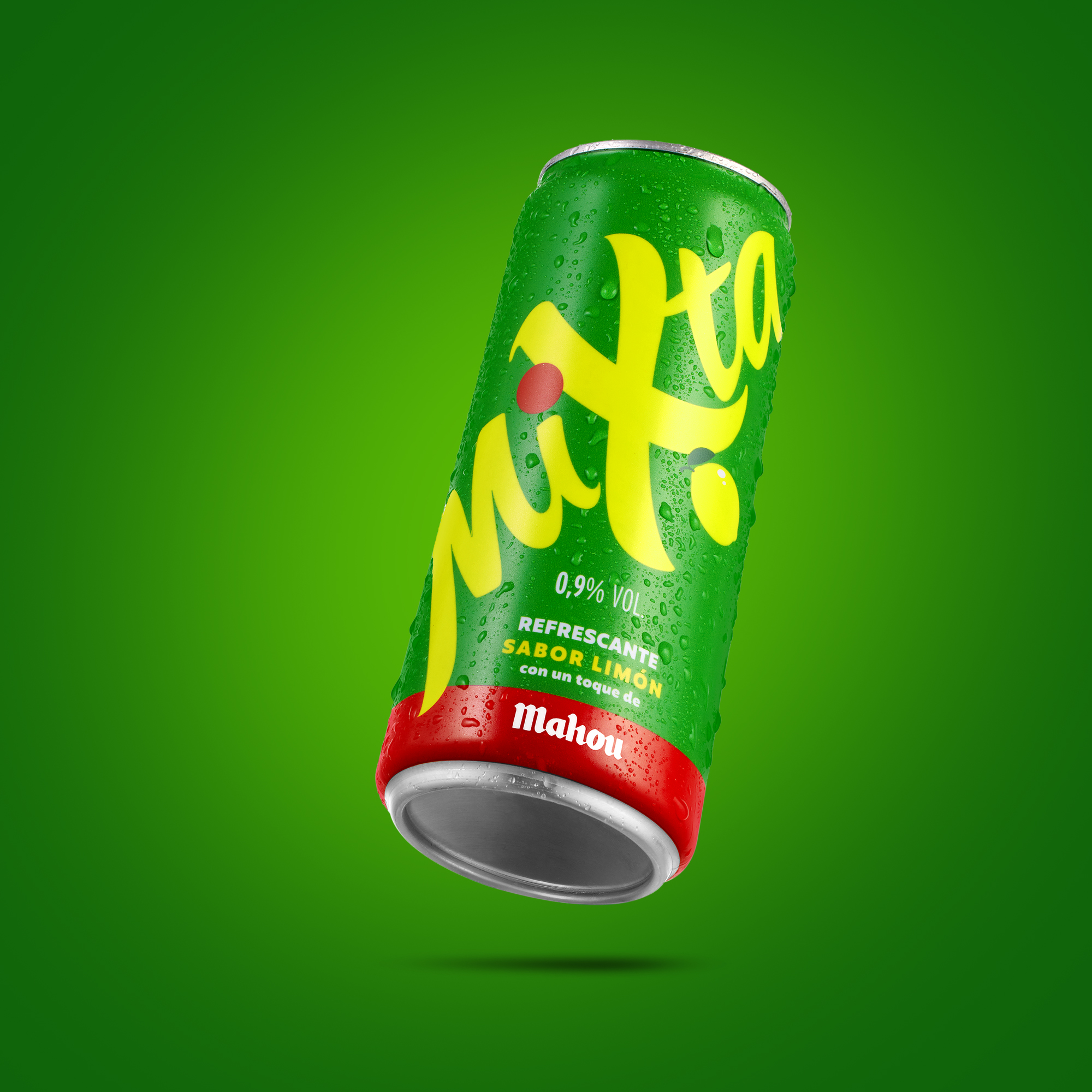
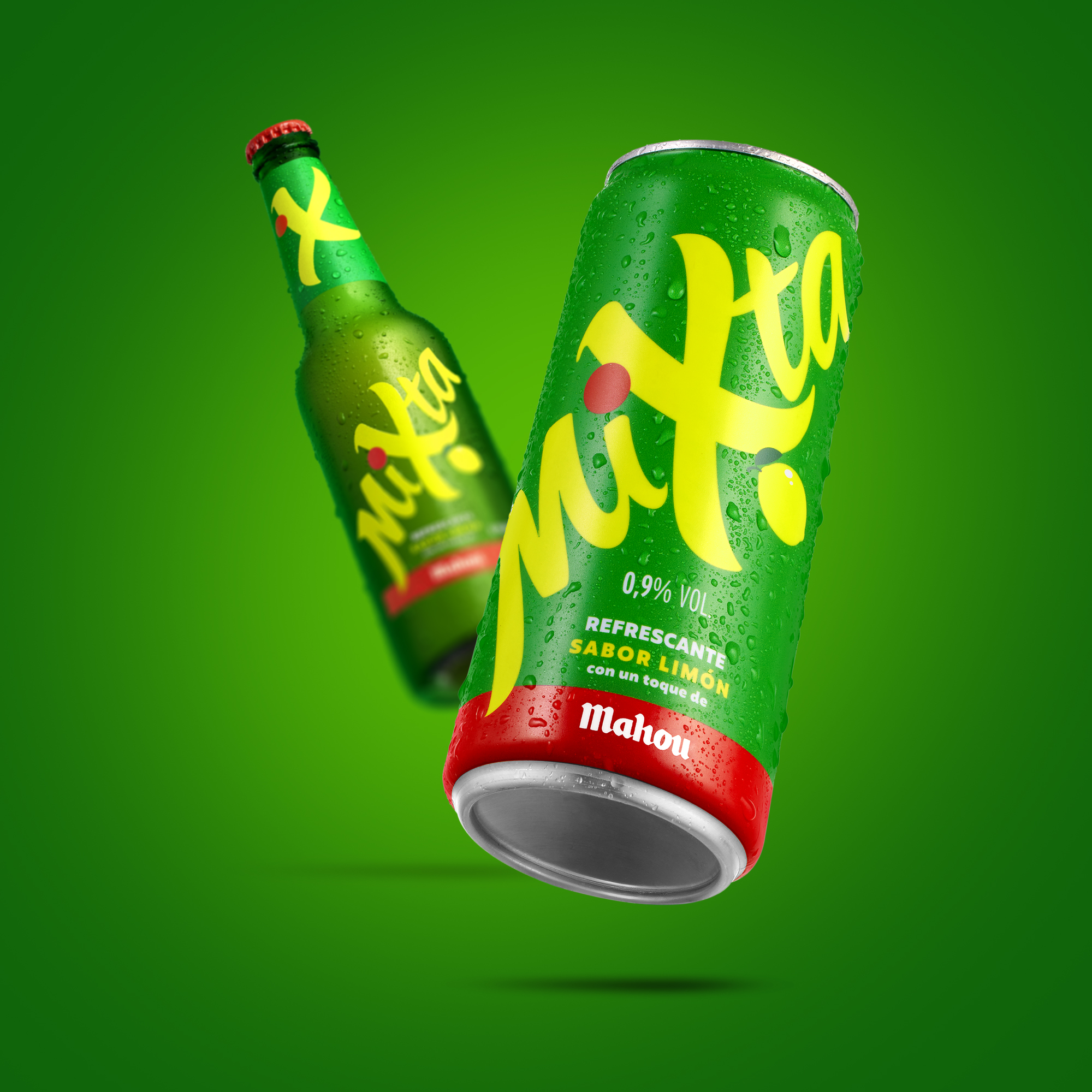
Mahou needs to redesign the identity and packaging of Mixta, its lemon flavoured drink with a touch of beer. Launched in 2005, it was time to update its visual codes to reposition it for 2025, expand the market and attract new consumers. For the branding restyling Supperstudio focused on the attributes of this brand to create a differentiating identity.
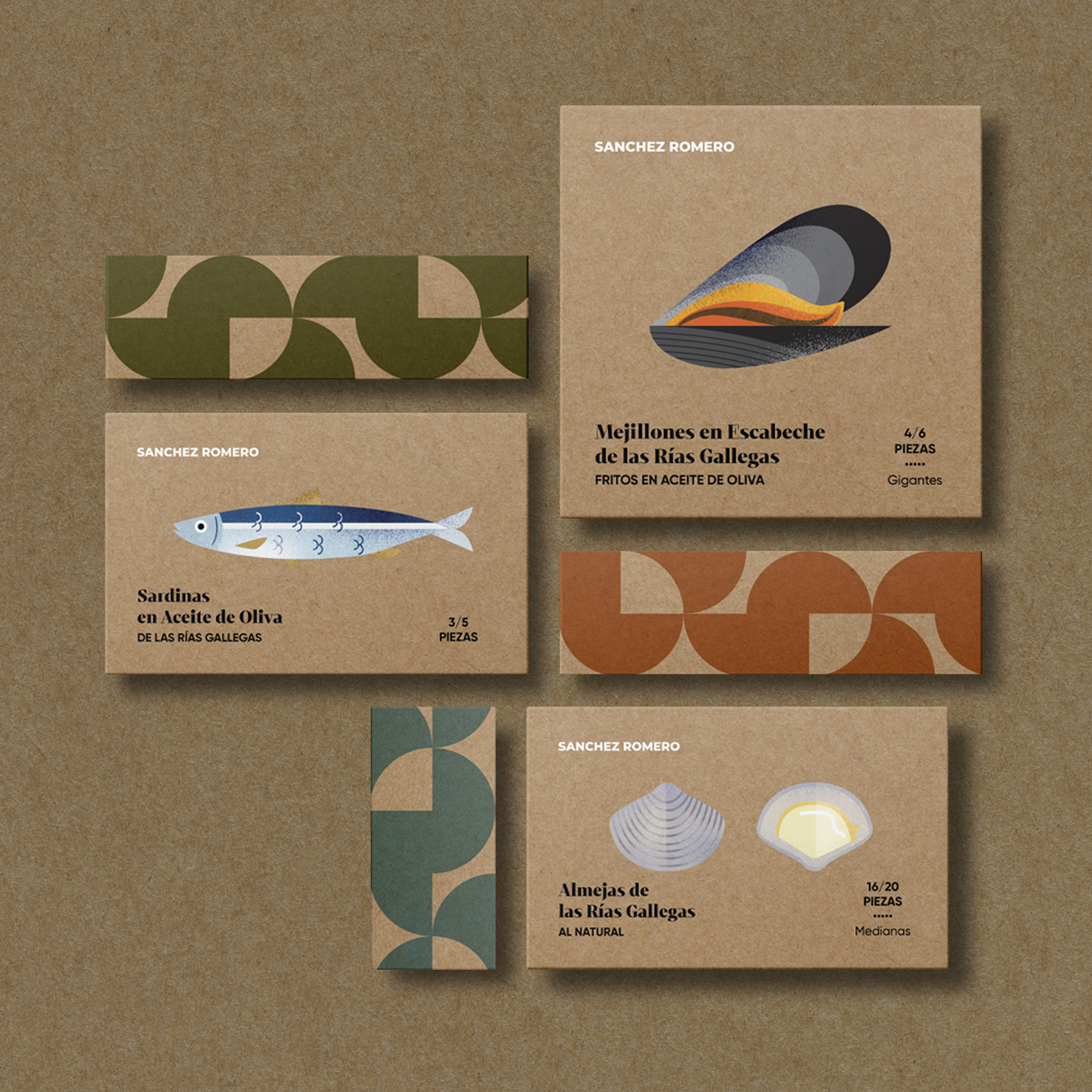
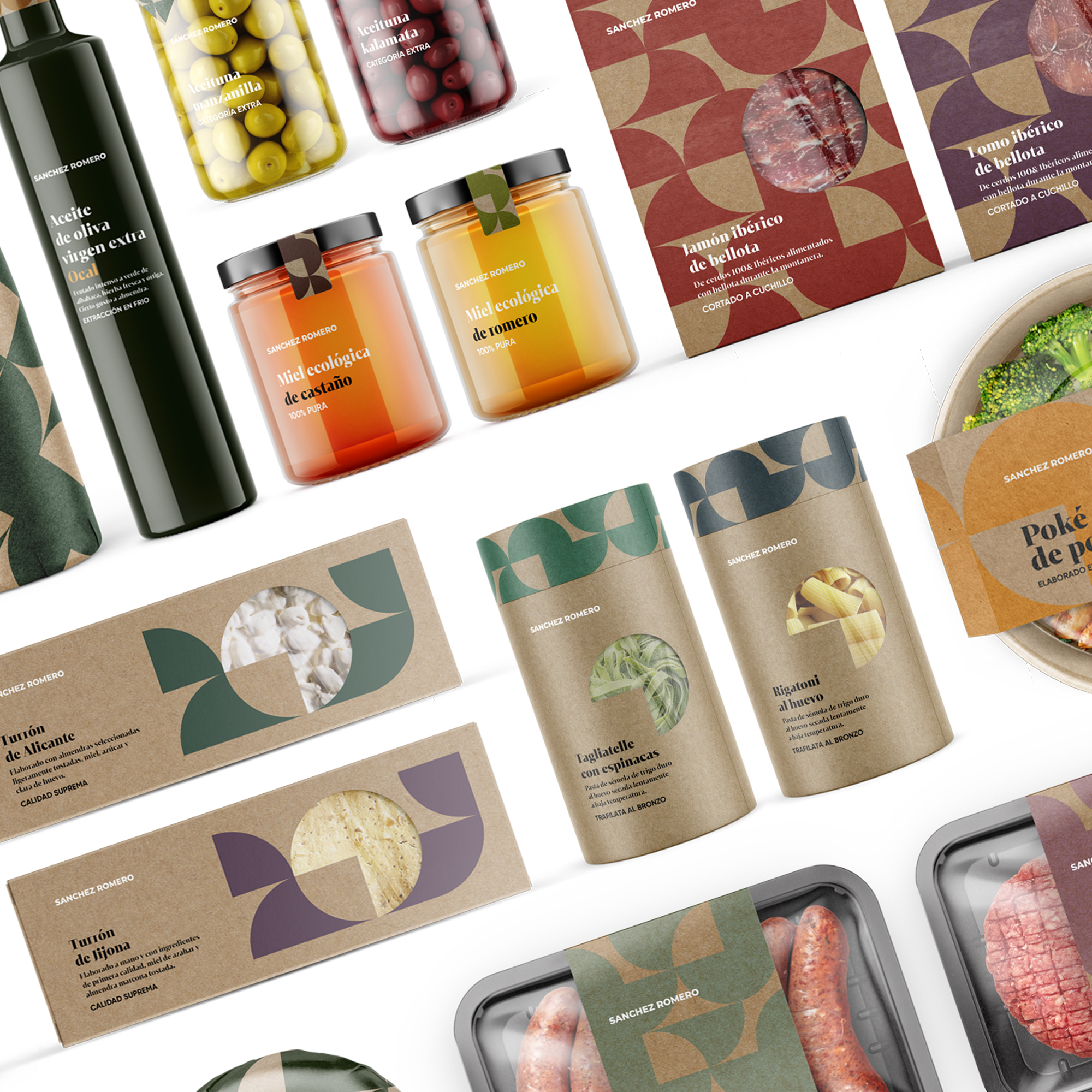
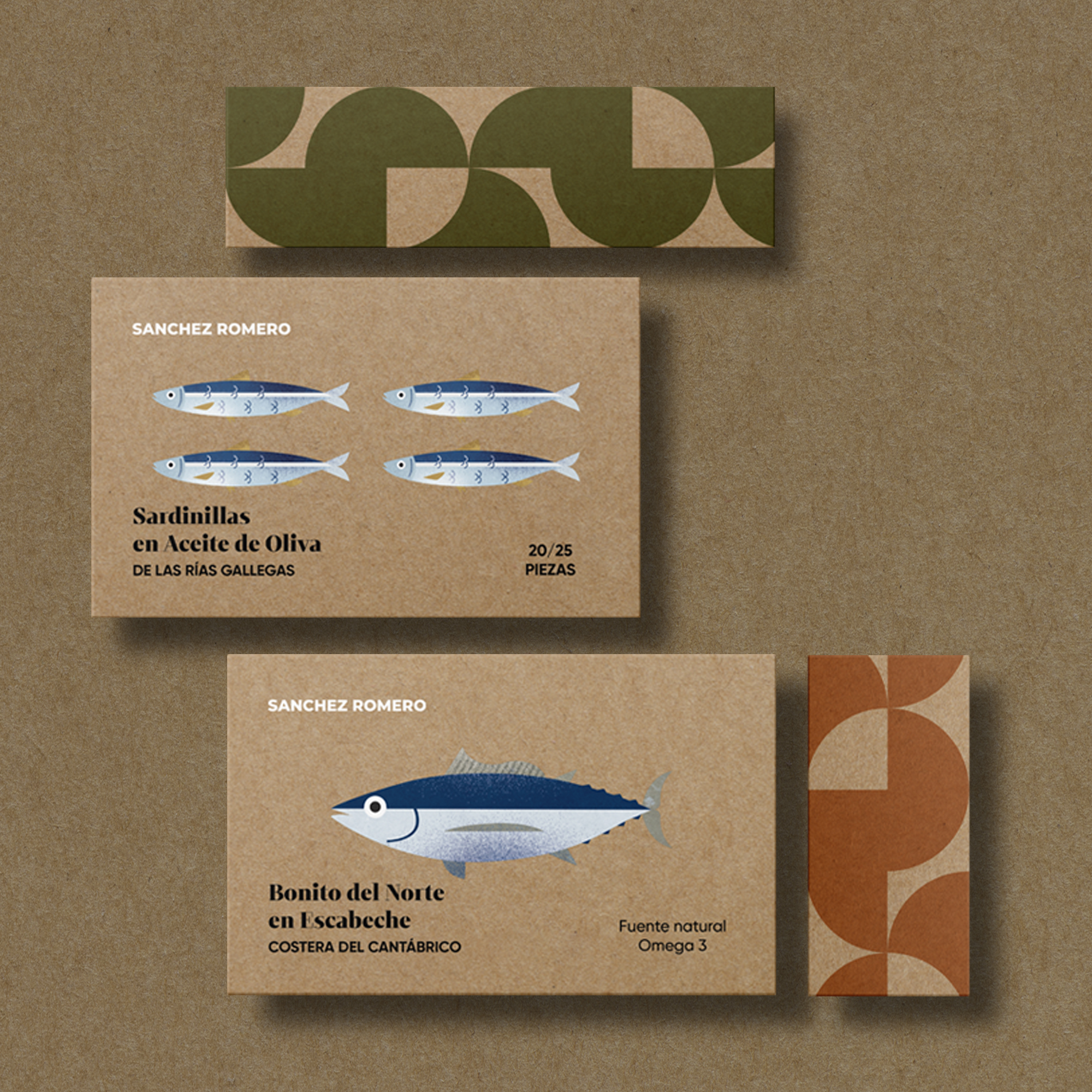
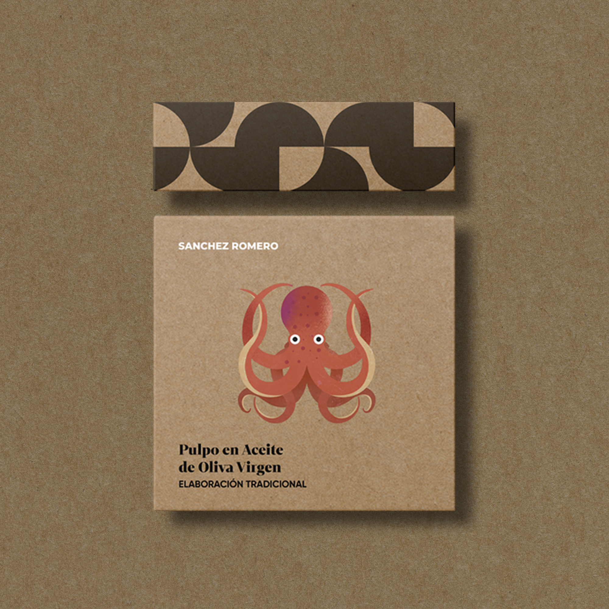
The new packaging identity for Madrid-based gourmet chain Sanchez Romero celebrates naturalness and the work of small and medium-sized producers who make their gourmet products while caring for the environment and animal welfare. We designed a line of packaging and wrapping for them with an eco-design approach: we reduced materials, inks and supports.
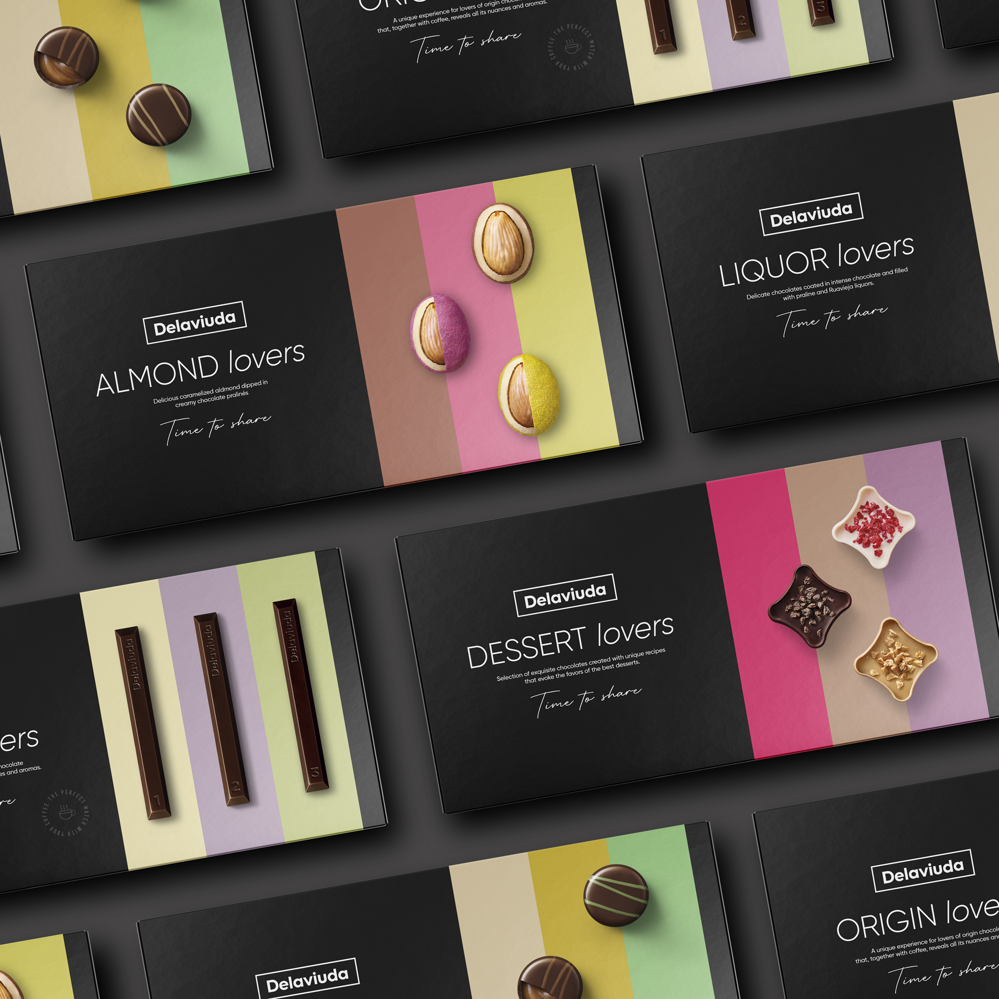
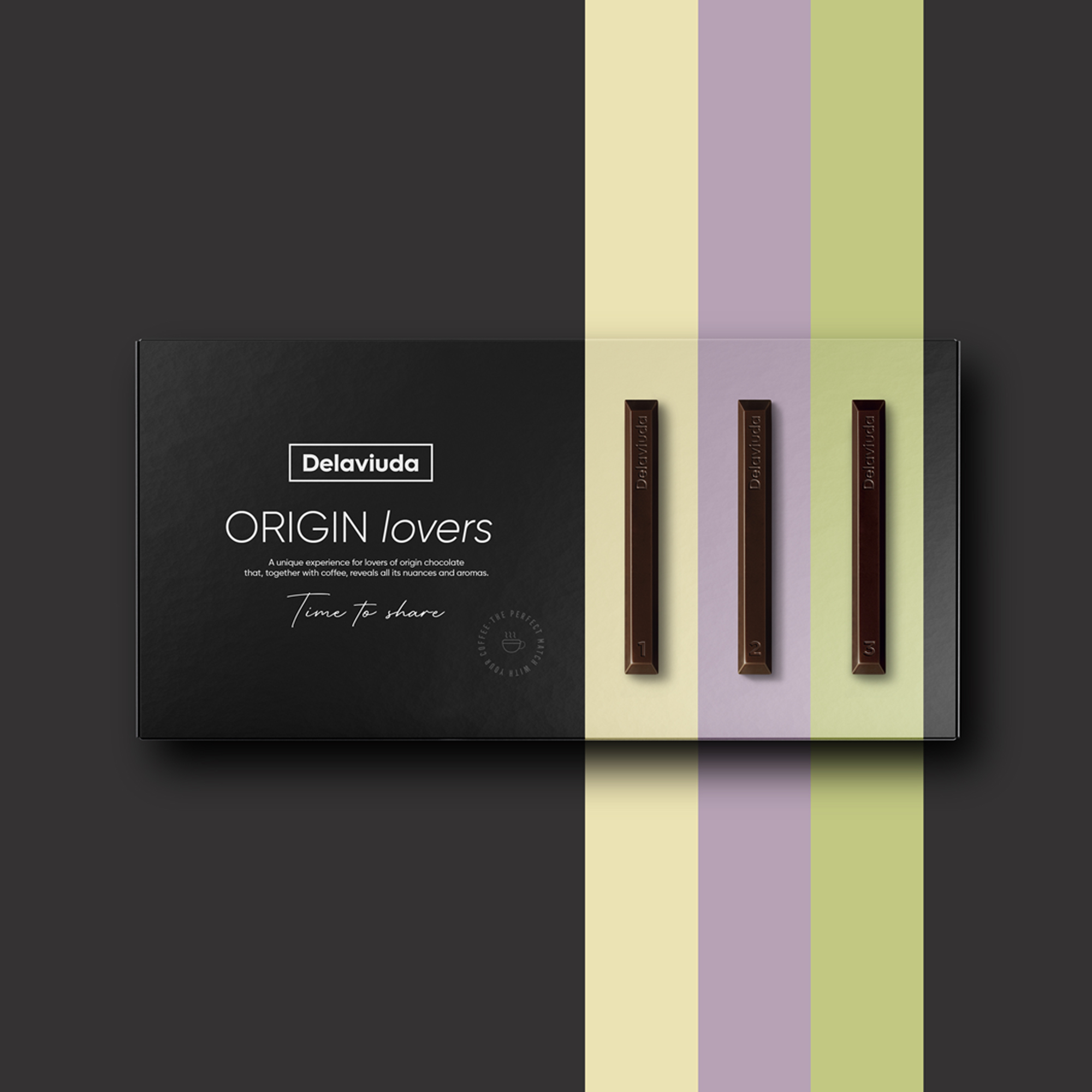
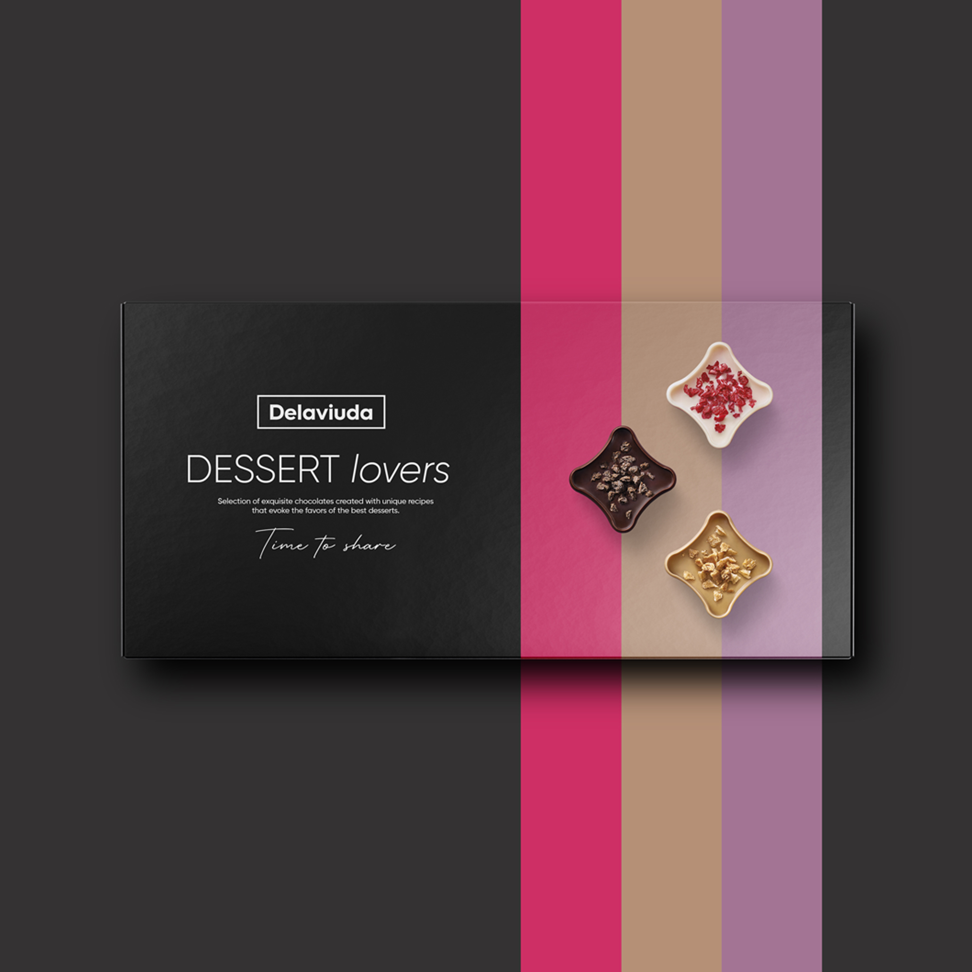
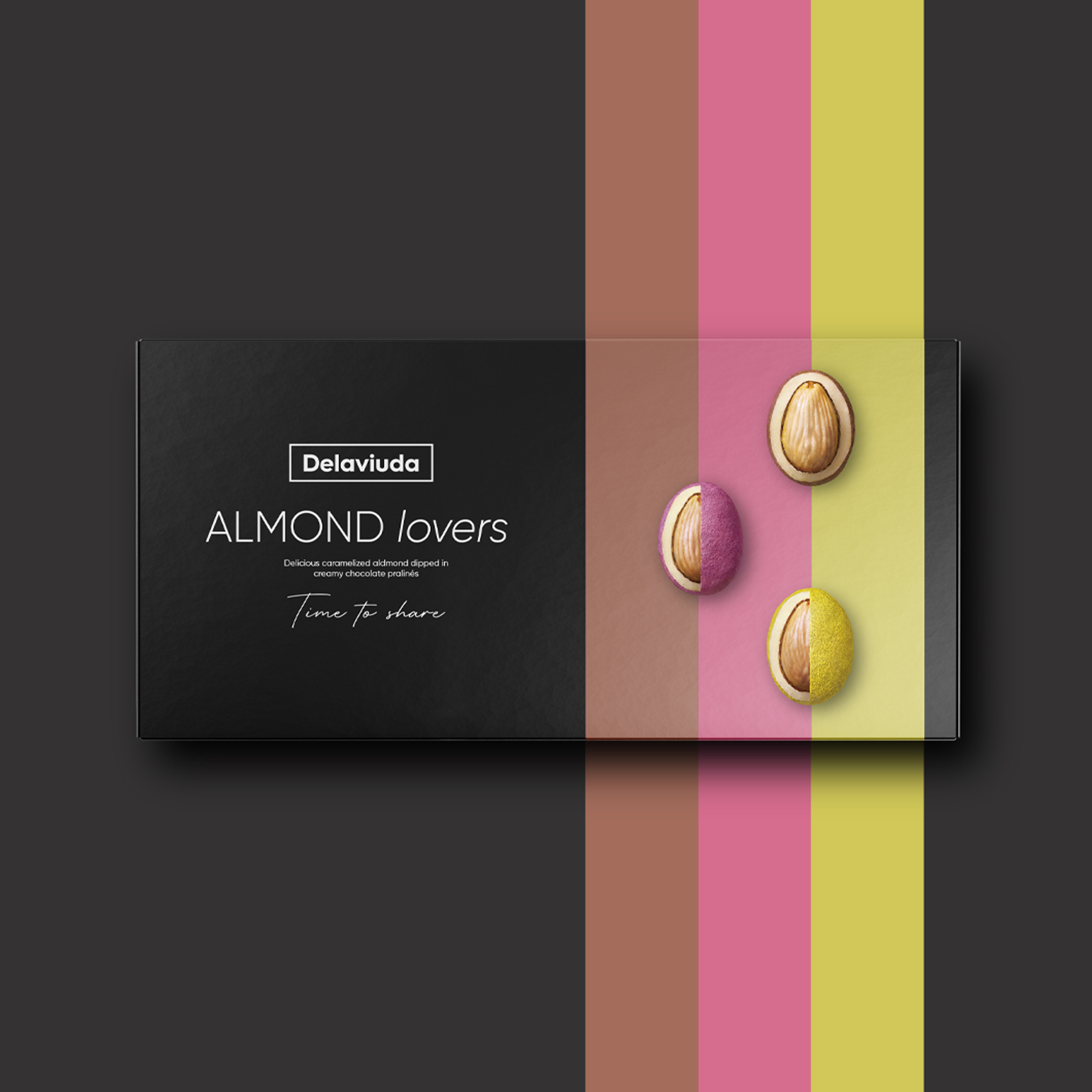
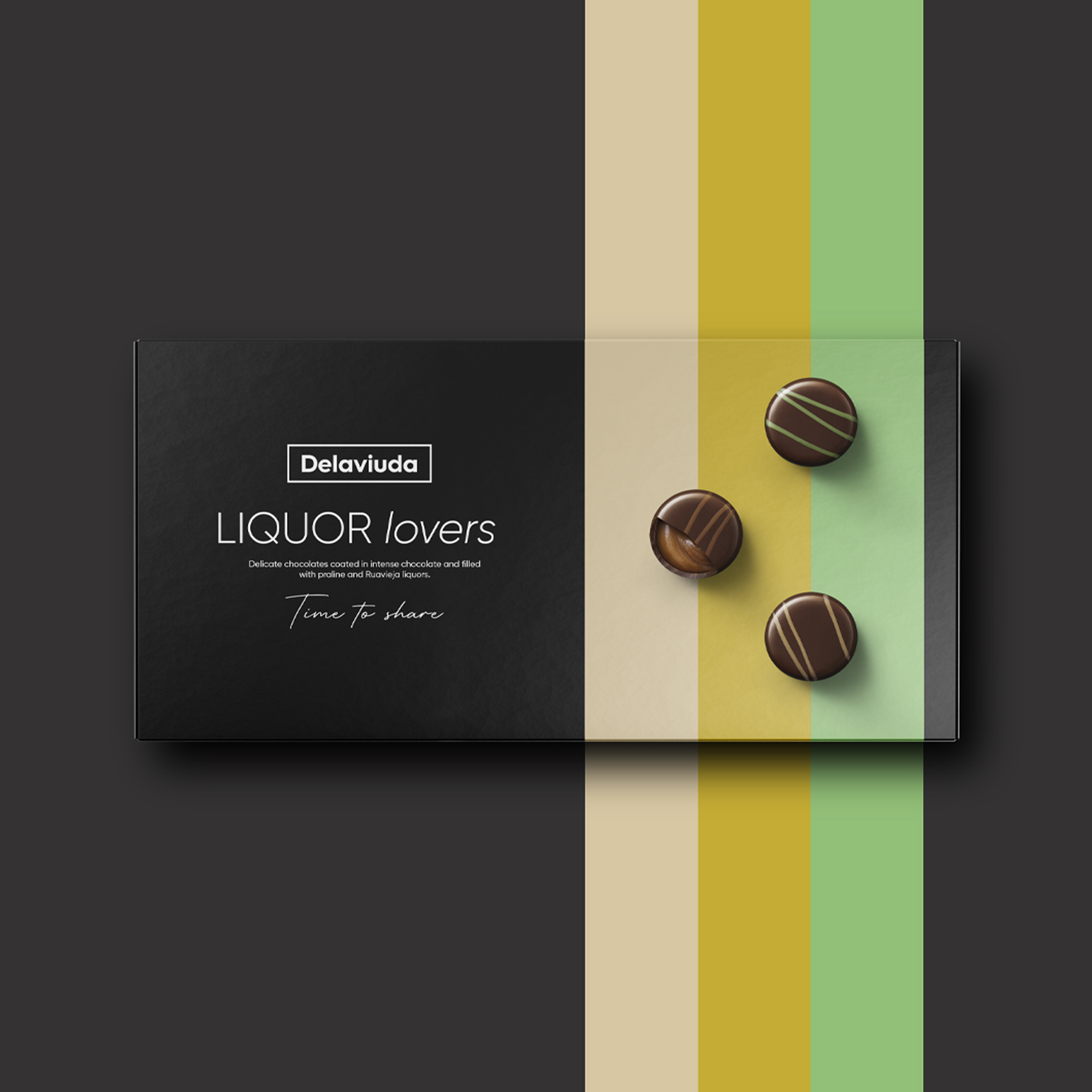
Delaviuda is an almost centenary company and the most iconic and traditional Christmas brand in Spain. With the aim of expanding its presence beyond the Christmas campaigns and looking to the international market, it is launching a new range of products: chocolates specially created to enjoy something as Spanish as the after-dinner moment. In addition to the order of this new packaging, Delaviuda requested a restyling and an update of the brand. The main objective: to give it a more contemporary and refined image.
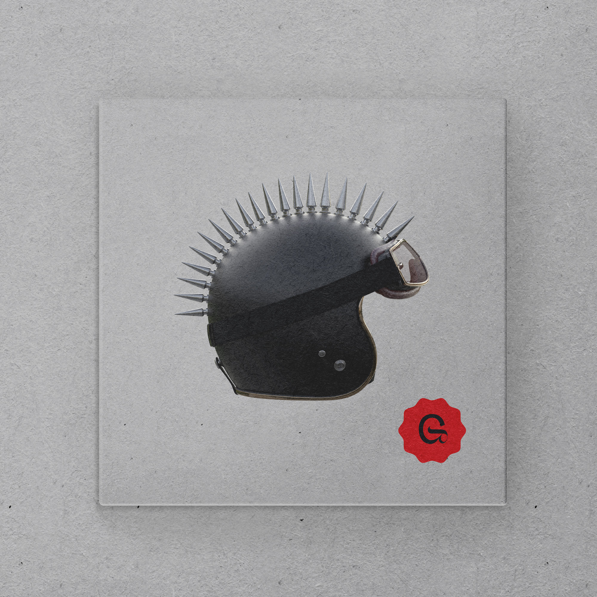
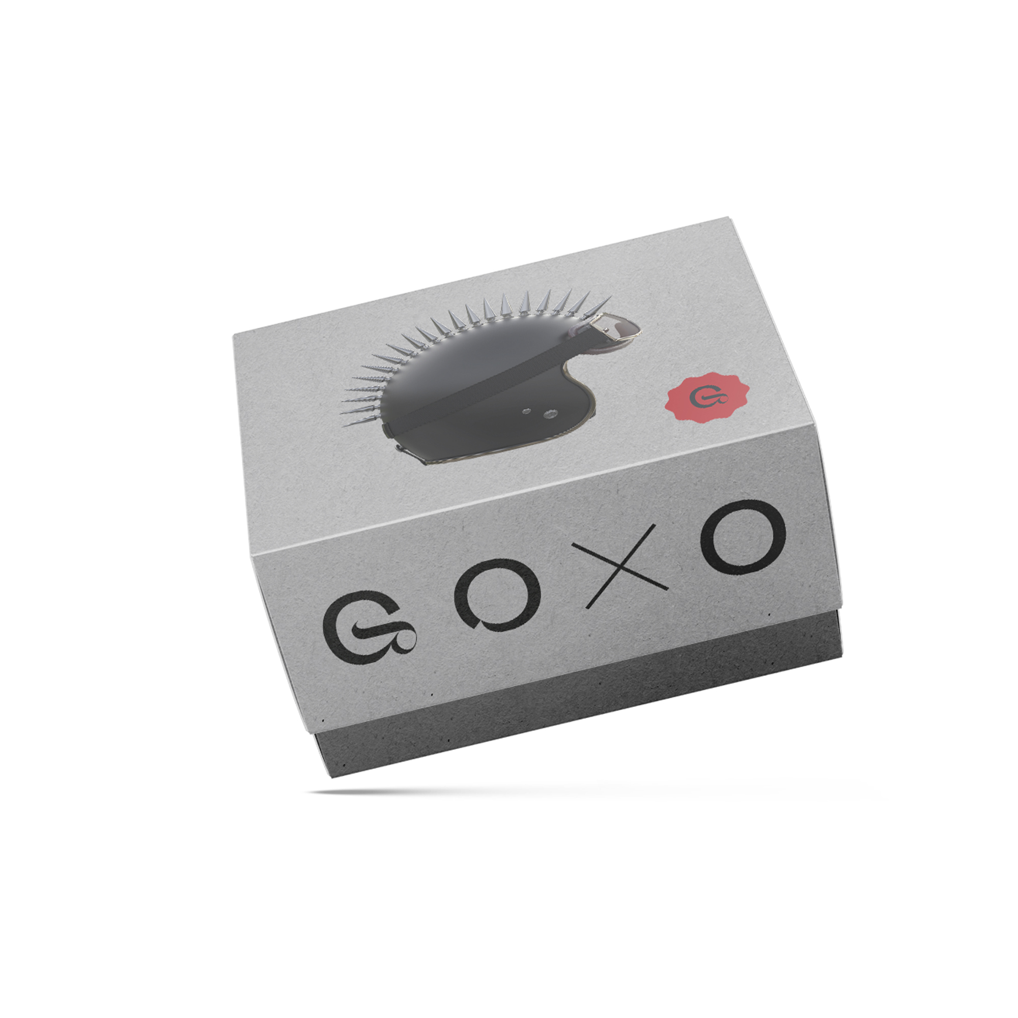
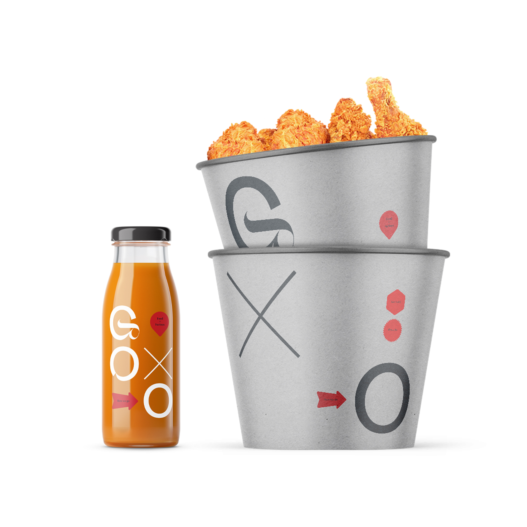
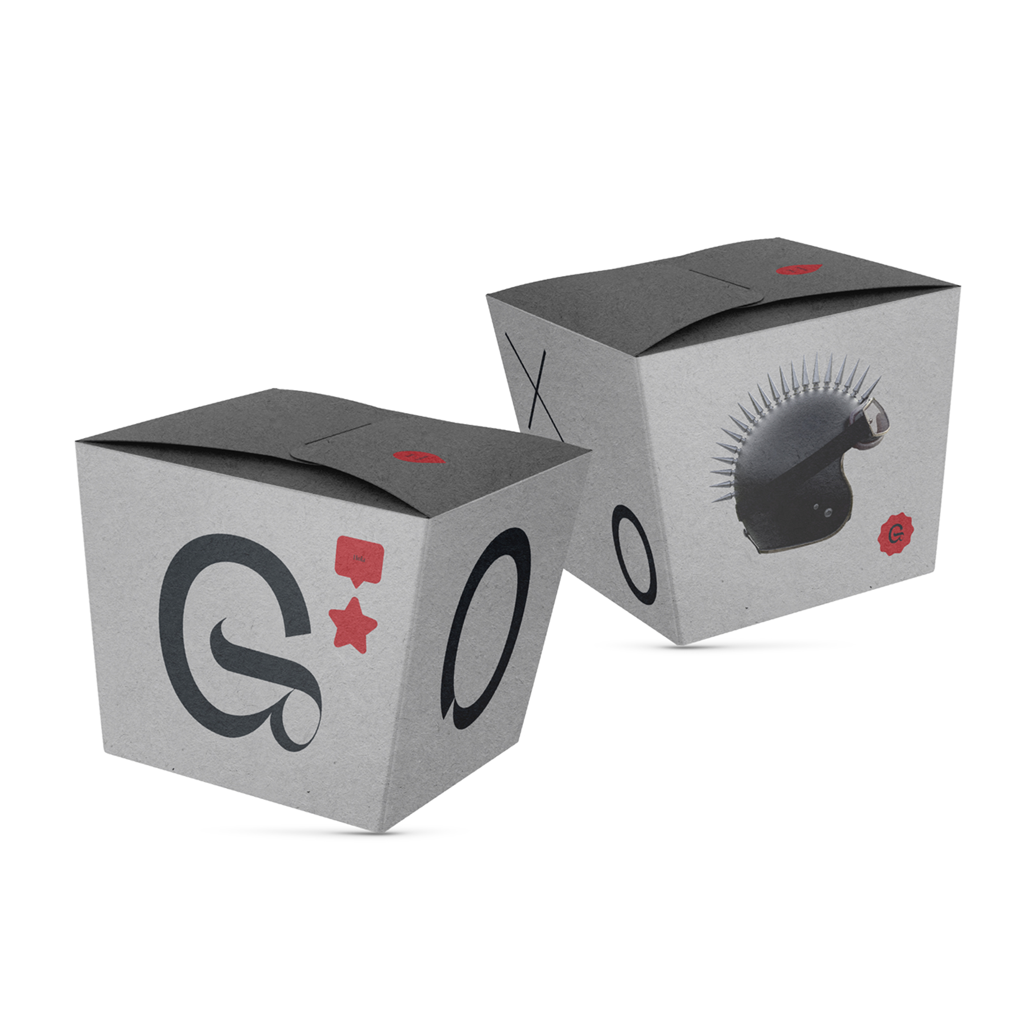
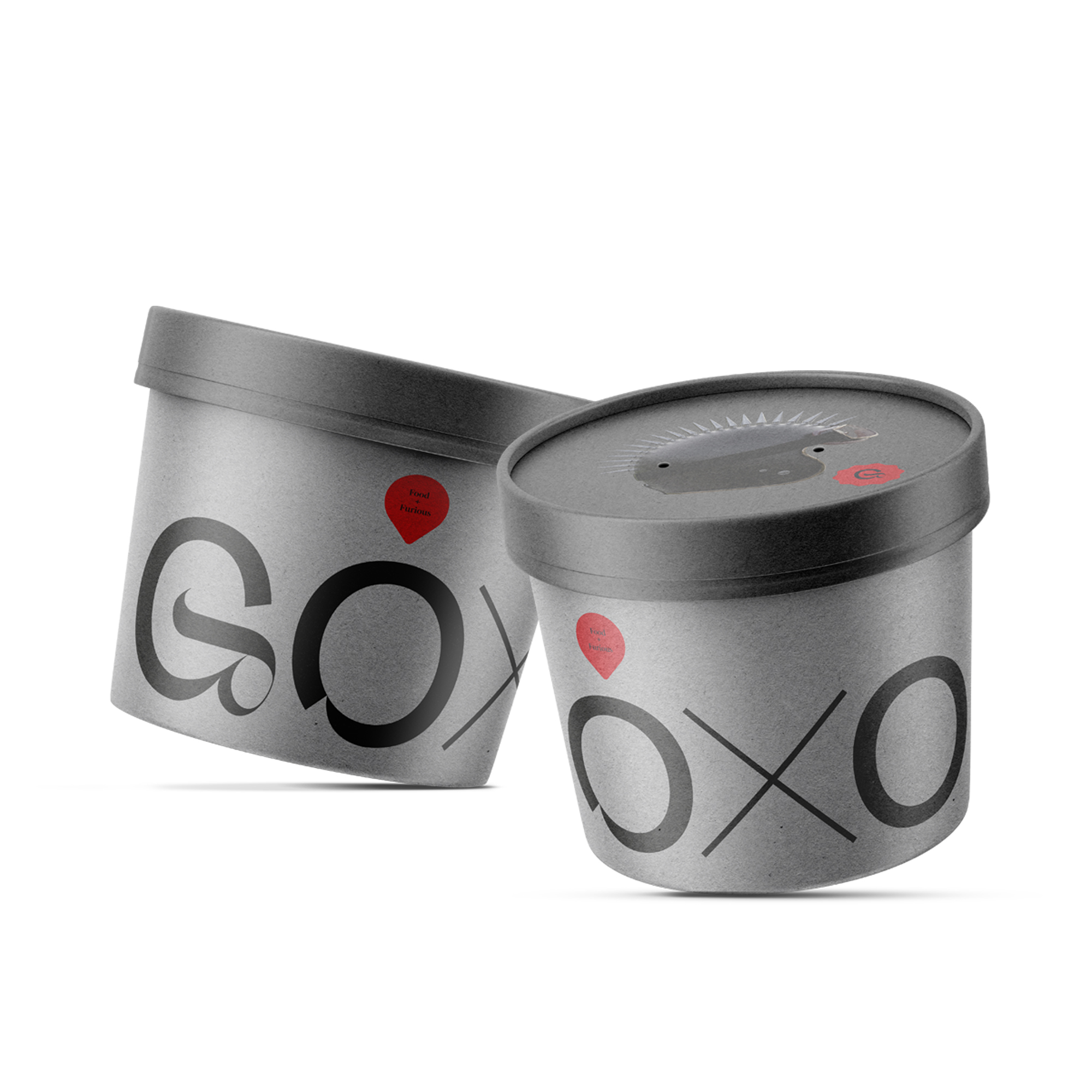
Goxo, the delivery brand of chef Dabiz Muñoz, required a redesign of its identity to bring to the public the hedonistic, creative, transgressive and gourmet proposal of one of the best chefs in the world. The chef’s personality, creativity, innovation and transgression are the inspiration for the proposal to take the brand to a higher segment of the market. Goxo is Food and Furious.
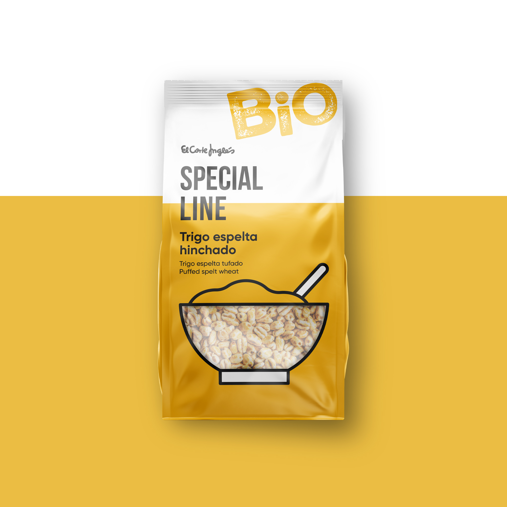
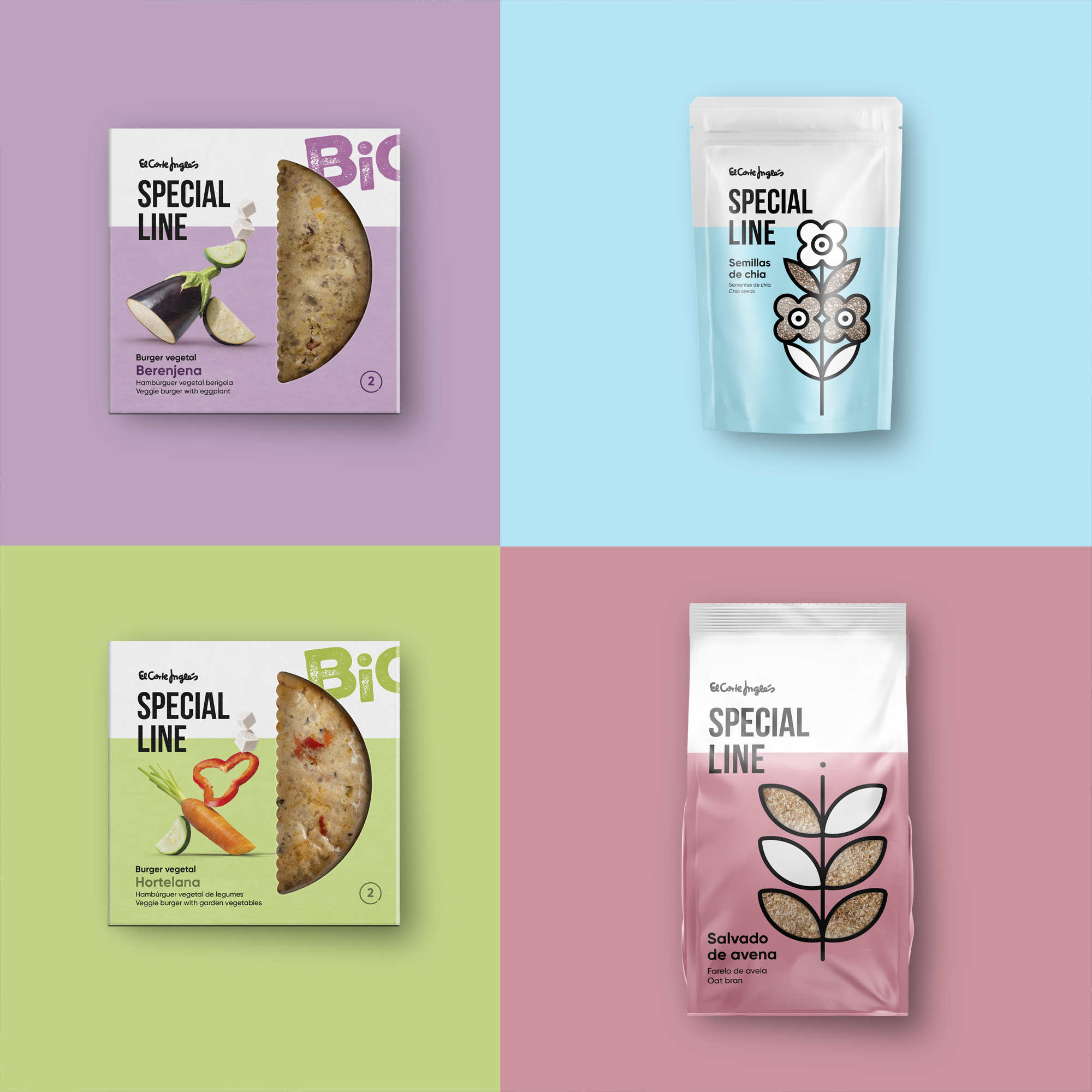
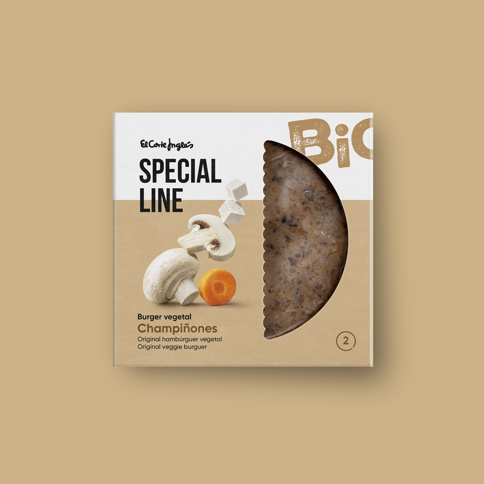
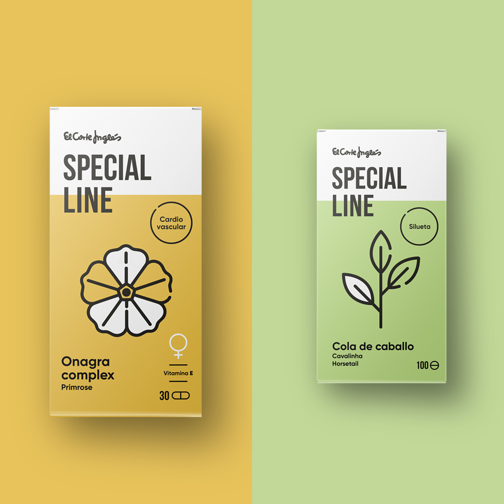
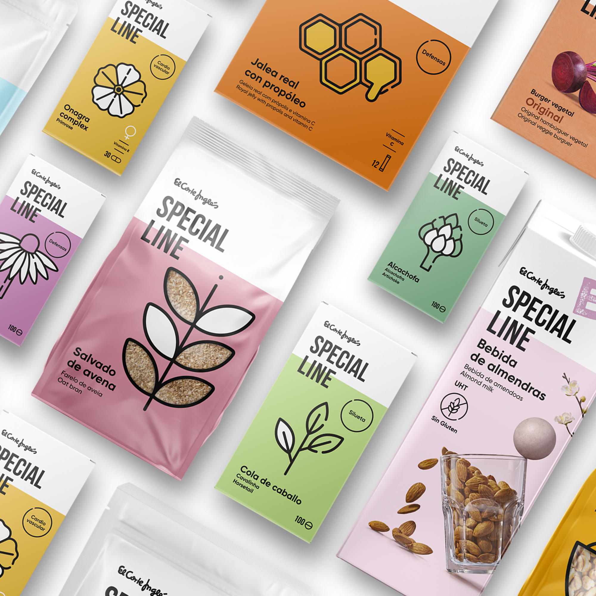
Special Line is El Corte Inglés’ brand specialising in healthy products, special diets and food supplements. With the aim of updating, relaunching and revaluing the brand, we have developed a visual identity that reinforces its essence and brings it closer to consumers in a clearer and more contemporary way.
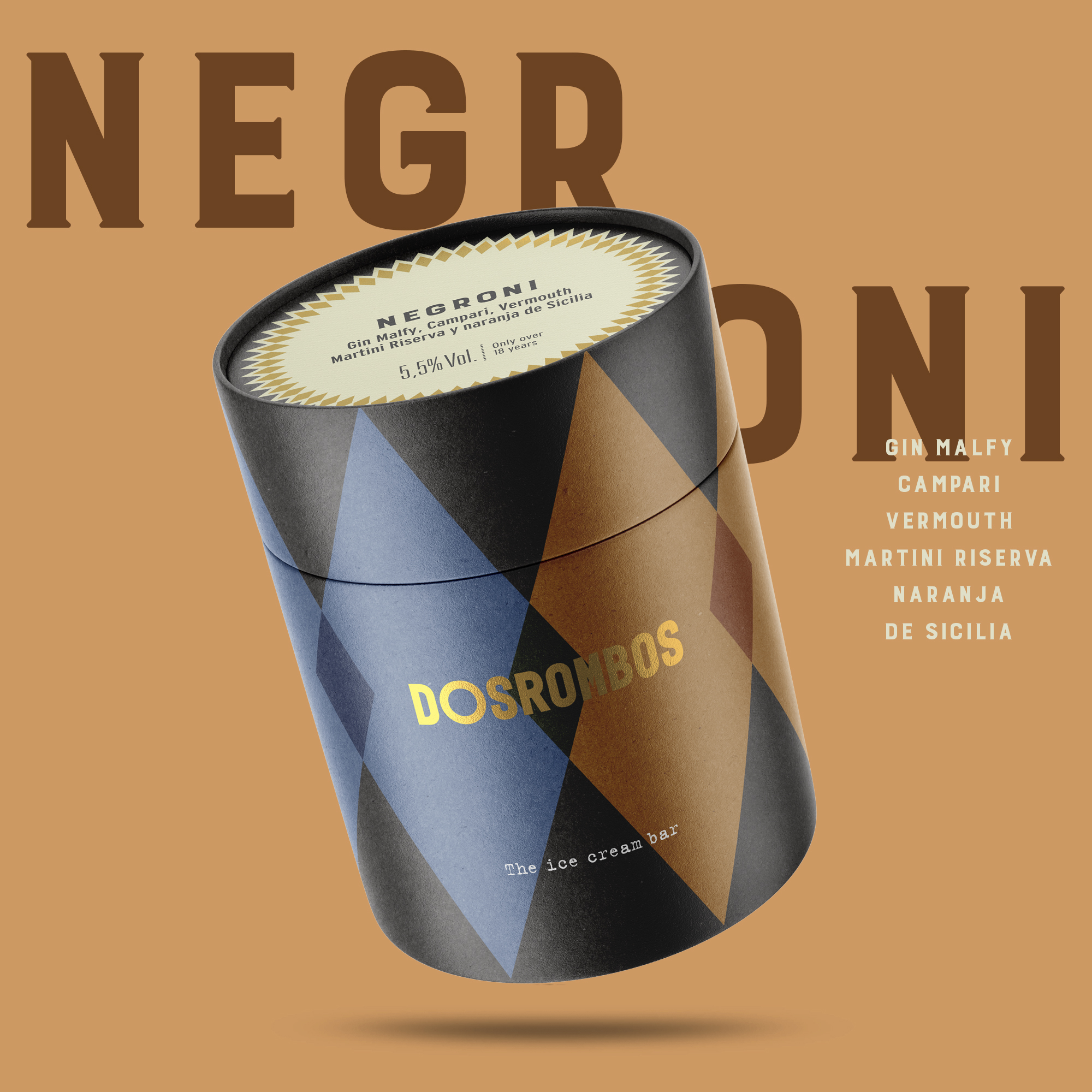
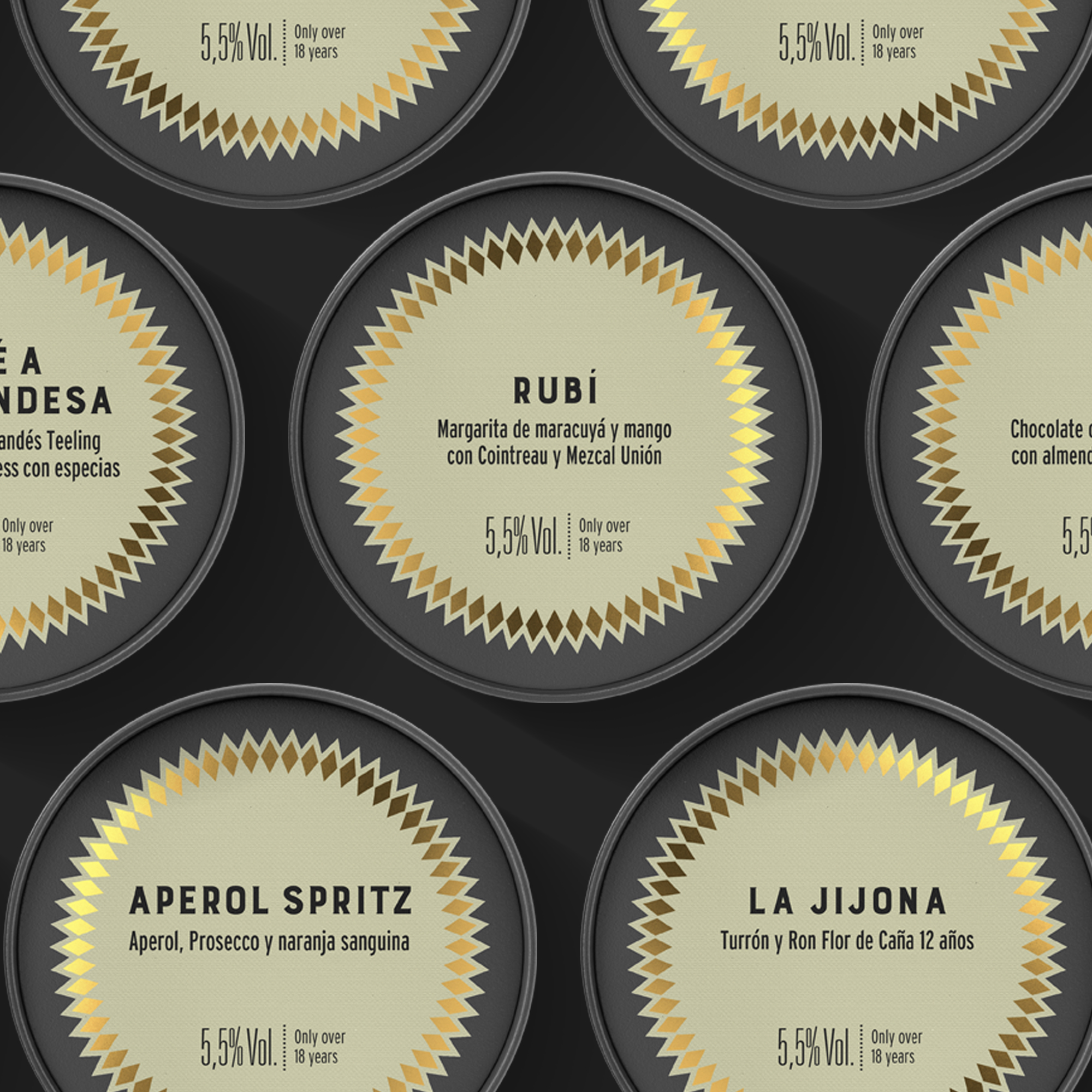
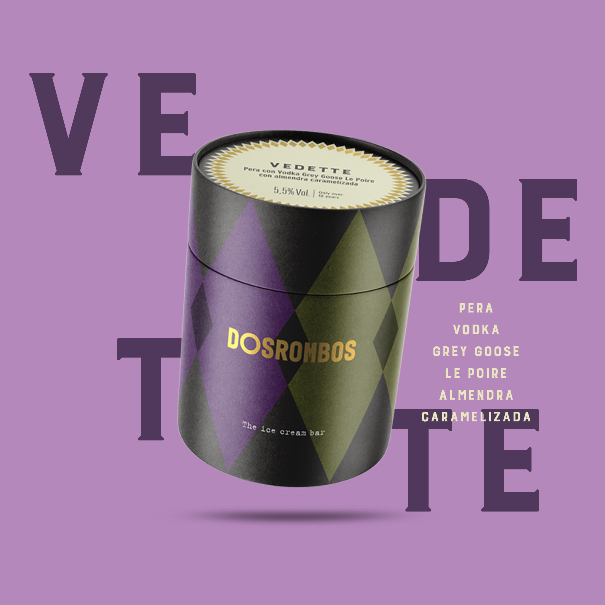
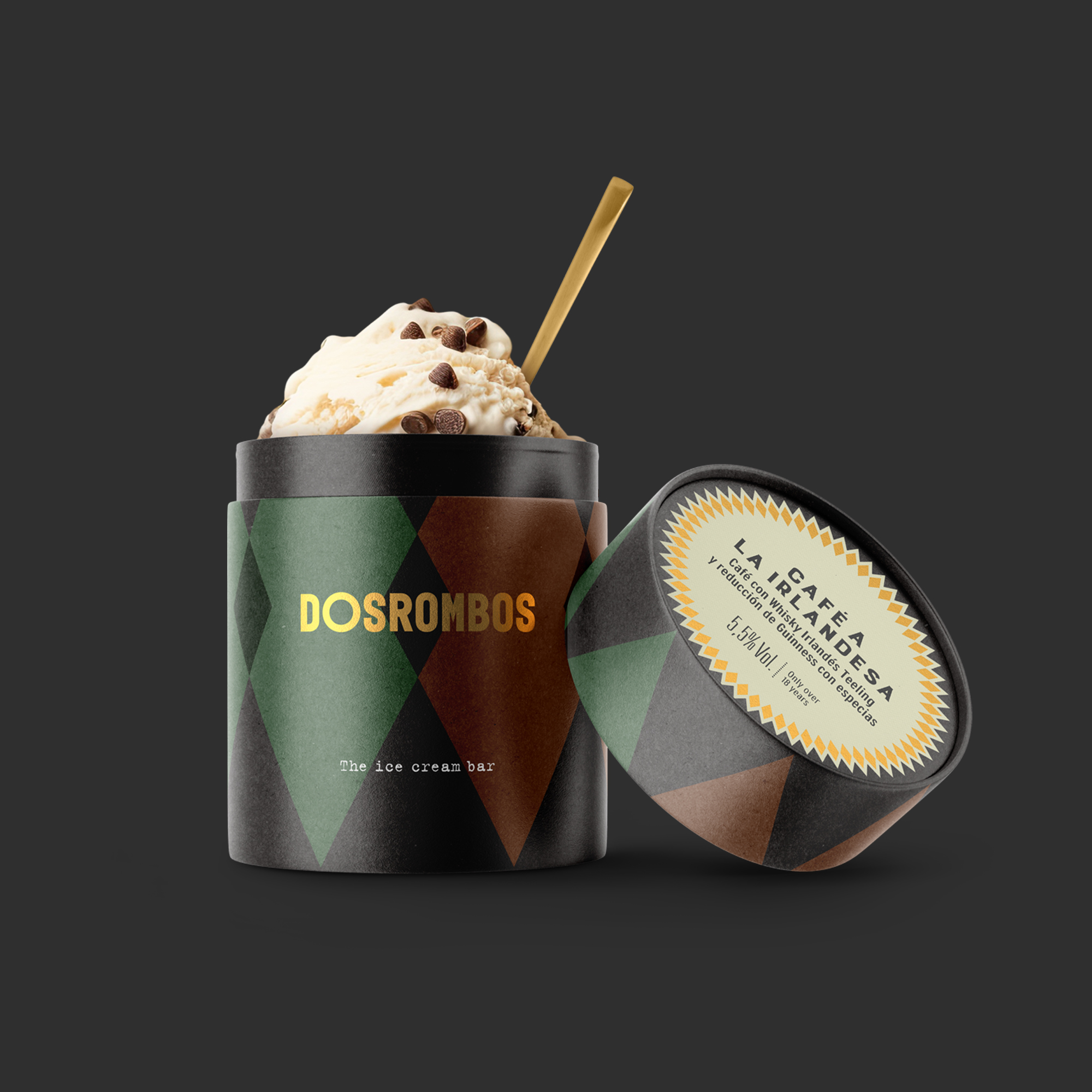
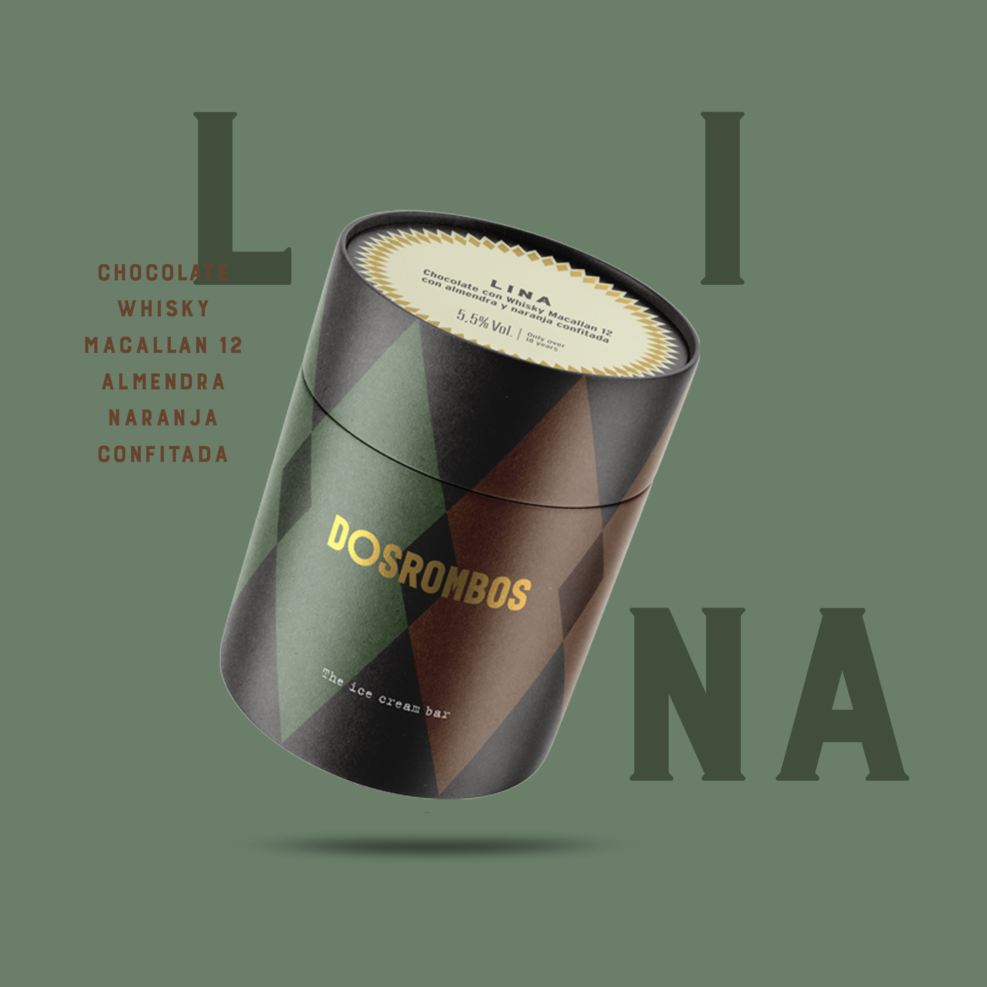
In 2024 a new product comes to our hands that mixes the traditional Italian gelato with the classic cocktail bar. Finally, an ice cream only for adults. DosRombos is born, the first ice cream bar exclusively for people over 18 years old. We rescue from our recent history an idea and a symbol that today acquires a new meaning.
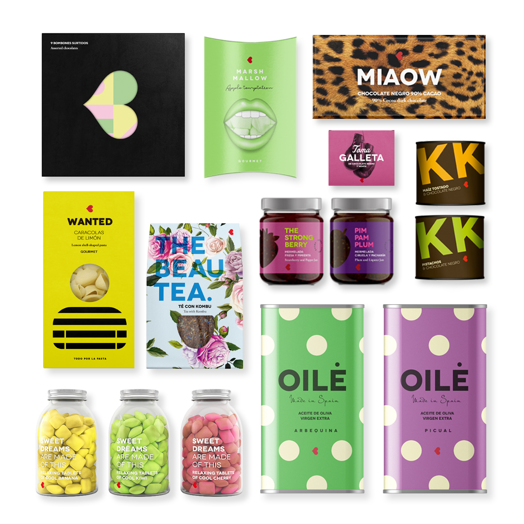
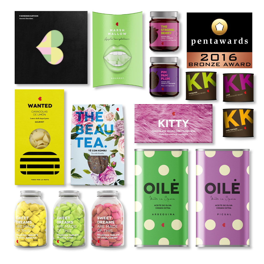
Identity and packaging design for the brand of gastronomic souvenirs Young and Beautifood. The main challenge was to turn regular products from the pantry into something extraordinary. Young and Beautifood is an example of happy packaging philosophy, a particular vision of design that combines simple concepts, optimism, full colour and a good storytelling.


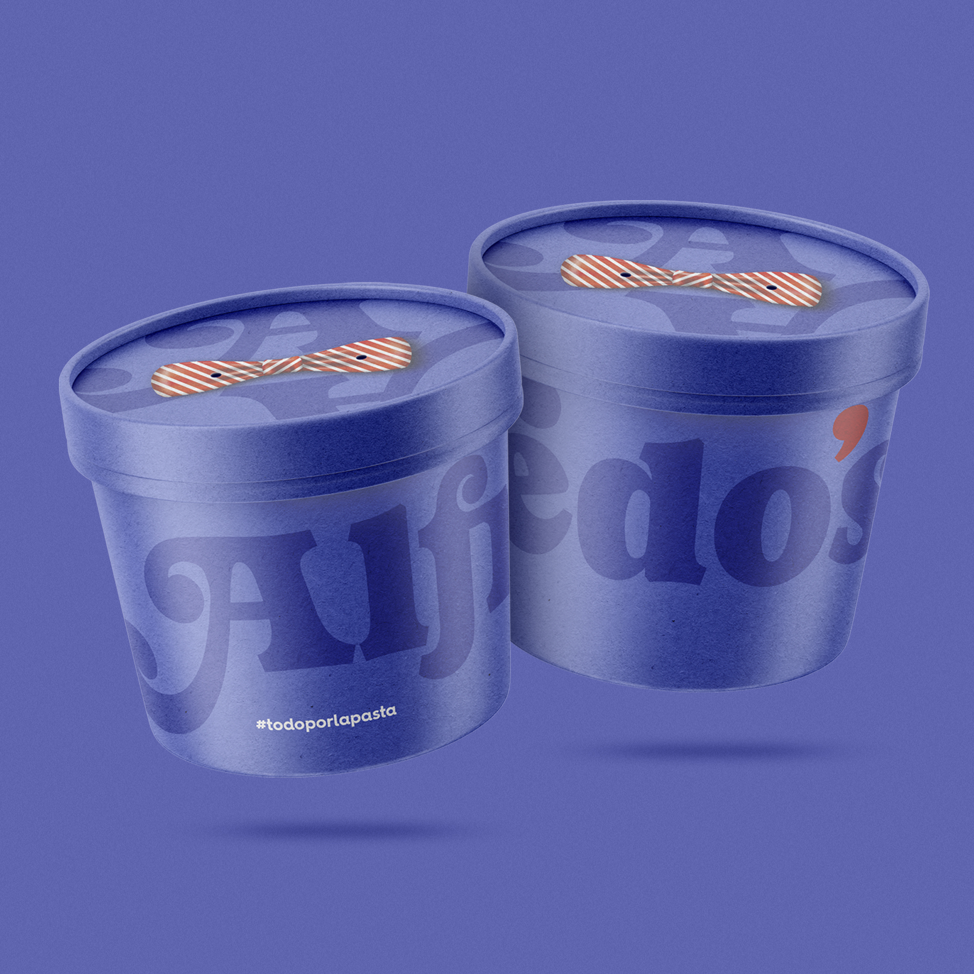
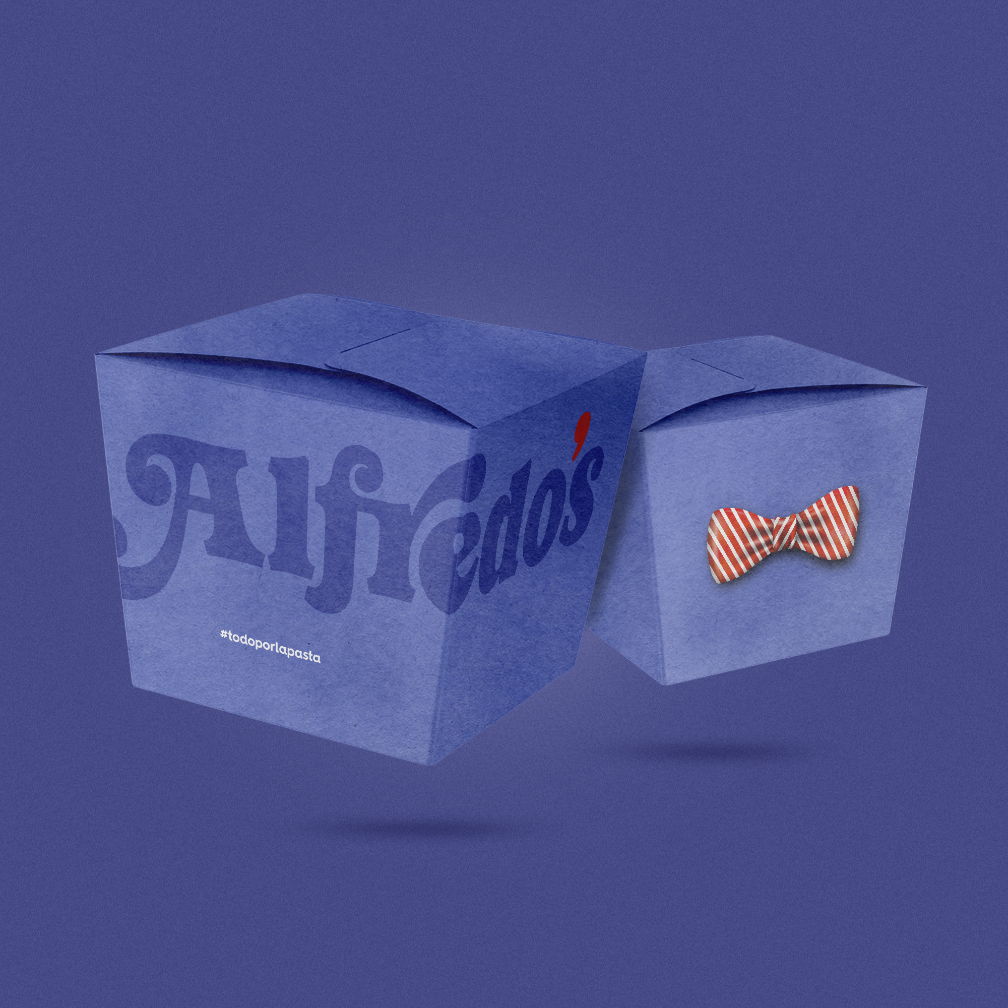
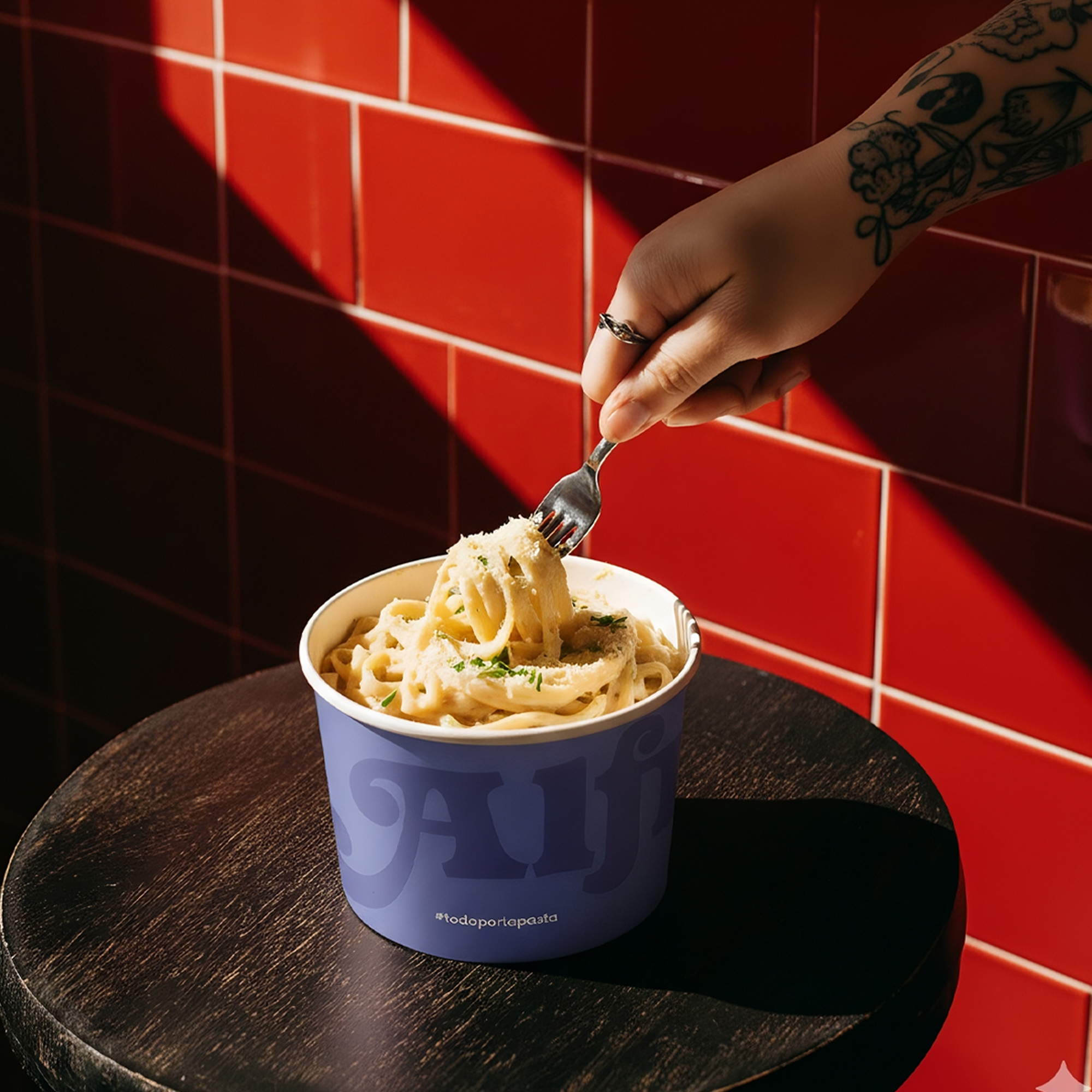
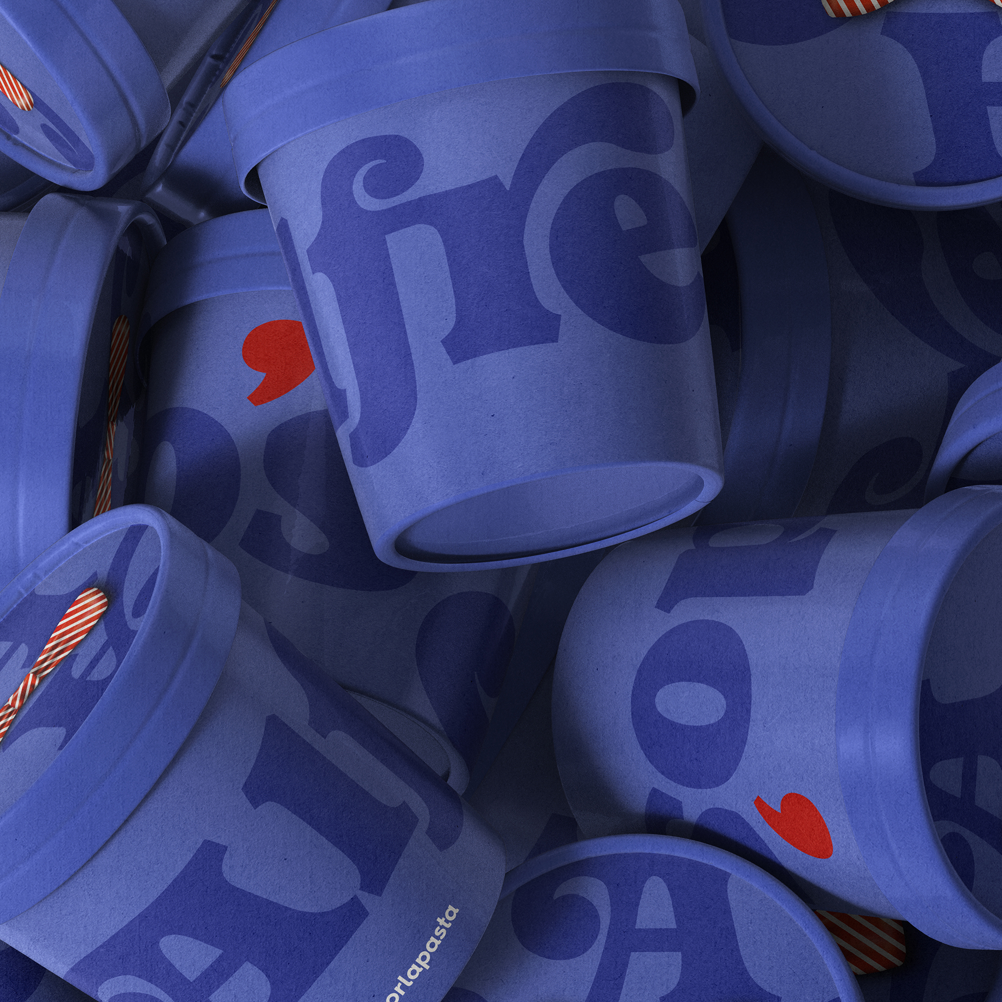
Alfredo’s is a small chain of takeaway pasta restaurants that needed a restyling to tackle its expansion phase. Italian-American restaurants in New York inspired our visual identity proposal, for which we developed two powerful brand assets: lettering with vintage features and a bow tie as a symbol that helps us convey the idea of attention and service.

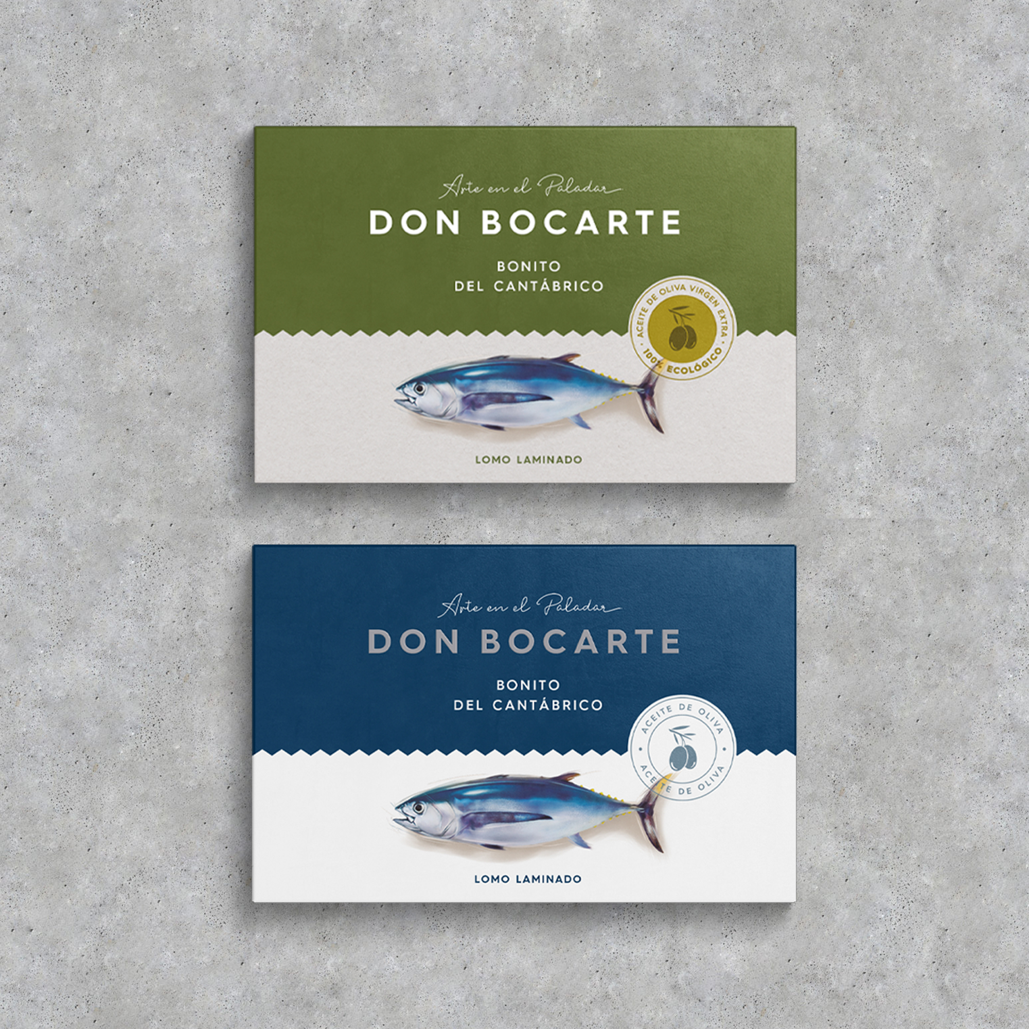
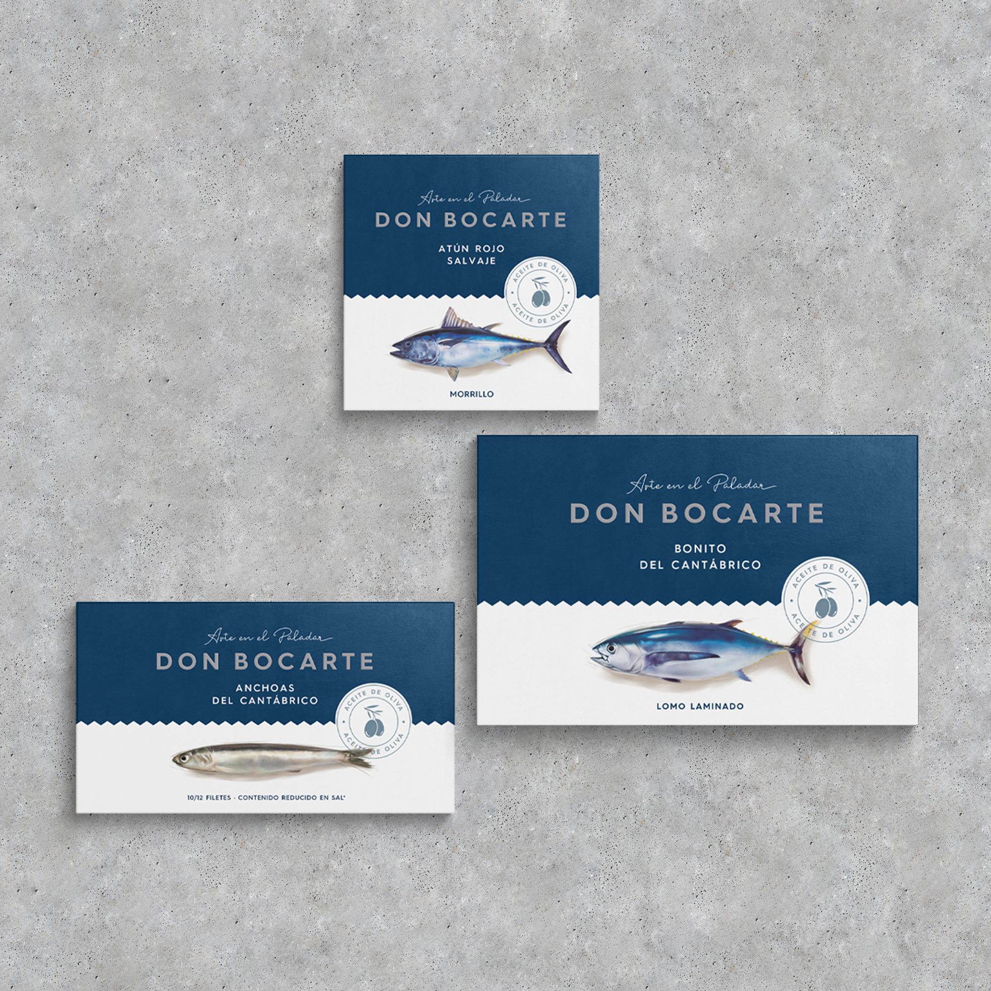
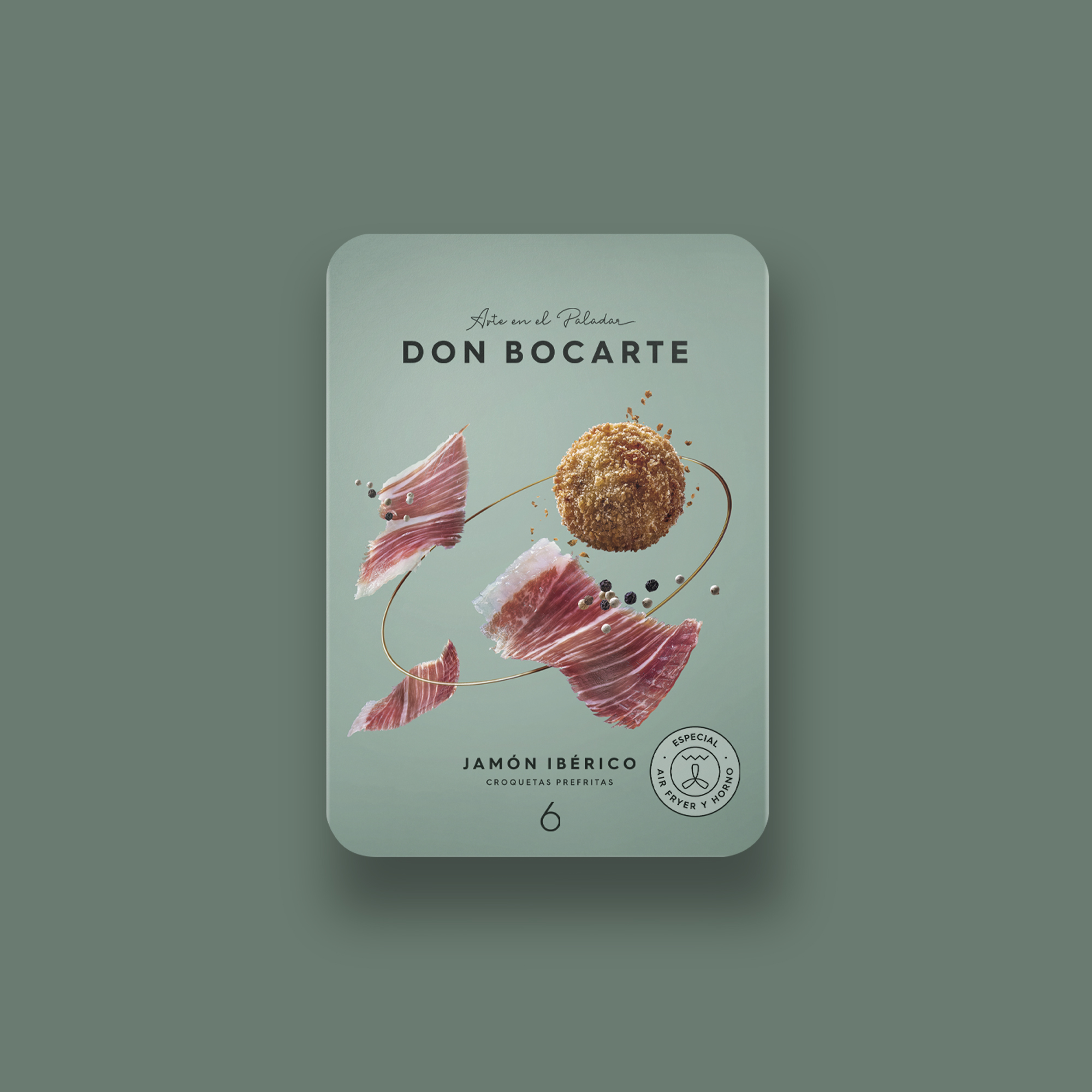
Don Bocarte, a leading Spanish company in gourmet canned fish, commissioned us to restyle and design their brand’s packaging. The tagline, Art for your palate, served as a foundation on which to build the new visual identity. The goal was to create a brand able to communicate the quality, the know-how and the trust that Don Bocarte is known for.
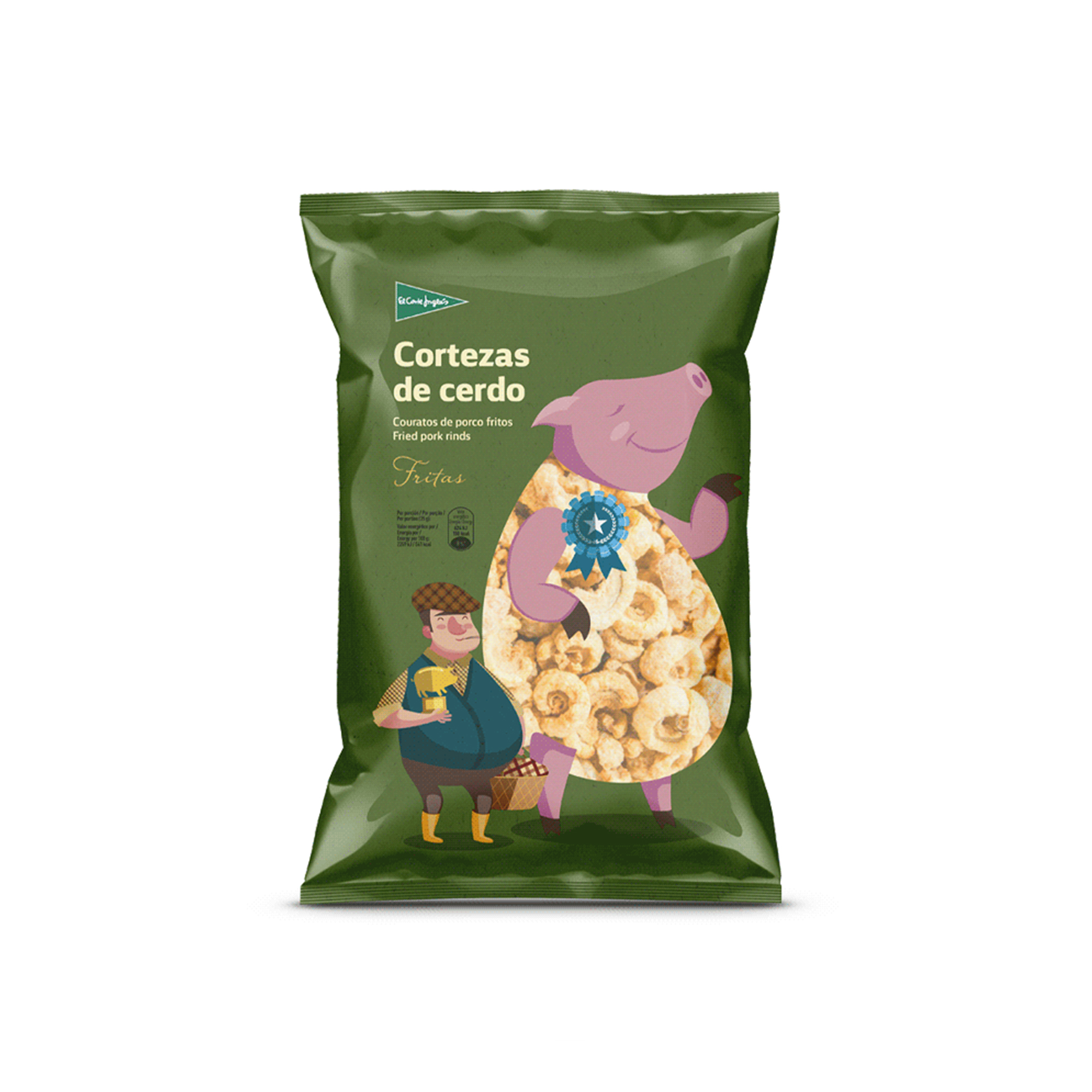
Conceptualization and design of El Corte Inglés Masterbrand. The Spanish brand wanted to reposition the image of its private label through a new communication strategy. The objective was clear: to evolve towards a more emotional communication closer to consumers. The new El Corte Inglés brand seeks to generate links with the customer and connect with consumer's lifestyle, while reinforcing values such as quality and trust, inherent to the brand.


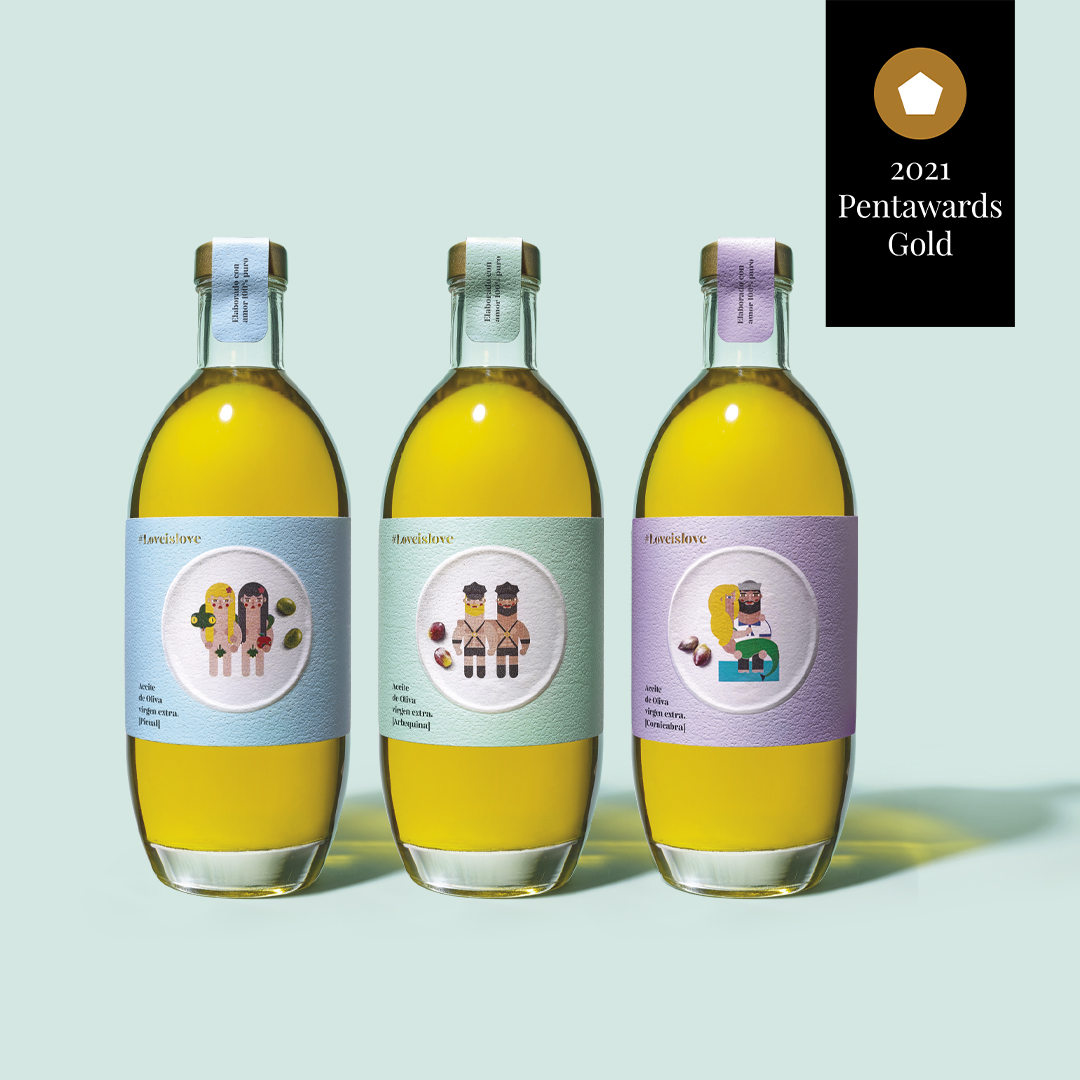
Conceptualization and design of El Corte Inglés Selection Masterbrand. The awards and recognitions universe inspire the brand asset of the new premium brand of El Corte Inglés. A proposal that combines gourmet, traditional and denomination of origin products under the same packaging architecture. The proposal articulates the design through a transversal band that divides the pack into three parts and serves to organize all the information and creativity of each category. Based on this architecture and the definition of the Masterbrand, small families of products are designed.


