
Since 2007, Studio Zak has been creating bold, multi award-winning branding and packaging design for brands that want to be seen, remembered, and chosen.
Led by creative director Paula Pozza, the studio is known for its storytelling-driven approach and striking illustrative style, blending strategy and creativity to build emotionally engaging, visually powerful packaging that resonates across cultures and markets.
Based in Italy and Brazil, our work blends Brazilian flair, Italian finesse — a multicultural approach that gives our designs a distinctive voice.
It all starts with a Hey.
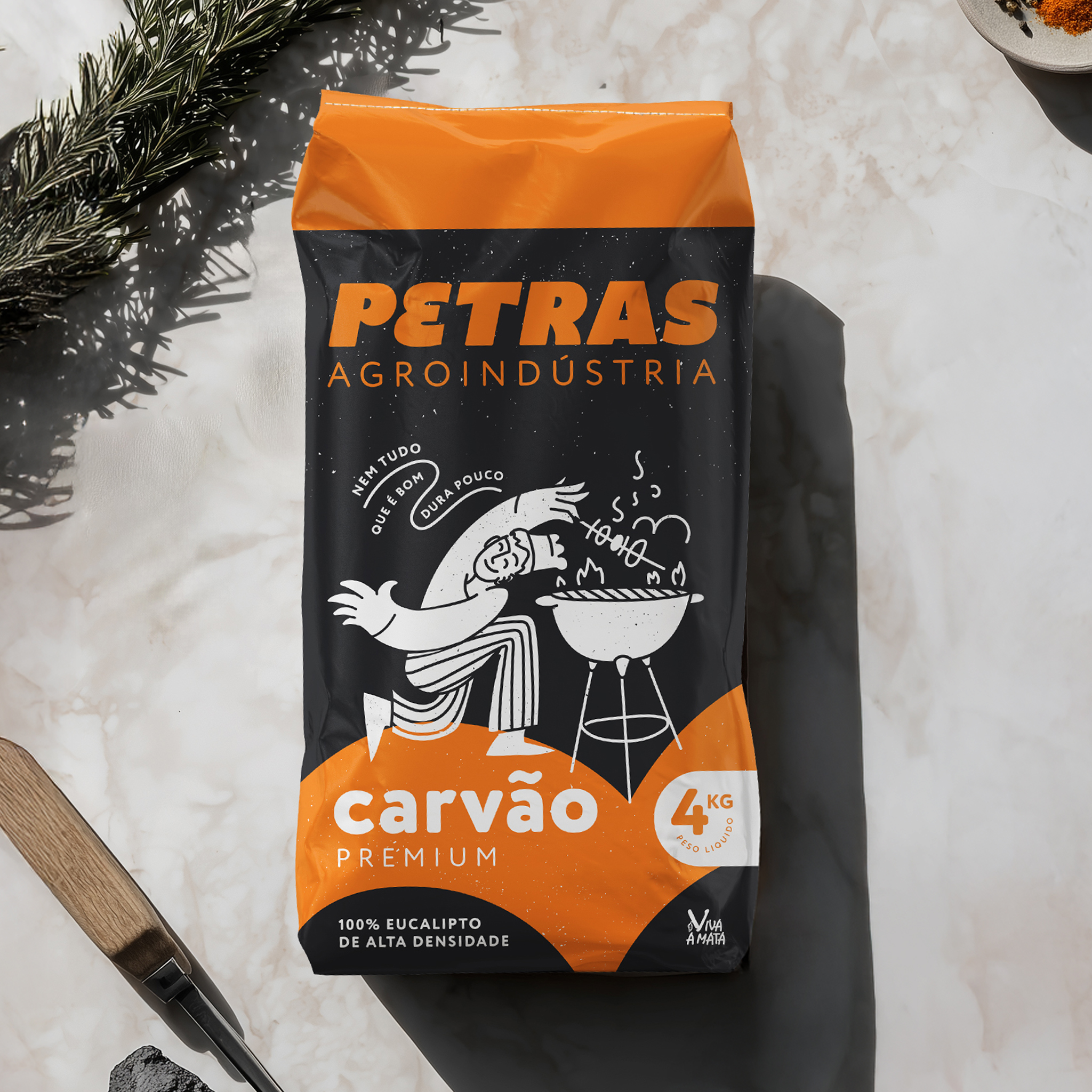
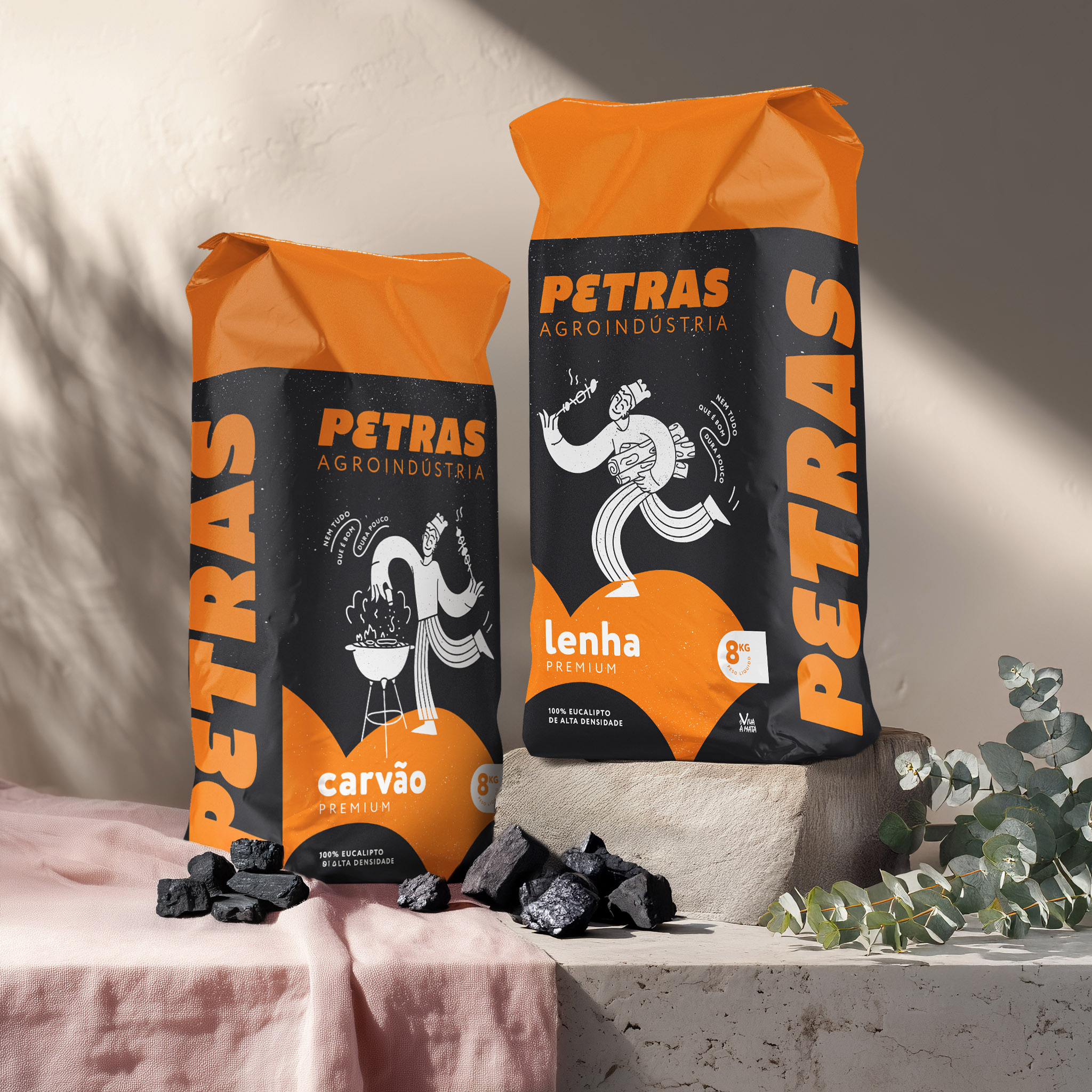
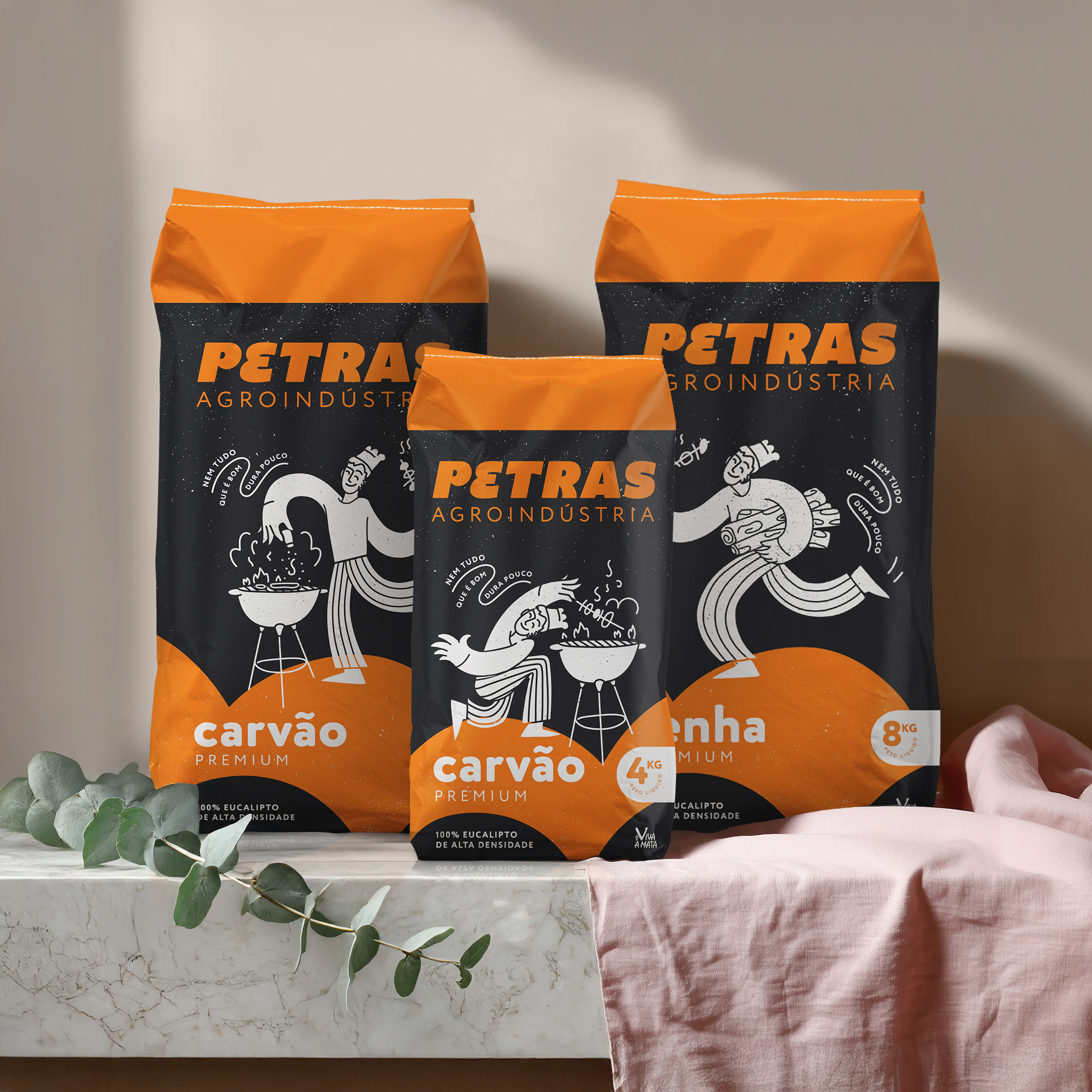
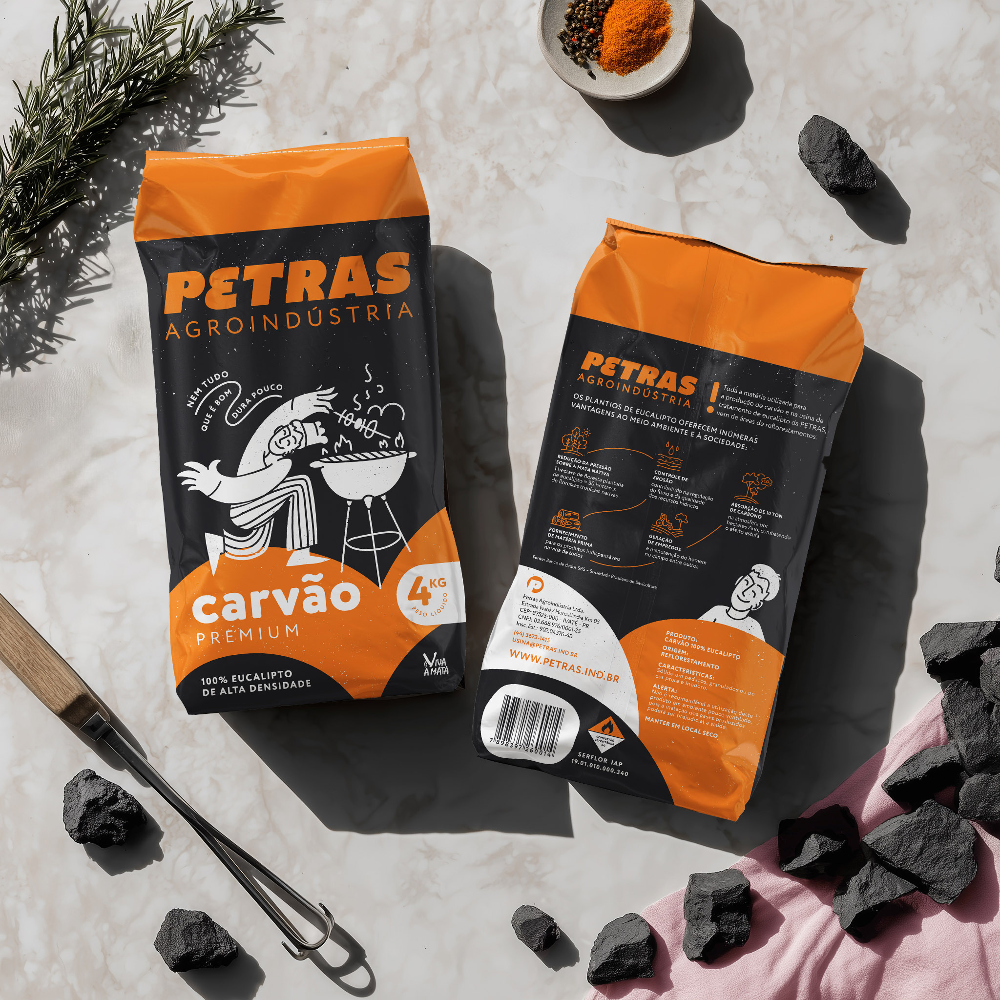
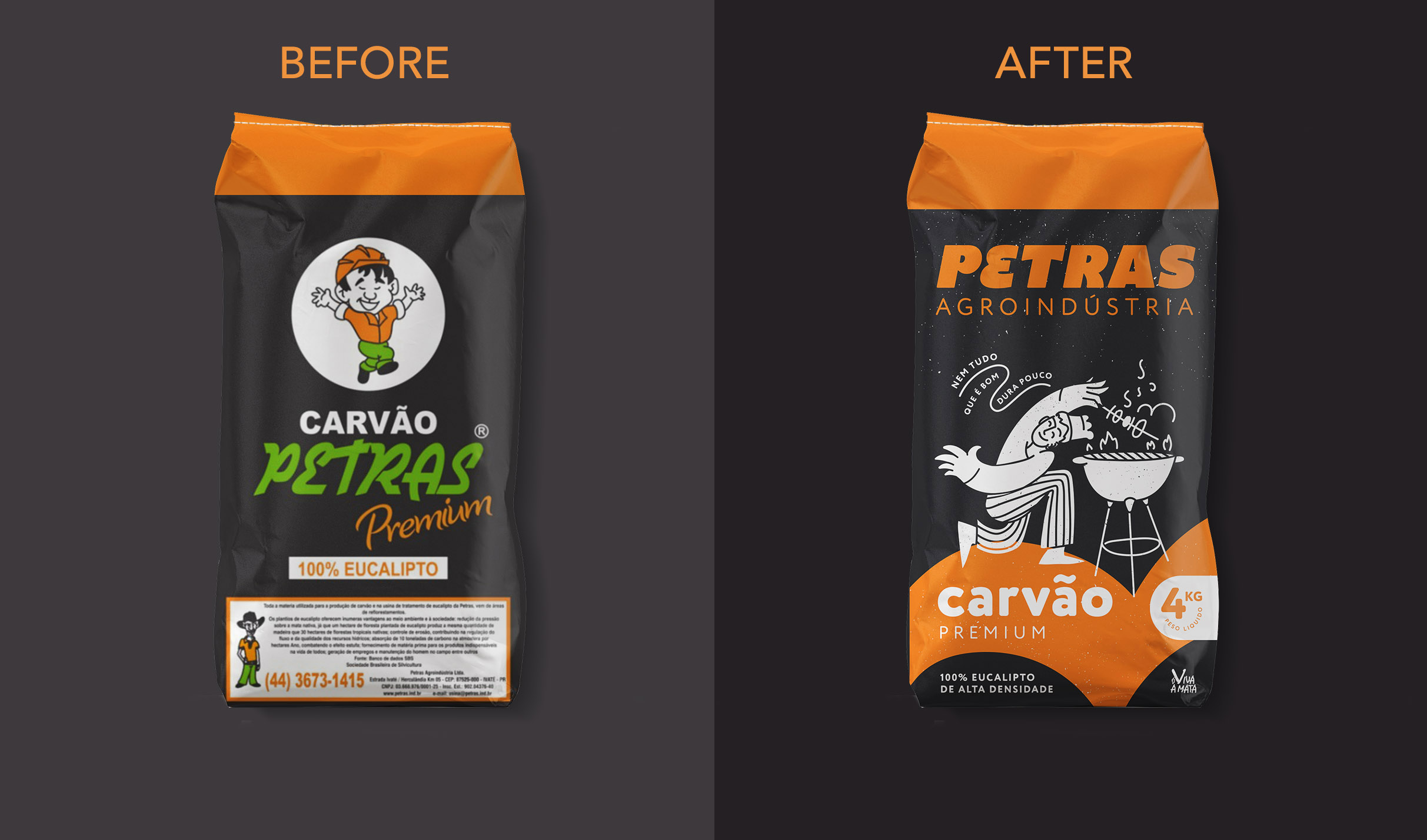
Petras is a family-run business from rural Brazil producing sustainable eucalyptus charcoal and other eucalyptus-based products. After 25 years, they came to us ready for a new chapter—while honoring the story that brought them here. The refresh begins with a refined logo, preserving Petras’ distinctive “E” and recognizable green and orange palette, now balanced and clarified for modern use. For the consumer line, we reimagined their mascot—originally from local comics—into a clean, contemporary illustration that brings warmth and approachability to every pack. On the corporate side, the logo stands confidently on its own, ready for business cards, delivery trucks, and B2B presentations where formality calls for a simpler look. For the charcoal range, we retained Petras’ signature black packaging and vivid orange stripes, ensuring a smooth transition on store shelves while keeping the brand instantly recognizable to returning customers. The mascot playfully spans three pack sizes, each capturing the joy of grilling while maintaining a clean, practical structure that holds up after opening. This is packaging that feels considered and confident—honoring Petras’ past while preparing them for what’s next.
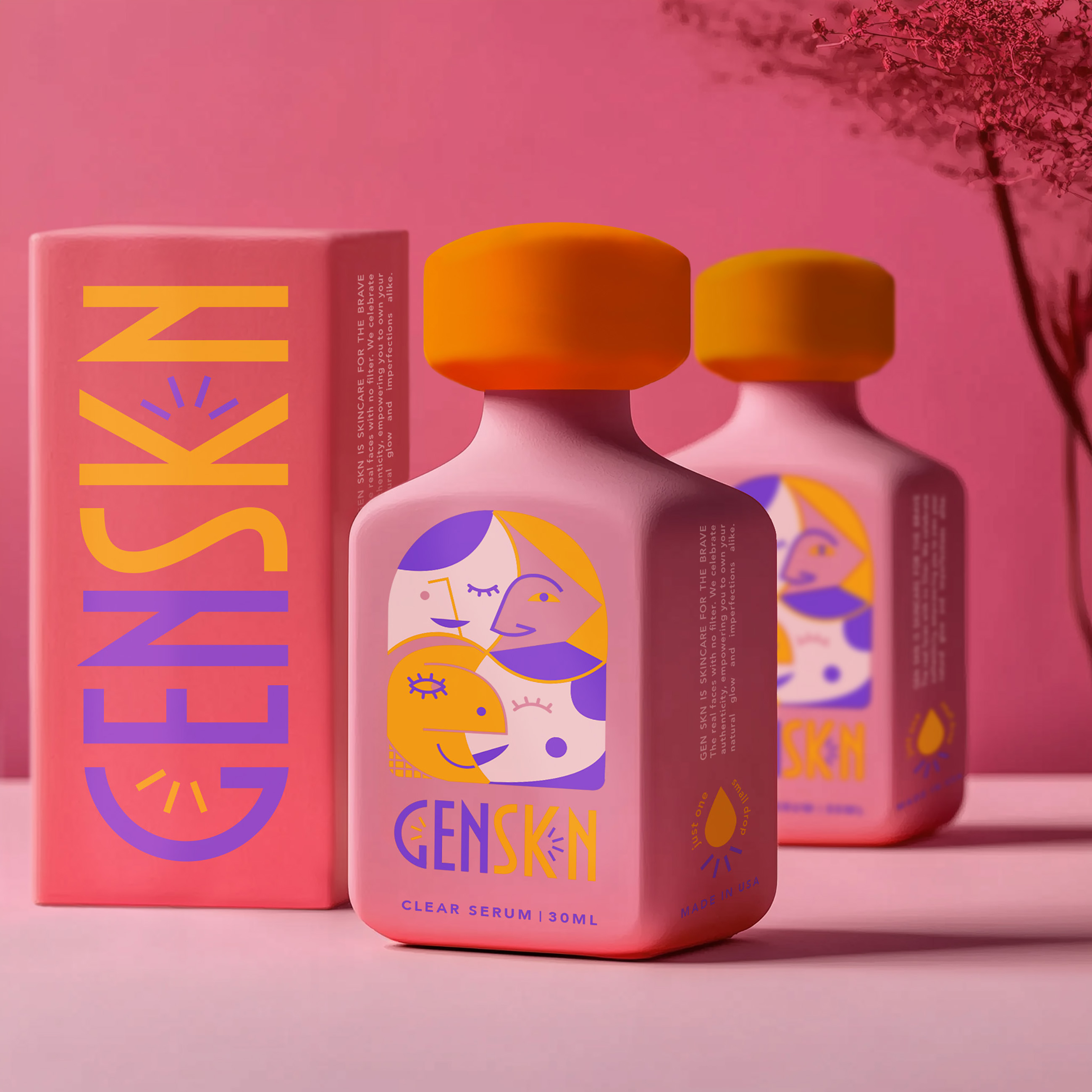
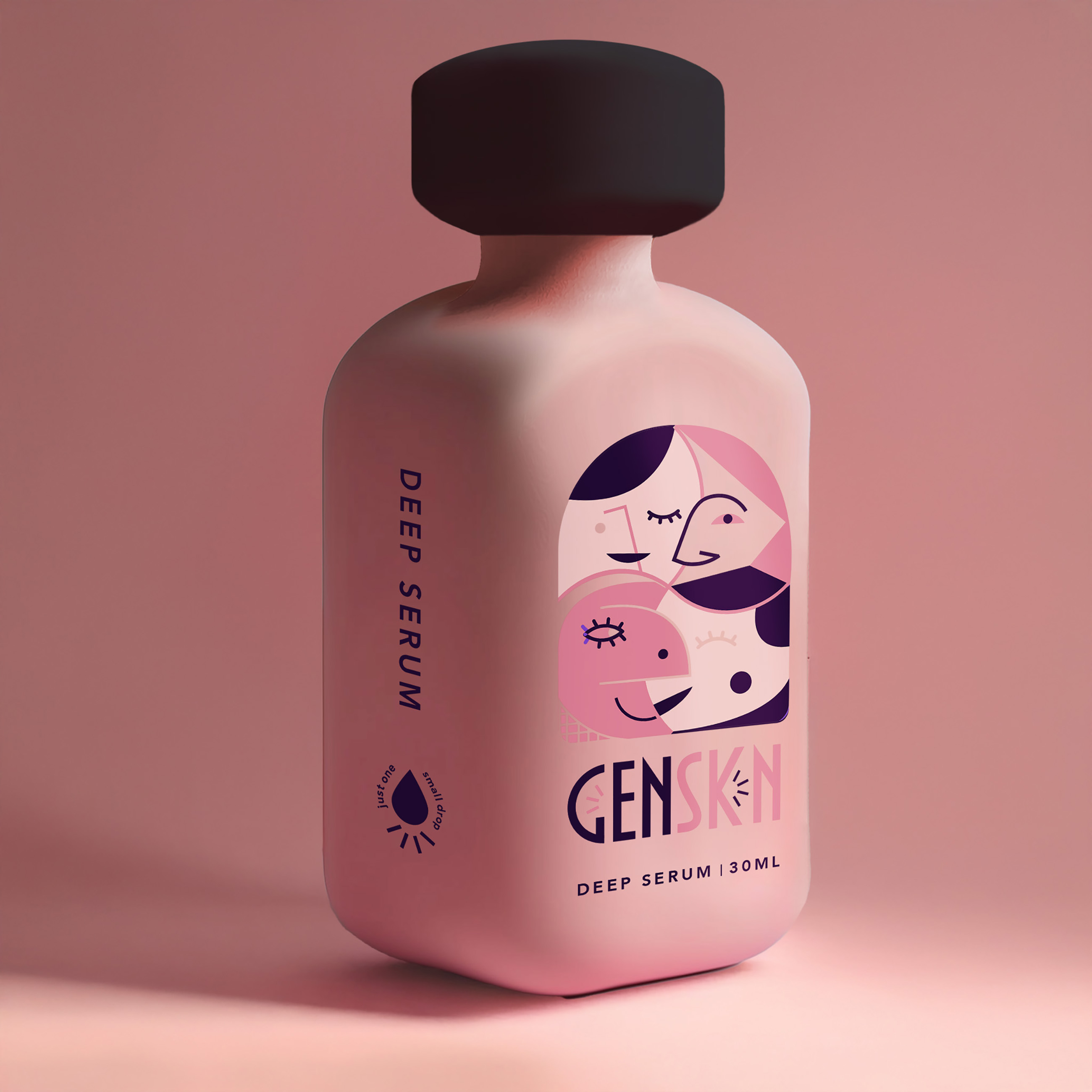
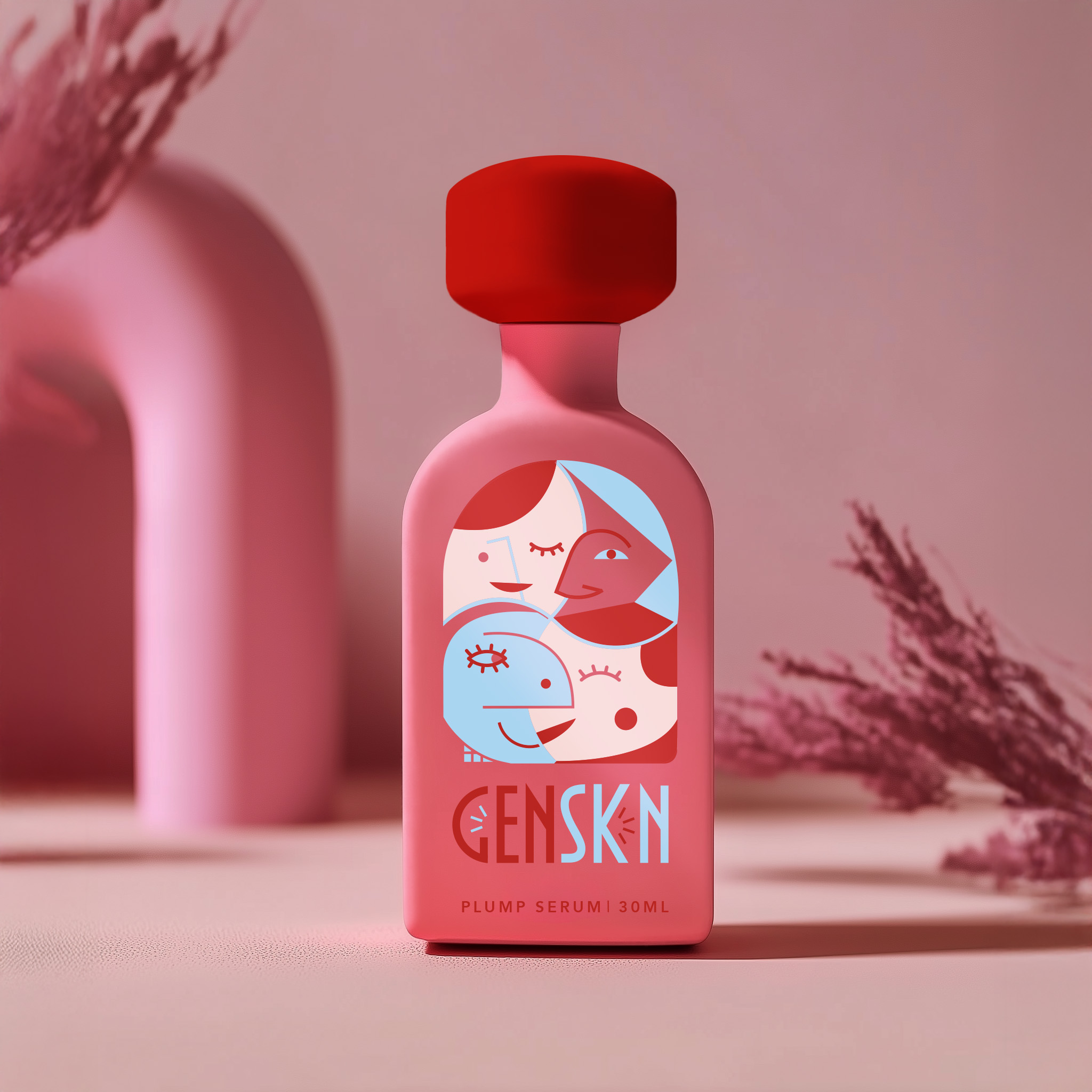
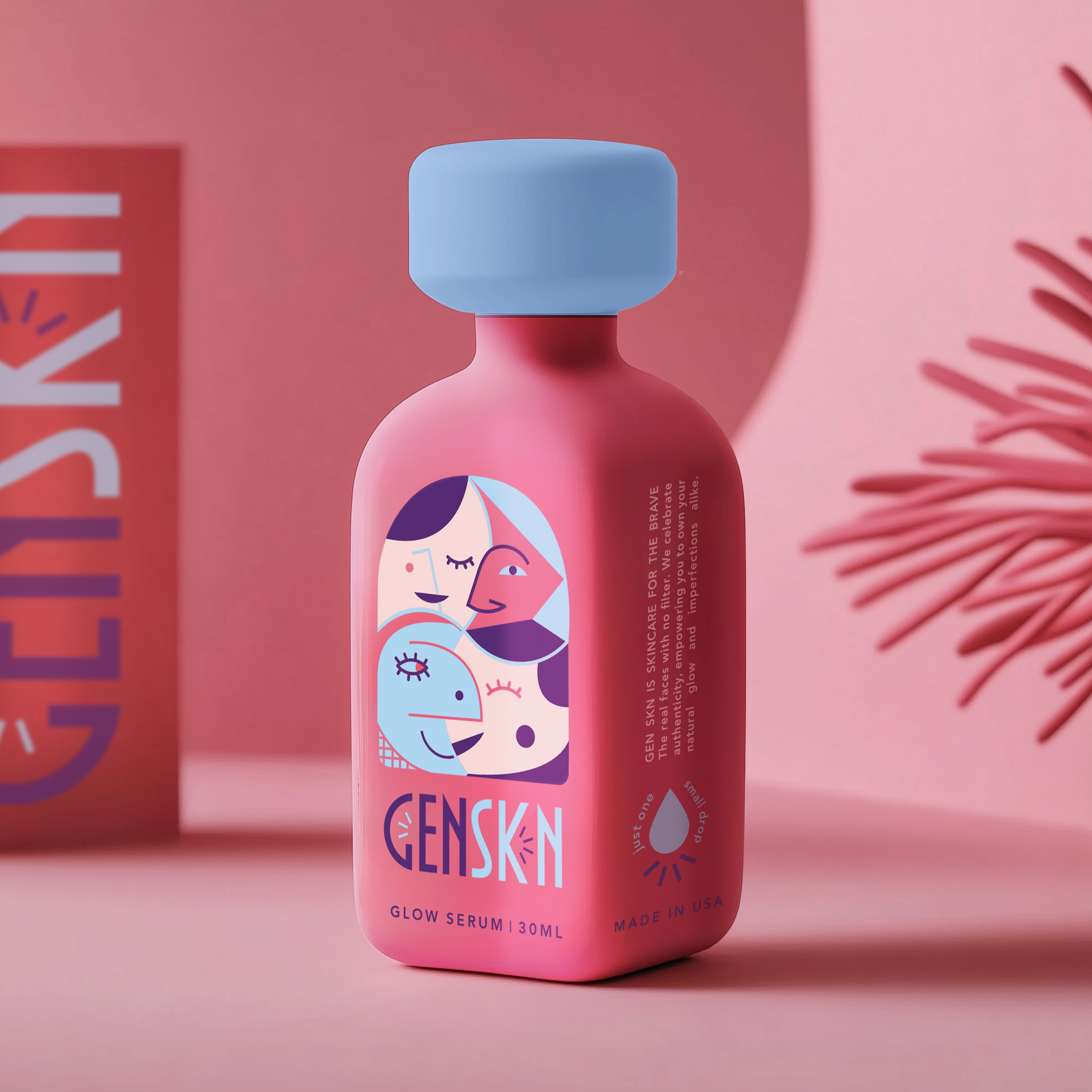
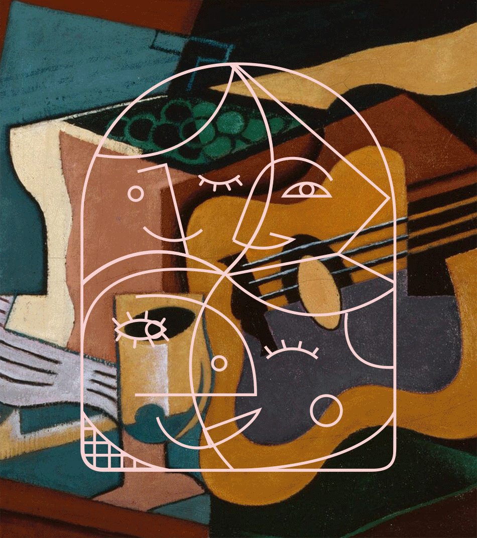
GenSkn is a bold, inclusive cosmetics brand redefining luxury in the world of serums. Unbound by gender and unapologetically expressive, the brand lives primarily online—where its visual identity speaks for itself. The packaging balances clarity and structure without feeling sterile. Each product features bold, straightforward typography set in a grid-like layout, complemented by soft blue-greens, off-whites, and bright reds that create contrast without being loud. Diagrams, graphic overlays, and playful mid-century-inspired type give the brand a design-forward, slightly scientific edge. At the core of GenSkn’s identity is a striking logo inspired by Cubist linework: a tangle of abstract faces flowing seamlessly into one another, a visual metaphor for the fluidity of identity. This bold, illustrative approach extends across the packaging, transforming bottles into mini art objects. Matte-finish pastels with oversized, color-rich lids give each product a sculptural, collectible feel—soft yet unapologetically assertive. This is packaging that takes up space—luxurious, expressive, and unmistakably GenSkn.
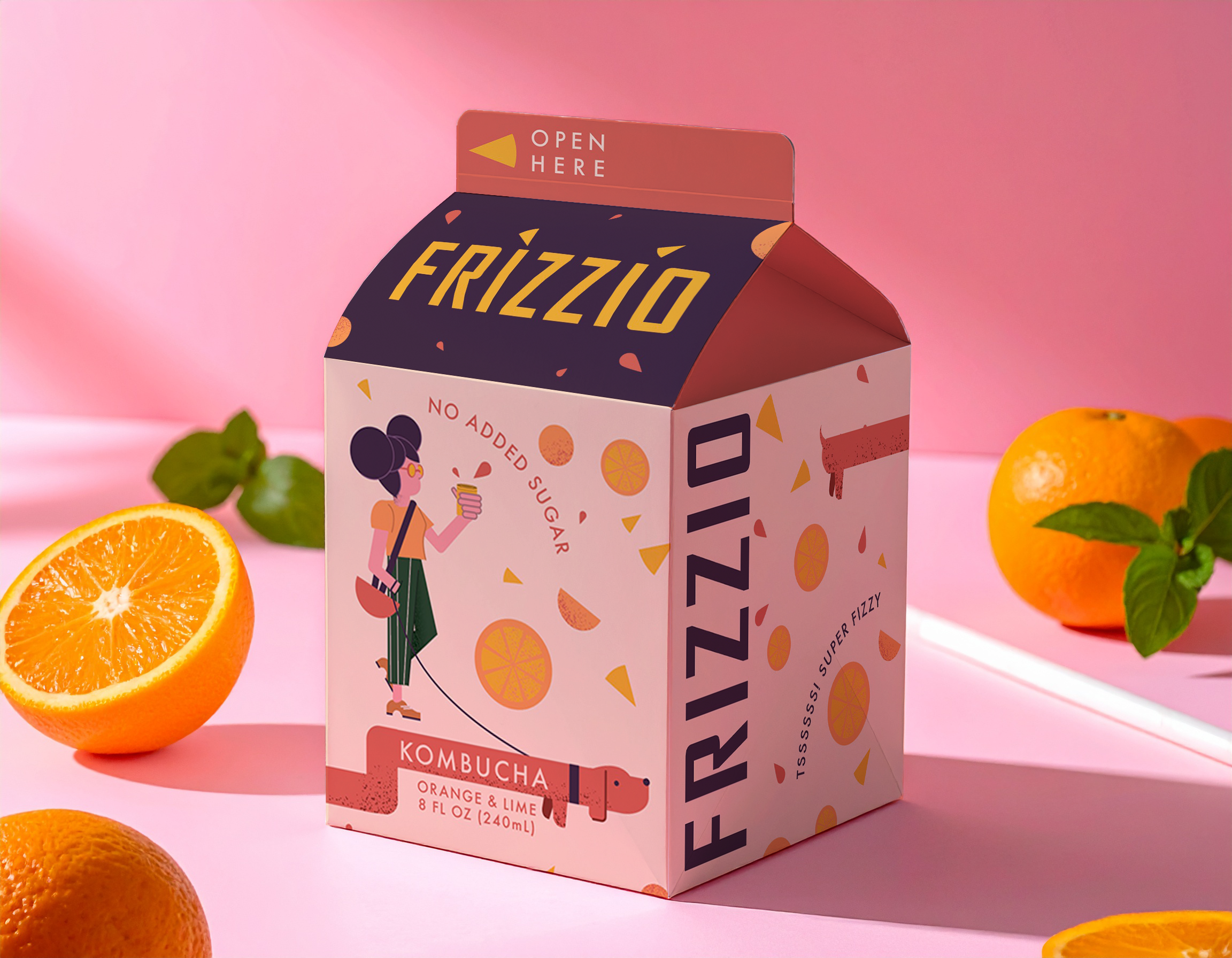
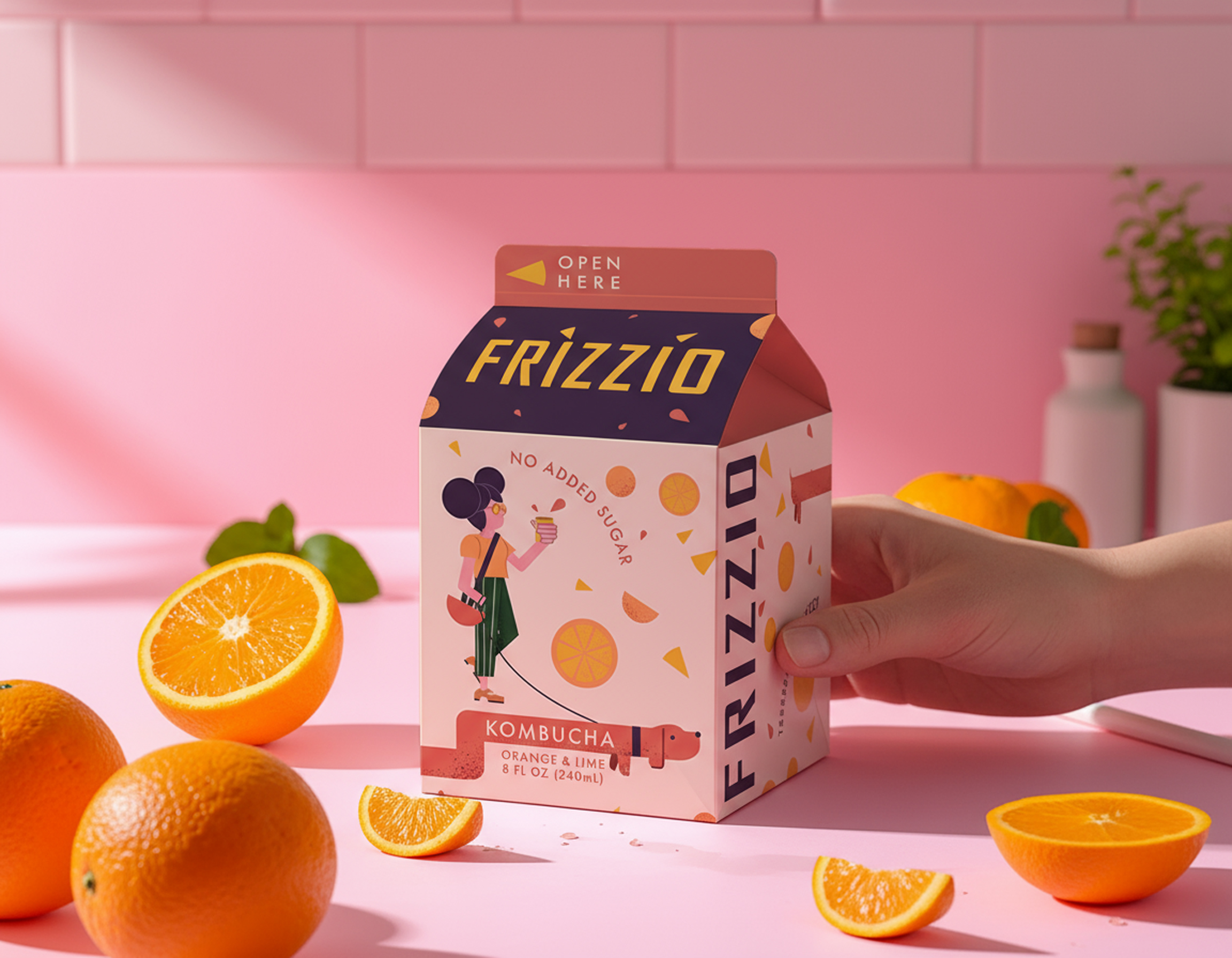
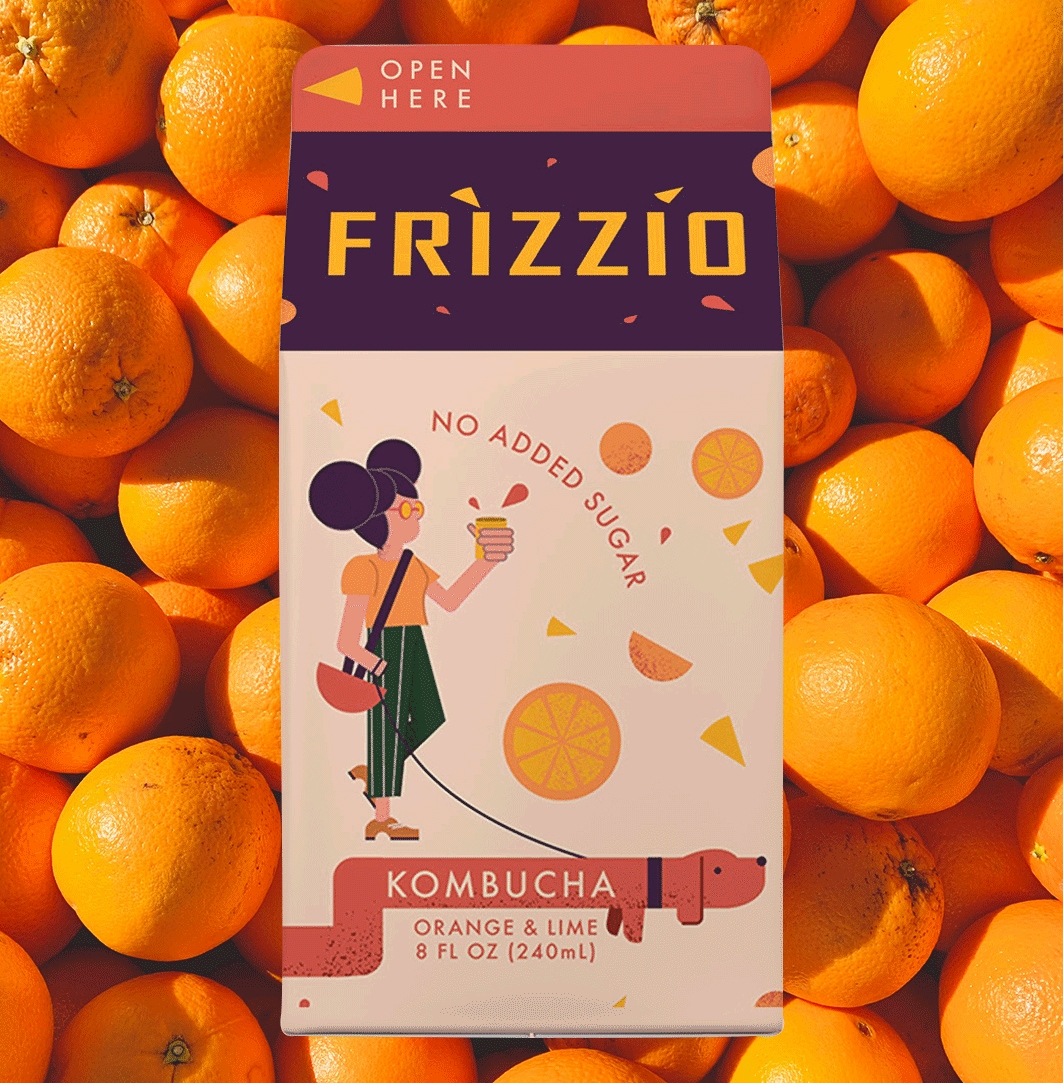
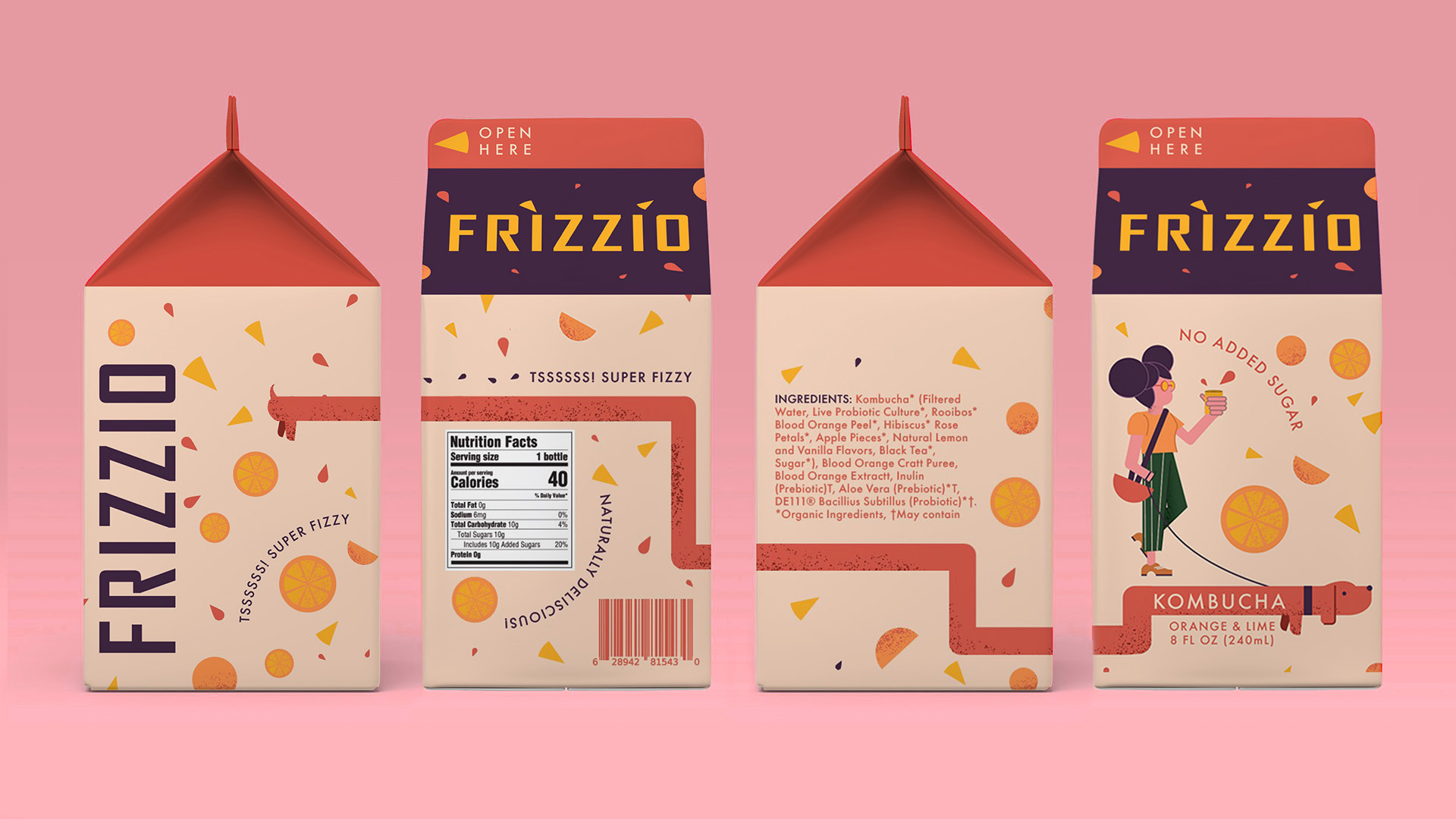
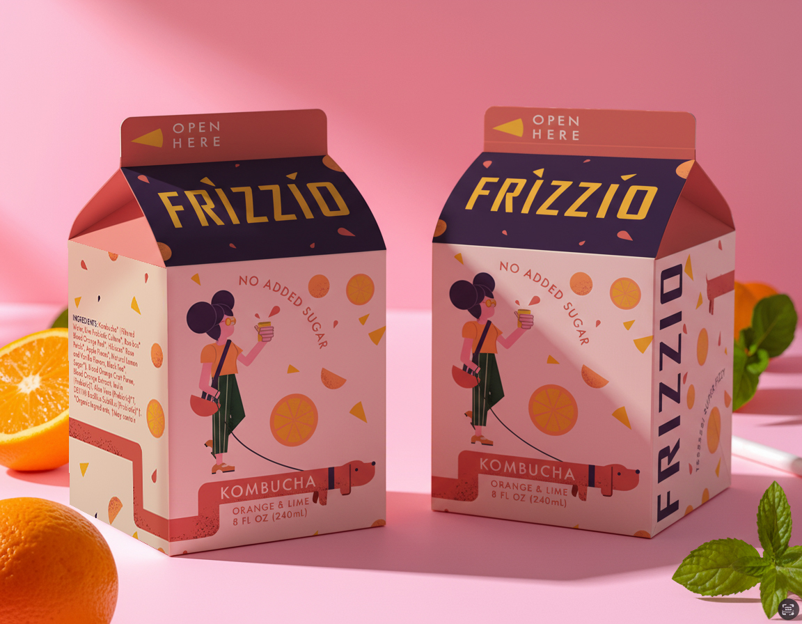
Frizzio is a kombucha that reinterprets the nostalgic world of vintage juice cartons — packaged in recycled Tetra Pak and designed to feel straight out of another era, but with a bold, Gen Z twist. Frizzio was born from a cultural shift — where Gen Z looks backward to move forward. This generation is redefining nostalgia, collecting fragments of the past and remixing them into something new. It’s not about retro for retro’s sake; it’s about belonging to a memory you never lived. In a market where kombucha often hides behind green, minimalist, and “clean” design codes, Frizzio takes a different route — one that celebrates imperfection, play, and self-expression. It’s a brand that doesn’t just fit in on the wellness shelf — it fizzes out of it. The identity blends grainy illustrations and a warm vintage palette with confident modern typography, striking a balance between familiarity and freshness. A quirky dog character wraps around the pack, tail wagging as it reappears on the back — adding a collectible charm that invites curiosity and connection. Frizzio embraces a neo-vintage aesthetic: a love letter to the tactile, the imperfect, and the joyfully human. It’s designed for a generation that finds comfort in the past, but lives entirely in the now — where nostalgia isn’t a retreat, but a rebellion. Its debut flavor, Orange, sets the tone — bright, cheeky, and ready to shake up the kombucha shelf with personality and style.
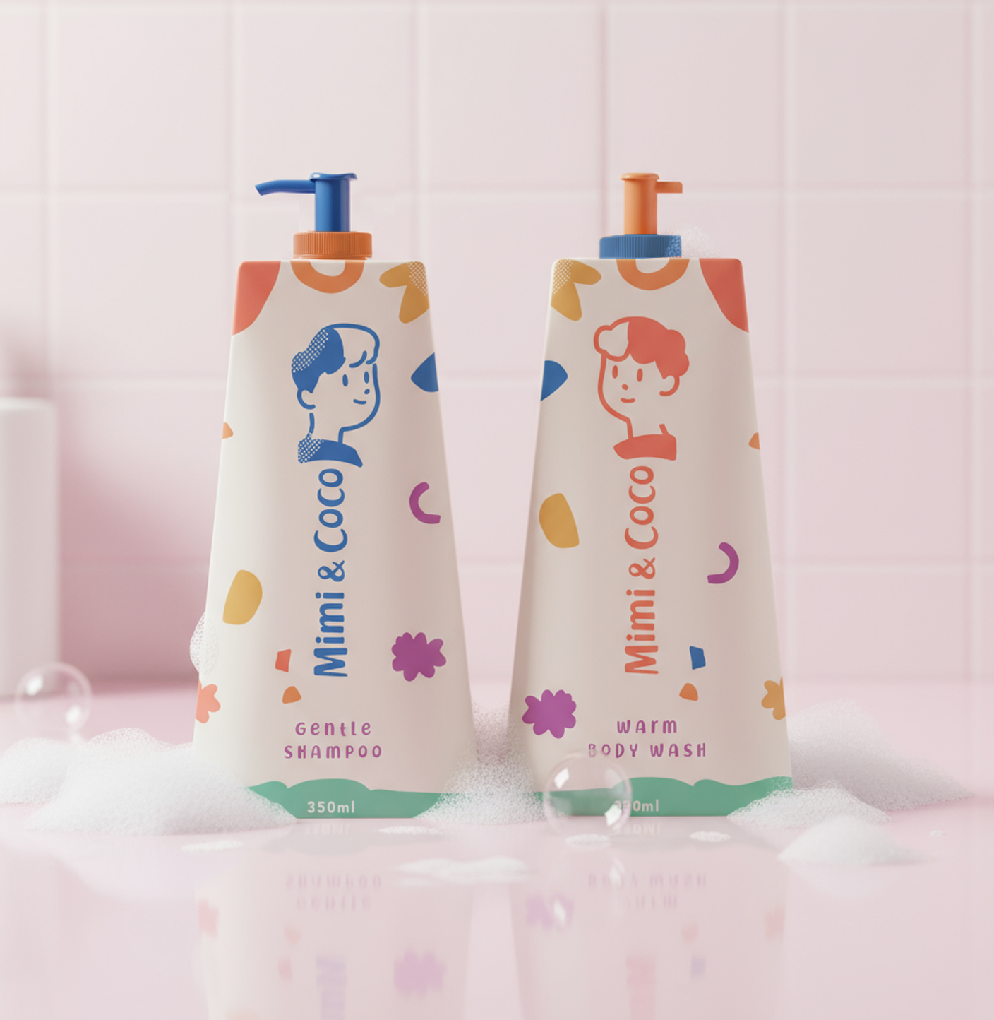
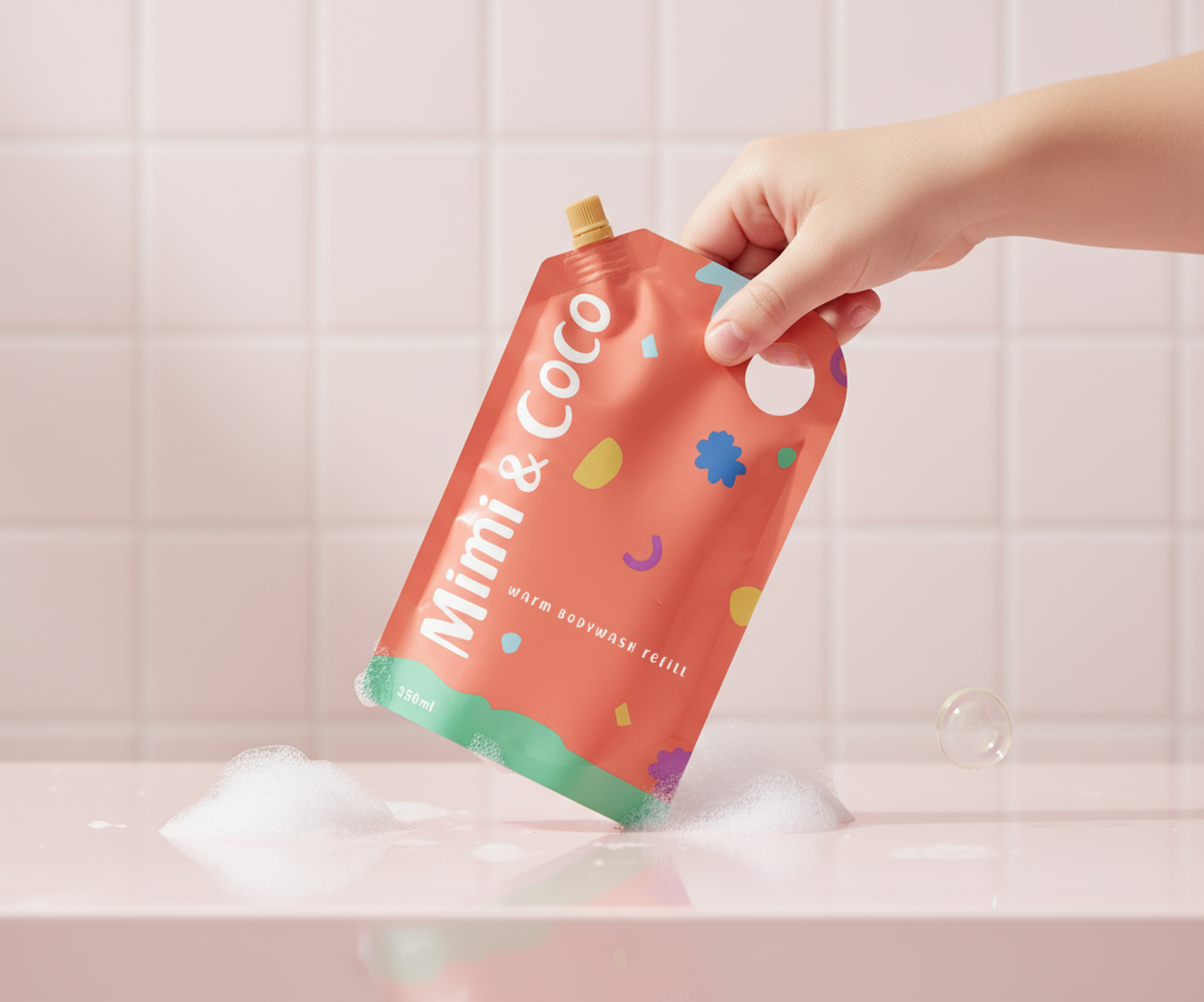
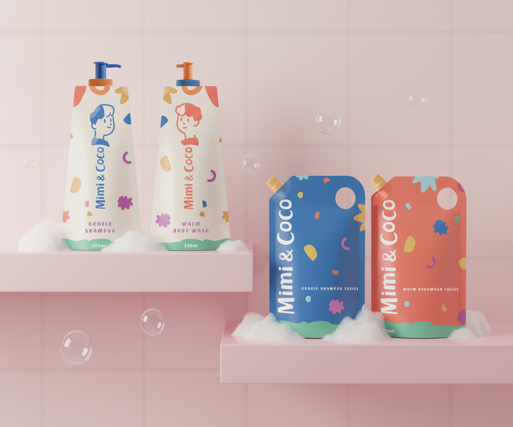
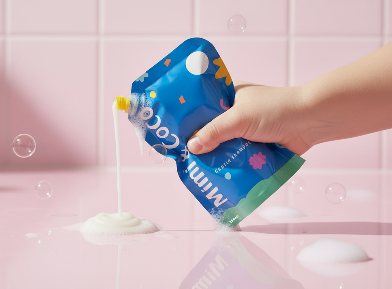
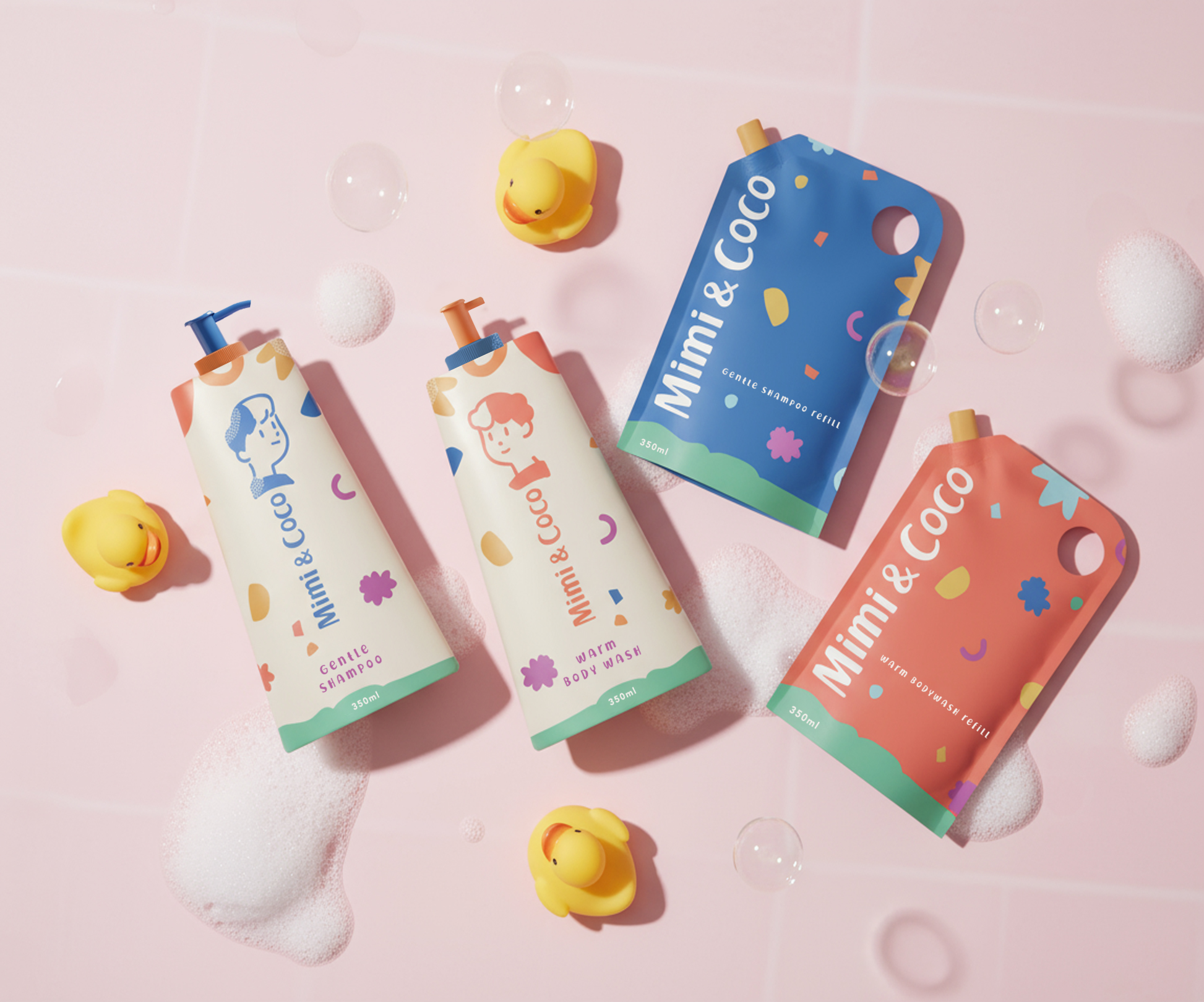
Mimi & Coco is a sustainable body and hair care line created for toddlers — where playfulness meets purpose. The brand redefines the idea of “care” by blending emotional growth with eco-conscious design. At its heart lies the belief that every child holds two sides: the brave and the gentle, the wild and the kind. Mimi & Coco celebrates both. The tone of voice and supporting visuals reflect this duality — lighthearted yet thoughtful, colourful yet calm, imaginative yet responsible. Visually, the branding draws from the unfiltered creativity of children’s drawings. The hand-drawn logo mixes upper and lowercase letters, while the illustrations of Mimi and Coco appear across supporting graphics in a style that feels both naive and authentic. A geometric pattern complements the duo, echoing building blocks and playful composition. The packaging system continues this honest simplicity. Matte bottles in recycled plastic are silkscreen-printed in toned-down primary colours — deep orange for the body wash, dark blue for the shampoo — with contrasting beige backgrounds that bring softness and balance. The refill pouches invert this palette, underscoring the brand’s circular design approach while creating a clear visual rhythm between bottle and refill. Sustainability is quietly embedded in every detail — from the refillable format to the minimal, durable finish. The result is a brand that feels fresh and familiar, playful and responsible, poetic and practical all at once. This isn’t just about bath time. It’s about nurturing a generation that grows up balanced — brave and gentle, wild and kind.
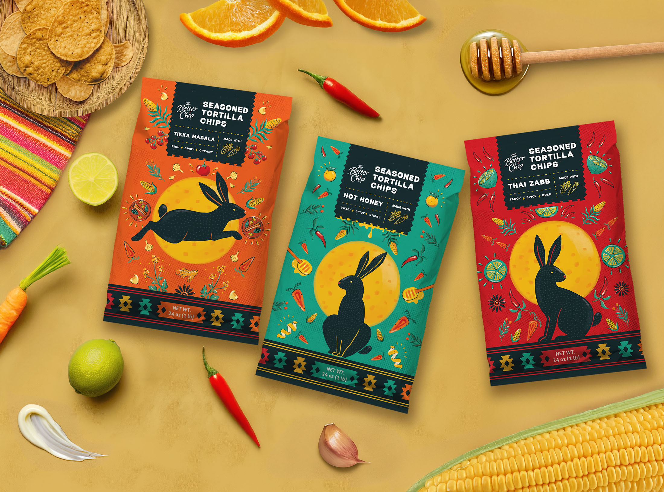
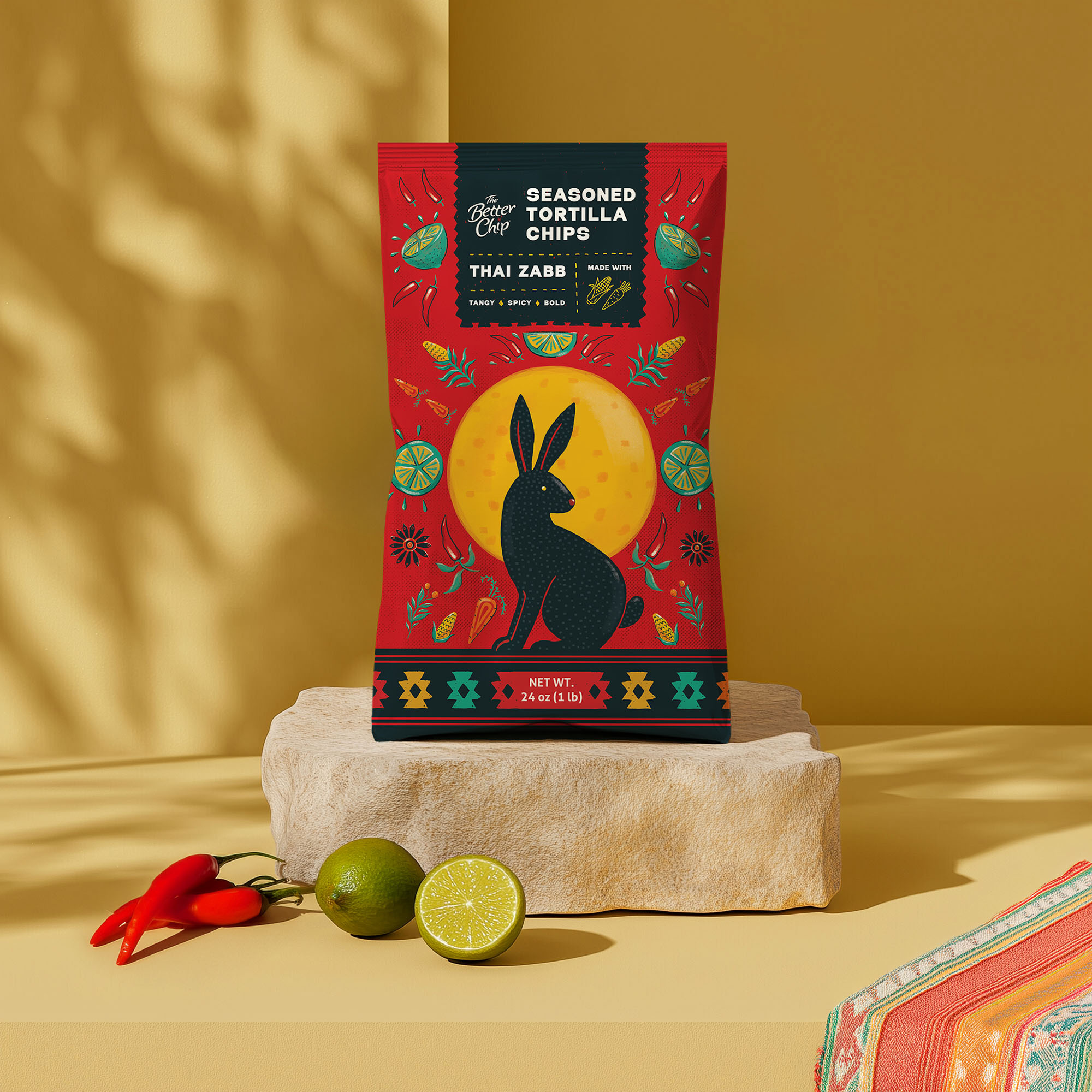
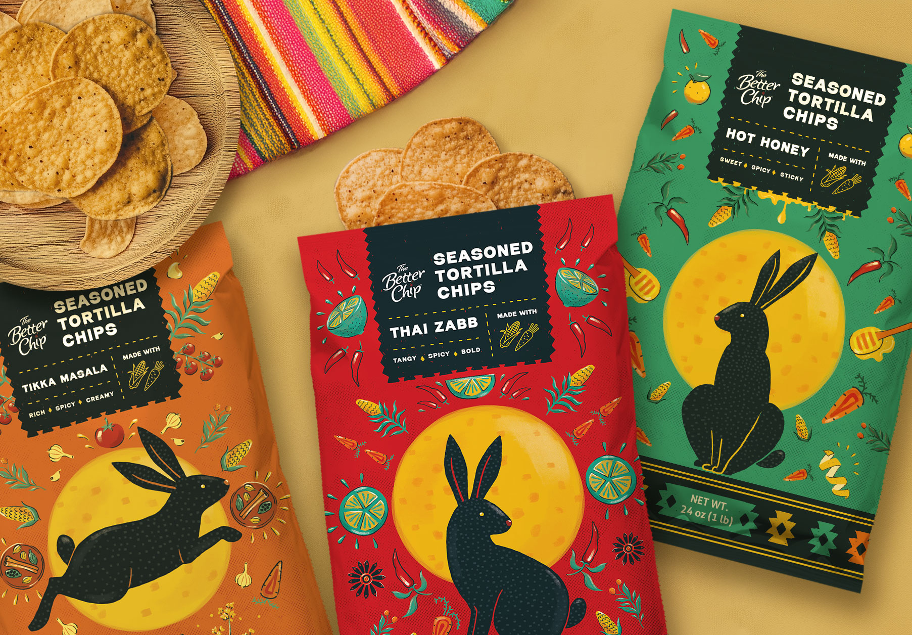
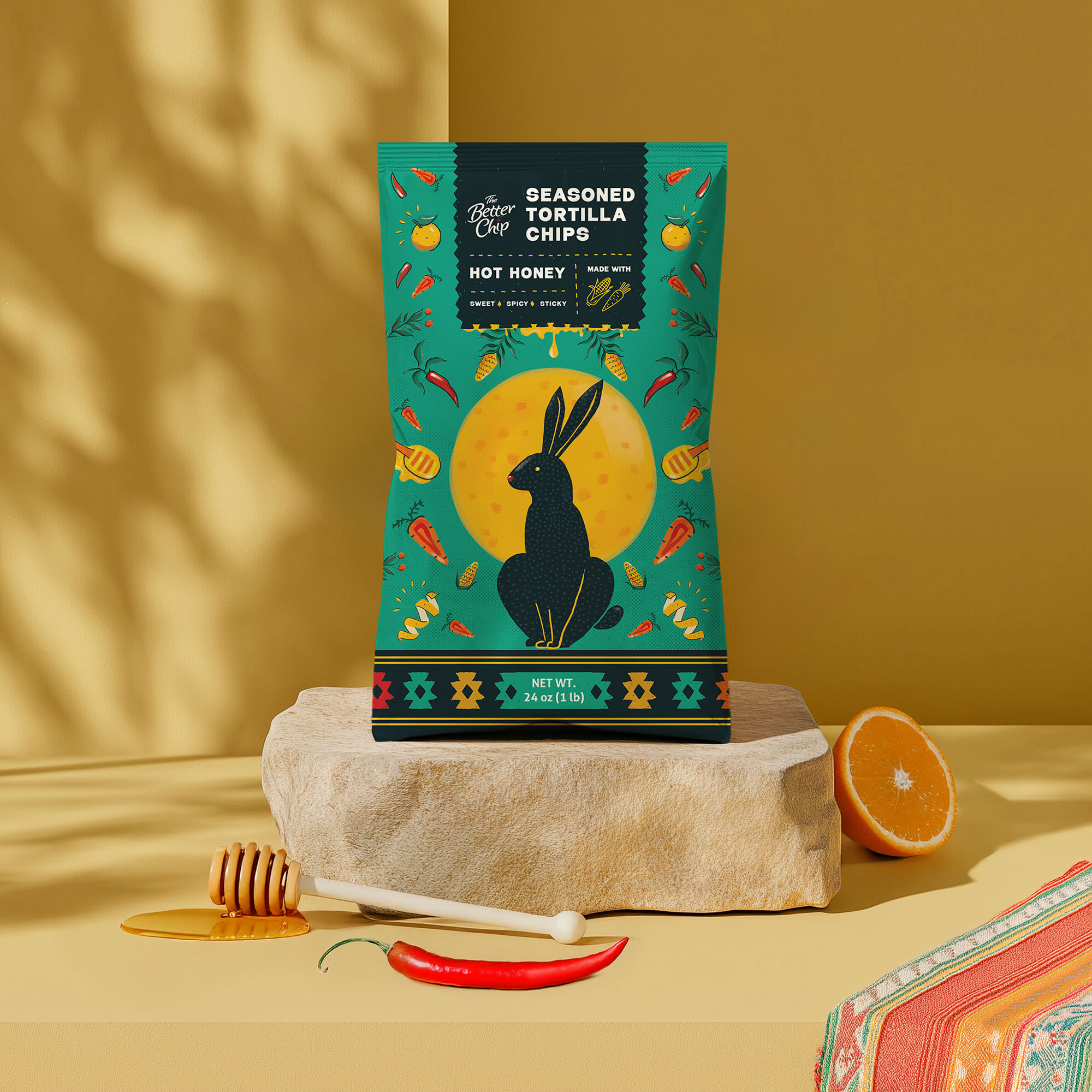
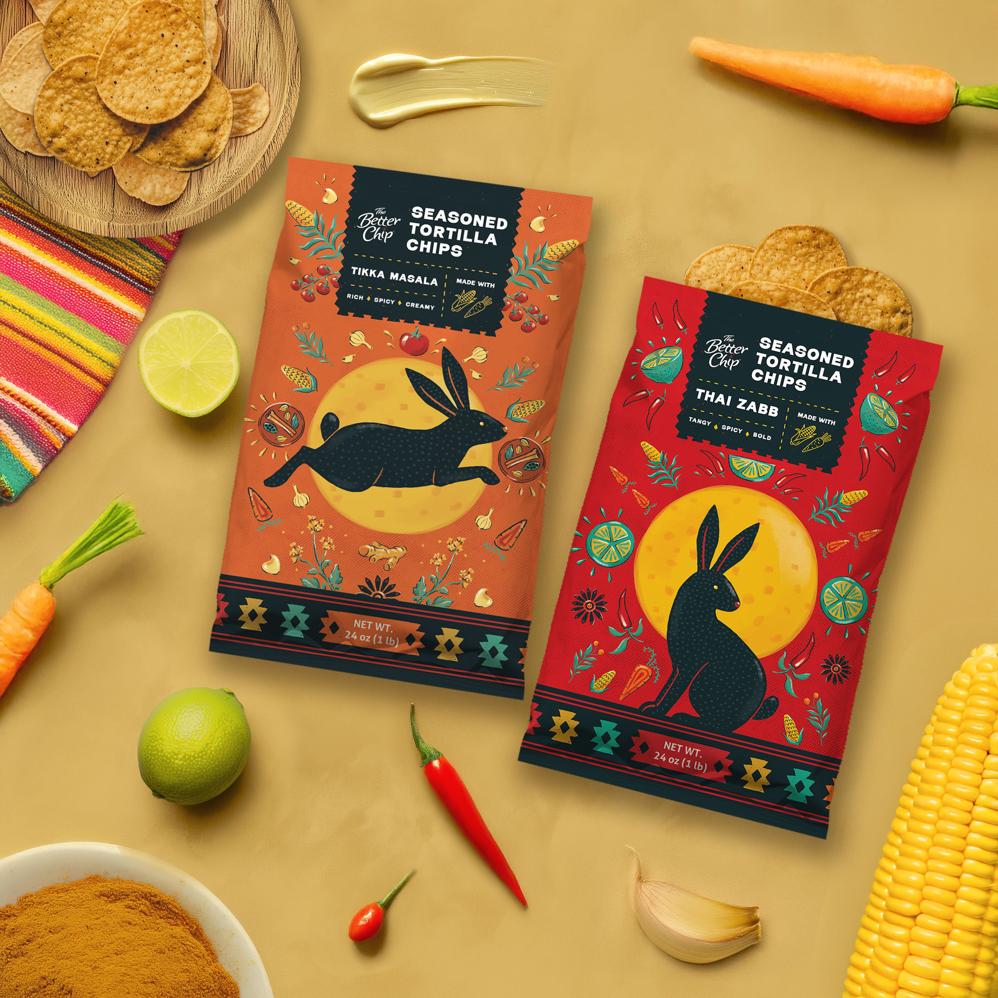
The Better Chip packaging design pays homage to the ancient tale of the Rabbit on the Moon, reimagining the round tortilla chip as the moon itself. According to legend, a kind rabbit offered its food to a starving traveler, who was actually a deity in disguise. Moved by the rabbit’s generosity, the deity honored it by placing its image on the moon. This visual storytelling is woven into the design concept, blending myth with vibrant, traditional Mexican patterns—a nod to the deep-rooted connection between tortillas and Mexican heritage. The mirrored, geometric patterns, inspired by Mexican folk art, feature the rabbit, the moon, and key ingredients like carrots, chilies, and honey, varying by flavor. The result is a bold, eye-catching composition that balances authenticity with modern and playful appeal. Designed for a club-size, family-style bag, the packaging features a high-contrast color palette, with striking combinations like bright yellow and red or orange and green, ensuring strong shelf impact. A minimalist font provides clarity, allowing the intricate, colorful elements to shine. Crafted to captivate Gen Z and Millennials, this design blends bold creativity with cultural storytelling, ensuring The Better Chip stands out in the competitive snack aisle.
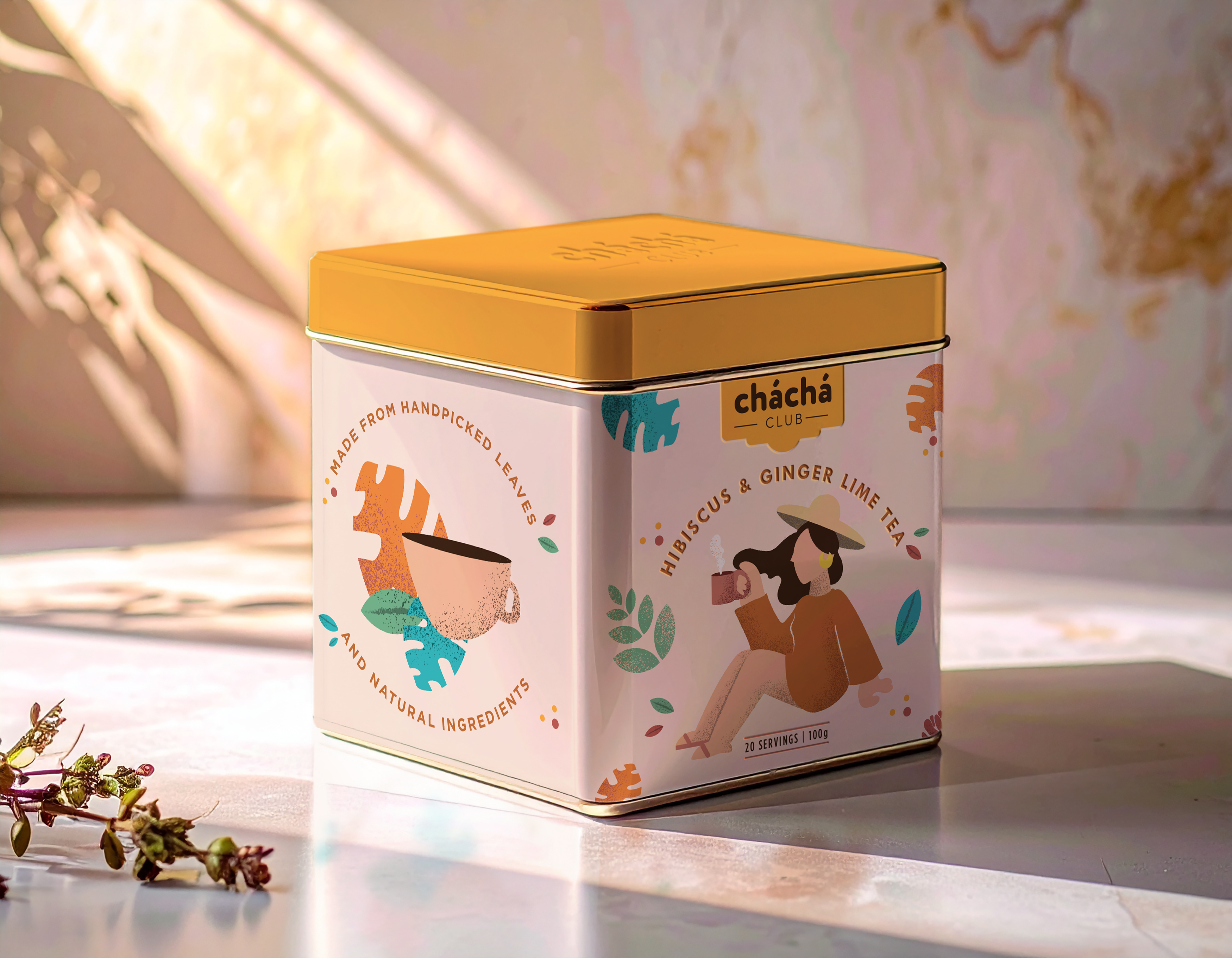
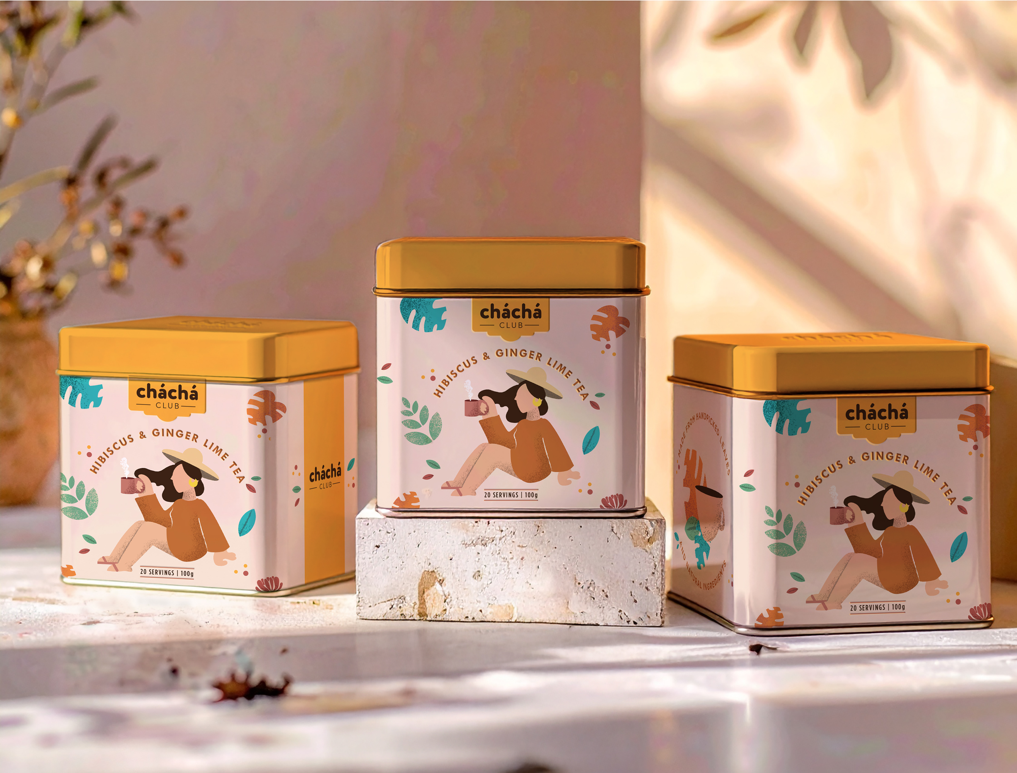
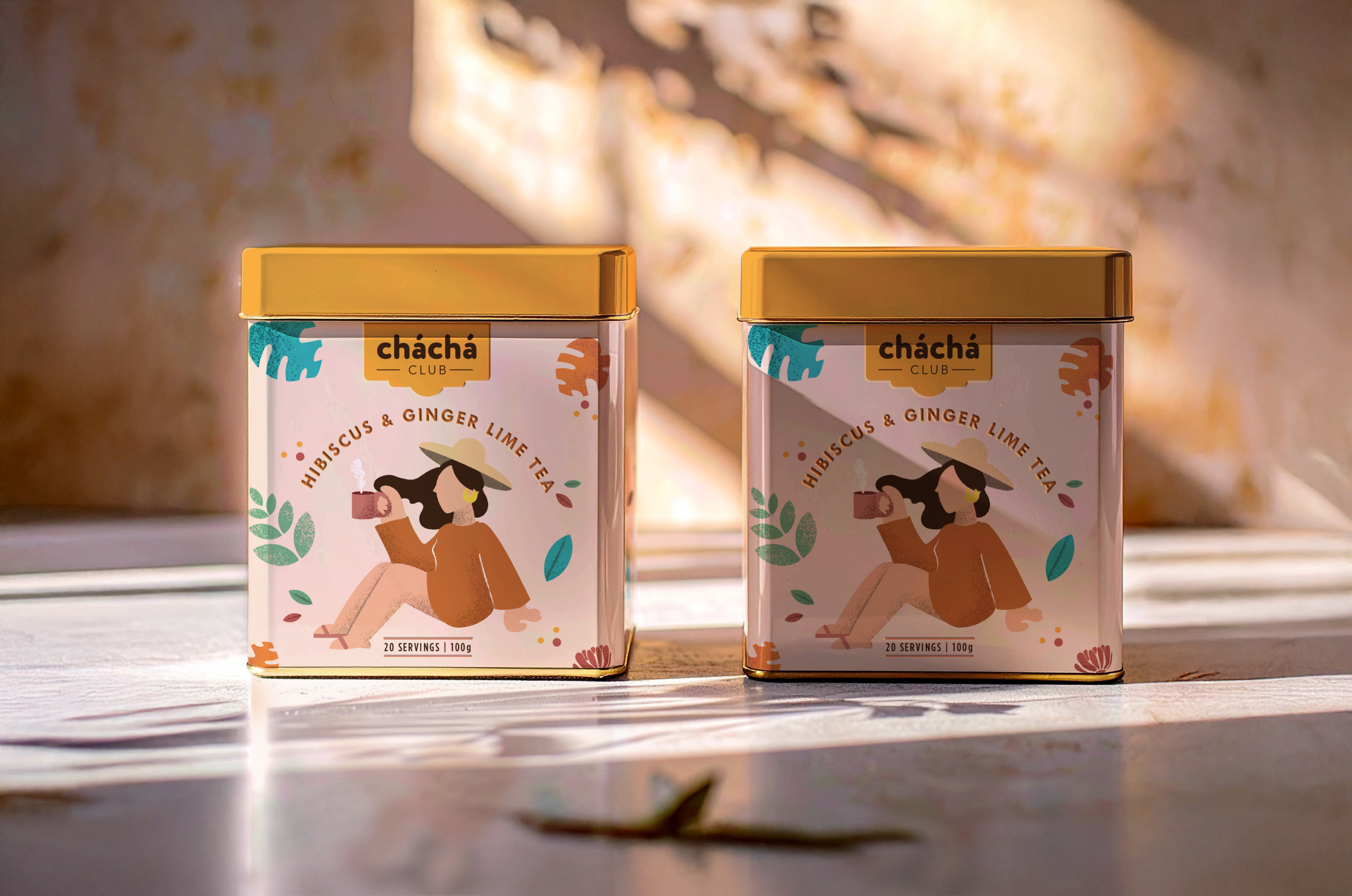
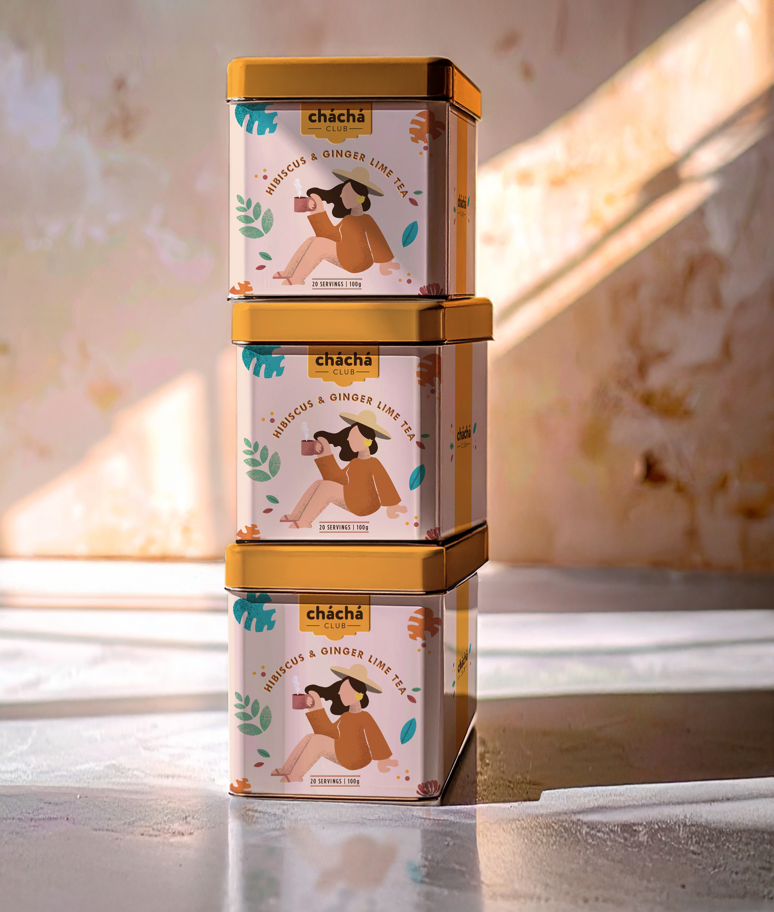
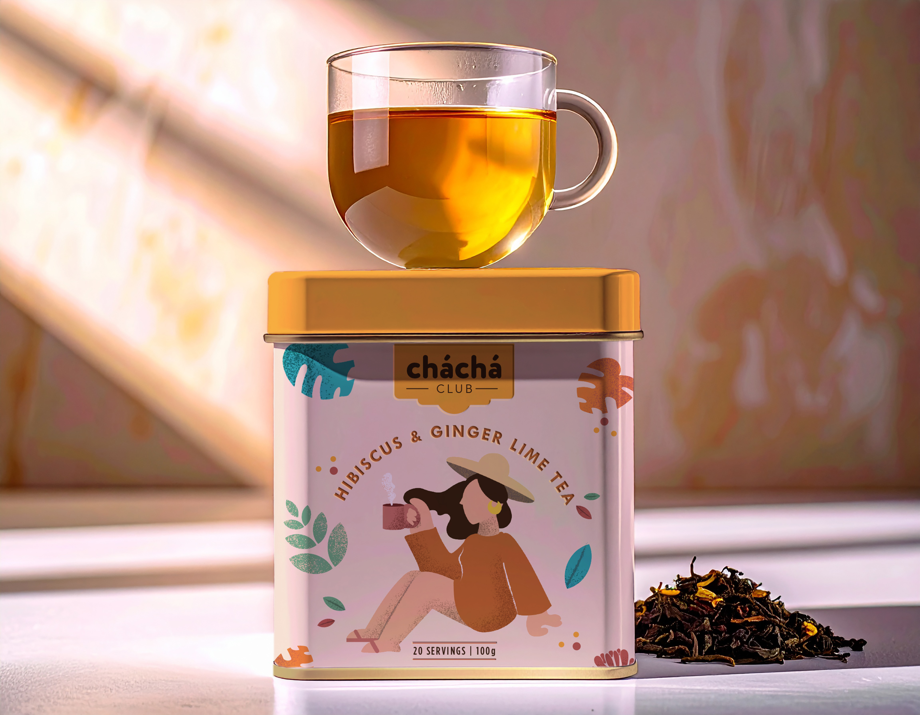
Originally from Brazil, Cha Cha Club’s name is a playful twist on “chá” (tea in Portuguese) and the lively cha-cha dance, giving the impression you’re joining an exclusive club—or even a cult—for tea lovers. This sense of belonging is at the heart of the brand, turning the daily tea ritual into a joyful escape with a bold, approachable attitude that feels like a small celebration in your day. The visual identity embraces the neo-vintage trend in a luxurious yet modern way. A framed logo inspired by vintage nightclub signs anchors the system, setting a warm, inviting tone. The illustration style is modern yet textured, creating a nostalgic atmosphere while remaining minimal and easy to connect with. Layered elements taken from the tea itself add depth and discovery to the illustrations, crafting a visual narrative that rewards a second glance. The muted, sophisticated colour palette contrasts with a bright yellow focal point on the tin’s lid, ensuring the packaging stands out on your kitchen countertop as a display-worthy object you’ll want to keep within reach. The tea is presented in a luxurious tin featuring relief typography, providing a tactile unboxing experience that elevates the ritual of opening your tea and enhances the anticipation of brewing your cup. At the centre of the storytelling is an illustrated character drinking tea, softly inviting you into the Cha Cha Club universe and reminding you to pause. Cha Cha Club transforms a simple cup of tea into a joyful moment of pause and connection, making your daily tea ritual feel like a small but meaningful celebration worth savouring.

We’d love to hear from you! Whether you’re looking to elevate your brand, create standout packaging, or explore a collaborative project, our team at Studio Zak is here to help.
Reach out to discuss your ideas, ask questions, or start a conversation — we’re ready to bring creativity, strategy, and our bold illustrative approach to your next project.
Let’s create magic together. All it takes is a Hey.