
Advision is an award-winning branding, packaging design, and integrated communication agency based in Veneto (Northern Italy), stands out for its ability to blend aesthetics, functionality, and innovation. The agency creates unique brand identity and visual communication projects, primarily for clients in the Wine & Spirits and Food & Beverage sectors.
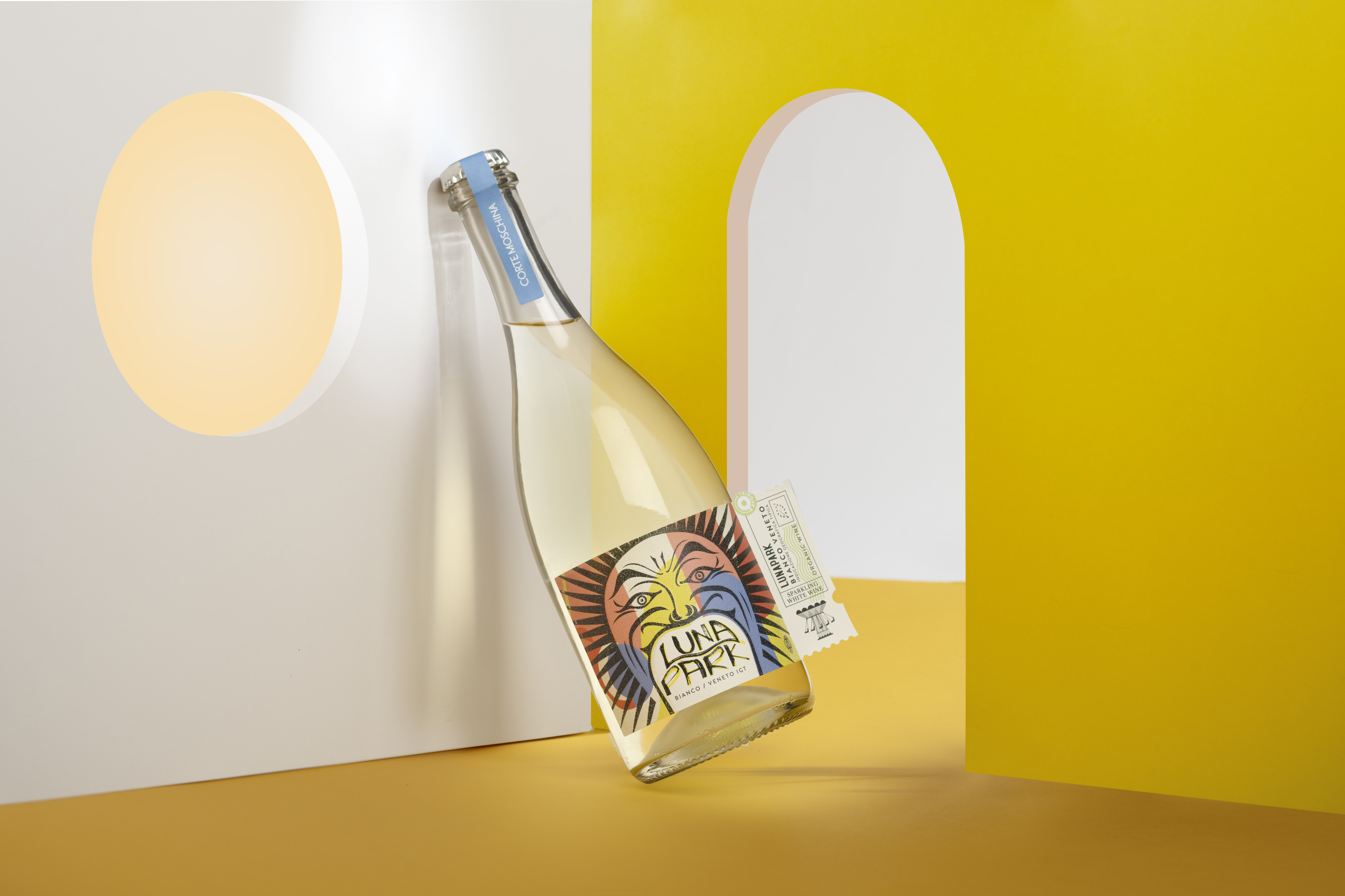
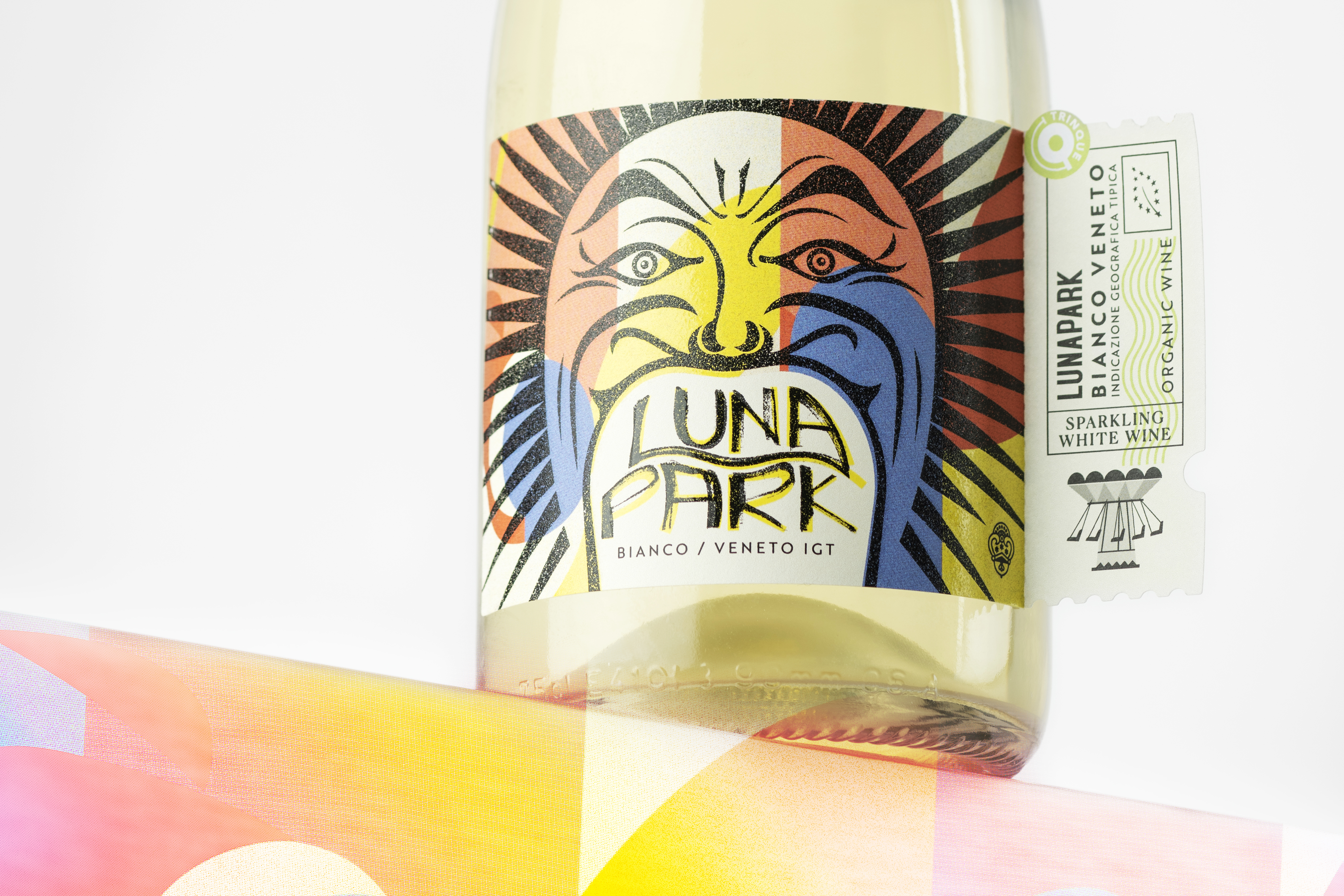
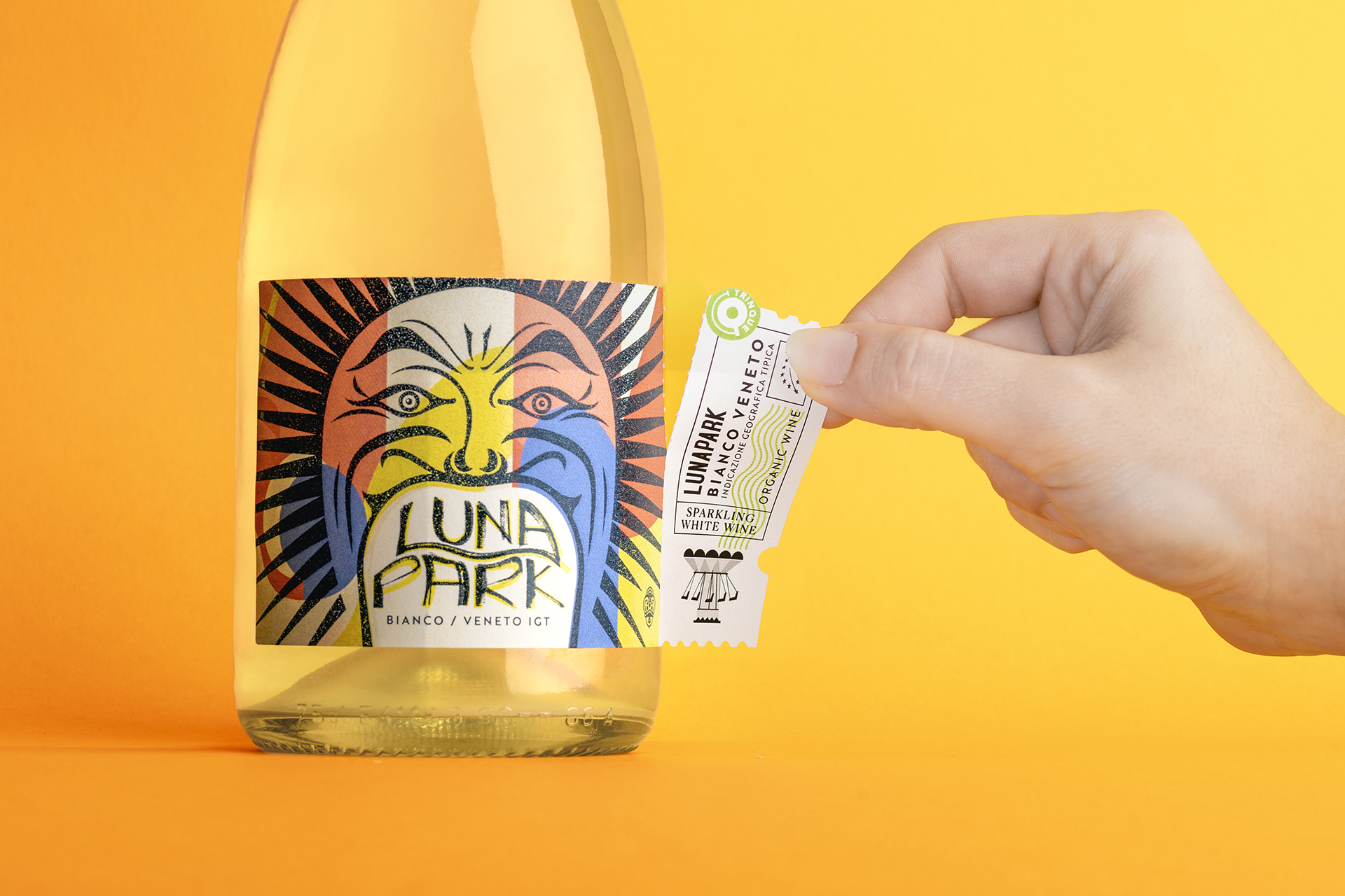
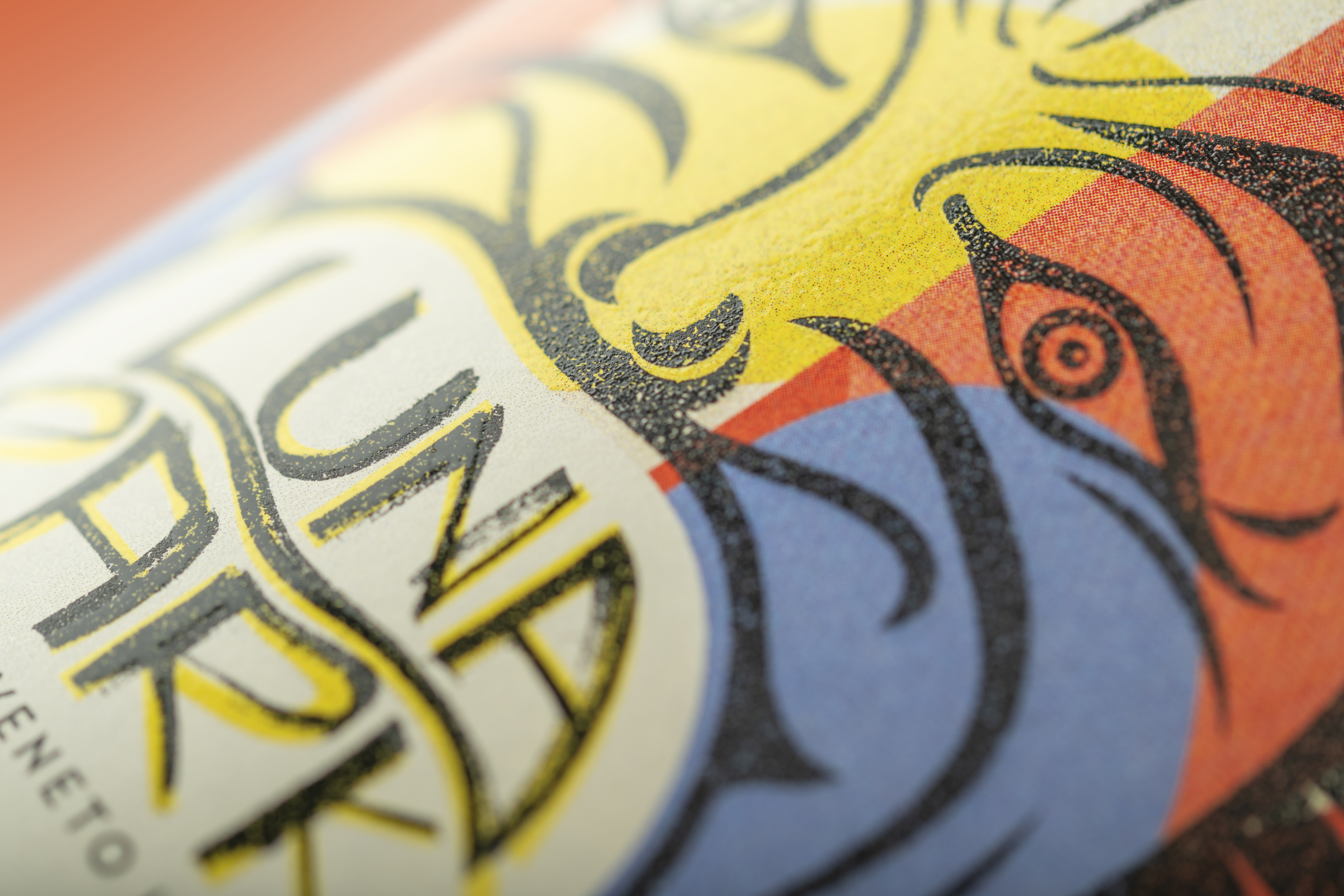
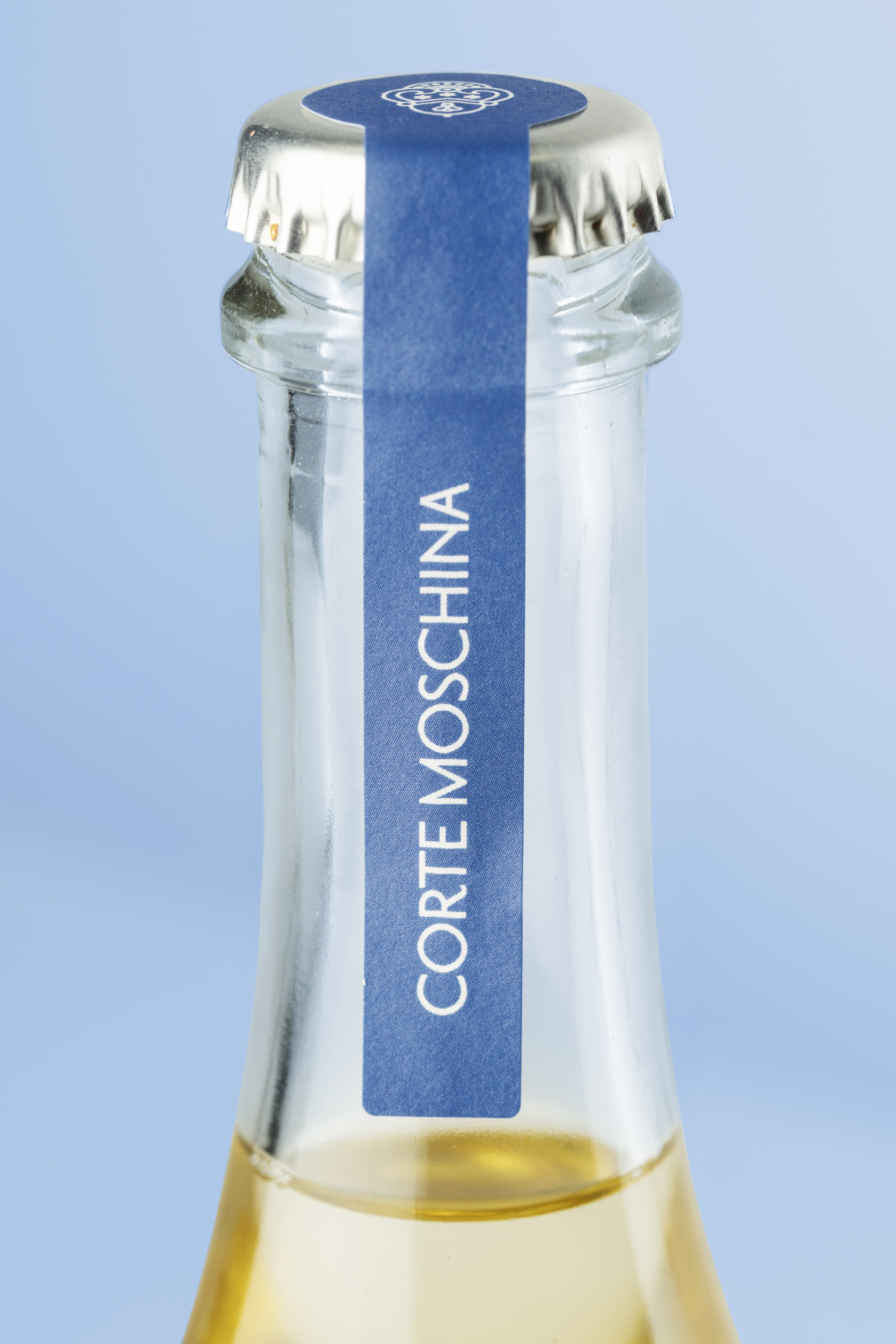
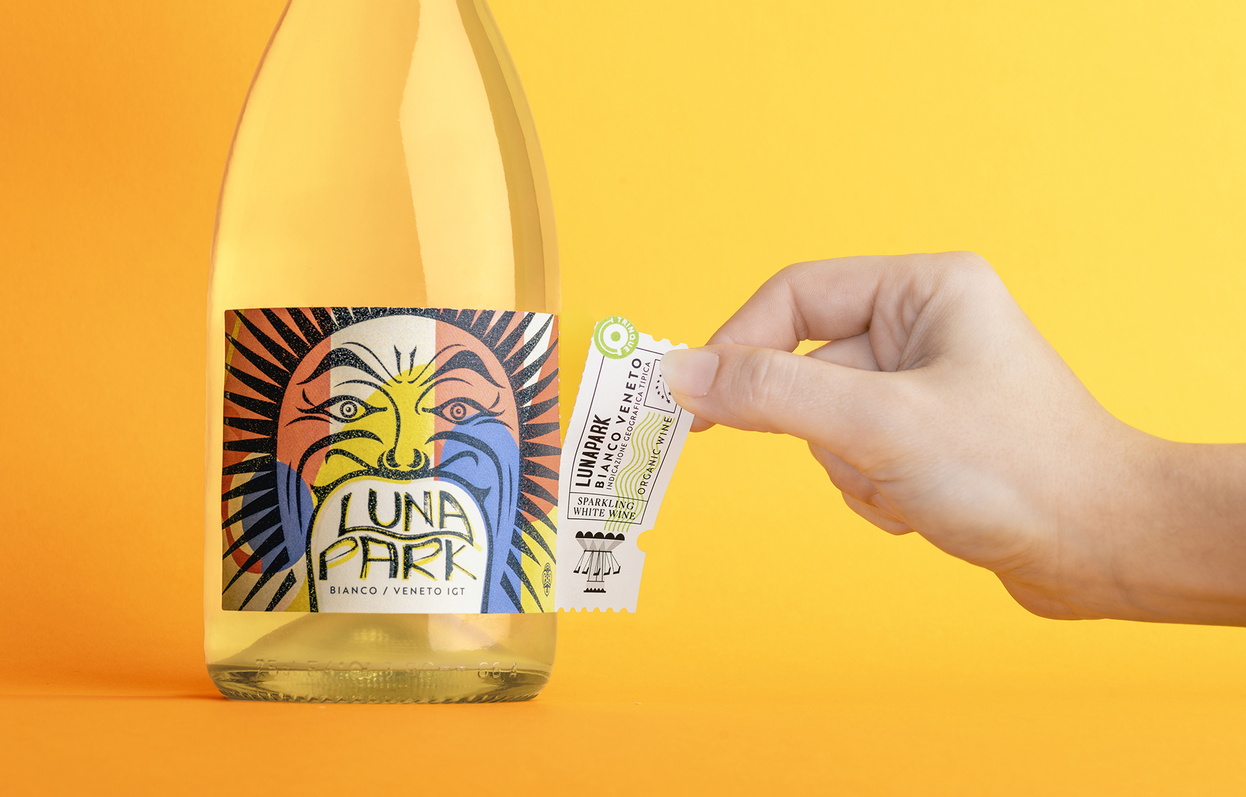
Adrenaline pumping. Fun. Exhilarating. Is this a wine or an amusement park? Corte Moschina's Luna Park is a lively, sparkling wine with a decidedly playful soul that provides the unique thrill that characterises the most memorable evenings. And it cannot resist having an equally eccentric label to guide the consumer through a whirlwind of sensations.
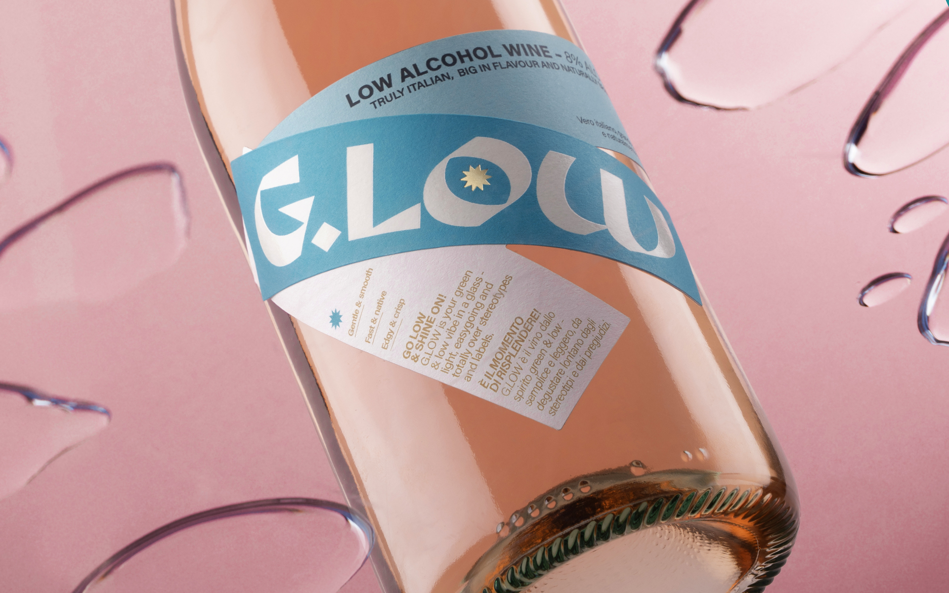
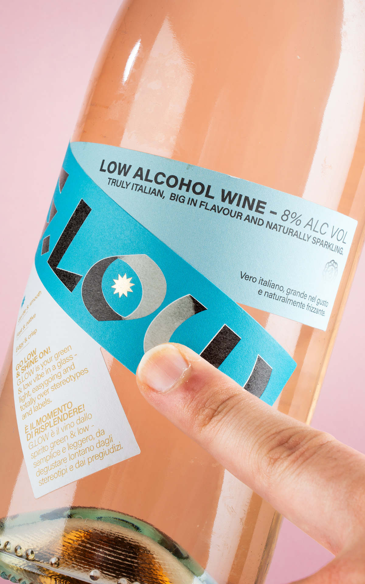
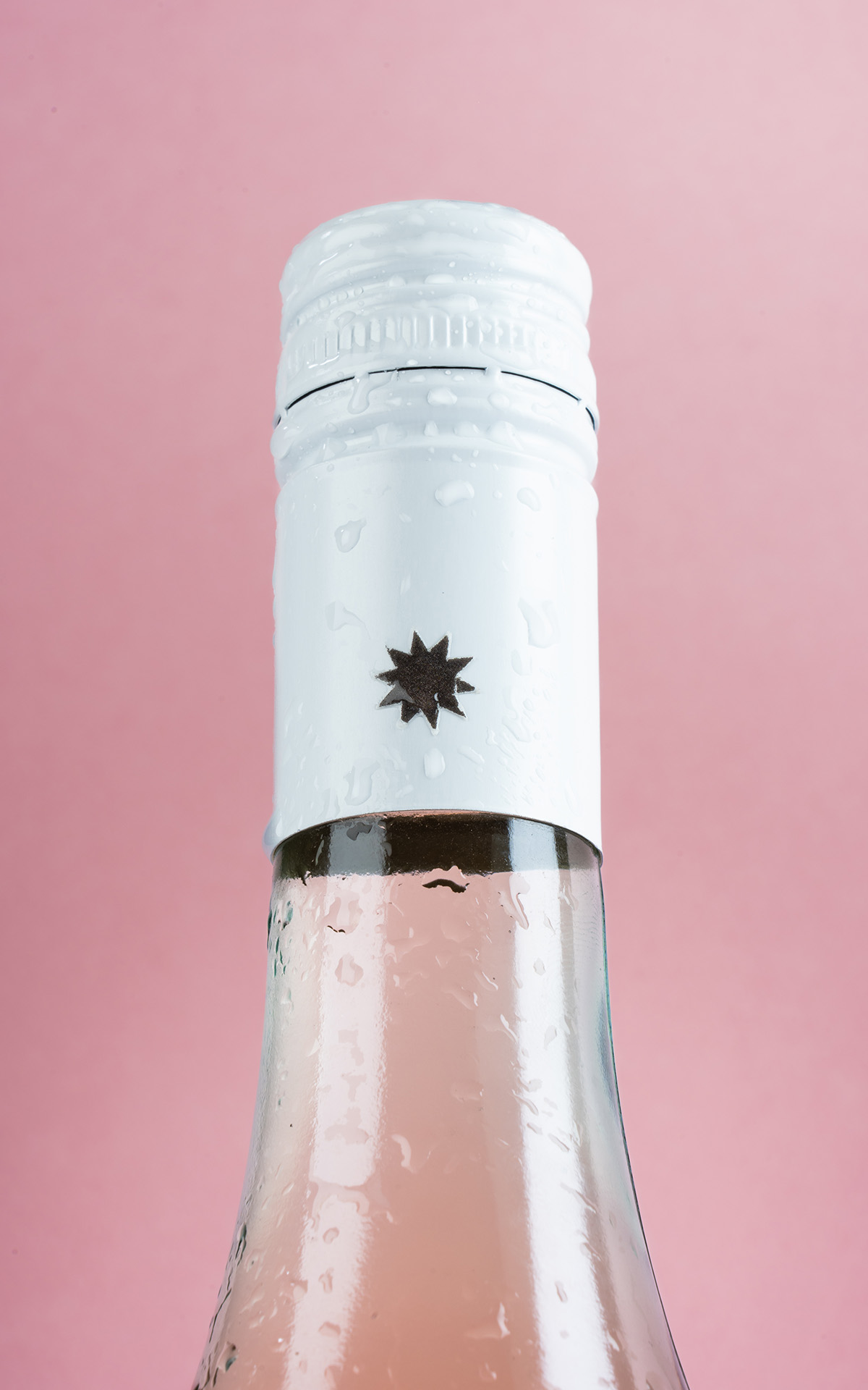
The creative process behind G.Low began with a clear and inspiring brief from the client: “To offer an experience of conviviality and lightness through an innovative low-alcohol wine that redefines the aperitivo ritual with taste, freshness, and a touch of originality. With fully sustainable packaging, we are committed to promoting a responsible lifestyle that celebrates the pleasure of good drinking without compromising environmental respect.” From this vision, we developed a creative path that merged visual provocation with strong, value-driven coherence. After a thorough phase of research and brainstorming, we shaped a concept that breaks with traditional wine label conventions, aiming to speak to a young, conscious, and curious audience. Our main inspiration came from eco-brutalism: a movement that combines the architectural rigor of brutalism—with its geometric forms, concrete structures, and raw aesthetic—with the spontaneous, harmonious return of nature. This contrast between structure and vitality guided us in creating a bold yet balanced and light visual aesthetic, just like the wine it represents. The choice of materials reflects this philosophy: we used Tintoretto Gesso Re-play paper, developed through a pilot project in collaboration with Fedrigoni, which reuses production waste from Cantine di Verona to create an elegant, natural, and fully recycled paper. A tangible symbol of the circular economy. Finally, to add an experiential dimension and make the product even more memorable, we introduced thermochromic ink: transparent at room temperature, it activates as it cools, revealing a black graphic at the wine’s ideal serving temperature. An unexpected detail that engages the consumer and makes the aperitivo ritual even more iconic.


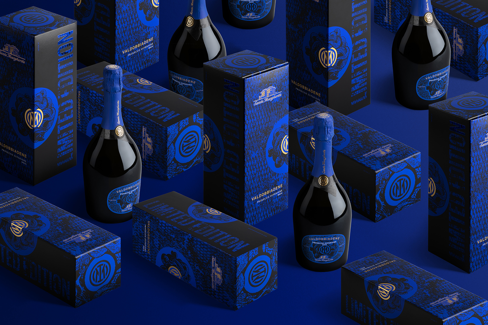
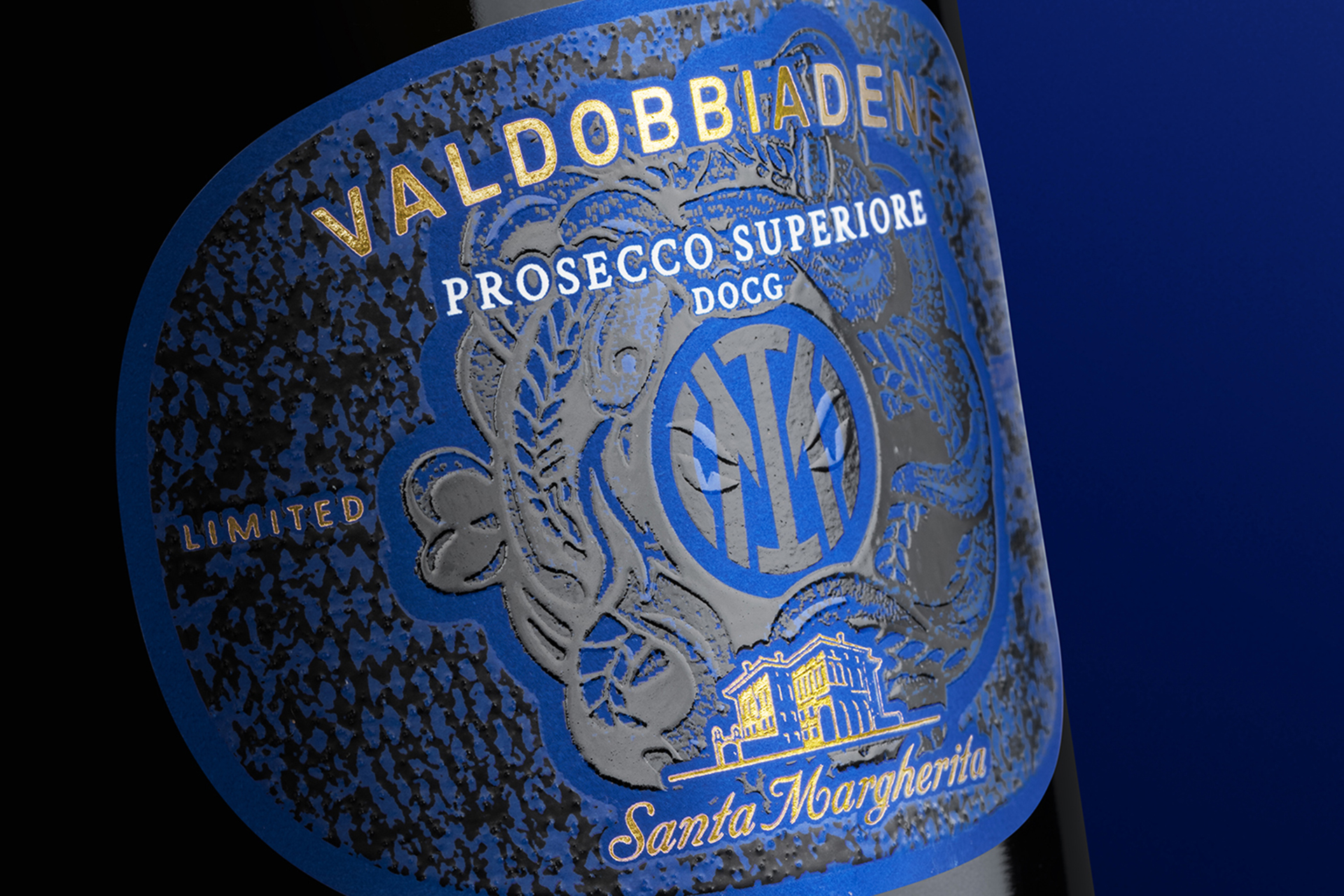
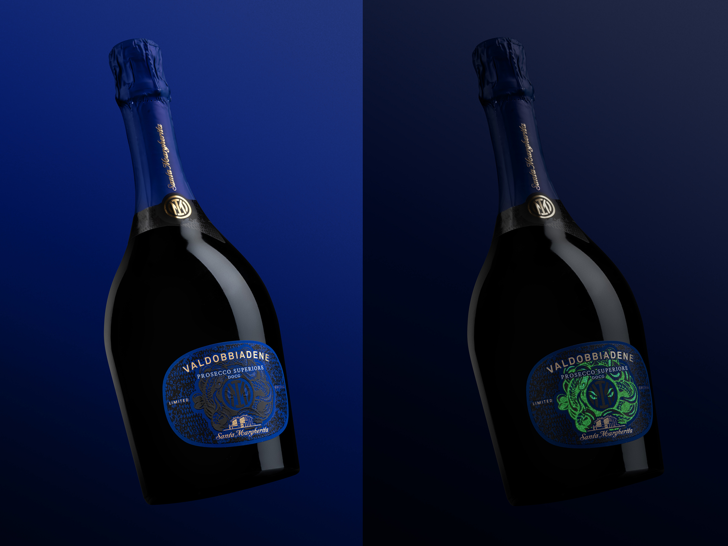
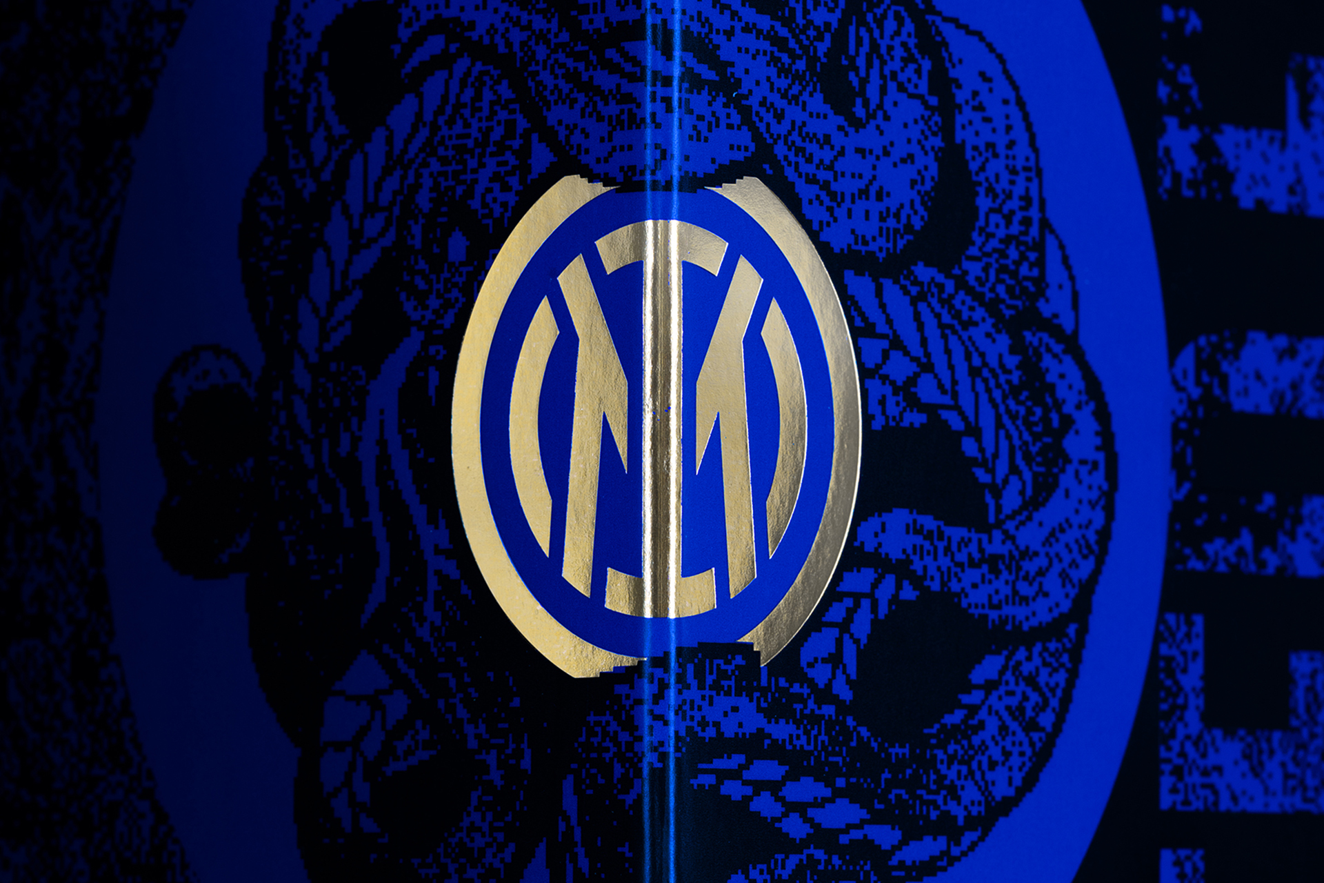
What do a prestigious winery like Santa Margherita Gruppo Vinicolo and an equally prestigious football team like FC Internazionale Milano have in common? Courage, a forward-looking approach and the will to excel. The creative concept of this Prosecco Valdobbiadene Superiore, dedicated to one of the teams that has written and continues to write the history of Italian football, unites common intents, goals and values. The texture of the label echoes both the current team uniform and the club's historic symbol: the snake, the protagonist of a luminous embossed varnish. Sophisticated printing techniques guarantee a distinctive and emotional result, which is essential to enhance the product and its positioning.

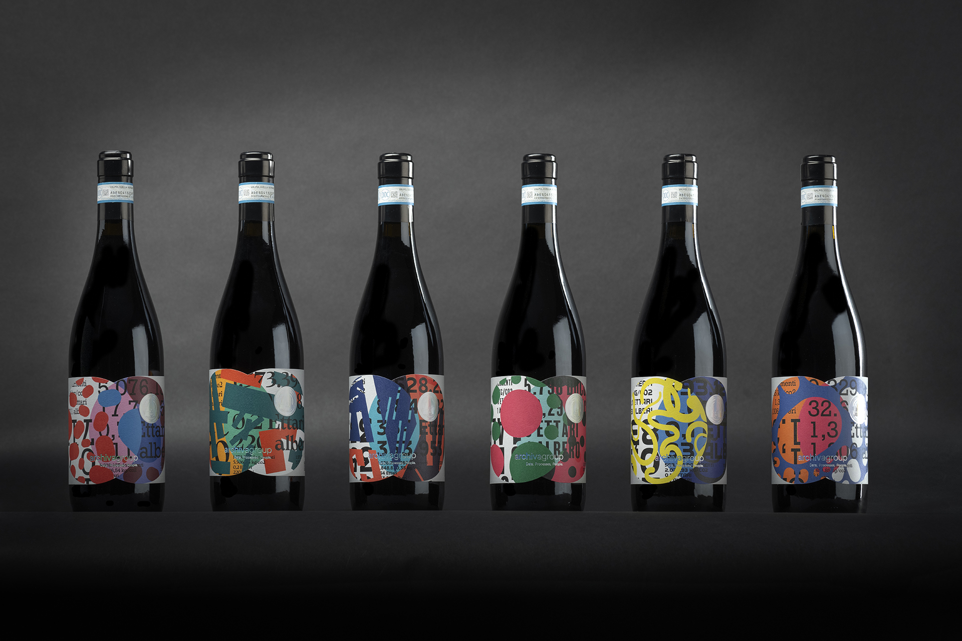
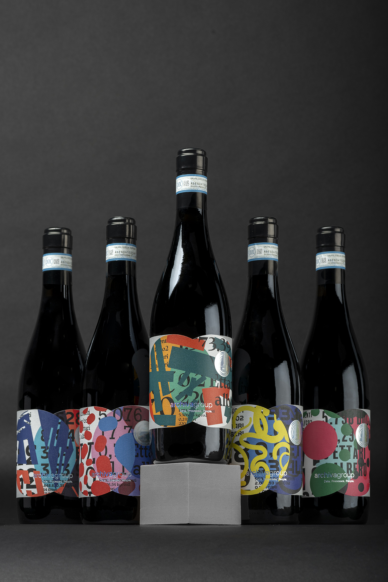
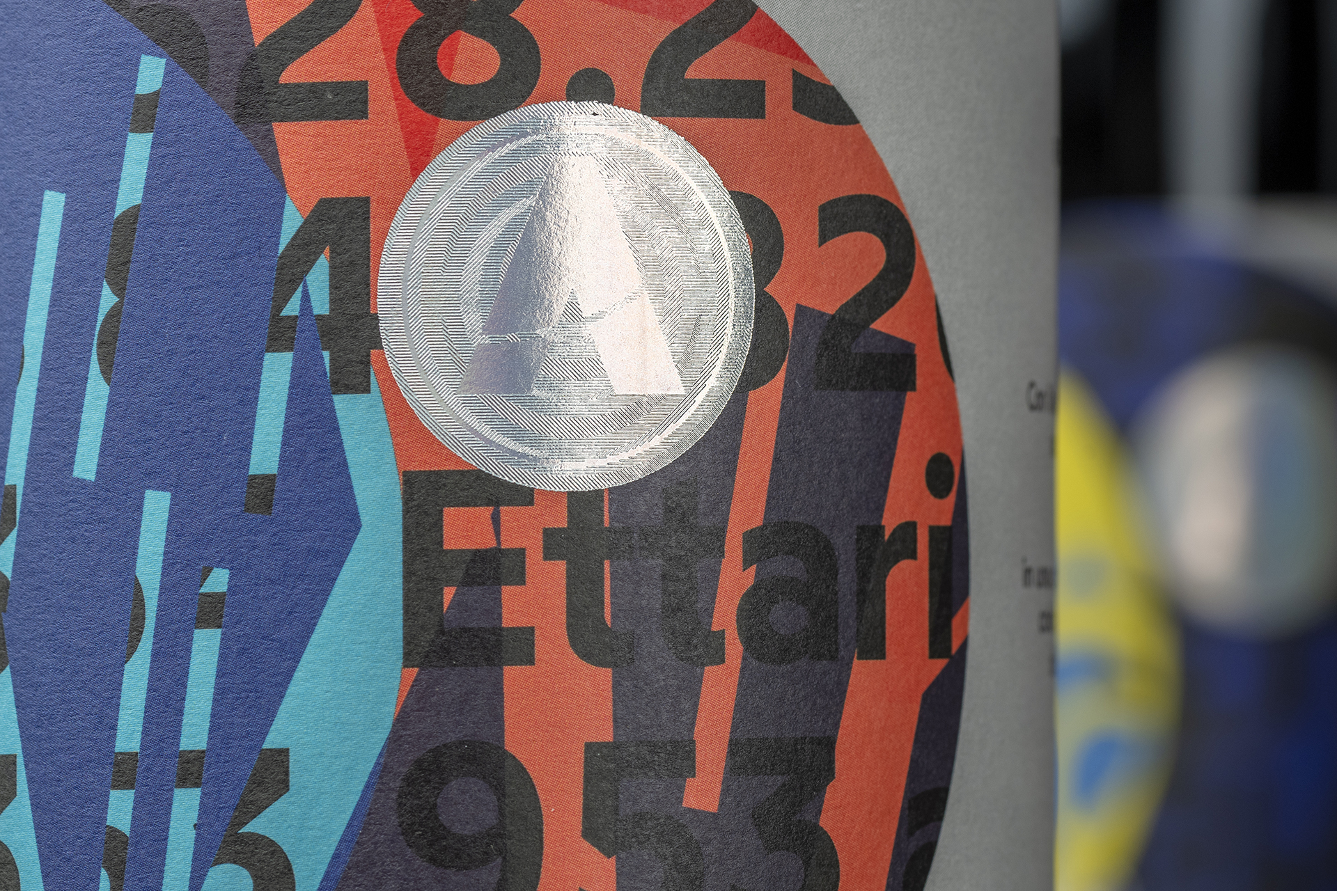
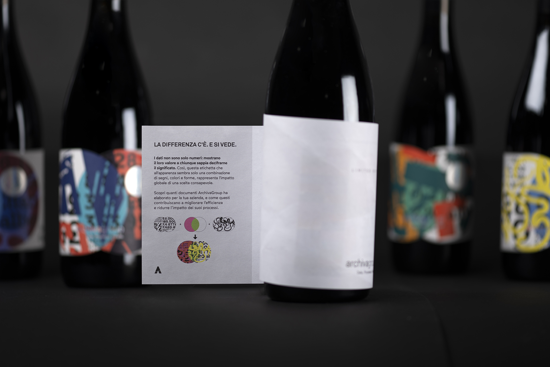
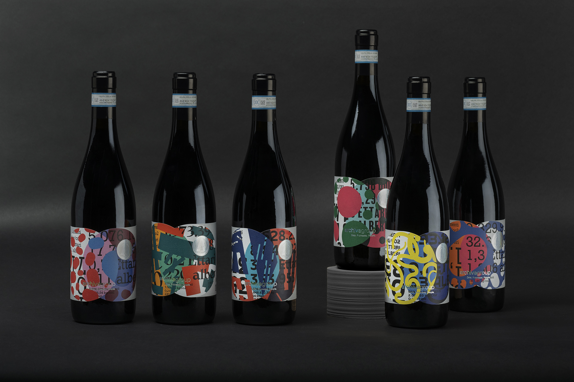
The difference is there and it shows. Data are not just numbers: they reveal their value to those who know how to decipher their meaning. So this label, which on the surface appears to be just a combination of signs, colours and shapes, represents the global impact of a conscious choice. A concept as simple as it is powerful: celebrating the uniqueness of each partner through a shared decision to adopt hyper-automation, dematerialisation and document conservation processes that have a real impact on productivity and the environment. Every document that is processed and digitised is equivalent to a sheet of paper that will be used for a purpose with a higher added value. Multiplying the optimisation by millions of documents means taking concrete and measurable action, preventing the release of hundreds of tonnes of CO2 into the atmosphere and saving thousands of trees every year. This is how Archiva came up with the idea for this corporate gift to the CEOs, CFOs and IT staff of the most important Italian companies: a bottle of the best Valpolicella wine from Cantine Allegrini, with a unique label, a masterpiece of variable data printing created with HP Indigo technology. The textures and vibrant colours, combined in an unprecedented way, tell the story of the collaboration with the Archiva Group. A real, tangible commitment, far from the greenwashing facade that serves no one.
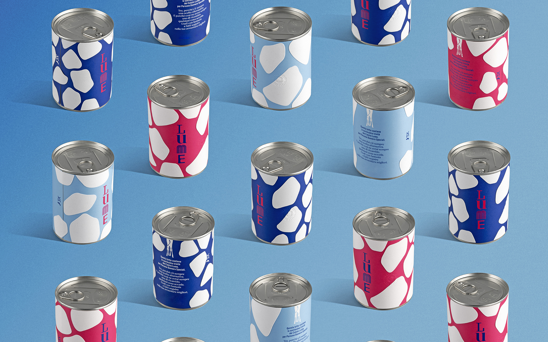
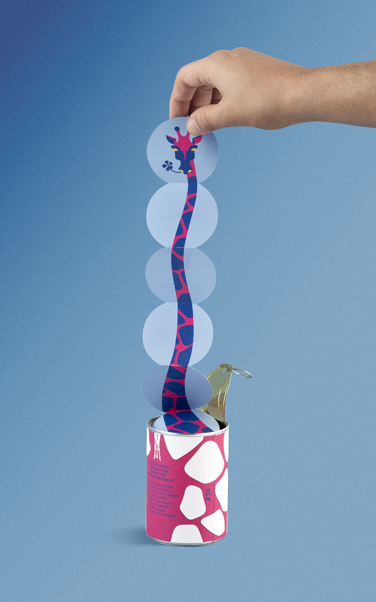
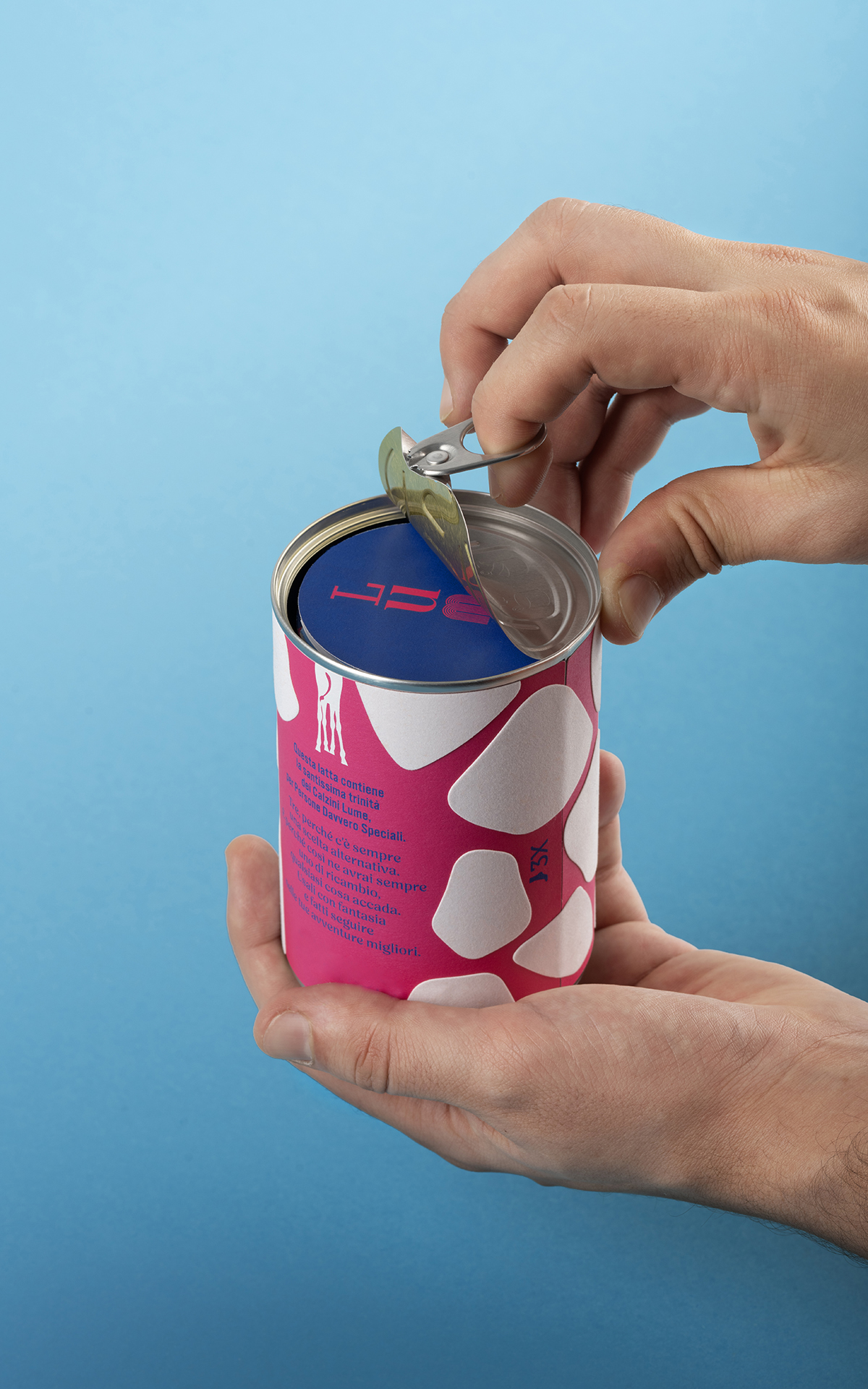
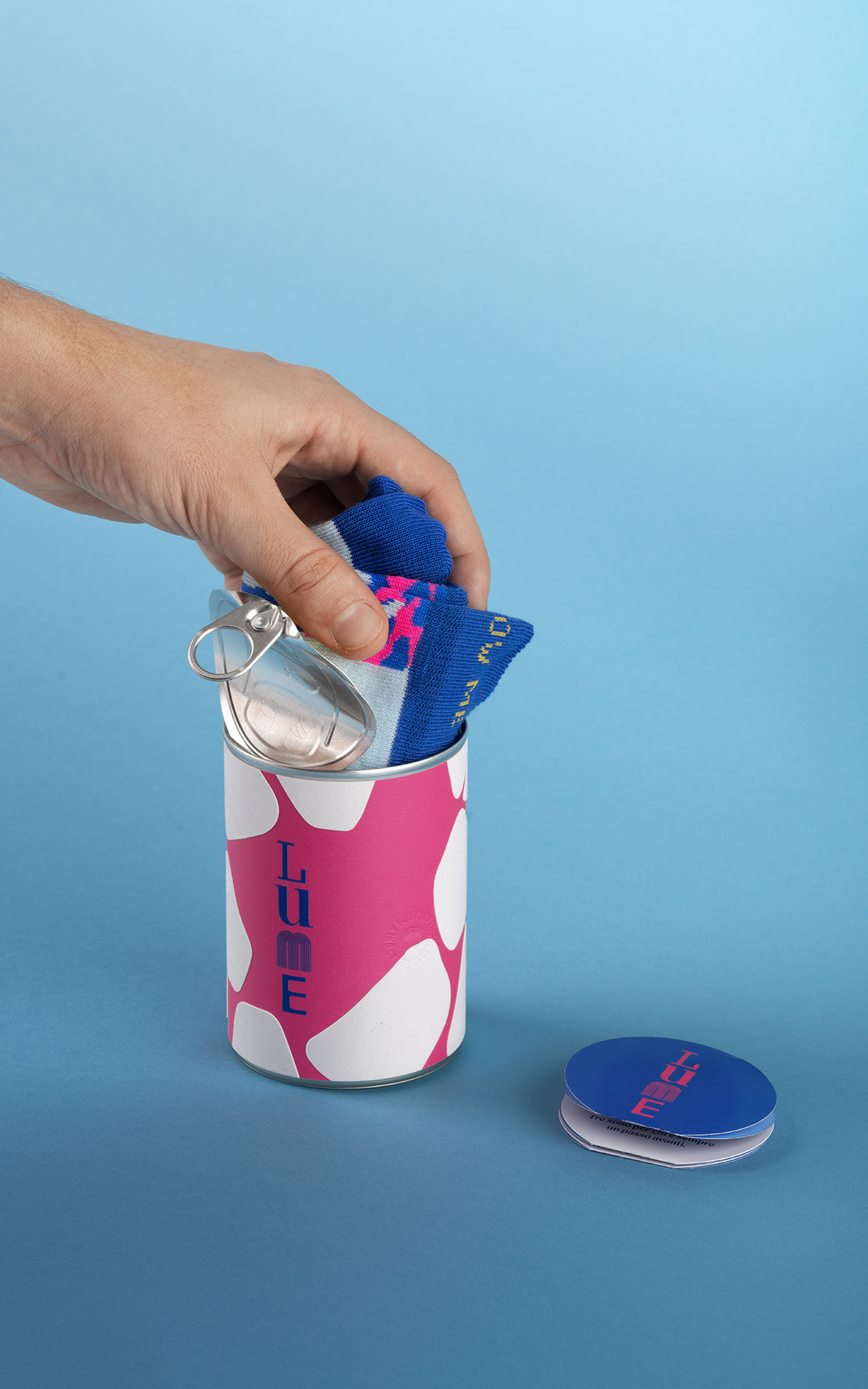
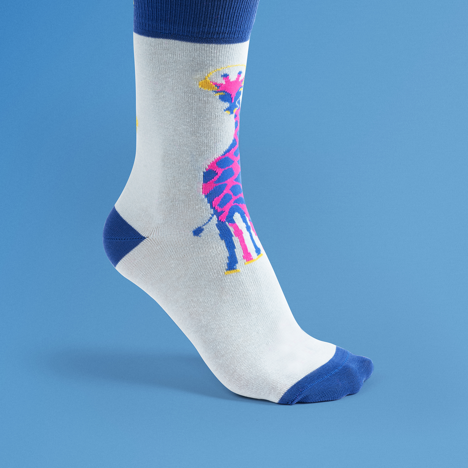
Lume is a trio of personalised socks, affectionately known as “the divine trio of socks.” Because why sell just a pair when you can sell three? Is three the perfect number? Not really. Three, so you’ve always got an alternative. And so you’ll always have a spare, no matter what happens. Have fun with them and let them be part of your biggest adventures. Each sock carries a different message, and there’s no right way to wear them—no rules, no order, no wrong turns. The direction is entirely up to you. The only real guidelines? Freedom and irony. (L)oving Lume socks is easy, if you follow these three rules: (U)sing only one sock is pretty daring, but with three you’re really on another level. (M)ix them up whatever way you like and don’t take yourself too seriously. There’s no right or wrong – only your style. (E)xtend your eyes upwards like a giraffe – from up high, the horizon looks that little bit closer. Lume is an invitation “to see like a giraffe—look ahead. From up high, the horizon always feels just a bit closer.”
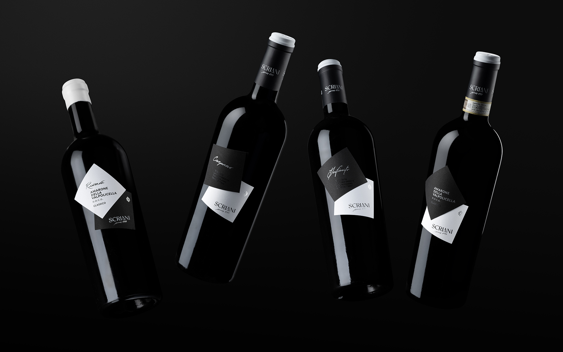
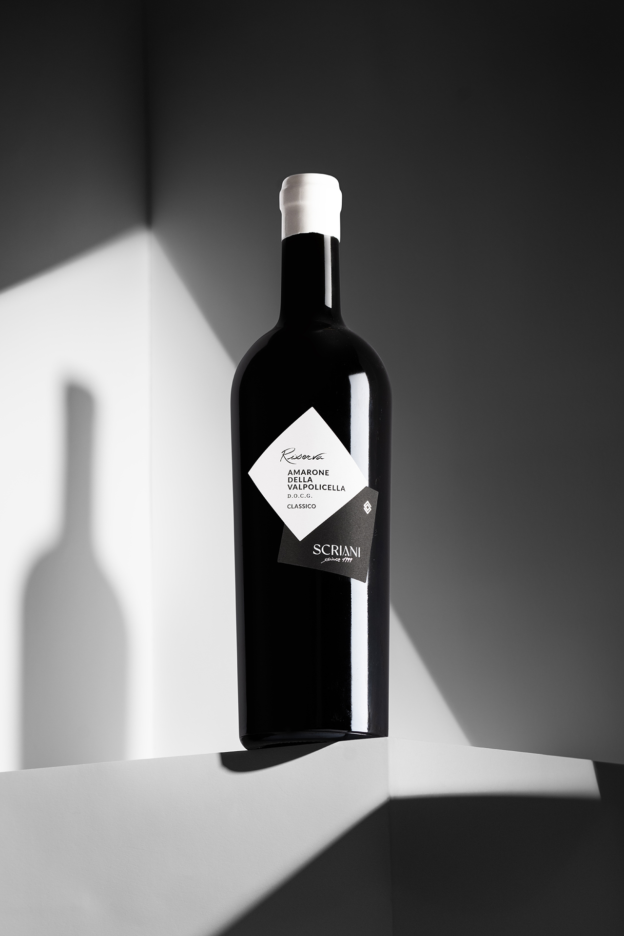
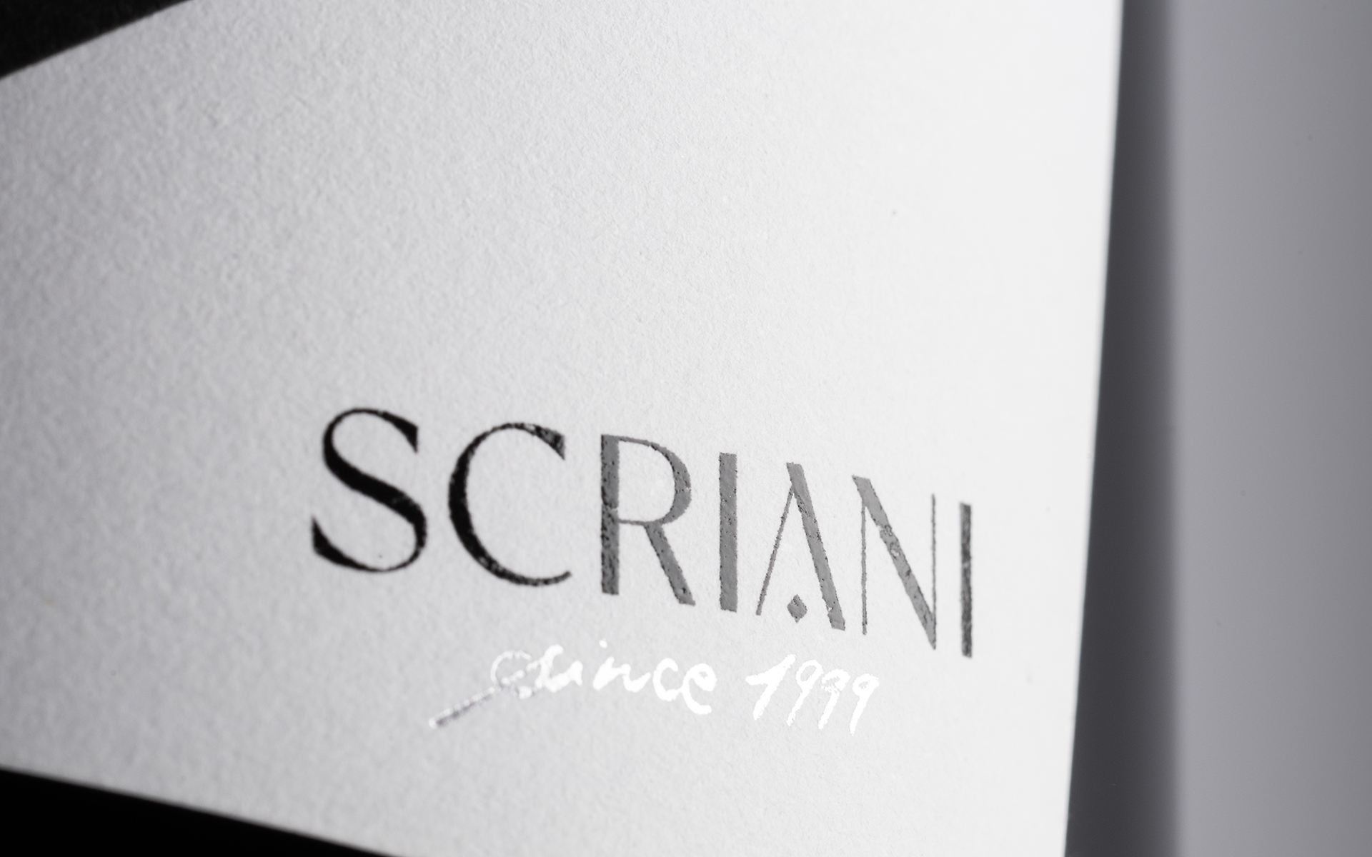
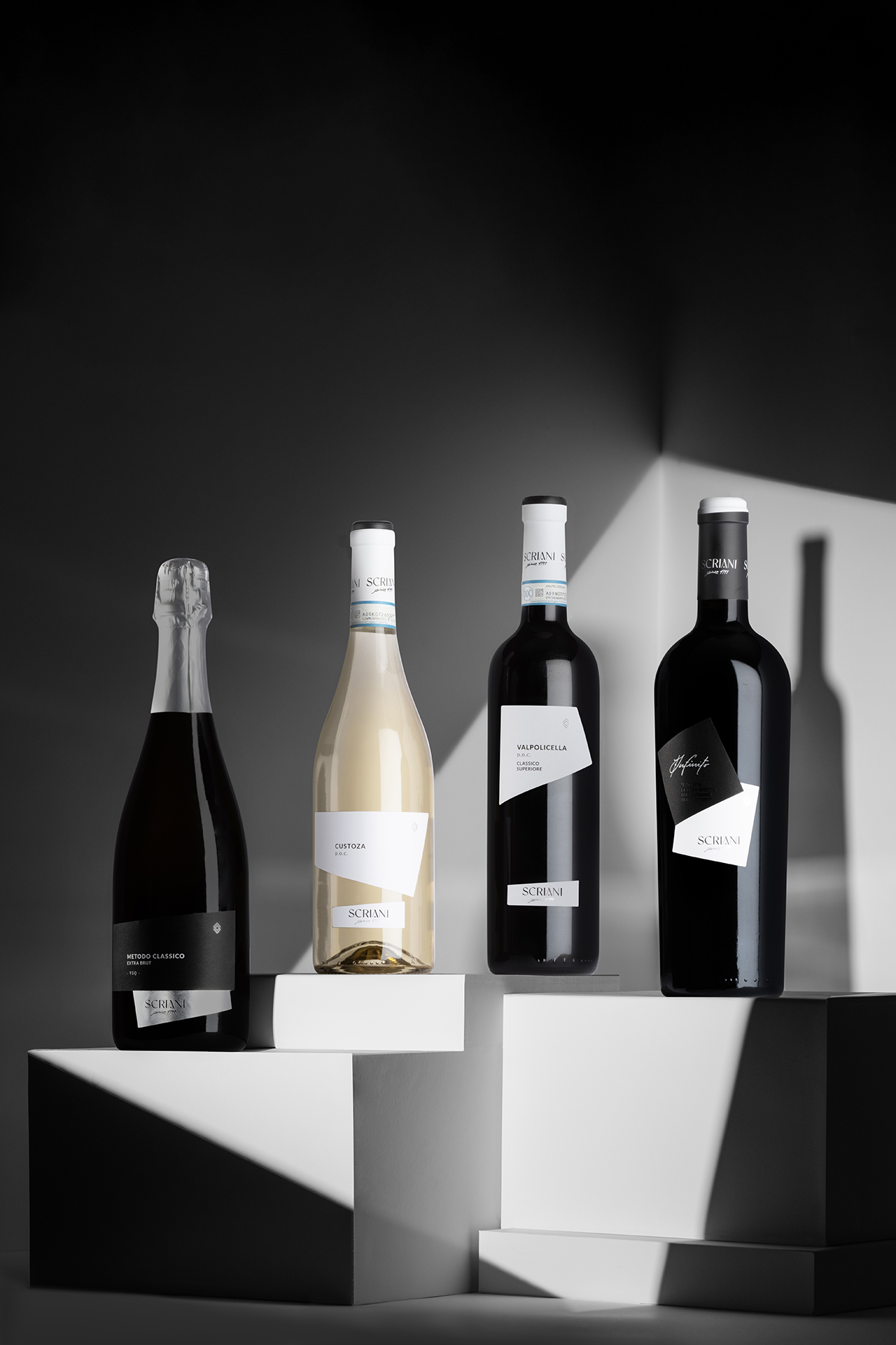
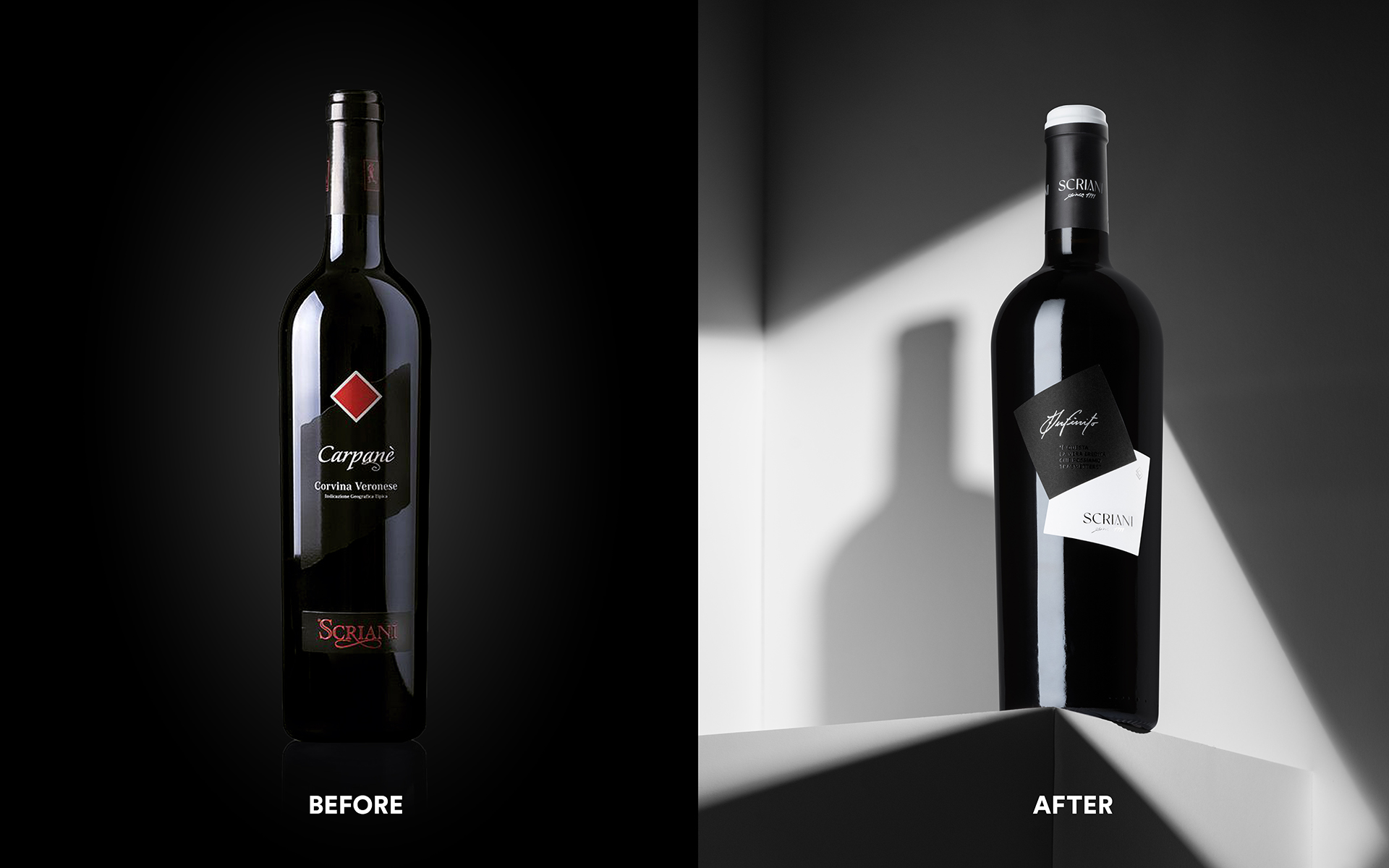
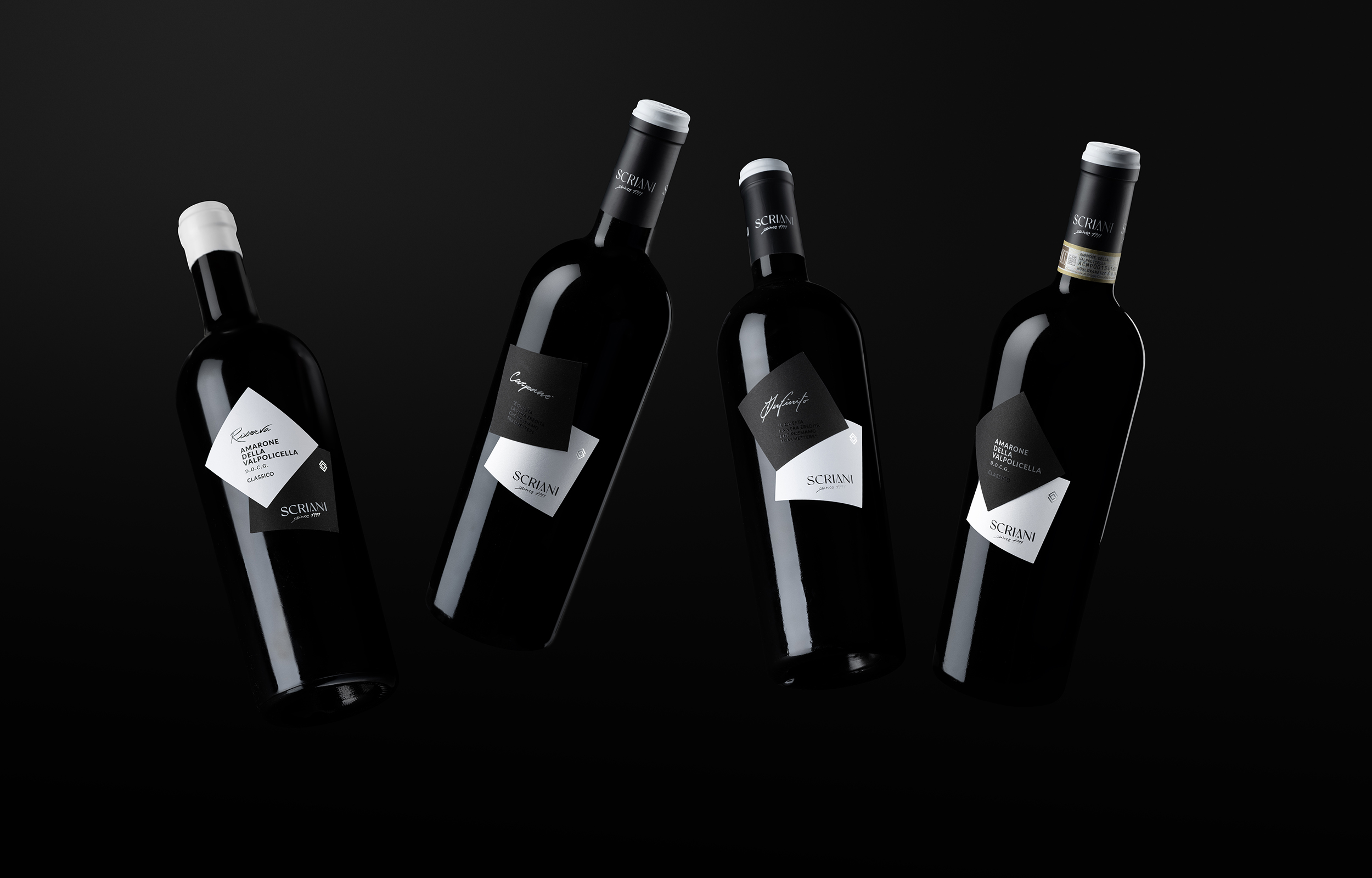
The complete renewal of the Scriani Winery's visual identity revolves around the concept of evolution. The current generational change within the family becomes a visual reference to represent the growth of the company through the synergic work of two generations to create increasingly better products. The shapes of the diamond and the square merge in perfect harmony, overlapping and evolving to create new geometries. It is from these shapes that the labels identifying the different wines are born, together with an elegant logo recalling the same shapes. The pictogram was born from the union of the Scriani 'S' and a reinterpretation of the decorative element. The result is a figure with a minimalist and sincere design, in keeping with the company's history.
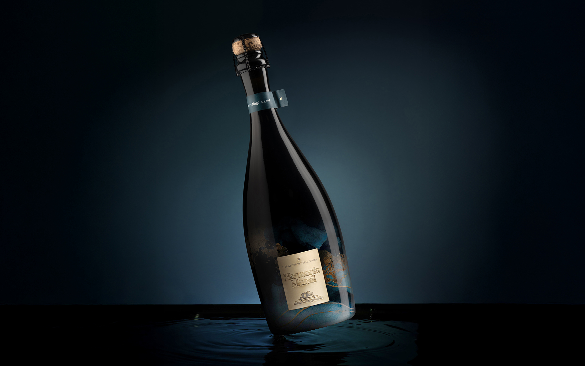
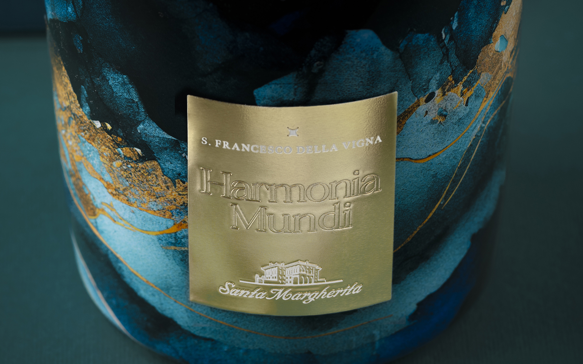
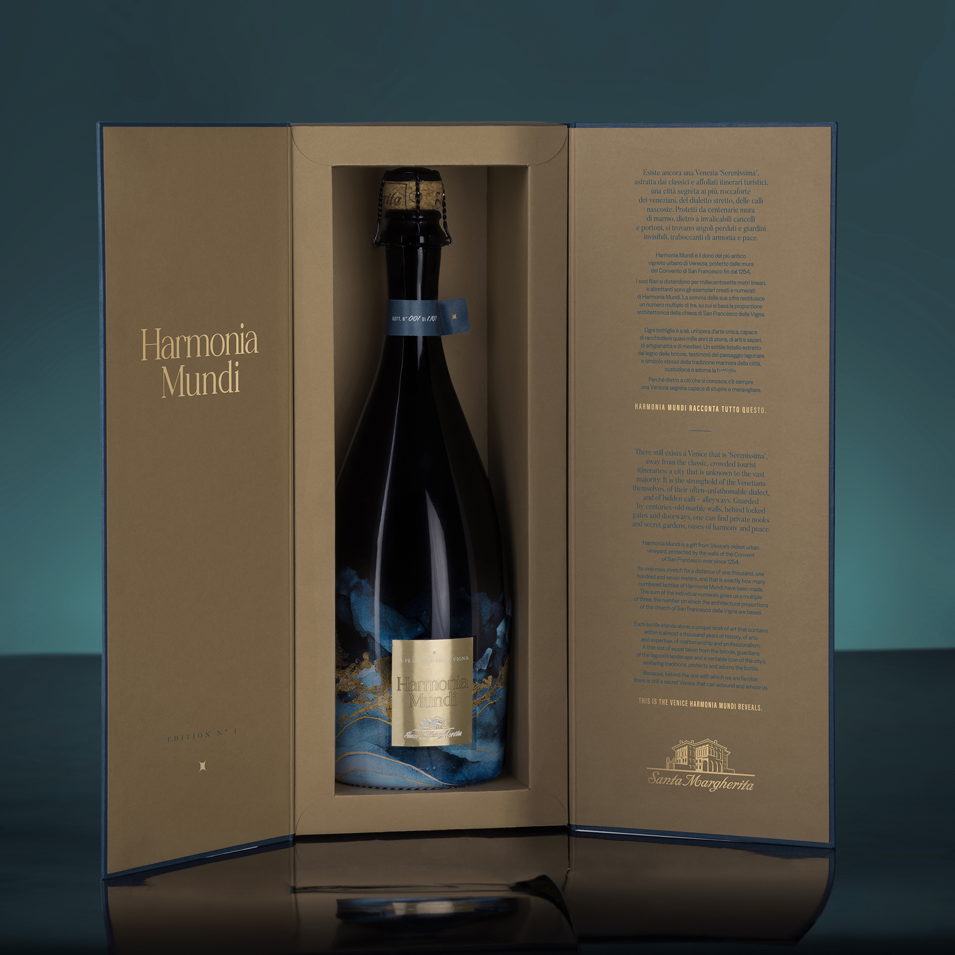
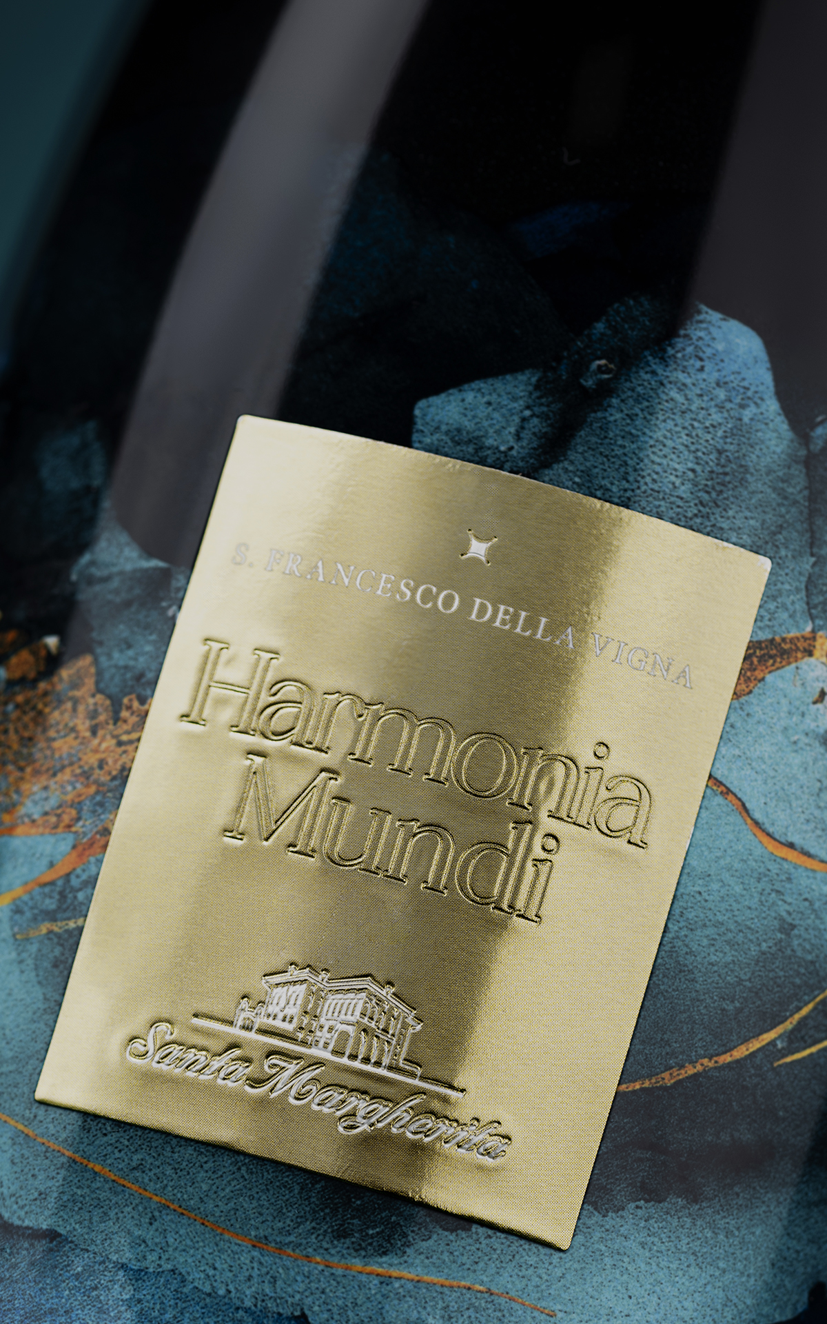
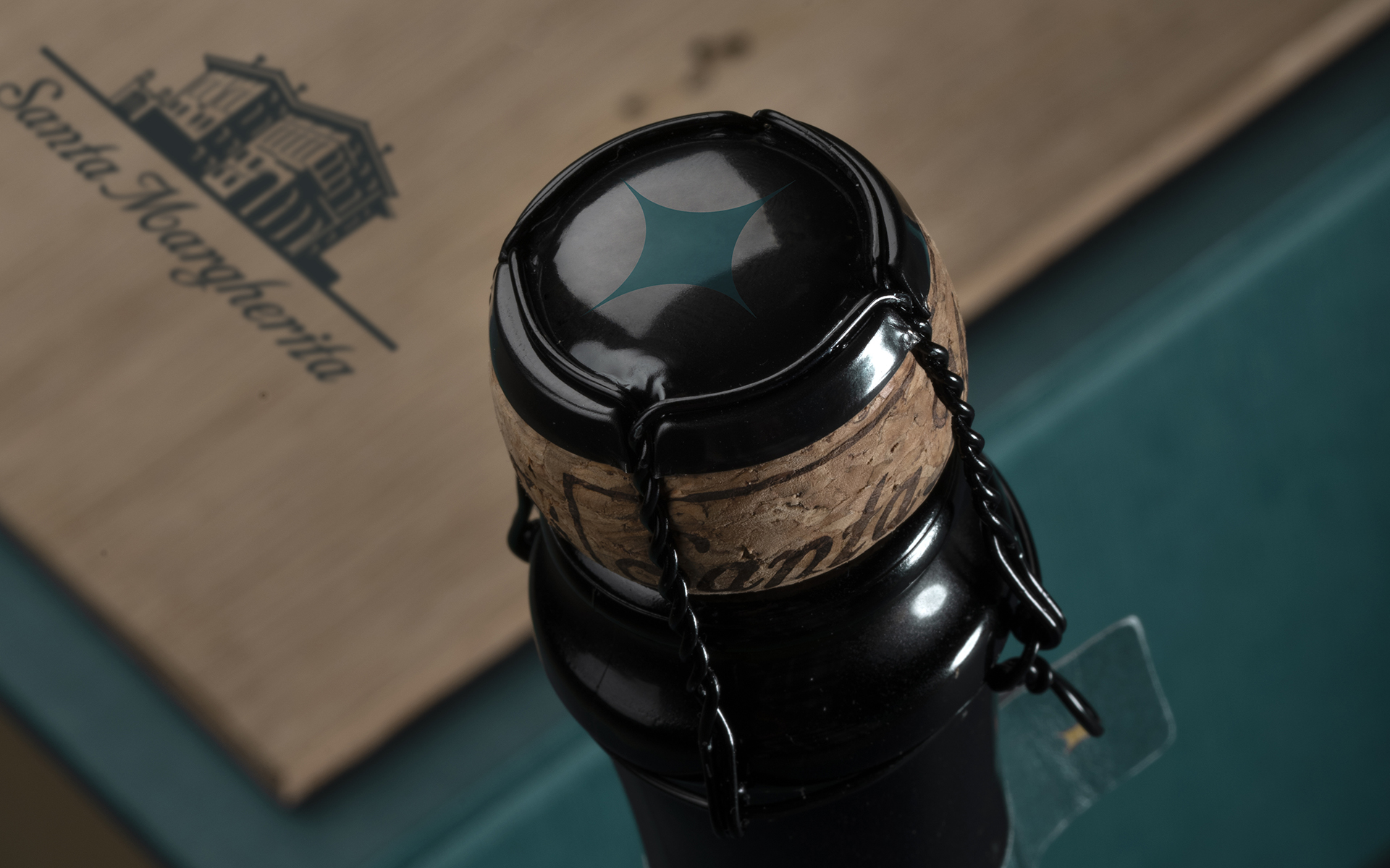
Harmonia Mundi is born from water itself – its bottle rising gracefully to reveal a distinctive shape and texture. Crafted using an exclusive and cutting-edge decoration technique: sublimation, also known as water dipping. Harmonia Mundi is a gift from Venice’s oldest urban vineyard, protected by the walls of the Convent of San Francesco ever since 1254. Its vine rows stretch for a distance of one 1.107 meters, and that is exactly how many numbered bottles of Harmonia Mundi have been made, numbered by hand. The sum of the individual numerals gives us a multiple of three, the number on which the architectural proportions of the church of San Francesco della Vigna are based. Each bottle stands alone: a unique work of art that contains within it almost a thousand years of history, of arts and expertise, of craftsmanship and professionalism. A thin slat of wood taken from the brìcole, typical wooden poles of the lagoon’s landscape and a veritable icon of the city’s seafaring traditions, protects and adorns the bottle. Because, behind the one with which we are familiar, there is still a secret Venice that can astound and amaze us. THIS IS THE VENICE HARMONIA MUNDI REVEALS.

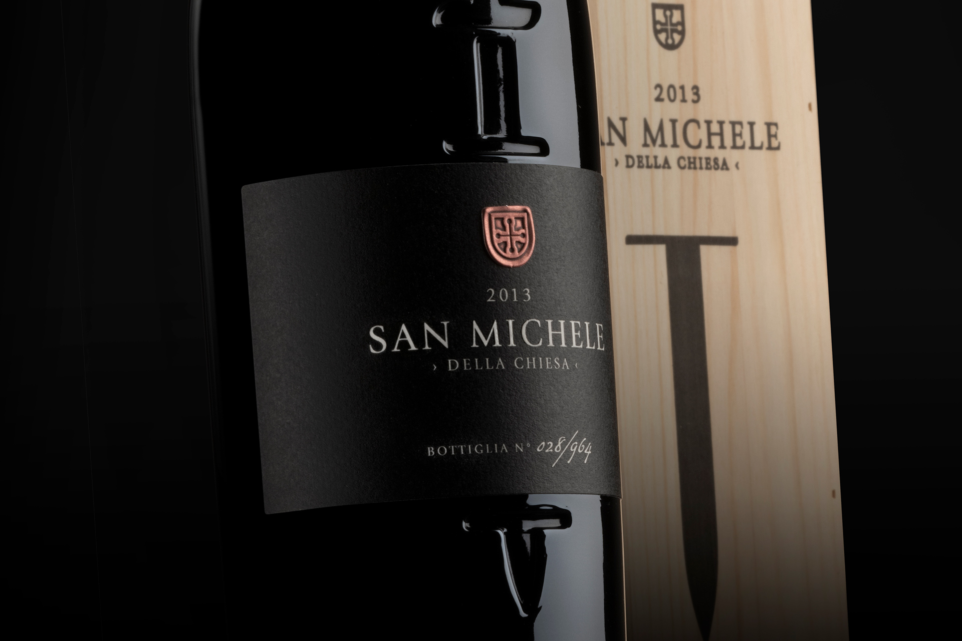
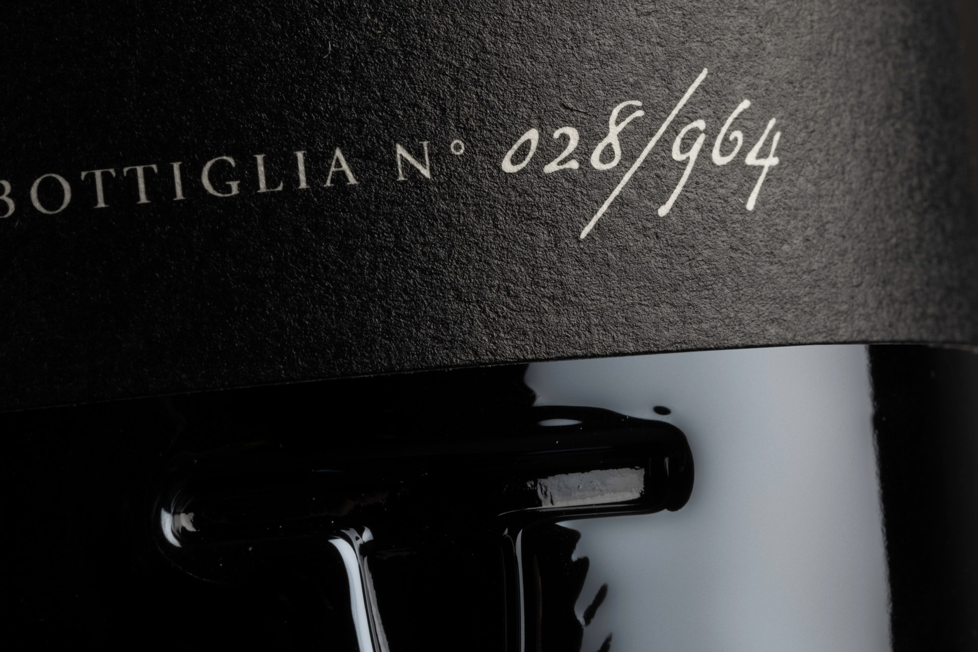
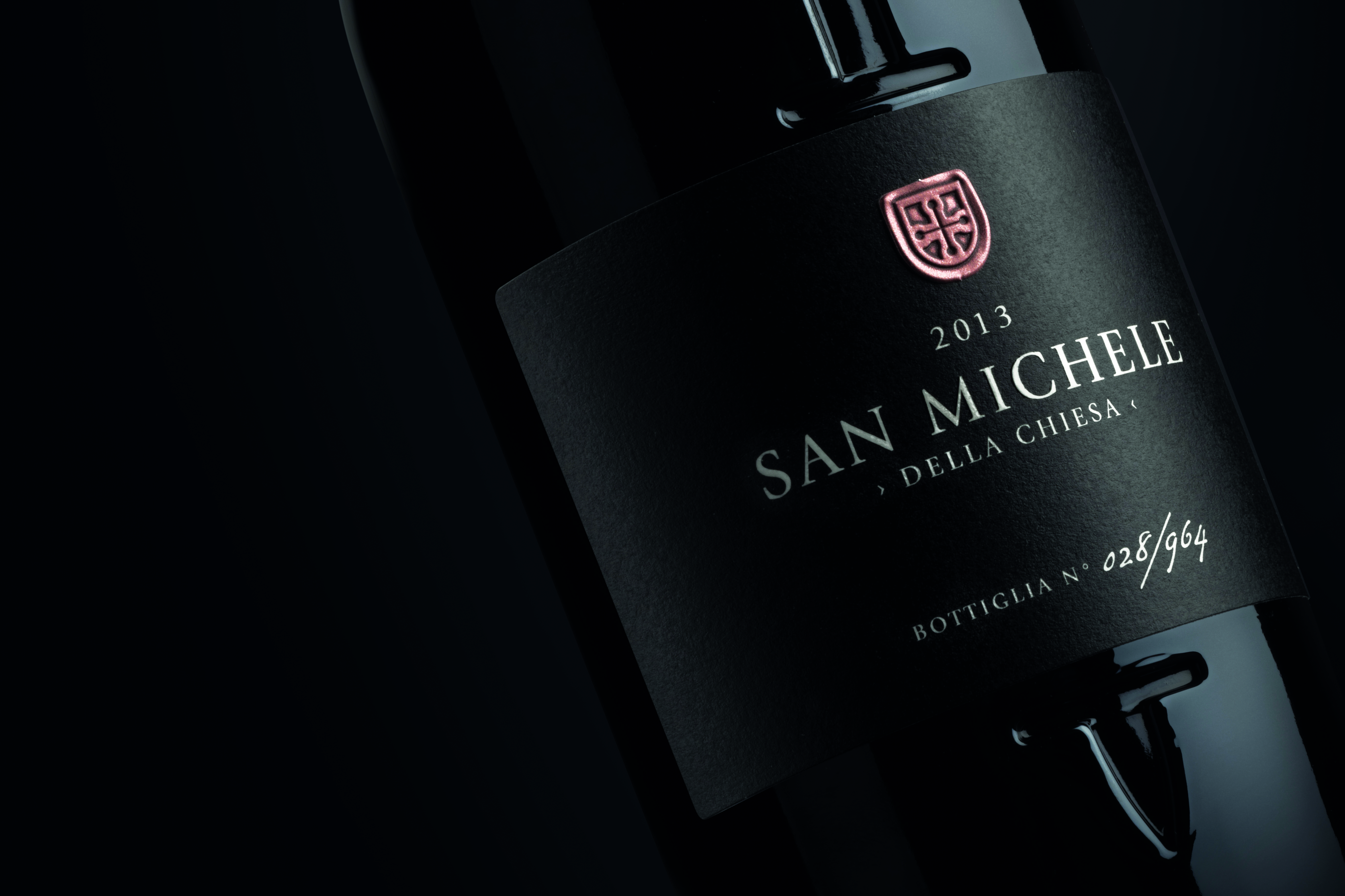
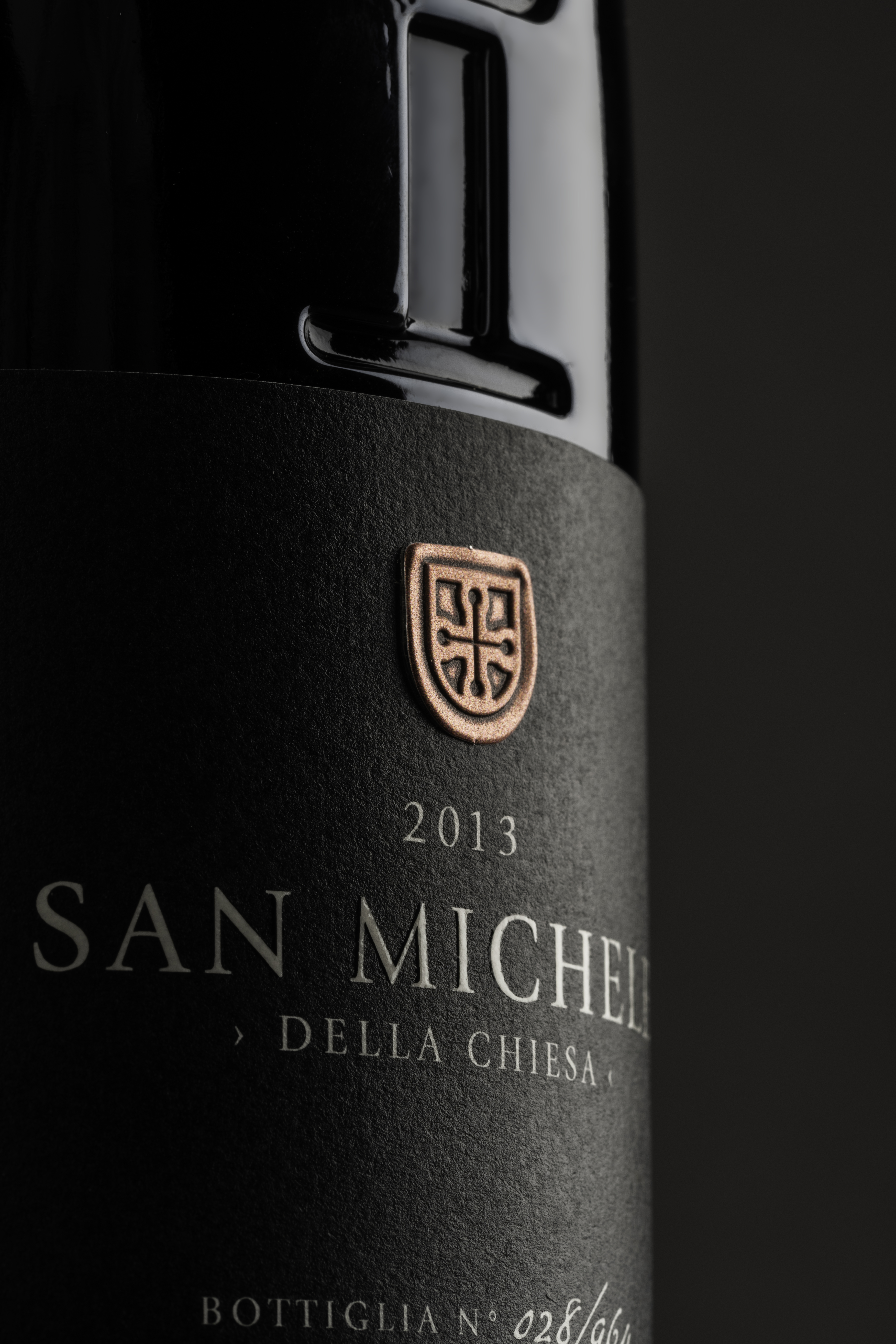
A small church and its ancient orchard; a few vines that carry a centuries-old legacy in their branches, together with a name: Saint Michael, the leader of the heavenly armies. The story orbits around a symbol of strength and the very idea of protection, which we have given material form to by impressing the sword of Saint Michael onto the bottle. The black label, as simple and solid as stone, intersects with the sword. An elegant Roman font, the year of production and the serial number of the bottle are the only elements needed to transmit a strong sense of identity, as strong as Saint Michael’s metallic shield.
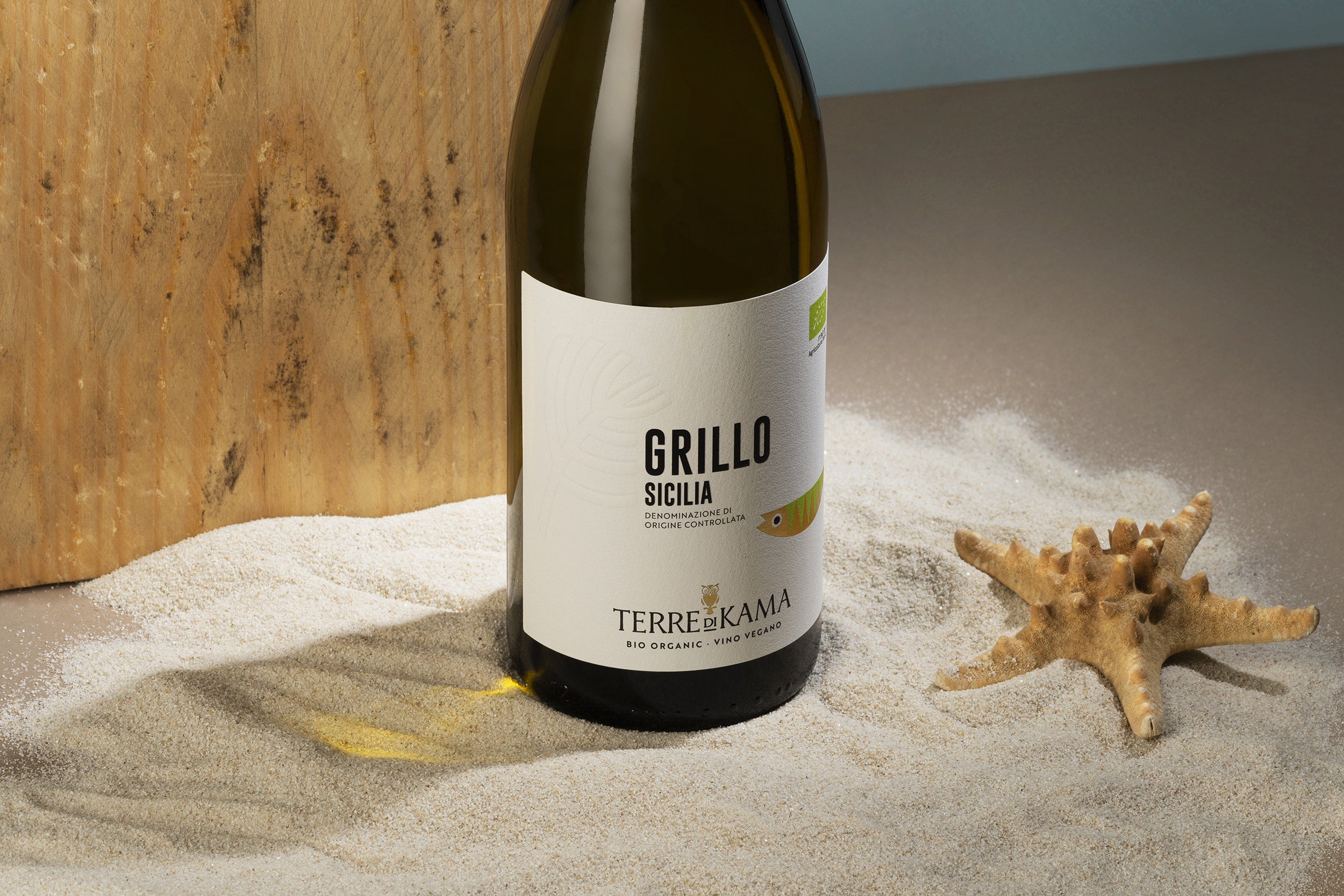
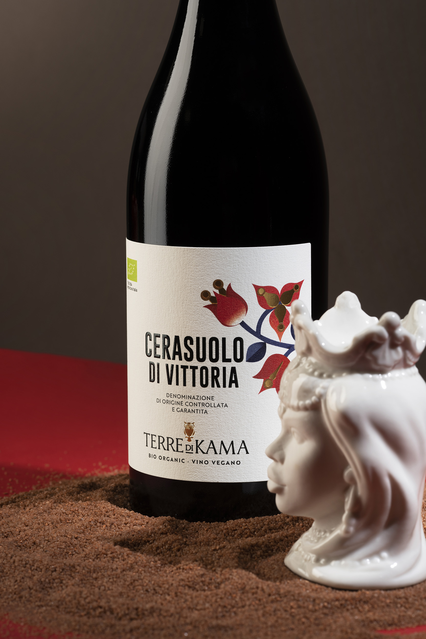
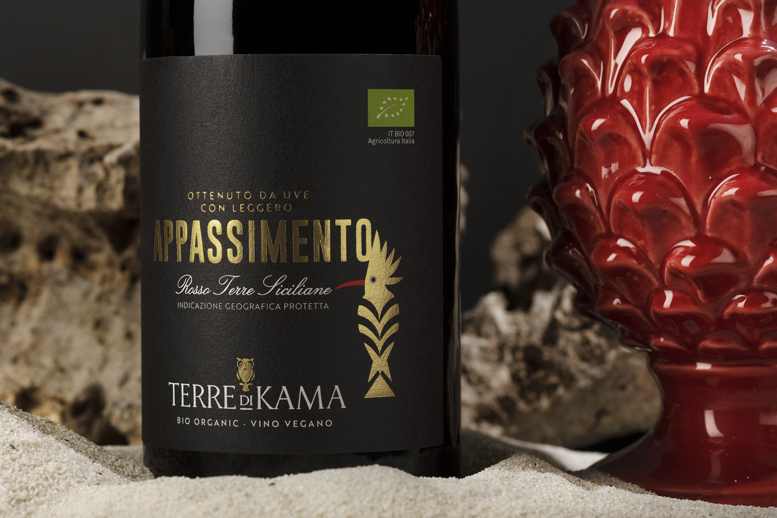
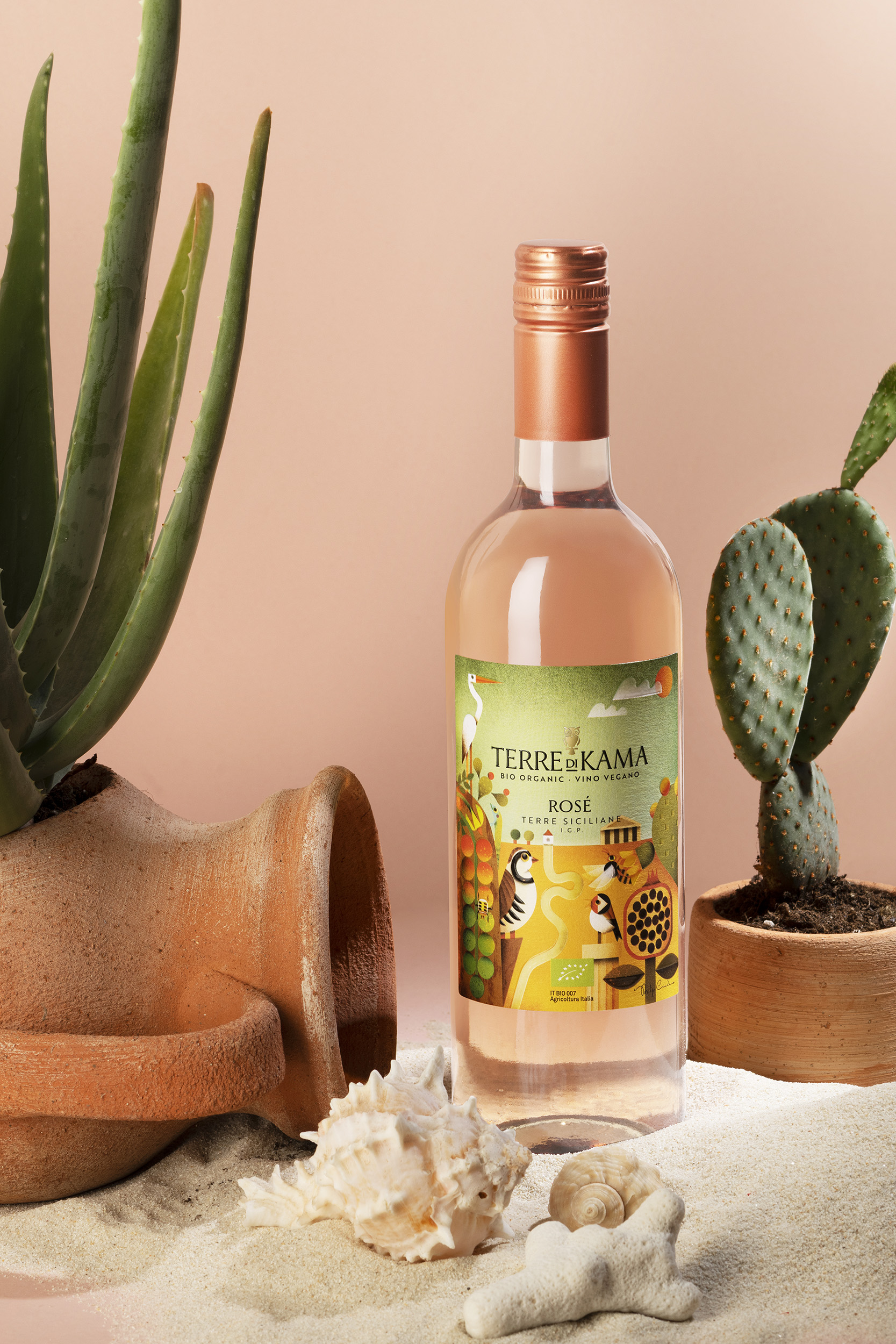
How do you communicate an ancient culture to millennials through wine? This is done through a colourful language and storytelling linked to Sicilian tradition and culture. It is a unique cultural encounter between ancient history and modern language. The Terre di Kama labels, with the unique style of Philip Giordano, address a specific generation. Terre di Kama is the organic wine dedicated to those looking for an authentic, sustainable and environmentally friendly product: in short, a wine for millennials. Born between 1981 and 1996, this is the first truly global generation, mindful of what they consume.

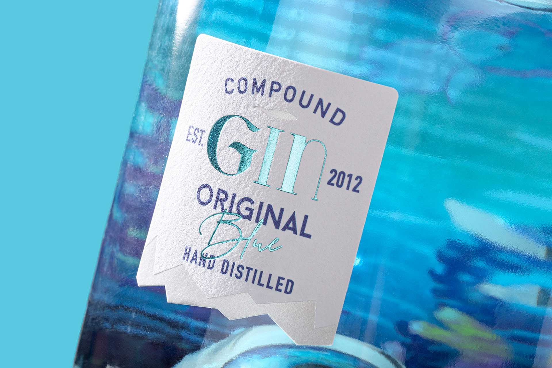
It’s not just a gin or a label. Lume – Spirit of the Abyss is an experience, an invitation to explore and start seeing things from another point of view. And to find out how the world changes when we look at it with curious eyes. When we look out over the ocean towards the horizon, the water darkens from turquoise to navy – almost black. We feel a thrill. We wonder what’s hidden in that unsoundable abyss and are a little scared of what might rise up from it. Our courage fails before such majesty and – in the equally impenetrable depths of our souls – something lights up inside us. It’s the spark of curiosity, stronger than any fear, the power that drove us to discover new lands and even touch the moon, and what still drives us to keep asking what’s hidden beneath what we see. In the darkness, even the faintest glint becomes a floodlight illuminating the unknown. That’s when we discover that we’re not alone, and that darkness is nothing but a border we can push away with the help of the flame we nurture inside. Welcome to Lume. Welcome to our world. Technical description Lume – Spirit of the Abyss is so much more than a mere label – the packaging forms part of the experience. Using a personal device such as a smartphone is the bridge leading to and illuminating the unknown. Once the bridge has been crossed, the bottle comes to life and reveals its secret world.
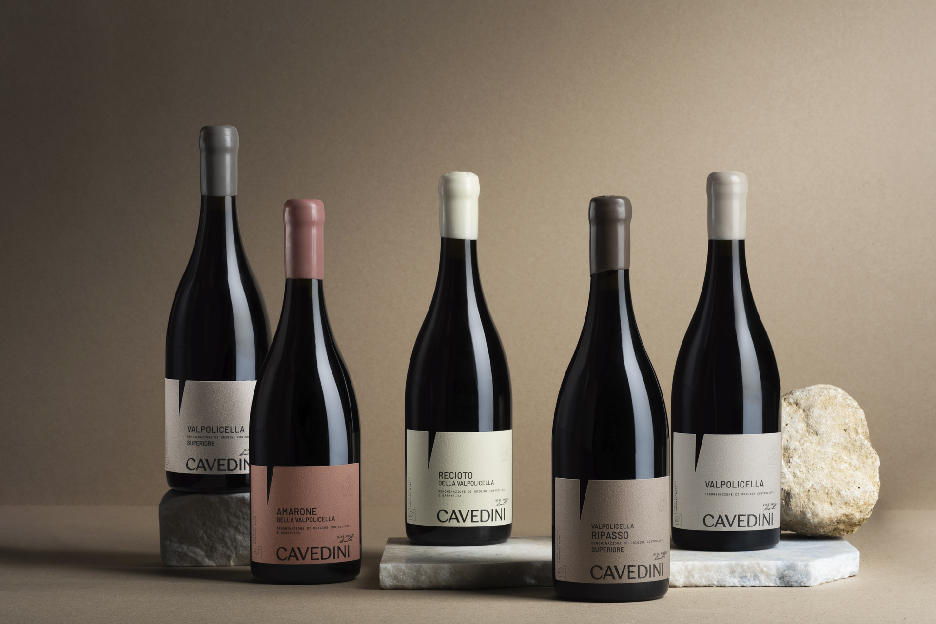
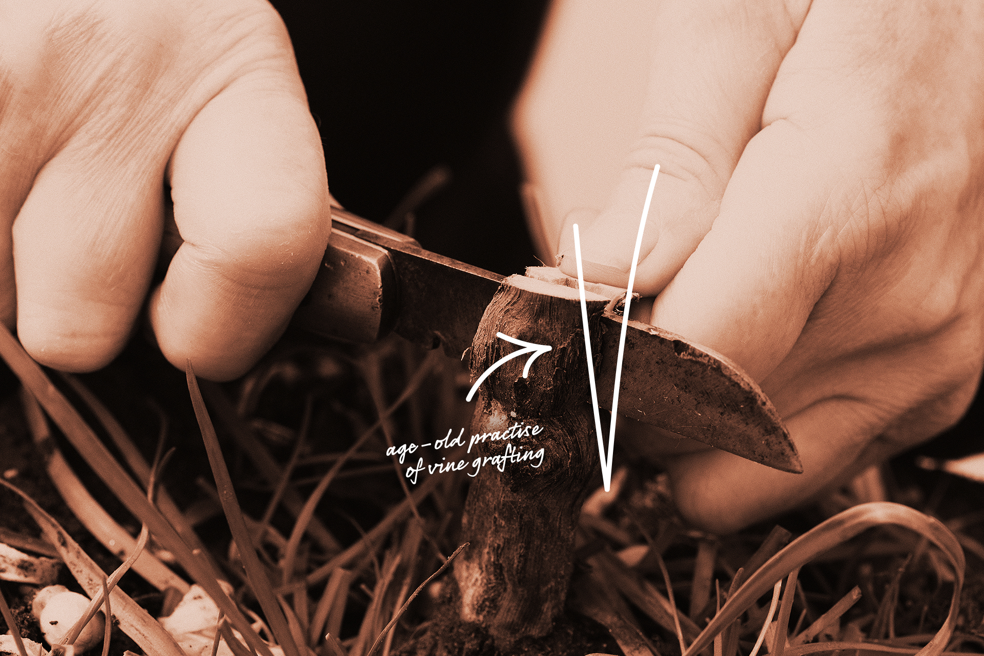
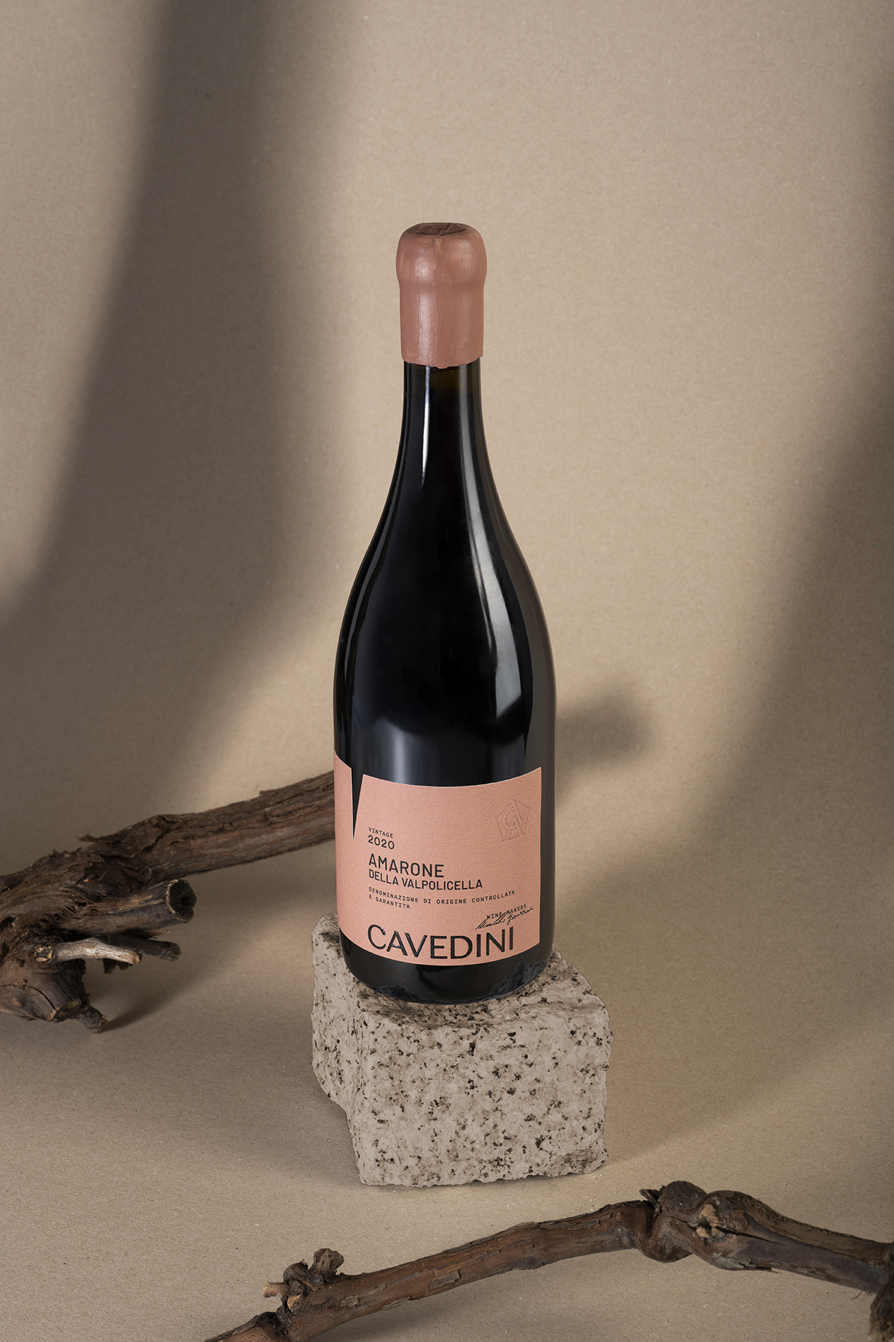
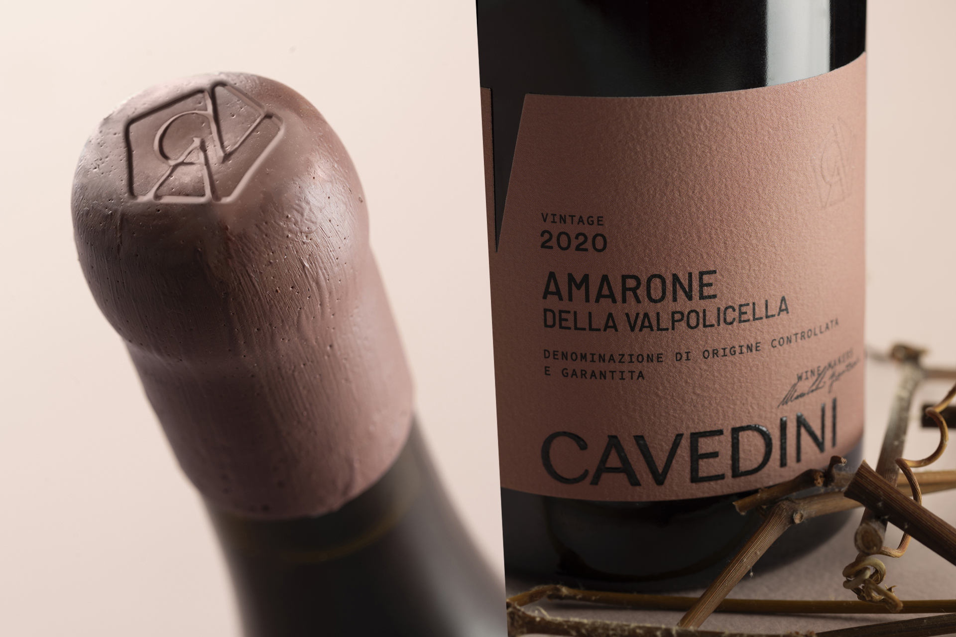
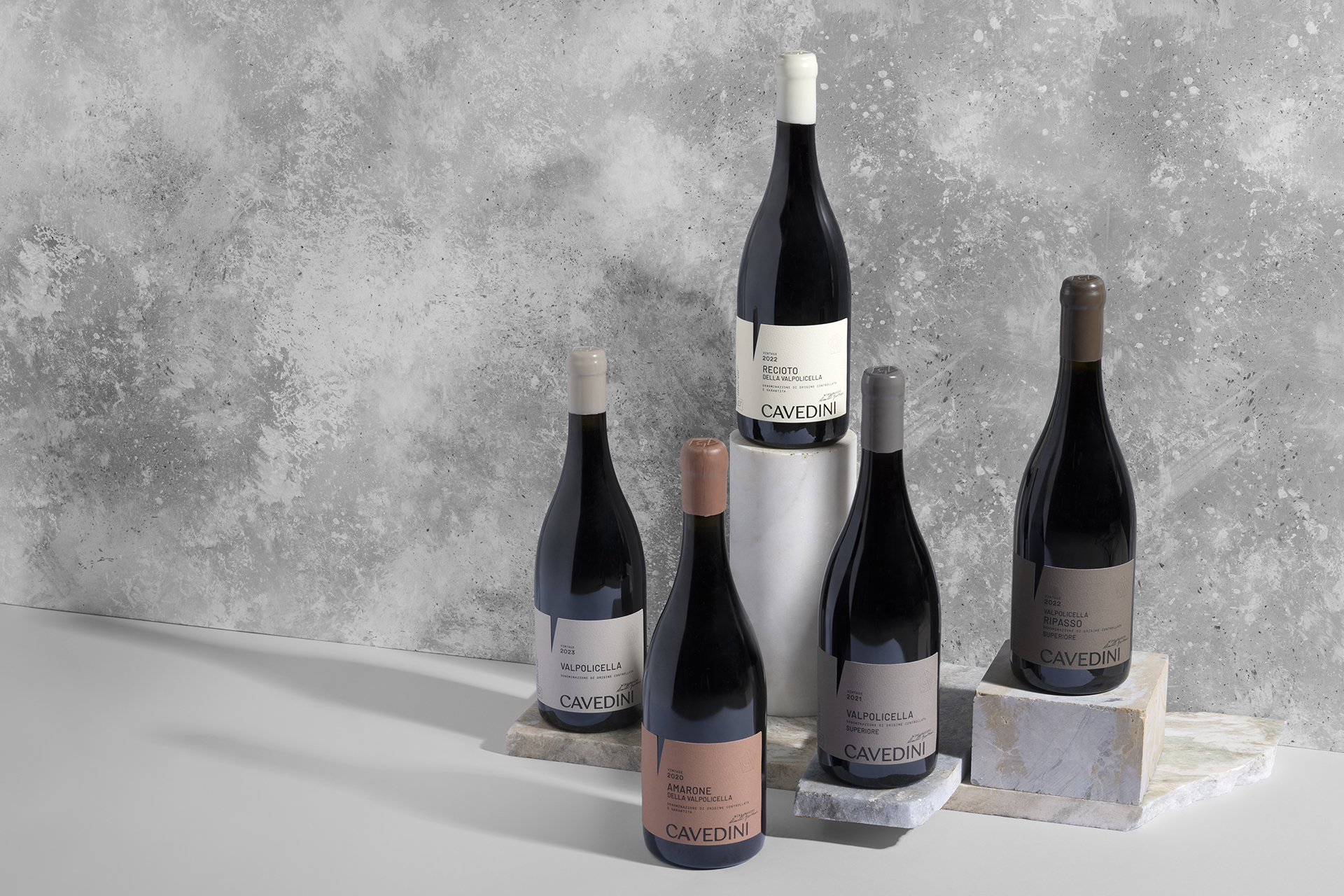
Deceptive simplicity formed of hints and hidden meanings. The restyling performed on the labels for the whole range of Cavedini Valpolicella wines uses space and geometry to express the family vocation. The organic lines of the vine leaf – represented through the bas-relief pentagon surrounding the family monogram – and the triangle in negative evoking the age-old practise of vine grafting become symbols of a craft passed down from generation to generation.