


Alpro's refreshed rebrand by Elmwood
Elmwood delivers a fun, flavourful and progressive rebrand for Alpro as the plant-based market booms
Elmwood delivers a fun, flavourful and progressive rebrand for Alpro as the plant-based market booms
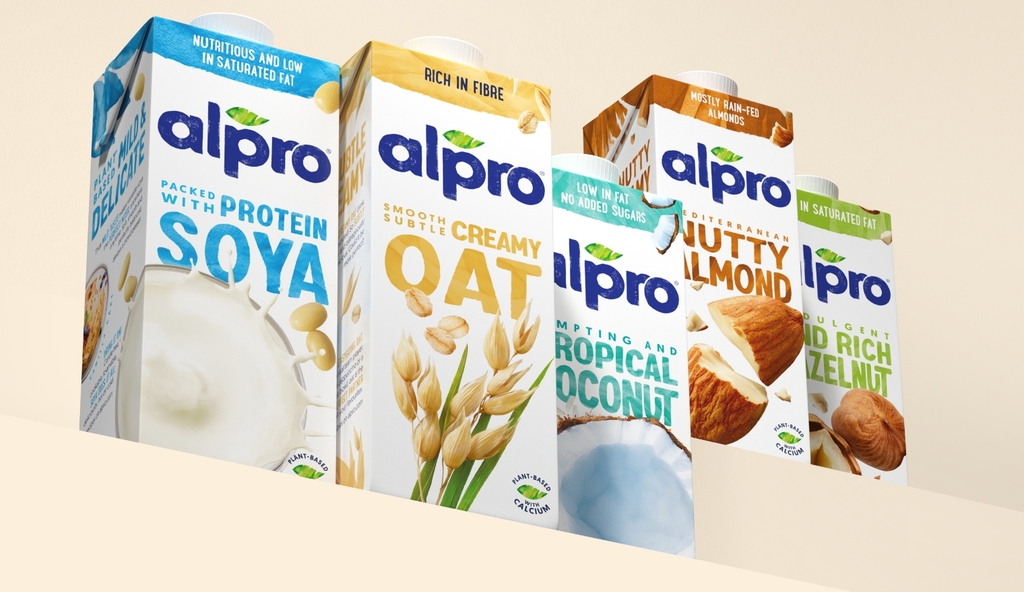
Plant-based pioneer Alpro reveals a confident new look that reasserts the brand’s fresh, flavour-packed appeal amid soaring industry demand. The revamp, led by global design consultancy Elmwood, focuses on Alpro’s natural ingredients via a series of on-pack and digital design accents. These include new photography assets, along with a playful tone of voice and bespoke typography from London-based lettering artist Rachel Joy in partnership with Monotype.


Using Elmwood’s strategy of “iconically always new”, the reinvention is intended to enhance Alpro’s position as a market leader in the dairy alternatives category. Refinements have been made with the aim of dialling up Alpro’s brand promise, reinforcing the power of its plant-based ingredients – as captured within a series of health benefits, along with an exceptional taste experience. The resulting restage work has finessed, rather than transformed, Alpro’s signature assets in line with a fast-paced ecosystem.


Elmwood’s new design ramps up flavour both through the photography and the language used by the brand on and off-pack. Taste descriptor notes such as “smooth, subtle, Creamy Oat” have been brought to the forefront, whilst the brand’s voice as a whole has become more youthful, including onomatopoeia and more descriptive language that helps consumers navigate the variety on offer. This freestyle voice is combined with a rebalanced palette that combines vibrant whites with pops of colour. The result is a progressive identity, created to appeal to a broader audience – including next-gen consumers.

“We’re proud to have worked alongside Alpro for over eight years now. When our partnership began, the conversation was very much about educating consumers with a simple, subtle design ethos. However, with a huge boom in awareness, we now have space to consider where Alpro goes next.”
“Through a co-creation process, we decided that there was room to move the needle, creatively, by focusing on Alpro’s wider brand story (rather than pack design alone). The result is an evolved design that focuses on the incredible taste and smooth, moreish texture of Alpro products – from drinks to yoghurts, mousses and more. Along with their positive impact on health and the planet, these changes show clearly that plant-based produce is no longer ‘just’ alternatives or supplements. They’re aspirational purchases in their own right.”, comments Kyle Whybrow, Executive Creative Director at Elmwood London.
For more information on Elmwood’s design, visit their website or follow them on Instagram.
Want to receive more monthly packaging inspiration? Sign up for our newsletter!