


Bringgreen by ESTABLISHED
ESTABLISHED delivers a packaging design creating a collaboration of science and style for Korea’s top health brand, Olive Young
ESTABLISHED delivers a packaging design creating a collaboration of science and style for Korea’s top health brand, Olive Young
When Olive Young, South Korea's premier health and beauty retailer, approached ESTABLISHED to breathe new life into a beloved vegan skincare brand renowned for its clean, high-quality ingredients, the design agency embarked on a journey to fuse science and style. The challenge was to not only spotlight the brand's dedication to pioneering formulas but also to demonstrate that science and innovation can harmonize seamlessly with fashion-forward sophistication.

At the heart of this brand transformation lies the concept of a stylish scientific lab. It's a bold departure from conventional skincare branding, where sterile and clinical aesthetics often dominate. The approach was to embrace the essence of a laboratory, reimagining it as a chic, fashionable space that exemplifies the brand's cutting-edge ethos.
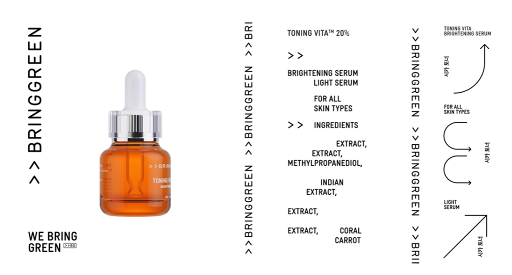
To embody this vision, ESTABLISHED delved into industrial design details that found their expression in the product's packaging. The bottle and cap now showcase these intricate details, merging an industrial edge with an elegant touch. The result is a packaging design that exudes a sense of innovation, making a bold statement on any beauty shelf.


The brand logo itself transformed to reflect the brand's core values incorporating elements that underscore the brand's commitment to science and innovation. The revamped logo serves as a visual representation of the brand's identity, bridging the gap between technical precision and contemporary style. In the realm of skincare branding, typography and symbols play a crucial role therefore adopting a typography that exudes technical and precise aura, resonating with the brand's dedication to research and development in a manner that aligns with modern aesthetics.

The use of arrows throughout the branding serves a dual purpose. Firstly, it symbolizes progress in a scientific sense, highlighting the brand's relentless pursuit of innovation and improvement. Secondly, it’s a subtle nod to the fashion-forward direction the brand is taking, signifying movement and advancement.
For more information on ESTABLISHED’s design, visit their website or follow them on Instagram.
Want to receive more monthly packaging inspiration?
Sign up for our newsletter!