


Everyday Humans rebrand by Julia Neiva
Julia Neiva delivers a packaging design crafted to capture the attention of a Gen Z audience with a bold and vibrant visual for everyday humans
Julia Neiva delivers a packaging design crafted to capture the attention of a Gen Z audience with a bold and vibrant visual for everyday humans
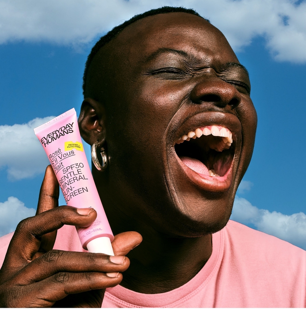
Everyday Humans is a rebrand for a skincare line that is designed to be trendy, inclusive, and specifically crafted for Gen Z. The rebrand incorporated vibrance, pastel colour hues, sleek and modern typography, and Instagram-worthy visuals.

Although the brand’s visuals are directed towards a Gen Z audience, the brand's ethos caters to everybody. With a mission to build on their environmental sense, the rebrand works towards making greener choices with biodegradable bottles, FSC-certified products, and recycled paperboard.

Julia Neiva was tasked with delivering a brand identity and packaging system that is inclusive to all, with an emphasis on targeting a Gen Z audience. The colour palette indicates flexibility and fun while maintaining functionality, thus developing a two-fold system. The colour palette is inspired by the ingredients used.

With a humble beginning with sunscreens, the brand has transformed itself into a lifestyle skincare brand, and the packaging supports its values with its design system, brand identity, colour palette, and typography topped off with sustainability at the core of the packaging material.
For more information on Julia Neiva’s design, visit their website or follow them on Instagram.
Want to receive more monthly packaging inspiration? Sign up for our newsletter!