


Inclusivity in Design x Neha Tulsian
This month, we speak to Neha Tulsian, mother, wife, daughter, designer, friend, timekeeper, creative director and chief energy officer of NH1 Design sharing her story as her multiple roles influence her designs as she breaks barriers and delivers solutions
This month, we speak to Neha Tulsian, mother, wife, daughter, designer, friend, timekeeper, creative director and chief energy officer of NH1 Design sharing her story as her multiple roles influence her designs as she breaks barriers and delivers solutions
Tell us something about yourself
Who am I? Now, this question itself is very self-reflective. I am a mother, a wife, a daughter, a designer, a friend, a timekeeper, and a creative director—so many roles in one. You can call me Neha Tulsian, the Chief Energy Officer at NH1Design, India. My inspiration comes from people. It could also be drawn from a change in government regulations, a movie, or a situation; my inspirations come from everyday life!
What is the story behind your agency/independent studio?
I studied design at LCC, UK. After that, I worked in both London and India for several years before the inception of NH1Design. Setting up my agency was never initially part of my plan. However, when my better half relocated to a new city in India, a potential client who wasn't able to work with freelancers encouraged me to establish NH1Design.
In hindsight, my upbringing in an entrepreneurial environment proved to be an advantage. It instilled in me a natural understanding of how to navigate the world of business. I learned that talent must be complemented by discipline and hard work.
I founded NH1Design with a humble goal: to create exceptional design work that resonates in the real world. This is not just about aesthetics; it's about design backed by a compelling idea. Design that brings smiles to people's faces. Design that stimulates thought. Design that can impact a brand's ROI while also making a meaningful difference.

What according to you is inclusivity in design?
Inclusivity in design, whether brand design, packaging design, space design, or any other form, is a multi-layered concept that should be an integral part of the creative process. It extends into various pillars like social responsibility, sustainability, accessibility, and gender among others.
To be inclusive you need to be exclusive: No great product or service can be everything to everyone. A deep understanding of the segment being served helps to comprehend the inherent diversity within it. For a healthy snack food brand targeting young adults in urban India, it needs to be conscious of the diversity of this segment – the latest zeitgeist, cultural diversity, dietary preferences, body types, sustainability quotient, etc. The same snack food brand, when targeting the elderly in urban India, may need to be conscious of diversity in portion and nutritional needs, accessibility, and comfort with technology. So, as designers, we not only need to understand the specific attributes of our customers but also need to map the diversities within these attributes. Each segment is constantly evolving: cultural, demographic, and economic changes are constant. If anything, the rate of this change is ever-increasing. As designers, we need to be sensitive to this constant evolution.
In architectural design, an inclusive design might entail enhancing accessibility by incorporating features like ramps, a space for all ages, and universal signage. Now, these days it also needs to consider the charging needs of electric vehicle owners and accommodate the evolving needs of gender identities. Similarly, makeup packaging should be gender-inclusive – it should no longer target only the female demographic.
Sustainability and Purpose: This one we all know. Packaging designers should understand the environmental impact of their materials and processes. Can the packaging serve a higher purpose beyond mere containment of the product? Can it effectively communicate the brand's dedication to sustainability or support a meaningful social cause? This alignment ties the design directly to the broader values and mission of the brand.
Designers are changemakers: Recently, I watched "Made in Heaven", a series on Netflix and I was struck by its inclusive and purpose-driven narrative. Popular culture and media have a significant influence on society. As creatives, we must recognize our role in shaping culture through our work. Ideating inclusive films, advertisements, and brand narratives that authentically represent a diverse array of people and perspectives can have a positive impact.
In essence, inclusive design not only recognizes the diversity within its user base but also shapes the narrative within it.
Which project(s) are you most proud of and why?
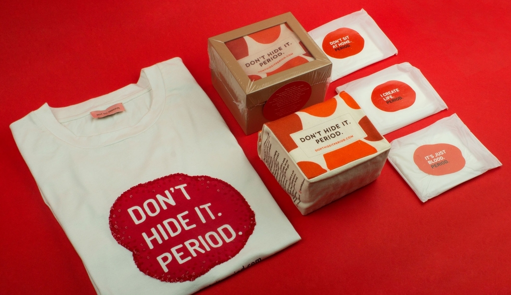
Redesigning embarrassment into eloquence - Don't Hide It Period
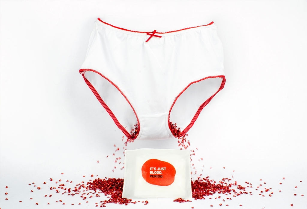
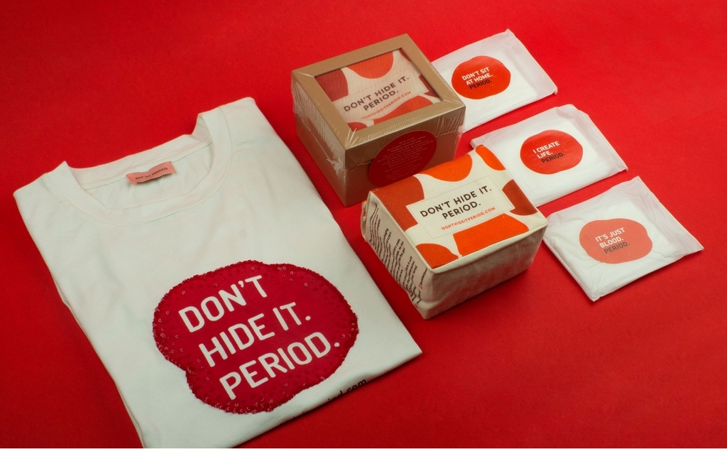
One of my favourite pieces of work has been "Don't Hide It Period." This was a self-initiated project where we identified a problem and took action. What I find truly rewarding about this project is how packaging design can be a powerful tool to address and challenge social taboos. How about we turn boring sanitary pad packaging into one that is inspiring, confident and sparks conversation? Period. The word is whispered in hush tones, almost like it’s an embarrassment. Look around you. Nobody talks about it or addresses it. We’re trained to believe it’s something to be embarrassed about. In India, even the chemist packs it in a black bag and gives it to you. And you put that little bag in your purse and rush home to do the needful.
Why does sanitary pad packaging fail to communicate and engage the end user? This question had been lurking in our head (and, our heart). It's almost like the sole purpose of the packaging is to hide sanitary pads by over-dressing them in florals, butterflies, cursive typography and stereotypical graphics. This brought us to the bigger question – why, in 2018, are we still shy to say the word 'Period'? Menstruation is a natural biological process. And that's all it is. In order to encourage people to open up and talk about periods we have designed a packaging system that allows women to embrace periods and break the ice between their dear uterus and the society. 'Don't Hide it Period' is a limited edition campaign to raise funds for charity and inspire people to openly talk about periods.
Find out more here.
Redesigning the 'Prescription to Medicine Intake' experience
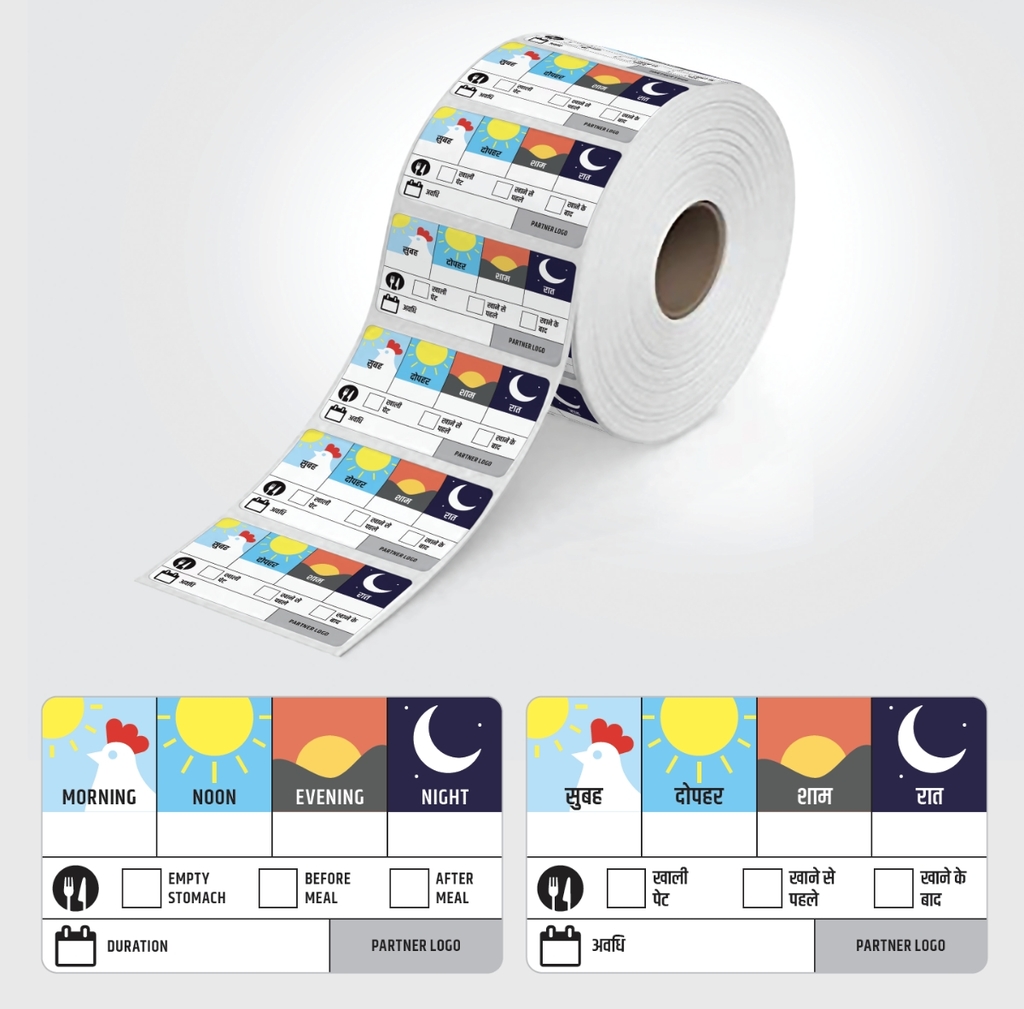
Like most design solutions, this one too, is rooted in a real story. My 3-year-old daughter Ira, falls sick often. It’s nothing serious – just her tiny body building its immunity. But being a mother, who’s forever paranoid, we visit doctors often. And every time I’m handed a prescription, I come home overwhelmed. So, this is what I started doing. On the bottles, I drew symbols such as the sun, moon, etc. to indicate the specific time of day the medicine had to be consumed. This helped me and my nanny follow the prescription better, minus the constant cross-checking.
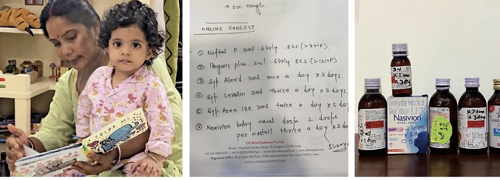
At our studio – NH1Design, we crafted a sticker which has a simple 4x4 grid. One for each part of the day. I then tested this at home. After a few iterations, it worked. Little Ira’s caregiver could easily understand this sticker because it’s not language-dependent, this can be widely used and understood. Historically, people have always responded to pictures better than text.
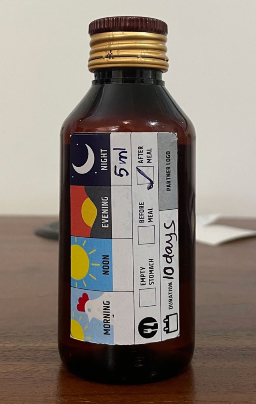
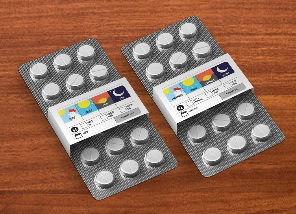
So the question now is...What if we want to solve this problem at scale? Can this small design change help encourage a better care experience? For impact, can Pharmaceutical companies like yours use this design system as a part of the packaging itself? Let me show you how.
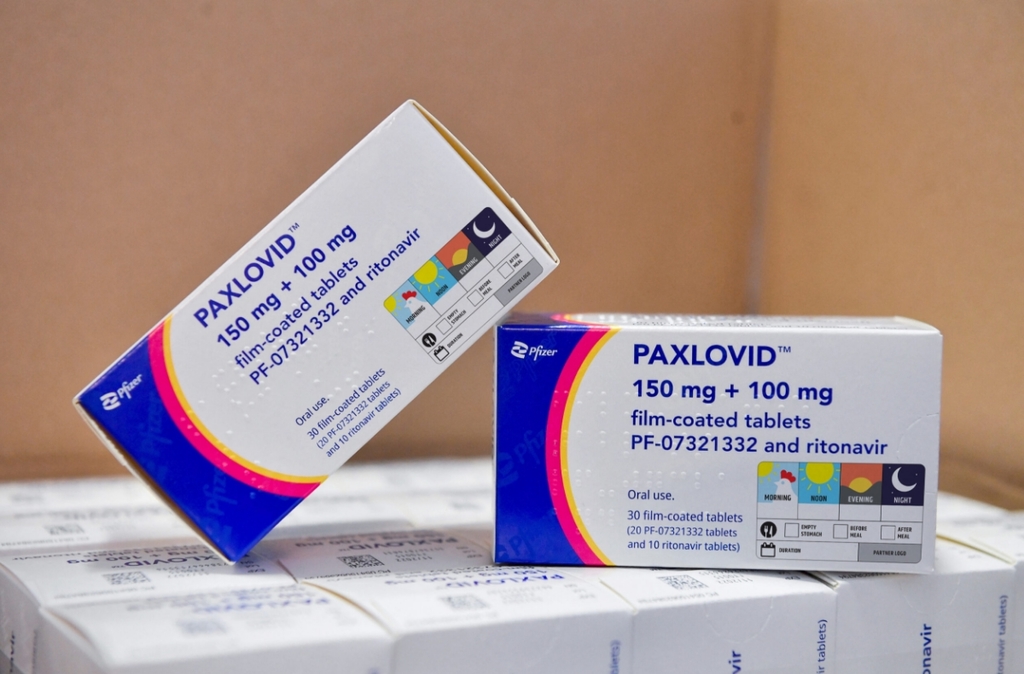
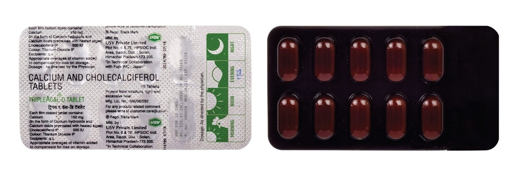
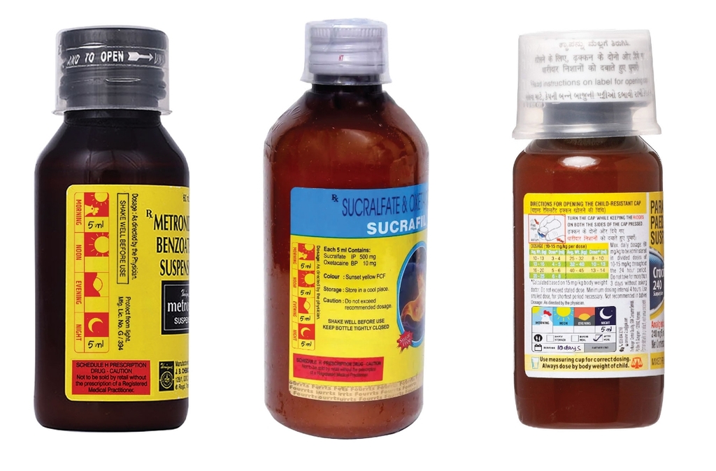
While we are still figuring out how to implement this at scale, we’ve made this design open-source. So you can download it and use it for yourself, or someone else.
Disclaimer: This project is conceptual in nature and all medicines shown above are for concept articulation only.
Find out more here.
If you could share one message with the young designers in the packaging design community, what would it be?
Be curious – but don’t just focus on what’s new but also question the obvious. The most common issues are often overlooked, so it's important to be curious and develop a perspective.
Find out more about Neha Tulsian
here.
Check out NH1 Design's
website
and follow them on
Instagram.