


MOJU by Earthling Studio
Earthling Studio delivers an unapologetic, vibrant, and bold visual redesign for MOJU.
Earthling Studio delivers an unapologetic, vibrant, and bold visual redesign for MOJU.
Ginger and turmeric shots have an inherently bold taste, and Earthling Studio's design for MOJU's packaging system leans into these elements. With entirely unafraid and oversized typography and bright yellow and red colour palettes, the packaging system is dynamic and approachable while remaining representative of the vibrant flavours within.


The new typeface draws inspiration from the old logo and the international type foundry Colophon. The new visual appeal delivers strong messages of boldness, strength, and freshness. The overall visual rebrand was to deliver an evolved brand identity, creating the most distinctive and potent version of itself. The updated visuals give MOJU dominance as the leading next-generation health company both online and offline.

The rebrand comes with a classic dosing bottle to add clarity to the products used. To make measuring out seven doses easier than before, the dosing bottle redesign offers a distinctive and recognisable flask-style construction with debossed dosing lines. Its compact design fits perfectly in any refrigerator and lessens the carbon footprint of each bottle during transportation. The portfolio has been reorganised into three segments that are led by benefits and are called Vitality, Immunity, and Gut Health.

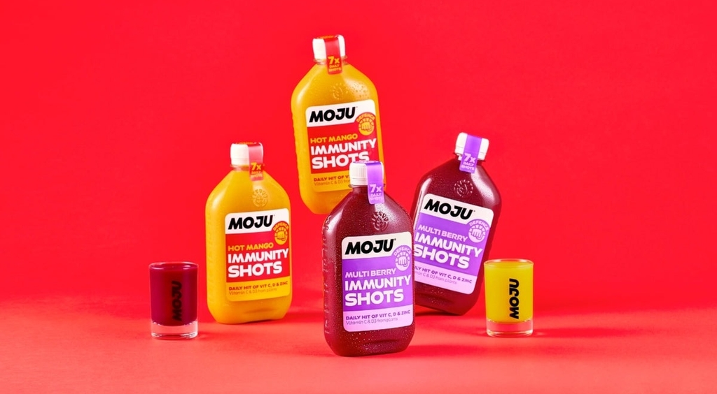
A clear message is communicated with the use of new, flavorful, and vibrant colours. The new iconography, MOJU, has made it simpler and more intuitive for consumers to select the ideal shot to support their short- and long-term health and well-being goals.
For more information on Earthling Studio’s design, visit their website or follow them on Instagram.
Do you have a new packaging you would like to share? Get in touch with us
here.