


Otherside's packaging design by Clay Andrews
The designer delivers a bold packaging that reflects the whiskey's spirit of uncharted adventure and exploration
The designer delivers a bold packaging that reflects the whiskey's spirit of uncharted adventure and exploration
OTHERSIDE Whiskey is crafted at the heart of the subcontinent and aged across India’s tropical belt, embracing the land’s extremes—from scorching heat to monsoons and shifting seasons. This whiskey isn’t just influenced by the land; it’s molded, shaped, and ultimately, it is the land. Aged entirely in India, this whiskey transcends tradition. In tropical conditions, it’s not just about age—it’s about skill, instinct, and perhaps a bit of wit. What might seem familiar at first evolves into a smooth, daring experience, guiding you into uncharted territory—where the journey is about discovering what you didn’t know.
The packaging reflects this spirit of uncharted adventure and exploration, offering something bolder and braver. A minimalist horizon line runs through all brand assets, symbolizing the vastness of the subcontinent and beckoning you to explore what lies on the OTHERSIDE.
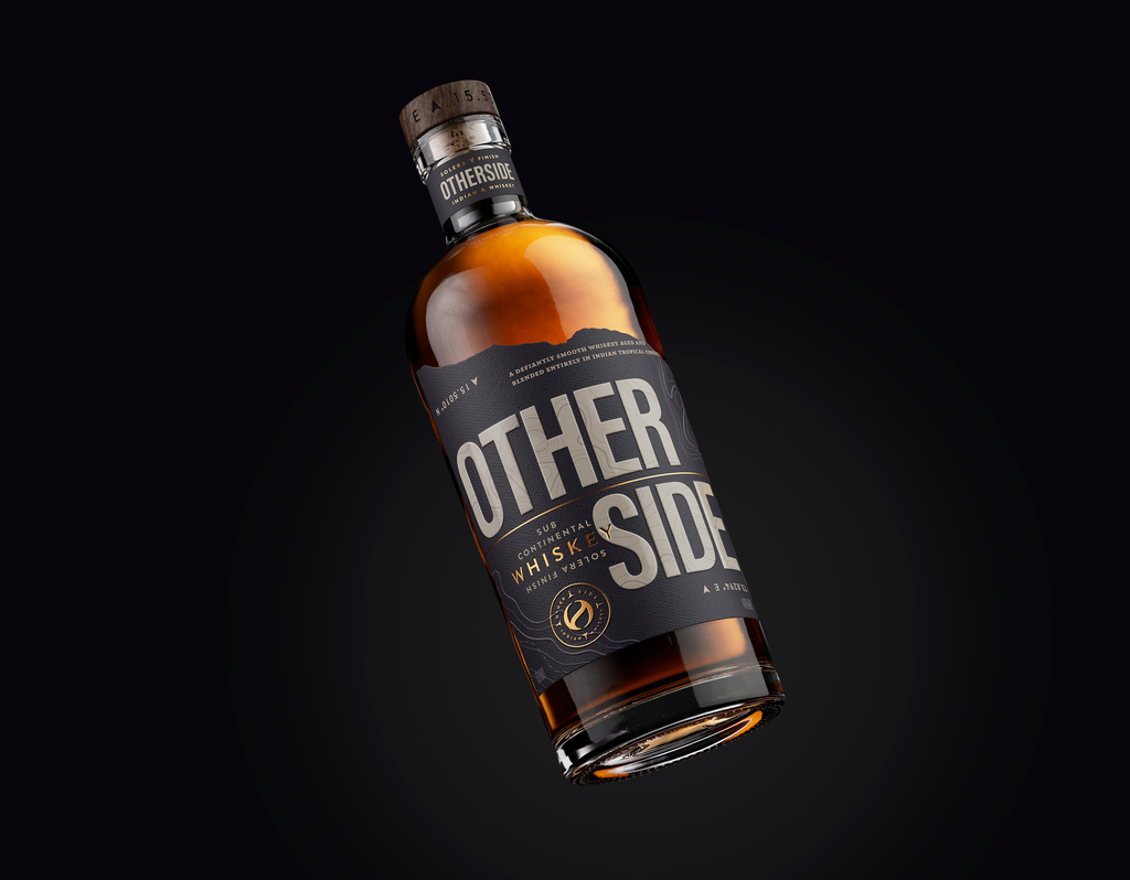
Bold typography stretches across to “othersides” of the label, inviting further discovery. Accents of turmeric-inspired pops of colour hint at the vibrancy of the land where OTHERSIDE is born.
Finally, the compass inspired roundel finishes off the pack, appearing on the label, closure, and gifting. Designed to be viewed from two sides—the positive "O" and the reversed "S"—this OTHERSIDE compass invites you on an adventure, navigating you into a new world of whiskey.


For more information on the design, visit Clay Andrews' website or follow them on Instagram .