Trends Revisited
Midway through the year we revisit some of the trends highlighted in our 2023/24 trend report to see how they have developed and progressed over the last few months.
Midway through the year we revisit some of the trends highlighted in our 2023/24 trend report to see how they have developed and progressed over the last few months.
The Art of Subtle Details
Using subtle details to evoke a particular character or narrative around a brands product. Not just in drinks packaging, we’ve been seeing these clever characters continued over the last 6 months to create a sense of depth, discovery and personality of the product and brand without becoming a gimmick.
The Long Dog Co.

Studio Unbound’s design for The Long Dog Co. creates a warm and artisanal feel that resonates with the brand's values, sense of light-hearted wit and, of course, their love for their cherished dachshunds. When the jars are lined up, you see a complete illustration of the long dog himself.
Find out more about Studio Unbound here.
Bionic Skincare

Bionic Skincare is inspired by the graceful snail. Designed by BLX Creative Design, it’s a testament to bionics, harnessing the beauty and effectiveness of snails to combat skin aging. The elegant lines and minimalist appearance not only captivate the eye but also provide a tactile delight.
Find out more about BLX Creative Design here.
THE CUP vs LIFE

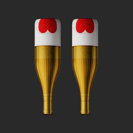
Marco Arroyo-Vázquez’s limited edition bottle for THE CUP vs LIFE prompts reflection on personal values and priorities. To highlight the "vs" opposition concept, two distinct graphics differentiate the cup, via a sleeve, from life. These graphics reveal hidden nuances representing essential yet often unappreciated aspects of life, like friends, family, and love, which we recognize only when they are distant or lost.
Find out more about Marco Arroyo-Vázquez
here.
All About The Numbers
The creative inclusion of numbers as a core aspect of labels have continued as a trend. Used to incorporate further credentials for the product, convey milestone, portion guidelines or to express the brand’s character and name.
15:45 Tea

CB Design for 15:45 tea lets the numbers do the talking. The agency delivers a clean design where the clever name of the brand takes centre stage, paired with an earthy colour palette to elevate its appeal.
Find out more about CB Design
here.
Colect

Lucas Machado Design’s packaging design for Colect creates a sleek, minimalistic housing for the brand's notebook and planner, blending vibrant colors with bold black typography.
Find out more about Lucas Machado Design here.
Les Naturals Albtre

Designed for Les Naturals Albtre, BY-ENJOY Studio features oversized, off-kilter typography and deep colours exuding luxury and sophistication. The sleek finish with matte accents enhances the premium look.
Find out more about BY-ENJOY Studio
here.
Back to Basics
As a way of making product packaging more sustainable, and helping to create a clean appeal for higher-end products, we’ve continued to see brand minimising the use of materials in their packaging. With this trend we’ve seen brands using embossed lettering and visuals on glass to add rich texture and decoration or keeping it completely stripped back and totally minimalist.
Paddington Lane

Paddington Lane rosé designed by Denomination draws inspiration from the uniform yet uniquely detailed terrace houses in Australia. The numbered series and intricately embossed wrought iron lace on the bottle add a touch of elegance, whilst the back of the bottle features a poignant wine quote by Robert Louis Stevenson to enhance the romantic appeal.
Find out more about Denomination here .
Papa Salt

Papa Salt has been created by Vert Design for Margot Robbie. Intentionally simplistic, they have reducing the design to its bare essentials. Creating a distinctive bottle form with edges smoothed over as if shaped by the sea, an aqua-blue sea glass effect radiates freshness and a swirling brand mark that alludes to an untold coastal story.
Find out more about Vert Design here.
Cosmic Kylie Jenner

Established NYC's packaging design for
Cosmic by Kylie Jenner
is inspired by astronomical photos of nebula. The agency created a fluid shape that is other-worldly but sensual, with irregular curves that feel great in the hand and minimal materials for a luxury look.
Find out more about Established NYC here.
You can download the full trend report
here
. Our 2024 trend report will be out at the end of the year, watch this space.


