


Back Interview with Alex Center, designer and founder of branding studio CENTER
We speak to Alex Center, designer and founder of branding studio CENTER to find out more about the team's latest designs for United Sodas of America and Kin Spritz, and his love of packaging design.
Tell us a little bit about you and your studio
My name is Alex Center and I’m a designer and the founder of the branding studio CENTER. We are Andrew, Ashleigh, Pete, Kevin, Sara, Jeff and Myself and we're a small but passionate team that loves building brands that people love. We used to work out of an office in Greenpoint, Brooklyn but today are building the brands of tomorrow from our apartments, childhood homes, apartments, couches, cabins and closets all over the country.
We work with brands like Kin Euphorics, New Balance, United Sodas of America, Camp, Conbody and many others that I really wish I could tell you about. I feel incredibly fortunate every single day to do what I love, especially in these wild times.
How did you come to setting up CENTER?
Running a studio with a team of rock-star designers and my name on the door has been a dream of mine for as long as I can remember. I’ve always been fascinated with entrepreneurs, startups, and introducing new ideas to the world.
My first job as a designer was working for a start-up called Glaceau which made the iconic beverages, Vitaminwater and Smartwater. It was working as an in-house Jr. Graphic Designer that I really learned what it takes to build a brand that people love. In 2007, the company sold to Coca-Cola for 4.1 billion dollars. After working in-house at Coke for a full decade, I missed that feeling that comes at the start of the journey and left to start CENTER. Now I get to live in that moment every single day with our amazing partners launching brands in different categories. The studio is just 2.5 years old but I really feel like we are just getting started!
What’s your area of expertise?
It’s funny, I never thought that I had a style or specific speciality and to be honest I never really wanted one. I felt that as a designer you needed to be able to adapt to whatever project you’re working on and find the right solution for the challenge. But now after 2 years of running my own business, I realized that patterns are emerging, not only with the type of projects we work on but the solutions we provide.
Our area of expertise is building brands with cultural significance, a bold identity / personality and a breakthrough package design at the…. center. (sorry, not sorry!) After we launched UNITED SODAS OF AMERICA earlier this year, an old Coca-Cola coworker said the brand was “Classic Alex Center.” That changed my perspective on my own work.
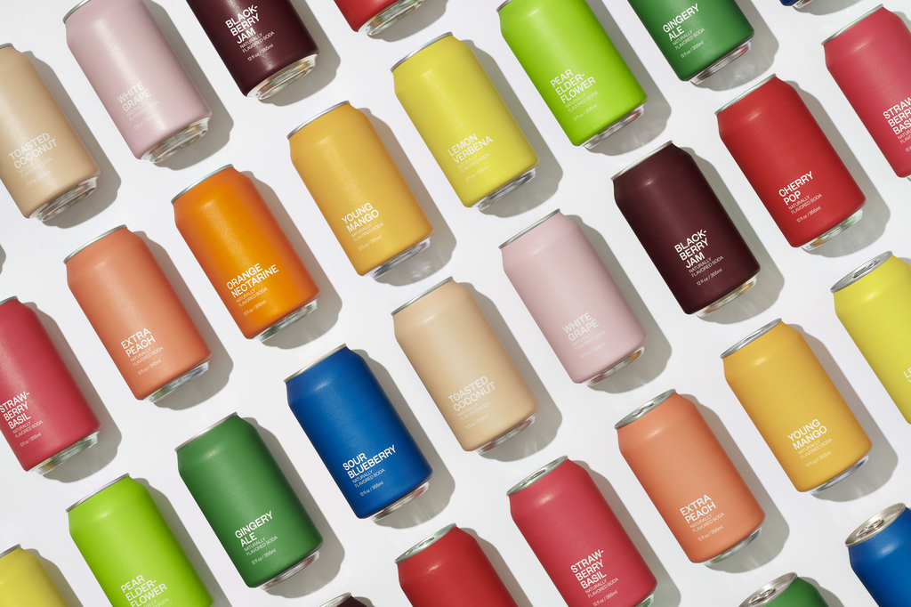
United Sodas of America


What is your favourite feature of this project?
My absolute favourite feature of this project is the matte feel and colour of the cans. When we first pitched this concept of a package design that had an ultra-minimal label, we knew that it had to feel really special when you held it in your hands.
We wanted it to feel different than any other drink you’ve ever seen in your life. Using a traditional soda can silhouette with a radical unconditional label makes it clear from first sight that this is the reinvention of soda. Apple packaging has always been an inspiration in that you really don’t want to throw it away after you’ve opened your device. The box is beautiful. We wanted to create packaging for soda that gave you that same feeling. I’ve seen some photos of people who have bought USoA and instead of drinking it are displaying it in their homes like art. Success!

What was the inspiration behind the design?
The inspiration behind the design was actually America. Visually America is typically represented by stars, stripes, flags, eagles and the colours red, white and blue. We knew immediately we wanted to go down a different path. We started thinking about our country and the variety, diversity and wide range of people that live here and how we can communicate that visually.
From there we concepted and designed a brand for United Sodas of America that was not red or blue (like Coke or Pepsi), but a rainbow of colours that represents the variety of our nation. That variety is what I believe makes us special. And that variety is what inspired the design for this brand.

What else do you love about the product?
One of the things that I love is the flavour of the liquid inside of the cans. The team did an incredible job creating a range of liquids that deliver an insane amount of flavour for only 30 calories without any artificial ingredients. I was able to participate in the product testing and trying each of the unique sodas was one of the most fun parts of working on this project.
When it came time for launch, we wanted to give that same experience to consumers. That’s why we have a 12 flavour variety pack where you can try each and every flavour and find your personal favourite. It’s incredible. Available now at unitedsodas.com!


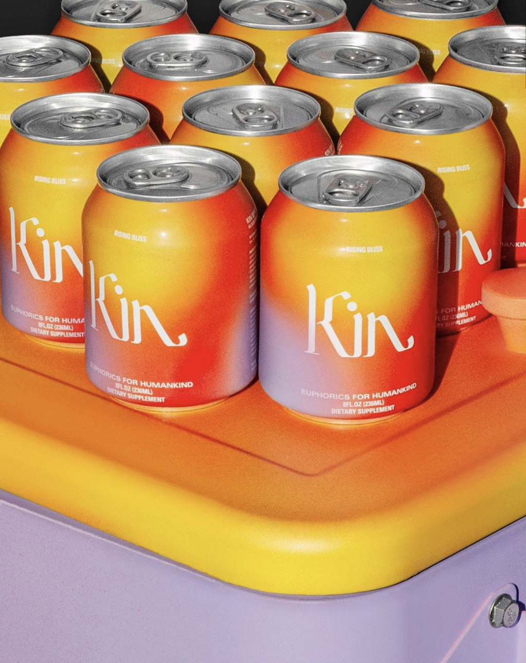
Tell us a bit more about one of your other projects, Kin Spritz
When we first met with Kin founder Jen Batchelor and her team they were getting ready to launch their first ready to drink product and I'm a huge fan of the brand so I jumped at the opportunity.
Our goal was to bring the spirit and the feeling of the brand that had lived primarily on their website/social and bring it to the beverage aisle. We wanted it to look it had come from the future and landed at Erewhon. Our first presentation I believe had something like 50 different box designs all of which we had done in only a week or so. Jen instantly gravitated towards the design you see today and from there, a new can design and brand marketing campaign all naturally came from it.
My favourite feature of the design is the outer box design which is actually the first piece of design we did for this project. To this day, it’s one of my favourite projects we’ve ever done at CENTER.
Kin Spritz


What was the inspiration behind the design?
When we started talking to Kin Euphorics we were super inspired by their desire to create products that bring you joy and are crafted for conscious connection. All bliss, no booze is their motto. And as alternatives to alcohol are sought by more and more customers, we wanted to help them stand out on the shelf and takes you to a future world of revelry.
Our package design was designed to capture that feeling when the sun is going down on a beautiful summer night, the colours of the sky are just right, there’s some music playing in the distance and the night has just begun. Our goal was to put that feeling on a can.

Tell us more about you, what about packaging design interests you?
I love packaging. I think the thing that most interests me the most about packaging is that while a brand is the holistic sum of all of its parts, packaging is often the first introduction. While websites/out of home/marketing/social media etc. are great ways to tell stories and connect with people, packaging is still king for product companies.
I think about Package Design as the icebreaker between people and product. In that context, how do we want to portray ourselves to the world? What do we want people to know about us? What are the most important features? How do we bake all of that into our package design? In many ways, it’s our 5-second introduction at a party when you don’t know anyone. How do we say hello? What do we want to say? How do we find common ground? What will make them fall in love? Why will they care? That is what I try to answer on an 8X3 label. Then we add a barcode and nutrition facts.
How did you get involved in design?
I grew up drawing and painting because of my mother. She and I used to set up still life scenes in our kitchen and draw together for fun. It was in those childhood years that I realized that I had inherited a little bit of her talent, but more importantly, I genuinely found drawing fun.
When I started taking Art classes in school, I felt confident knowing that this was a little superpower I had. I was a bit shy as a kid so this was a big deal for me. Once I figured out Art was my thing, I never looked back. I then went to college where I was introduced to Graphic Design and discovered that this could be a career path that involved working with brands. I instantly knew this was my path.
I’ve been a professional graphic designer for 15 years and plan to be one for the rest of my life. Designers don’t really retire, we just get older and take on less projects.
Where do you find your inspiration?
I find my motivation mostly in popular culture. I’m forever curious about learning why people fall in love with products, movies, music, services, people and of course brands at a mass scale. How do things get popular? Why do some ideas breakthrough? Why do people become obsessed with certain brands or trends?
I believe that brands are a reflection of people and culture. That’s why most of my inspiration comes from studying them. I watch a lot of documentaries, listen to a lot of podcasts, read a lot of books / Twitter to better understand people and what they are into. Then I can design for them.
About Alex and CENTER
Find out more about Center Studio via the website , Linkedin , Twitter , Instagram and Facebook .

