


Back 7 Design Examples of B2C E-commerce Packaging
The rise of online shopping has changed the way consumers engage with brands, we look at some striking examples of E-commerce packaging and online marketing adapting to the shift.
With the majority of shops closed across the world for most of 2020 and 2021 and the demand for social distancing, online shopping quickly became the norm. The way in which brands connected with new and existing consumers changed making it more and more important to elevate their e-commerce, product packaging and digital offering, focusing on the impact it makes on their customers from their mail rooms to the unboxing experience.
These new challenges presented new opportunities as websites offered more information, convenience and marketing possibilities, and E-commerce packaging created an opportunity to offer a one-on-one, immersive brand experience, with 40% of consumers likely to share the occasion on socials media if it is unique or distinctive.
Below, we’ll look at some great examples of E-commerce packaging and online marketing that connects with consumers and makes a lasting impression.
Lick Paint

Lick Home is a new online Home décor brand that provides easy-to-apply paint and wallpaper ranges that sets out to encourage and inspire consumers to finally complete that home décor they’ve been putting off.
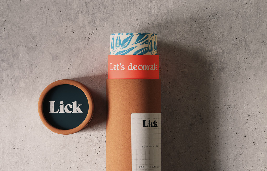
Design consultancy Two Times Elliot knew that being a direct-to-consumer brand, it was essential that Lick’s visual identity was built with a personality that could connect with a wide audience from the beginning of brand engagement. Therefore, the art direction and tone, although varied for subject matter, always carries an accessible and ‘lived-in’ feeling so as not to ostracize all kinds of ‘decorators’ at varying levels. Tools and products take on practical labelling with instructions and product codes respectively and the more inspirational imagery and campaign assets boast more characterful language, further developing the personality of the product.
![]()
To aid the recognizability of the emerging brand, simplified yet bold graphic content is applied with a ‘louder’ word mark. Acting as supplier and consultants, Lick’s website also provides an online community base to bring together DIY novices and experts alike.
Find out more on Two Times Elliot here and on Lick here .
Calgee.com
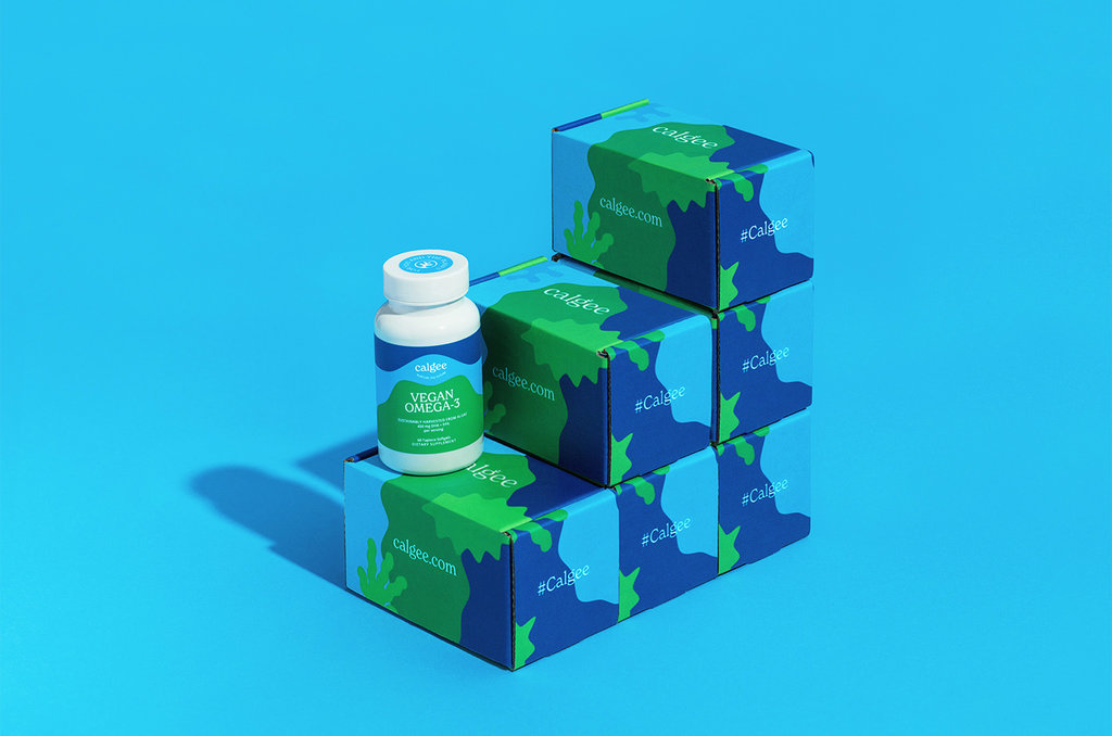
Calgee is an online mission-driven health and wellness company dedicated to producing high quality vegan Omega-3 supplements that are not at the expense of the planet. A mission echoed through to their branding and packaging, designed by creative studio Alexandra Necula who “help sustainable, ethical, and eco-friendly lifestyle brands connect visually with their tribe through strategic, emotional design”.

All elements of the packaging are made up of post-consumer recycled content such as the plastic used for the vitamin bottles. The inner wrapping is made with FSC certified tissue, printed on acid-free paper with soy-based ink and the outside mailer bag is made from compostable bio-based polymer. As a climate-neutral brand transparency is key, therefore detailed information about their packaging is communicated as soon as the website opens, allowing peace of mind for the environmentally conscious consumer searching for a fish-oil alternative.

The colour scheme and design is maintained throughout the marketing and packaging, right through to the e-commerce so is instantly recognisable from website to customers doorstep.
Find out more on Alexandra Necula here and on Calgee here .
Haus

When other brands lean towards ecommerce packaging that are colourful, eye-catching, and larger than life, Haus opts for a stripped back, minimalist aesthetic. A simple white cardboard box with a newsprint insert giving detailed information about how the product is made, cocktail recipes, and frequently asked questions.

Although minimalist, the packaging is in keeping with the brand’s no-nonsense approach to their product, Opting for the small details and messages to make the packaging stand out.
Find out more on Haus here .
Allbirds
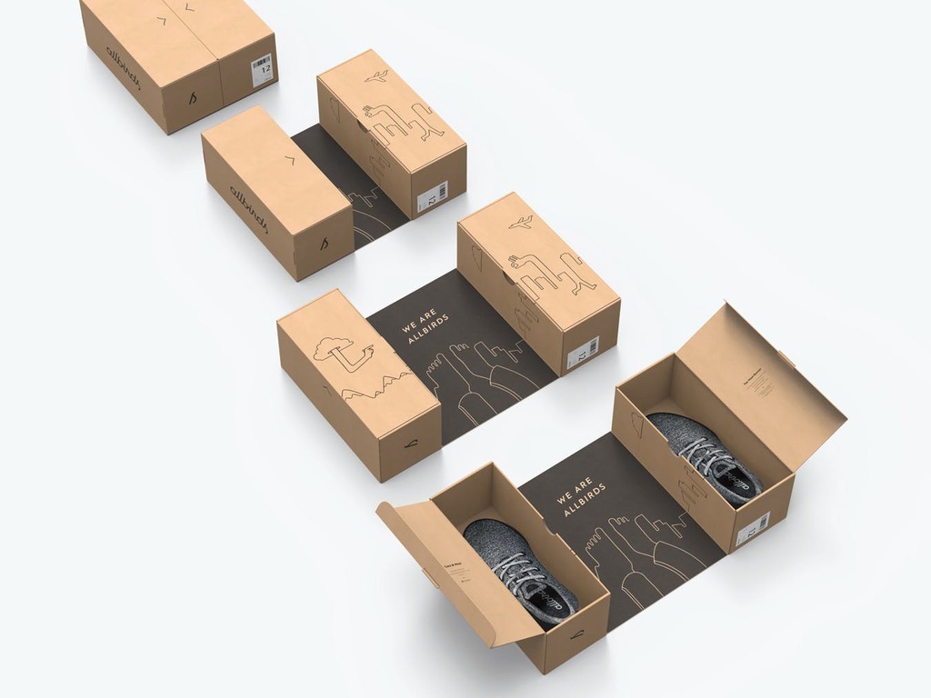
New-Zealand based Allbirds are a direct-to-consumer footwear and apparel brand shaking up the industry with a goal to achieve a zero-carbon footprint.
Brand and design company Red Antler developed the Allbirds brand from scratch, grounding it in curiosity, and instilling that feeling into everything; “an evocative name, flowing logotype, and surprising, dynamic packaging - Each interaction with the brand invites people to join the journey”.
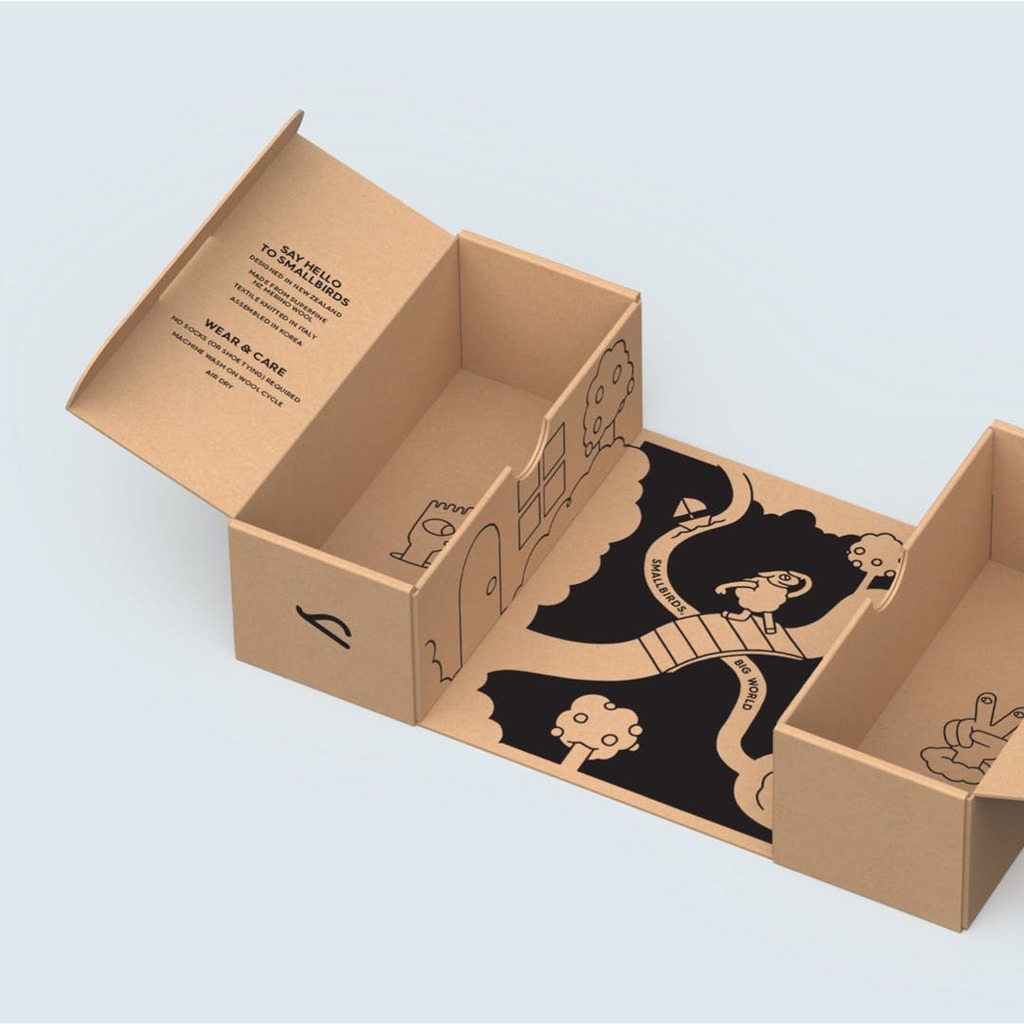
Their design for Allbirds' first generation, direct-to-consumer shipper was driven by the brand's simple and sustainable approach to design. Avoiding convoluted design elements and unnecessary waste, Antler set out to create a memorable unboxing experience with minimal packaging that served as both the mailer and shoebox, using 40% less materials compared to traditional shoe packaging.

(slipper box design by Jonathan Moran)
The shoeboxes are not only a core feature but also the foundation of a multi-functional packaging system. The resulting design serves as a shoebox, shopping bag, mailer, and display all in one. When stacked, the boxes create a colourful backdrop and also function as easy-to-read inventory storage and can be modified to reflect different styles and sizes.
Find out more on Red Antler here , on Jonathan Moran here and on Allbirds here .
Drunk Elephant

Drunk Elephant is a skin-care line that is clinical in its effectiveness and low-hazard in its composition, removing all irritants, allergens, fillers and dyes/colorants that typically get in the way of the beneficial ingredients.
Although the beauty brand’s skincare may possess a stripped down, purified approach, their packaging design boasts loud, popping colours and bold patterns. Once opened, consumers are instantly met with a kaleidoscope of pastel colours and characterful fonts within the box, some packages event including an image to colour in.

A particularly notable element to their website is their consideration for a wider audience, offering an accessibility option. This allows consumers to change the settings of the website to suit their individual needs from vision impaired to ADHD friendly to seizure safe and more.
Find out more on Drunk Elephant here .
Obadiah Coffee
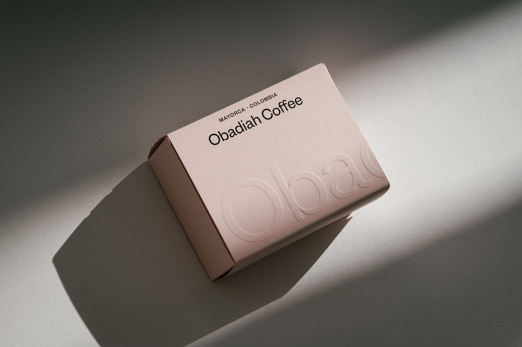
Obadiah is an Edinburgh-based coffee roaster taking coffee making back to basics and committing to a process that is “simple, sustainable and kind”. Their coffee is roasted weekly with deliveries made the following day offering single purchase to seasonal subscriptions to wholesale. Keeping it local, Obadiah founders approached fellow Edinburgh-based studio Human Resources to develop their complete visual identity that reflects the brand and makes a lasting impression.
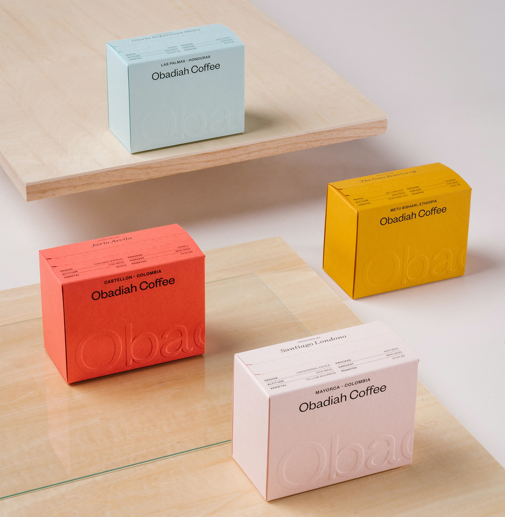
Obadiah’s natural, stripped back approach to their product is communicated throughout the minimalist packaging. Constructed from G.F Smith Extract papers, made from recycled coffee cups, and boasting a range of natural and striking block colours, the pack echoes the brand’s organic and simple ethos. Seasonal sourcing means frequent changes of roasts, for which Human Resources takes advantage of the variety of colours offered by G.F Smith’s Extract papers.
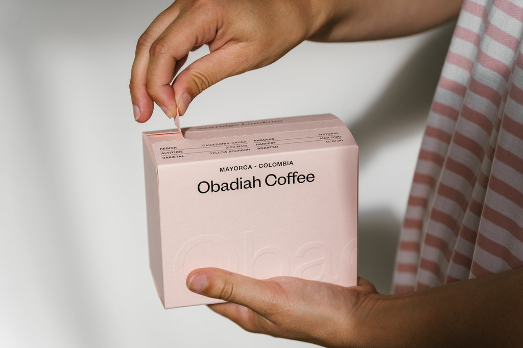
As a nod to location, sans serif ‘Founders Grotesk’ and serif ‘Triptych’, inspired by the work of the 20th Century Edinburgh-based Miller & Richard, is used remaining typographically local. Blind emboss and foiling is used to elevate the branding, giving it contemporary tactility. An easy to open strip at the top undoes to reveals an inner recyclable sack containing the coffee itself.
Find out more on Human Resources here , on Obadiah here and on G.F Smith here .
Brightland Oils and Vinegars
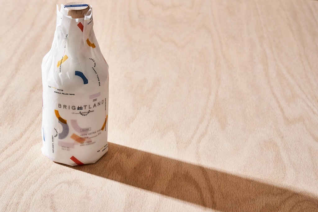
US based Brightland produces high-quality extra virgin olive oils and vinegars, consciously made in California. The family-run company sells individual bottles online or via subscription offering a replenishment delivery every 1, 2 or 3 months, based on consumer choice, and promises early access to exclusive collections, new product releases and gifts delivered each quarter.

An instantly eye-catching element of the branding is the iconic pattern, designed by SDCO Partners, against a clean white backdrop. The pattern takes inspiration from the form of the olive, and the abstract shapes and vivid colours bring the bold flavours of the oil to life. This distinct pattern is sustained throughout the print materials, website, and packaging.The primary colour scheme makes the brand identifiable but also provides coding for products, which is also reflected on the delivery packaging. A card is also encased featuring product information and suggested recipes.

Find out more on SDCO Partners here and on Brightland here .
Have some new packaging you’d like to share? Submit your project here for a chance to be featured!