


Back Monthly Discoveries, August 2020
As the most prestigious packaging design award in the world, Pentawards not only recognise the best packaging design via the competition but also promote the importance of packaging design through live events and social media. We are committed to being the bridge between excellent design organisation and brands that are always looking for the best packaging design solutions.
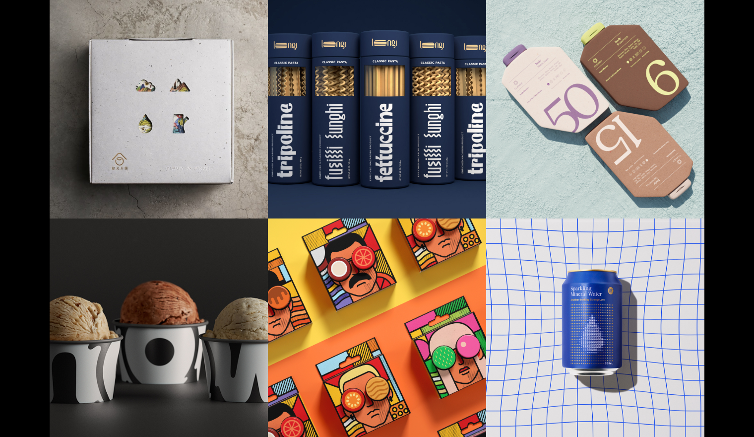
Take a look at the below for some of the most popular designs we shared this month across our social media channels.
Green Light Tea by Once Book Design


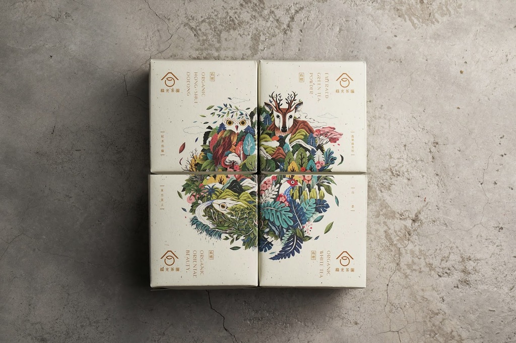

Green Light Tea Garden is located upstream of the famous Feitsui Reservoir of Beishi River in Pinglin, Taiwan, and is cultivated using organic farming to protect the environment and indigenous species. This sustainable ethos is refelcted in the packaging, which uses used tea leaves as tea residue paper.
Four creatures from Pinglin are used in its illustrations processed by eco-friendly ink: the collared owlet, formosan muntjac, lophura swinhoii and the emerald green tree frog. Integrated into the local environment alongside cloud, mountain, forest and water illustrations, these represent the symbiosis of the tea and its farming with nature.
Clemen Sunscreen concept by Eyla llarena


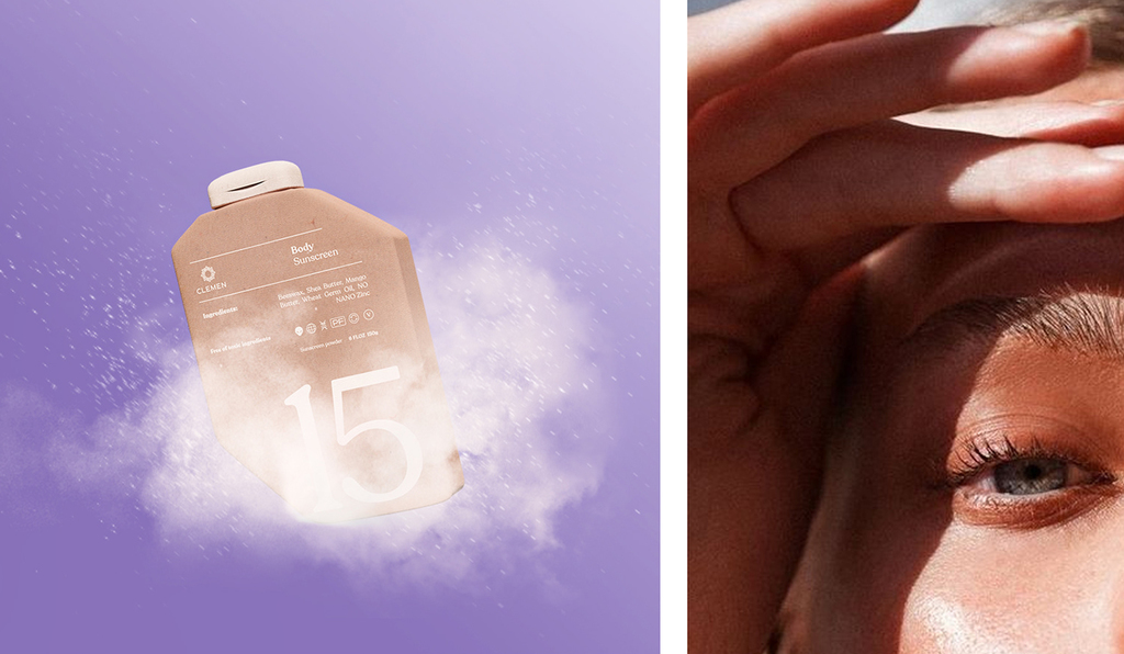

Clemen is a brand of sunscreen whose mission is to create products that are respectful of both the environment and the skin:-take care of the planet as much as your skin.
For this project, it was very important to highlight the purpose of this brand, using packaging that is made of 100% reused paper to ensure the least possible waste when disposing of it. The colour palette differentiates the types of sunscreens for different skin tones.
Different from other sunscreen brands, this design creates a different narrative to how we currently see the world of sun protection and that there really are alternatives that provide greater value.
Longi Pasta concept by Shyika & Shyika


The main idea of packaging concepts is to emphasize the shapes of long pasta types. The line of the Longi Pasta brand includes two sorts of pasta: classic and veggie, and four different types of each sort: fettuccine, tripoline, fusilli and spaghetti.
Shyika&Shyika have created typography that imitates the unique form of each pasta type and this has become the main focus on the packaging. They also chose a non-standard form of packaging for pasta — a tube. This is a clean design without unnecessary elements, so on the front of the packaging, there are only logo, name of the type pasta, and the transparent area which makes the product visible.
Now by Naturals by Drink Water Design


Now by Naturals is the premium experience offered by mother brand Naturals. The brand serves ice creams straight out of the churner thereby creating the softest, freshest ice creams possible.
The brand identity was crafted to highlight this unique out-of-churner experience that the brand offers. The logo is inspired by the melting ice cream circling in the churner. The fluidity tries to capture the softness of the scoop and the brand colours try to create a look and feel that’s distinct from Naturals.
StrangeLove by Marx Design


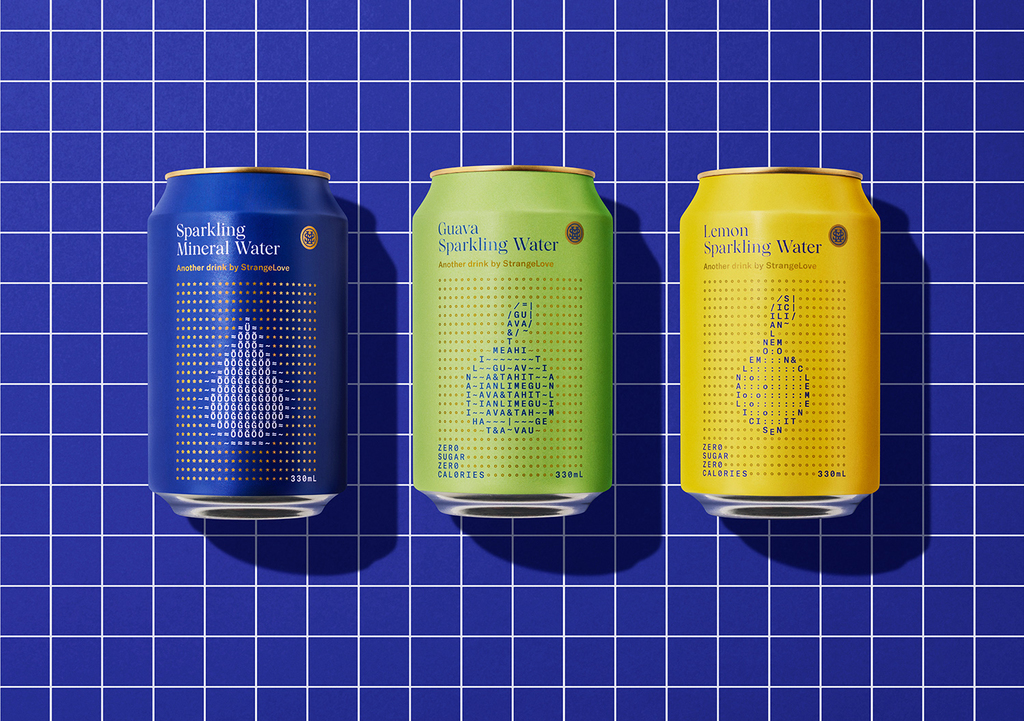
Melbourne-based StrangeLove is a dynamic and unconventional drinks company. Building on the success of their Tonic & Soda ranges, they saw an opportunity to disrupt the sparkling water category and introduce StrangeLove sparkling waters: Zero sugar, zero calories & all-natural flavours.
After looking at many periodic tables, analysing mineral content and PH levels, Marx saw a parallel in computer-generated ASCII code. Using the strategy of “borrowing from the past and modernising for the future” like they had used for their other ranges, Marx created the variant graphics from individual text characters - a graphic technique that was used to create computer graphics in the 1980’s. Embracing the idea that the water is made from many individual properties put together. The result makes the products stand out on the shelf and connect with its core audience.
RE:STAR concept by Polina Yanushko

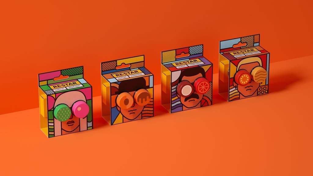

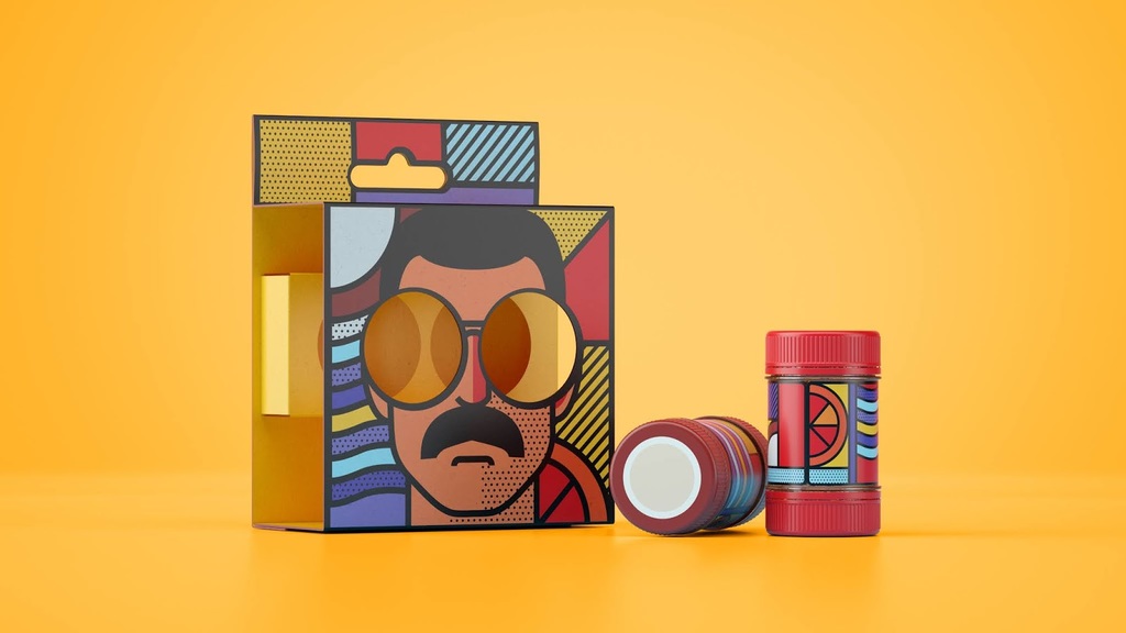
RE:STAR is an energy drink packed in a compact, portable capsule. This double-sided capsule is safe and easy to use. Once you open the bottom cap, a layer of foil protects the syrup from spilling. Screw the capsule on top of the bottle, shake it up and you’re done! All that’s left is to open the top cap and enjoy your RE:STAR.
The main idea of RE:STAR energy drink stands for two things — first, to make it resealable and to add a music flavour to it. The line consists of four products based off of main music genres: rock, rap, pop and jazz; each represented by a well-known public personality whose image is part of the design. Individual colour palettes for every flavour make it easier to differentiate one taste from the other. Semi-abstract shapes of used flavourings merged with the background serve the same purpose.
As for typography, double dots make the neutral logo more recognizable, and the last but not least fun thing about the project is a graphic instruction, placed at the back of the package.
Interested in a feature?
If you think your work deserves to be featured on our social channels, feel free to send us your design via info@pentawards.org. We look forward to hearing from you all!