


Back Monthly Discoveries, November 2020
As the most prestigious packaging design award in the world, Pentawards not only recognise the best packaging design via the competition but also promote the importance of packaging design through live events and social media. We are committed to being the bridge between excellent design organisation and brands that are always looking for the best packaging design solutions.
Take a look at the below for some of the most popular designs we shared this month across our social media channels.
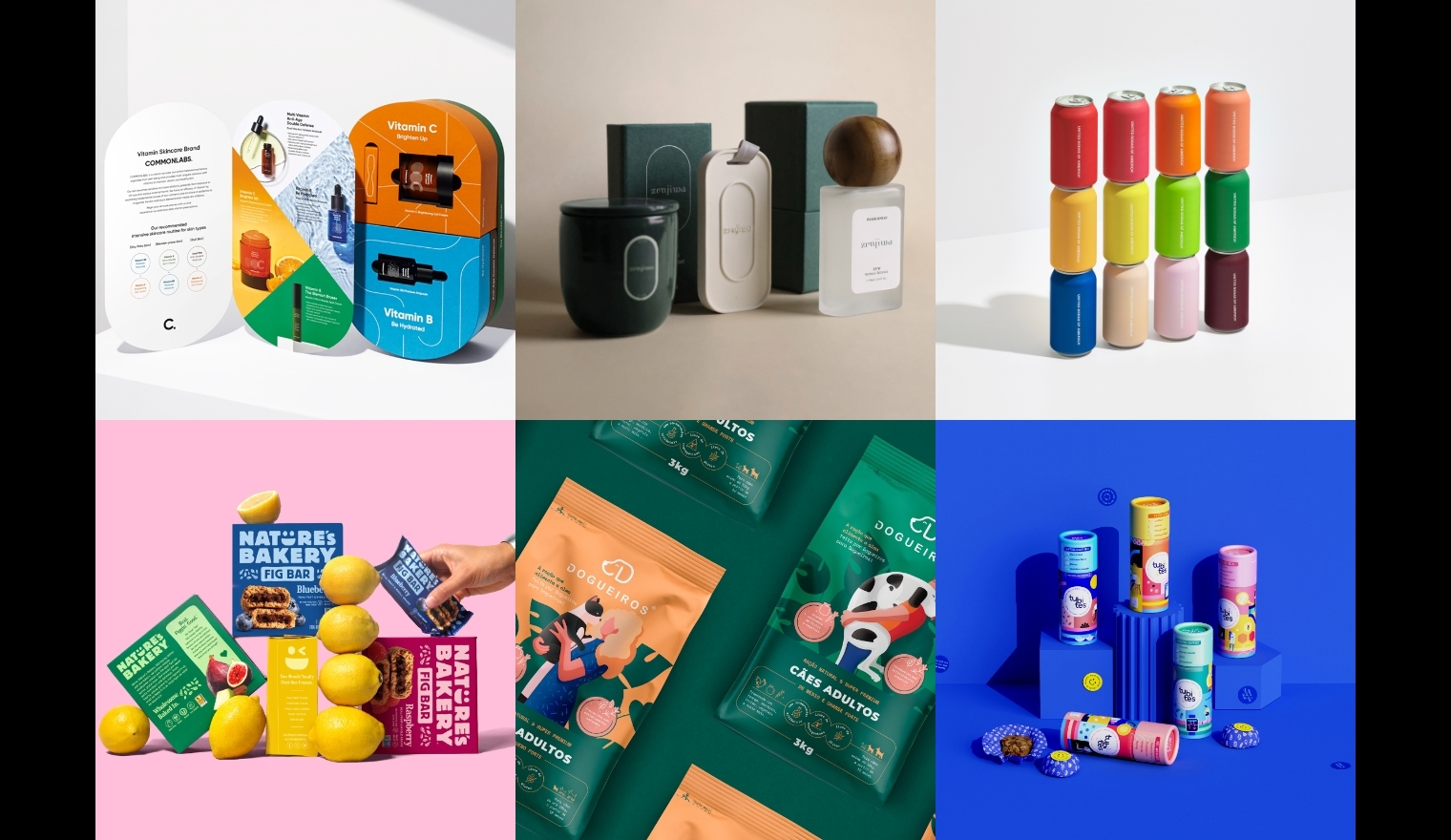
COMMONLABS Vitamin Kit by Heaz


This is a kinetic vitamin skincare brand that aims for healthy beauty. The design visualizes the shape of the vitamin pills gives the impression that the vitamin directly permeates the skin. The kit can be separated by skin type, just like vitamins that can be taken according to condition, and each product's effectiveness is intuitively expressed by adding a graphic motif using lines to the packaging.
Zenjiwa by Studio Woork


Zenjiwa is fragrance brand aims to influence a wellbeing lifestyle. Inspired by the relationship between nature, mind, body, heart and soul, Studio Woork includes the emotional connection to the art direction, visual identity, packaging and a one-of-a-kind feeling of luxury and exclusivity. They also make sure to keep the brand inherent with simplicity and timeless design. With the relation between the product to nature, they promote a sustainable lifestyle from the scented candle, scented stone table—made from 100% clay to the packaging of the product.
United Sodas by CENTER


This ultra-minimal packaging design for United Sodas focuses on various colours and the texture of the can. By using a traditional soda can silhouette with a radical unconditional label, it's clear from first sight that this is the reinvention of the soda can. The inspiration behind the design was America. Visually America is typically represented by stars, stripes, flags, eagles and the colours red, white and blue. But the team at CENTER wanted to go down a different path. They started thinking about our country and the variety, diversity and wide range of people that live in the USA and how they could communicate that visually. From there they designed a brand for United Sodas of America that was not red or blue but a rainbow of colours that represents the variety of America.
Natures Bakery by Hatch


As a family-owned company, Natures Bakery believes that everyone deserves better-for-you treats that tastes great and make you feel good. Hatch was challenged to turn the beloved “Fig Bar” into a household name by transforming the visual identity that disrupts a crowded shelf set and screams “wholesomeness baked in”. This design leveraged bold, primary colours to add some “oomph” and cheeky copy to surprise and delight existing and new consumers on every step of their journey, to help them thrive in their daily hustle – not just survive it.
Dogueiros by Valkiria Inteligência Criativa


This is a redesign project Dogueiros, a pet food brand based in Brazil. The new design presents a consistent graphic project, with a new colour scheme, visual effects and friendly illustrations. The new layout improves the clarity of information on the package, highlighting the most important aspects. Finally, the project takes on a more playful approach reflecting the happy and healthy relationship between dogs and humans.
Tubites by Lorena G


A playful, fresh, and colourful packaging for the new guilt-free snacks brand “Tubites”. Each of the product lines is aimed at a different situation (day-to-day, gym, office, etc.) and has a micro-story illustrated wrapping the tube packaging.
Interested in a feature?
If you think your work deserves to be featured on our social channels, feel free to send us your design via info@pentawards.org. We look forward to hearing from you all!