Back Who will be named the 2020 Diamond winner?
With the 2020 Pentawards Gala Ceremony just around the corner, we're looking forward to revealing who will win the most exclusive trophy: the Diamond – Best of Show Award. Before the big reveal, we take a look back at the previous Diamond award winners since the competition began.
Launched back in 2007, Pentawards is the leading competition exclusively devoted to recognising excellence in global packaging design. Year after year, the quality and variety of the entries has grown, making that top spot more and more difficult to reach.
After receiving more than 2,000 entries from 60 countries across the globe, 400 entries were shortlisted by our International Jury. But only the best designs will get their hands on a trophy, and only the best of the best will win the exclusive Diamond - Best of Show Award.
To find out who is crowned the 14th Diamond winner, join us at 1PM BST on the 24 September for the 2002 Gala Ceremony - you can register for free here.
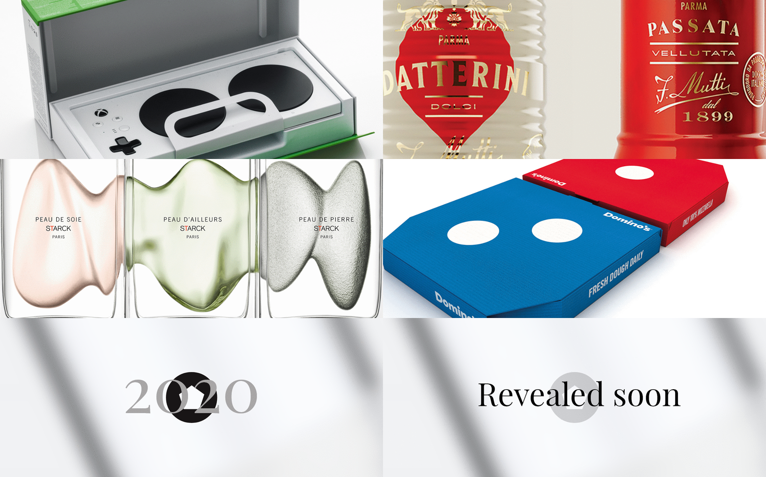
Last year's Diamond - Best of Show, the Xbox Adaptive Controller by Microsoft

What made this Diamond winning piece stand out was its unique customer experience. Designed for gamers with limited mobility, the Xbox Adaptive Controller perfected the out-of-box experience in accessible packaging.
Using insights gleaned from beta testers and UX respondents, each element of the packaging and unboxing experience had accessibility front of mind. The company developed a “no teeth” principle, as those with limited mobility often resort to opening packages with improvised movements, including using teeth.
Key elements that were incoporated include loops, which are highly proven levers to assist in accessibility, and an open cavity area under the controller, making it easier to remove the controller from the box.
Diamond Award winners 2007 - 2018
| | 2018 - Mutti, Auge Design This limited-edition range of traditional Italian tomato-based ingredients was been given a new lease of life, with a blend of past and future through an intricate system of symbols, that not only represent the different types of tomatoes and sauces in the range but that also become a powerful pattern, resonating throughout the entire range. Starting from the original format, the range was adorned with a new glamorous and luxurious feel, and with a high-end gold foil finish contrasting with the ivory silkscreen surfaces. |
| | 2017 - Starck Paris, Perfumes y Diseño Philippe Starck, originally known for his product, industrial, architectural andfurniture designs, ventured into the fragrance industry with the perfume label, Starck Paris. This is a collection of three perfumes—feminine, masculine and unisex. The concept involved creating three distinct and independent designs that would work together—both the bottles and their packaging—to form one sculpture. The fluid nature of the design creates a connectivity between the three fragrances, which is consistent throughout all aspects of the collection. |
| | 2016 - Domino's, Jones Knowles Ritchie Over the years, Domino’s pizza packaging had become overloaded with generic information that had lost impact with consumers, while the brand mark had become relegated to a small endorsement. Redesigning its delivery boxes in the UK enabled it to become the definitive article again, and this meant taking a bold and simple approach to replace the clutter on the boxes and focus instead only on the brand’s distinctive two-color logo. Since 96 percent of all Domino’s pizzas are sold in pairs, the brand’s pizza combo deal was used as the basis for the new design, with one red box and one blue. The result was an open invitation for sharing that said don’t order a pizza, order Domino’s. |
| | 2015 - Marc Jacobs, Established Kiss Pop was a new collection of lipsticks and make-up in the Marc Jacobs beauty line, which featured Kiss PopLip Color Sticks, Twinkle Pop Stick Eyeshadows, and Smart Wand Tinted Face Sticks. The use of a palette of bold colors and pencil-shaped implements for applying them immediately calls to mind an artist’s crayons or paint sticks, so that the design presents a novel and playful way to add color to the face. |
| | 2014 - Evian Drop, Group Danone The new design emphasized purity and presented a bottle which can be drunk in one go, like a glass of water, and which has no cap but a lid, no label but a sticker on the top. The bottles were retailed in places like premium non-food stores, hairdressers and pharmacies, and most radically from mobile units selling them in heavy traffic in Paris, changing the rules of the game: water went to the consumer, instead of them having to go and look for it in a shop. |
| | 2013 - Absolut Vodka, Family Business For years Absolut Vodka had led the way with innovation in vodka packaging, with limited-edition series such as Absolut Disco, Absolut Rock and Absolut Illusion. For 2012, it was time to redefine the limited edition itself. The idea was to make 4,000,000 unique bottles, so that each and every one became a limited edition on its own. This meant the production line had to be completely rebuilt, and every possible aspect of glass decoration be re-employed in a new way. Nearly every bottle sold out before the campaign period was over. |
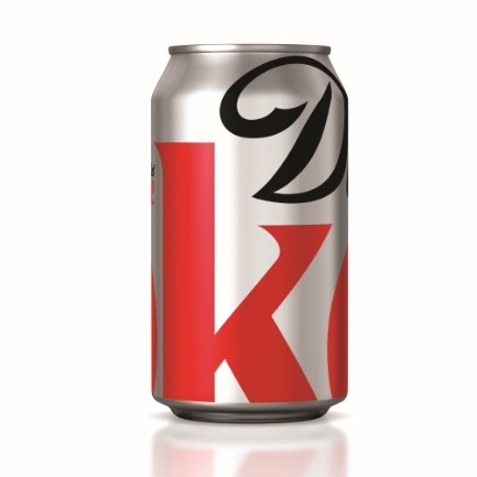
| | 2012 - Diet Coke, Turner Duckworth: London & San Francisco As the country’s number 2 sparkling beverage brand, Diet Coke was already well known to consumers, and the Coca-Cola Company North America set the challenge of extending that confidence in the brand to packaging. The resulting design delivered a bold perspective by focusing on the union of the “D” and “K” as the key recognisable elements of the logo. The unique crop of the main logo is at the centre of a visual identity, which appears at point of sale and in advertising for the drink. |
| | 2011 - Ramlösa, NINE Being sold in exclusive restaurants, venues and nightclubs Ramlösa, a natural mineral water, needed a premium packaging to distinguish it from the standard PET bottle sold in stores. The new premium bottle in PET, a plastic not associated with exclusivity by the target group, gained plaudits for its aesthetics as well as the environmentally positive effects compared with glass. Form and shape were modelled on old crystal glasses, the creative work being made harder because carbonated water makes plastic materials expand. |
| | 2010 - HOYU3210, ADK Hoyu is a well-established brand in the Japanese professional hair-colour products market, but was a newcomer in professional hair-styling products. The brief was to introduce Hoyu professional styling products into the very competitive, top-class hair salons, and establish a presence, using a very bold and memorable approach. The concept for this brand is “countdown”. As the hairdresser is about to finish the customer’s hair, the customer’s anticipation reaches a high point. The product is then used to conclude this “countdown” to the finish. |
| | 2009 - Kleenex, Kimberly Clark Some of the greatest creative ideas are also the simplest. The designers working for Kleenex were asked to create a limited-edition carton that would celebrate thesummer season and drive consumer delight. And Kleenex has broken the rules to offer a fresh combination of structure and graphics in perfect harmony, christened a “slice of summer”. A triangular box illustrated to appear like a section of different juicy fruits, watermelon, orange or lemon, thatlook enticing enough to eat. |
| | 2008 - Rosé Sauvage, Viktor and Rolf How do you create something new with a timeless product? The answer from Dutch fashion designers Viktor & Rolffor Piper Heidsieck was to reverse the directions. Still keeping the main classic graphic features (bottle, cork, icebucket, glass, and labels) vital to the champagne market, the idea was that if champagne needed to turn one’s head, all you had to do was reverse all these visual elements to amplify this impression, and to help differentiate the brand from its competitors by recreating the packaging. |
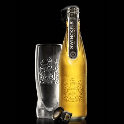
| | 2007 - Swinckels Beer, Design Bridge The bottle shape, label and colours were designed to reinforce the brand's freshness and high quality. The bottle neck's signature flat panel feature is not just tactile and memorable, it carries the label which doubles as a breakable seal for the cap, emphasing the product's quality and freshness. The clear glass bottle shows off the pure golden colour, which is light when at its best. Black, in combination with the gold and silver graphic elements, enforces the premium positioning. The brand name, signature of approval and use of the prestigious family crest embossed on the bottle reflects their personal pride in the quality standard. |
To see who's in the running for a 2020 Pentaward, take alook at this year's shortlist and tune in to the Gala Ceremony on Thursday 24 September to find out this year's winners.


