Back Wieden+Kennedy’s rebrand for Kentucky Fried Chicken
International fried Chicken giants, Kentucky Fried Chicken unveil their rejuvenated new look, created in collaboration with global design studio Wieden+Kennedy.
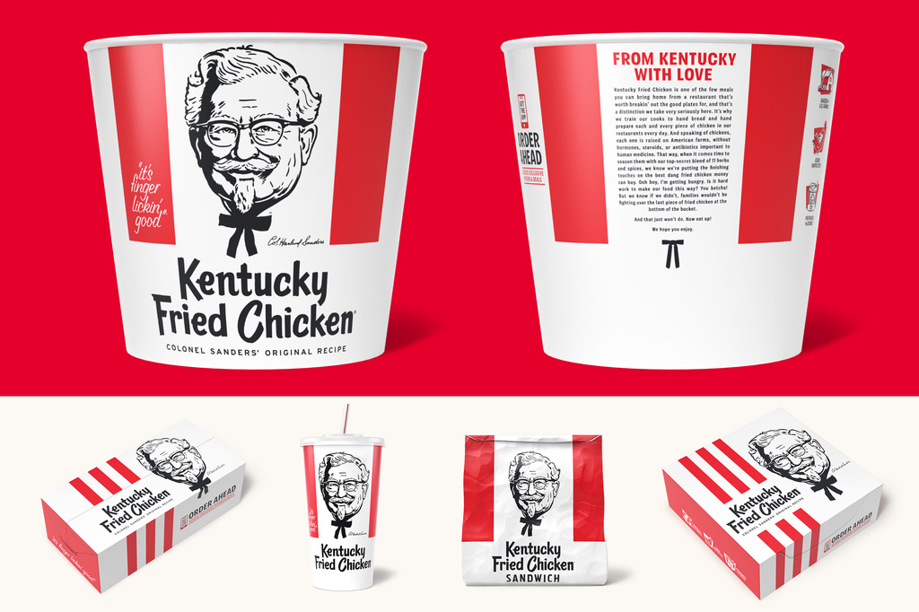
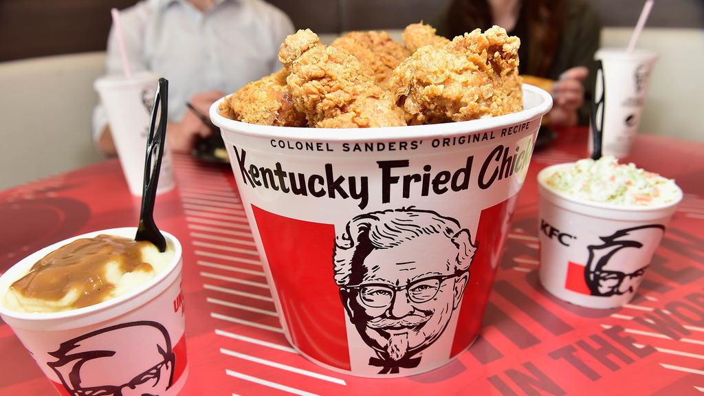
Staying true to the brands iconic design assets, Wieden+Kennedy’s new packaging is about injecting contemporary design cues to delivery a “more modern take”. The brand’s iconic red and white colour scheme appears across the packaging with an updated and simplified positioning, minimising the number of red stripes on a solid white background. Colonel Sanders' head still adorns the buckets, sandwich wrappers and cups, but with a refreshed illustrative design which more closely resembles its original style, and the "It's Finger Lickin' Good" slogan makes a playful return after an (understandable) brief hiatus.
(Bucket design before and after)
The new design drops the abbreviated initials and boasts the full name “Kentucky Fried Chicken” which is applied in a charming font that features a wide brushstroke and hand-painted style, that, much like the Colonel’s portrait, echoes the original 60’s design. Copy featuring re-heating instructions and a brief blurb about the history of its fried chicken now appears on the back of the bucket with the same folksy font treatment and signed off with the Colonel’s signature necktie.

The fried chicken chain has also used the opportunity to make steps towards their long-term plan to implement a more sustainable packaging strategy. All of the new paper packaging is certified by the Sustainable Forestry Initiative or the Forest Stewardship Council (FSC), with packages constructed with approved paperboard and already obtaining the How2Recycle labelling.
The new look is expected to roll out for summer 2021.
Find out more on Wieden+Kennedy Portland by visiting their website or follow them on Instagram .
Have some new packaging you’d like to share? Get in touch with us here for a chance to be featured.


