


Back World Chocolate Day 2020
Happy World Chocolate Day! Let's face it, we don't need many reasons to celebrate chocolate, so today we shine a spotlight on packaging design work for chocolate brands.
From the humourous and playful to the more luxurious and artistic, here are some of our favourites from the last few years.
Hands Off My Chocolate - 2018 Bronze Pentaward


Hands Off My Chocolate was a new chocolate range with cups containing chocolate balls with soft caramel and sea salt, chocolate balls with hazelnut praline, and sea salt and chocolate-covered fluffy marshmallows. Only catch? They weren't for sharing!
The objective of creating this new product range was to shake up the often dull and traditional luxury and bonbon products in the supermarkets. Consumer research showed us that people often find the assortment too boring when buying gifts to treat others, or even more importantly, themselves. We believed that a boost of these products was more than necessary and created three new products that are totally different than conventional chocolates.
The cups stand out of the shelves due to their cheerful and different designs. Their recognisable shape (known from many ice cream packages) attracts attention in the chocolate shelves, but is also familiar and feels like a real treat for yourself.
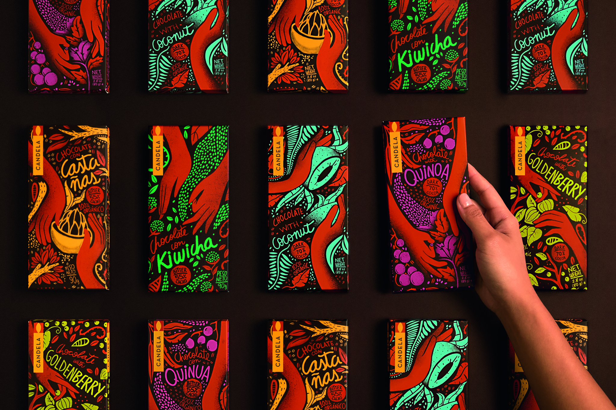
Candela by Infinito - 2017 Platinum Pentaward

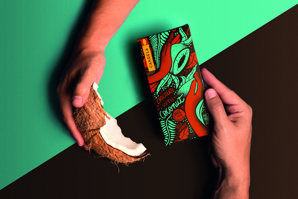
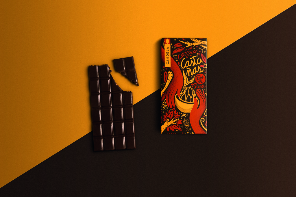
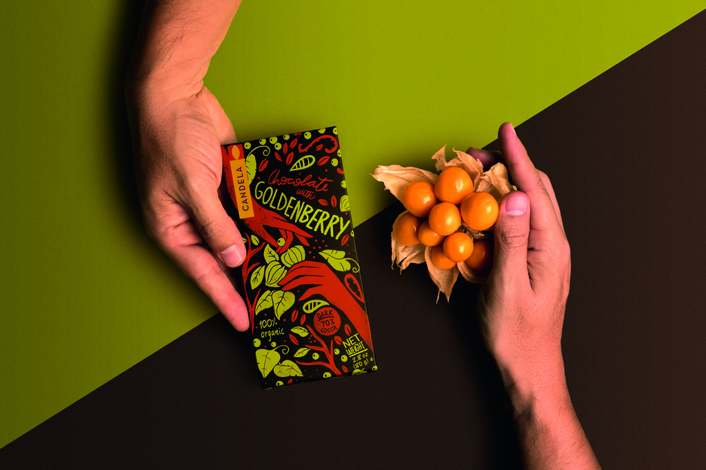
Candela is an organisation that processes and commercialises natural Peruvian chocolates. It brings together small producers and consumers with a distinct value proposal, which promotes environmental care and fair trade. Their ethos is: 'Do it right, do what's right', establishing a brand that is interested in offering both an excellent product and supporting the wellbeing of their consumers and the environment.
For this porduct, they developed a logo based on a simple and geometric candle, making a direct reference to its name ('candela' meaning 'candle' in Spanish). This generates a marked contrast with the illustrations, hand draw and featuring the hands of their producers, and show the richness of nature. Everything together points out how Candela takes care of the environment and of all the members of their supply chain.
Utopick Chocolates by Lavernia & Cienfuegos - 2017 Gold Pentaward


Paco Llopis is a Master Chocolatier in the world of 'bean-to-bar, an artisanal craft produced entirely under the makers control - in this case, using selected cocoa pods bought directly from local producers in Latin American countries.
He came to us with the challenge of creating a new design and unique packaging. As well as a name, Utopick: (a reference perhaps to the creator's desire for unattainable perfection and, at the same time, a play on words 'you to pick'), he also had a symbol: a ship embodying the spirit of adventure and representing the long voyage the cocoa pods make to reach the Chocolatier.
Engaged in the task of how to package the chocolate, we transformed the symbol into an origami boat, a moment that marked the birth of our solution. Utopick package their batches by hand so we created a unique way of folding the paper to wrap the bars. This is a hands-on process which embraces the traditions of a skilled craft that is free from the restraints of automation. The paper folds to create two triangles on the front of the design, each with their own colour and texture, personalizing every bar. The packaging opens and closes in a way that makes it easy to rewrap the chocolate making it appear untouched (it's well known that some people like to keep their chocolate addiction secret). We reproduced the same shapes on the bar, which is pre-cut into big triangles, once again taking advantage of the ships to own geometry - the symbol of Utopick.
Marou Chocolate x National Gallery Singapore by Rice Creative - 2016 Gold Pentaward


The National Gallery Singapore is a visual art museum occupying the former Supreme Court and City Hall sites, which houses the largest most comprehensive collection of modern South-East Asian art in the world. They were keen to partner with Marou Chocolate and co-brand a special range of chocolate bars which would represent both Vietnam and the National Gallery.
The National Gallery is comprised of three recognisable types of spaces: Historic, Modern and Transcendent, so we then created a set of icons based on architectural elements in the gallery which symbolise the three types of spaces, and Marou then created 3 flavours to match the gallery's spirit.
Once we identified a way to represent the National Gallery, our next challenge was representing Vietnam. Marou Chocolate alone was not enough to represent Vietnamese culture. So, in keeping with the hand-made spirit of Marou, we decided to wrap the bars in authentic 'Dong Ho' prints, a traditional print-making art form from a small village in the north of Vietnam. Bridging the two ideas together, we created motifs using the icons created for the National Gallery and then commissioned 'Dong Ho' artisans to print them using authentic methods and materials.
Van der Burgh Chocolaad by Studio Kluif - 2015 Gold Pentaward
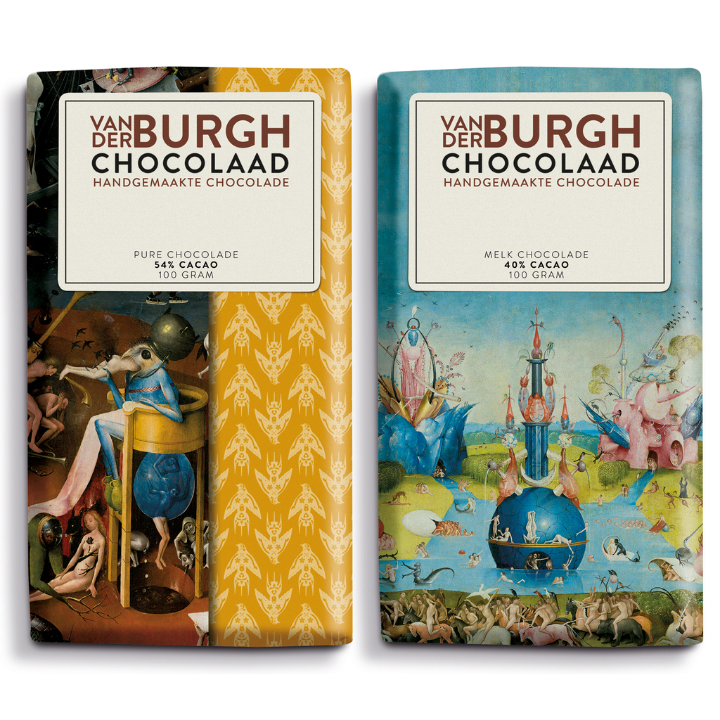

In 2016, 's-Hertogenbosch (a city in the Netherlands) commemorated the 500th anniversary of the death of the painter Jheronimus Bosch, holding an unmissable event for art lovers around the world.
In support of this, the jHEROnimus handmade chocolate was produced by the well-known “Van der Burgh Chocolaad” company, which used graphic patterns and Jheronimus' paintings to create a contemporary product line. The products were not only sold in museum-shops around the world, but also by numerous large (inter)national retailers.