Chuck Studios' new culinary identity for Tony's Chocolonely
Global food branding experts Chuck Studios craft a bold new look that celebrates the brand's chunkiness, charm, and commitment to change
Global food branding experts Chuck Studios craft a bold new look that celebrates the brand's chunkiness, charm, and commitment to change
Impact-led brand, Tony's Chocolonely, has unveiled a new look, crafted by Chuck Studios to launch a bold and fresh culinary identity that puts the chocolate in the spotlight.
Chunck Studio's approach started with a simple yet powerful insight: when people open a bar, they instinctively snap off the two end chunks first.
Olaf van Gerwen, co-founder and global creative director at Chuck Studios says: "While Tony's Chocolonely's mission-led marketing built the platform it stands on today, it's the product that will truly set Tony's apart in the crowded chocolate industry. "

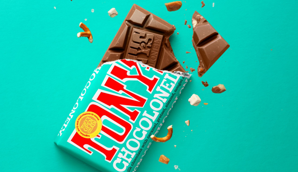
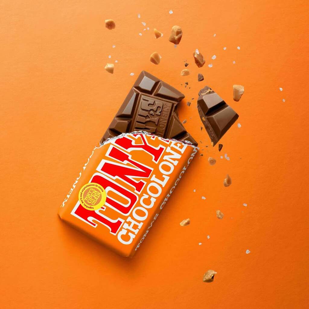
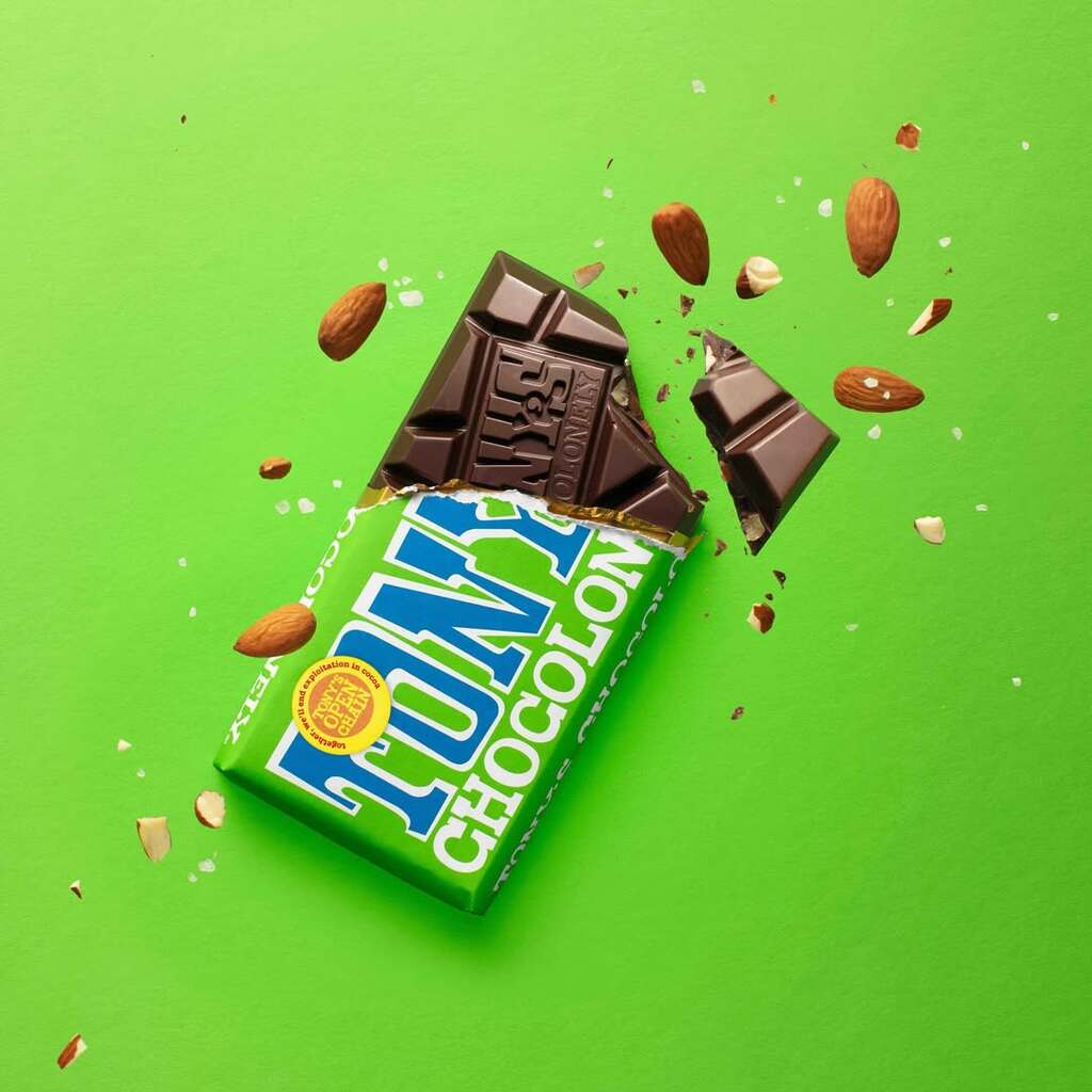
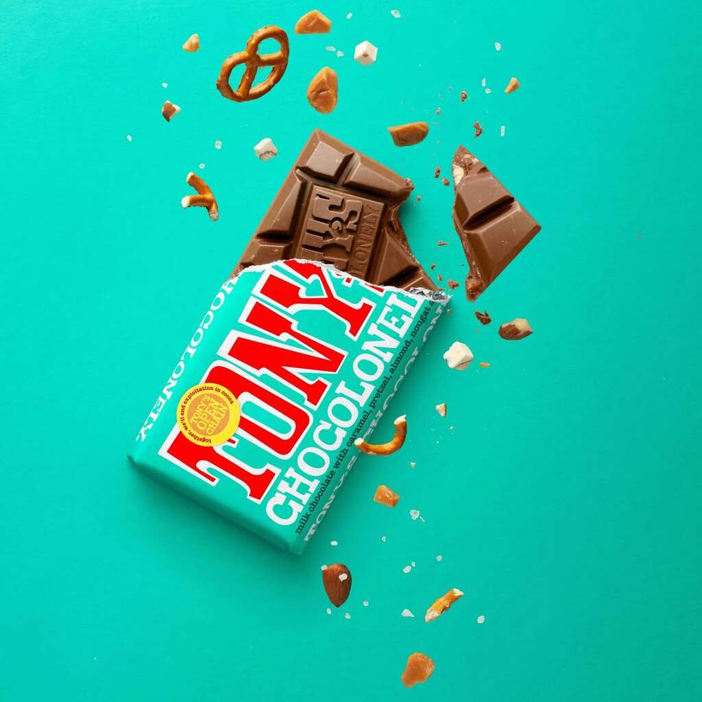
Chuck Studios introduced a new brand asset called ‘Neil’, the core of Tony's culinary identity. Inspired by Neil Armstrong, he represents firsts, impact, and the audacity to leave a mark. Neil isn’t just a chunk of chocolate: he’s a storytelling device. His broken, uneven sides show texture and inclusion. His angle is distinctive. His presence is craveable.

The studio also developed a set of visual rules to boost recognition and bring this identity to life. Bars should appear two-thirds wrapped with torn foil to show texture, and angled at exactly 66 degrees, a nod to Tony’s existing branding. They’re shot on paper backgrounds matching the wrapper or Tony’s red, and always feature visible ingredients, from whole chunks to crumbs.
The goal: a bold, sensory-first look that’s distinctly Tony’s.

The result is an identity that lets people blends the brand's ethical mission with irresistible visual appeal, building a visual world that feels as intentional and powerful as Tony’s mission.
"The new culinary identity shines a light on the deliciousness of their chocolate and shows it in a unique way, so it becomes recognisable even without the brand name." Olaf adds.
For more information on the design, visit Chuck Studio website or follow them on Instagram.


