


Design that Makes a Difference
World Design Day: Celebrating and showcasing design that makes a difference.
This World Design Day we thought it only right to showcase some packaging designs that make a difference. From tackling inequality and raising charitable awareness, to spearheading innovations in sustainability and designing to generally make people’s lives easier, this problem-solving industry continues to make strides throughout the world – so let’s celebrate that.
Tilt, Established NYC, USA
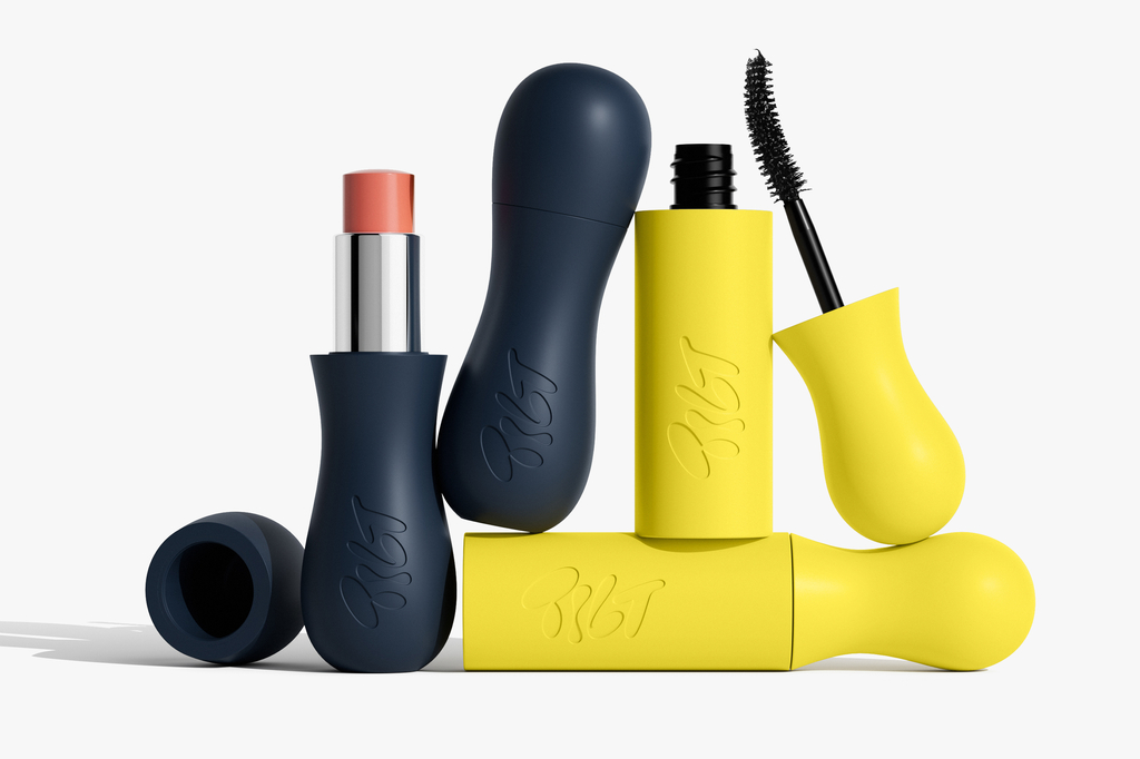


Established NYC’s packaging design for Tilt puts accessibility at its core. The make-up products are crafted with silicone-coated surfaces for better grip, with curved shapes to fit fingertips more comfortably. The shorter wand improves accuracy for shaky hands, while the refillable components feature an easy-to-use, patented stem. The packaging includes large tear-off tabs, Braille descriptions, and uses the Atkinson Hyper-Legible font for better readability.
Campaign images by Stevie Dance. Find out more about Tilt & Established NYC here.
Bosai Gift, Drawrope, Japan


Our first winner for the Design with Purpose special award, The Bosai Gift was created for the Japanese earthquake prone community. Its designed to be given as a gift and displayed rather than hidden away in the cupboard. It holds supplies like water, food and batteries, and it also doubles up as a lantern to help keep families feeling safe during a natural catastrophe.
Find out more about Drawrope here .
Notpla Oil Pipettes x Citizens of Soil, UK


With a focus on designing alternative packaging solutions that contribute to restoring planetary health, Notpla made a breakthrough in sustainable packaging with the Notpla Oil Pipette. A sustainable way to enjoy Olive Oil the Notpla Pipette is the ultimate plastic-free solution for portioned oil. Made from 100% natural seaweed-based materials, this biodegradable, home-compostable (and even edible!) pipette delivers convenience without waste.
Find out more about Notpla & Citizens of Soil here.
OT, Brandforma, Kazakhstan
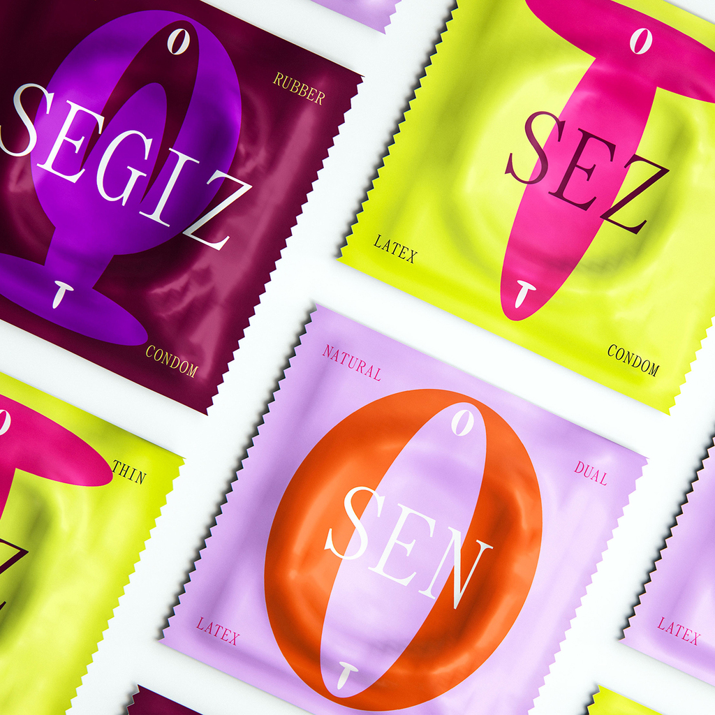

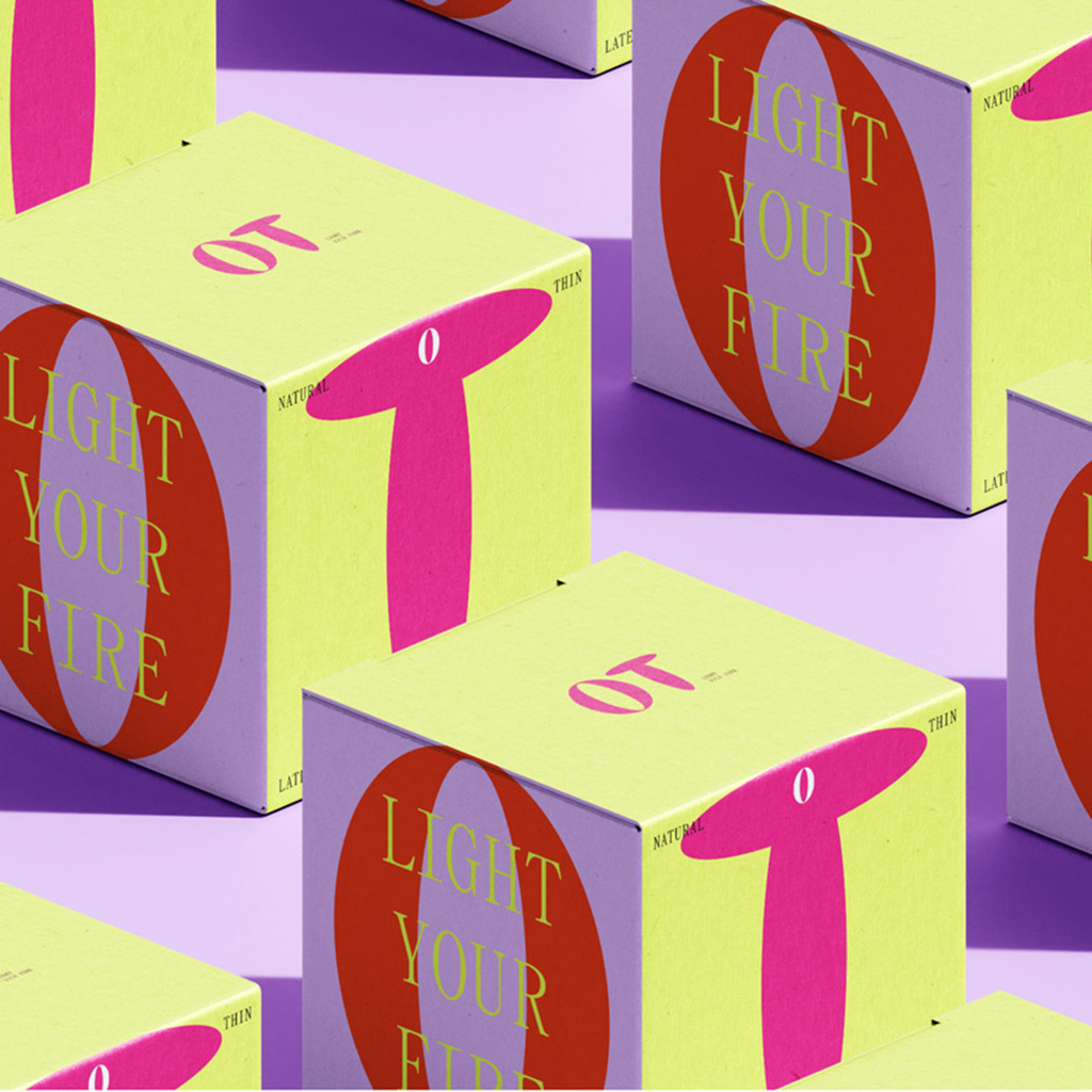
A major issue in Kazakhstan revolves around the absence of comprehensive sex education, gender inequality, and a culture of shame. Condom Brand OT, aims to redefine this sexual culture through design and communication. The brand strives to be not just a product, but also a symbol of harmonious and healthy relations between the genders, promoting the principles of equality and mutual understanding in the intimate sphere. The design attracts the attention of consumers with its ambiguous play with letters, shape and meaning with the "O" symbolising a woman, "T" representing a man.
Find out more about OT & Brandforma here.