


Designing the future: Meet the 2025 student gold winners
Every year, the Pentawards competition shines a spotlight on the next generation of packaging design talent - and our 2025 Student Gold winners have truly raised the bar
Every year, the Pentawards competition shines a spotlight on the next generation of packaging design talent - and our 2025 Student Gold winners have truly raised the bar
Bold in concept and refined in execution, these projects prove that the future of packaging is already in brilliant hands.
Explore them below.
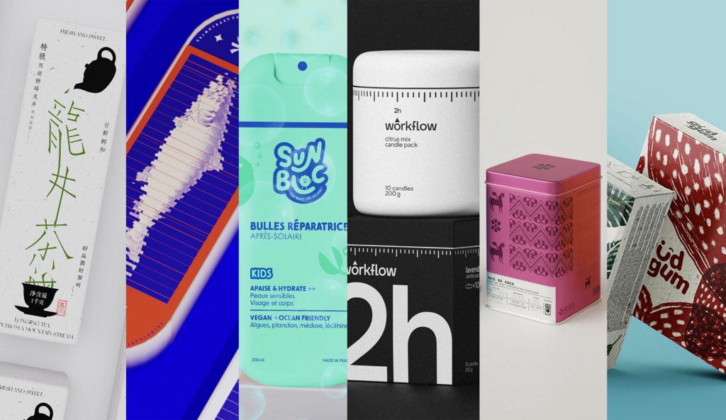
2025 Gold Student conceptual work - Beverages: "Eat Tea Go" tea packaging design by Taizhou University
The design of this packaging is inspired by the sense of flow when pouring tea, based on the Song style, the strokes of the words "Pu'er tea", "Longjing tea" and "Yunnan black tea" are split and reorganized, giving the text a sense of agility like flowing water. To ensure legibility, the arrangement of each stroke is meticulously carved, slender and sharp, highlighting the charm of calligraphy.
The overall design is smooth and easy to extend, integrating the essence of traditional tea culture and modern art, and the packaging is made of pulp molding and tea residue embossing, which not only conforms to the concept of environmental protection but also makes the tea packaging a beautiful carrier of cultural heritage.
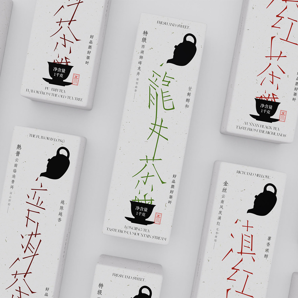
Student conceptual work - Food: Salmon Trail:Salmon packaging design by Luxun Academy of Fine Arts
An interesting and interactive packaging design for salmon. The design of Moire grating makes the packaging show the effect of ripening water and swimming salmon, exuding vitality and vitality, reflecting the freshness and delicious of the product. The pull design allows consumers to open the package through the pull ring, a wonderful experience to uncover the mysterious underwater world, increasing the interaction of the package.
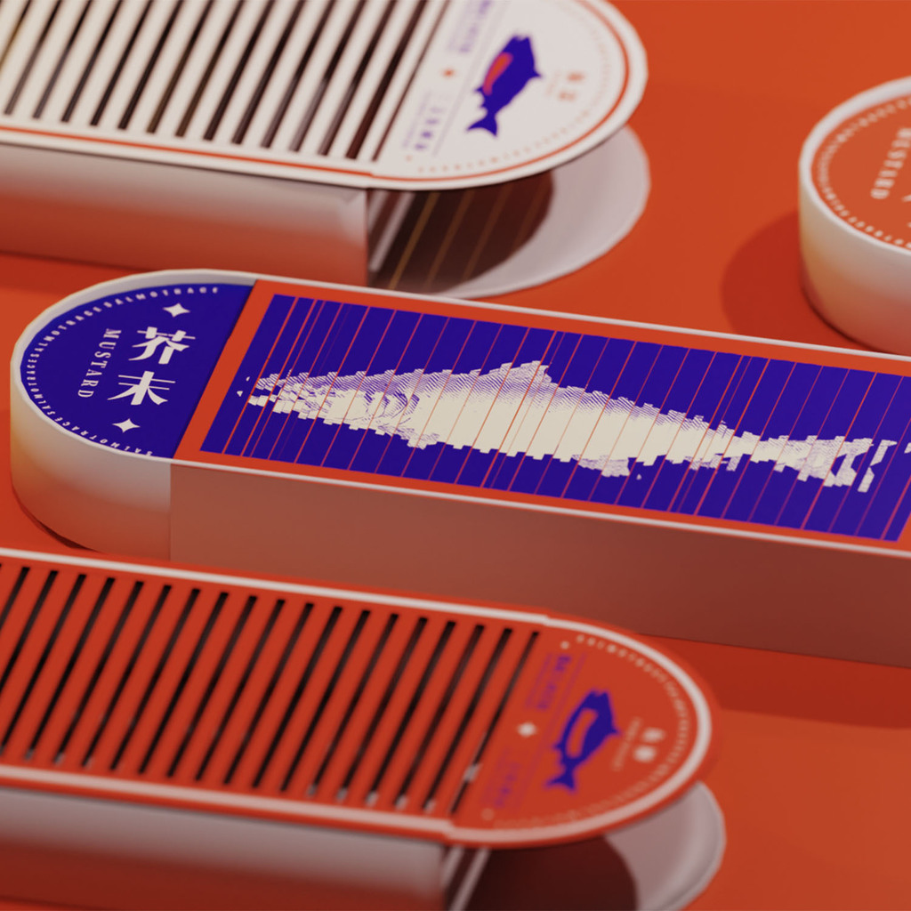
Student conceptual work - Body, Health & Beauty: Sunbloc by École Intuit Lab
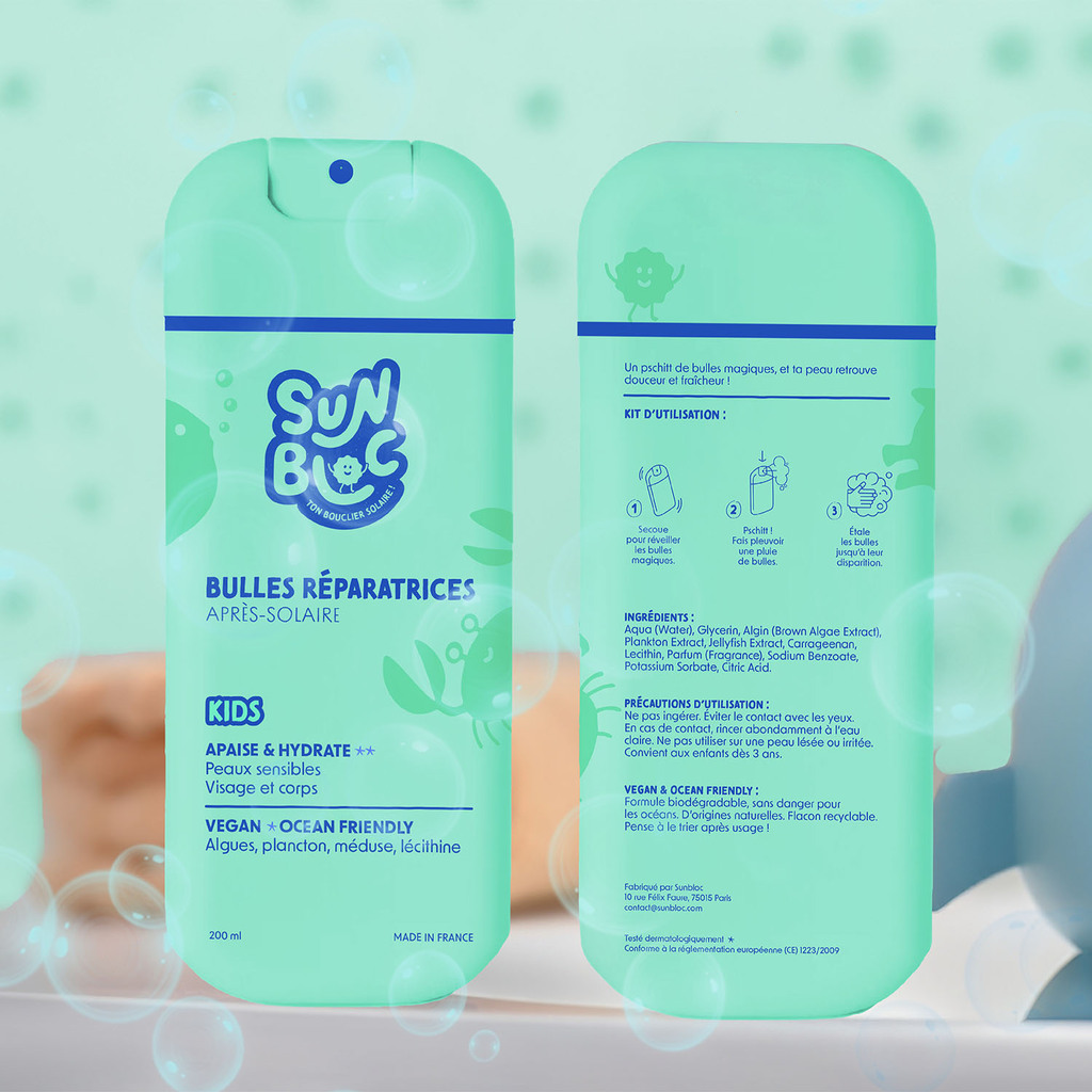
With Sunbloc, sun protection becomes an exciting adventure for kids! Every child becomes the hero of their own protection, armed with their very own sun shield, ready to face the sunny day. The products—temporary UV tattoos, colourful pastel sunscreen crayons, and repairing after-sun bubbles—are designed to make sun care fun, intuitive, and effective. Kids can easily apply their colourful tattoos and crayons, turning sunscreen into a game. The tattoos fade in the sun, reminding them when it’s time to reapply, and the crayons glide on smoothly without any sticky mess!
Parents finally have a simple, hassle-free way to keep their little ones safe under the sun. With playful marine creatures and a cute sun mascot as the "solar shield", children are excited to take on the responsibility of protecting themselves. Plus, Sunbloc is environmentally conscious—made with recycled plastic and ocean-friendly ingredients, so it’s kind to both skin and the planet.
Sunbloc isn’t just about protection—it’s about making sun safety a fun and empowering experience for kids while giving parents peace of mind. The evil UV rays better watch out!
Student conceptual work - Home, Leisure & Other Markets: Workflow: anti-procrastination candles by Oleg Kriukov
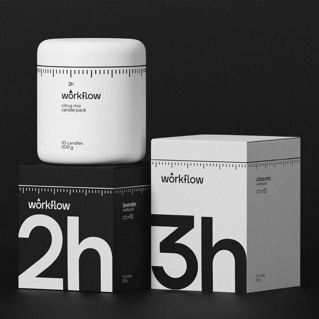
Packaging design for a lineup of aromatic candles aimed at fighting procrastination. The design involves both the boxes and the ceramic jars that hold the candles. There are 10 mini-candles per jar, each candle having a certain burning duration, helping the user to concentrate on work while it lasts — like a timer.
The packaging features minimalistic, timer-inspired details that highlight the intended usage of the product while also being functional design elements. A dial line with tick marks represents the familiar structure of a classic kitchen timer, a triangle pointer is incorporated into the typographic logo and points at the duration on the jars. This design is focused on minimizing visual distractions while still making the functionality and the burning duration of the candles clear.
There are two aroma categories in the lineup: the “calm down” (black/night) set with soothing aromas decreases hyperactivity and stimulates the ability to focus, while the “wake up” (white/daylight) set sets you up for work and fills with energy. The ceramic jars are designed with convenience and portability in mind, so the candles can be lit in the lids. When the candles are used up, the jars can be reused or serve as cups.
Student conceptual work - Brand Identity & Connected Packaging: MATE by ELISAVA
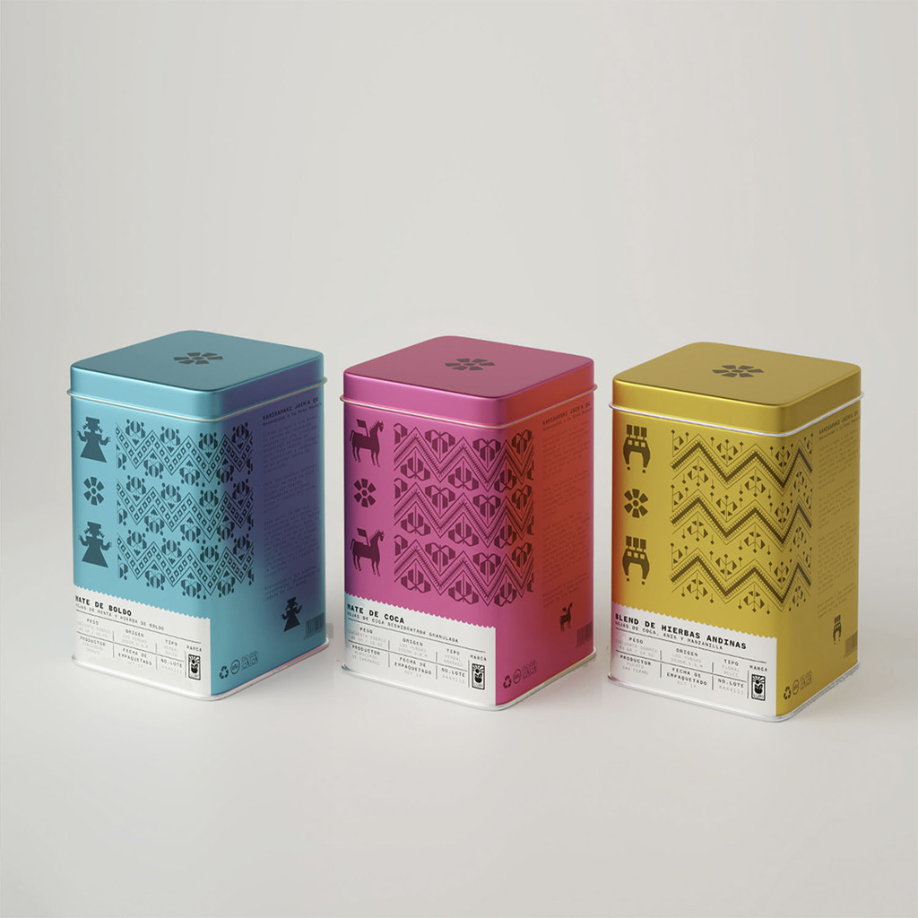
This packaging project is an innovative proposal for mate de coca and other herbal infusions, created for a small to medium-sized company specializing in infusions made with Andean herbs. Each blend is more than just a drink—it reflects the ancient wisdom of the Andes, conveyed through its ingredients and presentation.
The packaging design is inspired by the chullpa, a traditional item used by Andean communities to store coca leaves for medicinal and ceremonial purposes. This object, made from ayuagos and decorated with Andean textile motifs, served as a reference for the packaging’s graphic design, capturing the essence of the Andean world in every detail. Beyond its aesthetics, the packaging aims to highlight the importance of the farmers who make this product possible. The label includes information about the origin of the herbs, the altitude of the cultivation, the farmer’s name, and the blend’s flavour notes.
Additionally, a poem is included to reinforce the storytelling, allowing consumers to connect with the rich cultural heritage behind mate de coca. This packaging not only protects the product but also tells a story of tradition, identity, and respect for the Andean land.
Student conceptual work - Sustainable Design: Gud Gum by UAL
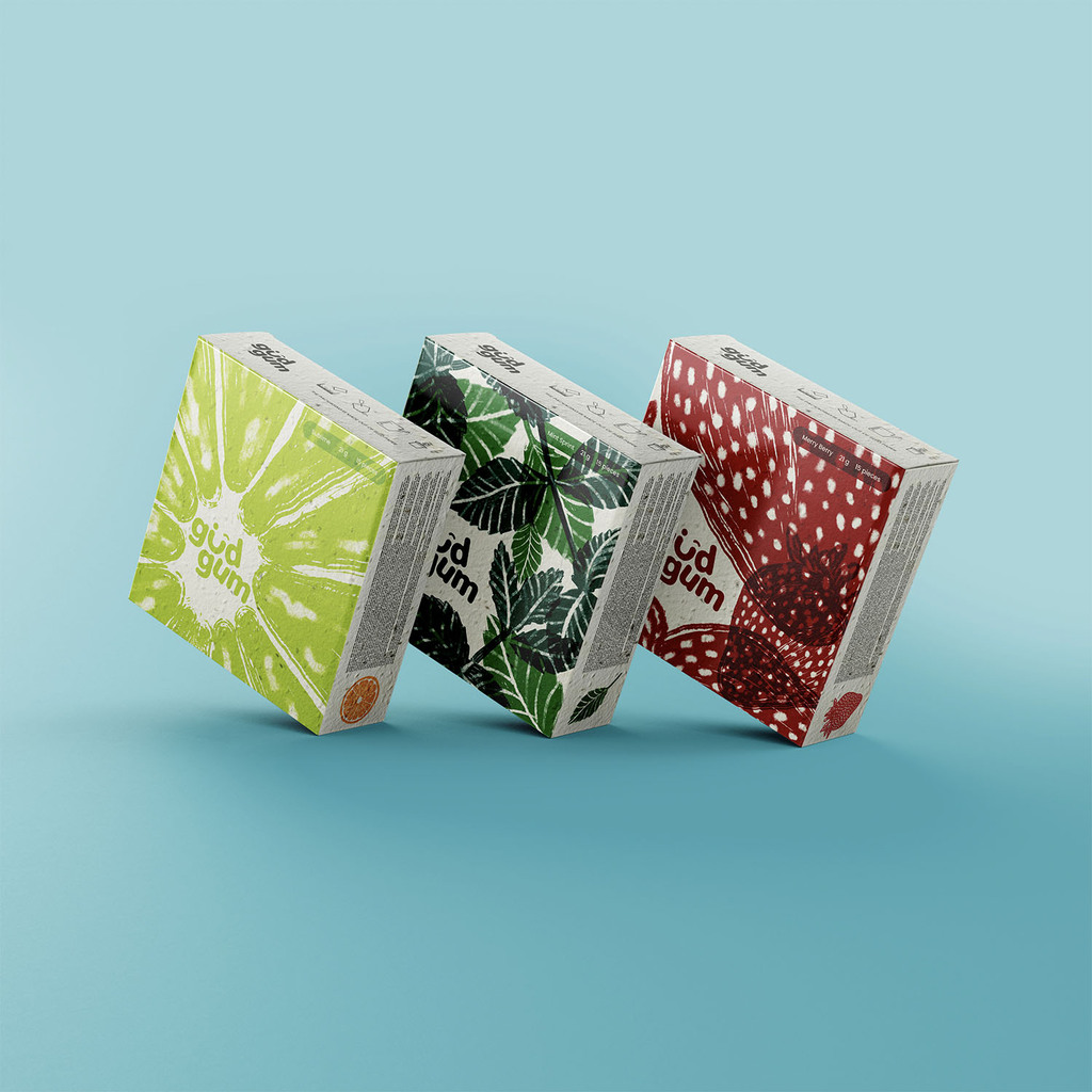
GudGum is a conscious and eco-friendly chewing-gum brand. The name itself is a clever play on words. "Gud" means jaggery in Hindi, a natural and traditional sweetener known for its health benefits and organic origins. GudGum is plastic-free, sugar-free, bio-degradable, vegan and cruelty-free. It provides eco-conscious consumers and health-aware snackers a guilt-free way to chew without giving up flavor.
GudGum’s logo highlights its innocence and the packaging communicates its organic quality. Its brand identity is natural, earthy and playful with tones inspired by jaggery, berries, citruses and minty leaves. The tone is witty, refreshing and informative, a delightful mix of goodness and gumption.
GudGum believes that sustainability should be seamless and smart. Made from seed paper, GudGum’s wrapper disintegrates naturally. One of the biggest issues with chewing gum is improper disposal. GudGum tackles this problem head-on with a simple yet ingenious solution. The packaging sports perforated sections allowing bits of packaging to be torn off, to wrap the chewed gum before disposal. This allows for the smooth disposal of both the gum and its packaging. With GudGum, every chew is a step towards a cleaner planet and every wrapper is a seed for the future.