


Doh! Sparking a new category craving by Brandon Consultants
Sparking a new category craving for bake-at-home cookie dough: independent agency Brandon partners with Bakeaway to launch doh!
Sparking a new category craving for bake-at-home cookie dough: independent agency Brandon partners with Bakeaway to launch doh!
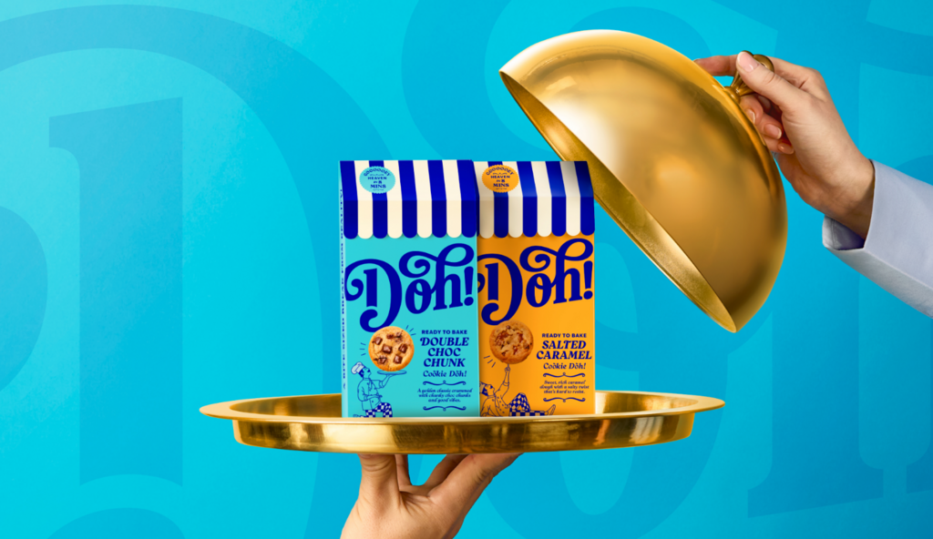
Independent branding agency Brandon shared the launch of its latest innovation project with BakeAway. From developing the product proposition and brand strategy to creating the branding and designing the packaging, Doh! is a deliciously new bake-at-home cookie dough range that launches in over 1,000 Tesco stores, 400 Asda stores, Ocado, and other UK retailers from 17th April 2026.
From the outset, Brandon and BakeAway worked in close collaboration to bring this innovative NPD idea to market. The strategic unlock came from consumer research across the snacking and treating categories. Consumers craved warm, indulgent moments that felt satisfying and personal, but they didn’t want the stress or mess of making them at home from scratch.
Understanding that consumers wanted to feel like the creator without having to be the master baker, Brandon and BakeAway built out a brand blueprint including brand purpose, proposition, and personality to bring the product to life. Naming came next.
Doh! is short enough to be memorable, has a sense of playfulness that draws interest, and has enough stretch for the brand to go beyond the initial product launch for future growth opportunities. Landing on “Spark a little doh-lightfulness" as the brand idea, Brandon then translated this into design strategy.
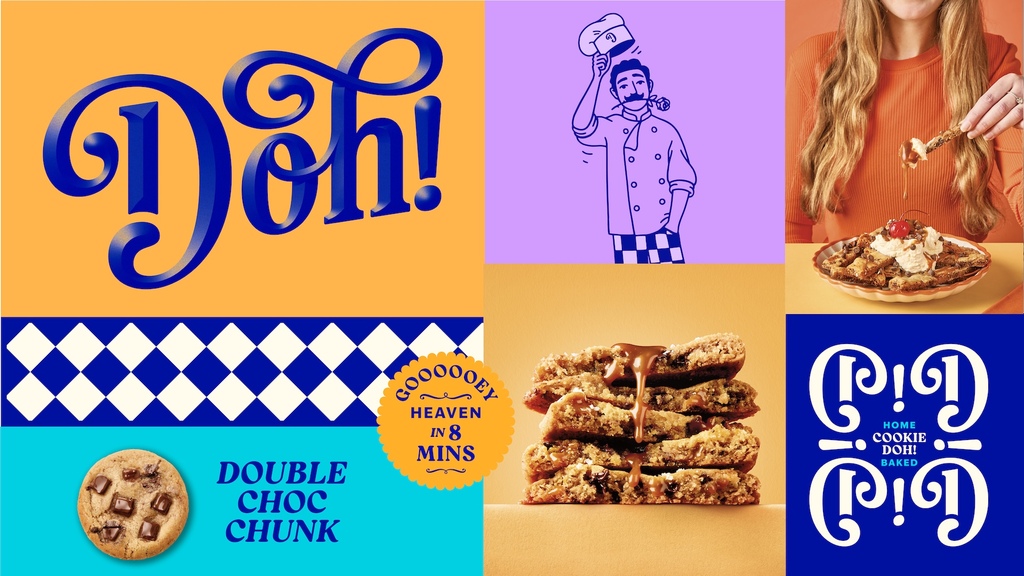
Brandon also enlisted a second creative collaborator – renowned lettering artist Dan Forster – to bring an extra level of craft to the Doh! logotype. The fluidity of the wordmark and its flourishes have been designed to reflect the craft in baking, the softness of dough, and the squidginess of the centre of a perfectly baked cookie. It’s playful, but in a grown-up, indulgent way.
Alongside the character development and logotype, details within the visual brand identity system include:
- A primary colour palette of Doh-licious blue and Fresh off-white. Taking inspiration from emerging interior design trends in contemporary bakery venues, the combination of the two speaks to baking expertise but avoids traditional category clichés.
- A secondary colour palette of warm, soft pastels that have been given an extra lift: Joy turquoise, Golden orange, and Melty purple. Complementing the core blue and white, these were chosen to feel flavoursome and indulgent.
- A set of patterns that can be used on and off pack as backgrounds or graphic elements to add pace to design layouts. The checkerboard references chefs' trousers and kitchen floor tiles, the stripes are inspired by bakery awnings, and a repeating pattern made from the D of wordmark is reminiscent of café veranda furniture.
- Reigo Black as the primary typeface, which is full of character and has a soft and gooey feel that works in harmony with the crafted logo. Ivy Epic was chosen as the secondary typeface for its simplicity and clarity when longer form copy and informative messaging is needed.
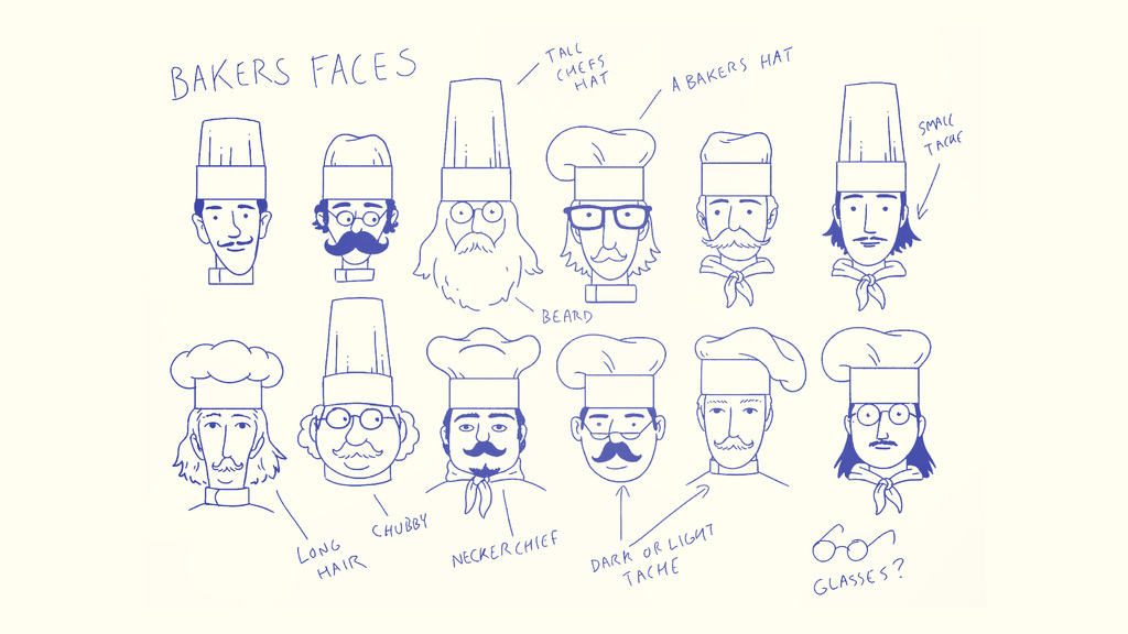
- Illustration guidelines based on Don Doh’s unique style, and a set of illustrated assets for launch, including the back-of-pack ‘how to’ instructions.
- Developing a cheekily charming and feel-good Tone of Voice guidelines with a supporting Messaging Matrix. Combined, these ensure that words lift the mood just as much as the visuals and eating experiences do, wherever the brand shows up.
- A photography style that is fun, energetic, and evocative of indulgent home baking. Based on the beauty of symmetry, the clean bright lighting heroes the products and highlights the textures of the freshly baked cookie creations, inspiring people to get creative in their own kitchens.
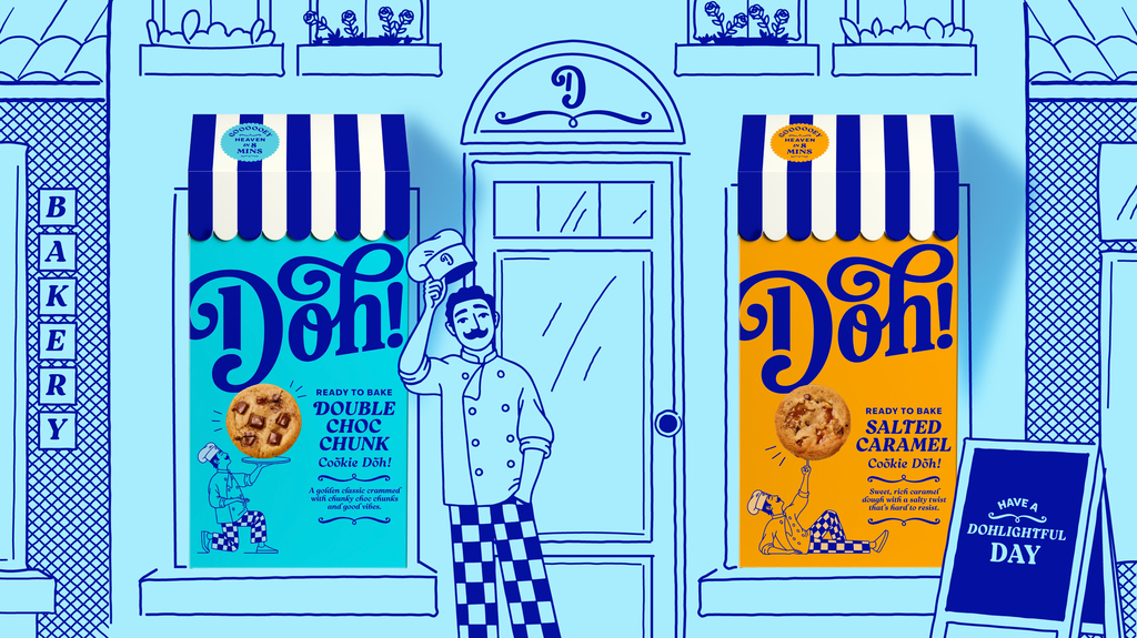
Standout packaging was crucial in driving brand awareness and consumer trial for this new product. Inspired by the rising trend in premium independent bakeries that draw queues around the block every weekend, Brandon transformed the cookie dough box into a storefront, complete with a striped veranda awning and, of course, Don Doh. When lined up, the Doh! boxes create an eye-catching street of bakeries that are unlike anything else on shelf. Adding an extra touch of flair and theatre to the unboxing experience, when consumers open the awning, they’ll find a QR code on the inside, directing them to recipe suggestions.
For more information on the design, visit Brandon Consultants' website or follow them on Instagram .