


lombaert studio’s minimalist design for Kōy–ko organic oils
By drawing inspiration from Japanese culture, lombaert studio creates a minimalist brand and visual identity that finds balance in the design elements.
By drawing inspiration from Japanese culture, lombaert studio creates a minimalist brand and visual identity that finds balance in the design elements.
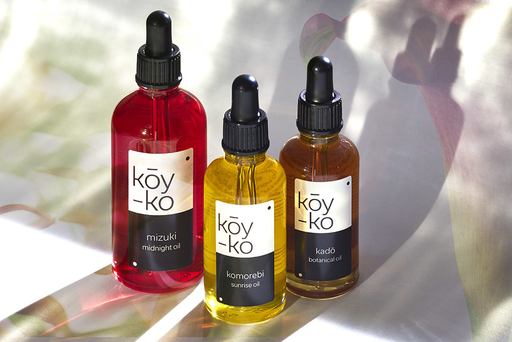
Kōy–ko is a Japanese brand offering a range of organic beauty oils designed to regenerate the skin from sunrise to sunset. The brand and packaging design, developed by London based design agency lombaert studio, explores Japanese culture, honouring the sophistication of their beauty rituals.
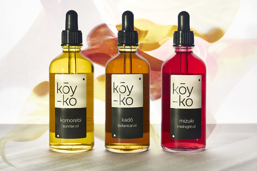
lombaert’s design takes inspiration from the codes of Onmyōdō, a Japanese philosophy based on the Yin and Yang where forces are interdependent. Playing on this idea of contrasts bringing balance to the world, the colour palette is kept neutral with simple black and white labels, clear glass bottles and a black lid. Therefore, by contrast the organic vibrancy of the oils are enhanced, celebrating the beauty found in the natural ingredients within each product.

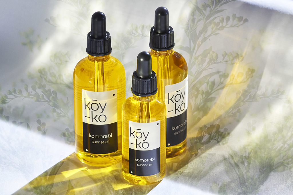
The names of the three variants come from different Japanese expressions for the stages at which the oil is to be used: Komorebi, describes the morning sunlight filtered through the trees, Kadō "way of flowers" and the ritual is completed with Mizuki, “beautiful moon”.
For more information about lombaert studio’s design visit their website or follow them on Instagram .
Have some new packaging you’d like to share? Submit your project here for a chance to be featured!