


Looking back at the Best of the Best: Pentawards Diamond winners
As Pentawards turns 20, we’re looking back at all of our Diamond winners - celebrating the work that defined the very best in packaging design
As Pentawards turns 20, we’re looking back at all of our Diamond winners - celebrating the work that defined the very best in packaging design
At the very top of the Pentawards competition sits the Diamond. Awarded to one outstanding project each year, it highlights the work that captures attention, challenges conventions, and moves the industry forward.
Looking back, these winners also trace the evolution of packaging design - from beautiful and functional to increasingly thoughtful and purposeful.
Here, we revisit every Diamond winner so far.
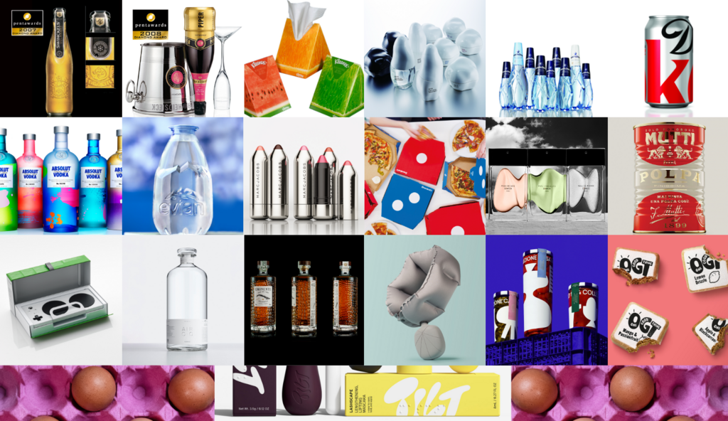
2007 - Swinckels by Design Bridge and Partners (Global)
Swinckels is a new concept in beer. It is a fresh, unpasteurised premium pilsner that is kept cool from the moment it is brewed and has a shorter shelf life than traditional beers. The design of the bottle shape, label and colours is intended to emphasise the brand’s freshness and high quality. The iconic flat feature on the neck of the bottle is not only tactile and memorable, but also incorporates the label, which acts as a tamper-evident seal for the cap — reinforcing the product’s quality and freshness. The transparent glass bottle reveals a pure golden colour, light and crisp at its best. Black, combined with gold and silver graphic elements, strengthens its premium positioning.
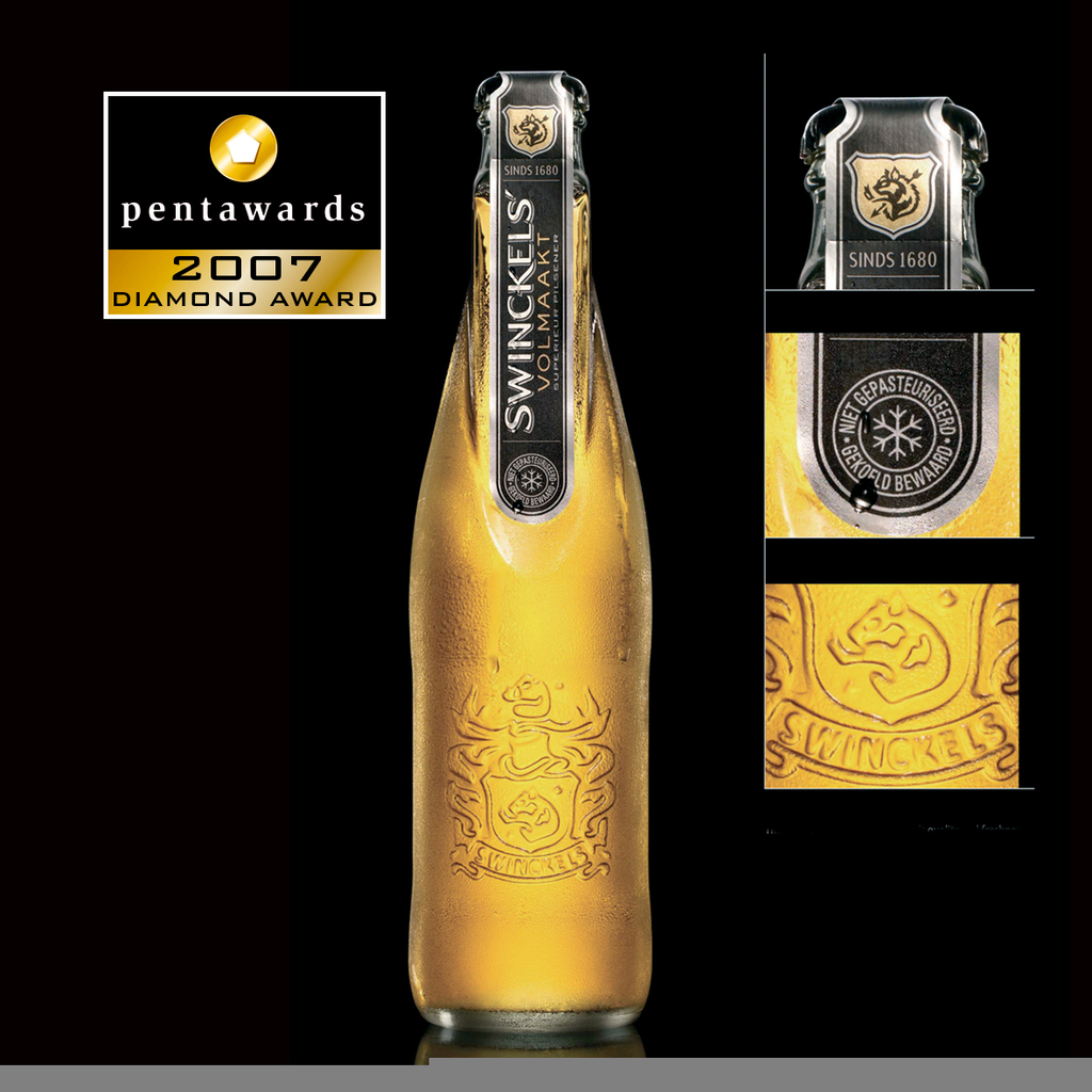
2008 - Piper Heidsieck Rosé Sauvage by Viktor and Rolf, by Sleever International (France)
Designed by Dutch fashion duo Viktor & Rolf, the Pieper Heidsieck Rosé Sauvage bottle reimagines champagne tradition through inversion. Inspired by the idea of “reversing proportions,” the bottle rests on its neck, with the neck label, front label, and cap foil all flipped upside down. While maintaining the classic visual codes of champagne: bottle shape, cork, labels, ice bucket, and glass, the designers subvert expectations to create a striking and playful experience, as if the champagne itself has turned one’s head. This bold yet simple concept set the bottle apart in a category dominated by tradition. The glass bottle is wrapped in an innovative sleeve produced by Sleever International, reinforcing the unconventional design. Launched as a limited edition in late 2007, the bottle was available exclusively in duty-free shops and select bars, positioning it as both a collectible object and a statement in contemporary packaging design.
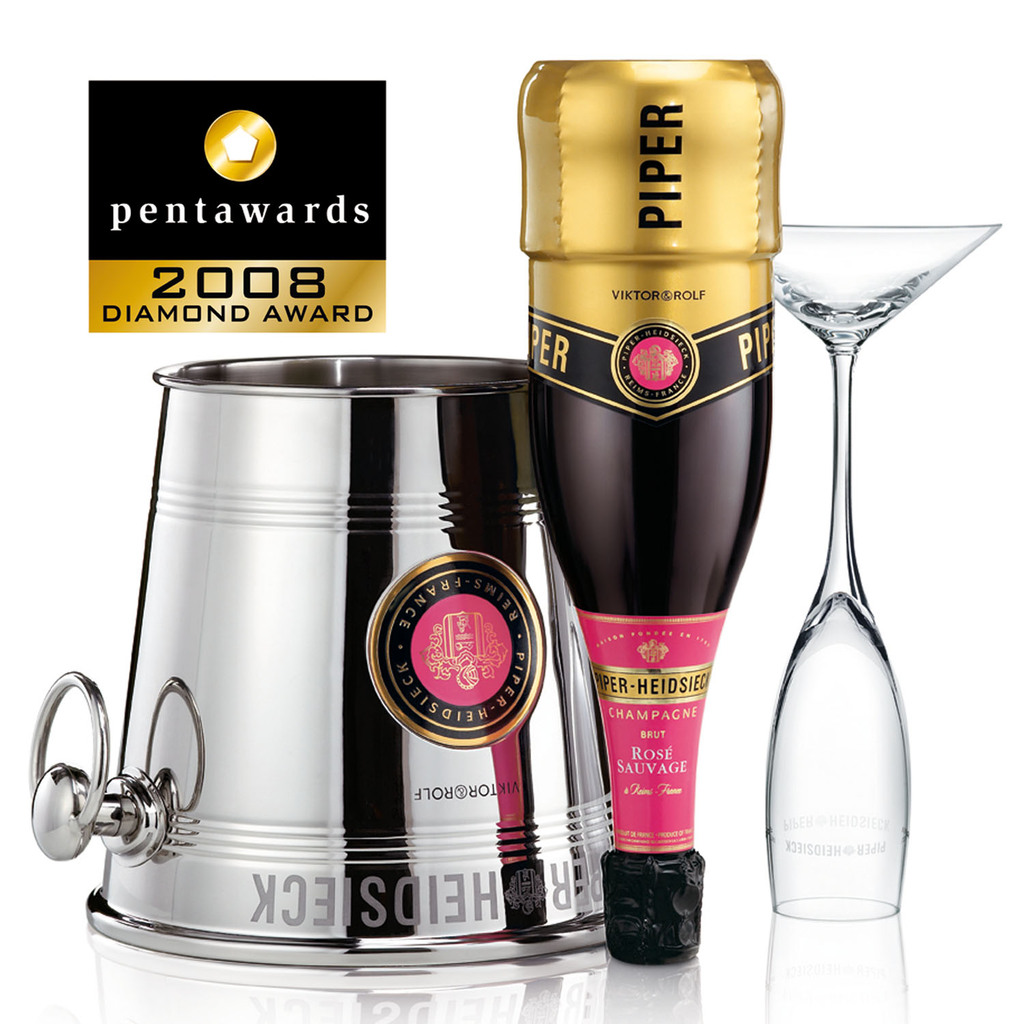
2009 - Kleenex by Kimberly-Clark (United States)
Kimberly-Clark introduced a fruit-themed tissue box collection that transformed everyday packaging into a playful design object. One of the standout concepts was a watermelon wedge–shaped box, an instantly recognizable symbol of summer, fun, and happiness. By treating the packaging as part of the product rather than a disposable container, Kleenex moved beyond generic box designs to create something decorative and suitable for both home and office environments. While maintaining the brand’s core qualities—soft, strong, and absorbent 2-ply tissues made from FSC-certified fibers—the fruit-inspired packaging refreshed the brand’s image and helped drive consumer engagement and sales during this period.
2010 - HOYU3210 by ADK (Japan)
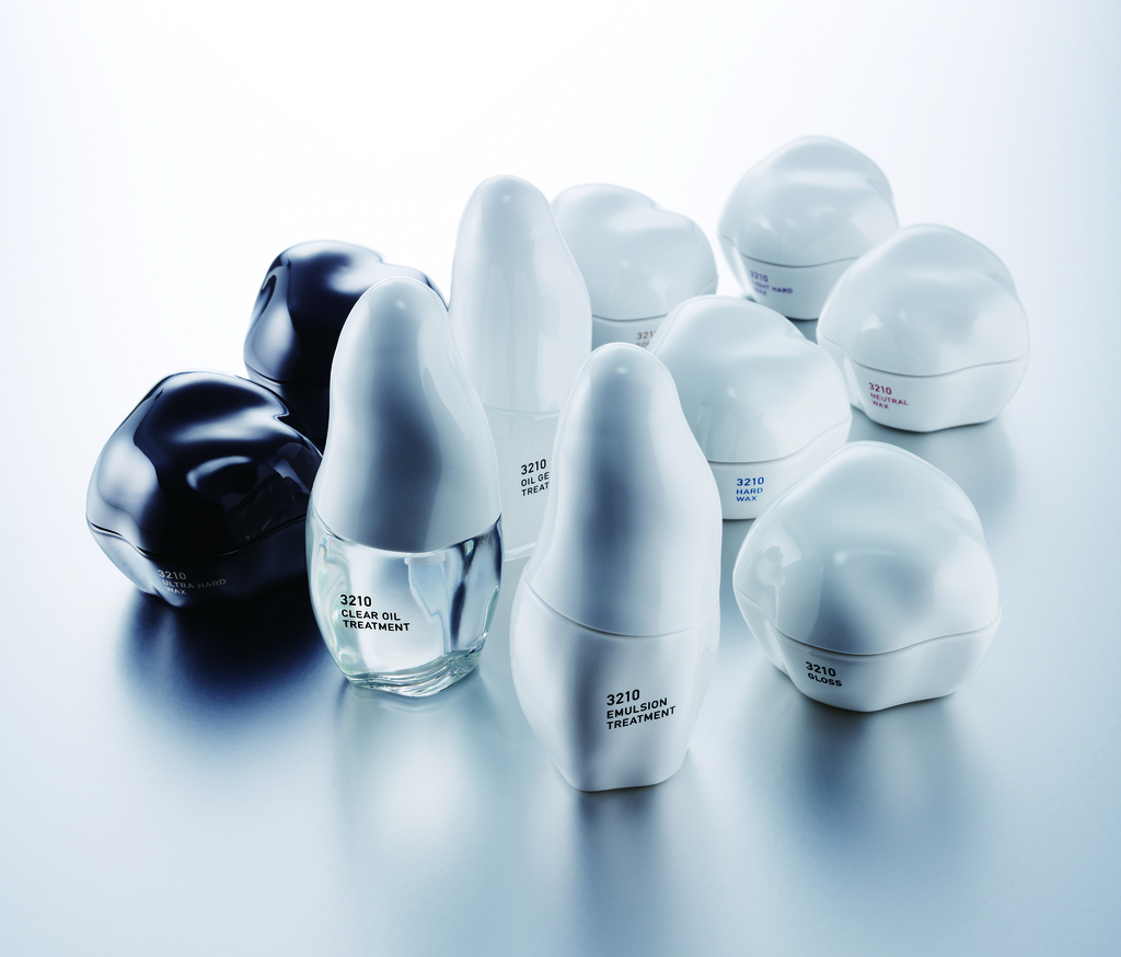
HOYU3210 – countdown to beauty – is a range of products specialising in hair and hairdressing products. 3210 refers to a countdown to indicate what the product has to offer consumers, in a few seconds, even with the stress of the last finishing touches before going out, the ideal solution for a really perfect hairstyle. The distinctly original and ideally ergonomic shape of the bottles leaves the usual codes behind to stand out among all its competitors. The designer confesses that he did not use a computer to create these ever so particular forms. His tools were his hands, the earth to be moulded, the file and sandpaper.
2011 - Ramlösa by Nine (Sweden)
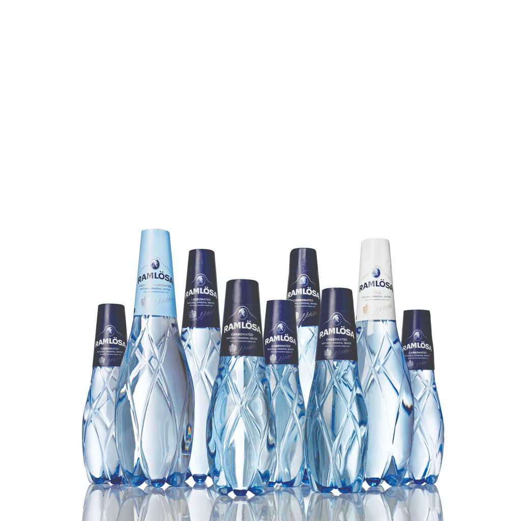
Designed by Swedish agency NINE, the Ramlösa premium bottle redefines luxury packaging through an innovative use of PET plastic. Drawing inspiration from traditional cut crystal glasses, the design translates sharp, elegant facets into a modern, lightweight material, creating a refined aesthetic while significantly reducing the product’s carbon footprint compared to glass. Intended for exclusive environments such as restaurants, bars, and nightclubs, the bottle balances sustainability with a high-end presence. Structural elements typically associated with carbonated PET bottles are intentionally integrated into the base, becoming part of the overall visual expression. The bottleneck label communicates carbonation levels while incorporating updated brand elements. A hidden ink pattern of stars and trails glows under UV or black light, adding a theatrical effect for nightlife settings
2012 - Diet Coke Crop Packaging by Turner Duckworth (Global)
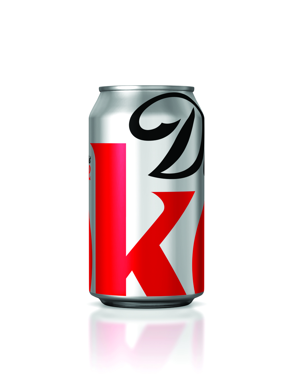
Coca-Cola commissioned Turner Duckworth agency to redesign Diet Coke. The refreshed packaging features a section of the logo, cropped to feature the “D” and the “k,” set against the brand’s signature silver backdrop, creating a sleek, modern look for the brand.
2013 – Absolut Vodka “Absolut Unique” by Family Business (Sweden)
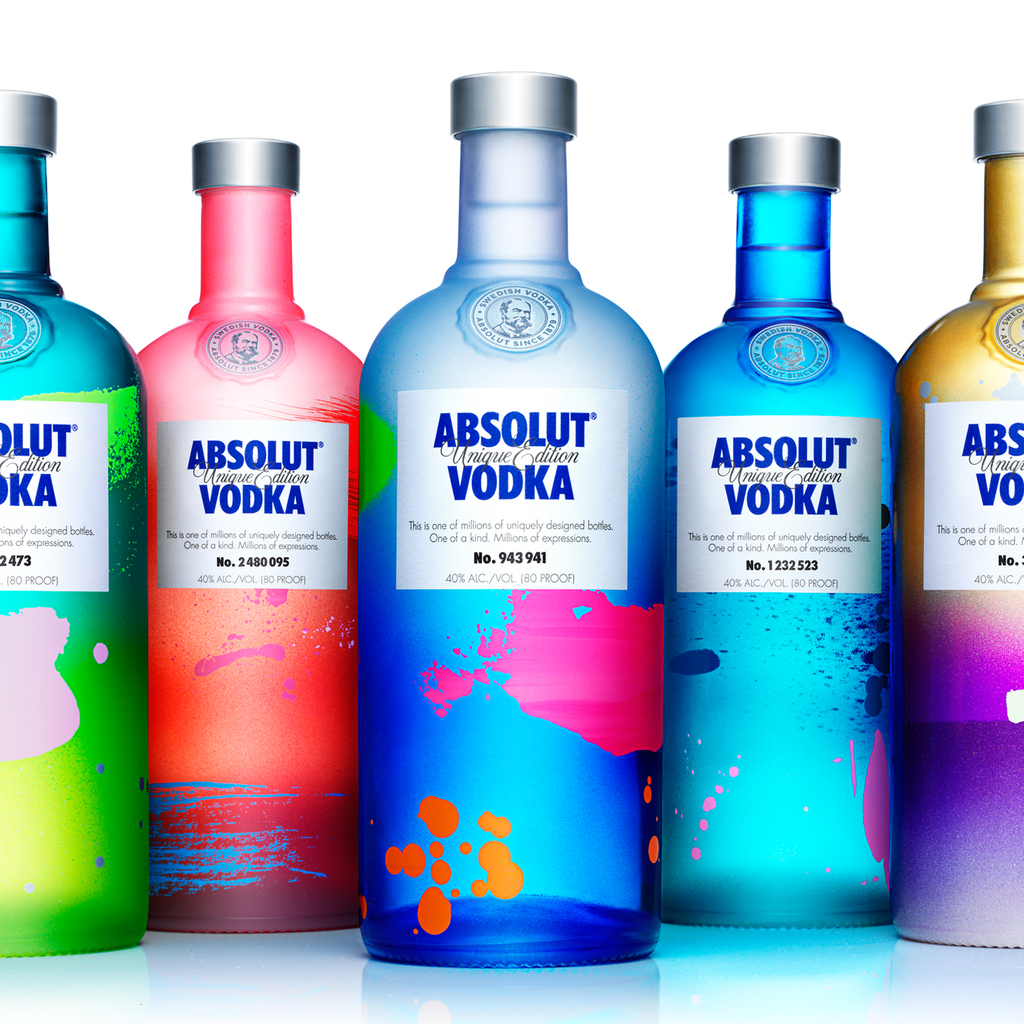
Absolut Unique redefined the idea of limited-edition packaging by making every single bottle one of a kind. Launched globally between September and December 2012, the project involved producing four million uniquely decorated bottles, each featuring a distinct combination of colors, patterns, and glass treatments. To achieve this, Absolut rebuilt its production line and pushed every available glass-decoration technique in new and unexpected ways. Rooted in the brand’s long-standing celebration of individuality and “chosen families,” Absolut Unique aligned closely with Absolut’s historic support of the LGBTQIA+ community
2014 – evian “Pure Drop” by Group Danone (France)
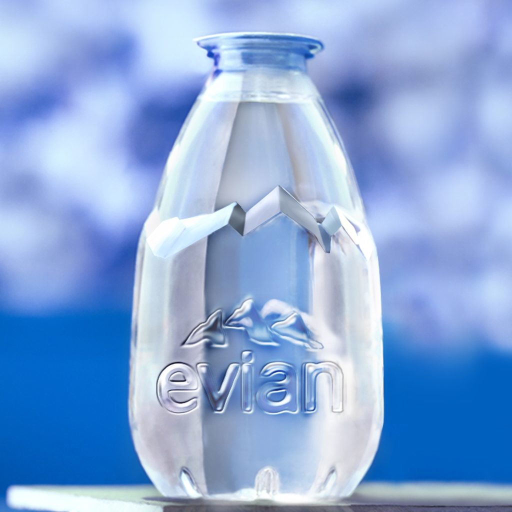
The Evian Drop is a compact 200ml PET mineral water bottle designed for quick, on-the-go hydration. The bottle eliminates the traditional cap and label, replacing them with a peel-off lid and Evian branding moulded directly into the bottle. This minimal design reduces material use while maintaining strong brand recognition. Positioned as a complementary format rather than a replacement for standard bottles, the Evian Drop offers a lightweight, convenient solution for consumers seeking instant refreshment.
2015 – Marc Jacobs Beauty Line by Established (USA)
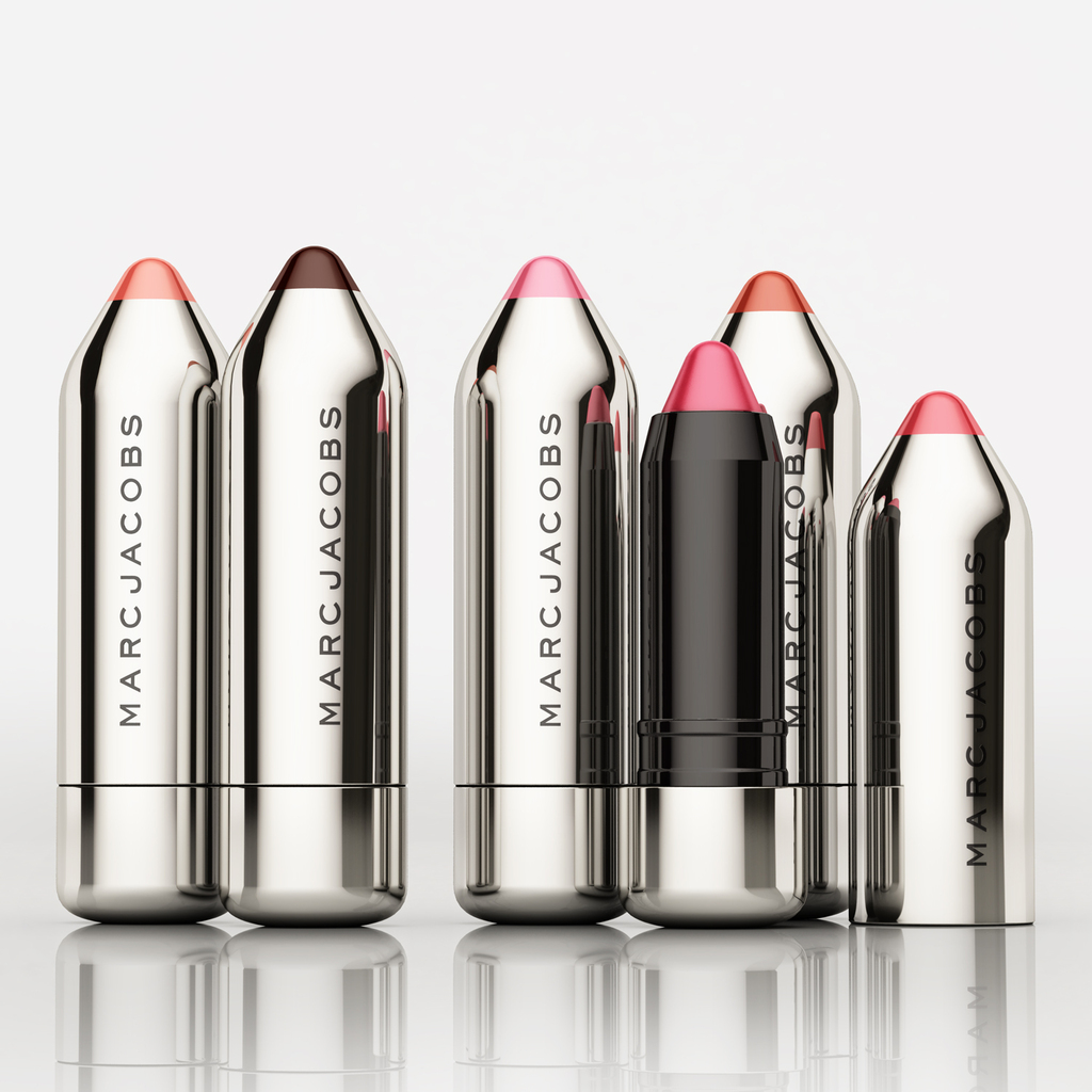
The Marc Jacobs Beauty packaging introduces a luxurious, rule-breaking aesthetic defined by high-shine black lacquer and curved, sensual forms.
The line is conceived to feel like a premium accessory rather than traditional cosmetics: tactile, substantial, and deliberately indulgent. Ultra-thin compacts with button-locking mechanisms, weighted lipstick cases, and precision tools like the Magic Marc’er eyeliner combine functional performance with a simple yet thoroughly modern visual language. By blending high fashion, bold color, and collectible design, the packaging establishes a distinctive, giftable presence within prestige beauty.
2016 – Domino’s by Jones Knowles Ritchie (Global)
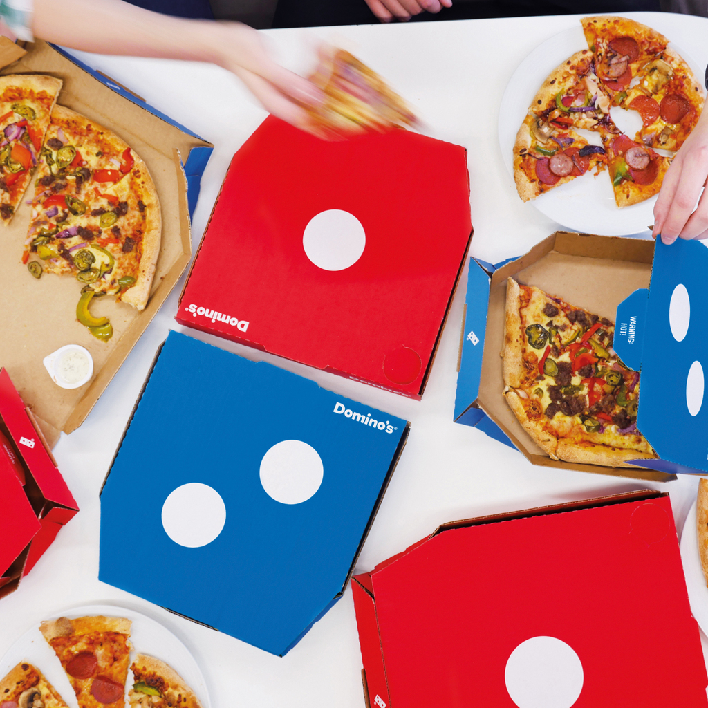
Jones Knowles Ritchie redesigned Domino's UK pizza boxes to turn the packaging into a bold, instantly recognizable brand asset.
Based on the insight that 96% of UK orders consist of two pizzas, the design introduces one red box and one blue box, intended to be delivered together to form the iconic domino logo. Promotional clutter is stripped away, allowing the logo to become the central visual and the box itself to act as the brand’s core expression. The clean, high-impact design encourages interaction and social sharing, transforming the delivery moment into a playful experience known as the “Domino Effect.”
2017 – Starck Paris by Perfumes y Diseño (Spain)
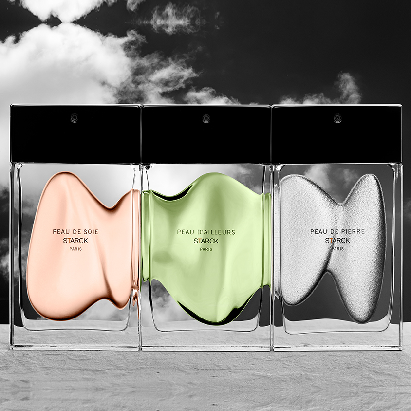
Perfumes y Diseño challenges traditional fragrance packaging through a radical, design-led approach that treats scent as an architectural object. Each bottle is defined by raw, sculptural forms and industrial materials, rejecting ornament in favor of concept and function. Paired with restrained typography and minimal secondary packaging, the system positions fragrance as an intellectual and emotional experience rather than a decorative luxury. By stripping perfume packaging back to its essence, the line establishes a provocative alternative within the fragrance category.
2018 – Mutti Spa by Auge Design (Italy)
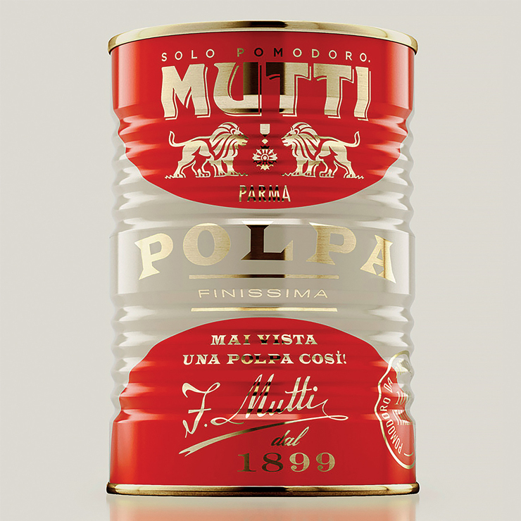
This project creates a refined dialogue between past and future, blending Italian tradition with a contemporary, artistic expression. Abstract, geometric symbols represent each tomato variety, translating familiar products into a modern visual language. Set against elegant ivory backgrounds and elevated with luxurious gold foil, the design brings a premium, gallery-like quality to everyday cans and bottles.
High-end finishes, including sophisticated silkscreen printing and metallic foiling, reinforce the sense of craftsmanship and quality across the range, which includes tomato pulp, cherry tomatoes, peeled tomatoes, datterini tomatoes, tomato purée in glass bottles, and tomato concentrate in tubes. By transforming staple ingredients into design objects, the packaging celebrates Italian heritage while confidently looking forward.
2019 – XBOX by Microsoft (United States)
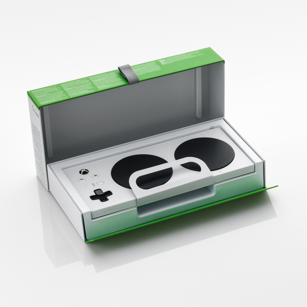
This packaging rethinks consumer electronics unboxing through an accessibility-first design approach. Created for the Xbox Adaptive Controller, the system is engineered to be opened without tools, fine motor control, or two-handed strength, using integrated loops, hinged openings, and adhesive-free cable management. Clear, text-free graphics guide setup intuitively, while protective air cells maintain a compact, efficient pack size. By prioritizing inclusive use without sacrificing visual simplicity, the design establishes a new standard for accessible, human-centered packaging across the category.
2020 – AIR Vodka by Air Company (United States)
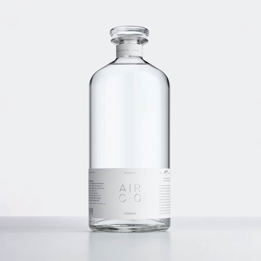
Minimalist and sustainability-led, the design presents vodka as a visual and tactile experience. A low-positioned label allows the liquid itself to take visual priority, while a clean, restrained logo emphasizes simplicity and elegance. The bottle is designed for reuse, easily transforming into a carafe, vase, or container, supported by removable FSC-certified labeling and non-toxic adhesive. Sustainable printing, fully carbon-offset through tree-planting initiatives, reinforces the environmental ethos, while the overall form balances luxury aesthetics with thoughtful, responsible design.
2021 – Eminente Reserva by Moët Hennessy (France)
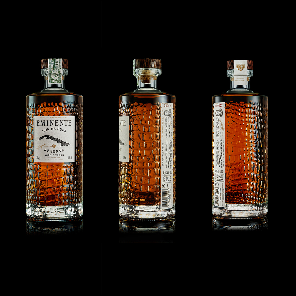
With its crocodile-shaped logo and textured glass bottle, this rum was inspired by its native Cuban land locals call “Isla del Cocodrilo” (island of the crocodile). The bottle is produced in Mexico, the closest country to Cuba that produces glass, therefore reducing transportation. The labels, made using cotton by-products from the textile industry, are affixed by hand in Cuba. The front label reveals the brand logo and product description using embossing, debossing and hot gold stamping. The back label, with the form of a train ticket, is an invitation to board for a trip to wild Cuba.
The intricately engraved bottle stopper is made of sustainable cork and wood coming from FSC forests. Once the rum is sipped, the repurposing of the carafe will transform it into a beautiful decorative object: a candle holder, a vase or a jug of water, whatever your creativity will lead you to.
2022 – Pocket Neck Pillow by Urban Forest Lifestyle Limited (China)
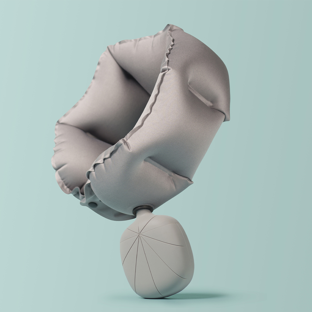
The tree shaped shell is the packaging for a travel neck pillow. It is small and portable and also in a lovely shape. Using the elastic property of silicone material, this packaging is used as both a storage bag and an air pump for the neck pillow. It is a sustainable and environmental friendly design because the packaging is functional and reusable. Consumers will use the packaging all the time rather than throw it away after buying the product. The air pump function totally changes the way to use an inflatable neck pillow. Just simply use the packaging to blow the pillow rather than blow by mouth and it is a healthy way especially when travel during Covid-19 period. This packaging design makes the travel pillow unique and quite attractive.
2023 – CASA MARRAZZO 1934 by Auge Design (Italy)
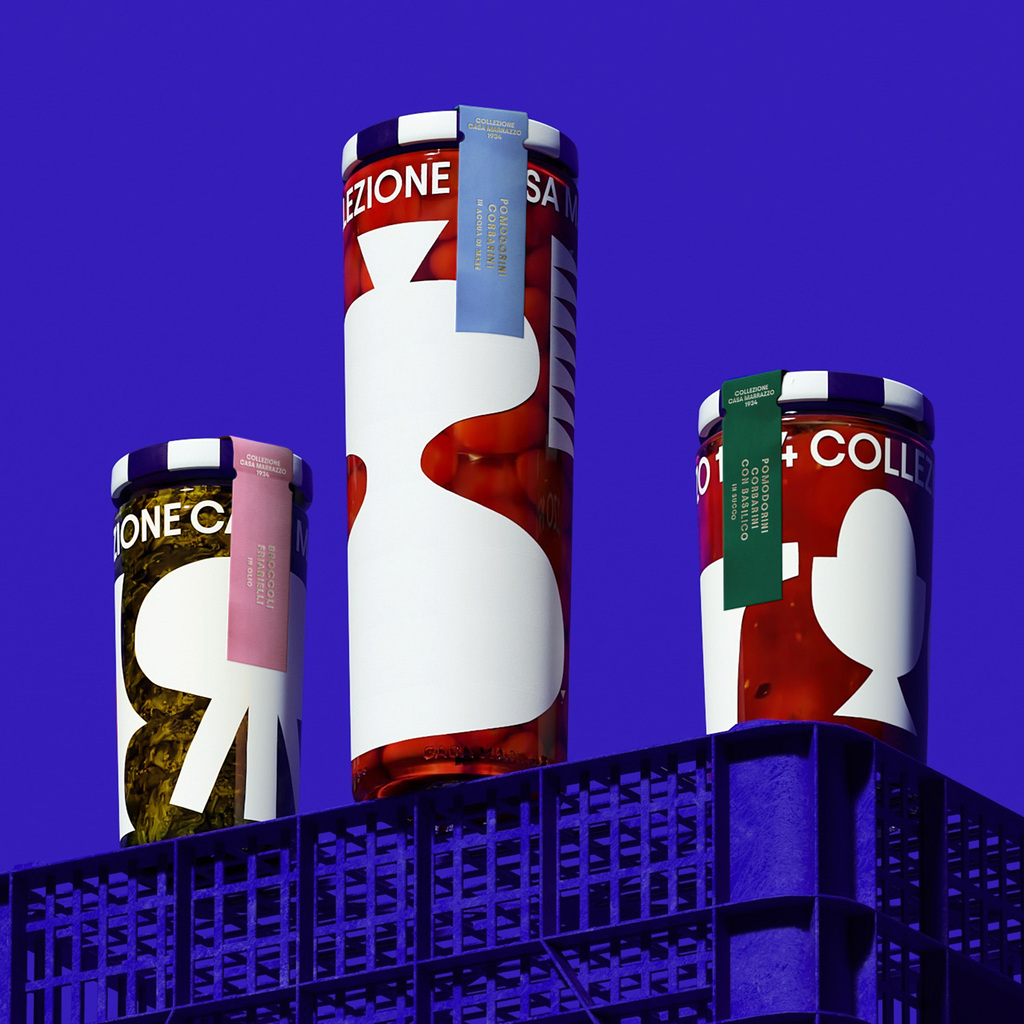
Rooted in family heritage and artisanal craft, the Casa Marrazzo 1934 packaging presents preserves as contemporary design objects. Oversized, screen‑printed illustrations of domestic tools and objects wrap clear glass jars, allowing the vibrant colour of the ingredients to become part of the visual language, while custom caps and an elegant colour palette distinguish each product. Simple, gold‑printed labels enhance shelf presence and reinforce the premium quality of the product, elevating everyday food into a warm, sophisticated experience. By uniting nostalgia, craftsmanship, and modern graphic expression, the design creates a cohesive visual identity that celebrates tradition and authenticity.
2024 – OGT (One Good Thing) by This Way Up (United Kingdom)
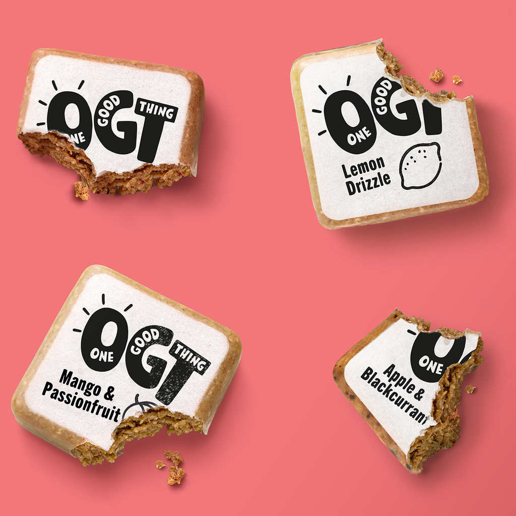
One Good Thing (OGT) snack bars use innovative, eco-friendly packaging. The primary packaging consists of an edible beeswax-based coating that protects the bar while being completely edible, alongside a rice paper label printed with 100% natural, food-safe ink. For secondary packaging, corrugated cardboard is used in a postage format, made from 70% recycled materials. It's fully recyclable and compostable, aligning with the brand’s commitment to sustainability by eliminating waste and reducing environmental impact.
2025 – Tilt Beauty by Established (United States)
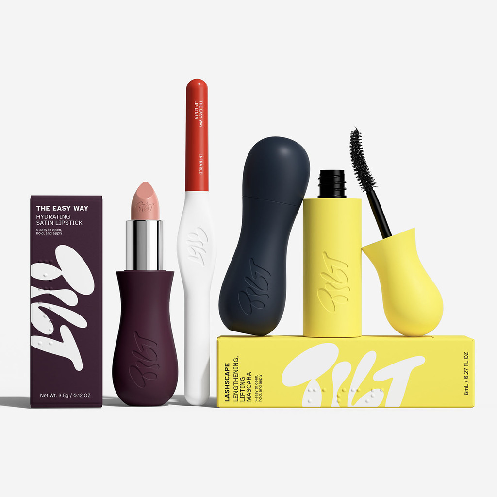
A breakthrough in beauty packaging and the first makeup line to earn the Arthritis Foundation’s Ease of Use Certification. By placing accessibility at the heart of its design, Tilt marks a turning point: packaging conceived for people living with chronic pain, mobility challenges, or low vision from the very beginning, rather than adapted afterwards. It’s a reinvention of beauty packaging that makes glamour more inclusive — without compromising on elegance or desirability. Every element was reconsidered for everyday ease — from shorter mascara wands that steady the hand and minimise tremors, to silicone-coated surfaces that improve grip, and soft-close magnets that make opening and sealing effortless for users with reduced dexterity.