


Meet the 2026 Pentawards winners
The 2026 Pentawards winners have officially been revealed. Explore the top winners, including this year’s Diamond: Best of Show.
The 2026 Pentawards winners are here. Following our 20th Gala Ceremony, we’re celebrating the packaging designs that rose to the top - including this year’s Diamond: Best of Show
Celebrating its 20th year, the 2026 competition received over 2,000 entries from more than 65 countries across the globe. More than 700 projects were shortlisted by our international jury, with the winners revealed at the Gala Ceremony on 16 October.
Take a look at the top winners below!
DIAMOND – BEST OF SHOW
Label created by the wine itself - Piquentum Brut Nature, Studio Sonda
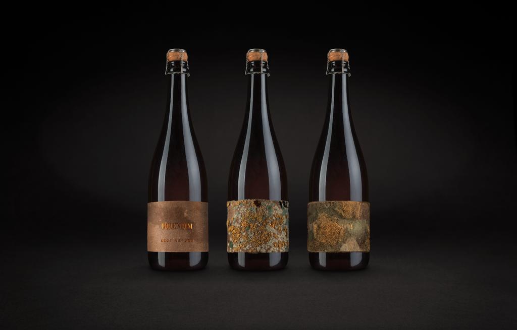
Piquentum Brut Nature is an organic sparkling wine designed as an answer to an industry where most producers use artificial shortcuts. While over 97% of sparkling wines are made with industrial sugar and artificial yeasts, Piquentum produces both naturally and in-house from grapes grown in its own organic vineyard. The packaging brief: create a label that acts as a Manifest of Zero Compromise - not a claim, but proof.
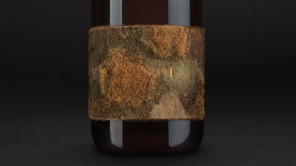
The label becomes a living material expression of that promise. During secondary fermentation (the step that creates bubbles), sediment is naturally formed and removed through dégorgement. Most producers discard it; here it was embraced and turned into the label itself, resulting in the first wine label ever created exclusively by the wine itself.
Depending on environmental conditions, the label continues to develop after application, behaving as a living surface and forming noble mold and similar organisms. Rather than hiding natural variability, the packaging makes it visible - turning the bottle into a credibility tool in a category where consumers increasingly doubt marketing claims.
For the client, this creates clear differentiation in premium settings: the label is tangible evidence of minimal intervention and a built-in storytelling device for sommeliers. It also supports sustainable design by repurposing a natural byproduct that would otherwise be discarded, linking production philosophy directly to packaging.
BEVERAGE PLATINUM (Sponsored by Paris Packaging Week)
A little wine, Australian Vintage
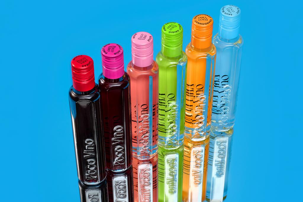
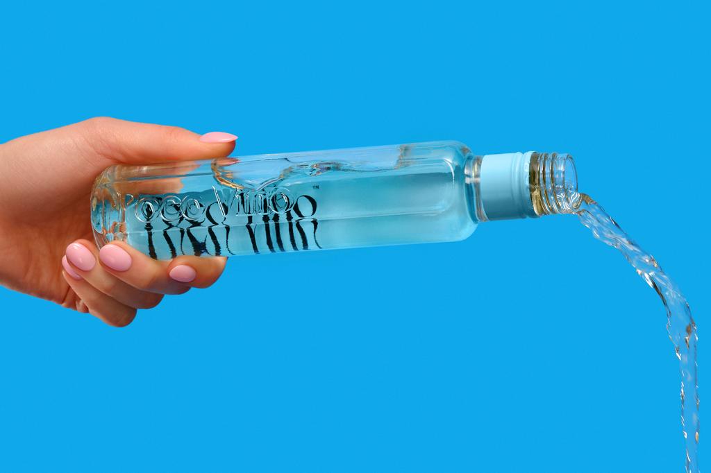
Poco Vino™ is a format-first wine innovation built around distinctive 187ml single-serve bottles that reimagine how wine is packaged, shopped and enjoyed. A sleek, shelf-ready format combines combining premium aesthetics with functional efficiency, this exciting new wine innovation enables horizontal merchandising, offering faster replenishment, and improved retailer shelf efficiency.
Poco Vino’s impact on the packaging industry lies in challenging the dominance of the traditional 750ml bottle by introducing a scalable, design-led “mini” format that aligns with modern consumption needs. Borrowing from growing trends seen in FMCG categories, Poco Vino makes wine snackable, demonstrating how format innovation—not just product innovation—can unlock relevance and growth in a historically conservative sector.
The product addresses key challenges including consumer overwhelm, fear of committing to a full bottle, and increasing demand for moderation and sustainability. Its smaller format reduces waste, removes the pressure of choosing “wrong,” and makes wine more accessible for casual, mid-week and solo occasions.
Poco Vino delivers clear benefits: it attracts new and younger consumers, drives incremental category growth, increases purchase frequency through mix-and-match formats, and enhances in-store efficiency and visibility through the stackable, fridge-friendly display units and free-standing display units.
Poco Vino’s vibrant packaging colours that denote varietals help shoppers not only locate but differentiate between categories. Ultimately, Poco Vino provides a future-facing packaging solution that makes wine more convenient, engaging, and relevant to contemporary lifestyles.
BODY, HEALTH & BEAUTY PLATINUM (Sponsored by AROS Group)
Darphin - Stimulskin Plus, Servaire & Co
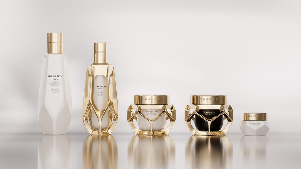
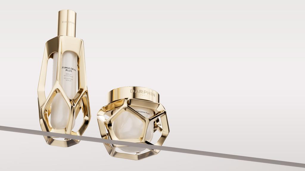
A revolutionary packaging system for luxury dermocosmetics: a sculptural metallic cage with an openwork design that houses a refillable glass core made with 30% recycled material. Inspired by the skin's natural cellular matrix, the packaging translates nearly 20 years of research on morphological aging into a tangible visual and tactile language, creating a distinctive identity across the entire skincare range.
This design redefines luxury packaging by making scientific expertise visible through form. The architectural cage structure transforms functional packaging into a collectible beauty object, establishing a new aesthetic benchmark in premium dermocosmetics. It proves that sustainability and luxury can coexist harmoniously, the refillable system preserves the outer case as a durable, precious object while enabling responsible consumption.
This approach challenges the industry's traditional disposable model, positioning eco-consciousness as intrinsic to brand value rather than an afterthought. The project reconciled seemingly opposing requirements: high-end luxury codes with sustainability imperatives, complex refill functionality with seamless aesthetics, and technical precision with emotional appeal.
Achieving flawless execution of the openwork metallic structure while maintaining consistency across multiple formats required exceptional engineering. The design overcame these challenges through innovation protected by two international patents, demonstrating unprecedented technical sophistication in dermocosmetic packaging.
The packaging delivers significant environmental improvements : 47% weight reduction for serums and 40% for creams, substantially lowering carbon footprint during production and transportation. The refillable system reduces waste while creating lasting consumer engagement.
BRAND IDENTITY & CONNECTED PACKAGING PLATINUM (Sponsored by io.tt)
HEINZ Dipper, Kraft Heinz
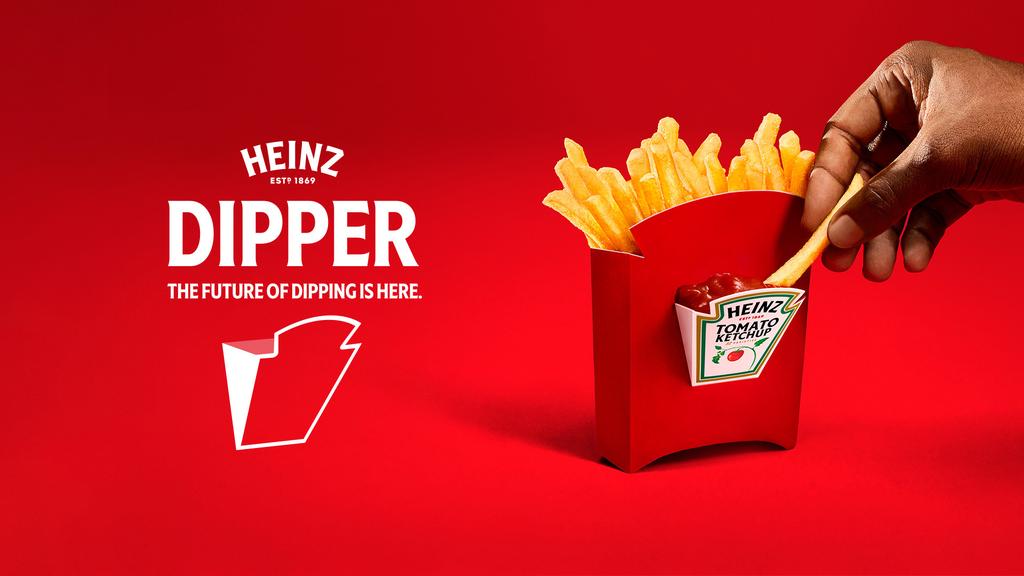
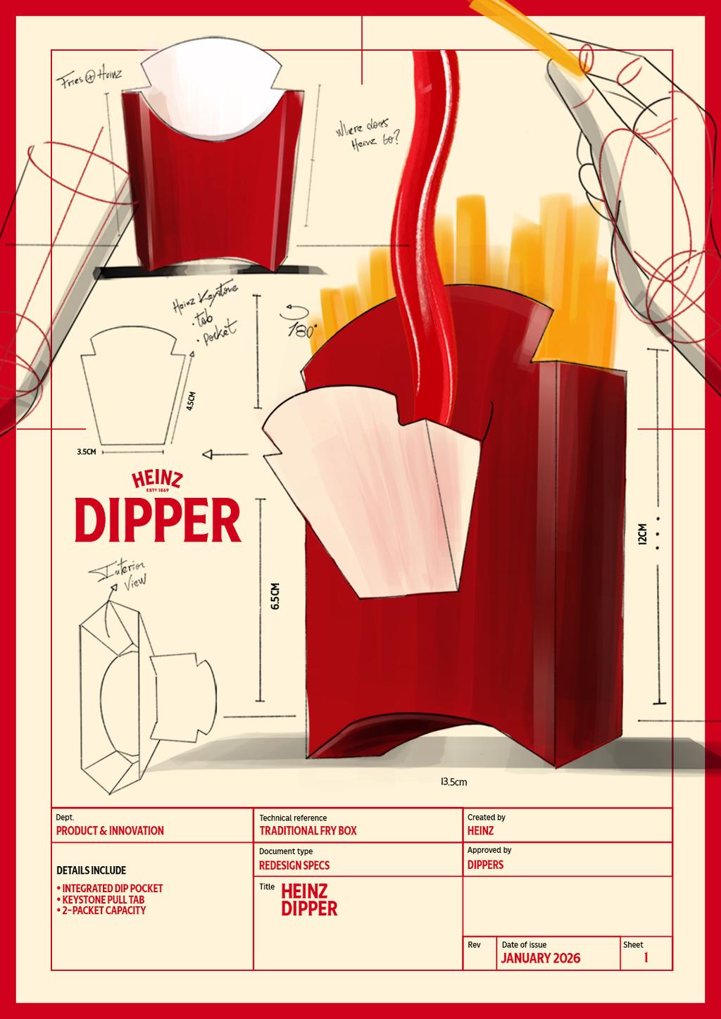
The Heinz Dipper redefines the traditional fry box through a structural innovation that integrates a built-in dipping pocket, aligning packaging design with real consumer behaviour while increasing brand presence at the point of sale.
One of the most common behaviours, dipping fries into ketchup, has historically required separate handling, creating inconvenience and limiting usage in on-the-go environments.
The Heinz Dipper resolves this disconnect through a design-led approach. Using the geometry of the Heinz keystone logo as a structural blueprint, a fold-out compartment is engineered directly into the fry box, creating a stable, accessible space for condiments.
This integration enables a seamless dipping experience without adding components, increasing pack complexity, or disrupting existing formats. The solution required precise development of fold mechanics, material strength, and load-bearing performance to ensure the compartment could securely hold condiment portions while maintaining structural integrity during transport and use.
Beyond function, the design transforms the fry box into a high-impact point-of-sale asset. By embedding brand identity into the architecture of the pack, it creates immediate visibility in fast-paced foodservice environments such as restaurants, stadiums, and events. Each unit serves not only as packaging, but as a branded interaction at the moment of consumption.
Scalable across global markets and compatible with existing service models, the Heinz Dipper demonstrates how structural packaging design can solve a universal consumer need while elevating packaging into a tool for both usability and commercial impact.
FOOD PLATINUM
Calma & Chicha, Mutta Estudio
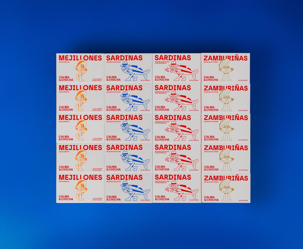
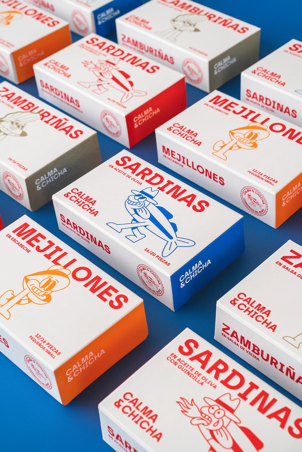
Conservas El Capricho is a family-owned company dedicated to preserved foods in a small town in northern Spain. A company deeply rooted in family tradition and in the history of canning in Santoña (North of Spain).
The new brand needed to break away from the standards of the Spanish sector, moving away from tradition to create a more contemporary and approachable product that would allow the company to reach new markets.
From the construction of the name to the branding and packaging, the project focused on developing a fun and fresh concept that would position the brand in a younger, more international market.
The graphic universe is built around two characters, two sisters: “Calma”, a peaceful and empathetic sardine and a strong defender against injustices of the sea; and Chicha, a fun and eccentric mussel who cannot be held responsible for her actions when she’s hungry—making room for the introduction of new characters in the future.
Both the illustrations and the colour palette are cheerful and playful, capable of capturing the consumer’s attention and allowing the brand to stand out from its competitors at a single glance.
HOME, LEISURE & OTHER MARKETS PLATINUM
Mono-Kinetic: AR Smart Wearable Packaging Collection, Hong Kong Even Realities Limited
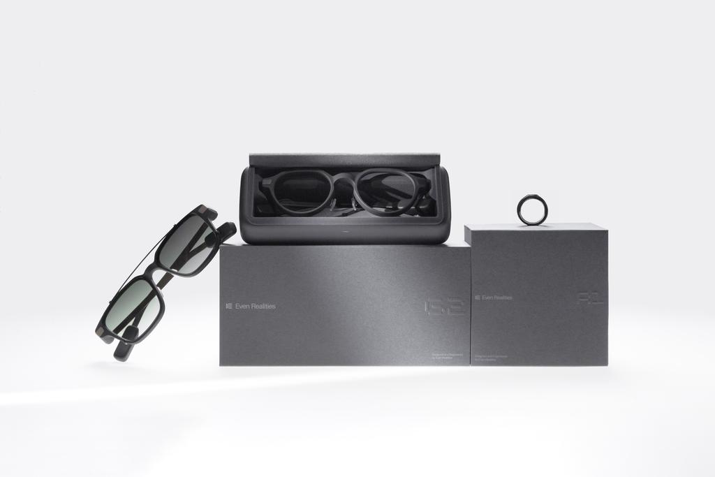
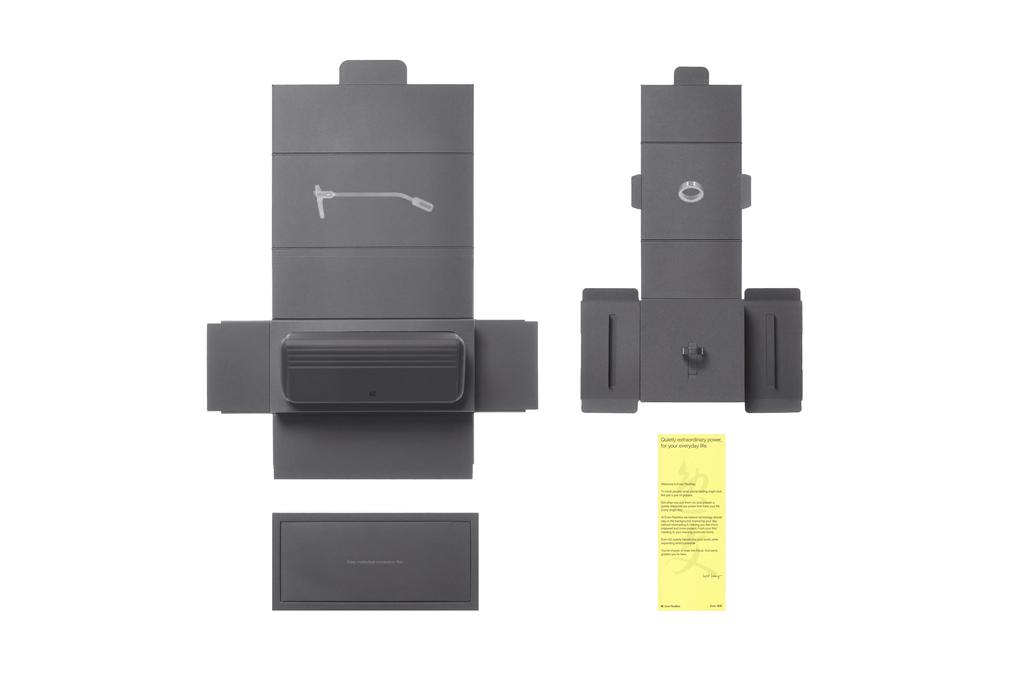
This collection reimagines the first encounter with AR technology. Moving away from typical consumer electronics aesthetics, the design prioritizes tactile authenticity. Through deep paper craftsmanship, it creates a unique experience where material tension communicates an elegant, restrained brand narrative.
The challenge? Achieving robust protection and an extreme unboxing ritual through a minimalist mono-material strategy.
Using a mono-material approach with precision V-grooves, the structure features gravity-sensing unboxing. As the internal tray is lifted, four side panels naturally drop away, presenting the product as if it were on centre stage—transforming the process into a ritual of mechanical beauty. This geometric folding logic provides all-dimensional drop protection for delicate optics without secondary buffers.
Addressing logistical complexity, the structural compatibility accommodates 10 ring sizes within a single SKU. This ensures the ring remains vertical and the logo stays centred upon opening, maintaining flawless visual consistency across the series.
The collection eschews over-printing for physical blind embossing and monochromatic ink, significantly reducing chemical impact. By utilizing a single material, the design returns to the essence of sustainability, ensuring maximum recyclability through a simplified material life-cycle.
PROFESSIONAL CONCEPTS PLATINUM
NUDE, Stencoil SL (Abisal Studio)
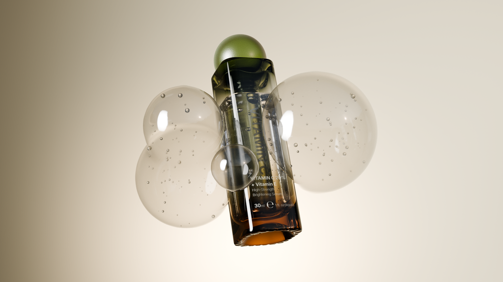
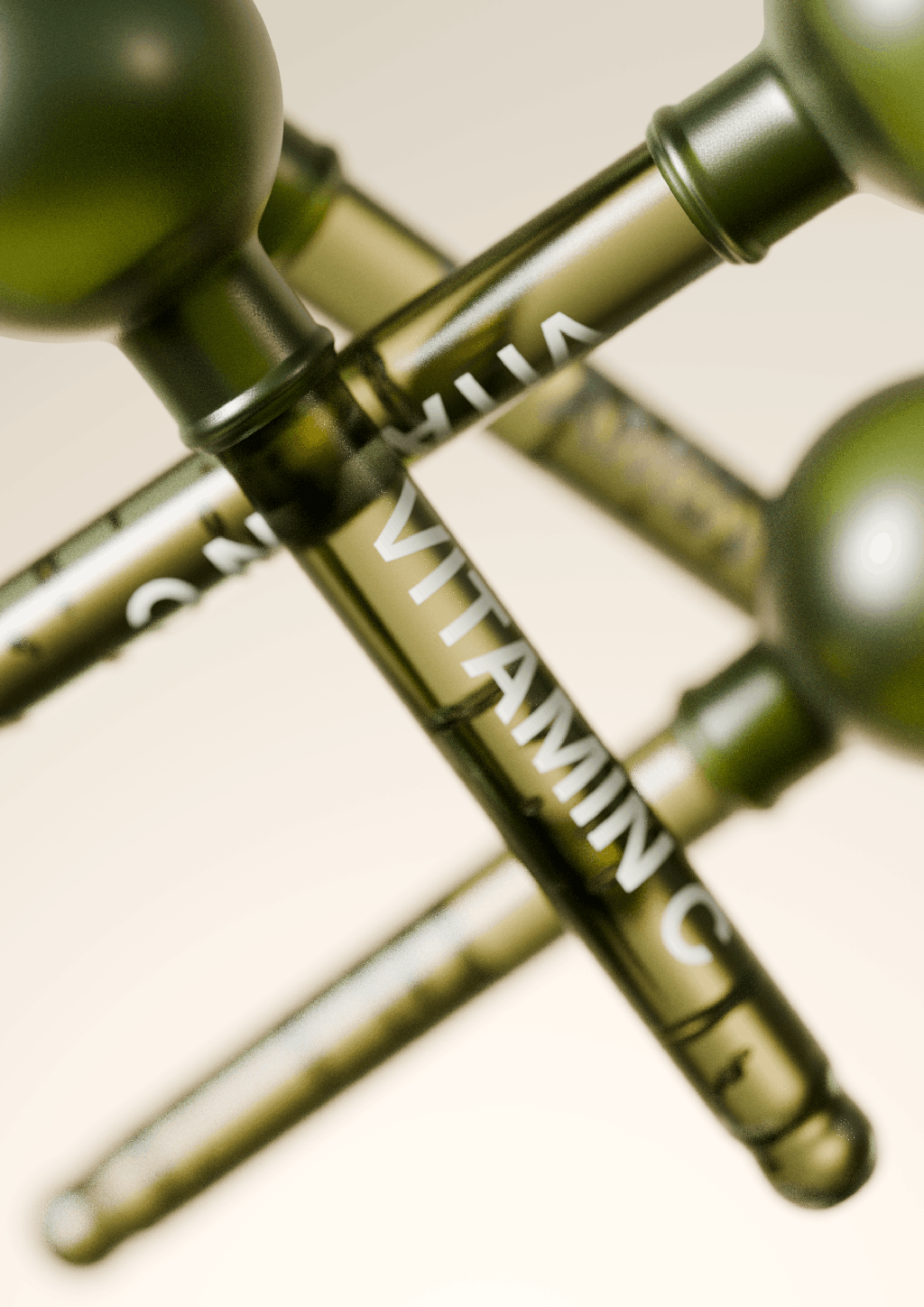
The luxury beauty industry traditionally relies on complex, multi-component dropper systems. This results in unnecessary plastic waste and complicates the recycling process. This concept challenges that status quo by redefining luxury through reduction.
A conceptual, ultra-minimalist packaging design for the high-end cosmetics and skincare sector. Visually, it explores architectural tension by contrasting a rigid, heavy-base rectangular glass bottle with a pure, soft spherical dropper. It relies on structural purity and premium materials rather than graphic application to communicate sophistication.
By engineering the dropper's suction bulb to function simultaneously as the bottle's primary closure, the design entirely eliminates the need for extra plastic collars and overcaps. Its impact on the packaging industry lies in demonstrating that true premium appeal does not require material excess. Instead, structural ingenuity can achieve both tangible sustainability—through component reduction—and a high-end, sculptural aesthetic.
The distinctive, geometric silhouette also acts as an iconic brand asset. It creates a highly recognizable product that stands out on retail shelves and digital environments, communicating "quiet luxury" without relying on heavy, trend-dependent graphic design.
SUSTAINABLE DESIGN PLATINUM
COMBOX, Sanopack Innovation
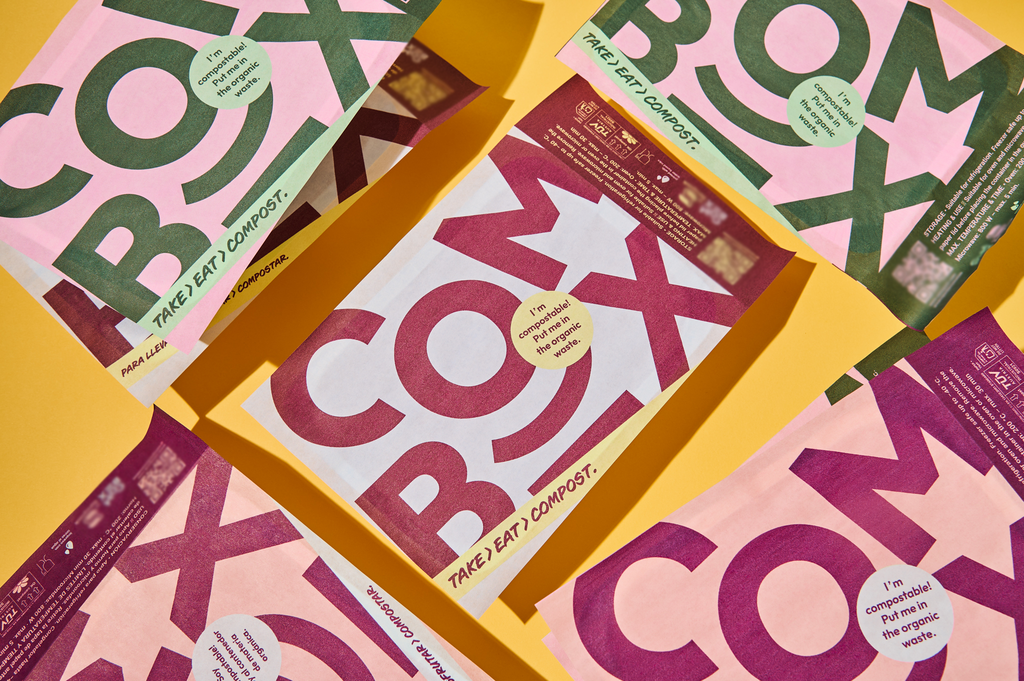
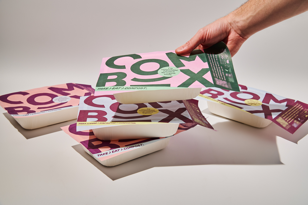
COMBOX integrates sustainability across materials, production and real use conditions. It replaces conventional multi-layer plastic takeaway packaging with a paper-based structure combined with a certified compostable biopolymer coating, providing grease and moisture resistance while maintaining compostability.
In takeaway food applications, packaging is typically contaminated by grease and food residues, making effective paper recycling difficult. COMBOX addresses this by offering a compostable solution aligned with real end-of-life conditions and actual disposal behaviours.
The material structure simplifies conventional complex laminates, reducing material complexity and improving end-of-life management. Digital printing enables on-demand production, eliminating minimum orders and significantly reducing overproduction, obsolete stock and material waste. Each unit is produced only when needed, improving resource efficiency across the supply chain and reducing storage and transport impacts. Water-based inks reduce emissions and avoid solvent-based processes, improving environmental and production safety.
Functionally, COMBOX allows transport, reheating and consumption in the same container, reducing the need for additional packaging elements and helping prevent food waste.
Designed for scalability, the system enables brands to adapt packaging content without generating waste from unused inventory.
NXT-GEN, BEST STUDENT WORK
CUBBLY shampoo, Anaëlle Van Laer - LUCA School of Arts
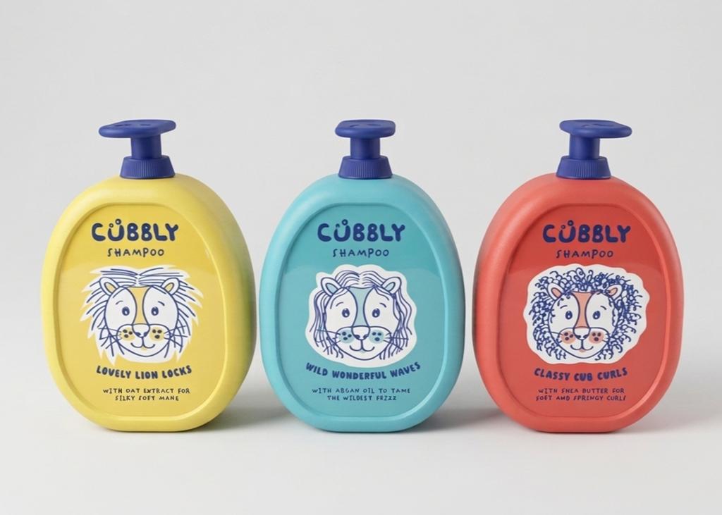
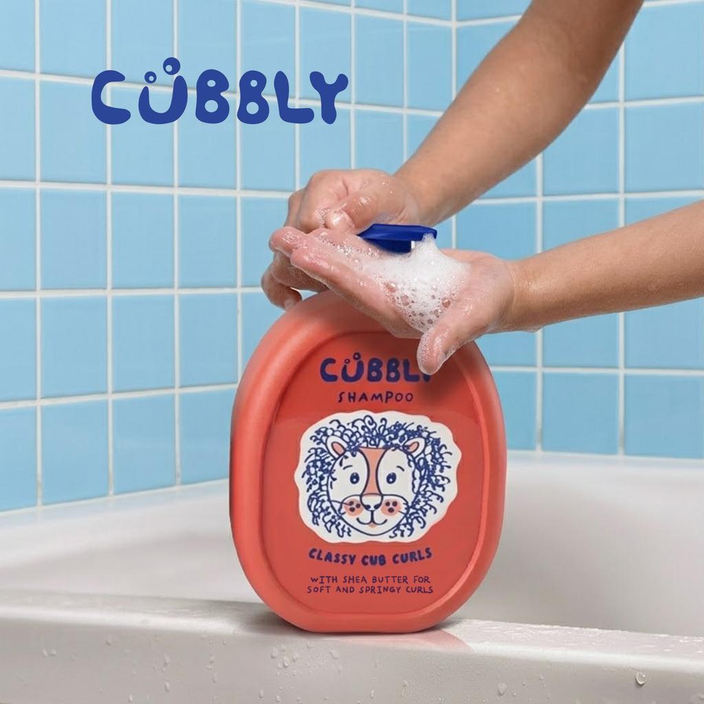
CUBBLY is an innovative children’s shampoo concept built on a simple yet often overlooked reality: every child has a unique hair type.
Within the children’s personal care industry, a one-size-fits-all approach is still too common, despite the fact that different hair textures require different care. CUBBLY addresses this gap by embracing inclusivity and personalization, creating products specifically tailored to a variety of hair types. The initial product line includes three variants for straight, wavy, and curly hair. These differences are expressed not only through the formula but also visually, using a series of playful mascots—little cubs with distinct hairstyles.
Through a thoughtful combination of colour, illustration, and typography, the packaging becomes intuitive and accessible, allowing both children and parents to quickly identify the right product. At the same time, it communicates the product’s properties and key ingredients in a clear and engaging way.
CUBBLY goes beyond visual communication alone. The bottles feature a pump system that encourages children to wash their hair independently, increasing ease of use while supporting their sense of autonomy and confidence.
By seamlessly combining design and functionality, CUBBLY delivers an inclusive and educational experience, setting a new standard for how packaging can contribute to awareness, usability, and self-confidence in children.
This year’s Special Awards, which recognise remarkable achievements in packaging design by individuals and agencies, were also handed out during the Gala:
- People’s Choice Award: Korean Bros by Truffl (United States)
- Educator of the Year Award: ELISAVA (Spain)
- Best Newcomer: GOOD PEOPLE WANDER (France) & Clay Andrews (Australia)
- Design Agency of the Year: Servaire & Co (France)
- Best Use of Embellishment Award - Alongside our Special Awards, we’re also delighted to feature a sponsored recognition, created in collaboration with our partner KURZ. The awarded designs are Grimaud from Good People Wander (Gold), Gifting The World Range by Hotel Chocolat (Silver) and DIVERSA Tequila by Tridimage X Boldrini & Ficcardi X JVD Estudio X Infinito X LIP (Bronze).
For more information on the Special Awards winners please see here, and view the full list of the 2026 winners in the Winners Gallery !