


Mojave Mallows by Stephanie Ka-Man Chan
Stephanie Ka-Man Chan delivers a visual revamp for startup brand, Mojave Mallows with a fresh, psychedelic visual identity
Stephanie Ka-Man Chan delivers a visual revamp for startup brand, Mojave Mallows with a fresh, psychedelic visual identity
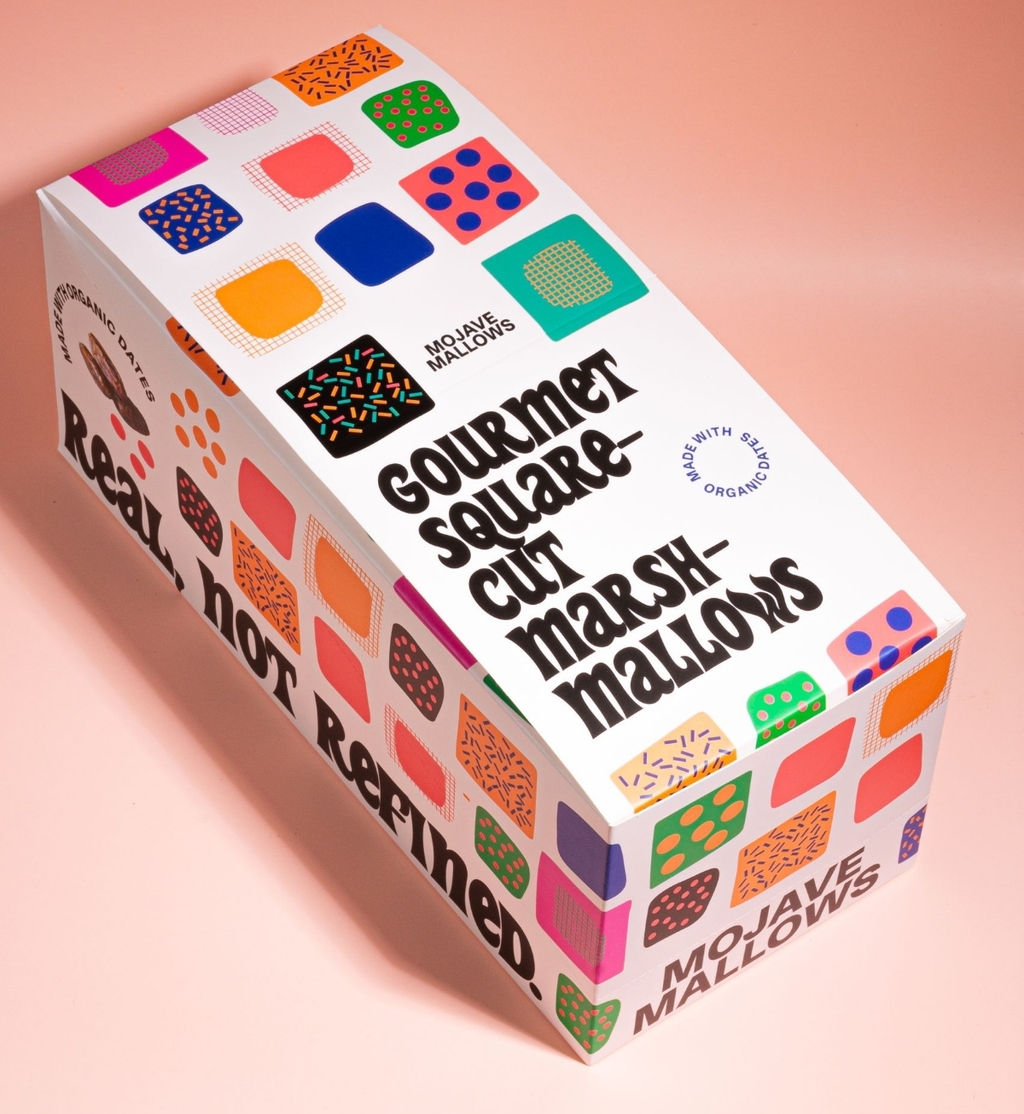
Majave Mallow’s redesigned visual identity is a vibrant celebration of colours and patterns. Bold, bright, and vibrant colours replace photography and a visual identity crafted for a shelf standout. The rebrand focuses on a unique hand-cut marshmallow shape as an illustrated motif on the packaging, point-of-sale boxes, packing tape, and bags.

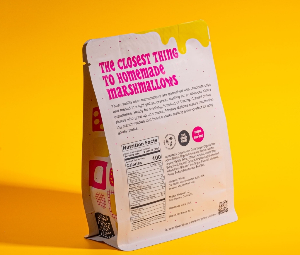
Replacing the previous smaller bags, the large bags offer a wider area allowing room for a playful approach with swirly psychedelic illustrations adding a nostalgic element to the design. The brand's commitment to sustainability is showcased in using post-consumer recycled materials for all pouches, reflecting a dedication to eco-friendly packaging.
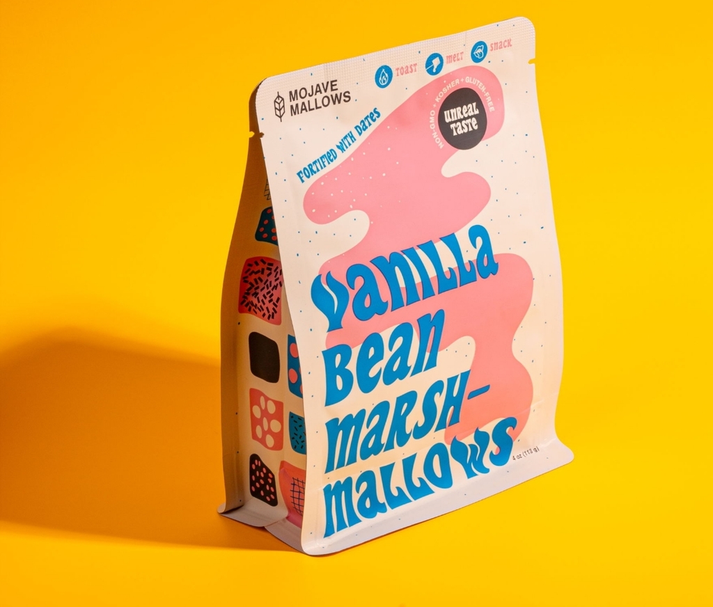
The typography, colour palette and visual illustrations match the characteristics of a marshmallow. The stretched and distorted typeface matches a melted marshmallow. Adding to its gooey attributes the overall design is a fun, swirly and psychedelic visual identity.
For more information on Stephanie Ka-Man Chan’s design, visit their website or follow them on Instagram.
Want to receive more monthly packaging inspiration? Sign up for our newsletter!