


Monthly Discoveries, April 2025
Need a bit of inspiration? Look no further. We're always looking to recognise the best packaging design from agencies worldwide, so we have pulled together this month's most liked from our social channels to keep you inspired
Pentawards, the world's most prestigious packaging design award, not only recognises the best packaging design through competition but also promotes the importance of packaging design through live events and social media. We are committed to being the bridge between excellent design organisations and brands that are always looking for the best packaging design solutions
Take a look below at some of the most popular designs we shared this month across our social media channels.
Youth to the People by Sebastian Ariel Curi


Sebastian Ariel Curi's packaging design for Youth to the People.
This limited-edition packaging is a vibrant celebration of the brand's community. The design bursts with colour and movement, featuring dynamic illustrations of people joyfully interacting with the product—turning their appreciation into a lively, party-like scene.
Find out more about Sebastian Ariel Curi here .
RAMI TORTI by Dispenser Studio


Dispenser Studio's packaging design for RAMI TORTI.
The packaging features a bold, hand-drawn illustration with organic, flowing shapes that evoke olive tree branches. The vibrant backgrounds contrasts with the dark glass bottle, whilst freehand typography adds an artisanal touch.
Find out more about Dispenser Studio here .
The Cocktail Cabinet by A Friend Of Mine


A Friend Of Mine Design Studio's packaging design for The Cocktail Cabinet.
A collectible series of cocktail recipe card packs, each featuring a bold die-cut shape inspired by its spirit—like an olive for Gin or an ice cube for Whiskey. Inside, vibrant gradients reflect the art of mixing drinks, while illustrated recipe cards combine classic design with cocktail expertise.
Find out more about A Friend Of Mine Design Studio here .
Pasta Fortuna by nju:comunicazione

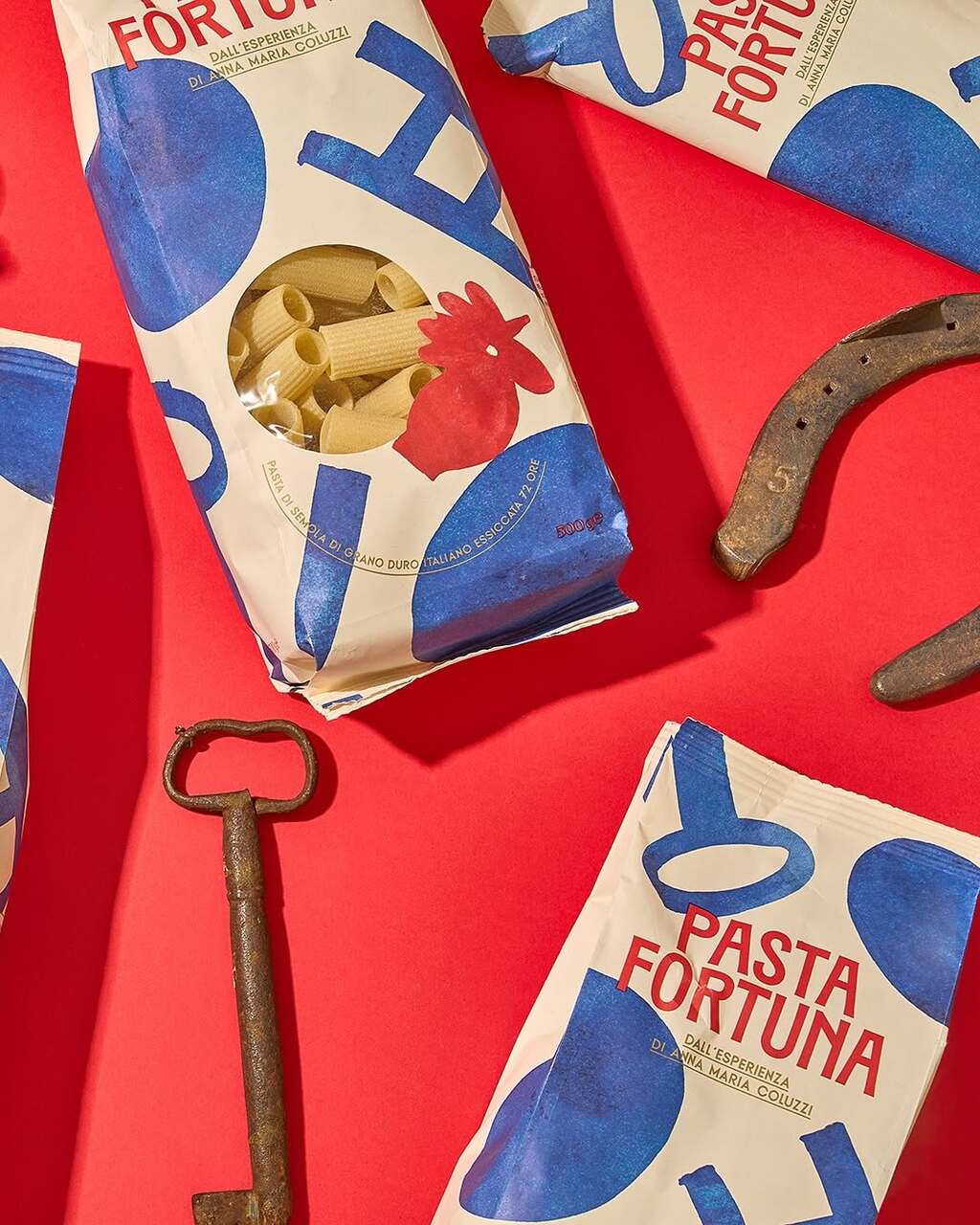

nju:comunicazione's packaging design for Pasta Fortuna.
Pasta Fortuna celebrates love, tradition, and good fortune through its packaging. Inspired by the Cucù rooster of Matera—an emblem of light and protection—it pays tribute to Mamma Anna Maria Coluzzi and the rich identity of Basilicata, capturing the true spirit of Southern Italy.
Find out more about nju:comunicazione here .
Lumé by Supernova Design


Supernova Design Inc.'s packaging design for Lumé.
The packaging breaks away from the clinical norm of skincare with a nature-inspired identity full of warmth and emotion. Soft, calming hues and detailed illustrations of natural scenes and human figures highlight each product’s function, creating a deeper, more personal connection with the customer.
Find out more about Supernova Design here .
B-Egg by Tubik Studio


tubik's packaging design for B-Egg.
This packaging features bright yellow-orange cartons with dripping yolk graphics and whimsical illustrations. When stacked or placed next to each other, the packaging create engaging visuals that enhance the playful design.
Find out more about tubik studio here .