


Monthly Discoveries, March 2026
Need a bit of inspiration? Look no further. We're always looking to recognise the best packaging design from agencies worldwide, so we have pulled together this month's most liked from our social channels to keep you inspired
Pentawards, the world's most prestigious packaging design award, not only recognises the best packaging design through competition but also promotes the importance of packaging design through live events and social media. We are committed to being the bridge between excellent design organisations and brands that are always looking for the best packaging design solutions
Take a look below at some of the most popular designs we shared this month across our social media channels.
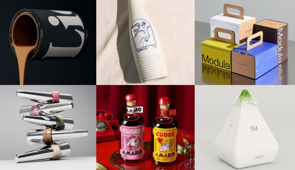
Lick by Midday
![]()
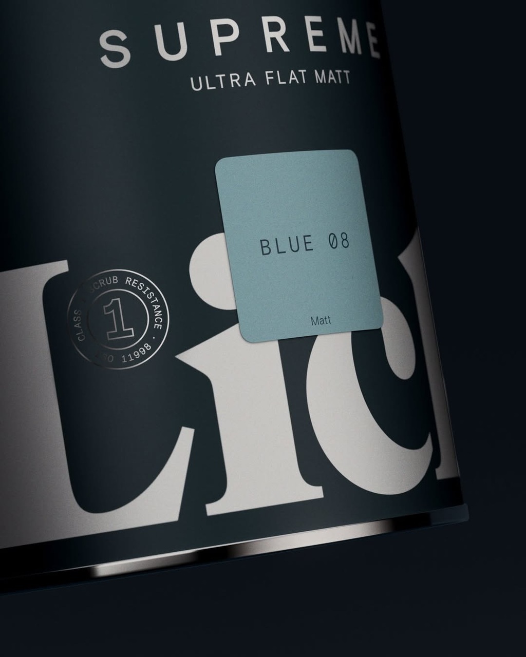
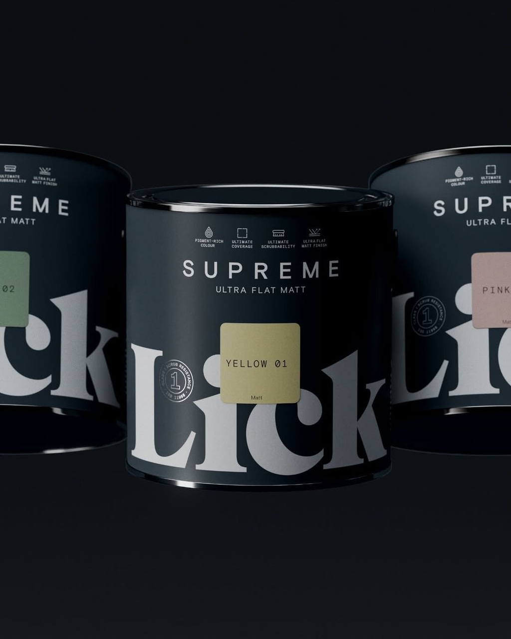
Midday's packaging design for Lick.
A premium extension for the brand, the design language refines and amplifies the core identity, while the bold decision to obscure the logo foregrounds the product’s defining feature - its superior coverage.
Find out more about Midday here .
Cuore Amaro by Beatrice Cristini
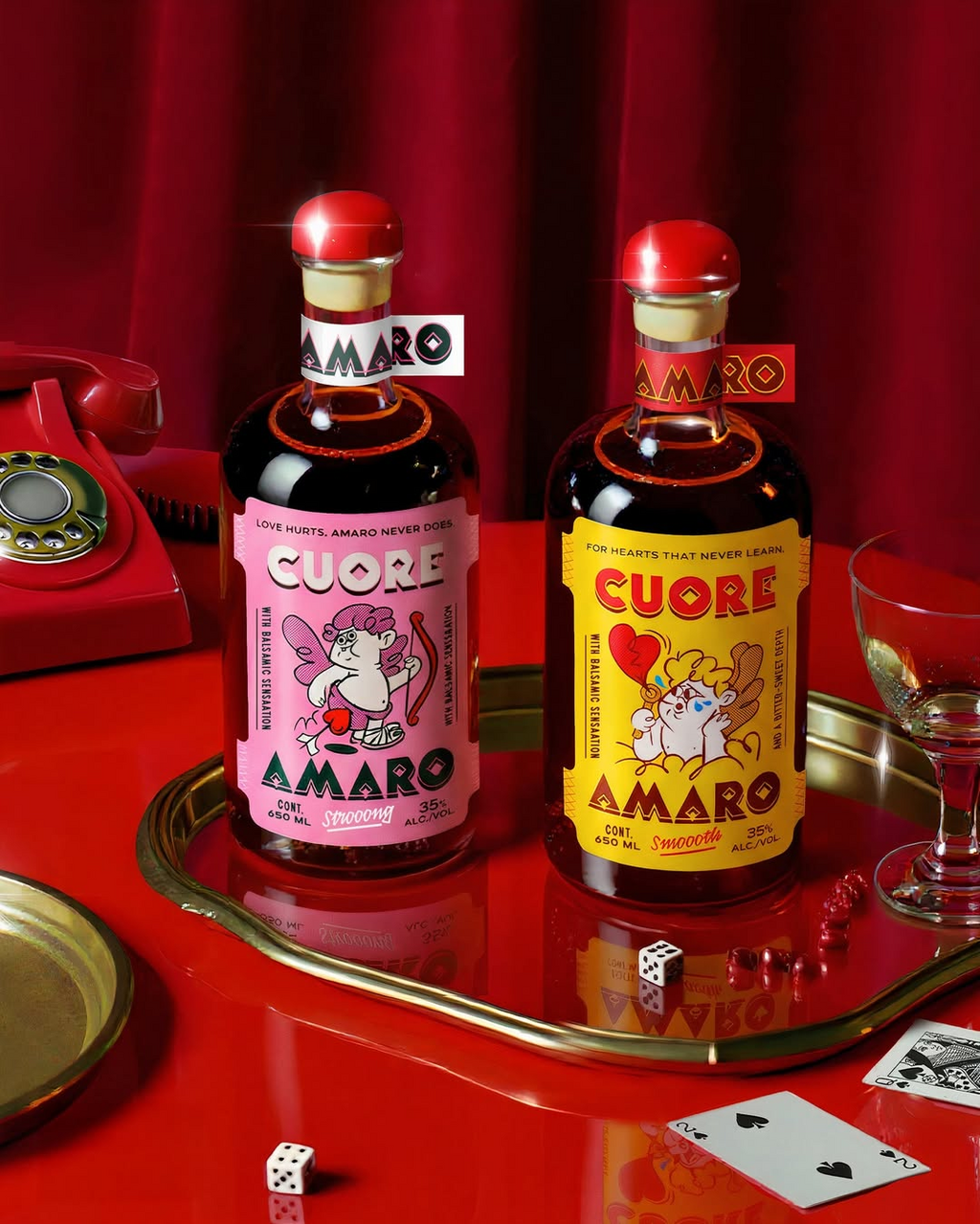
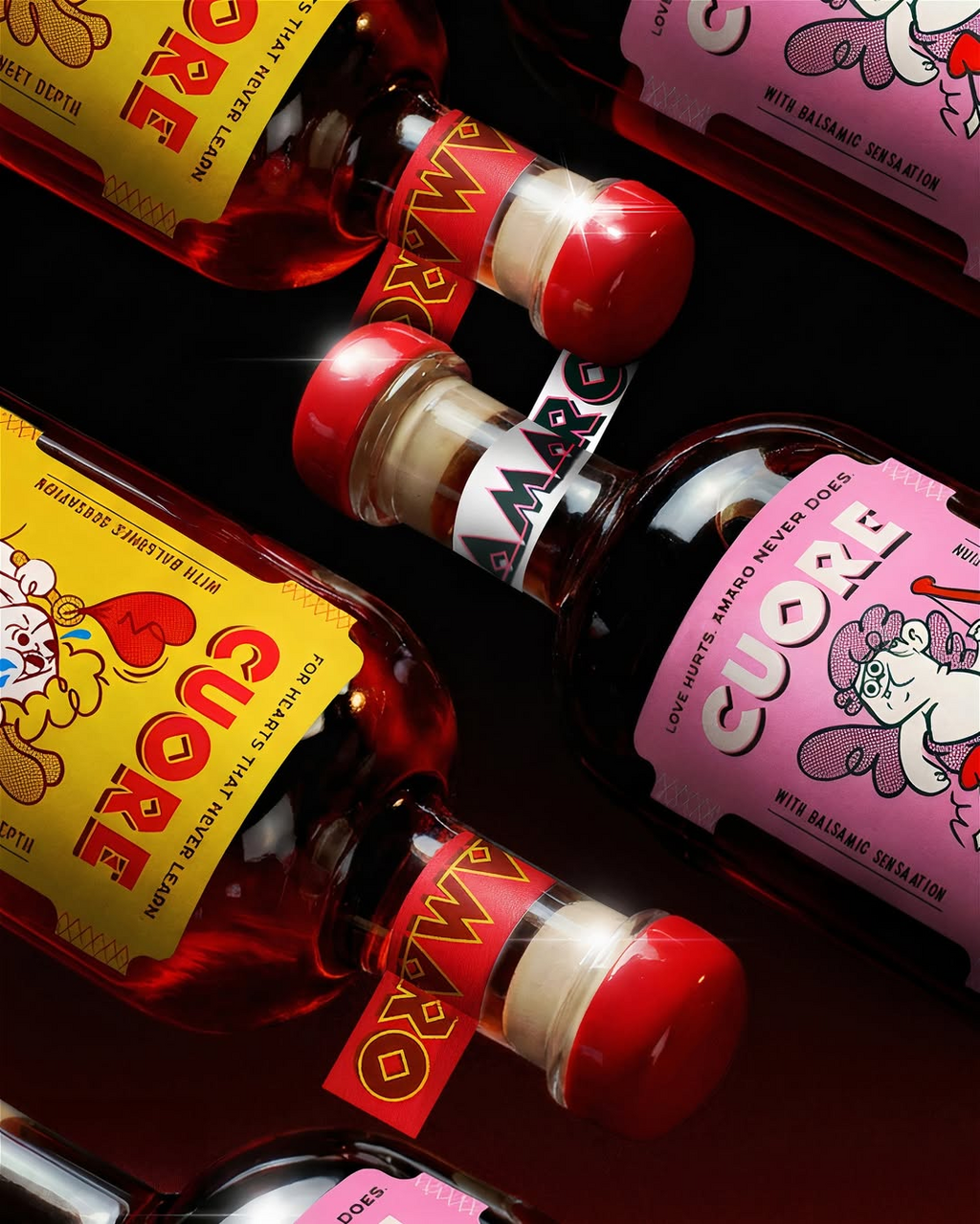
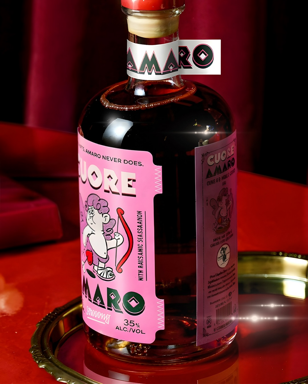
Beatrice Cristini's packaging design for Cuore Amaro.
The packaging plays with the drama of love and heartbreak through bold colour blocking and playful, character-led illustration. The vibrant pink and yellow labels contrast bittersweet storytelling with retro charm, turning the amaro bottle into a statement piece full of personality and attitude.
Find out more about Beatrice Cristini here .
Ammos Vodka
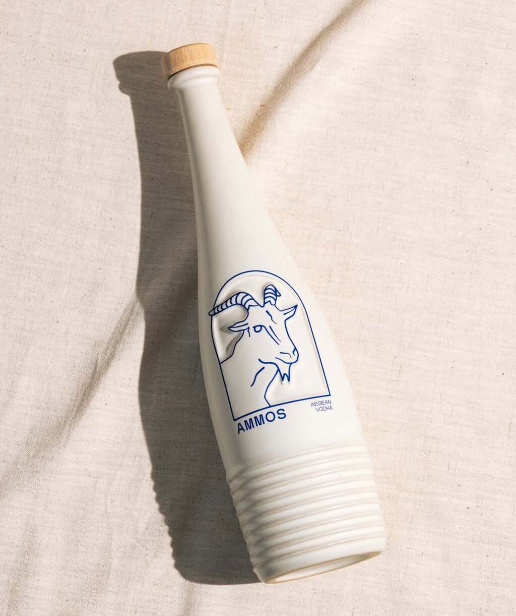
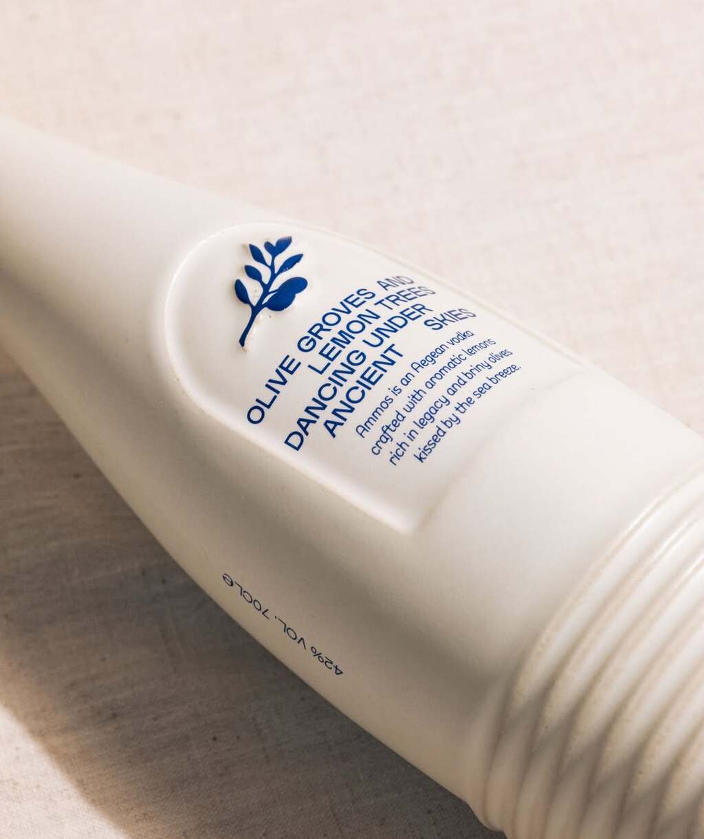
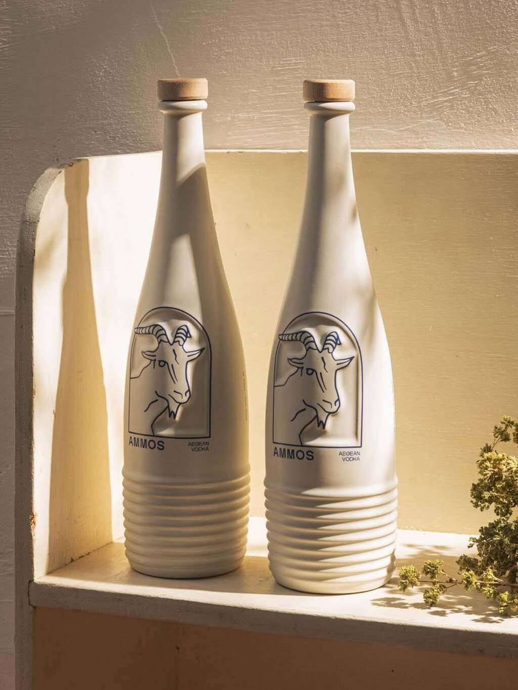
AMMOS Vodka's packaging design.
A bespoke ceramic bottle that blends craftsmanship with contemporary minimalism. The matte finish, sculpted base detailing and natural wooden stopper reflect a meticulous attention to detail, while the refined illustration adds a Mediterranean character.
Find out more about AMMOS Vodka here .
ORGN by d origin
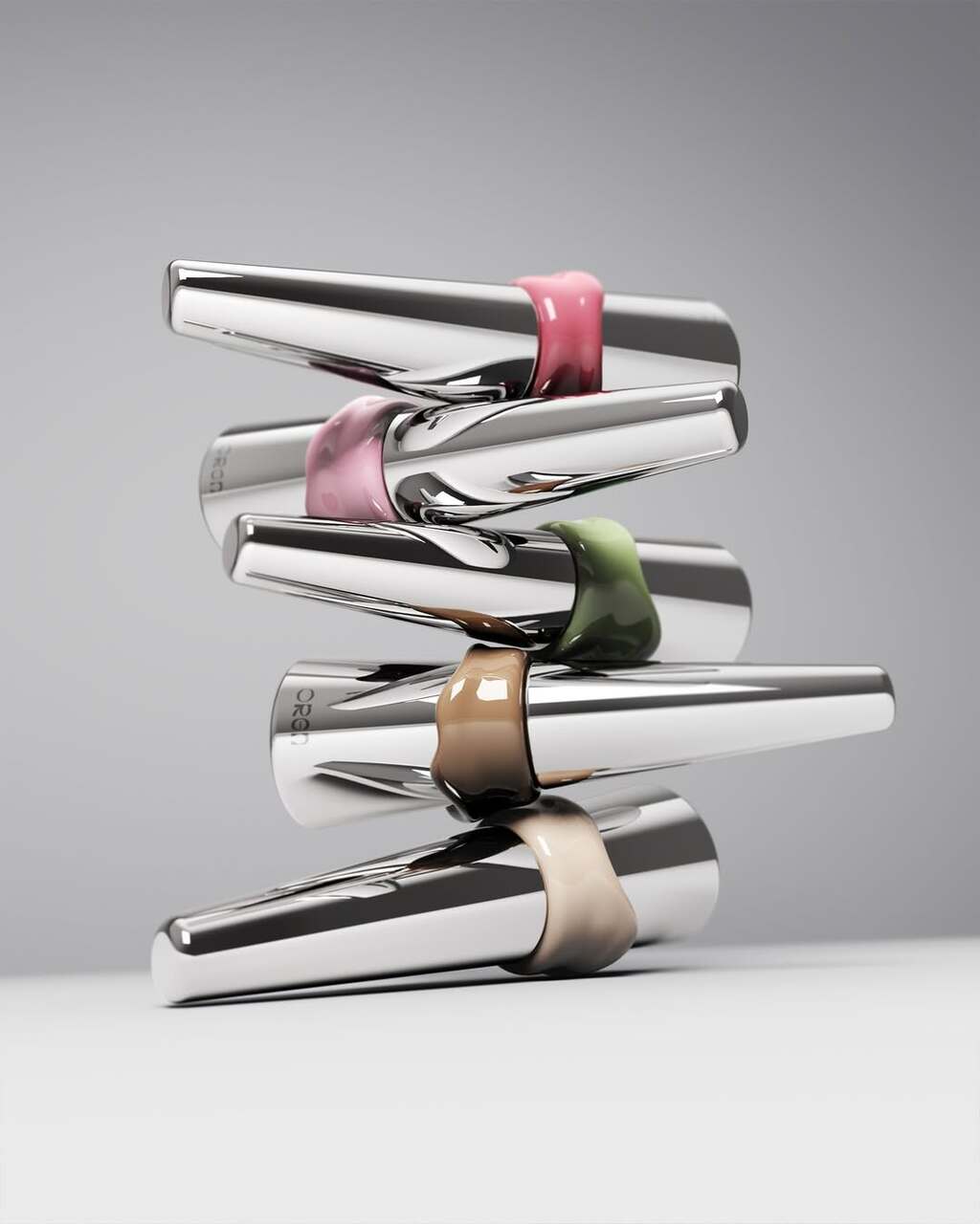
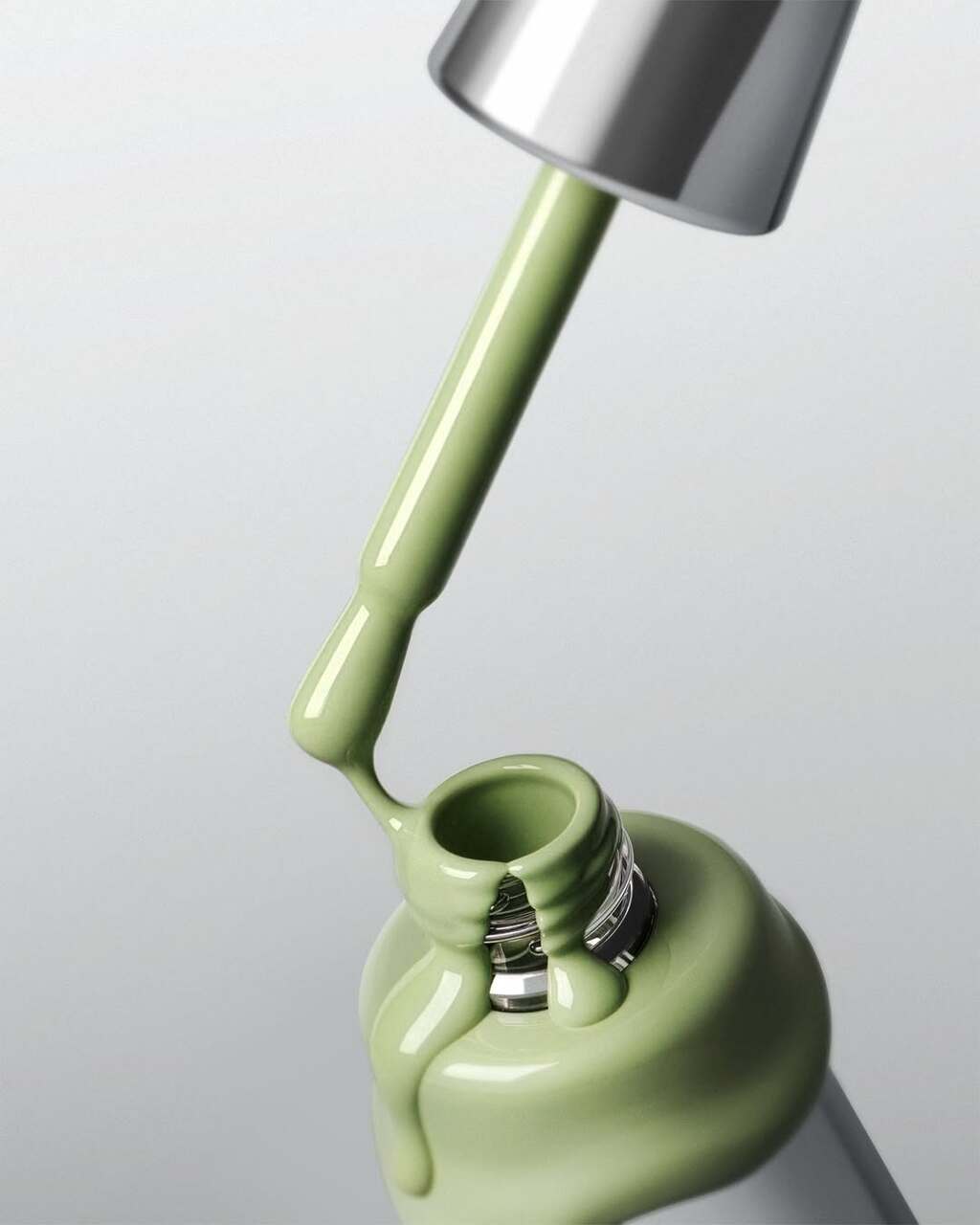
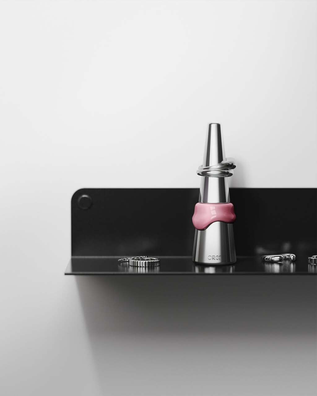
d origin's packaging design for ORGN nail polish.
The packaging captures the fluid moment when nail polish flows between two integrated parts, with the section matching the product’s shade. The contrast between solid metal and glossy elements gives Melting its distinctive presence - and when not in use, it doubles as a ring holder.
Find out more about d origin here .
Module Roast by Standard Format
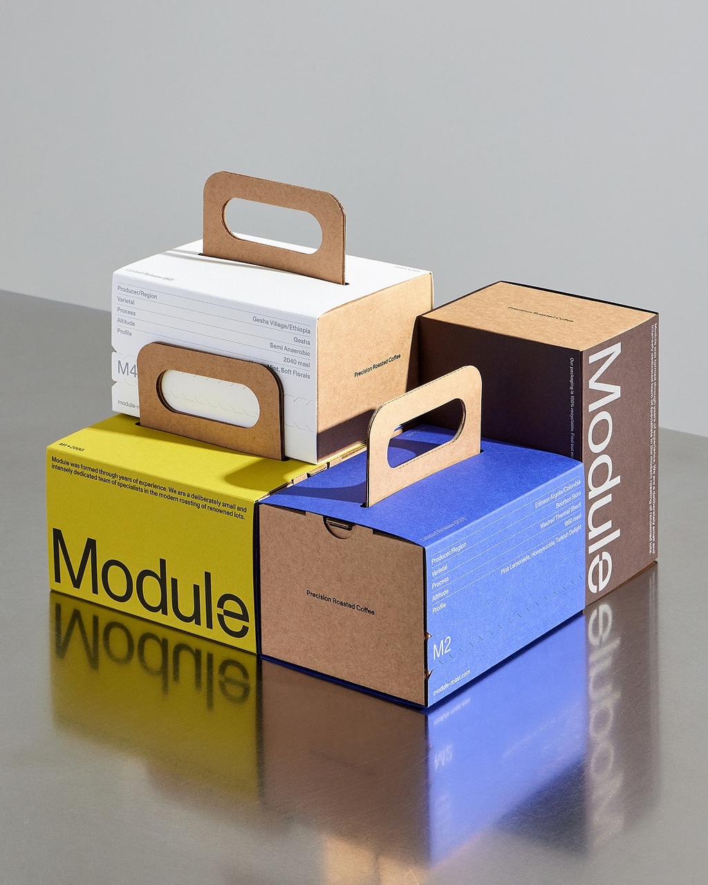
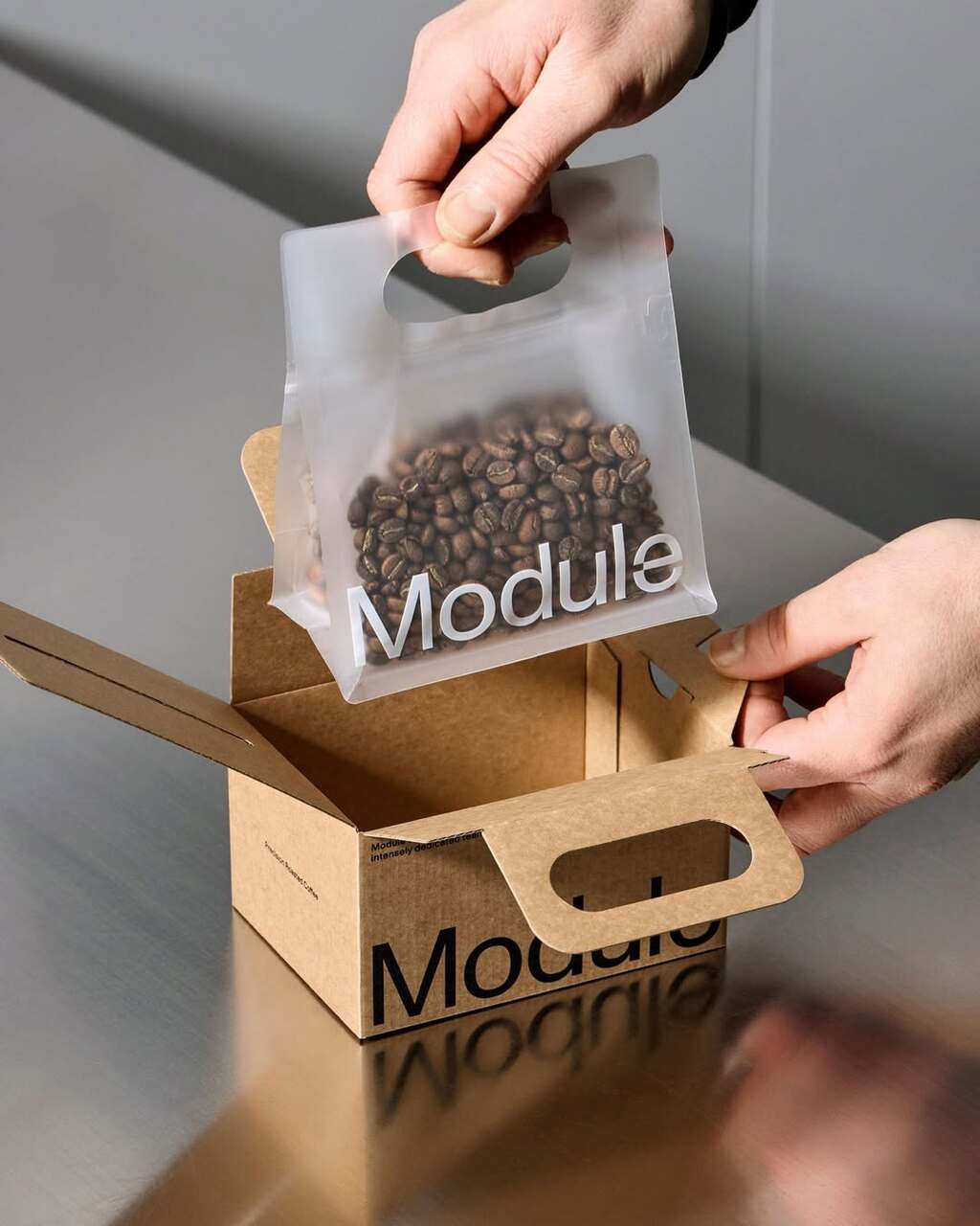
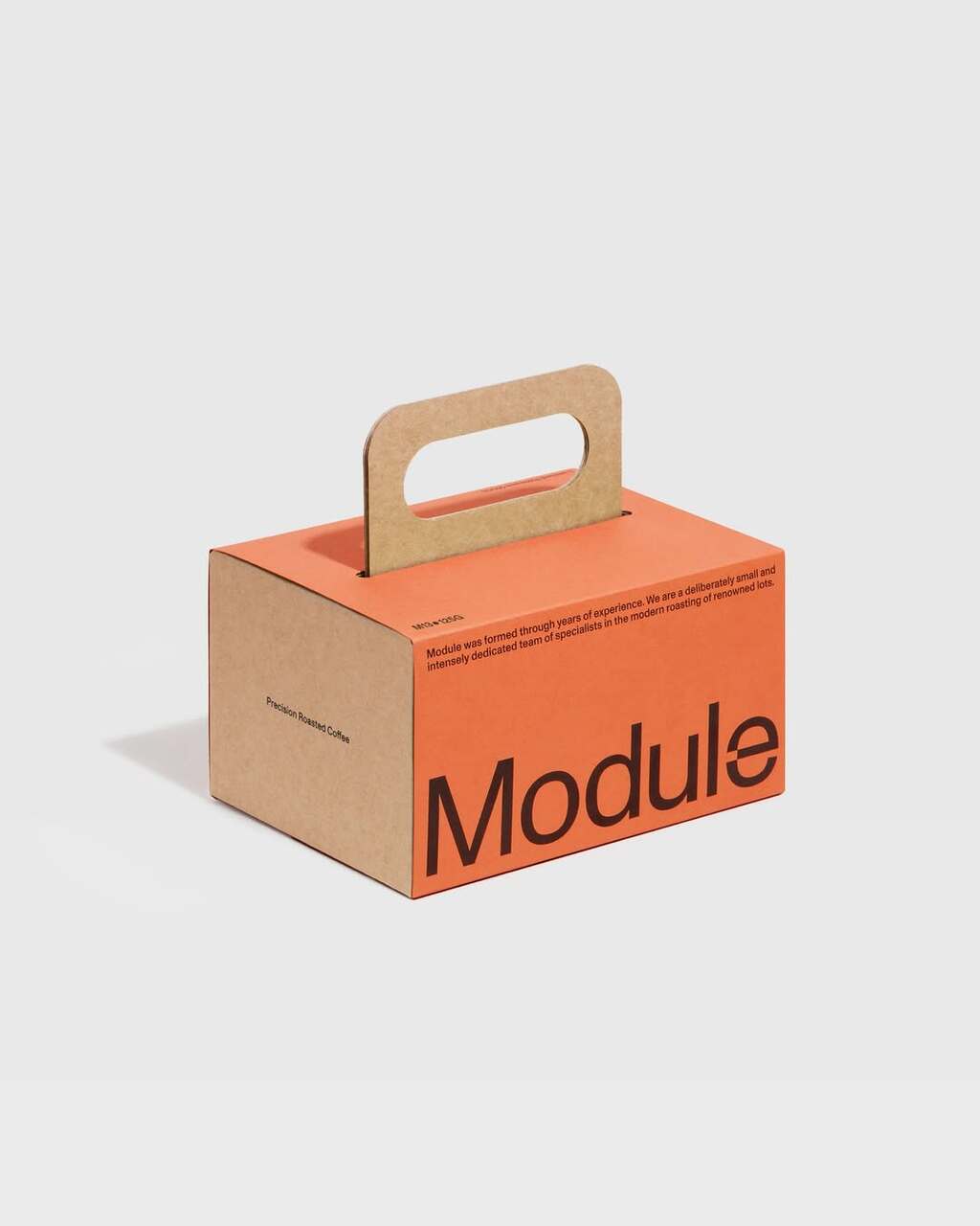
Standard Format's packaging design for Module Roast.
Featuring clean typography and colour-blocked labels, the packaging feels both premium and functional. Made from 100% recyclable materials, it can be fully recycled at home.
Find out more about Standard Format here .
FUJI by Marco Arroyo
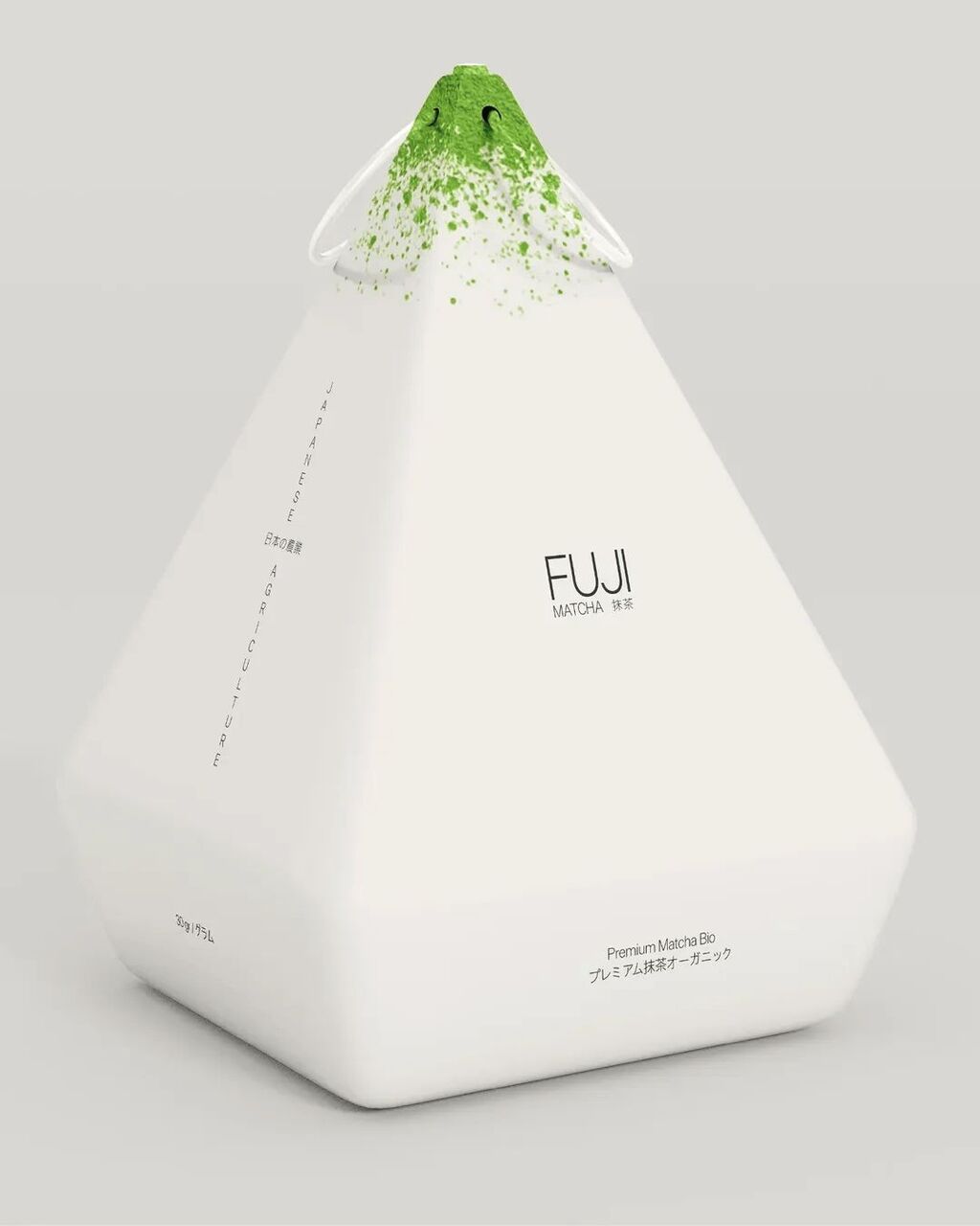
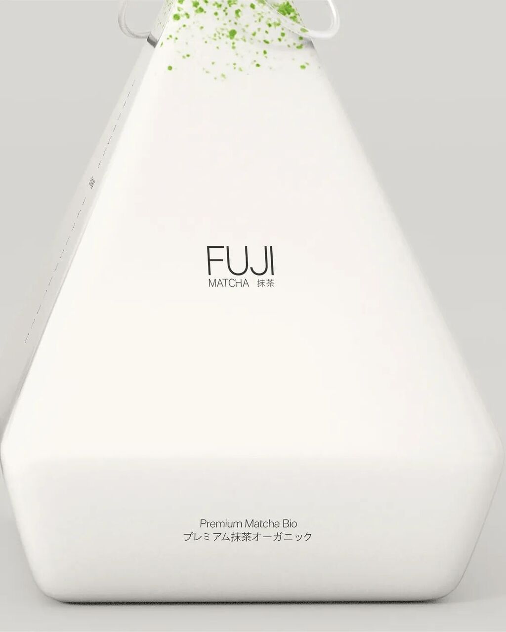
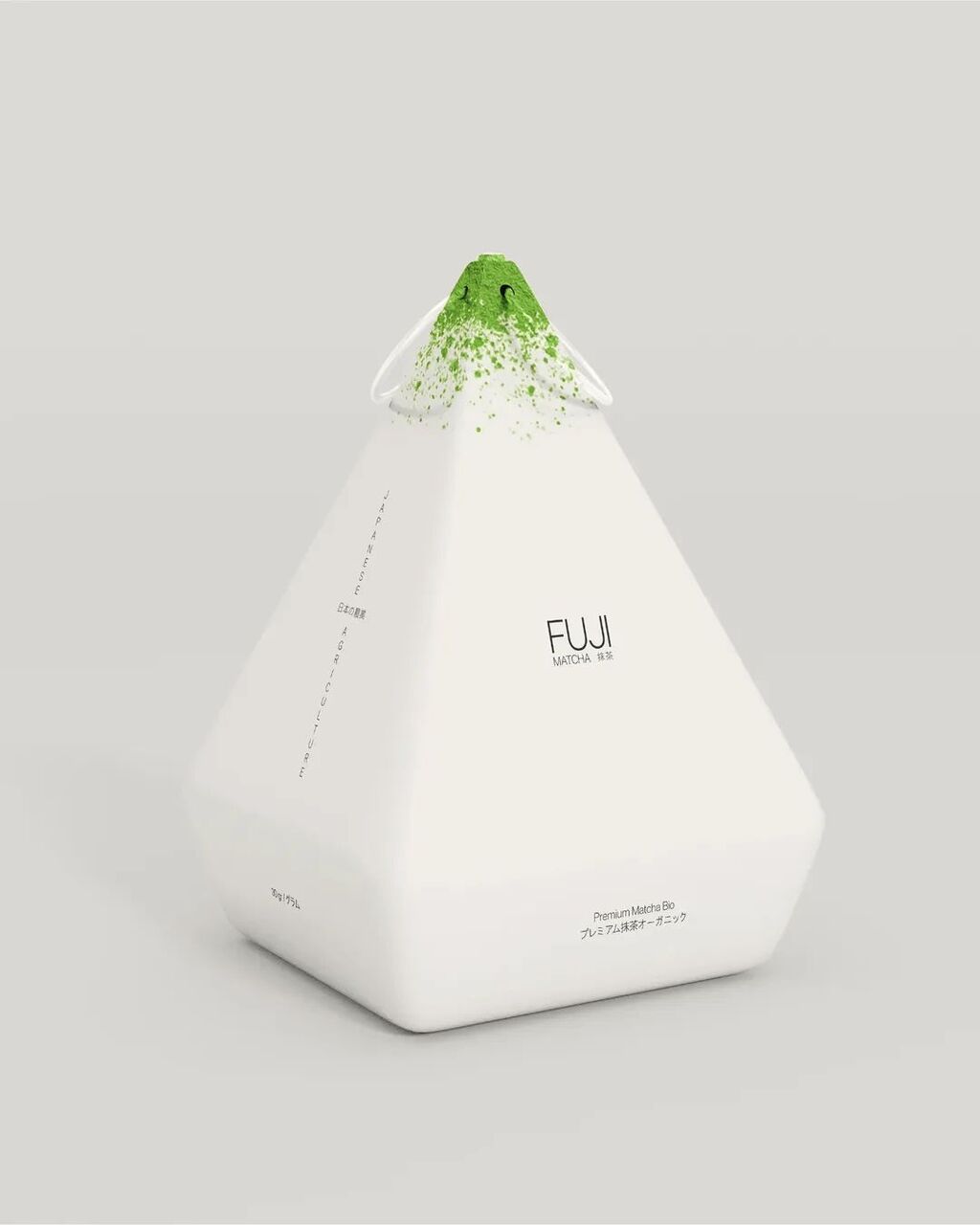
Marco Arroyo's packaging design for FUJI.
Inspired by the roots of Mt. Fuji, the packaging transforms the iconic peak into a sculptural, minimalist form that celebrates both origin and purity.
Find out more about Marco Arroyo here .