


One iconic brand. One iconic look. Coca‑Cola® sharpens its identity under one bold visual system
JKR unified the brand across 200 markets globally and created a visual identity as singular and iconic as Coca-Cola itself
JKR unified the brand across 200 markets globally and created a visual identity as singular and iconic as Coca-Cola itself
The Coca‑Cola Company launched a new global visual identity system developed by JKR, sustaining the brand’s iconicity with a fresh, dynamic, and scalable look. Built around the strategic principle to make every Coca‑Cola execution look and feel unmistakably Coca‑Cola, the visual refresh signals a new era of brand consistency and standout across more than 200 markets.
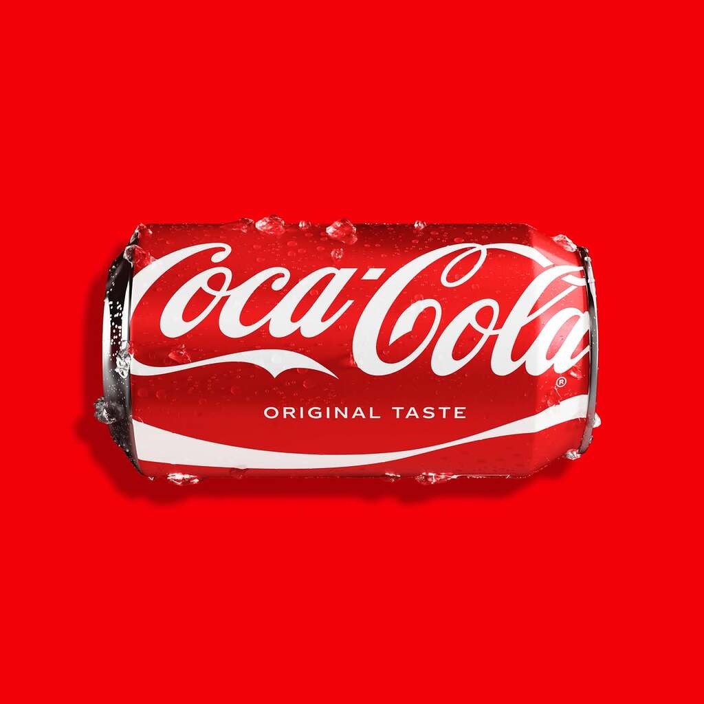
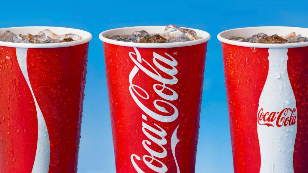
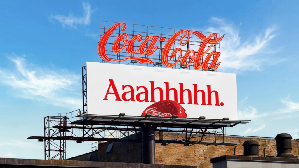
The new system amplifies Coca‑Cola’s iconic core assets. The bold red and white palette, the uplifting Dynamic Ribbon, the impactful Arden Square, and the unmistakable Spencerian script will be more prominent across packaging, retail environments, equipment, and digital experiences.
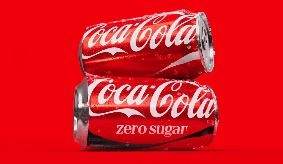
Coca‑Cola Zero Sugar design is evolving to draw from the iconic heritage of Coca‑Cola with its own distinct visual cues: larger “Zero Sugar” text, a prominent black Dynamic Ribbon on cans, and a black bottle cap on PET packaging.
"Coca‑Cola is one of the most recognized brands in the world, and with that comes a responsibility to keep evolving” said Arnab Roy, President, Coca‑Cola Global Category “This refresh is about being clearer and more consistent in how we show up, wherever people experience our brand. By building on the things people already know and love, we're creating a stronger foundation for growth while staying unmistakably Coca‑Cola."
So whether someone is reaching for Coca-Cola or Coca-Cola Zero Sugar, in New York or New Delhi, it will taste like Coca-Cola and look like Coca-Cola. Unmissable. Undeniable. Always iconic.
For more information on the design, visit JKR's website or follow them on Instagram .