


Susanne Kaufmann reveals updated packaging honouring alpine origins and eco values
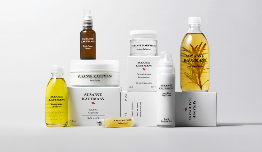
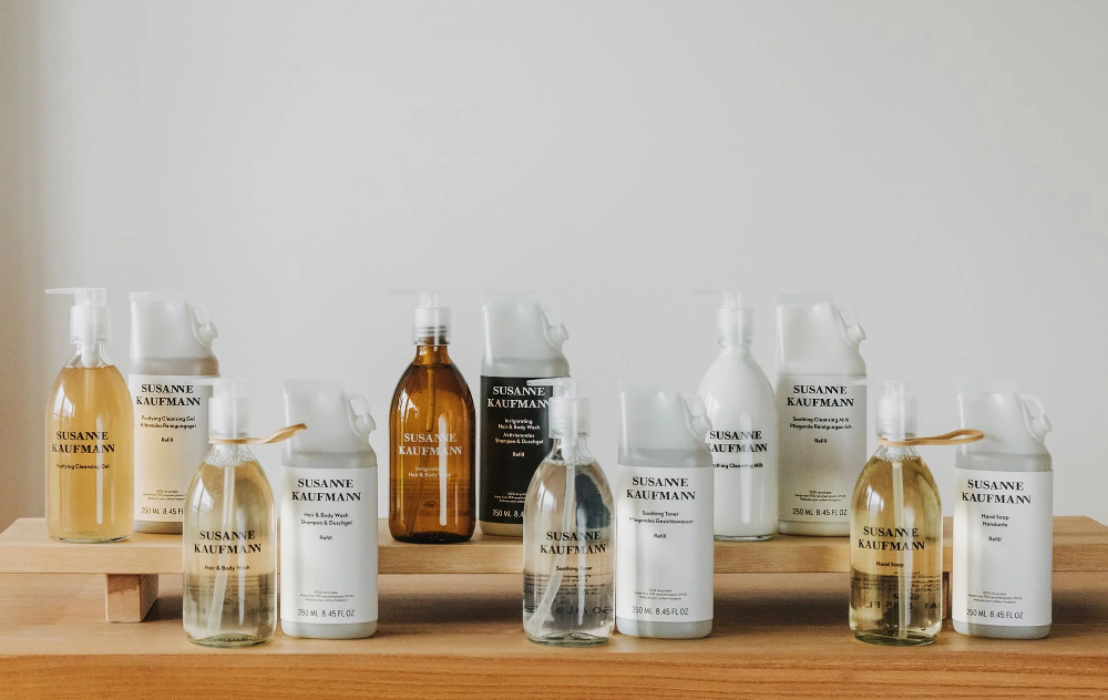
Collaborating with London-based agency Free The Birds, Susanne Kaufmann has introduced a refreshed packaging design that encapsulates its commitment to natural beauty, sustainability, and its roots.
Collaborating with London-based agency Free The Birds, Susanne Kaufmann has introduced a refreshed packaging design that encapsulates its commitment to natural beauty, sustainability, and its roots.
In an increasingly competitive luxury skincare market, Susanne Kaufmann sought to elevate and enhance its brand presence and packaging to better reflect its Alpine heritage and pioneering approach to natural beauty. The brand turned to Free The Birds to help articulate its vision and create packaging that reinforces its distinctive status while staying true to its commitment to mindful, sustainable beauty.
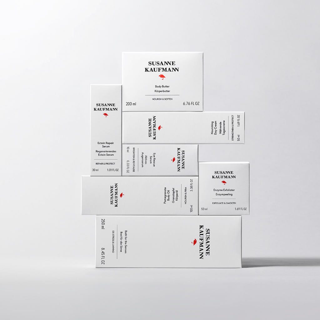
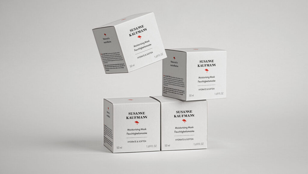
Free The Birds refreshed the secondary packaging system, balancing understated luxury with powerful storytelling. Central to the design is the introduction of the bird motif, an emblem previously used in seasonal gifting, now elevated to a permanent fixture across the range. Rendered in a bold red, the icon embodies the brand’s natural origins, efficacy, and dedication to sustainable wellbeing.
The packaging is enhanced with premium finishes, including a soft-touch material that echoes the tactile experience of the products themselves, and a clean, considered aesthetic that mirrors the brand’s holistic philosophy.
Free The Birds also helped to refine the brand’s positioning, ensuring that the story of its Alpine roots, spa heritage, and innovative clean skincare formulations is communicated consistently and compellingly across all customer touchpoints.
For more information on the design, visit Free The Birds' website or follow them on Instagram.