


Trends revisited: Mid-year reflections
Midway through the year we revisit some of the trends highlighted in our 2025/26 trends report to see how they have developed and progressed over the last few months
Midway through the year we revisit some of the trends highlighted in our 2025/26 trends report to see how they have developed and progressed over the last few months
Bye Bye Barriers
Inclusive packaging is becoming part of brand identity itself. Across all sectors, we’ve been seeing inclusivity treated not as a compromise, but as a chance to push creativity further.
Senza 1 Senso by NSG
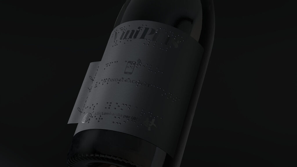
A project developed by NSG Design with AIS Lombardia and the Italian Union of the Blind and Visually Impaired, to rethink wine packaging as a truly accessible experience.
The label becomes an inclusive and purpose-driven device. Tone on tone, like the darkness millions of people navigate every day not by choice, but by necessity. While you try to read it, they’ve already read it with their fingers. Braille becomes living text under the fingertips. NFC unlocks an audio-digital layer: bring your phone closer and a voice begins to tell the wine story. Then comes the tear revealing a second layer that uncovers the full story behind the project.
Find out more about NSG here .
Rare Beauty
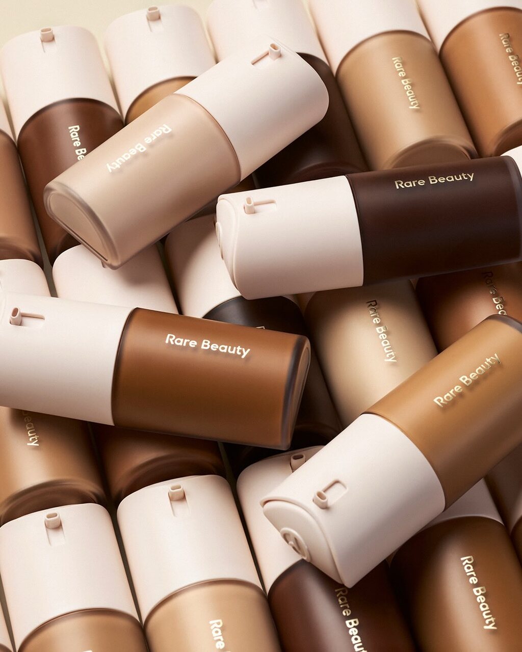
Rare Beauty has made accessibility a core part of its packaging design through its Made Accessible initiative, introducing features such as easy-grip matte finishes and rounded caps that are easier to hold and open.
Its latest introduction in 2026 is its True To Myself Foundation with a custom pump system. The locking mechanism was inspired by the fragrance packaging and was developed with accessibility in mind, helping users who experience dexterity challenges.
Find out more here .
Microsoft Inclusive Design Toolkit
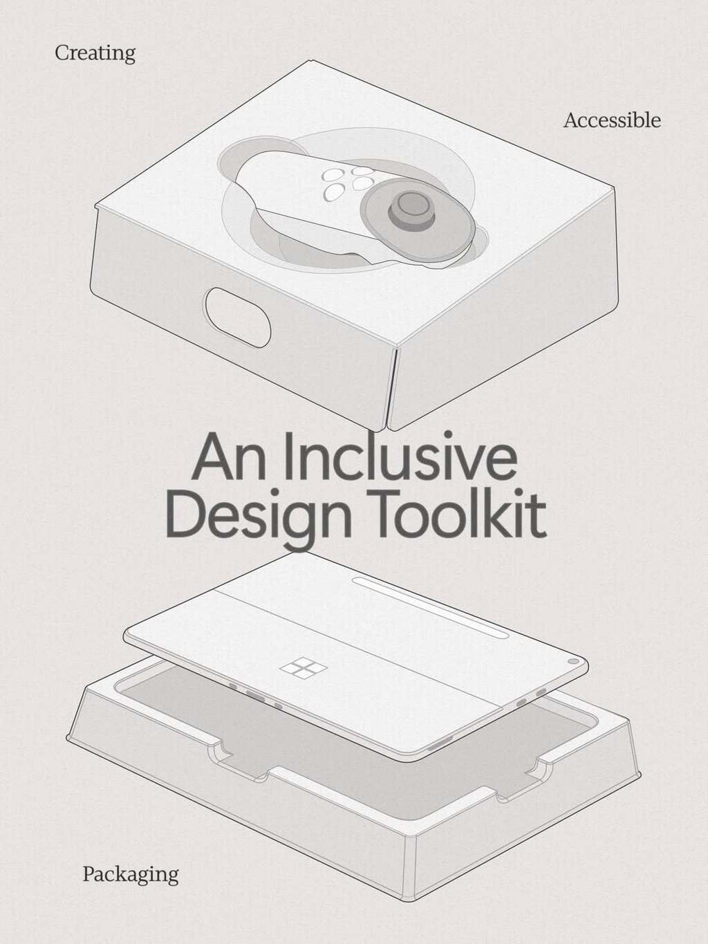
Tech giant Microsoft is well known for identifying barriers to inclusion and turning them into opportunities to create better experiences.
Beyond advocating for accessibility through its own packaging, Microsoft's Packaging and Content team has developed a toolkit that anyone can use to create more accessible packaging.
Find out more here .
The Dopamine Effect
The use of saturated colour, playful form, and oversized graphics continues to be a trend, offering a rush of optimism in the everyday.
Korean Bros by Truffl
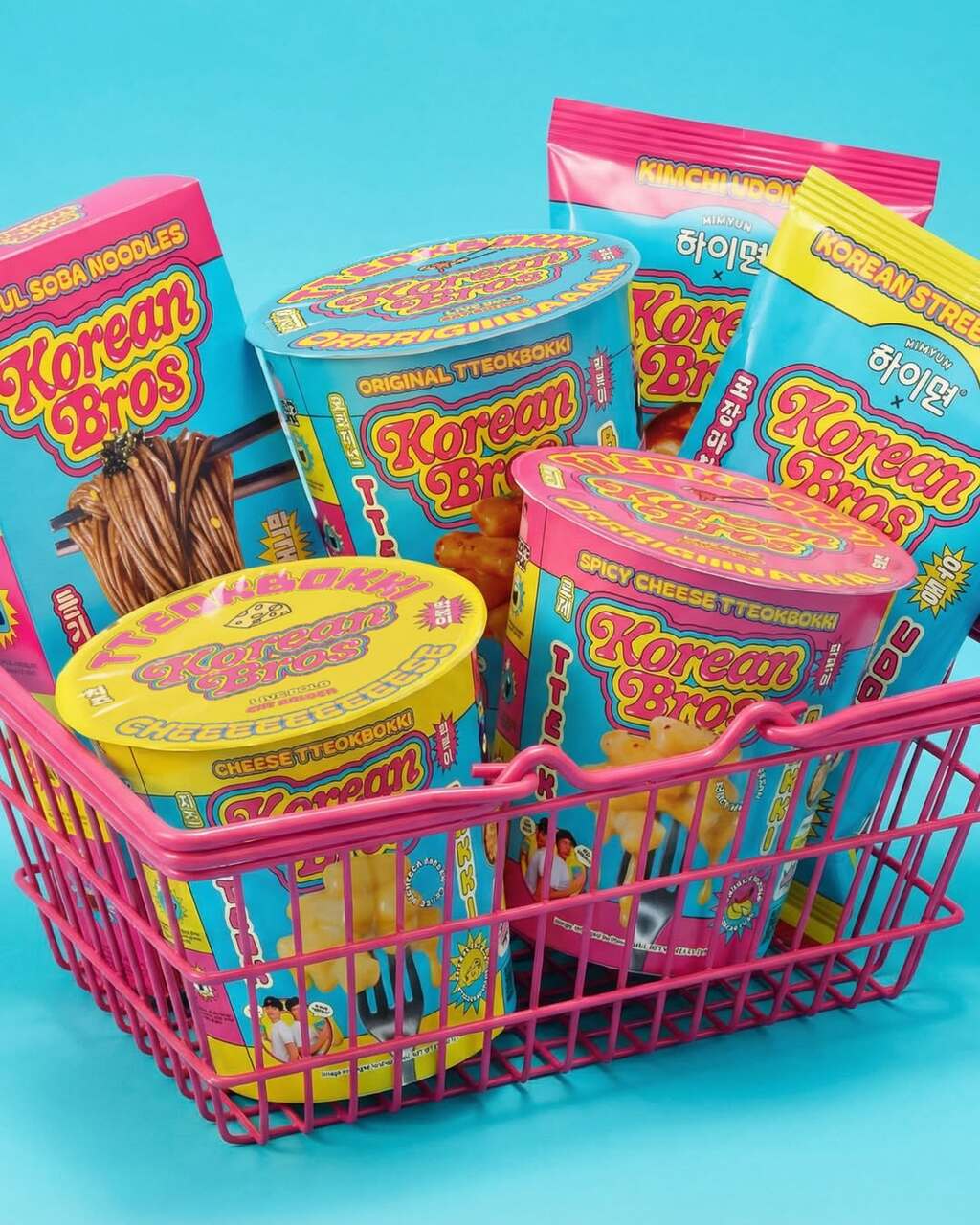
The packaging by Truffl positions the brand founders as mock celebrities, using bold, satirical visuals and a custom bubble-lettered wordmark inspired by 90s pop culture. A layered typography system combines custom and display typefaces, whilst a vibrant palette cuts through the typical muted tones of the Korean food aisle.
Find out more about Truffl here .
Beemore by Boundless
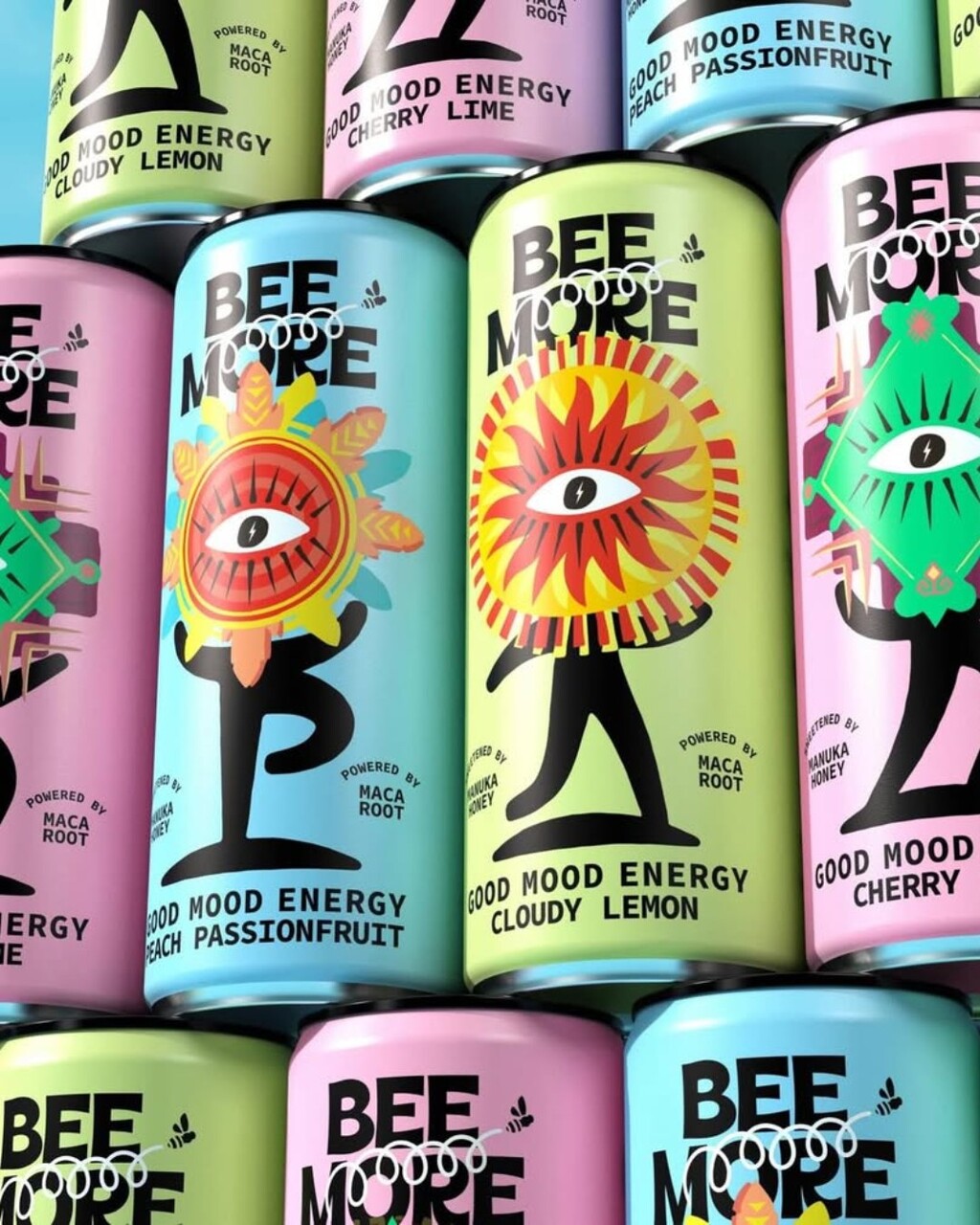
The packaging pairs bold colours with playful illustrations to express the brand’s “good mood energy” concept. The central eye-and-sun motif creates a striking focal point, blending mystical cues with a modern graphic style.
Find out more about Boundless Brand Design here .
CRUNCH! y nju:design
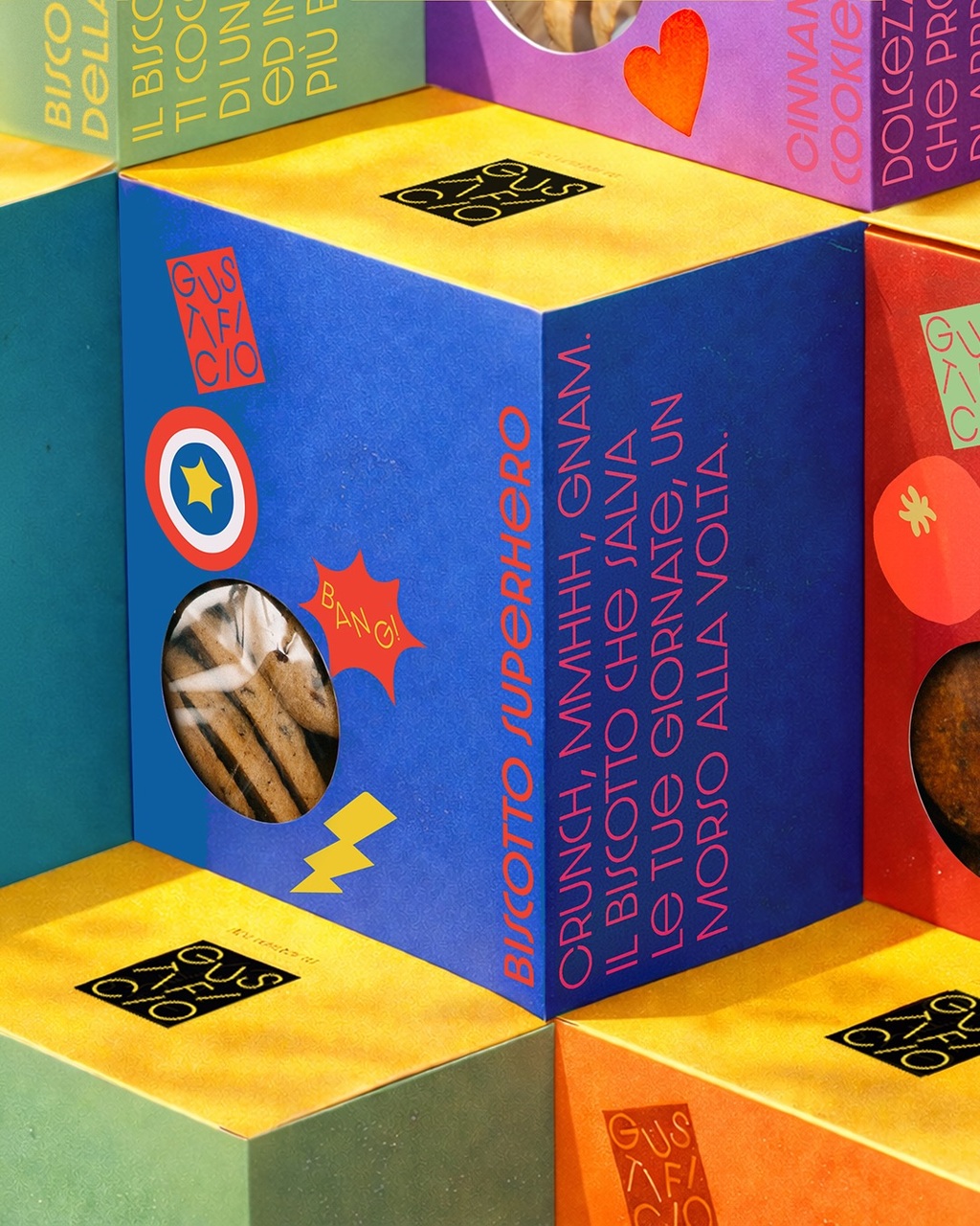
nju.design crafted every detail for this biscuit collection: from the cardboard made of natural material in a pocket-sized format, to the illustrations that evoke joy, to the copywriting with a short story for each one. The vibrant contrasting colours make each pack unique, appealing, and full of personality.
Find out more about nju.design here .
Upfront Font
From food to beauty, packs keep leaning more and more on bold, expressive type to command attention, often stripping back imagery entirely.
Ukiyo by IWANT
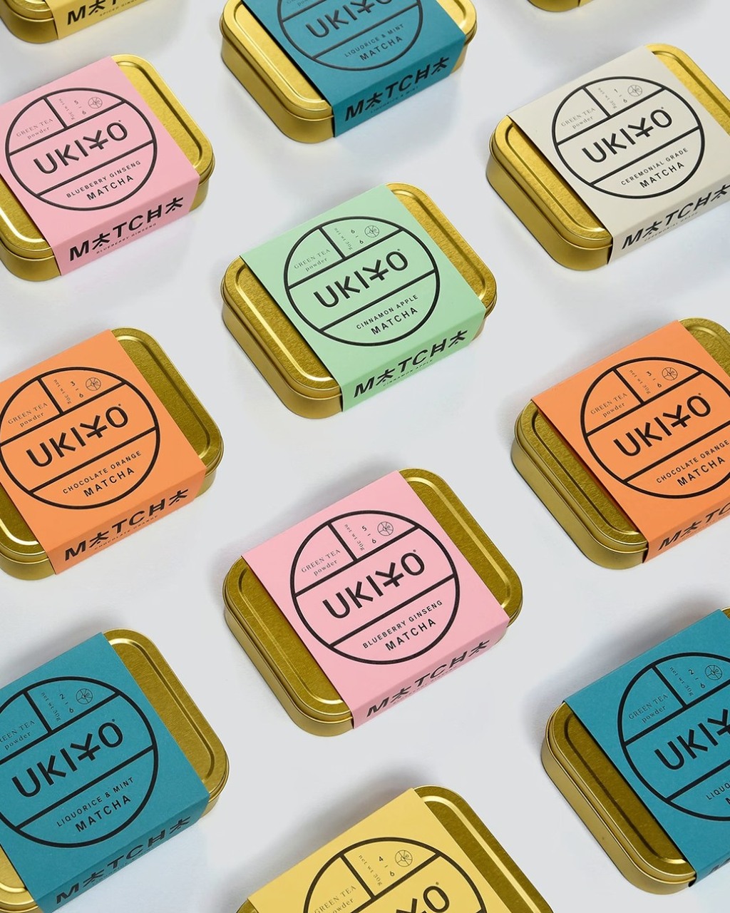
Inspired by the Japanese concept of the “floating world”, the packaging reinterprets matcha through a refined combination of colour, typography, and materiality. Soft pastel tones paired with metallic tins create a contemporary yet calming aesthetic, while the circular identity system brings clarity and consistency across the range.
Find out more about IWANT Design here .
Honey Department by Foreign National
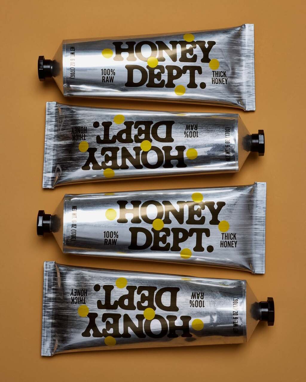
A sleek, squeezable tube, the packaging emphasises ease of use whilst highlighting the honey’s thicker texture. Bold, oversized typography and golden dots echo the richness of the product, creating a distinctive identity that stands out from traditional jars.
Find out more about Foreign National here .
Kimchi by Alexandria Pak
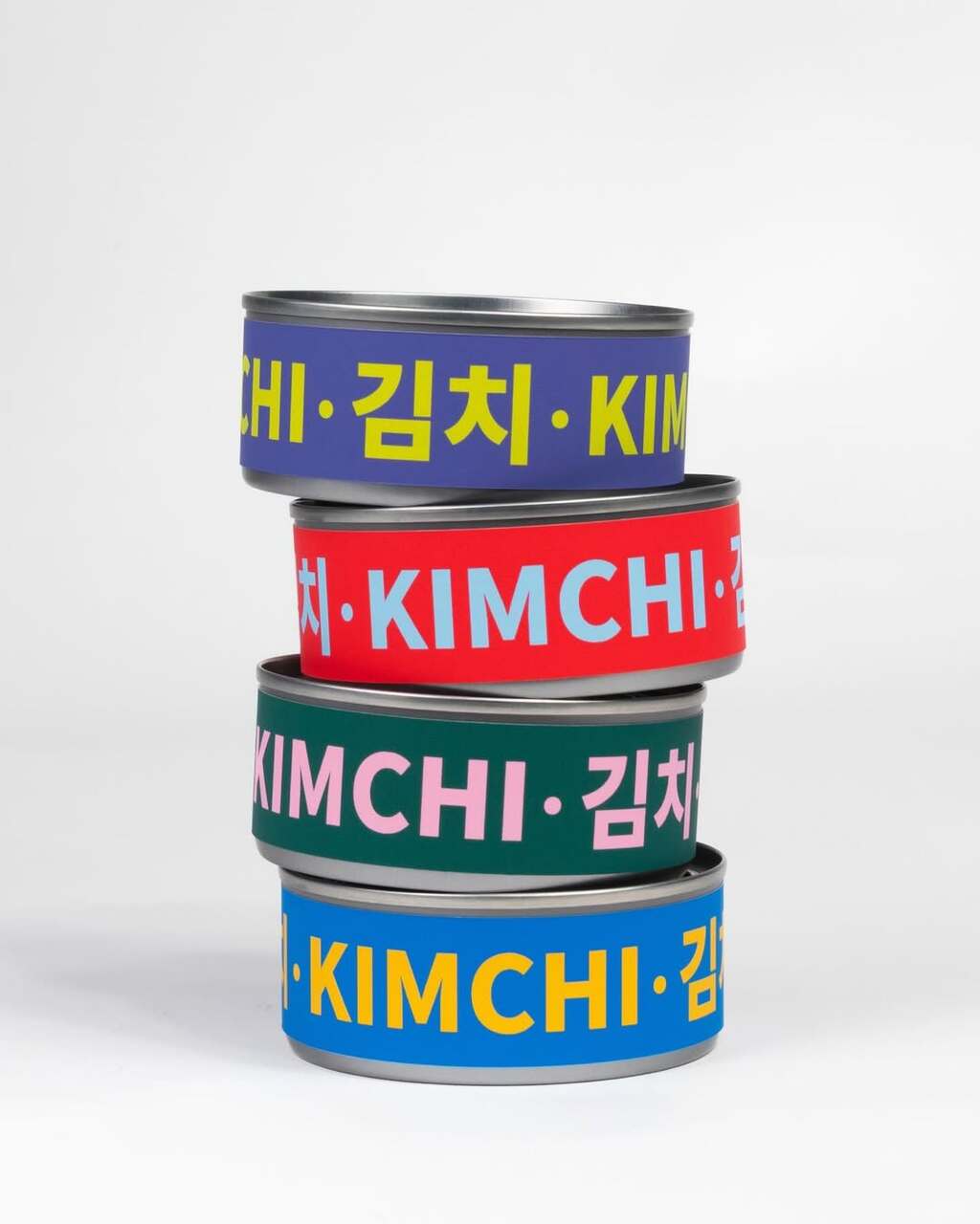
This single serving packaging was designed with bold colours to represent each of the four unique flavours. Latin and Hangul alphabets work together to emphasise Korean heritage while offering accessible and enticing information for Western consumers
Find out more about Alexandria Pak here .
Download the full report and let us know which trends you're seeing evolve the most in 2026.