


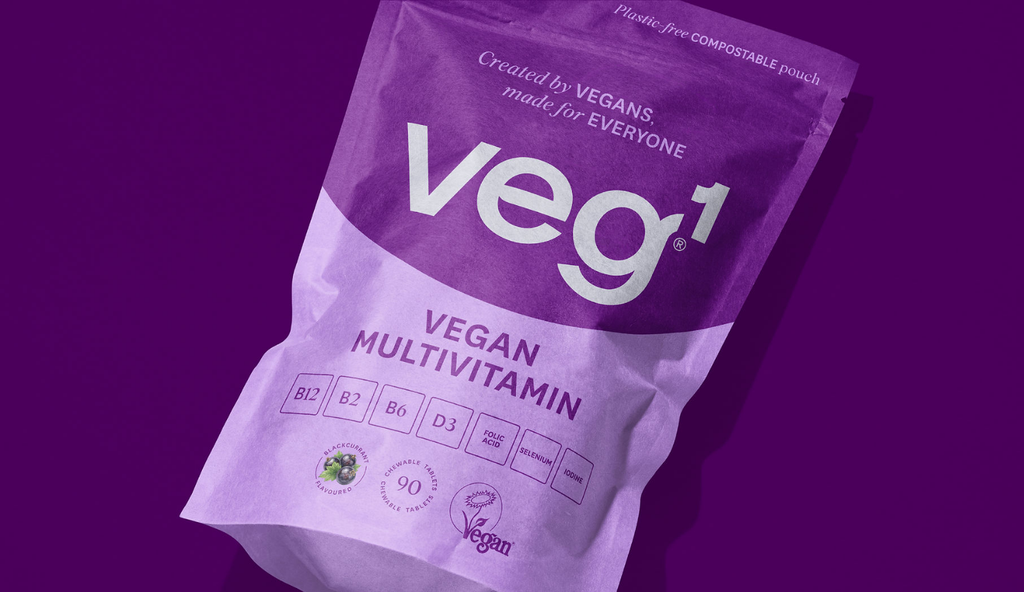
veg1® – Pouch-perfect vegan nutrition by SoreThumbStudio®
The studio collaborated with The Vegan Society on a comprehensive brand and packaging refresh for veg1®
The studio collaborated with The Vegan Society on a comprehensive brand and packaging refresh for veg1®
The Vegan Society wanted to transform its flagship supplement brand from a predominantly D2C product into a retail-ready brand while moving to a more sustainable packaging format.
The challenge was to strengthen consumer appeal and future-proof the brand without compromising its environmental principles.
As an environmental-first organisation, The Vegan Society was committed to finding the most sustainable packaging solution available. A move from aluminium tins to certified home-compostable pouches reduced material usage, lowered shipping costs through a lighter pack, allowed the product to fit more easily through customers' letterboxes and delivered more opportunity for a stronger on-shelf presence.
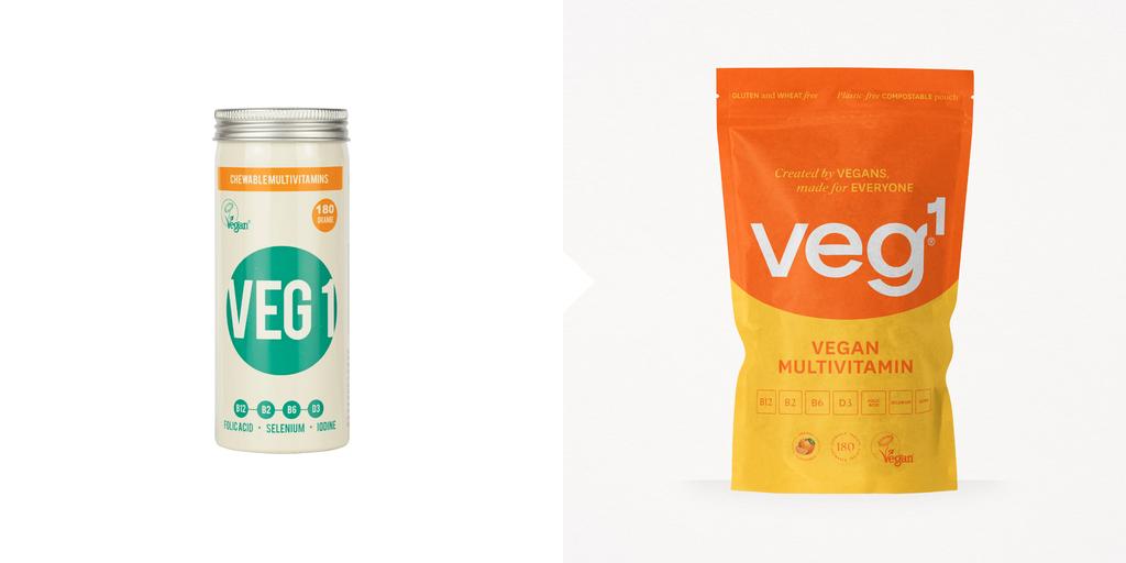
Working closely with the client, SoreThumbStudio® evolved the veg1® identity so it better reflected the brand's clean health proposition. By moving it away from being an unbalanced uppercase logo to a completely unique, hand-drawn lowercase logotype that nods to elements on the periodic table, the studio gave it a friendly feel with a soft-scientific touch.
The studio also helped The Vegan Society reposition veg1® as the supplement brand for vegans and non-vegans alike and reinforced this message with a new brand tagline, "Created by vegans, made for everyone."
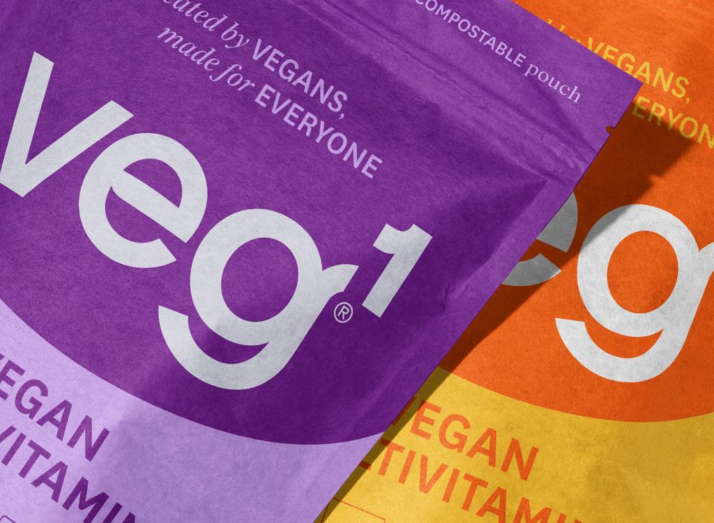
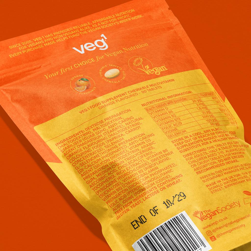
The packaging system took full advantage of the new pouch format.
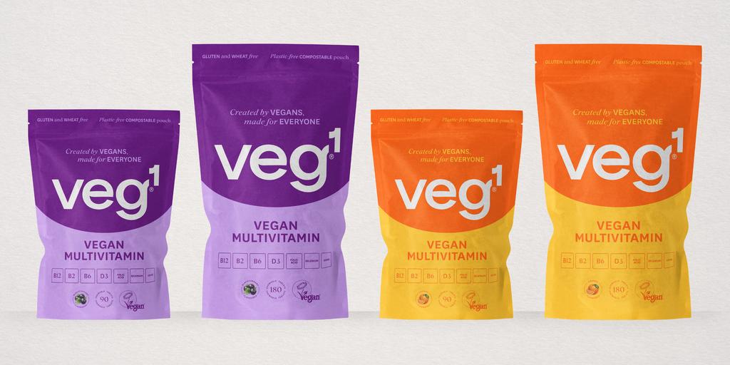
SoreThumbStudio® repurposed the brand's circular graphic device at a much larger scale to create a distinctive "pack smile", supported by a dual-colour design that improved impact, strengthens navigation across the range and gave the brand a more confident in-store presence.
Drawing on their strategic understanding of how consumers shop supplements, they refined the information hierarchy to help shoppers identify the product faster and understand its benefits more easily.
The new pack architecture was also designed with the future in mind, building in the flexibility and rigour needed to accommodate new SKUs and product line extensions while maintaining a consistent look and feel.
The result is a contemporary supplement brand that combines sustainable packaging with stronger retail presence, clearer communication and a flexible design system built to support future innovation.
For more information on the design, visit SoreThumbStudio®'s website or follow them on Instagram .