


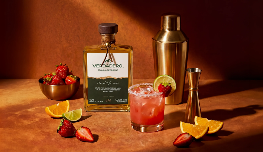
Verdadero Tequila, designed by CreativeWise
CreativeWise delivers a bold tequila packaging system, combining expressive typography, earthy tones and distinctive details
CreativeWise delivers a bold tequila packaging system, combining expressive typography, earthy tones and distinctive details
Verdadero is a premium tequila brand born from a connection between Texas and Jalisco, Mexico. CreativeWise was brought in to reimagine the brand from the ground up, creating an identity and packaging system that could honor the spirit’s Mexican origins while building a distinctive, contemporary presence for a new generation of tequila drinkers.
The challenge was to navigate a category filled with familiar visual codes. Rather than relying on the ornate details, traditional motifs, and expected cues often associated with tequila packaging, the goal was to create something confident and recognizable with a more restrained point of view.
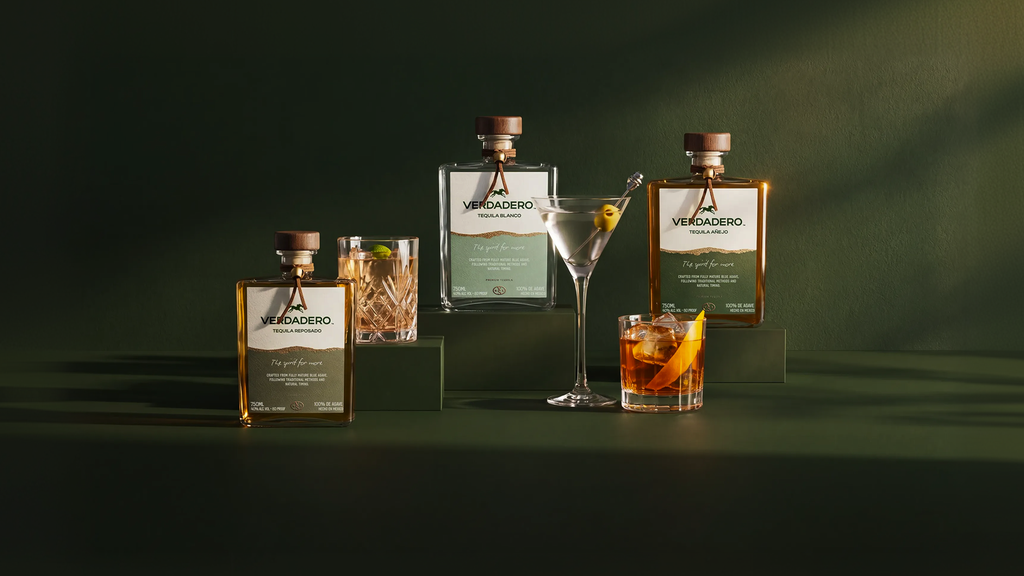
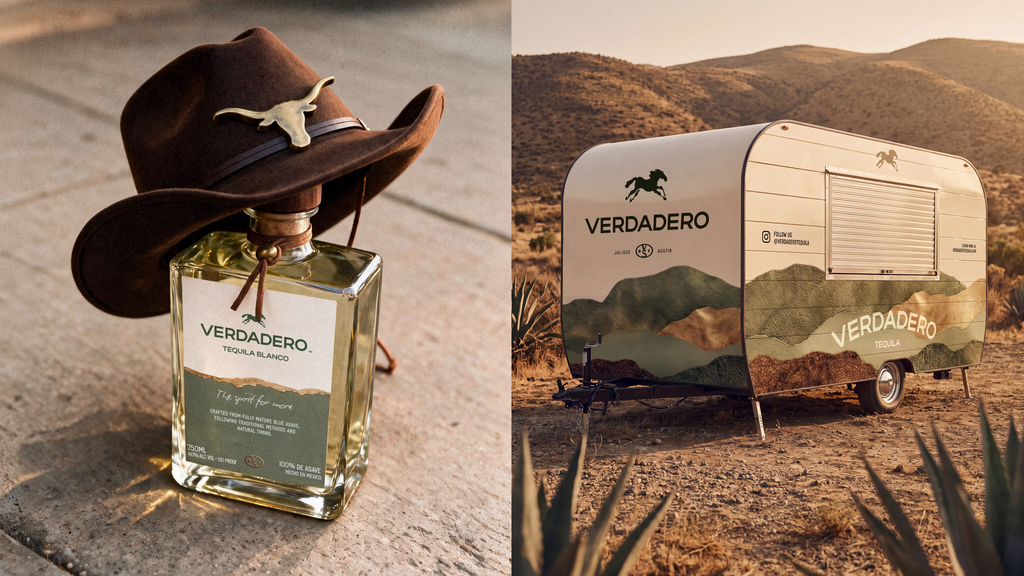
At the center of the identity is Verdadero’s bold wordmark, paired with a graphic agave symbol that becomes a recurring element throughout the brand. The packaging combines expressive typography, a warm and earthy palette, and carefully considered details to create a bottle that feels both grounded and contemporary.
Each expression within the range has its own color while remaining part of one cohesive system. The labels use contrast, scale, and a clear typographic hierarchy to make the Verdadero name immediately recognizable. The result is a system designed to hold together across different expressions without losing the individual character of each bottle.
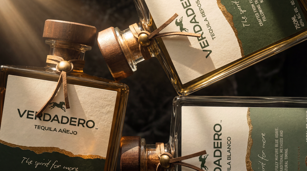
The physical qualities of the packaging were equally important. The weight and simplicity of the bottle provide a strong foundation for the identity, allowing the label and typography to carry much of the personality. Small details throughout the packaging add depth without overwhelming the overall composition.
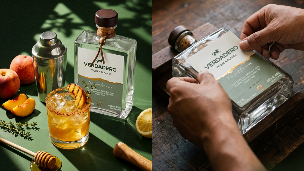
Beyond the bottle, the identity was designed as a complete brand world. The same visual language extends across secondary packaging, digital experiences, campaign imagery, merchandise, and brand touchpoints, giving Verdadero a system that can evolve while remaining immediately recognizable.
The result is a tequila identity that connects two places central to the brand's story: the craftsmanship and heritage of Jalisco and the bold, independent energy of Texas. Rather than reproducing traditional category conventions, Verdadero translates those influences into a contemporary visual language of its own.
For more information on the design, visit CreativeWise's website or follow them on Instagram .