


Back Accessible Design: 5 packaging designs that celebrate user diversity
The concept of Accessible Design revolves around the idea that every design decision has the potential to include or exclude customers. These five companies and designers have taken a step forward to deliver packaging designs which have been optimized to be accessible to individuals with specific needs or disabilities.
If, like the examples below, your packaging design aims to ease the user-experience regardless of age, disability or physical condition, then don't miss your chance to show it off in this year's competition in our new Inclusive Design sub-category.
Find out more and get involved
here.
Braille labelling on L'Occitane packaging

In 1997, l'Occitance made the conscious decision to write their product names in Braille on our packaging and have continued ever since.
It's not only a way of making their products more accessible to the visually impaired; it's also a way of raising public awareness about sight loss.
Find out more about their accessibility commitments
here
.
Yogo, Federica Caruso

Yogo is a hybrid toy system designed by Federica Caruso to allow children with Developmental Coordination Disorder (DCD) to exercise fine motor skills.
The overall goal for Yogo is to create a toy that can be used at home or during a therapeutic session, which is perceived by the child not as therapy but as a purely playful moment. To do this, Yogo exceptionally translates therapeutic exercises into a digital game app, with which the child can interact using tangible tools, specially designed to improve their manual motor skills. The child will not use the touchscreen to play, but, in order to exercise motor skills they will interact with the physical tools to operate on the digital game.
For more info on the project and designer, see
the website
or find Federica on
Behance
.
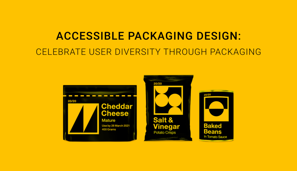
Vision 20/20, Jones Knowles Ritchie and Revolt Communications
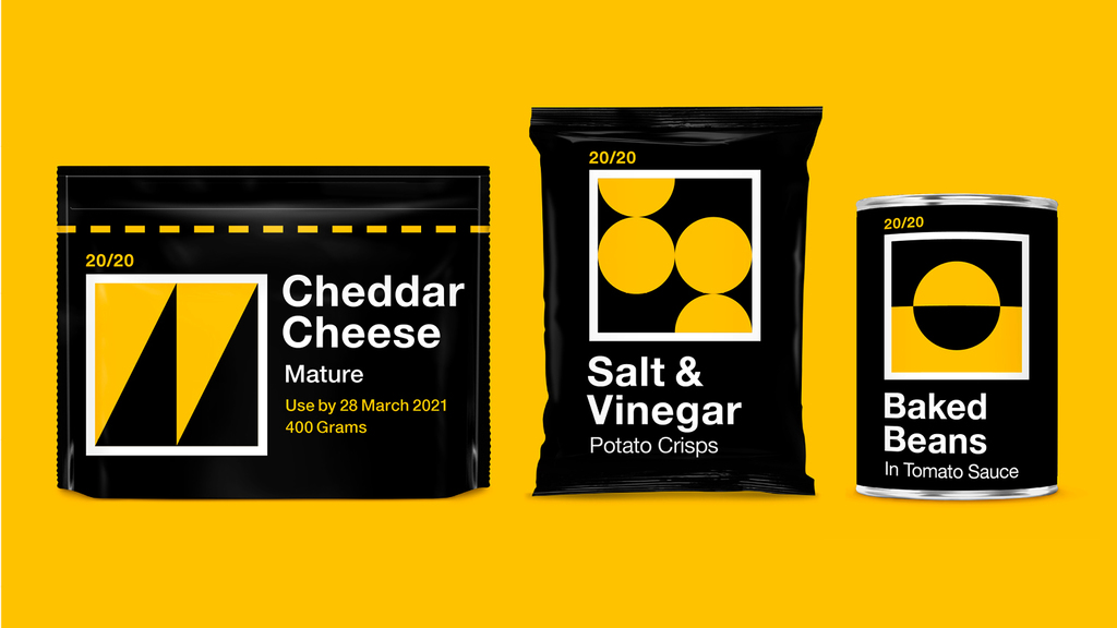
Vision 20/20, by design studio Jones Knowles Ritchie and Revolt Communications, is a set of packets that feature large font and bold shapes that are easy to spot on the shelf or in a dark cupboard.
Jones Knowles Ritchie and Revolt Communications focused on how to make the packaging as visually clear as possible, making it more accessible to sight impaired people by increasing legibility and using high-contrast graphics.
For more info on Jones Knowles Ritchie, see
here
, or find out more about Revold Communications
here
.
Herbal Essences' Inclusive Bottle design , P&G

Relaunched by P&G, Herbal Essences’s Bio:Renew bottles have been redesigned to be more accessible to people with visual disabilities. The bottles feature two clever tactile marks on the bottom indicating whether they’re shampoo or conditioner, making it even simpler than using braille.
By using a simple code, P&G could make the bottles packaging less depentant on vision and more inclusive for the whole community.
For more info on this packaging,
see here.
Xbox, Microsoft

The packaging of Xbox by Microsoft sets a powerful milestone on the journey of accessible design, and it was named Diamond Best of Show winner in the 2019 Pentawards competition.
Creating a unique user experience, physical touchpoints, visual or material cues and structural elements are designed to lead the customer through a logical and seamless unboxing, making the packaging accessible for gamers with limited mobility.
By rethinking how they package their product, Microsoft brilliantly incorporated accessibility into the packaging design and unboxing experience, allowing customers to interact with the product on their own terms.
For more info on Xbox by Microsoft, watch
this video.