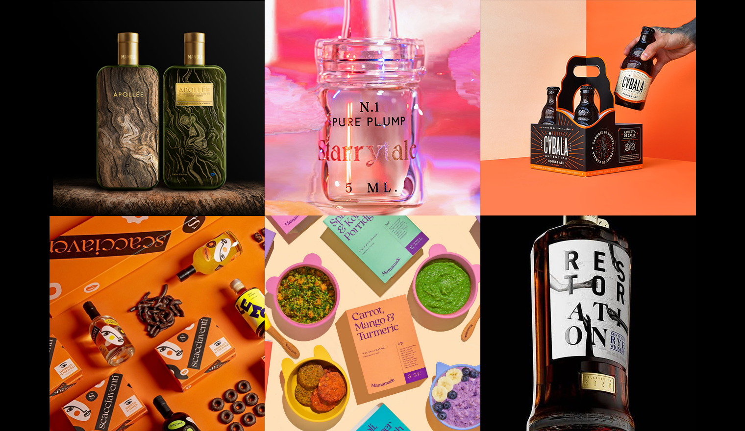
Back Monthly Discoveries, April 2021
As the most prestigious packaging design award in the world, Pentawards not only recognise the best packaging design via the competition but also promote the importance of packaging design through live events and social media. We are committed to being the bridge between excellent design organisation and brands that are always looking for the best packaging design solutions.
Take a look at the below for some of the most popular designs we shared this month across our social media channels.
Manoli Canoli Premium Olive Oil by Antonia Skaraki

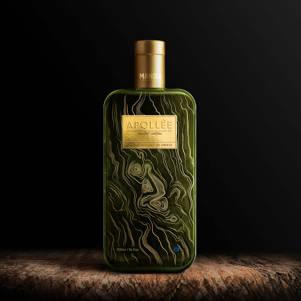
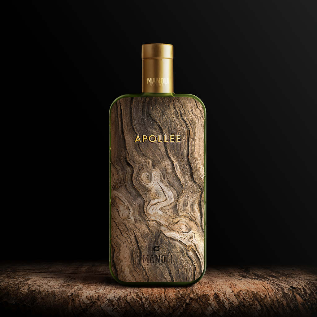
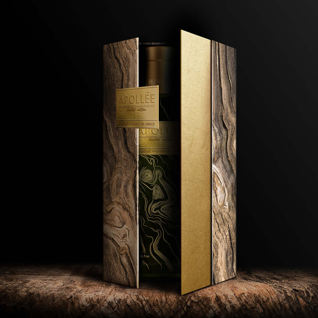
The brand identity inspiration for Manoli Canoli Premium Olive Oil came from the origins of the founders, the place where Apollo –the god of light – and where the olives which offer us a supreme extra virgin olive oil are born; Greece. A.S. created a unique artisan packaging that feels both fresh and sophisticated at the same time. The unusual shapes and gold-and-earthy colour palette successfully convey the exceptional quality of this unique olive oil, placing sophistication at the forefront, while paying homage to the Greek heritage.
Find out more on Antonia Skaraki
Cábala by Hobby Brand Studio


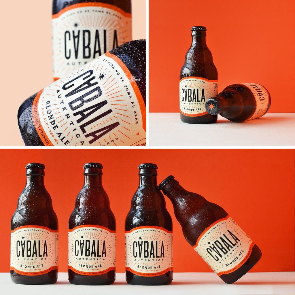
Cábala is more than just a drink. For that reason, Hobby built a concept inspired by that popular ritual of sharing a beer in the street, at the table, at home or in front of a church. A ritual shared by all, that became a kind of "social amulet" to enjoy life and share moments. The design of a striking and powerful packaging, in which the number of bottles is intentionally different from the traditional (fivepack), accentuates the fact of wanting to break paradigms and schemes within the category. In addition, the construction of the logo proposes a hidden message: the letter "A" has been intentionally rotated to hint at two important meanings: a change of destiny, and a glass of beer.
Find out more on Hobby
Castle & Key by Stranger & Stranger


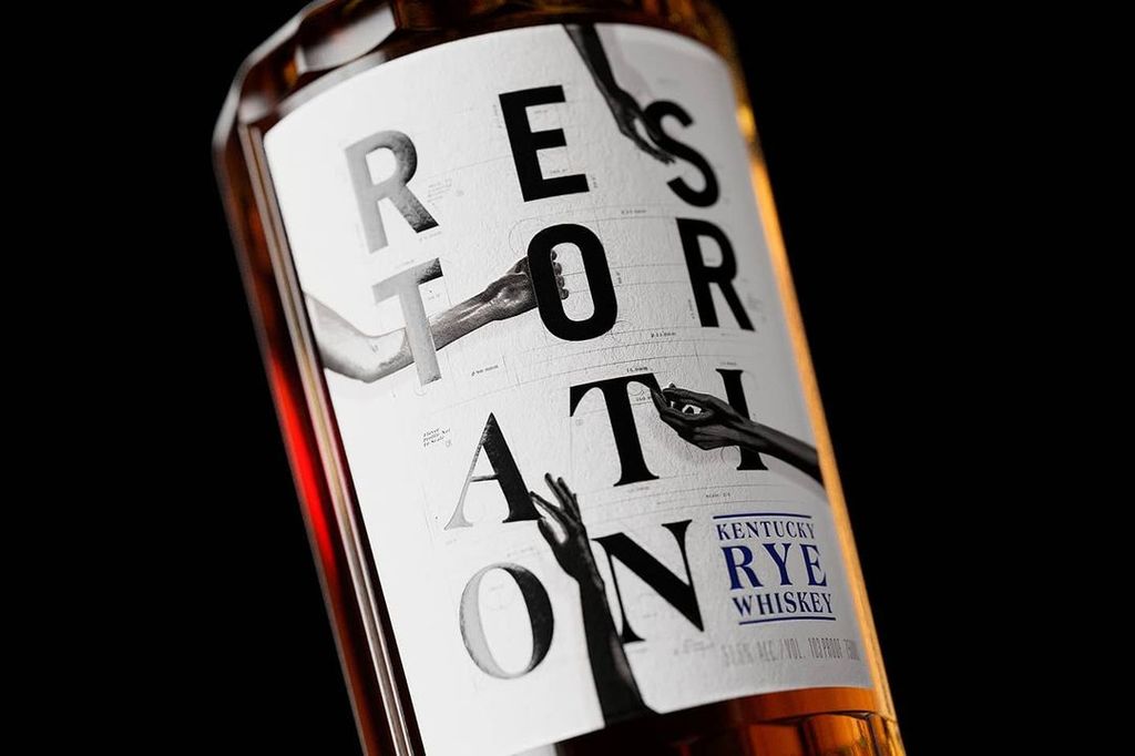

Castle & Key launched its first whiskey along with an entirely new bottle design for several of its products. Stranger & Stranger created the new look for the distillery spirits portfolio, which now includes Restoration Rye whiskey, Roots of Ruin Gin and Sacred Spring Vodka. Each new design represents the detail, time and care that went into making each spirit, with elements of the restored historic distillery adorning every touch point in this crafted range.
Find out more on Stranger & Stranger
Starrytale by Alejandro Gavancho
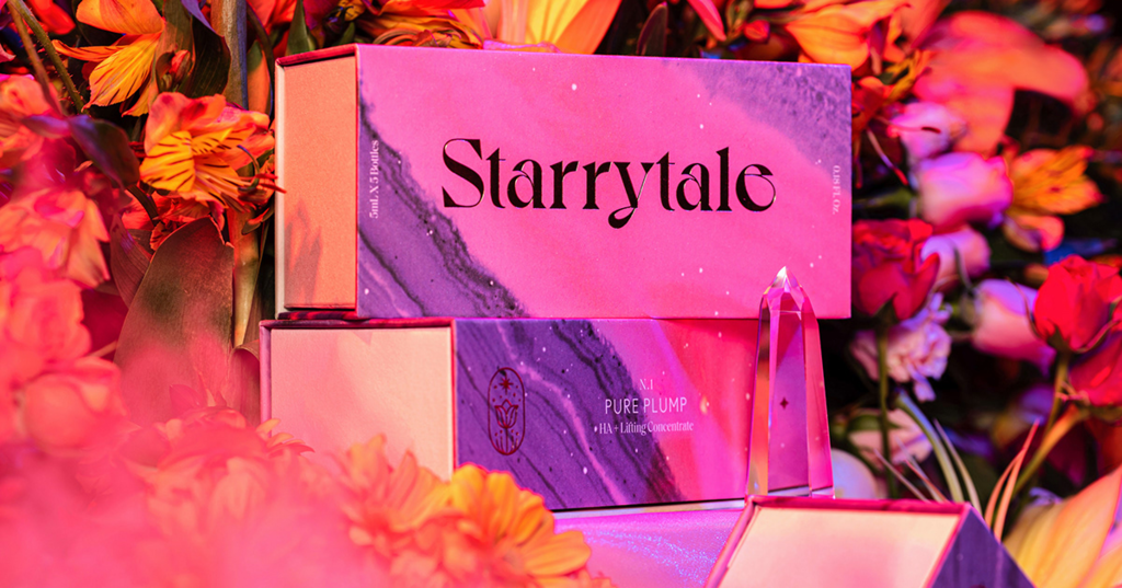
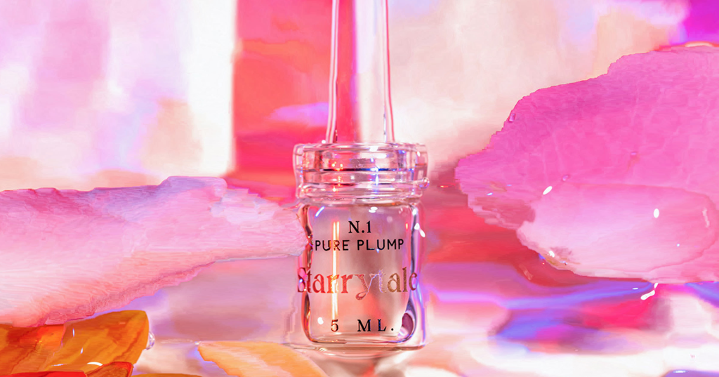
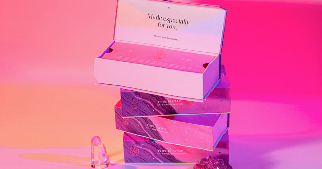
Designed by Alejandro Gavancho, Starrytale packaging evokes a natural mysticism while delivering premium quality and visual appeal. Pastel colours and gold highlight were chosen to reflect not only a youthful, softer side, but also to show the products clinical and reparative properties. By juxtaposing organic patterns and motifs with block colour, complimented by elegant typography, Starrytale achieves an exciting and modern aesthetic that invites the customer to explore, feel and experience the products.
Find out more on Alejandro Gavancho
Scacciaventi by Lettera7


Scacciaventi Packaging Design by Lettera7. Translating the passion for Amalfi Coast into an eclectic production of confectionery, liquors and spirits, Lettera7 projected a packaging inhabited by a set of stickers which saturates the surface with rigor and dynamism making every pack deeply authentic. Result: the vivid colours and the fluidity of the visual details accomplish a project that tells a tradition with a minimalist and contemporary language.
Find out more on Lettera7
Childish Design


Childish Design kicks off its 'design for better purposes' with new identity for plant-based baby food Mamamade. Simple packaging designs give the feeling of a methodical, simple journey for parents to follow while highlighting health benefits of the products. The colour palette is bright and optimistic but still holds a sense of maturity, capturing the sense of vibrancy and texture of the food.
Find out more on Childish Design
Have some new packaging you’d like to share? Email us info@pentawards.org for a chance to be featured!


