Back Monthly Discoveries, July 2020
As the most prestigious packaging design award in the world, Pentawards not only recognise the best packaging design via the competition but also promote the importance of packaging design through live events and social media. We are committed to being the bridge between excellent design organisation and brands that are always looking for the best packaging design solutions.
Take a look at the below for some of the most popular designs we shared this month across our social media channels.
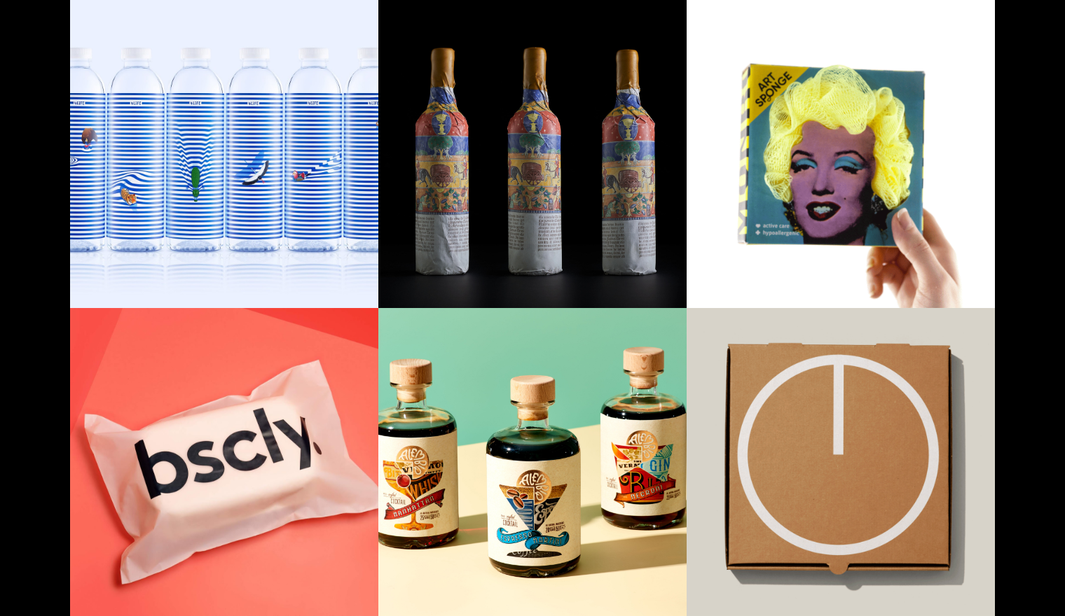
Springwater by Prompt Design


Springwater is naturally produced and is available from the source of mineral water from Doi Chaang, Chiang Rai (Northern Thailand). This water is the natural product from the abundant fertile forest where we have to respect for habitat and environment.
Designed by Prompt Design the package illustration is to convey how the animals live their lives with the water. The wavy lines and animals explain about the animals living with the water resource. For example the flamingo flying, the tiger swimming and the crocodile crawling in the wavy lines which represent the beauty of water waves.
These pictures are reminding us that water is the life support of all living things. This is where the brand 4Life Mineral Water comes from!
Art Sponge by Lesha Limonov


Art Sponge is a design concept inspired by the portraits of the Rijksmuseum and the hairstyles of their character. Lesha Limonov decided to approach the task with humour and turned the hair of famous painting characters into shower accessories.
The designer developed a package with paper cutting in place of the characters' hair: Rembrandt, Alida Christina Assink, Marten Soolmans and Oopjen Coppit. The "hair" protrude from the plane and can be touched! It turned out to revive portraits and create an unusual design for a simple hygiene item.
The idea turned out to be scalable, and people can make a large number of SKUs with various masterpieces. For example, a continuation of the story was a series of bright Pop-Art sponges with Monroe.
Codex by Estudio Maba


The Codex wine design is a classic piece, which captures the meaning of the name. The Codices were manuscripts in books before the invention of the printing press, in which the capitular letters played a fundamental role, turned into works of art in themselves.
Large embossed letters build the delicate and sensory label surface, almost sculpted on paper. The graphic universe of the Codices is very rich in elements and allows us to build the different pieces of the bottle, from the capsule to the outer packaging. For the latter, a great illustration describes the vintage and the elements of the family heraldic shield, in a classic and colourful narrative, covering the piece that is gradually discovered by the user.
Bscly


Bscly, a tech-enabled DTC brand that is focused on creating stylish & sustainable clothing kits for people who want to stay focused in the morning – perfectly paired outfits that let you get dressed in seconds and look (and feel) good all day.
To reflect the sustainable core value, not only the mailer packaging was made from corn they also choose sugarcane as the material for the box. It's biodegradable, compostable and eco-friendly. It’s harvested and regrows, fully, every year, capturing more CO2 from the atmosphere. Because it regenerates, it’s a renewable material that will never run out. Sugarcane also does this really cool thing where it helps bring nutrients back to the soil it’s planted on, even depleted pastureland. It’s a material that goes beyond not doing harm—it actually does some good.
Alembiq by Positivity Branding


Alembiq is a great new brand from Madrid that offers pre-mixed cocktail classics in true modern craft style. They are the beautiful blend of high-quality spirits from an urban distillery in Madrid, pre-mixed with the typical ingredients that make the classic Manhattan, Negroni and Espresso Martini.
Positioned as ‘urban pre-crafted cocktails‘ Positivity Branding created the dashing modern-classic visual identity and packaging design, garnished with a new iconic logo. Each design is cleverly crafted, reflecting how the cocktail ingredients are blended by mashing up classic labels, with each cocktail classic ‘distilled’ into its own classic glass. Fun details about the origin of each cocktail – like the Italian Count Negroni – were also incorporated into the design, following through to the often neglected back label.
Round-the-Clock Pizza Box by Man Wai Wong


This is a pizza box packaging designed for Toronto's 7 West Restaurant, a 24-hour restaurant that wanted to boost off-hour pizza orders. So, the designer targeted loyal, regular-hour customers by turning 7 West pizza boxes into reasons why any time can be pizza time. If someone ordered pizza at 1 PM, they received it in a box that suggested why 1 AM is also a great time to devour pizza. 12 boxes were designed, one for every hour, and coordinated to delivery hours.
Interested in a feature?
If you think your work deserves to be featured on our social channels, feel free to send us your design via info@pentawards.org. We look forward to hearing from you all!


