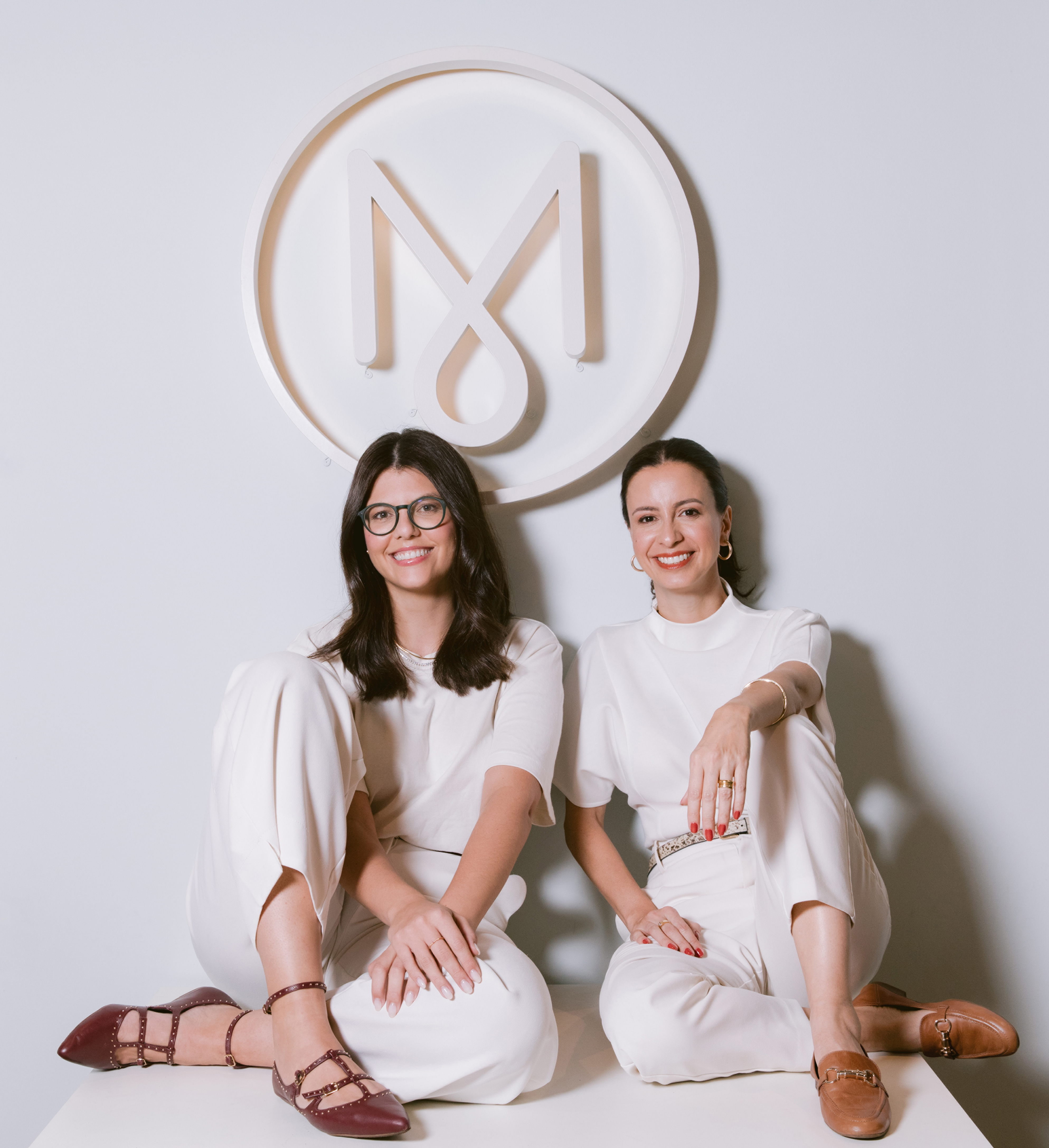
We are an award-winning Brazilian design studio specializing in branding and packaging design. Founded in 2010, we’ve developed more than 3,000 packaging designs and earned over 30 national and international awards.
Blending strategic thinking with technical expertise, we help brands stand out through authentic storytelling, visual impact, and cultural relevance. Our work covers a wide range of industries and is always guided by a commitment to excellence, innovation, and emotional connection.
Led by two women, we bring a distinctive feminine and creative perspective that bridges Brazilian vibrancy with global design standards. With clients around the world, we create meaningful design that moves both brands and people.
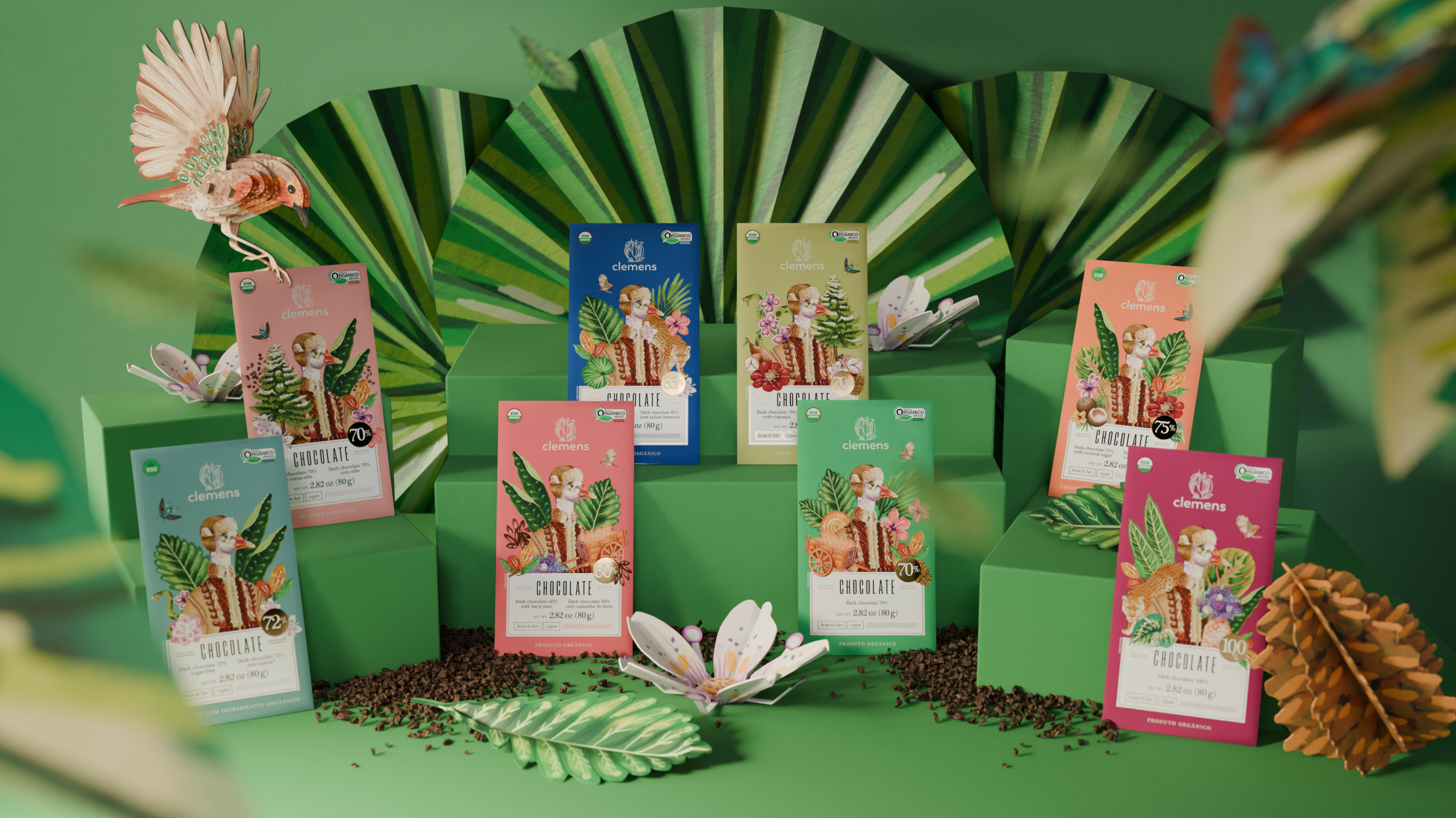
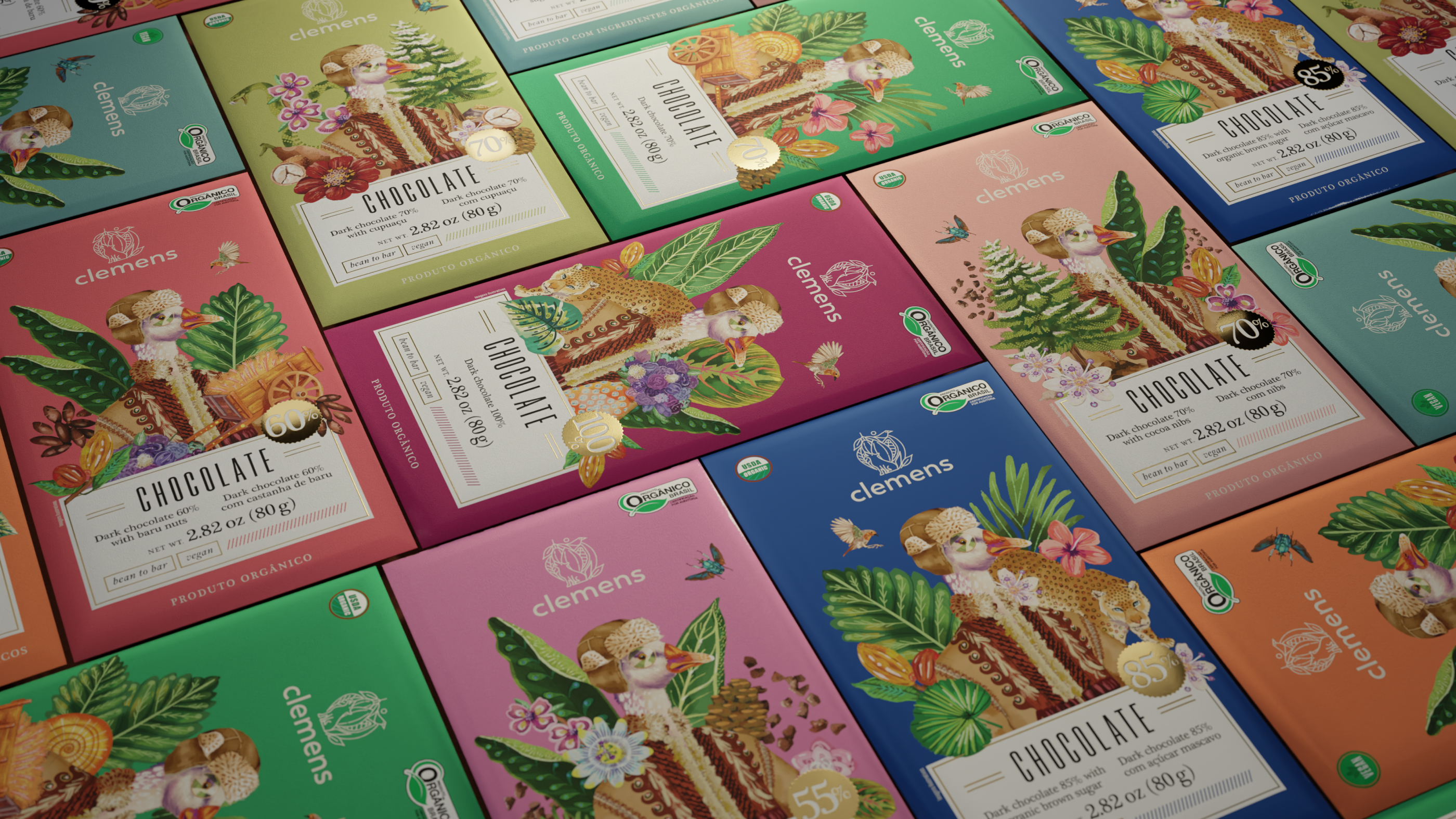
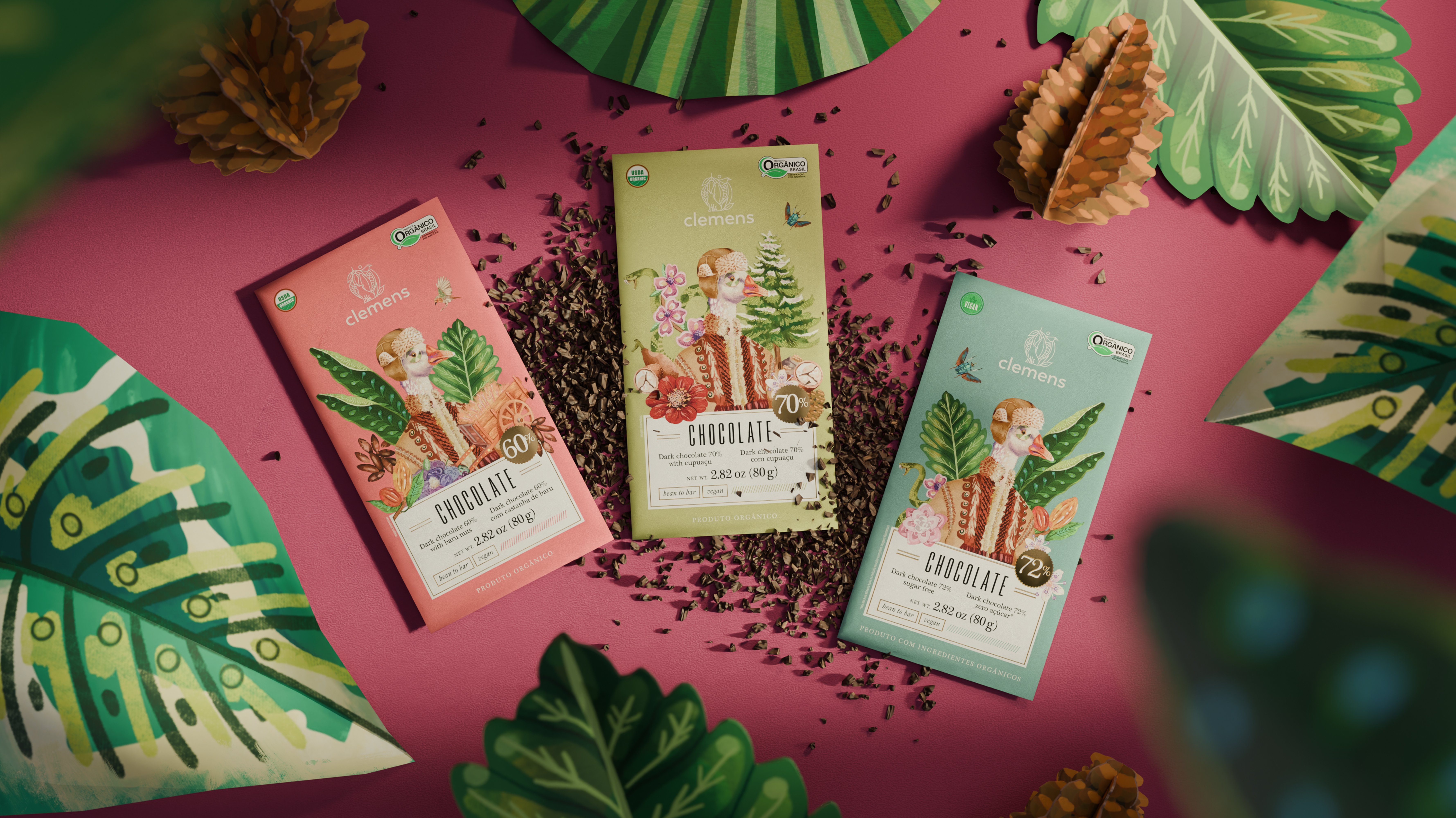
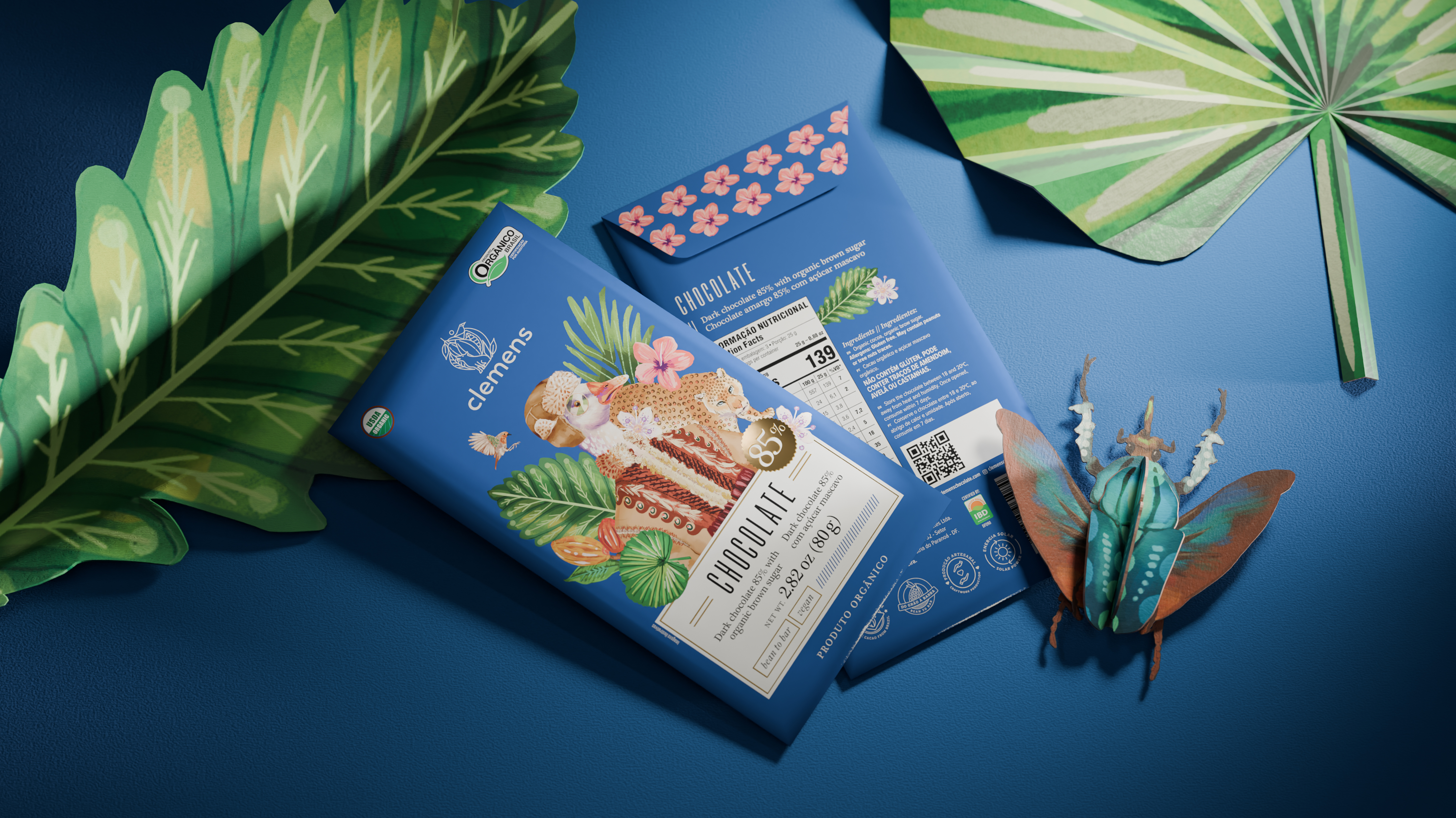
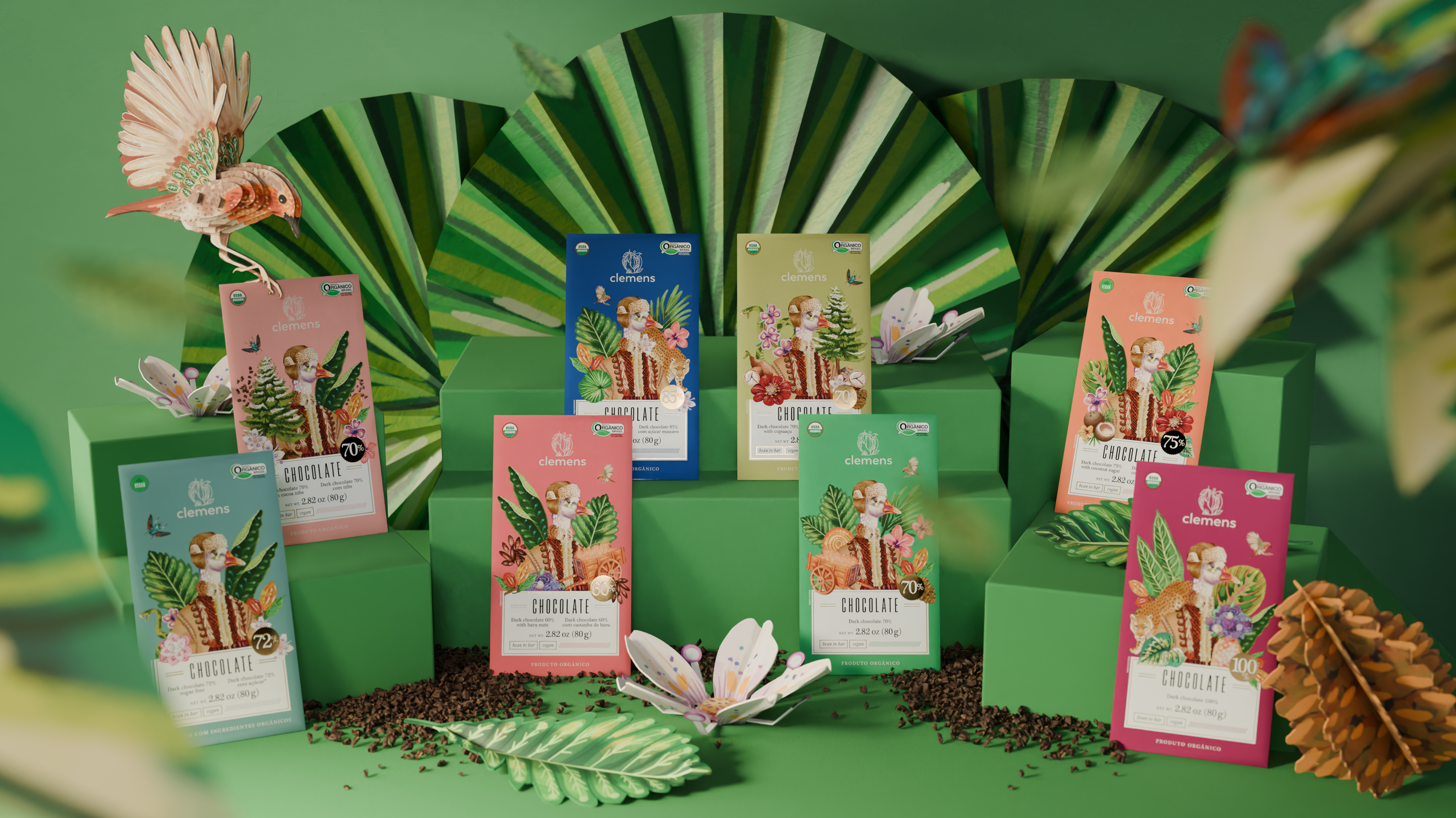
Clemens creates artisanal chocolates using organic Brazilian cocoa, but beyond this appeal we found that the brand’s narrative holds extraordinary aspects. The brand’s name honors the owner’s grandfather, who migrated from Siberia to Brazil in 1933, with his adventurous life inspiring a book. This rich narrative that shaped Clemens' childhood and youth was brought to life in the packaging through illustrations inspired by the book’s passages. Bold brushstrokes depict key moments, such as the goose from his happiest memory, the snake that frightened him on his journey, and the Russian coat that warmed him on dreadful winter days. The complete product line features various chocolate bars, each composed of different ingredient combinations, which were also illustrated and incorporated into each composition, ensuring that every product hold unique details consistent with its surprising story.


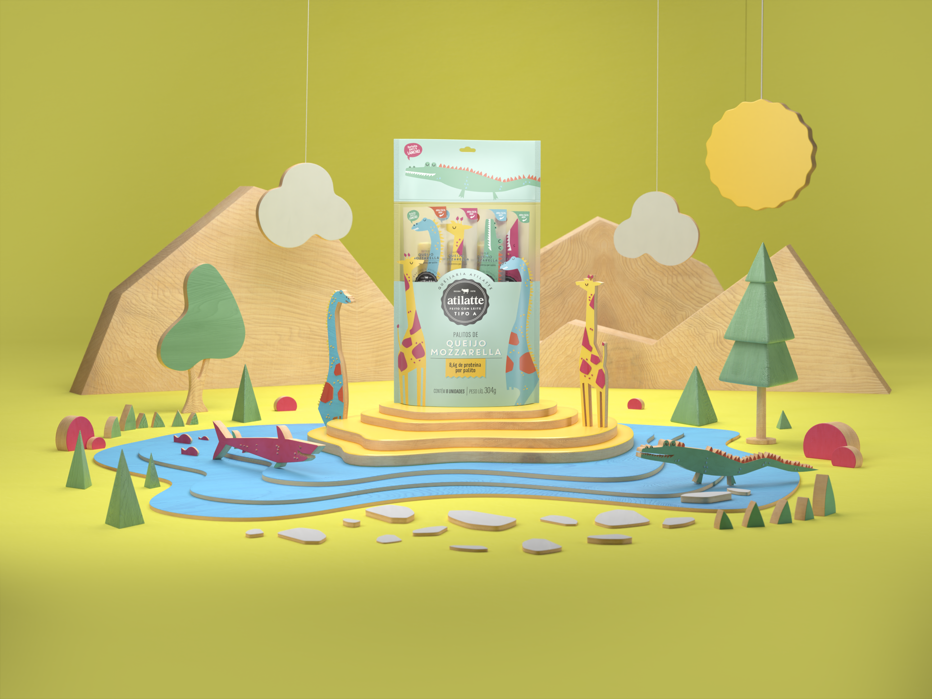
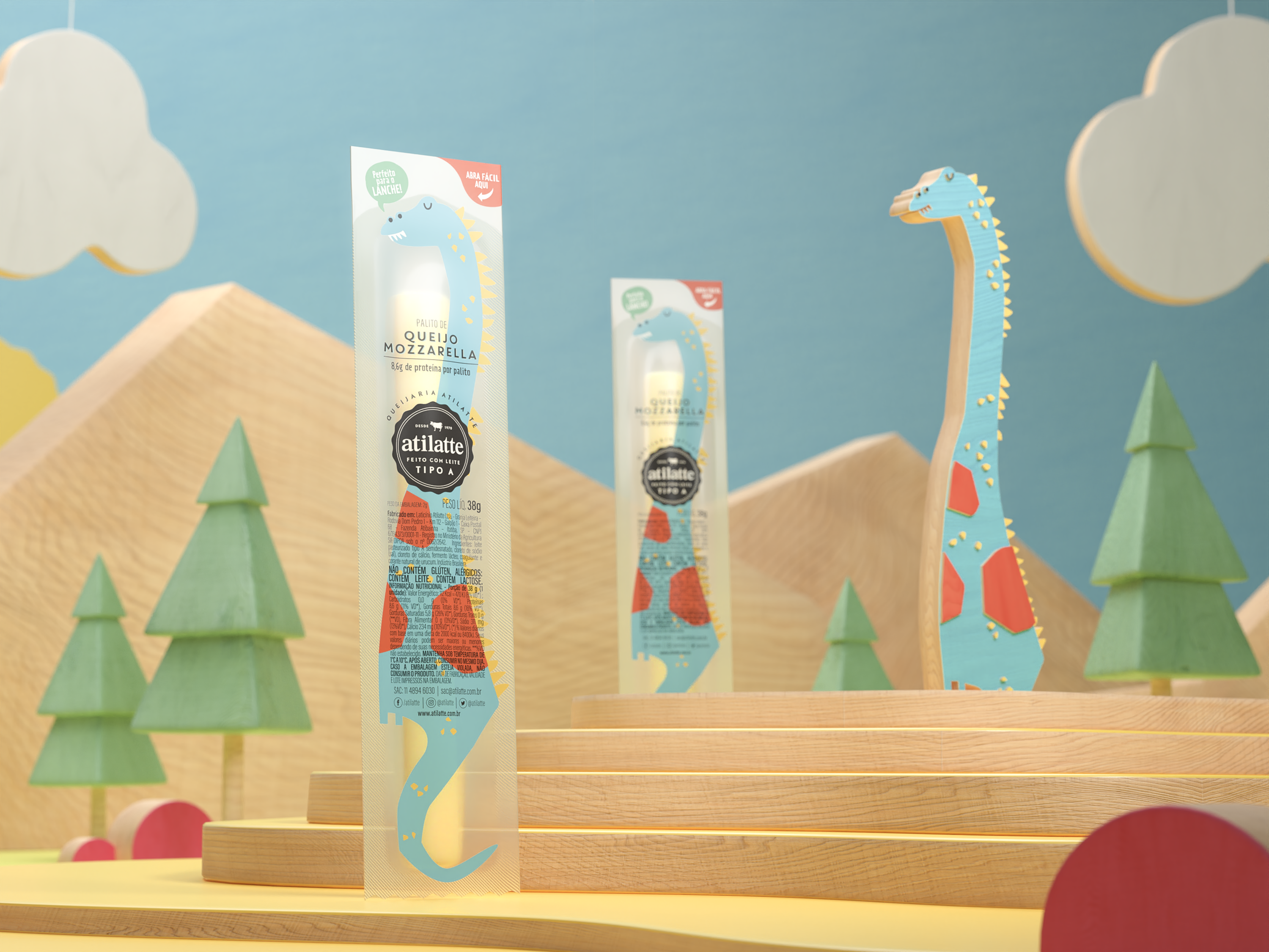
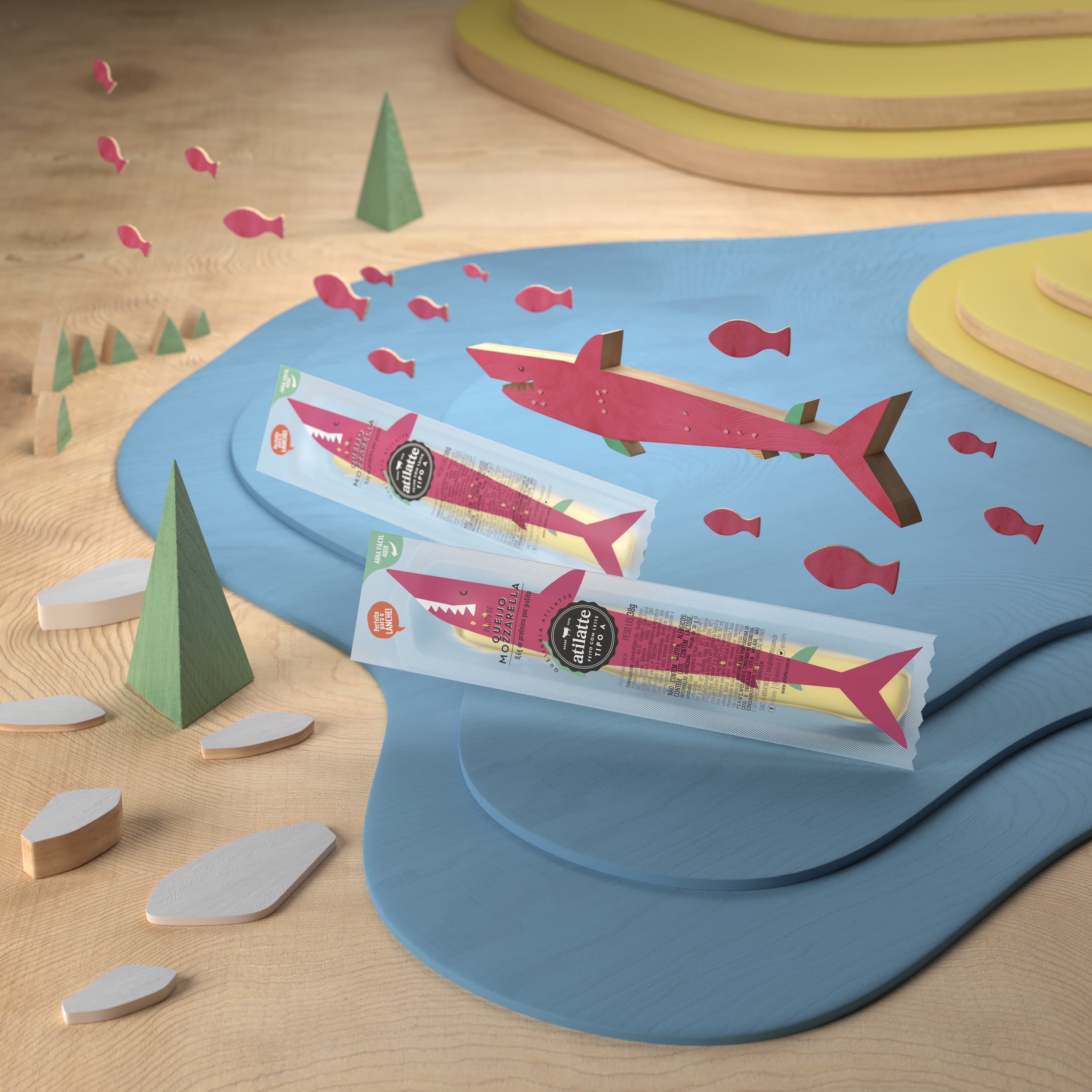
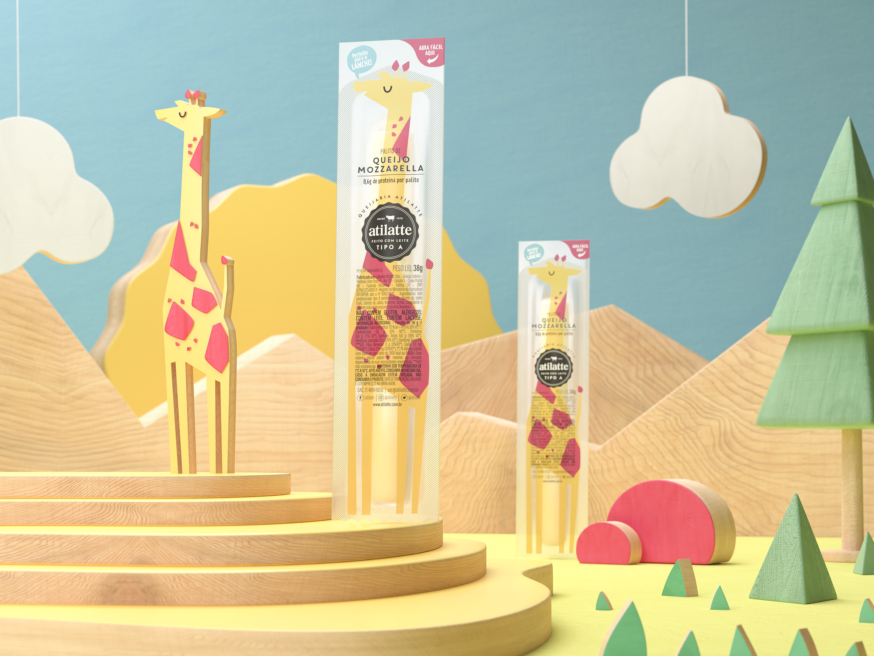
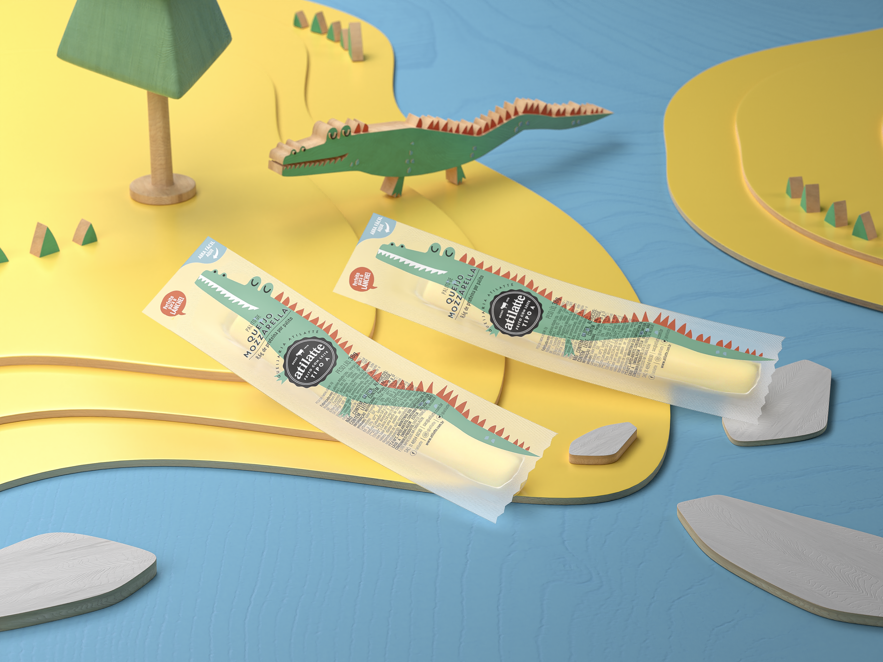
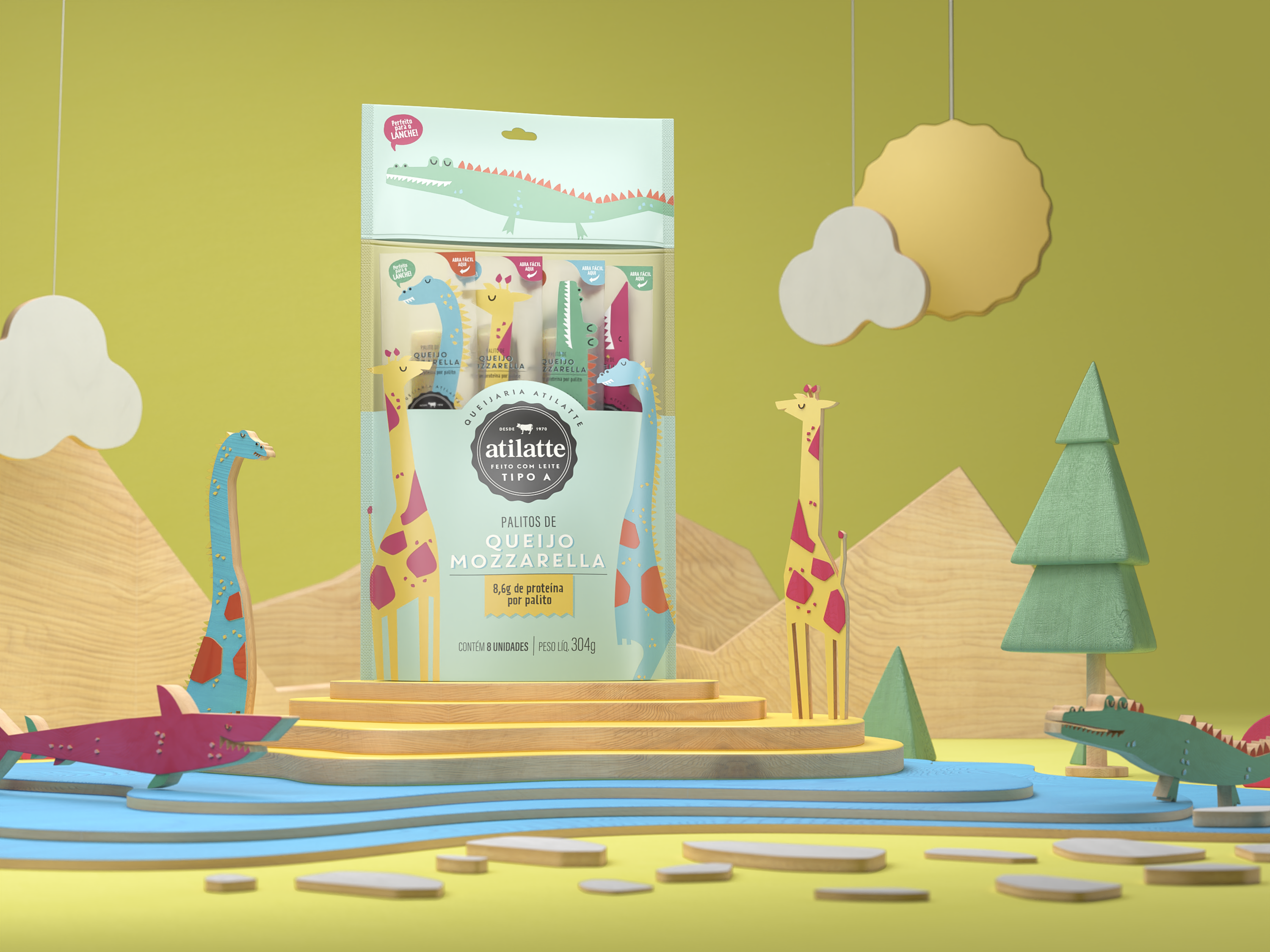
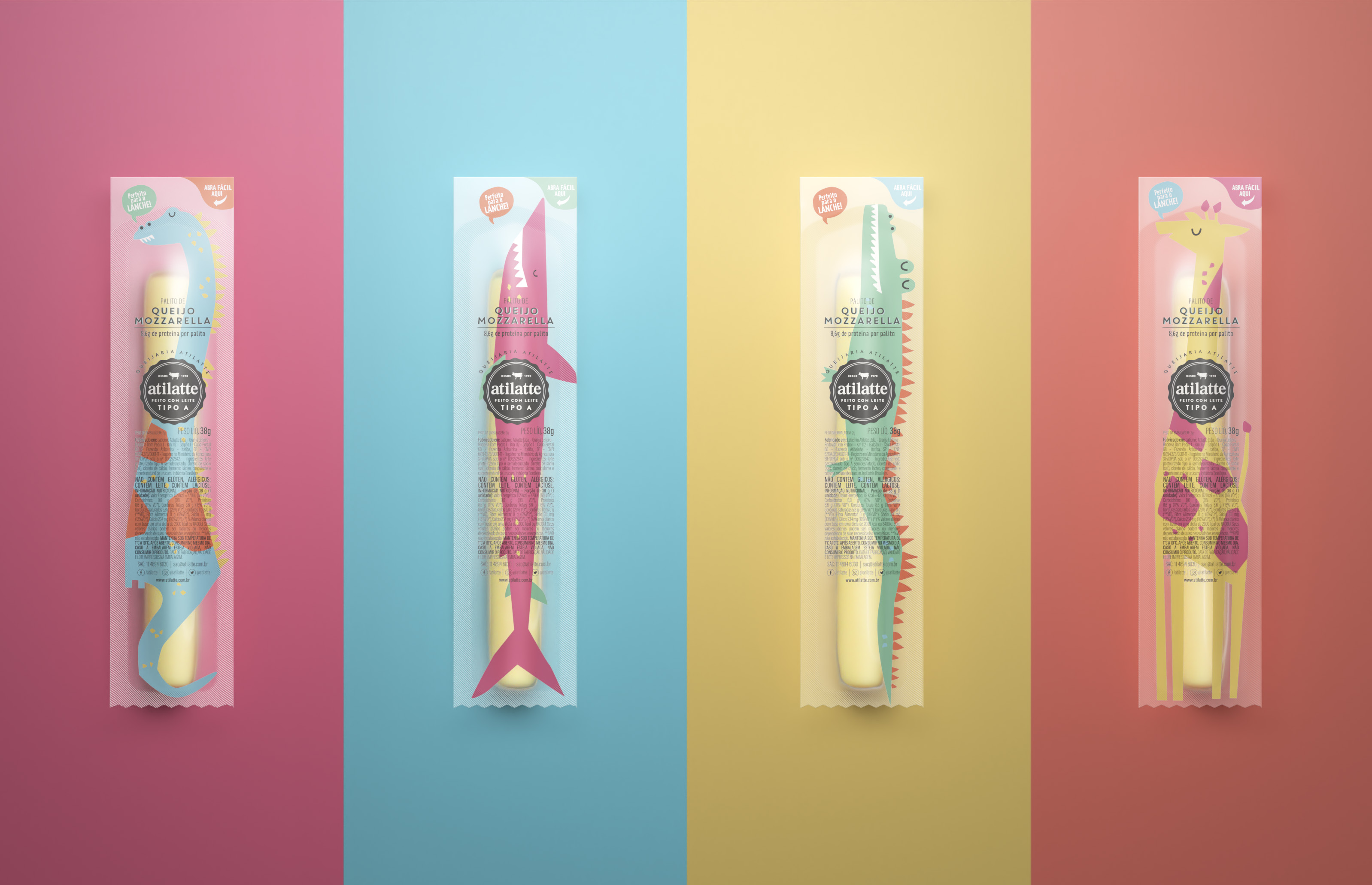
A perfect option for every lunch box and also for in-between meal snacks, Atilatte string cheese is made with grade A milk, fully providing the quality and the healthiness of dairy products. We were asked to design a package aimed at children, while considering two different buying options: buying a single product or buying an 8-stick bundle sold in stand-up pouch packages. Our goal was to develop a fun packaging that would not only connect with the children, but also appeal to the adults at the point of sale. A playful universe, inhabited by “long” animals, was created - which fitted perfectly into the string cheese long shape. The package’s vibrant color palette decorates the lunch boxes, making snack breaks even more enjoyable for the little ones.

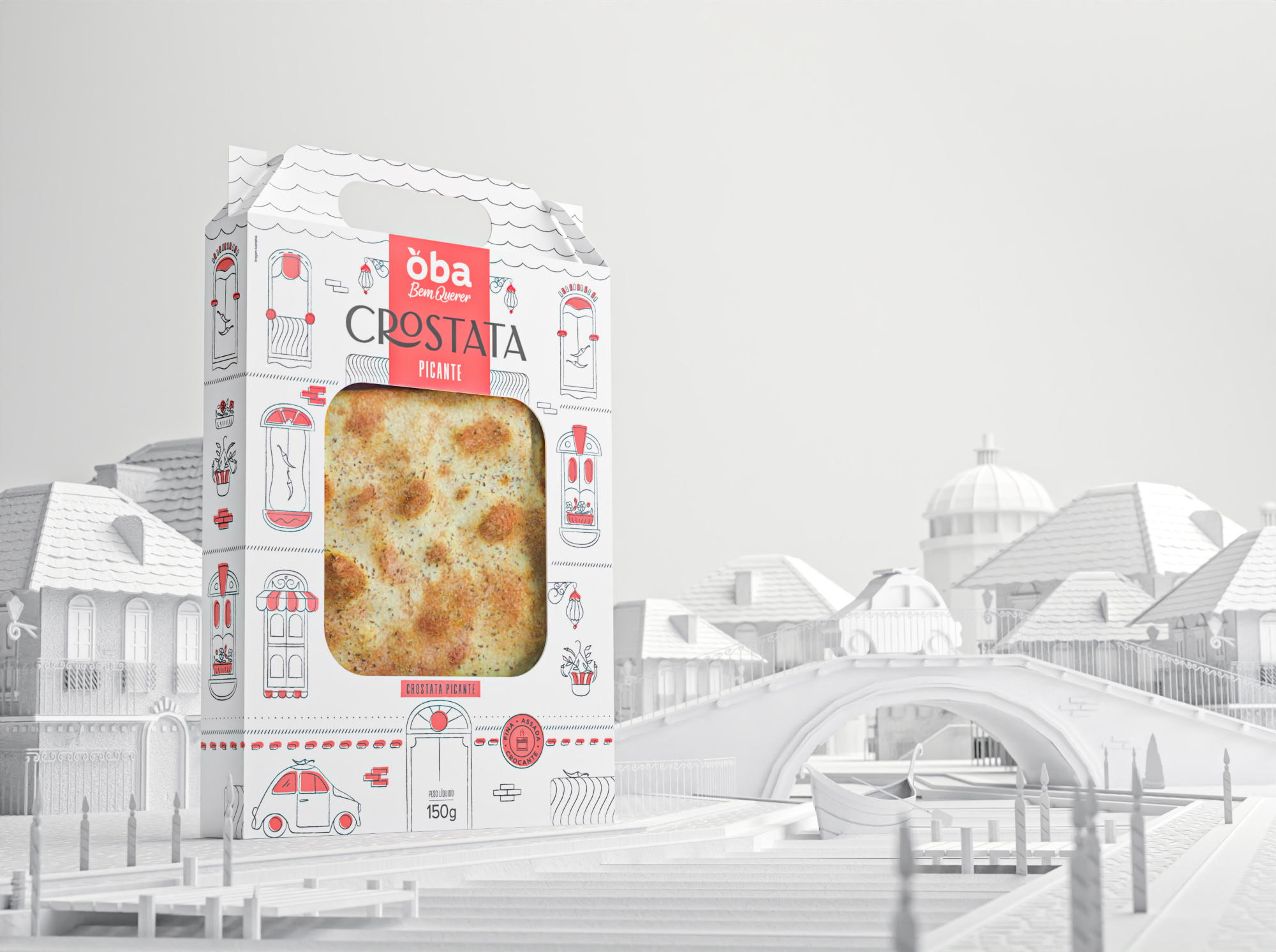
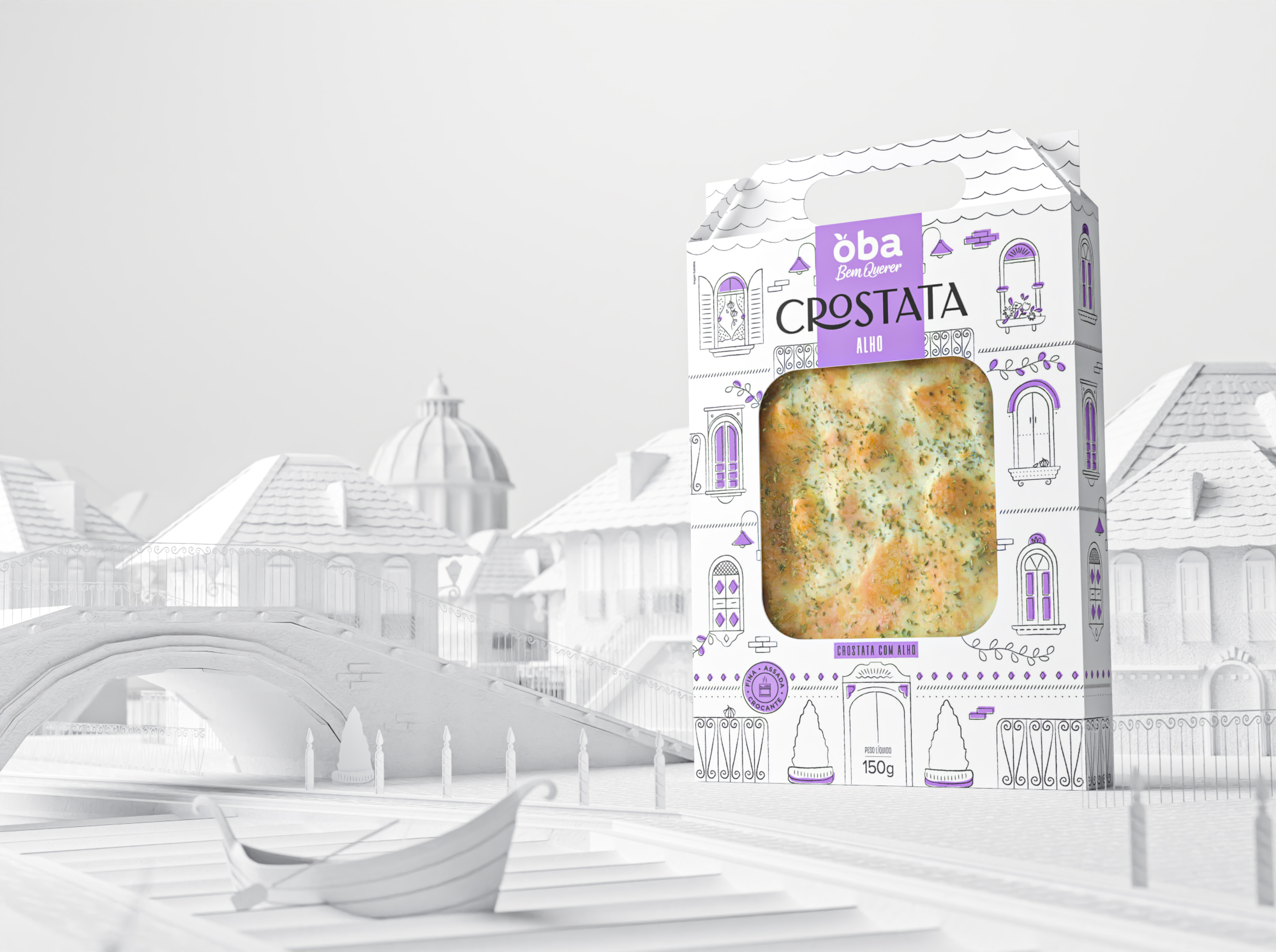
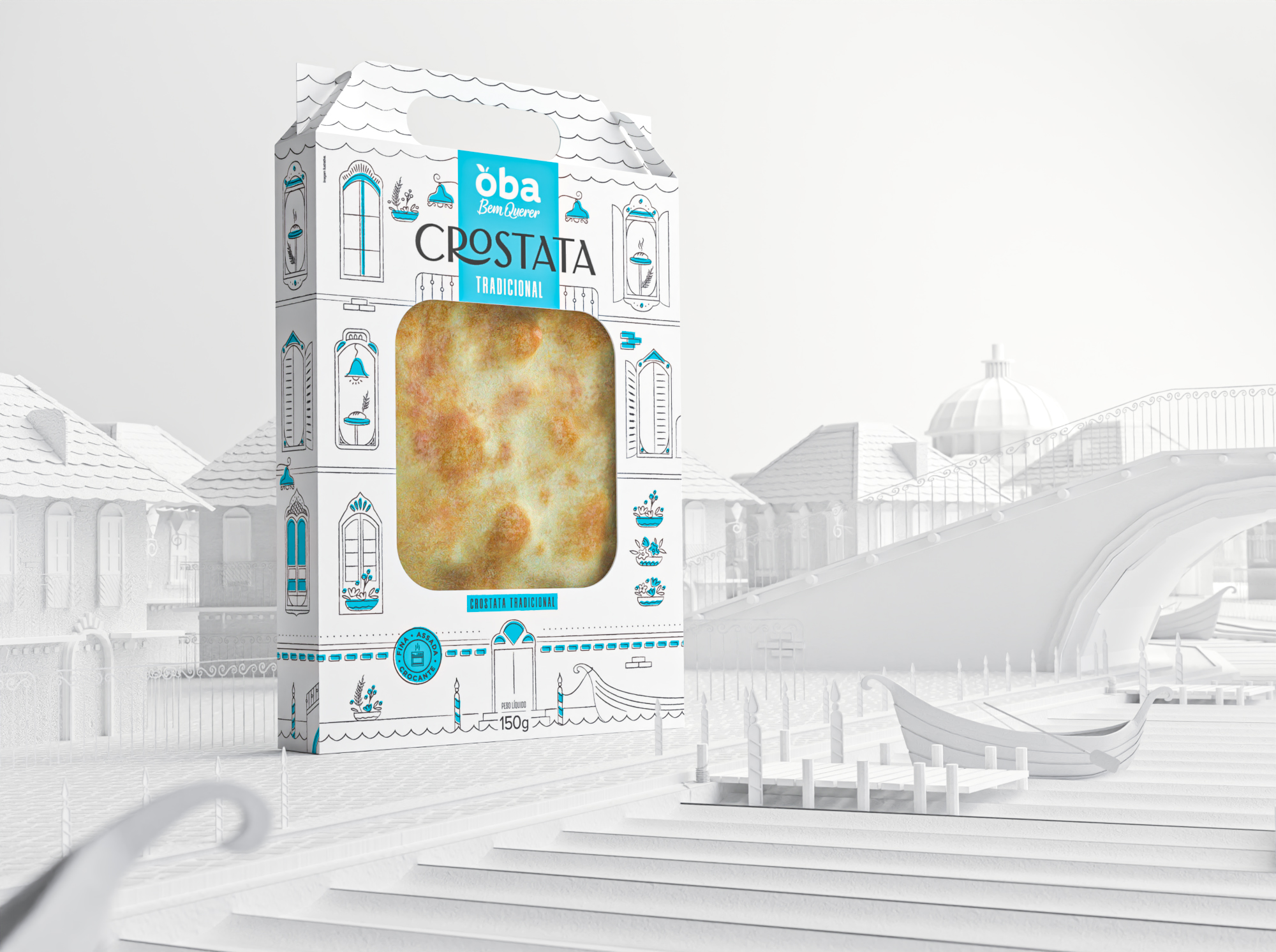
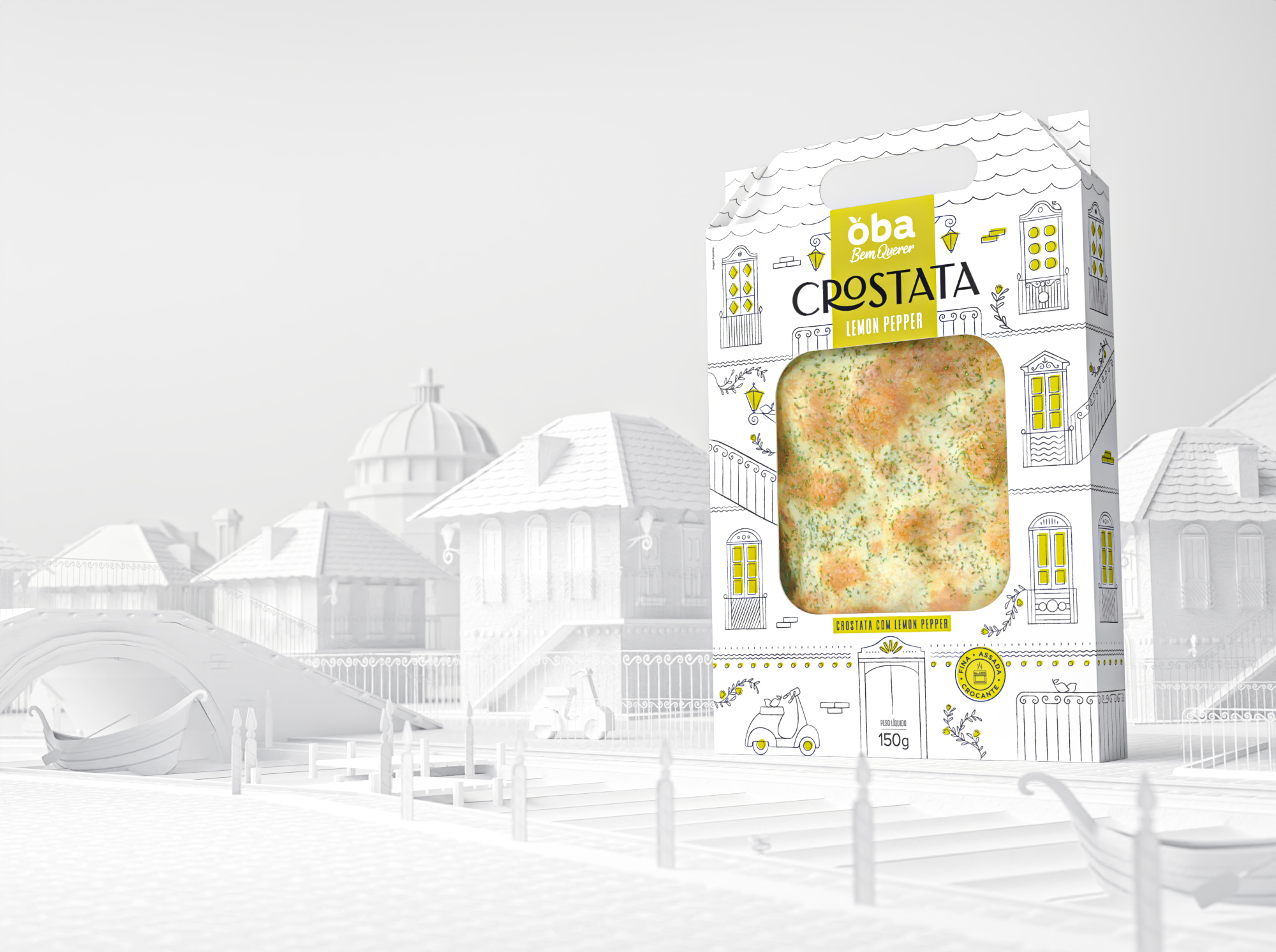
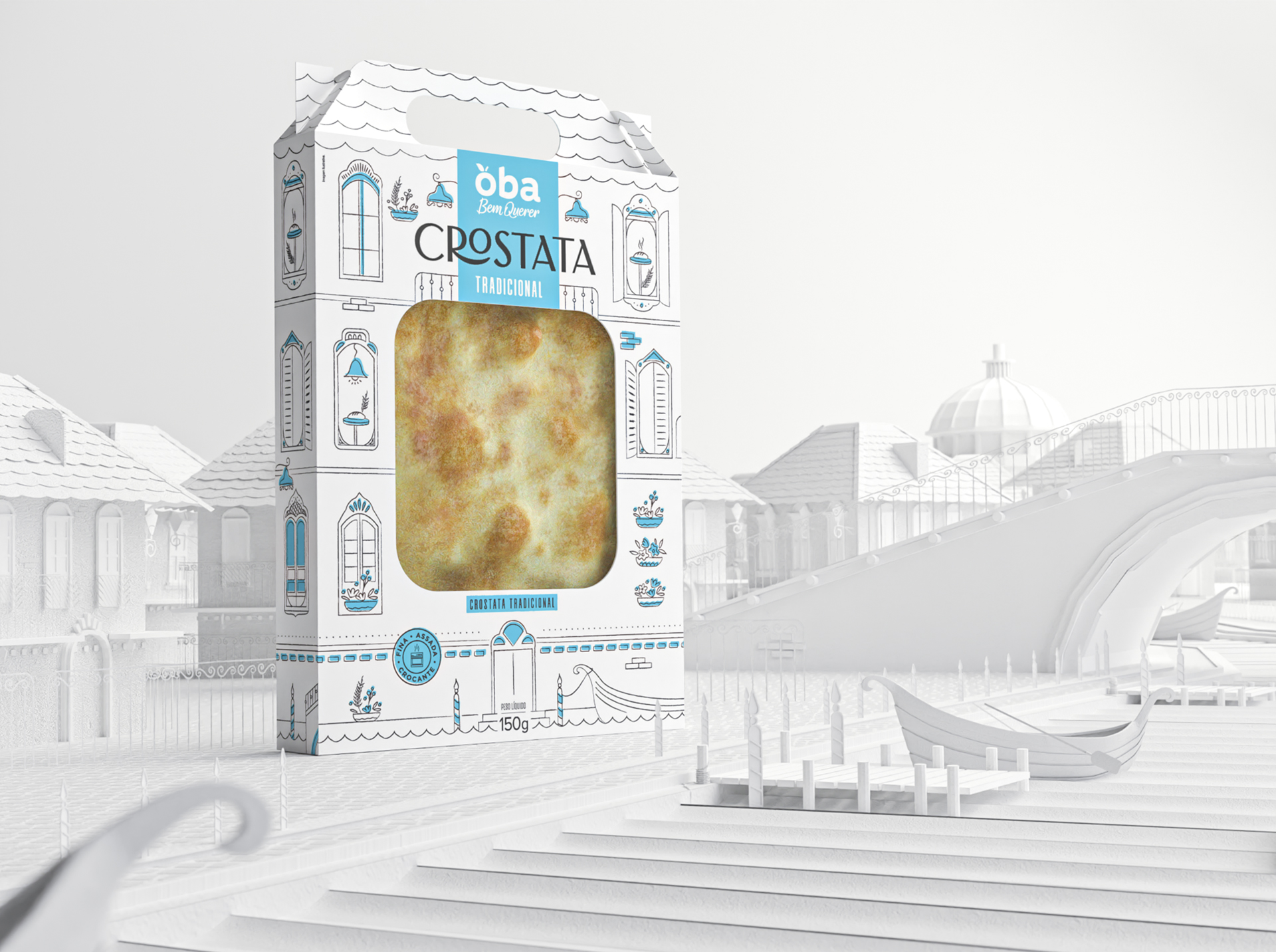
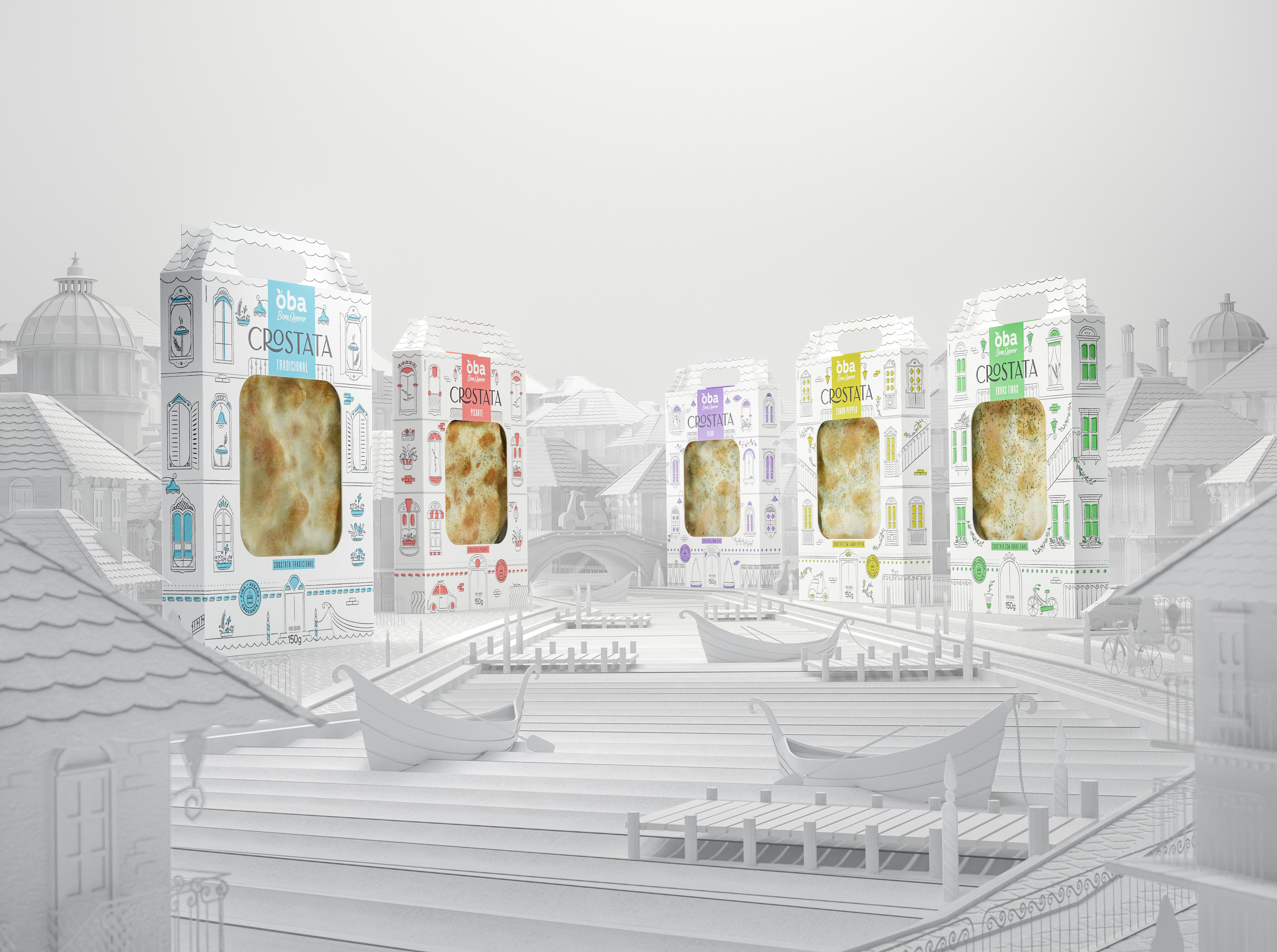
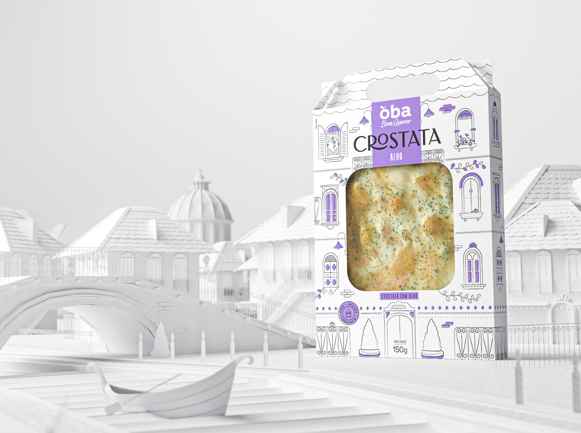
Inspired by Italian cuisine, Oba Flatbread Crackers offers a casual snack at any time. The packaging had to be appetizing and casual but limited to a two-color printing process, our first challenge in this project. Therefore, black was used throughout, with a second color highlighting each product's main ingredient. The dieline, previously defined by the supplier, got a makeover and its shape was turned into traditional charming Italian houses, full of details and “easter eggs" featuring ingredients in the illustrations, bringing to life a lovely Italian scene. The packages do not only protect the products, they are appealing, and stand out at the point of sale. Their design motivates the consumer to buy more products, since they can be used by the whole family to play with, that way being reused instead of thrown away.

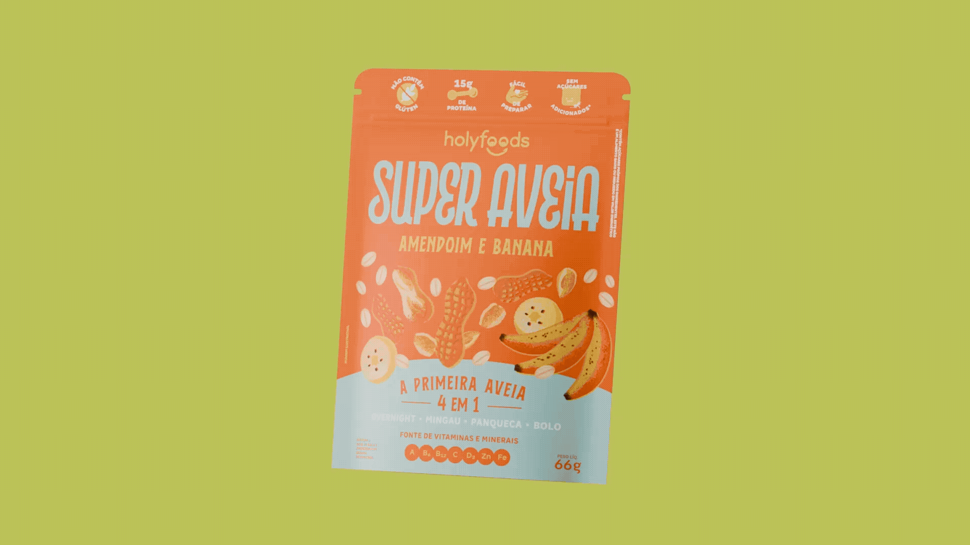
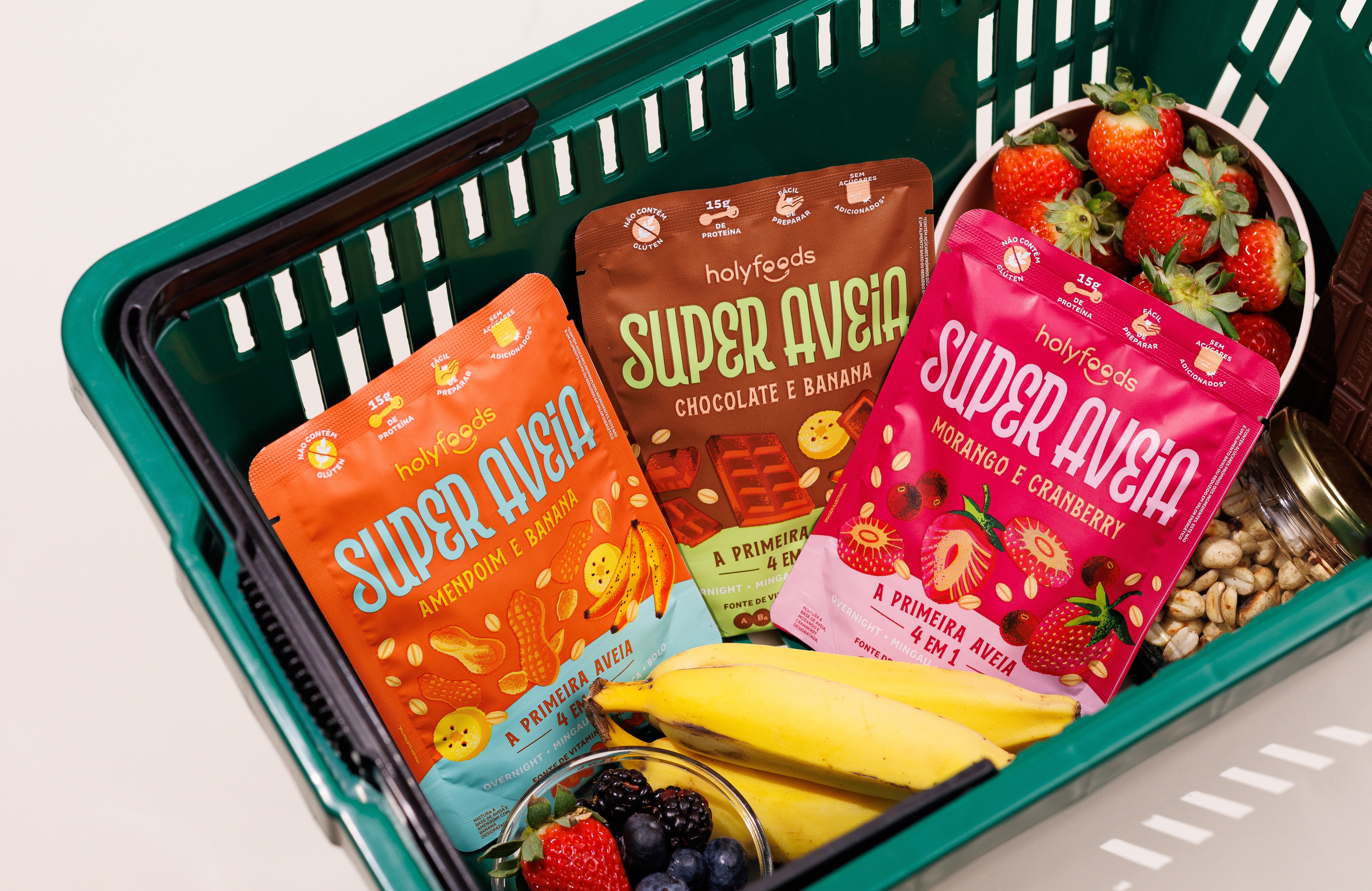
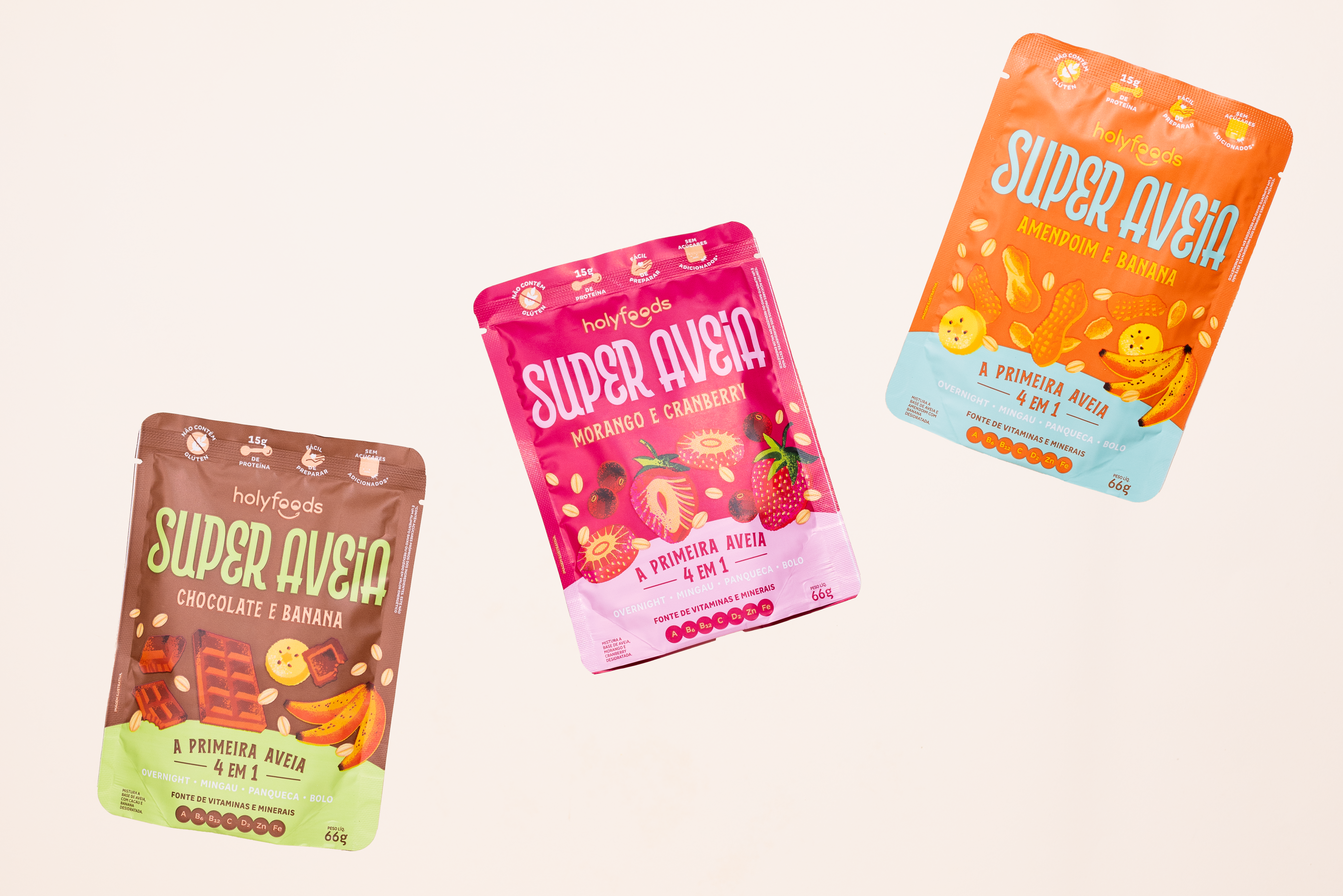
Super Aveia offers three flavor combinations: Strawberry & Cranberry, Peanut & Banana, and Chocolate & Banana. With 15g of protein and essential vitamins, it’s a wholesome choice for breakfast, snacks, or even desserts. The main challenge was fitting a lot of information into a compact design. The custom “Super Oats” logo features friendly, bold curves, dividing space with the versatile “4-in-1 oats” concept on the front panel. Ingredient illustrations with soft textures and dynamic compositions bring personality to the packaging, and each SKU uses a bold color system, while maintaining consistency across the Holy Foods brand. A playful tone is used to highlight product benefits, and a step-by-step guide on the back makes preparation easy. A QR code offers more recipe ideas, enhancing the consumer experience.

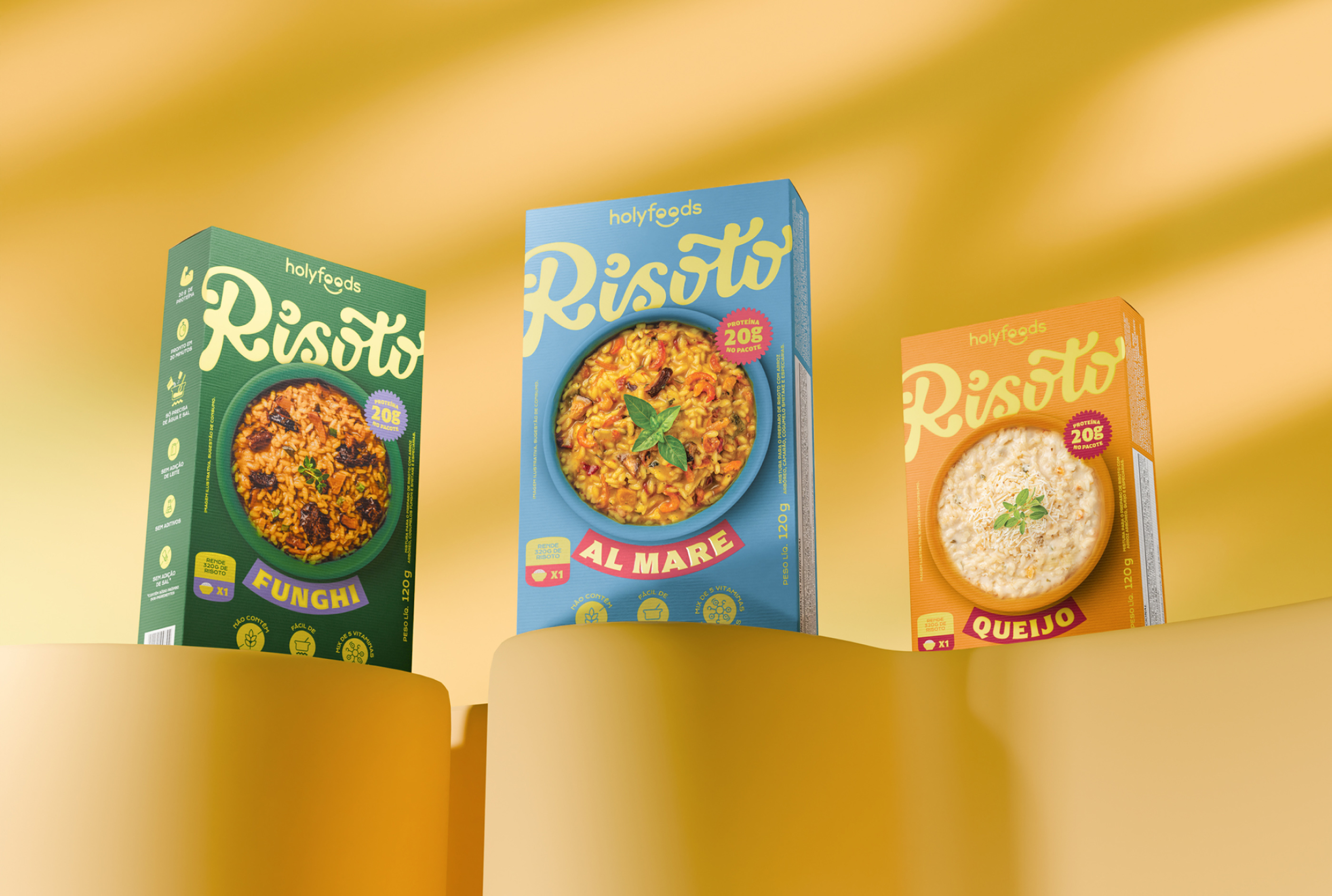
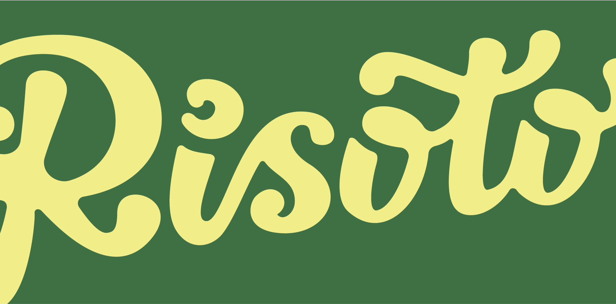
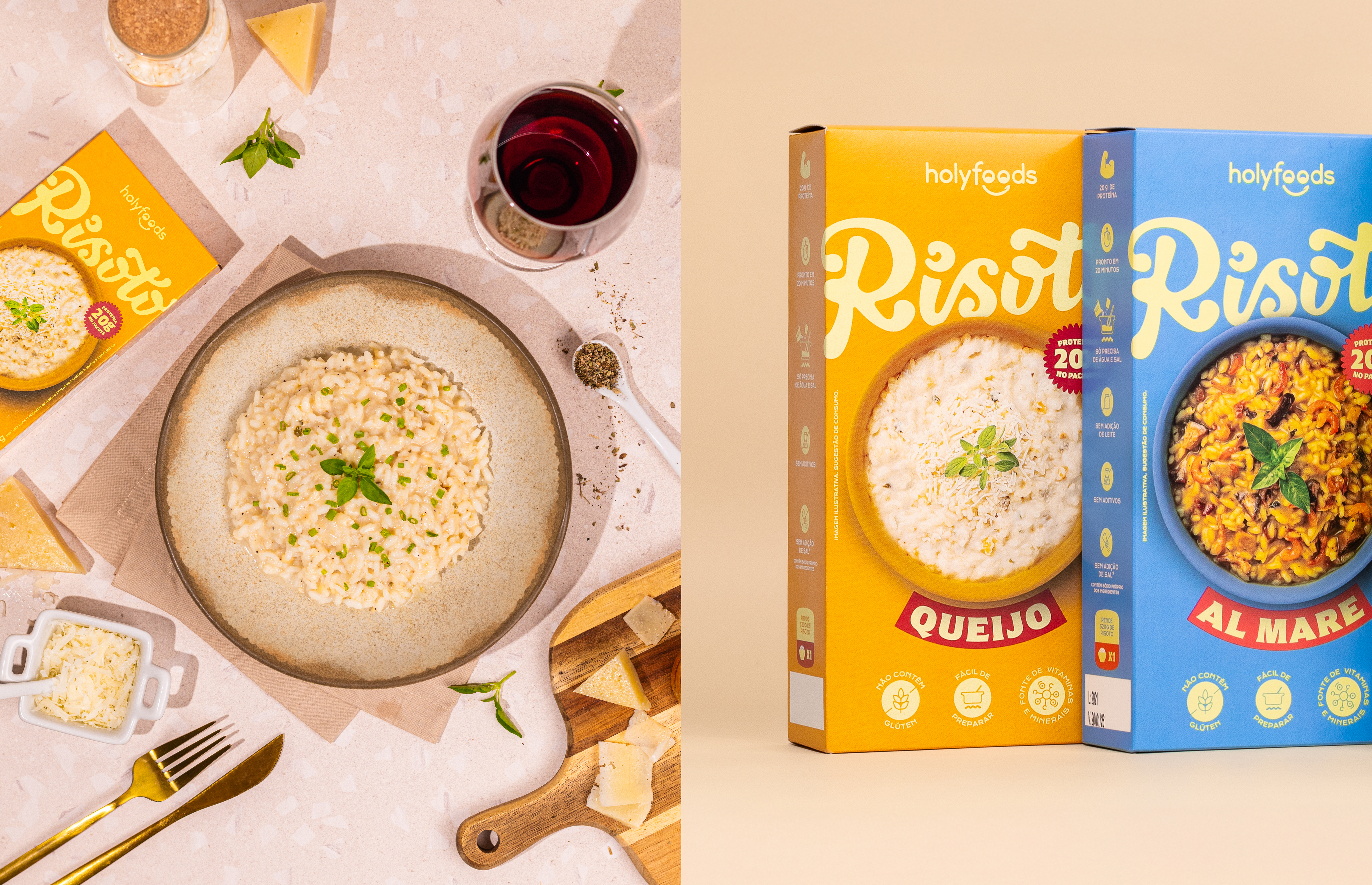
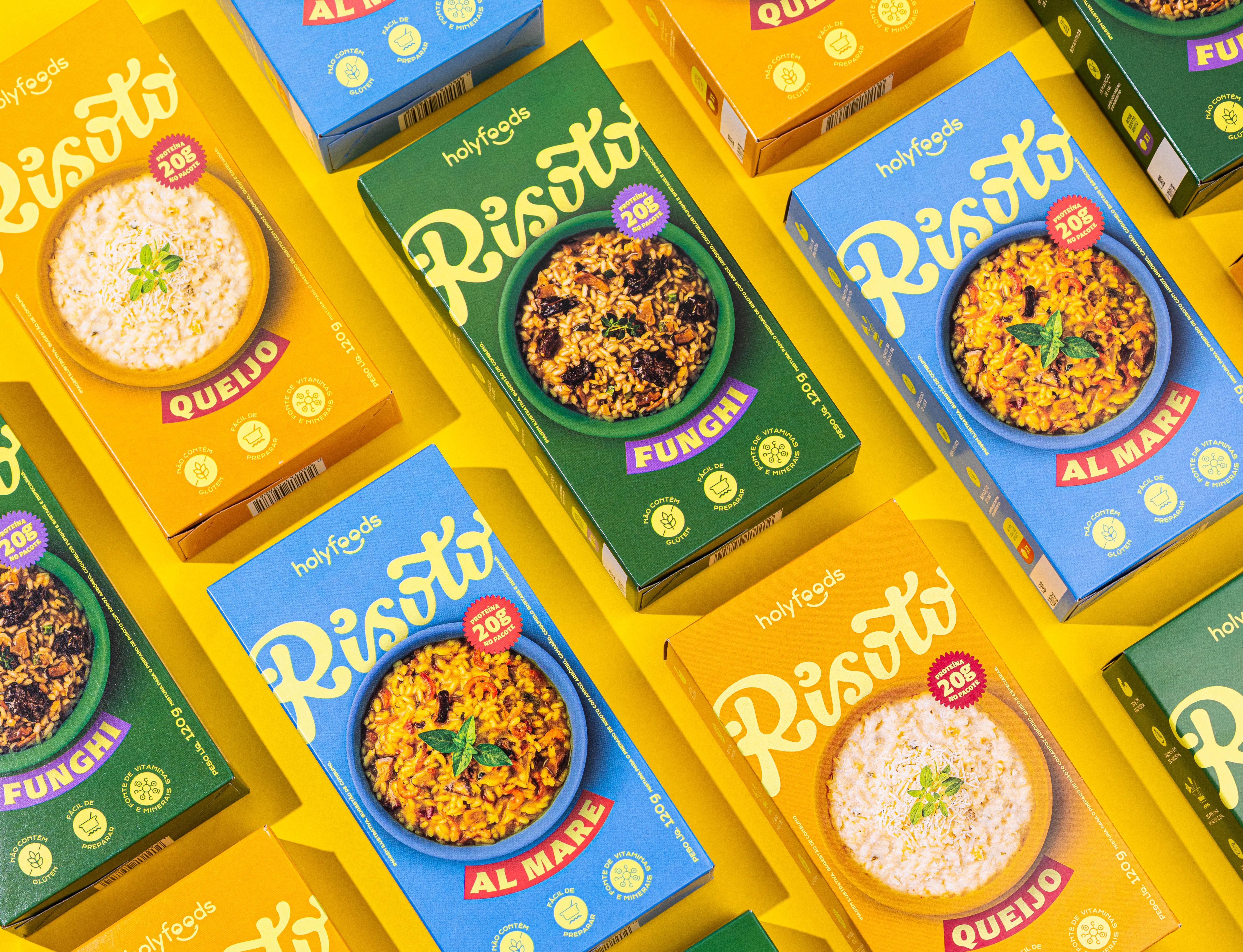
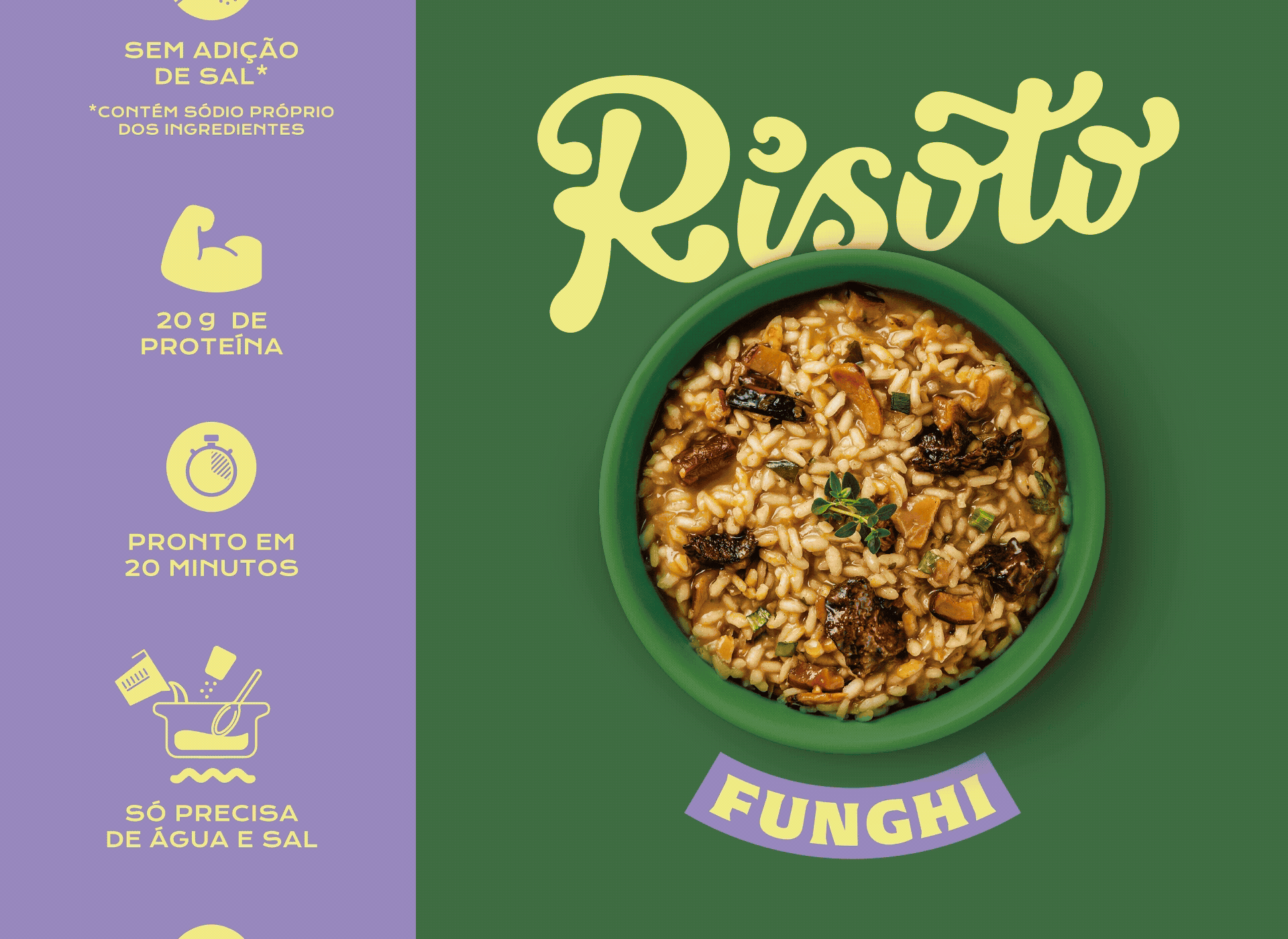
In 2025, Holy Foods expanded its nutritious and flavorful portfolio with three new Protein Risottos: Al Mare (shrimp, shiitake, and spices), Funghi (vegan and lactose-free), and Cheese (vegetarian), offering a premium, convenient mealtime experience. The challenge in this packaging design was to balance a sophisticated feel with Holy Foods' colorful, eye-catching identity. The custom-lettered "Risoto" stands out on the front panel, and the color palette creates an elegant contrast, blending seamlessly with existing products. Photos of the dishes in bowls enhance visual appeal, and an icon system highlights key features already recognizable by their customers. Furthermore, illustrated cooking instructions in the back emphasize how simple the cooking process is. Once again, Holy Foods proves that convenience and nutrition can go hand by hand — and that real food can be simple, delicious, and full of purpose.
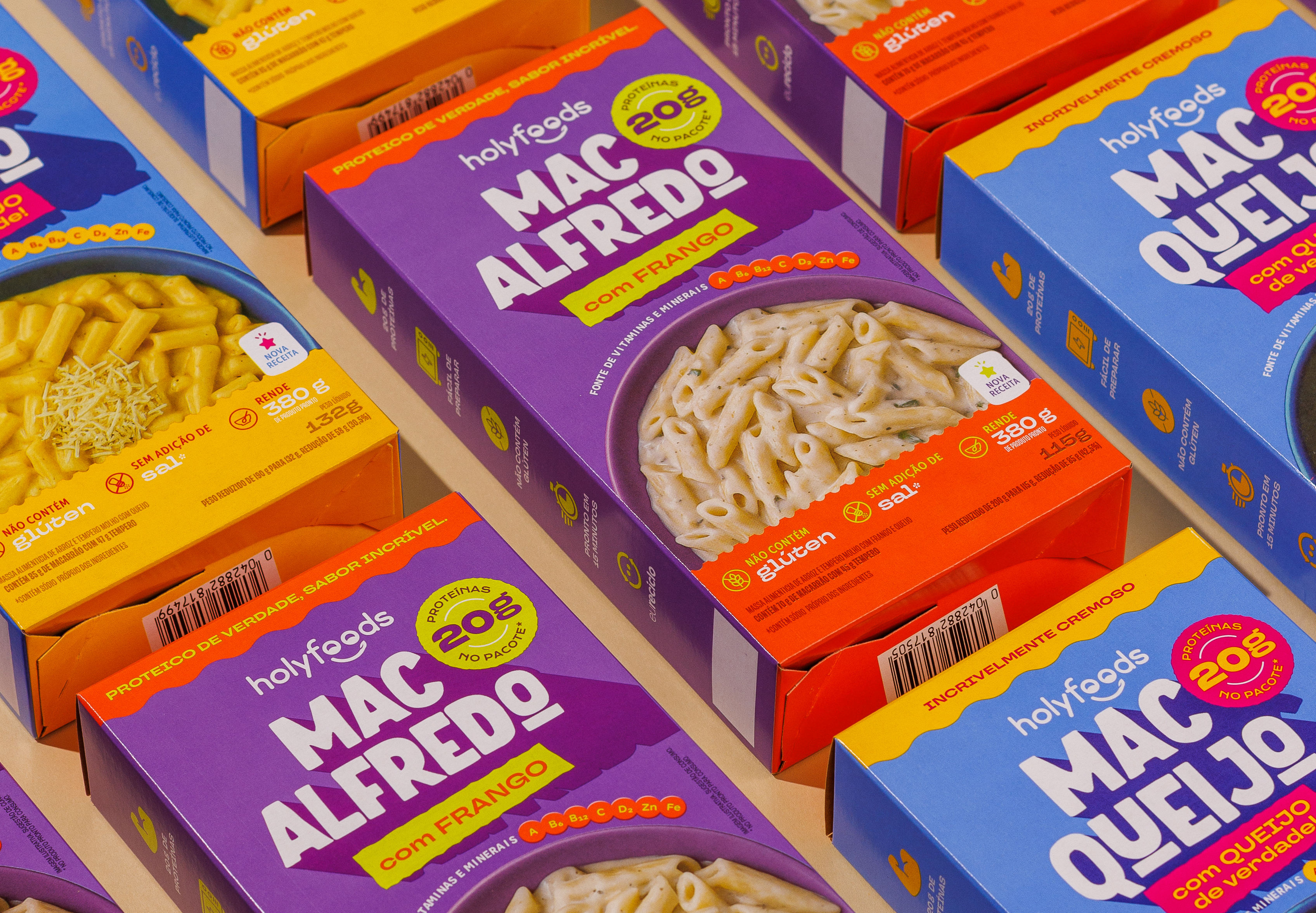
Holy Foods’ noodles follow the same principles as other Holy Foods products: gluten-free, salt-free, with very low sodium levels, yet still a comfort food that is practical and delicious. For the packaging design, designed for a younger audience, we incorporated the vibrant colors already known by the customers, along with other elements that bring a touch of boldness and fun: charismatic typography that highlights each flavor name, and 3D effects that emphasize the creamy and delicious texture of the different pastas. Unique product features are communicated through a clear iconographic system on the packaging, making it easy for consumers to understand the benefits at a glance.


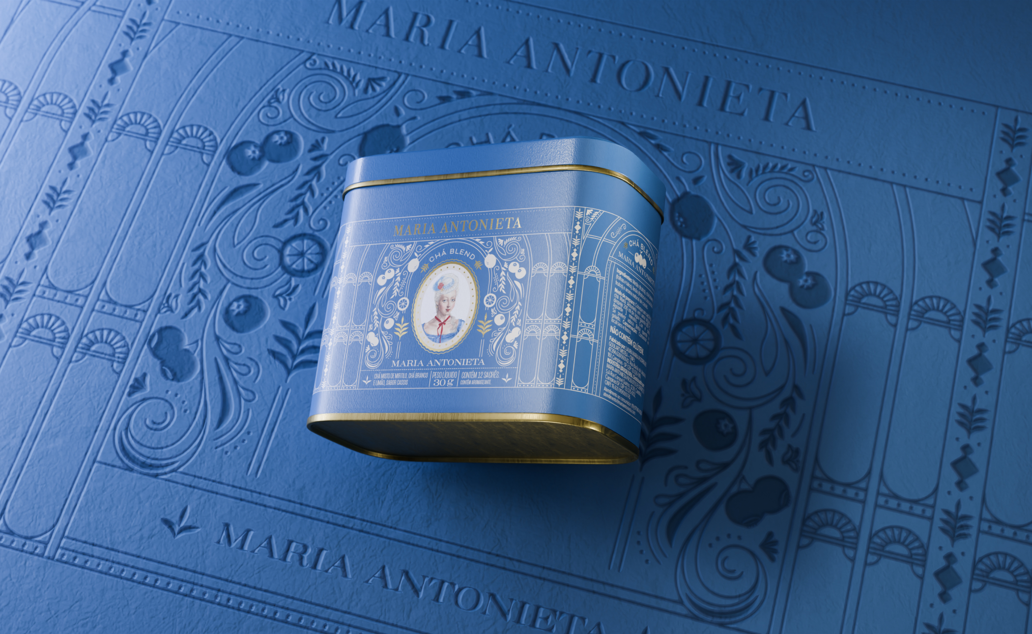
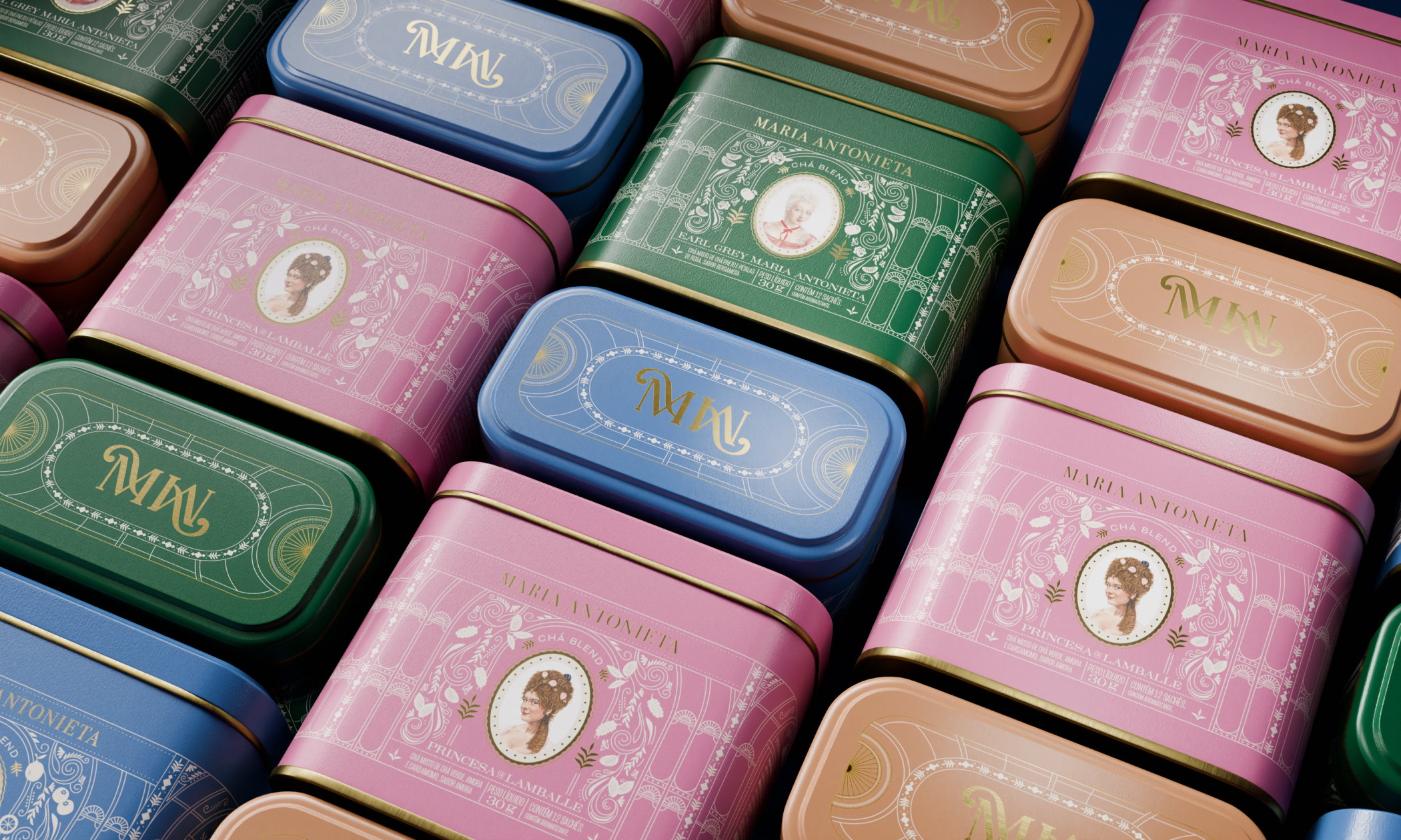
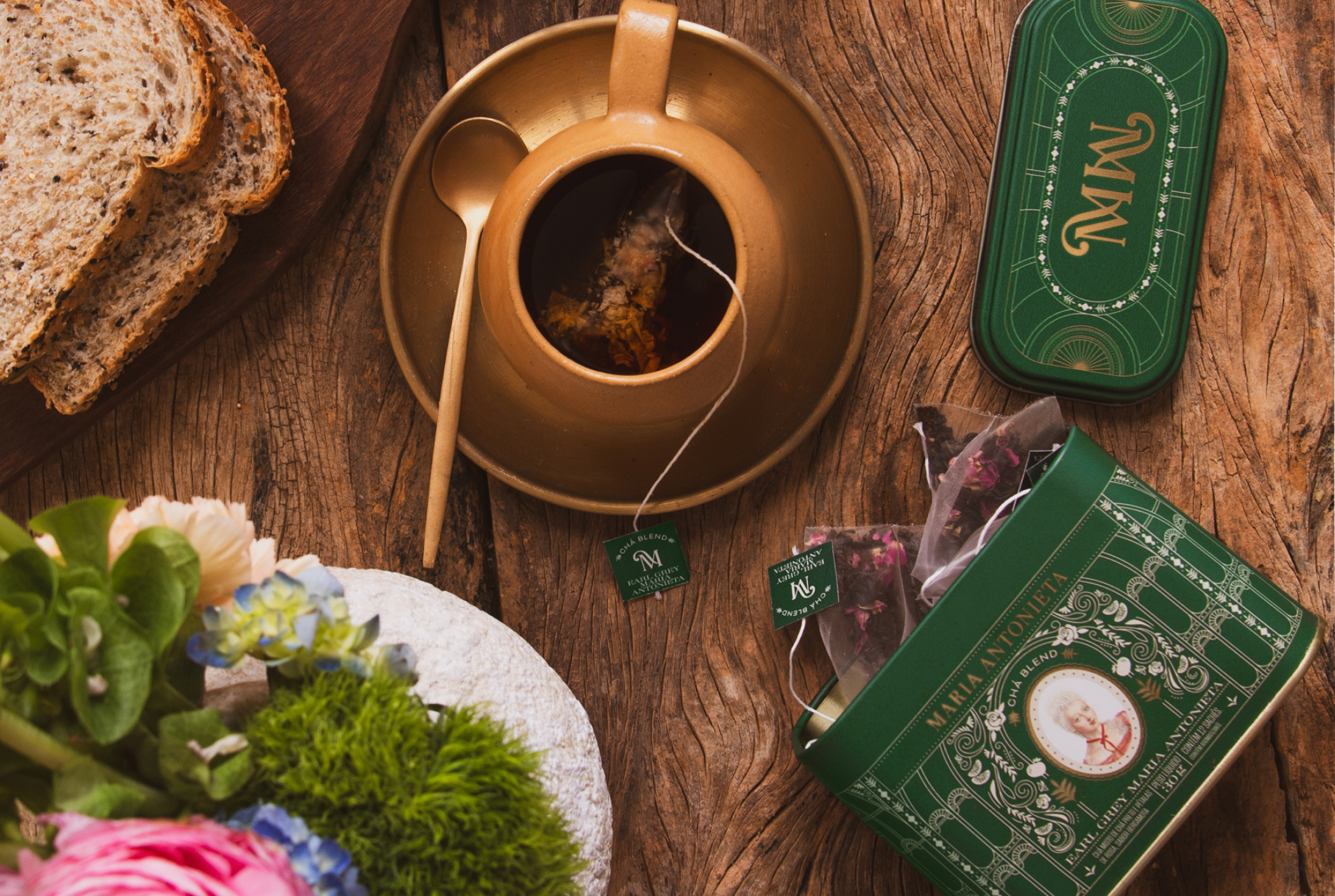
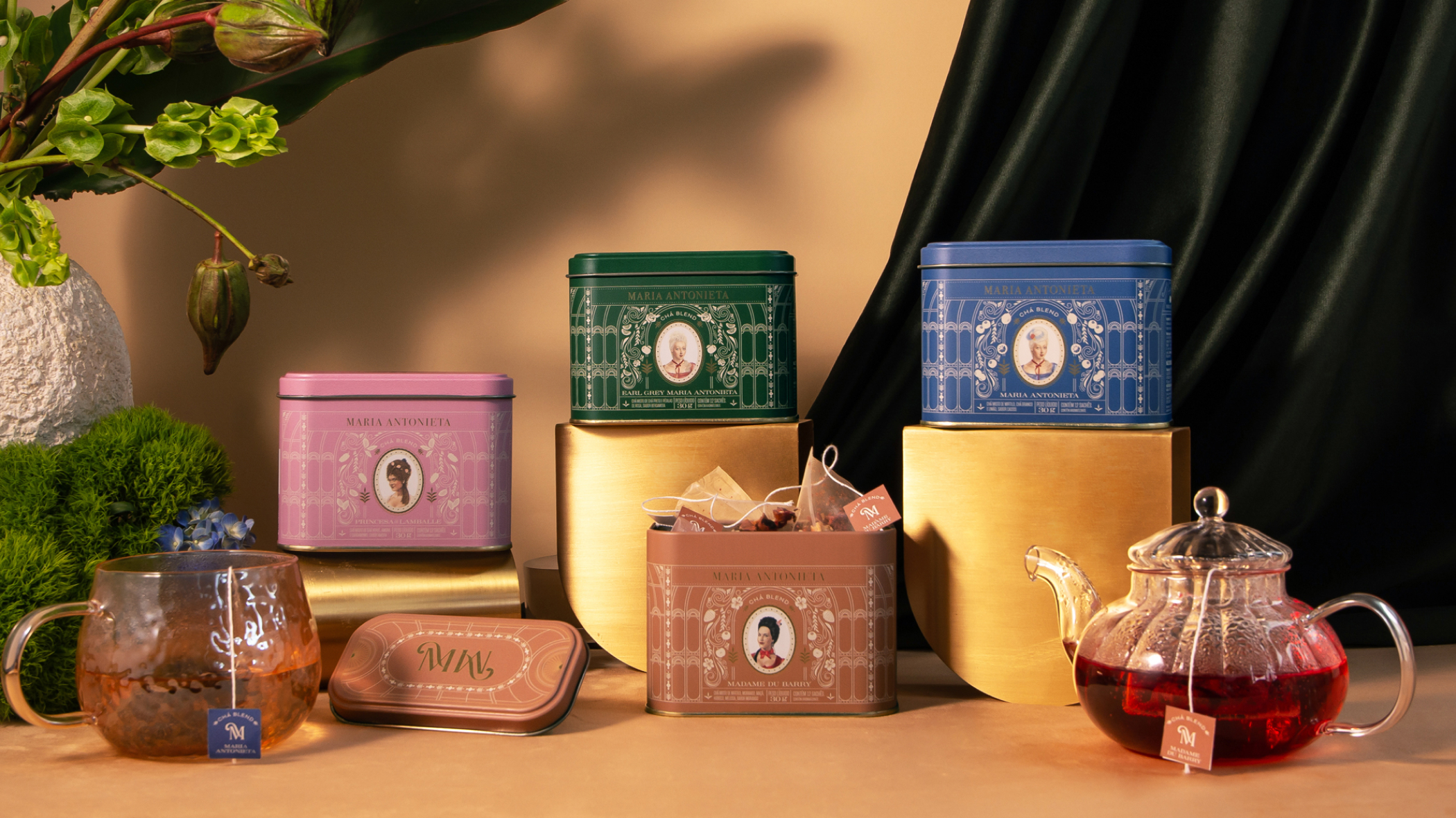
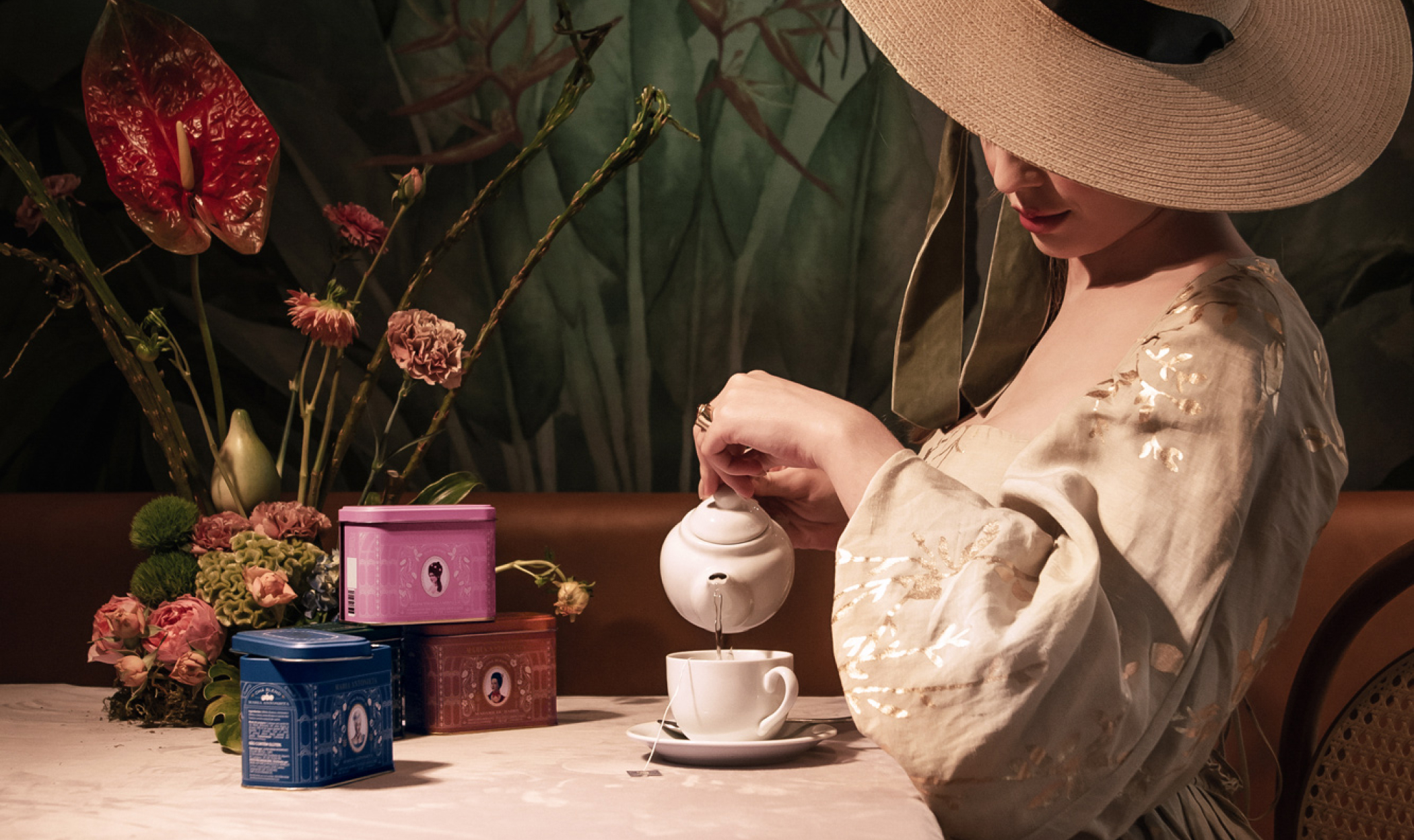
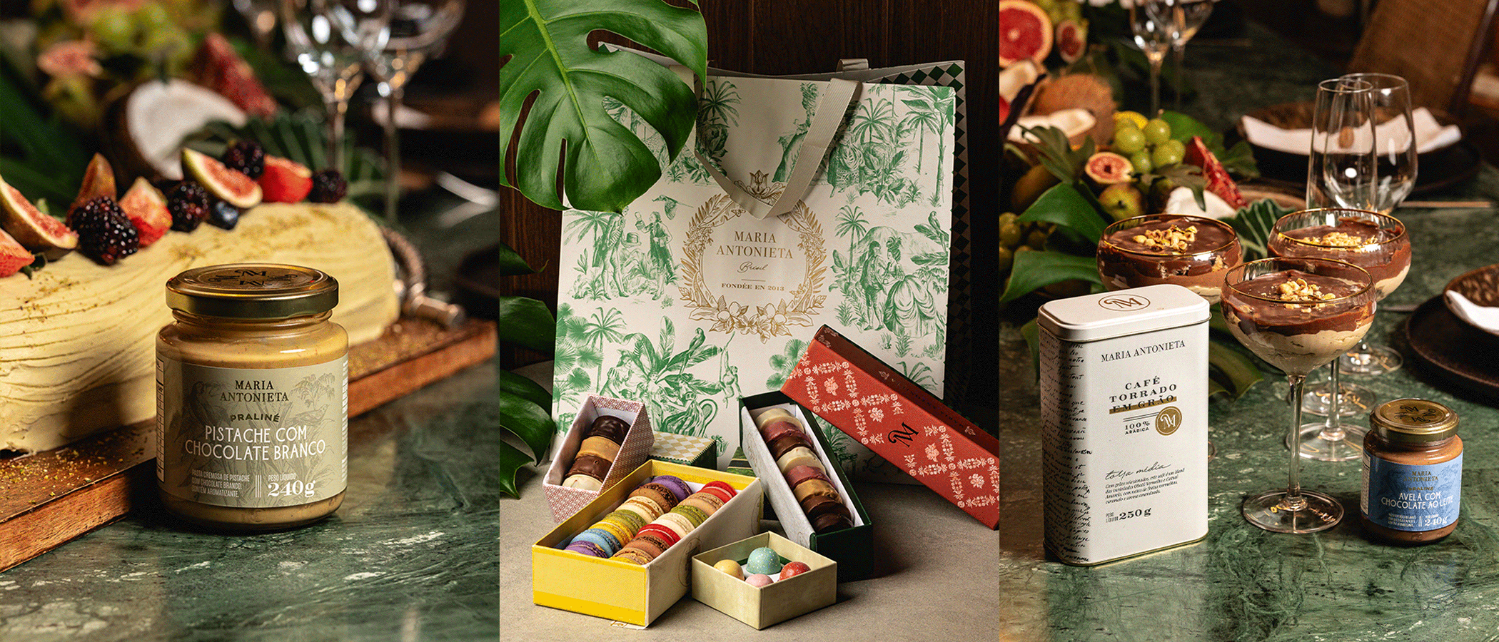
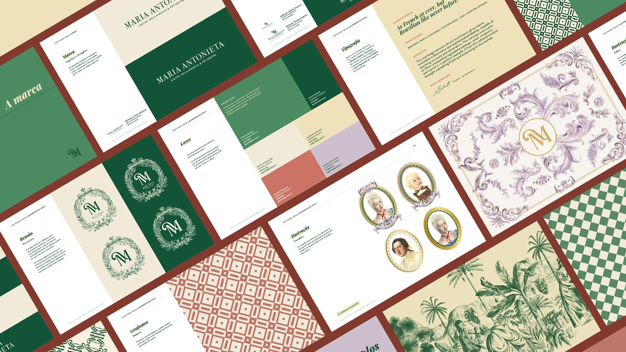
The focus os this project was the delicacy of the shapes, the subtlety of the font size, and the graceful adornments and curves. The design of each can in Maria Antonieta's tea line invites consumers to explore every detail and feel special about owning such an exclusive product. We drew our main inspiration from art nouveau garden greenhouses, with their metal and gloss structures, imagining these as the perfect setting for an afternoon tea among the ladies of the French court. For each tea flavor was assigned a unique color, along with illustrations of elements related to the ingredients, and a cameo of a character such as Queen Marie Antoinette and Madame Du Barry. The lids of the cans feature designs reminiscent of the roofs of these beautiful garden domes, adding to the storytelling.
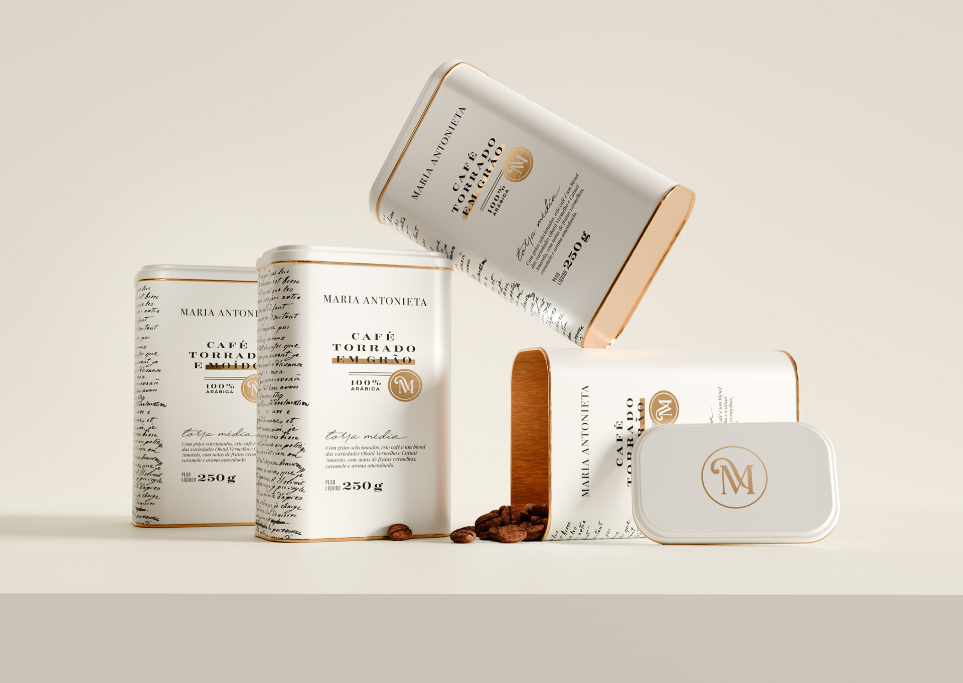
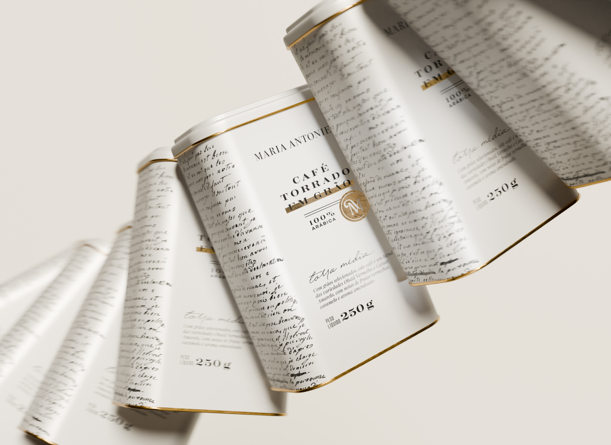
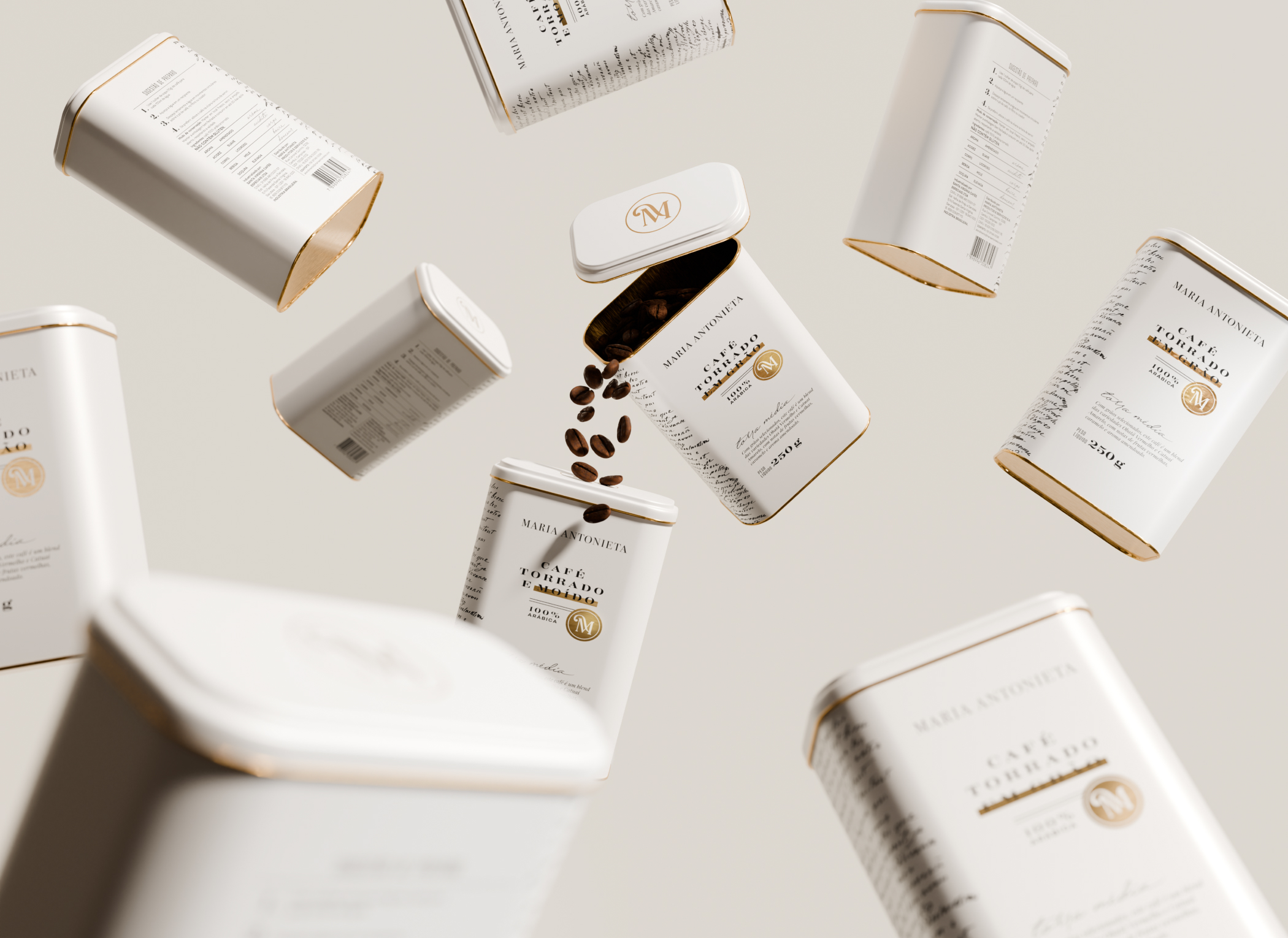
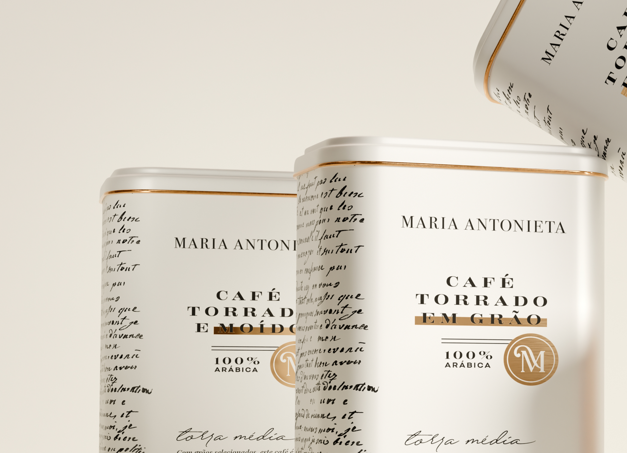
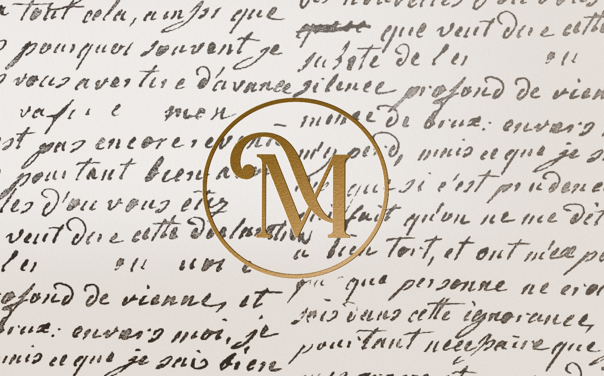
For the development of Maria Antonieta's coffee packaging, we sought for a clean yet charming aesthetic. Our goal was to make the coffee stand out as a refreshing contrast within the product portfolio, which was fulfilled by rich and maximalist designs, while also maintaining the brand's positioning in the luxury market. The packaging design was inspired by the coded and redacted letters secretly exchanged between Marie Antoinette and Count Axel Von Fersen, as well as the story behind them. The side of the can features a reproduction of one of the original letters, with the words standing out against a white background and extending across the front and back views, creating a seamless visual flow. Golden details, carefully applied to specific areas of the packaging, add a touch of luxury and sophistication, making the packaging a highly presentable piece – an important aspect for the brand and its consumers.
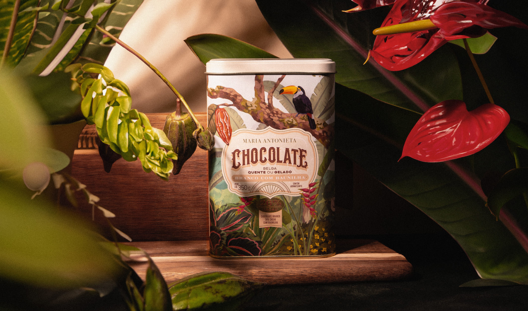
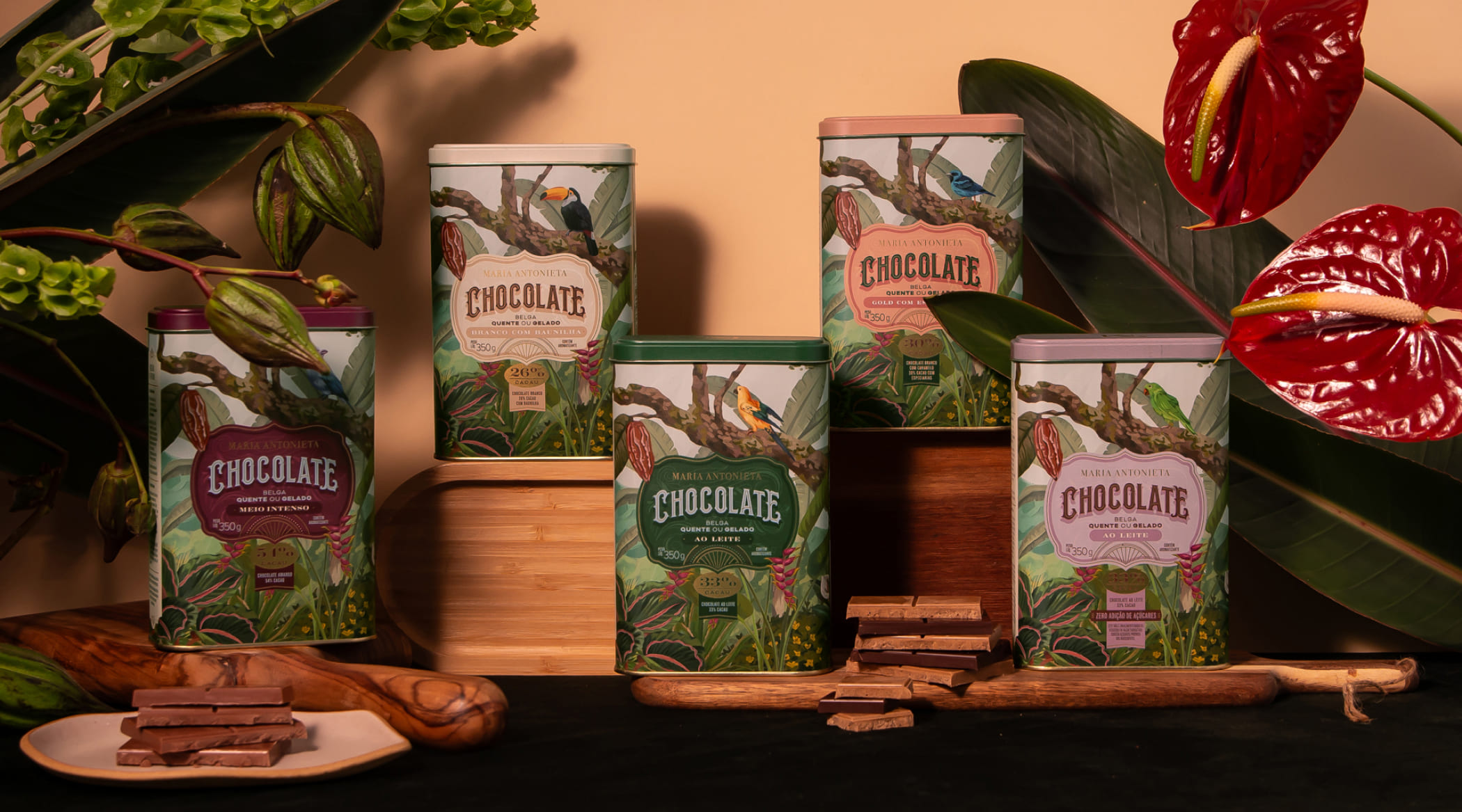
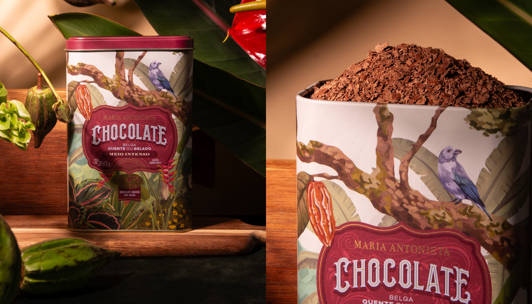
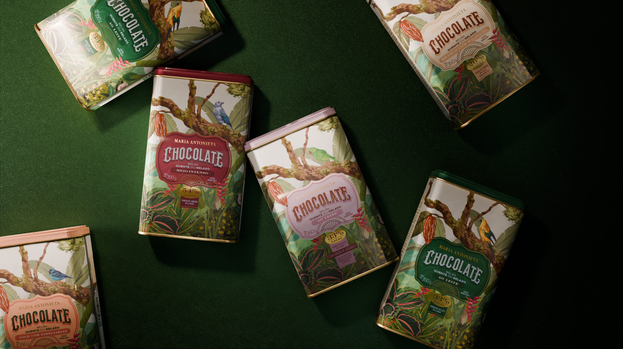
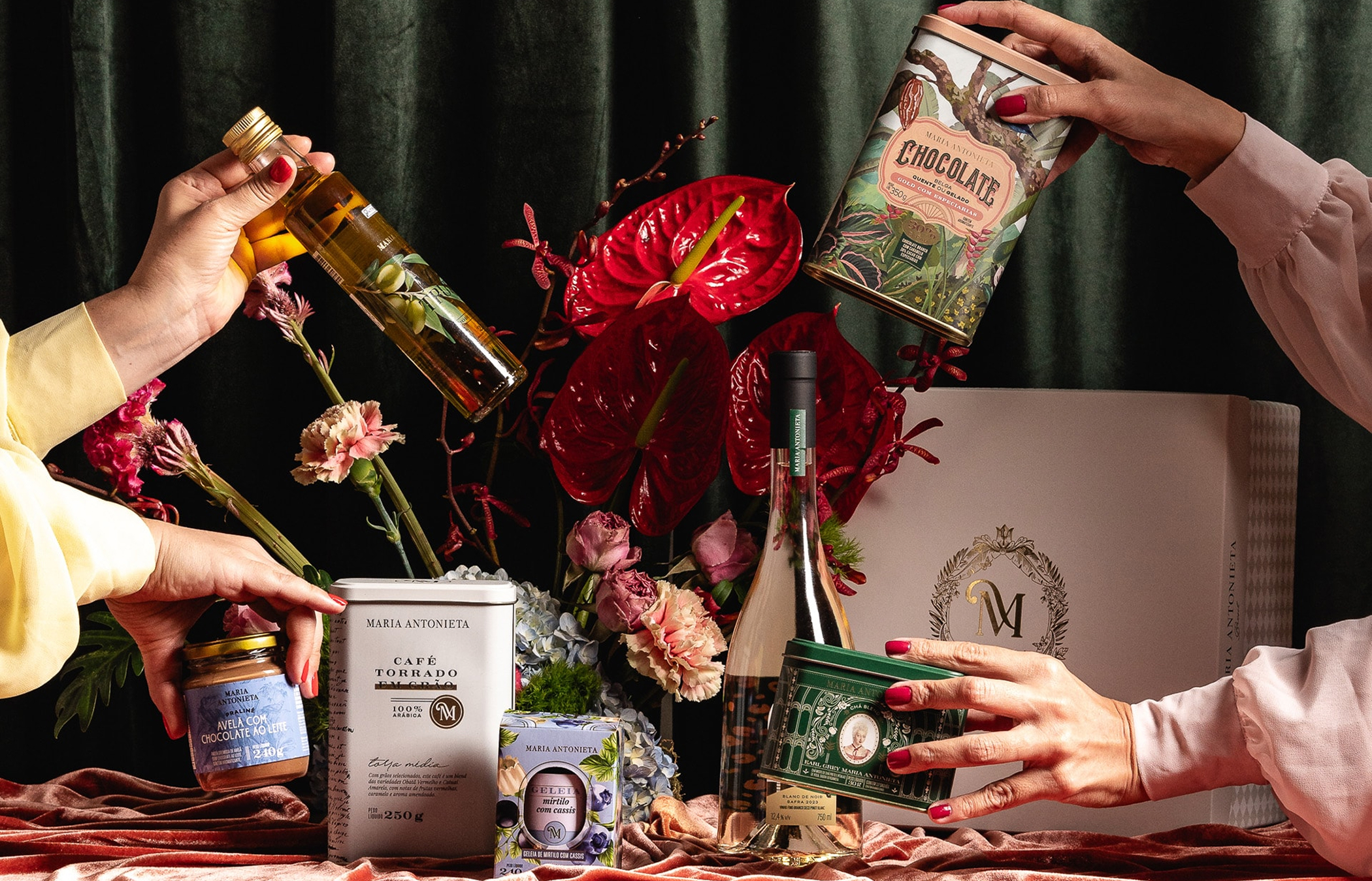
Five different flavors of Belgian powdered chocolates to be enjoyed as hot or cold beverages. Despite the familiar concept, what sets this line apart from others on the market is the exceptional quality of the ingredients contained in these cans. Cans that not only protect the product but also communicate, enchant, and make consumers want to keep them even after the contents are gone—this was a guiding principle for our creation. Layers illustrating Brazilian flora overlap, setting the scene for birds that help differentiate each product. The exclusive illustrations, combined with detailed graphic elements and elaborate typography, bring an exotic and highly refined air to the compositions. We chose non-obvious colors to reinforce the desired positioning. This tropical and sophisticated atmosphere is part of Maria Antonieta's strategy and resonates well with the brand's select audience.
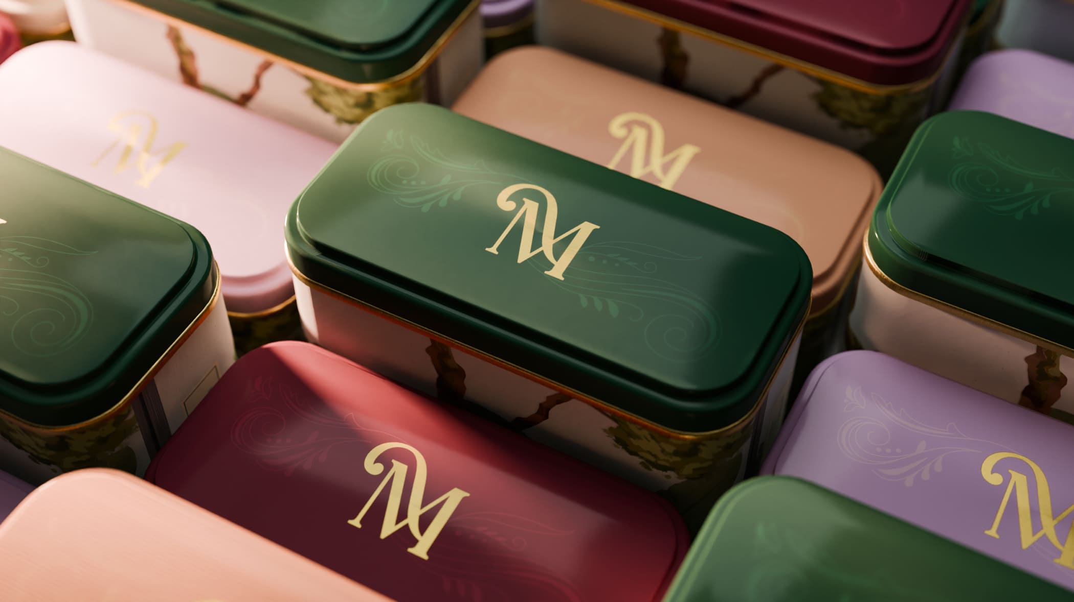

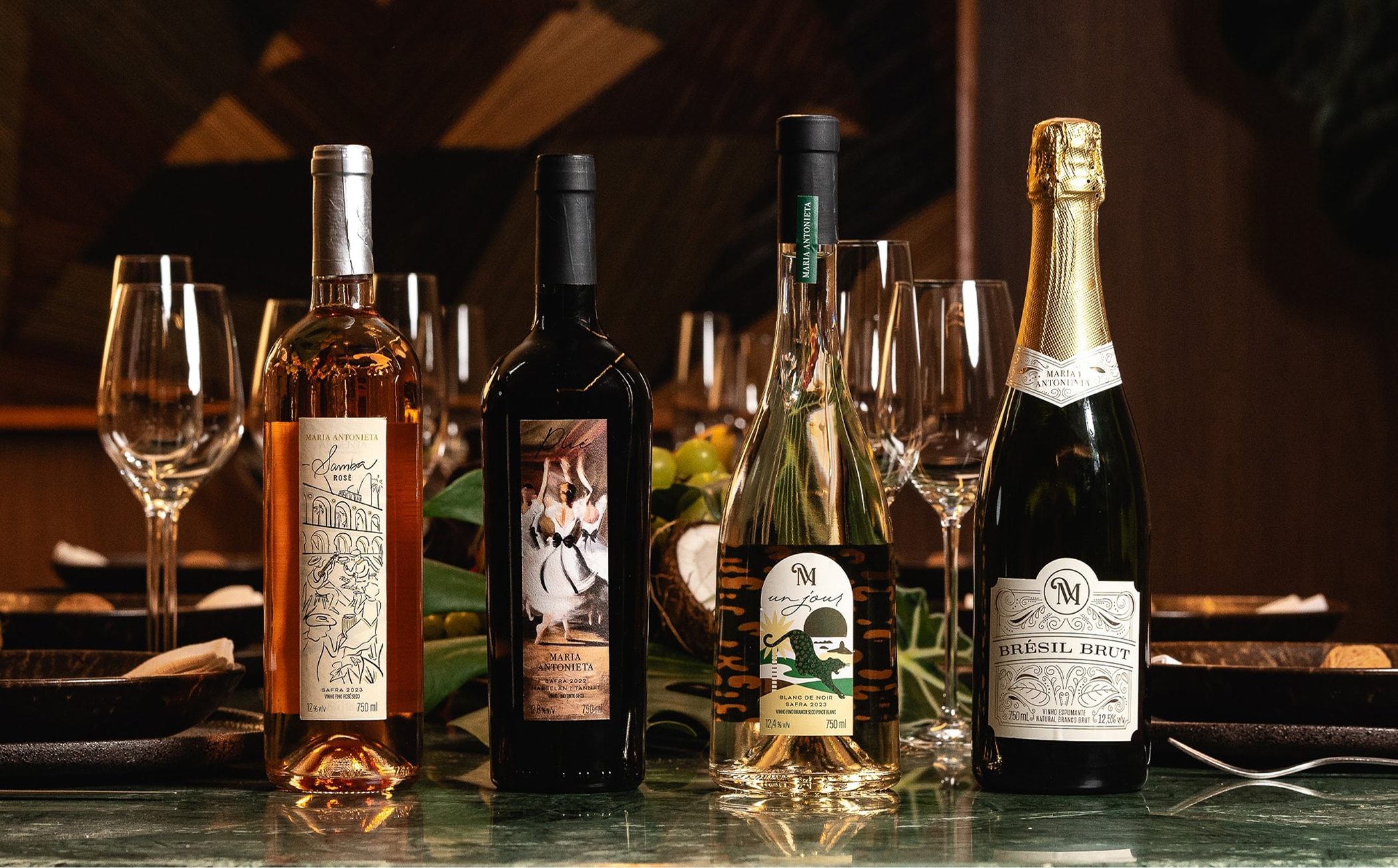
Maria Antonieta, a charming blend of bistro, boulangerie, pâtisserie, and chocolaterie with French roots and a Brazilian soul, has been delighting customers with excellence for over a decade. We developed a concept for a new chapter of the brand, imagining what it would be like if the French court had settled in Brazil: “as French as ever, but Brazilian like never before.” The outcome is a refined mixture of ingredients, flavors, traditions, and cultures, seamlessly blending the best of both worlds for their sophisticated consumers, those who appreciate heritage and the prestige the brand embodies. Each piece created is unique, yet all seamlessly connected. Whether launching a new product or creating a branded experience, we continue to craft a visual universe worthy of a luxurious and contemporary Franco-Brazilian banquet.

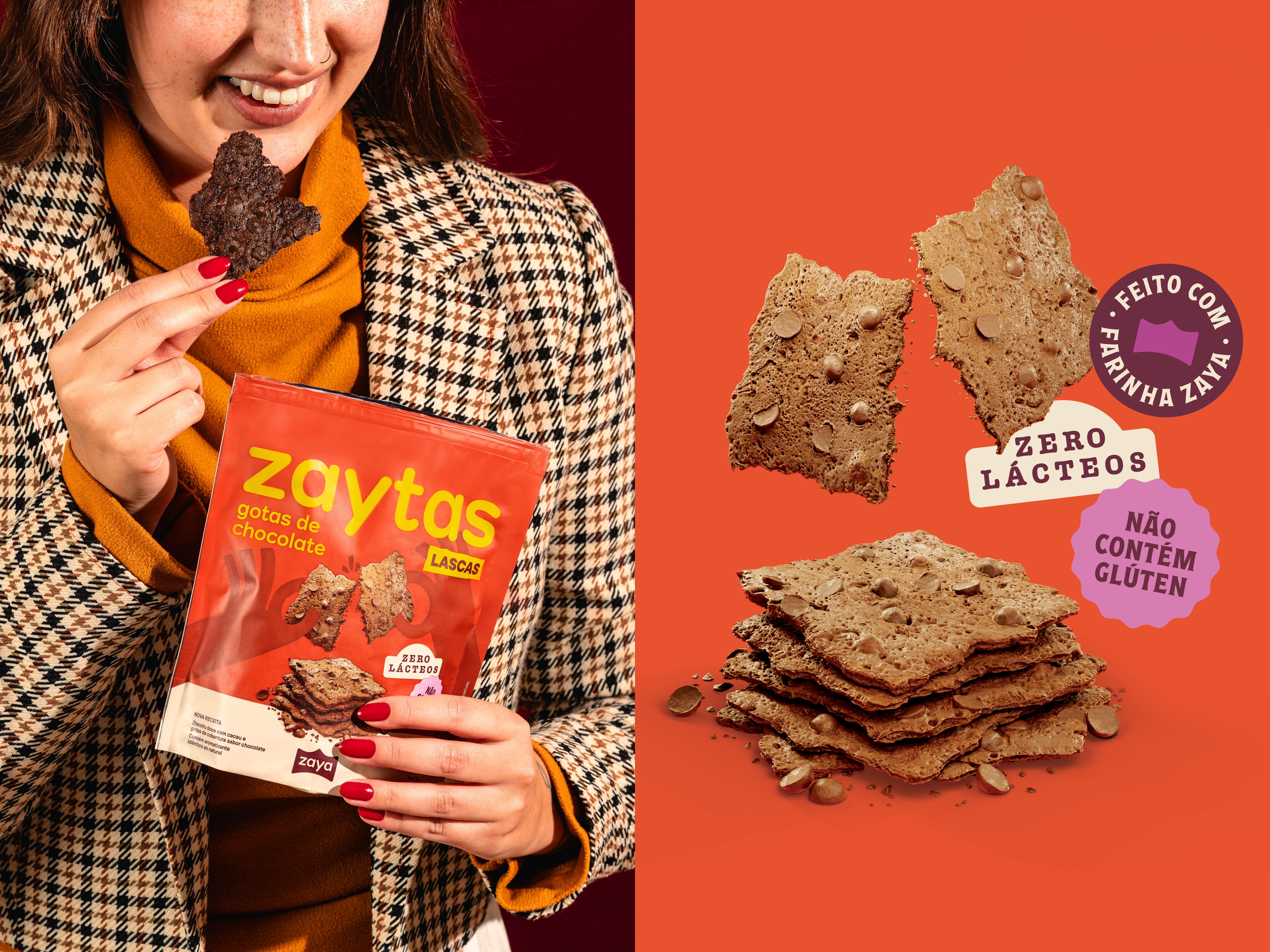
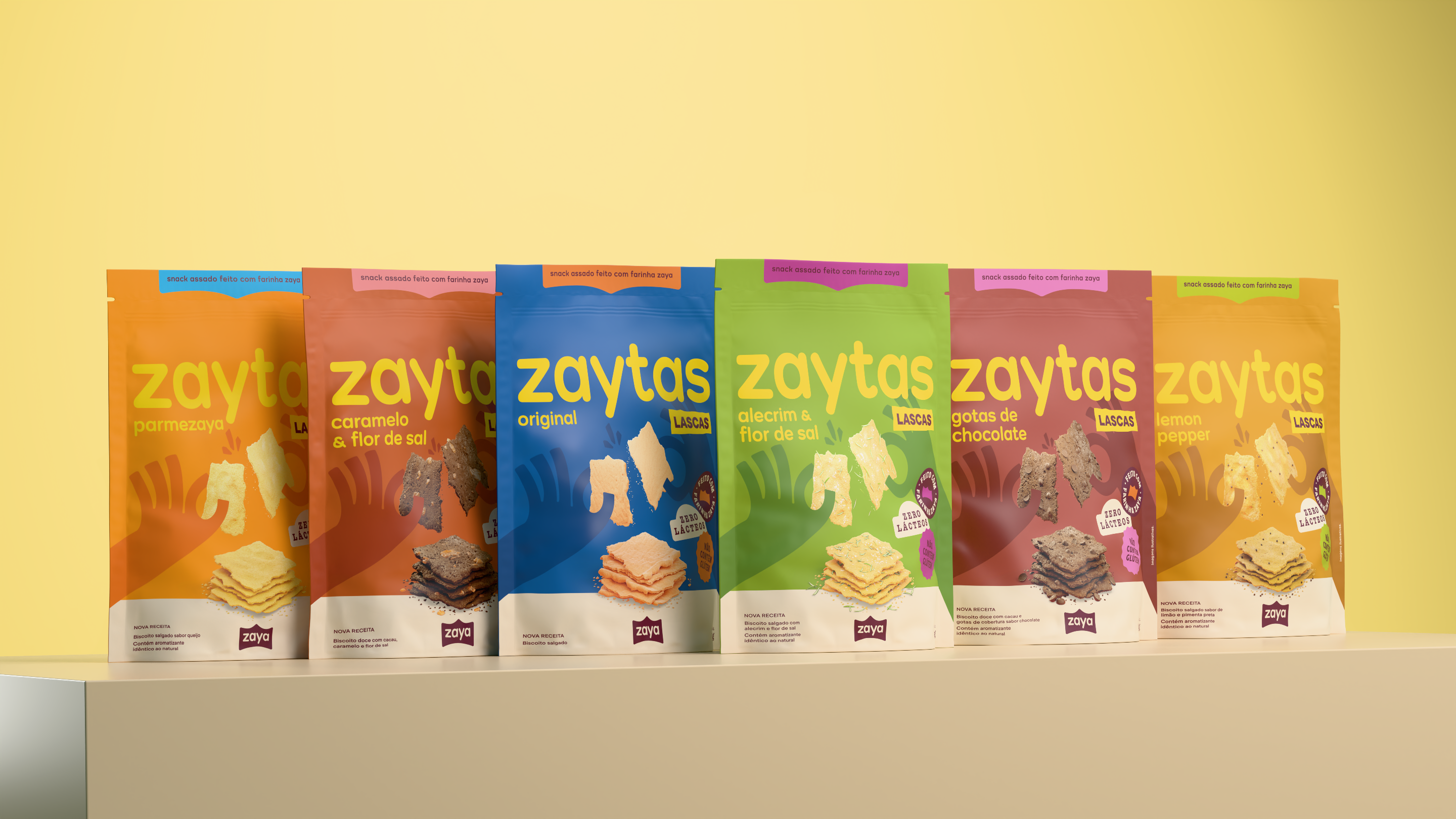
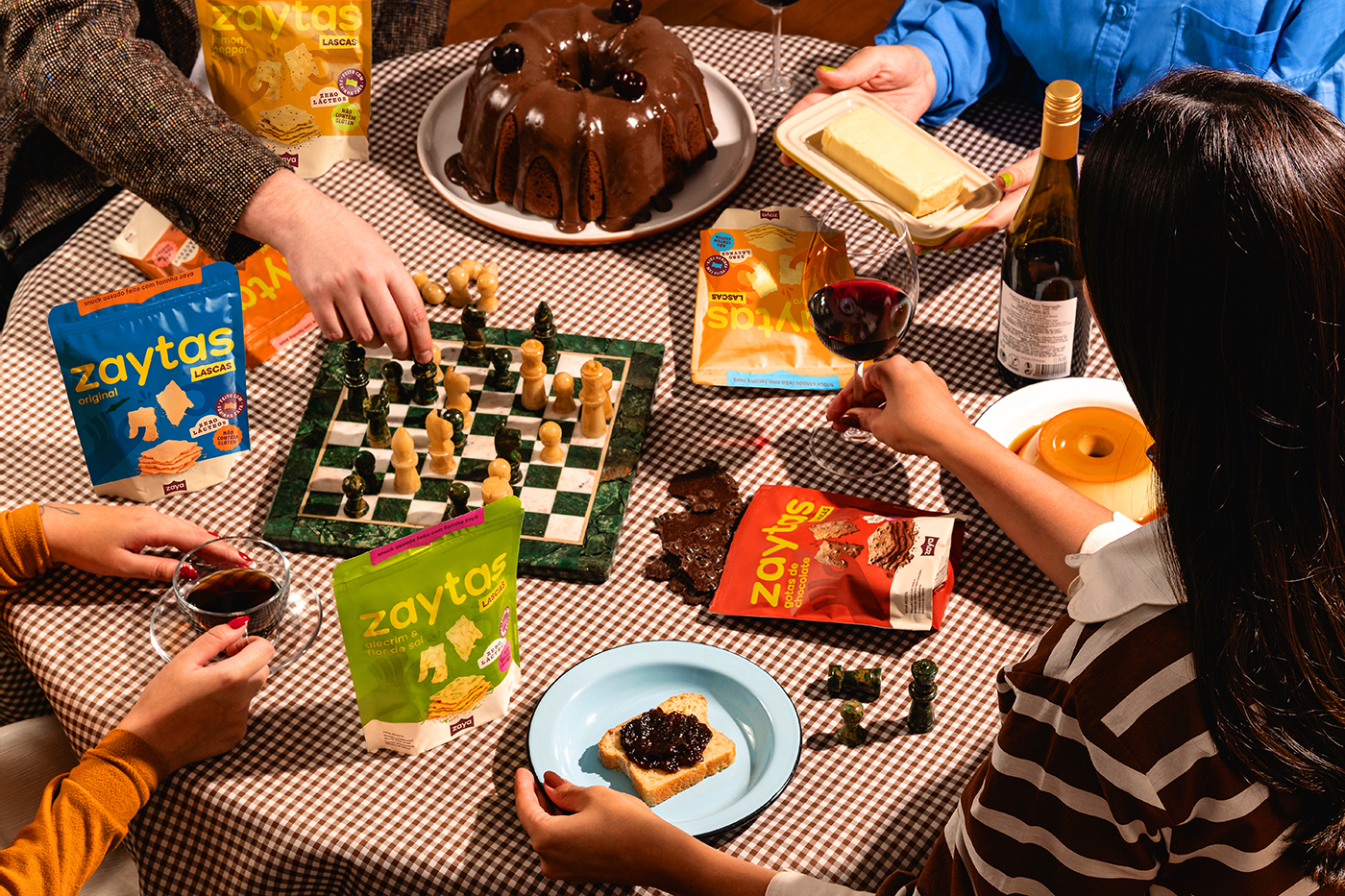
Zaya began as a brand offering a single-ingredient flour: cassava. Over time, it expanded its portfolio, always focusing on products that are safe for people with severe allergies or gluten intolerance, strengthening its position in the “healthy snacks” category. We developed Zaya’s brand strategy and new visual identity. Since the brand was already well-established in the market, we took care to preserve its essence, avoiding any disruption in public perception. At the same time, we aimed to broaden its communication universe, making it more versatile through a proprietary typeface, playful illustrations, and packaging that highlights both flavor and inclusivity, while maintaining consistency across the entire line.

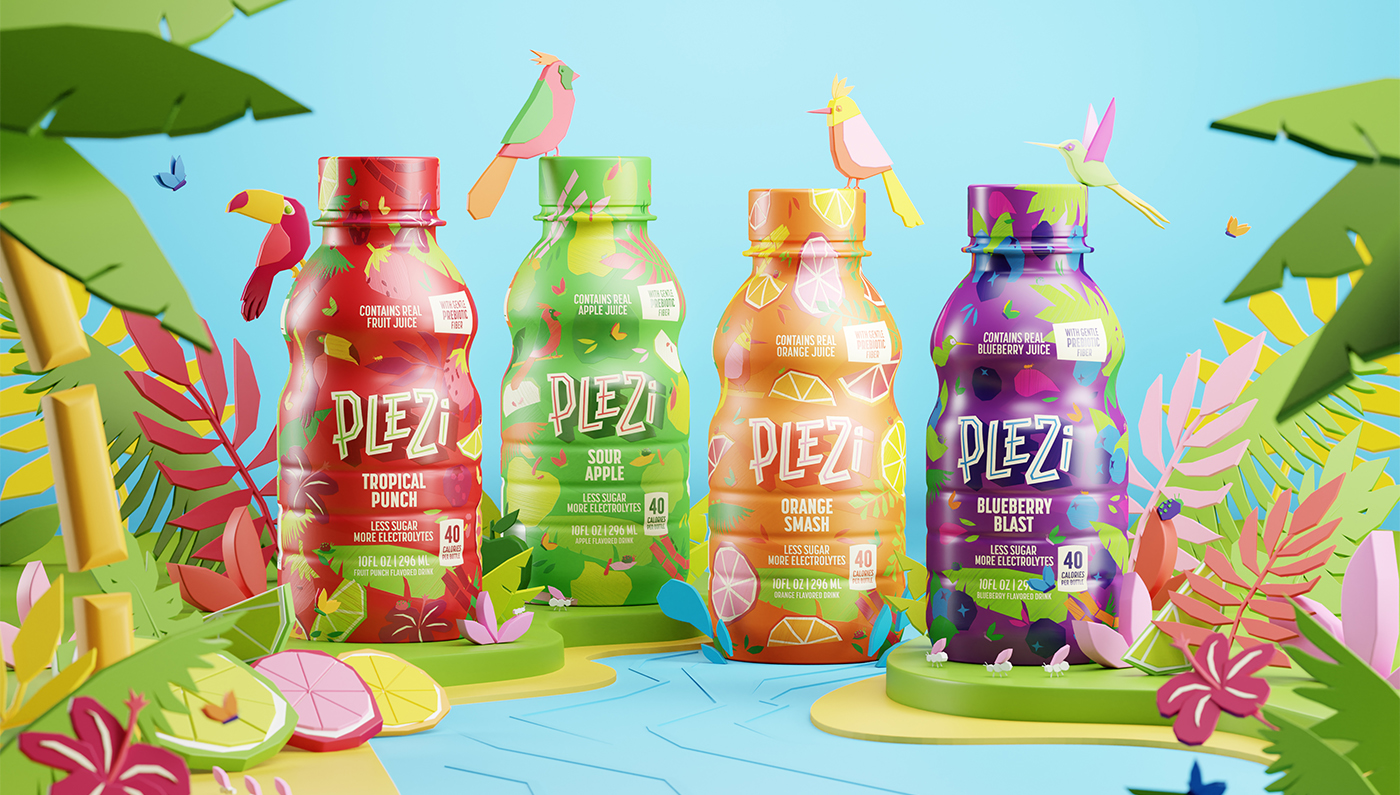
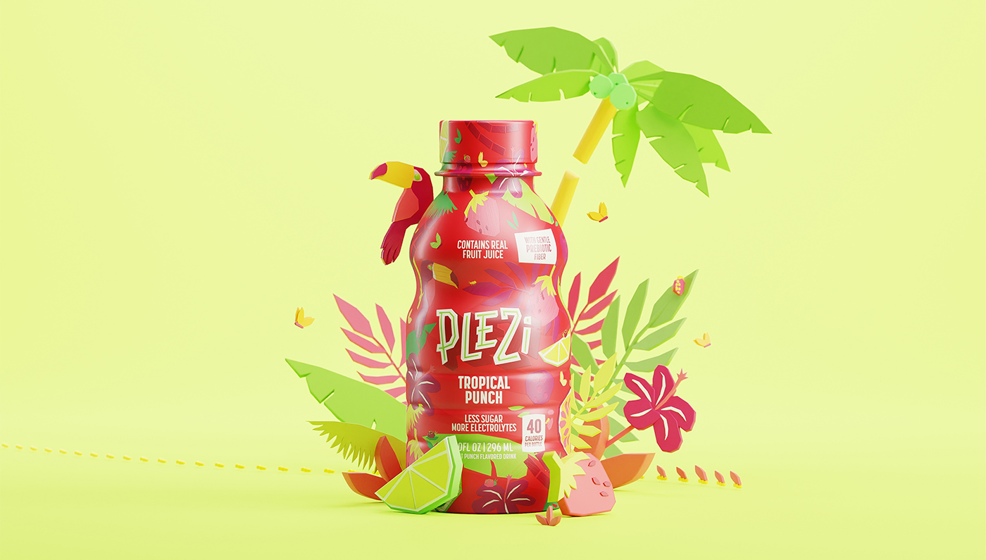
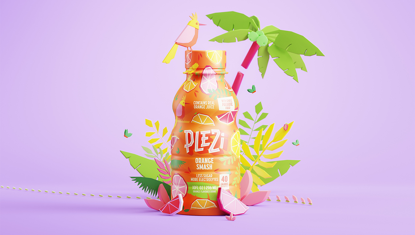
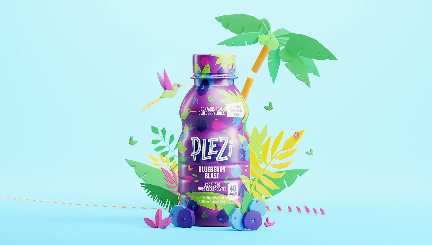
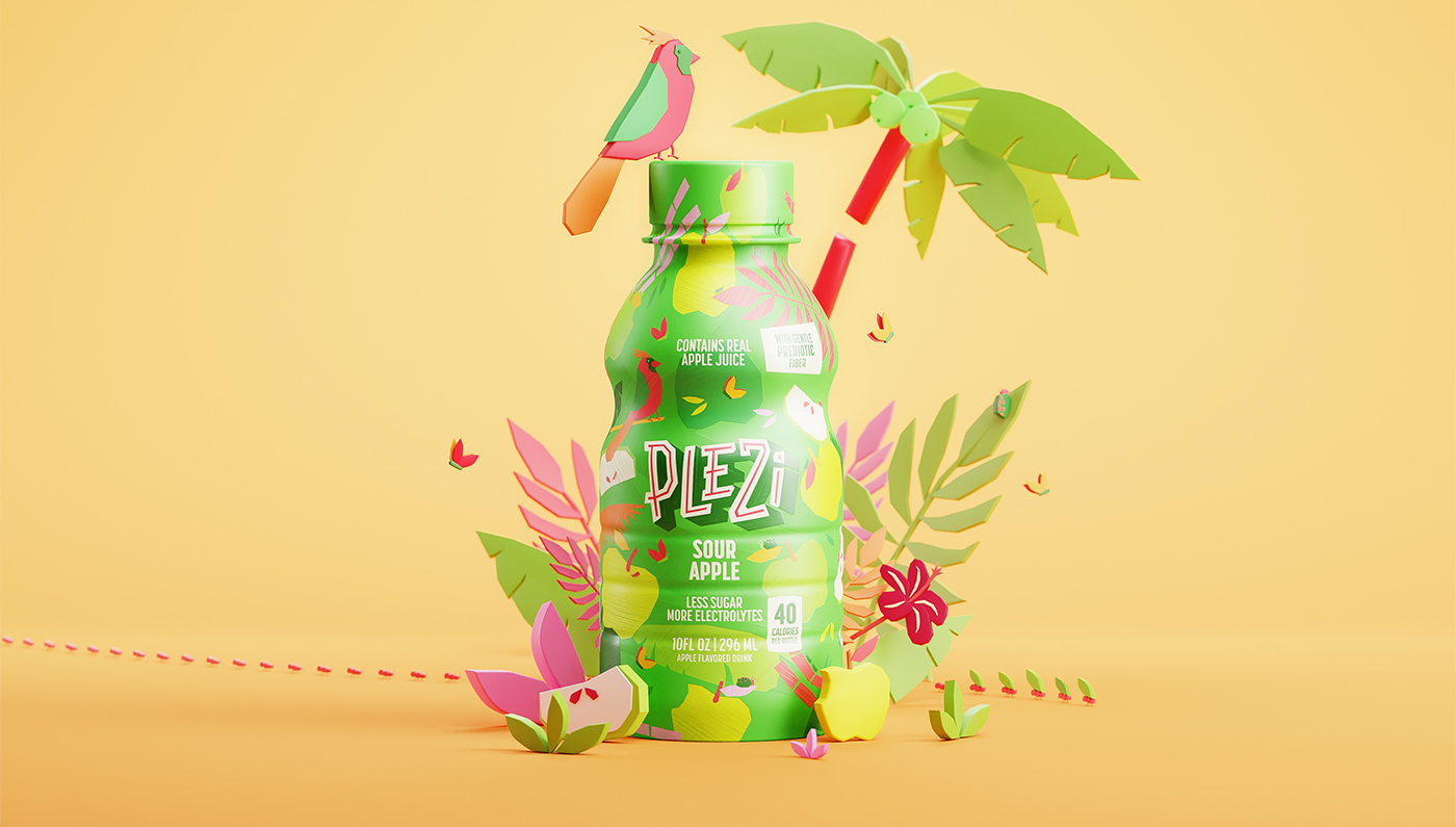
A L.A. company tasked us to create a new visual identity and labels for four kids' juices in the U.S. aimed at children aged 7-12. The design needed to be interactive, allowing kids to engage with the packaging while promoting a natural, healthy product, and also appeal their parents, the purchase decision makers at the point of sale. Illustrations of tropical ingredients, leaves, and birds evoked a tropical forest vibe, and strong, saturated colors appealed to the target age group, while irregular drawing strokes added a hand-drawn, natural feel. In addition, the child is challenged to find a certain number of insects in the illustration, with the results that can be checked through a QR Code. The goal was to make children excited about the product while reassuring parents of its health benefits, enabling children and parents to make a better buying choice at the point of sale, opting for a less processed product with a higher nutritional content.