


Back The Rise and Evolution of Cannabis Packaging
With the legalisation of cannabis for both medical and recreational purposes becoming more and more common across the globe, packaging design has been at the forefront of changing old-fashioned perceptions and stereotypes attached to the controversial product. Here, we go through some of the key moments and look at some of our favourite design examples.
The CBD Wellness Era
A leading factor in cannabis prohibition was fuelled by the psychoactive properties synonymous with the product caused by ‘THC’. Science and the public however embraced another common cannabis compound for its wellness and medicinal potential, CBD.
CBD is the second-most prevalent cannabinoid produced by Cannabis Sativa L. Researchers have found that the compound has proven effective for pain relief, as an anti-inflammatory, helped to reduce anxiety and is commonly used for various conditions such as epilepsy and arthritis with the first cannabis-based medicine available under prescription in the UK in 2015. CBD products entered the commercial market initially as health supplements in oil/tincture and capsule form, sporting a whole new persona and image with packaging design language as the driving force.
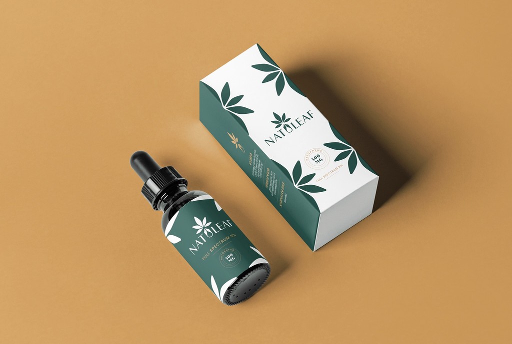
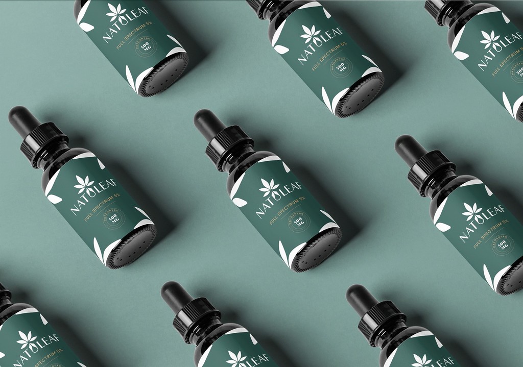
CBD Oil
Coollab Design’s packaging features a stylised logo motif of the cannabis leaf itself, making it instantly identifiable and creates a wallpaper like pattern when the boxes are stacked together. The use of green is in-keeping with the signature cannabis style, but the choice of soft, deeper shades provides a more modern, natural feel. The pipet container commonly used for CBD oil is practical but also gives it that medicinal aesthetic.
Another example of CBD oil packaging was developed by Burgopak and Duallok, called Kolluda. You can read more about this in our previous interview with Alethea Price, Marketing Manager at Burgopak here .
Over the last few years, a huge variety of products have emerged, including foods, medicines, and cosmetics.
Food
A recent favourite is the rise of hemp seed milk. Good Hemp use a hand painted aesthetic with a soft, muted colour scheme for their hemp seed milk packaging to reflect the natural ingredients and add a premium touch.


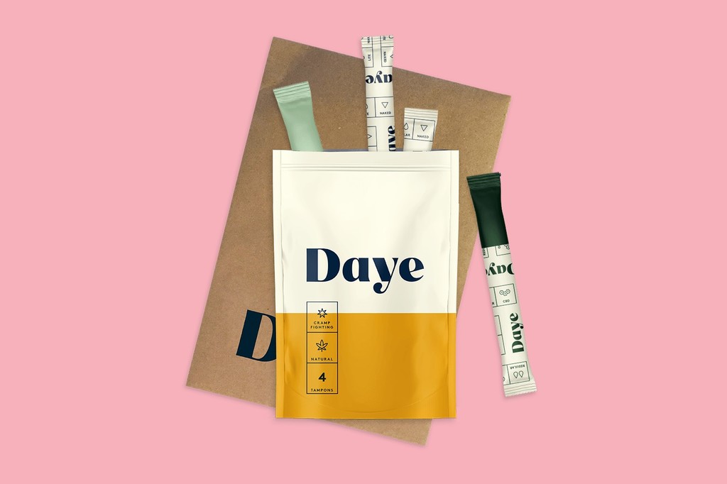
Sanitary Products
New UK brand ‘Daye’ tampons come infused with cannabidiol to quell the agonies of period cramp combine the modern-day cannabis aesthetic with period positivity packaging. Valentina Milanova, Daye Founder & CEO decided to bring the brand development in house, collaborating with Erin Rommel, founder of Second Marriage Studio, as Daye’s artist and illustrator. Forest greens, burnt orange, and custom-designed illustrations define the brand's identity, putting the clean yet eye-catching style of classic Swiss brand Geigy alongside pagan, tarot-like imagery.

Cosmetics
Cosmetics and skincare have also seen a rise in CBD blends.
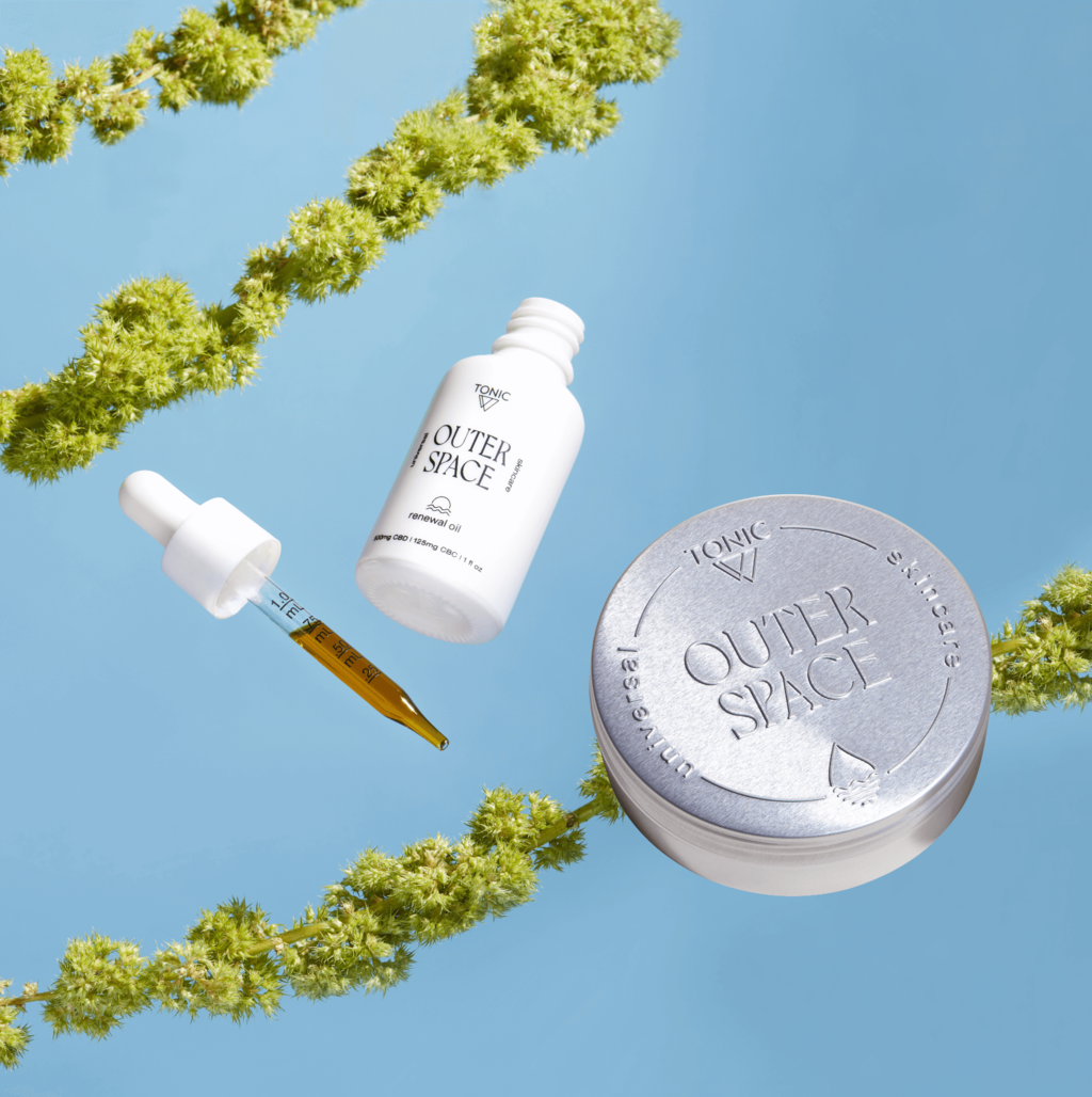
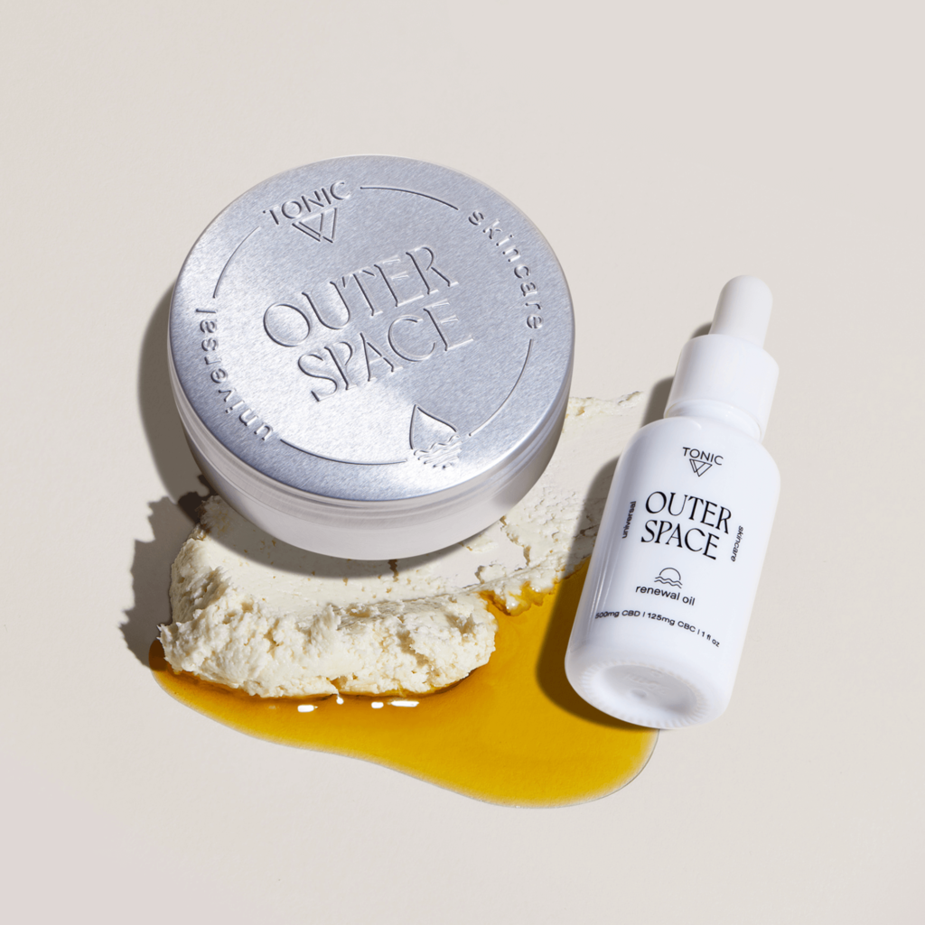
Plastic Palm Tree’s packaging design for wellness company TONIC’s debut skincare line, Outer Space, utilises a minimalist aesthetic, relying on clean lines and a monochrome pallet. Featuring an opaque screen-printed dropper bottle and an embossed tin with a letter pressed outer box. The simple packaging was developed to reflect the ‘pure and clean’ product.
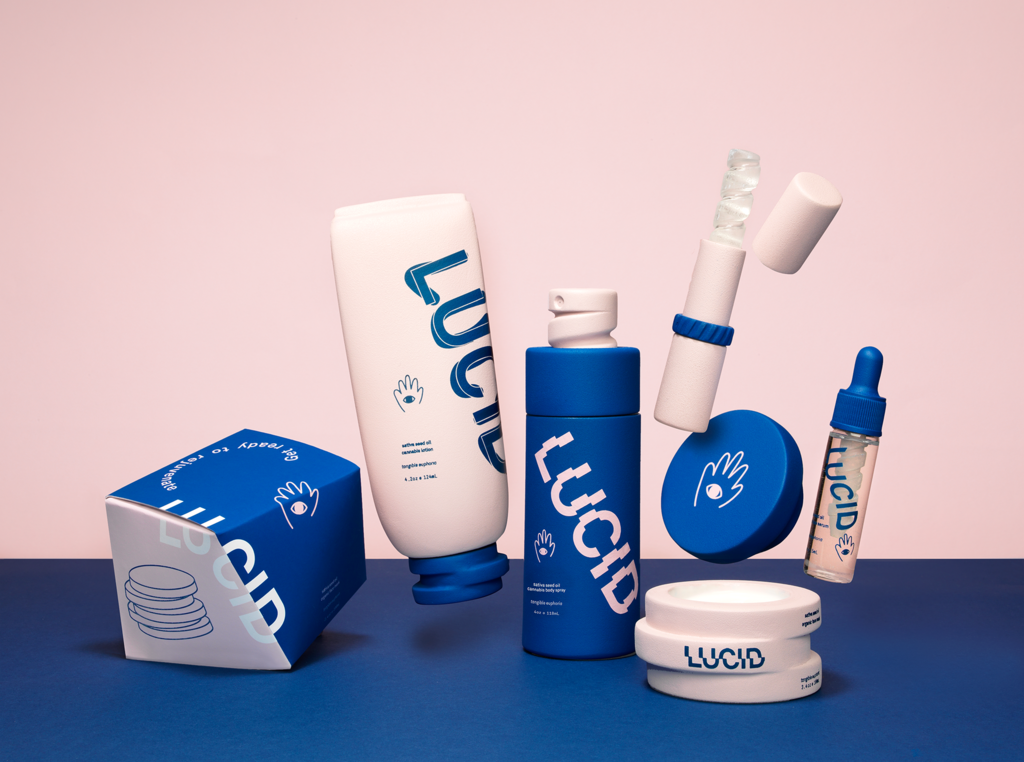
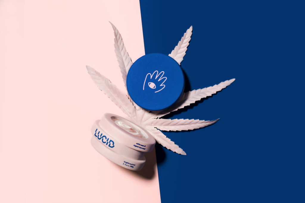
Some designers have opted to veer away from more familiar colour pallets and icons, one example being Angela Pack’s design for unisex skin care brand ‘LUCID’. Utilizing enhanced surrealism to reflect tangible euphoria, complimented by contrasting powder pink and deep blue. “Lucid brings a new twist on skincare where it is fun, quirky, and interactive.”
A new cannabis revolution
The legalization of cannabis for recreational use in countries such as Canada and almost half of the U.S has caused a boom in the mainstream commercial market and the cannabis industry has gone through a dynamic transformation to meet the challenge. Upscale imagery and design elements are commonly applied to create a more sophisticated and appealing aesthetic, veering away from its previous plastic wrapping, dealer-down-a-back-ally image.
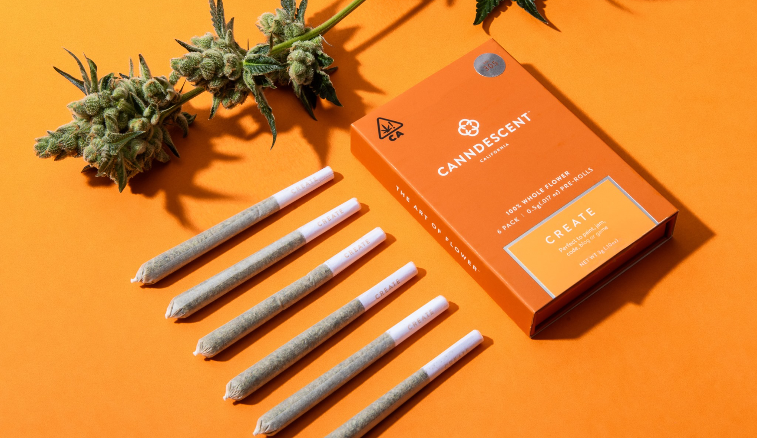
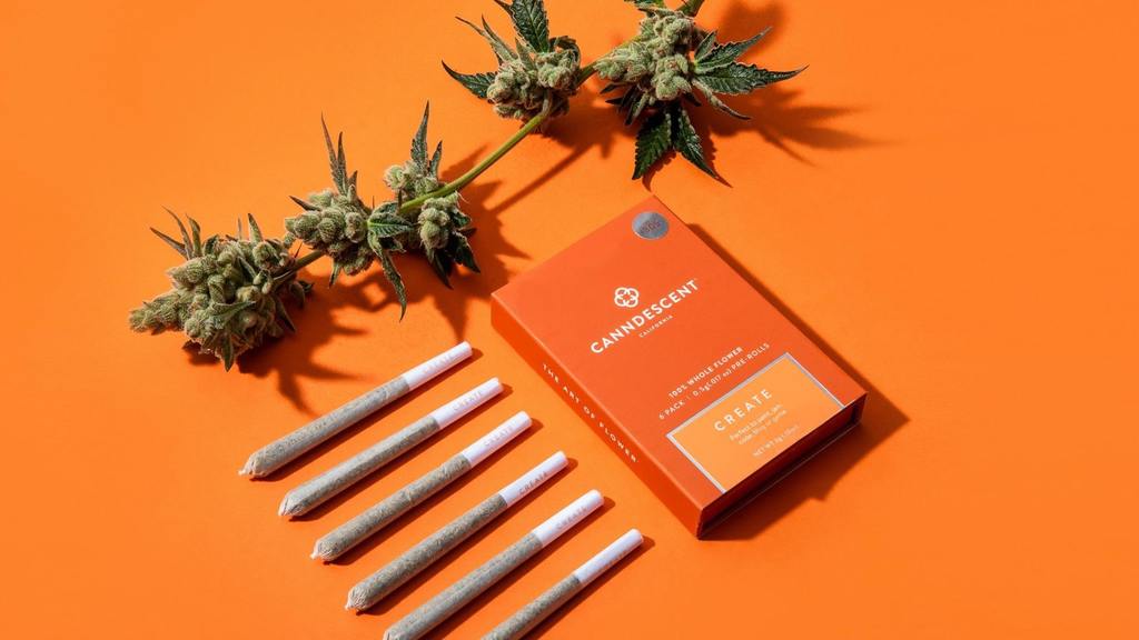
Pre-Rolls
Canndescent recognises recreational cannabis as a luxury product used to curate and enhance one’s life experiences.
Avoiding ‘traditional’ cannabis tropes, the bespoke brand opts for a premium luxury packaging design, with five different effects ranging from Calm to Charge, each indicated by blocks of earthy colours which are complimented by the company’s warm signature orange. Offering a varied selection that are more akin to luxury jewellery or cosmetics product packaging.

With an aim to shift perspectives, packaging for this ever-growing market seems to be a key to its success. By making it more familiar, Instagrammable and upscale, this previously frowned upon industry has become increasingly more appealing to a much wider audience.
Find out more about the packaging featured here:
- Coollab Design website , Instagram
- Good Hemp website , Instagram
- Second Marriage Studio website , Instagram
- Plastic Palm Tree website , Instagram
- Angela Pack website , Instagram
- Canndescent website , Instagram
Have some new packaging you’d like to share? Email us info@pentawards.org for a chance to be featured!