


Honey's rebranding by ISD Group
ISD Group delivers a rebrand for Kyiv confectionery Honey that conveys the true madness of flavours in a single identity.
ISD Group delivers a rebrand for Kyiv confectionery Honey that conveys the true madness of flavours in a single identity
How to package the entire Ukrainian pastry art and convey the true madness of flavors in a single identity? Founded in 2013 with a basic identity, Honey, a Kyiv confectionery, has become renowned for its innovative dessert philosophy. By 2023, its initial honey-shaped logo and monochromatic yellow-white scheme did not reflect the sophistication of its culinary artistry, impeding the brand's evolution.
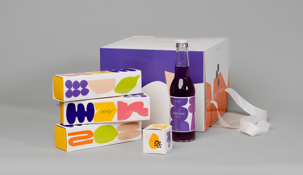
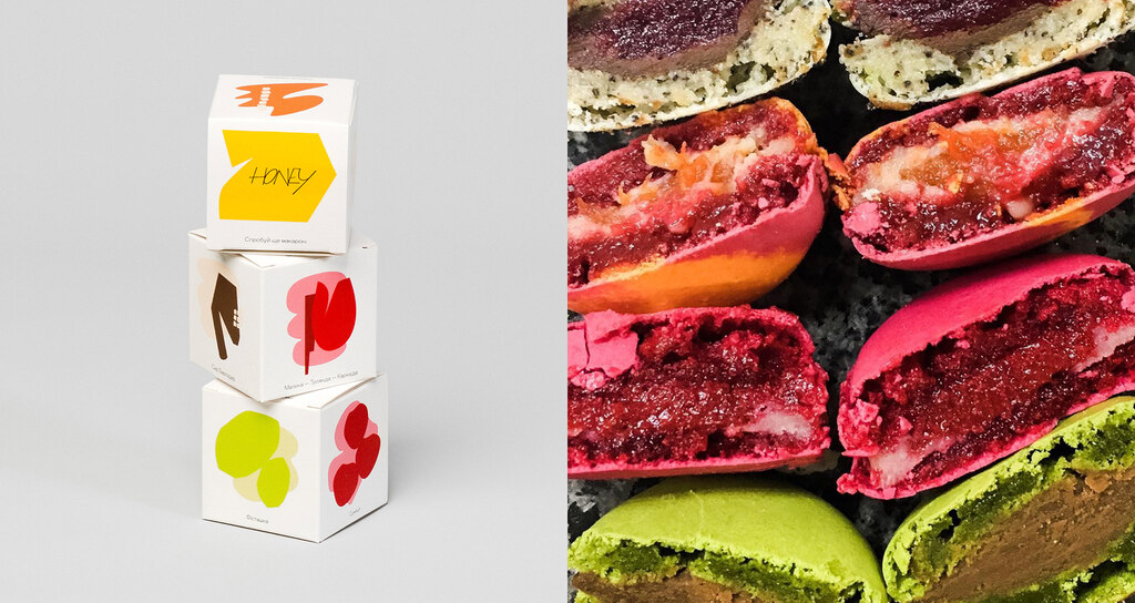
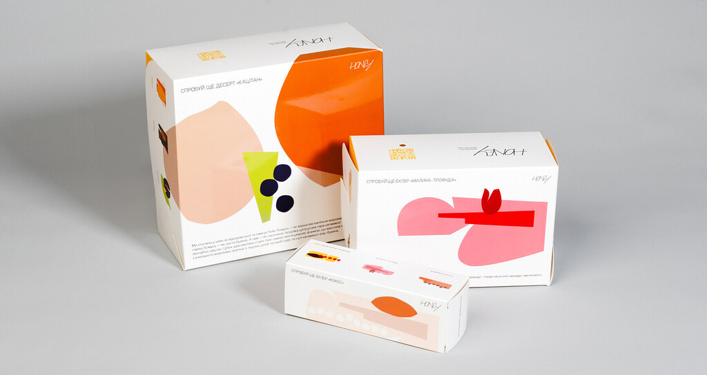
Honey uncovers and fuses a kaleidoscope of exotic, local, and international ingredients, presenting unrivalled tastes, like candies with Ukrainian herbs and black chokeberry. The rebranding aims to embody that product complexity.
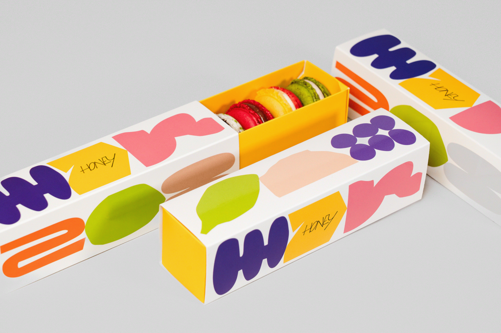

To help in exploring the variety of desserts (more than 100 items), ISD Group developed a "From Pleasure to Surprise'' scale. They reinvented Honey's identity to showcase the layered textures, scents, ingredients and artistry of each dessert, moving beyond mere taste. By deconstructing desserts into ingredients depicted in varied forms and colors, the studio uncovered their core before customers experience it first-hand.
For more information on the design, visit ISD Group's website or follow them on Instagram.
Want to receive more monthly packaging inspiration? Sign up for our newsletter !